![]()
We’ve spent the last 10 months working on the rebrand of Mozilla, which, from the original strategy and narrative stages, through to first design concepts and development, has been carried out in the open. There have been countless design routes, thousands of blog comments, and hundreds of video conferences. But, finally, we have reached agreement on the way forward.
To reiterate, briefly, the impetus for this project has been Mozilla’s desire to be better known and better understood by their past, present and future audiences. For too long they have been associated only with their most famous product, Firefox, and their not-for-profit status simply hasn’t registered. As they now recognise, ‘we’re uniquely able to build products, technologies, and programs that keep the Internet growing and healthy, with individuals informed and in control of their online lives’.
Whilst a strategic basis had been established before johnson banks were appointed, we were able, through our discussions, scenarios and workshops, to find a clear strategic ‘sweet spot’ to create a platform for the visual brand. Many of us are concerned about how our lives are tracked, data-mined and exploited online, so we were keen to show Mozilla in a different light.
Now Mozilla are clear:
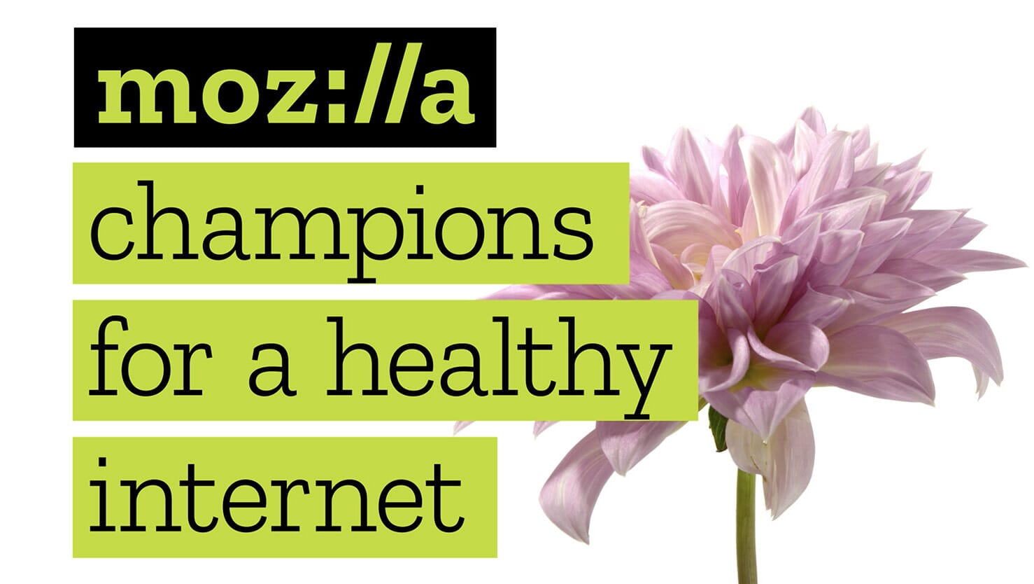
‘We want to be known as the champions for a healthy Internet.
An Internet where we are all free to explore and discover and create and innovate without barriers or limitations.
Where power is in the hands of many, not held by few.
An Internet where our safety, security and identity are respected.’
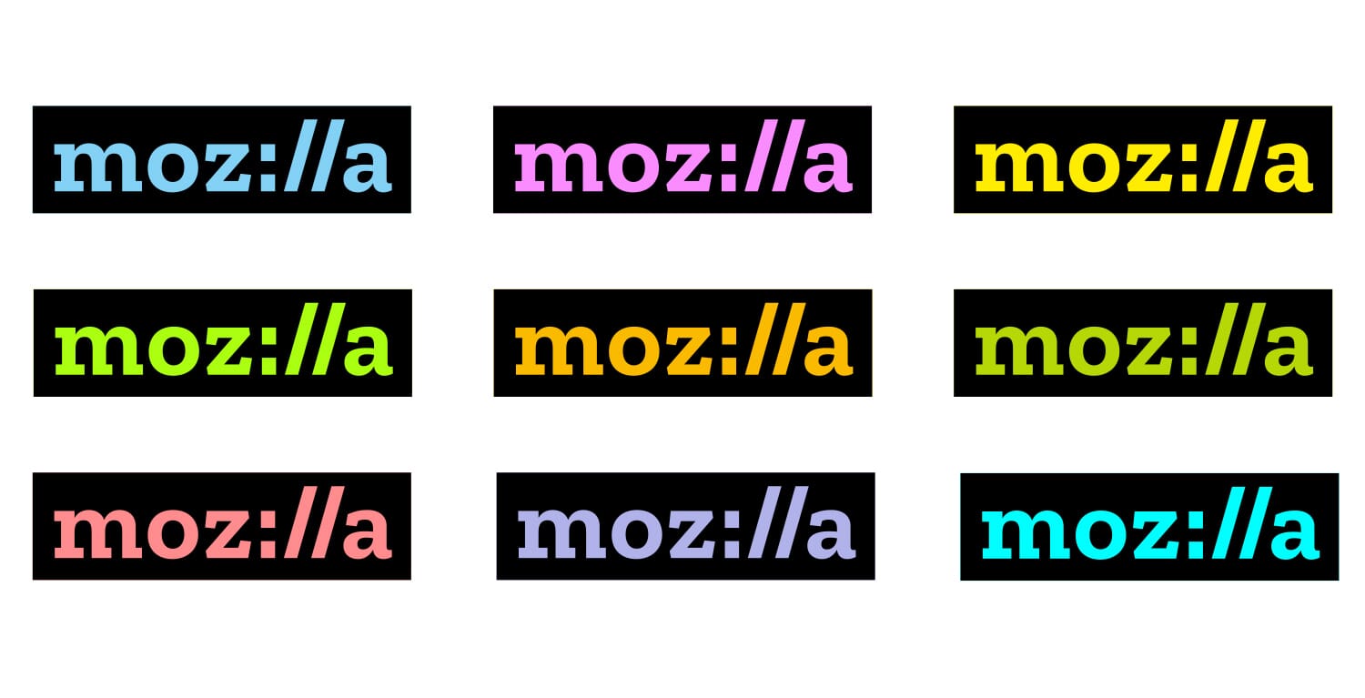
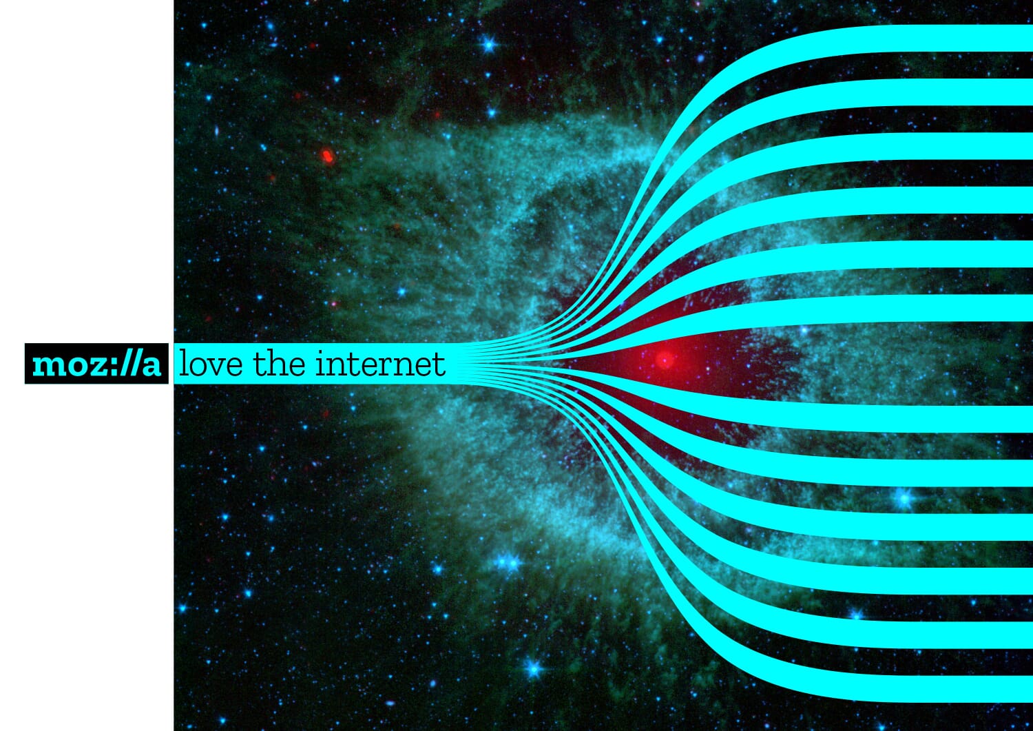
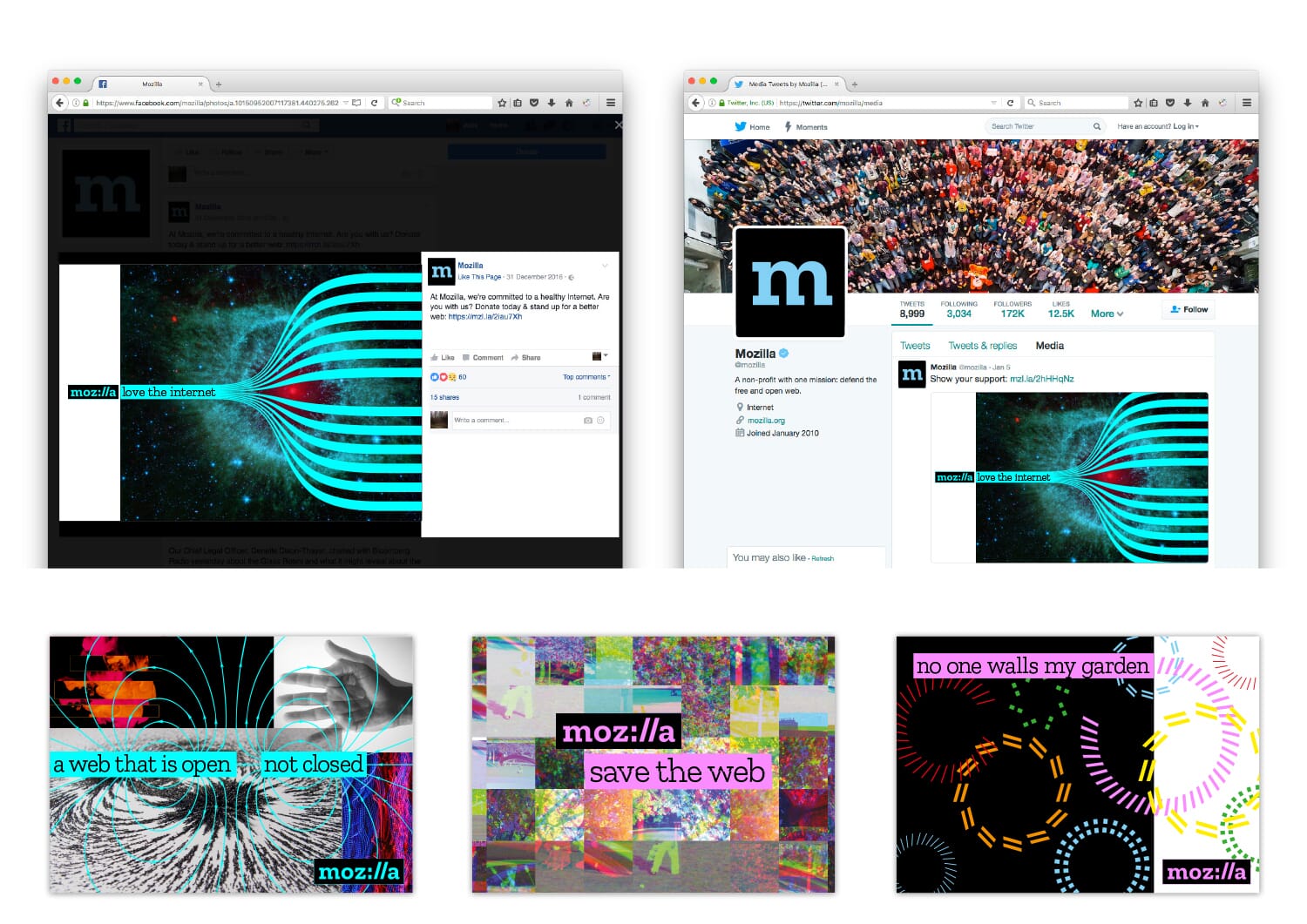
Right from the first design meeting, we had included an idea that built part of the code of an Internet URL, into their name. An idea which represents how people and knowledge are linked in an increasingly connected world.
The idea persisted and eventually became the backbone of the final route. It won through because it resonates well with their core internal and external audiences. The use of some of the language that lies at the heart of the Internet neatly encapsulates their desire to be the champions for a healthy Internet, stand up for what’s good about the web, and make it clear that they are an Internet pioneer. Above is a short animation that encapsulates the scheme.

As we pushed the idea further, we were able to make the coloured bars allude to internet browser address bars and discovered that we could fill these bars with both type, messages, images, or a combination – alluding to a typical web journey. It started to become a very flexible system. And we had always enjoyed the thought that this was a logo you could type, as in ‘moz://a’.
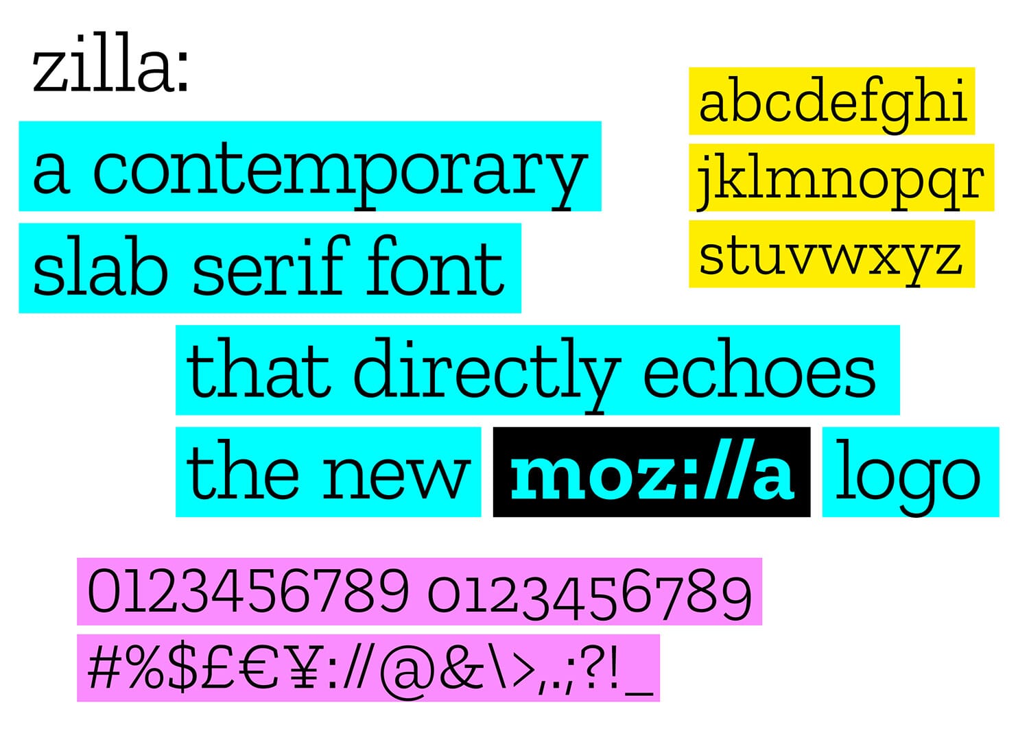
Initially we restricted ourselves to free fonts, then started to think about a commissioned font that would then be made available free of charge. The font foundry Typotheque was chosen to do this because of the fonts they had already designed that could form a basis for what we needed, and the type foundry has a long and distinguished link to some of the earliest web font designs.
The final font is carefully customised so the details that you see in the angles and serifs of the final logo carry across into the font itself. It will be extended out into several weights, and eventually into Cyrillic.
It’s based on a ‘slab serif’ style – chosen because much coding is still done in ‘typewriter’ style fonts , so there’s an additional link there. And, in our research, we had flagged the fact that nearly all of their peers and competitors have moved to humanist sans-serif fonts and wordmarks – we felt strongly that they should move in a different direction.
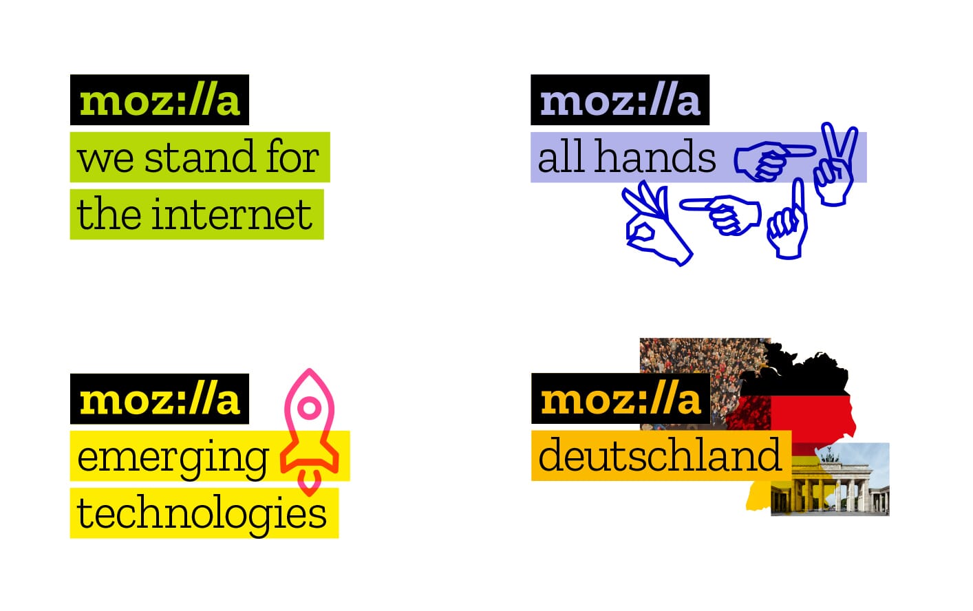
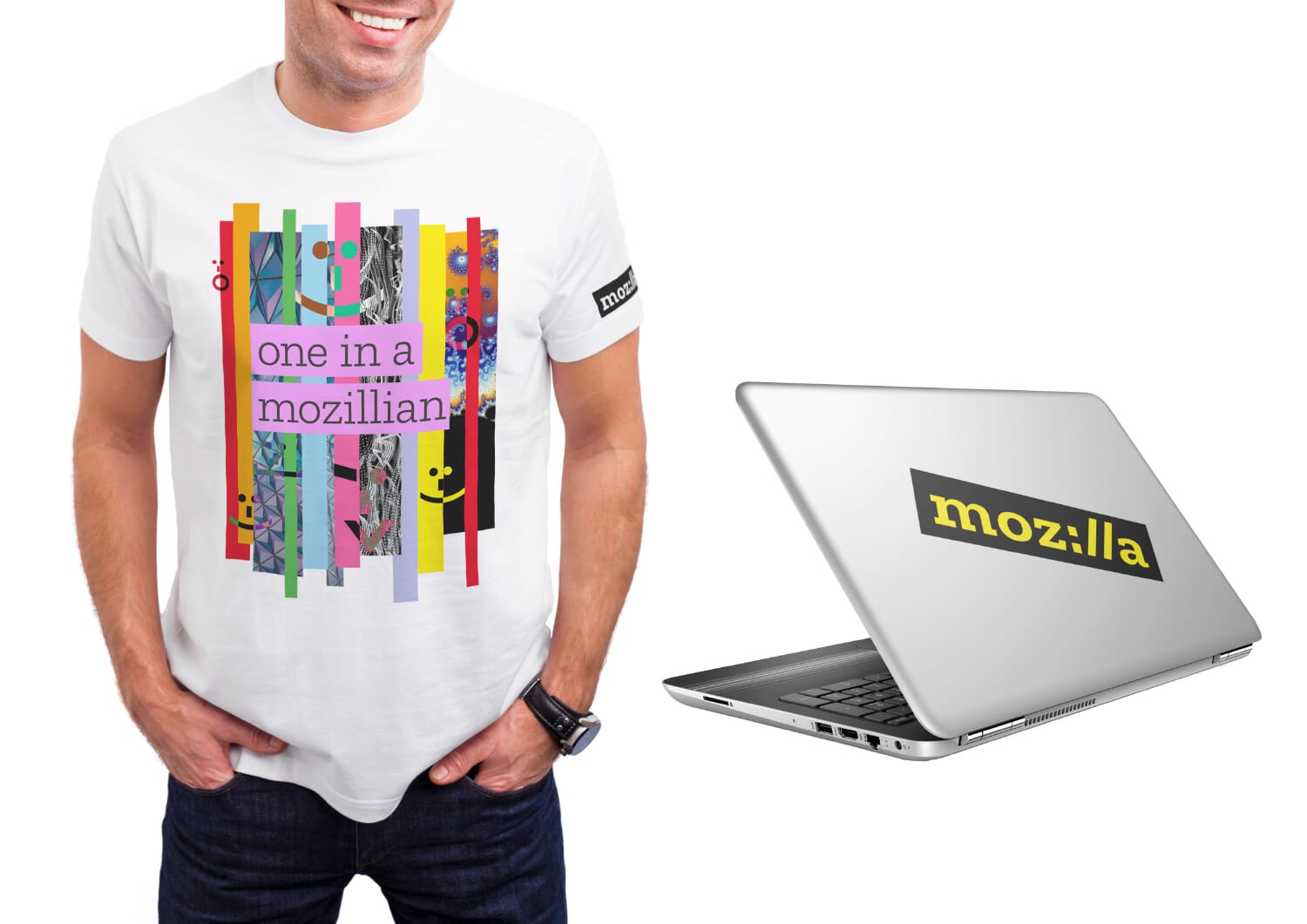
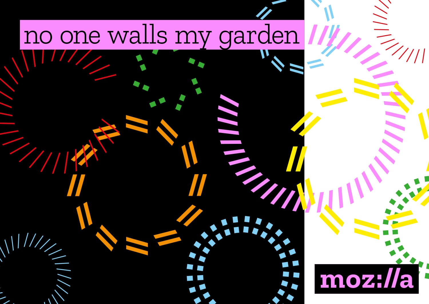
In our research we’d noticed that Mozilla seemed reticent to ‘take a stand’ in a way that matched with our other not-for-profit clients, so it was important to find a way for Mozilla to include messages near the mark itself. We had also audited a vast array of different sub-brands and communities, so the new design plots a more unified course for these.

As we explored this route further we realised that we needed an imagery palette that was as wide as possible to let us talk about people, technology, connections, open-source, privacy… …all the topics they want to cover now, and any new ones in the future.
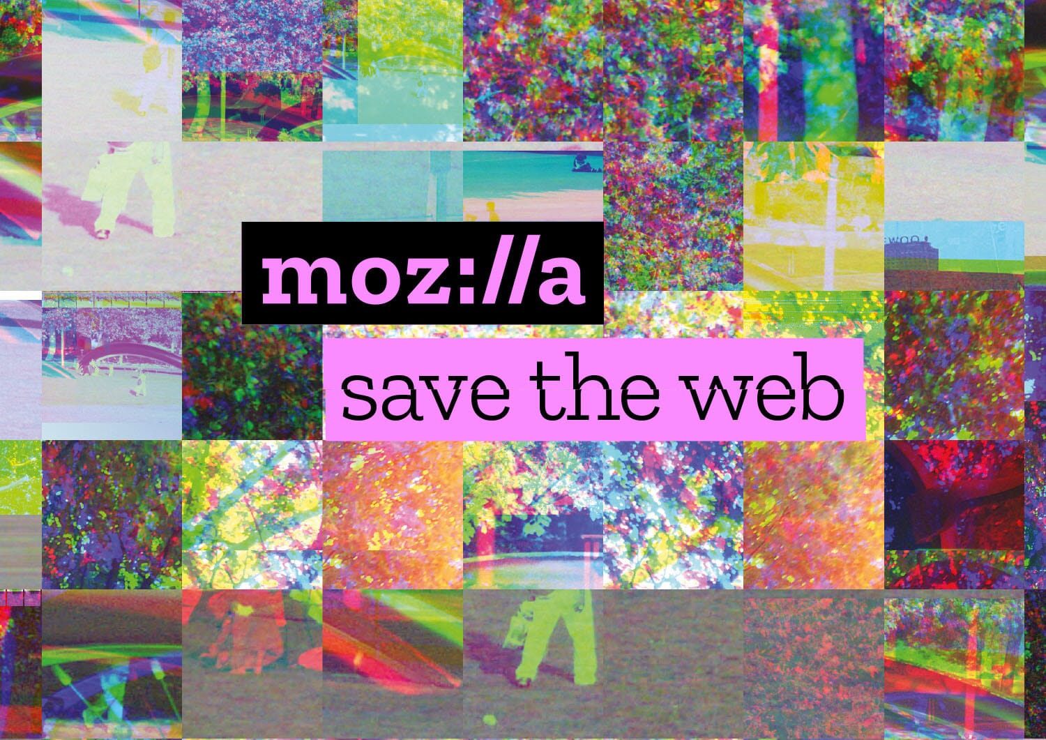
So we began to explore the idea of an almost digital ‘collage’ of imagery that would begin to sum up the wonder, width and craziness of the web. The next step on this will be to call for and build an online gallery of Mozilla imagery, film and animation – to source their image bank in a similar manner to how they create their code.
There follows more examples of the final route in action.
You can read more about the final scheme on the Mozilla Open Design blog and make comments if you wish. But only nice ones.
Or you could read more on Creative Review, It’s Nice That, Creative Bloq, Brand New, Design Week and Wired
Design: johnson banks
Typeface design: Typotheque
Digital consultants: Sennep
Moving Image: Matt Ingram
Additional photography and image credits:
Flower ©Forrest Brown
Birds ©mkToy
Shell ©AndreaAstes
Mouth ©GeorgePeters
Brandenburg Gate © Pierre-Selim Huard
Cosmos ©NASA/JPL-Caltech/Univ.of Ariz
Iron filings ©Windell H. Oskay, www.evilmadscientist.com
Fractal ©Tom Beddard http://sub.blue/nanoflakes