
For the last month we’ve head our heads down working on the Mozilla brand project, which, as you may have read, is being done ‘in the open’. There follows a quick overview of what’s been happening, and then the design development itself.

Since the first round of designs
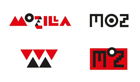
A month ago on this blog and on the Mozilla project page we published the seven initial design routes (repeated above), organised around five possible narrative themes. There’s been an unprecedented wave of interest: articles across the web; hundreds of tweets, thousands of comments and perhaps hundreds of thousands of words of feedback. Plus many rounds of meetings at Mozilla offices across the USA.
It’s fair to say that, whilst there’s been overall support in general, and interest in the process, some of the critique has been pretty robust. But, we expected that. So we went away, regrouped, licked our wounds, decided what was useful feedback, what wasn’t, and moved forward.
Some that we’ve left behind
Of our original seven, four have fallen by the wayside, one has remained intact and two others have directly led to new ideas. The four that have gone are the Open button (which tied us too closely to ‘open’ in general) and Flik Flak, which had its fervent supporters but was either too complex, or too similar to other things (depending on who you spoke to).
The Impossible M was an early favourite, but it transpired that it was just too close to other design treatments already in the public domain. The Connector stayed in the running for some time, but was eventually overtaken by new ideas (and always slightly suffered from saying Mozilla ‘twice’).

What we resolved to do next
The brief for the development work gradually formed.
We knew we wanted to take one route forward from the first round and develop it. We wanted to think more deeply about Mozilla’s role in the Internet and how that could be expressed, visually or metaphorically. We wanted to think more about how the Internet works - randomly, producing lots of data, with everyone participating. From the blog feedback it became clear that something linking more directly back to the old ‘Dino’ mark should be looked at. Something developing the current colour scheme would help, and that we should concentrate on core marks before developing fully fledged schemes. This re-brief directly led to the four design routes that follow below.
How the work links to the core narratives
At this stage of the project, we’re still using three of the original narratives and have added another:
The Pioneers - still a strong and resonant territory, and one that works well with at least one of the final four.
The Health of the Internet - a new idea that posits Mozilla as one of the key ‘guardians’ and advocates of the Internet’s overall well-being.
Taking a stand - a positioning that emerged directly from our earliest discussions and is still very strong.
The maker spirit - as we’ve seen from the first round, the community of Mozillians is vocal and engaged and is key to the organisation going forward.
![]()
Route One: Protocol 2.0
A strong contender from the first round of ideas that we’ve continued to work on and improve. By putting the internet http:// protocol directly into the word - Moz://a - it creates a typeable word mark, and by doing so alludes to Mozilla’s role at the core of the Internet (and hence the ‘Pioneers’ positioning). We've also beefed up the blue to the classic RGB #0000FF (as used by Netscape) to further enhance its 'roots of the web' credentials.
We’ve been strengthening the typography from the first round and looking at ways to expand the graphic language out across a typographic and pictogrammic language. We’re also experimenting with a thought that some of the characters in the mark could swap in and out, randomly, pulling fonts characters or emoticons from a local computer or the web itself. A freaky thought, but could be great.

Here are some key slides that show how the work is developing.


Route Two: The Flame
This is a completely new direction. Whilst rooted in the ethos of the ‘Pioneer’ thinking it also crosses over into the ‘Taking a stand’ narratives. We started to think that a flame could be a powerful symbol of Mozilla’s determination to remain the beacon for an open, accessible and equal internet for all, and something that a community gathers around for warmth.
As we started to experiment with flame symbolism, one simple design won through which simply merges an ‘M’ and a flame. After some experimentation, we think a dot/pixellated form for this idea works well, and it animates nicely.
Here are some key slides showing applications out to sub-brands, community designs and merchandise.


Route Three: Burst
This route has stemmed from two trains of thought - firstly a new narrative direction where we have been actively considering Mozilla’s role in recording and advocating for the health of the Internet. Visually we’ve been investigating data-led ideas and classic internet imagery, whilst not forgetting some of the thinking of ‘Wireframe World’ from the first round.
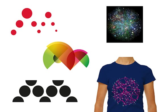
As we looked harder at data sources we realised that five was a key number: Mozilla is collecting data around five key measurements as we type (and you read), and there are five nodes in a capital ‘M’. So we combined the two thoughts.
This creates a very beautiful, almost fragile idea that we know has great potential in online and animated forms. It also lends itself well to a set of interlinked images for Mozilla’ many initiatives.


Here's a screen capture of some experimental online coding we've been doing for this route, which you can access and play with here.

Route Four: Dino 2.0
Last, but definitely not least, meet Dino 2.0. As we took on board the comments from the first round on ‘The Eye’ route, our first typographic developments were OK - but not overwhelming.

So we forced ourselves to go back a step and look again for ways to hint at a ‘zilla (whilst not being too specific) and something that could form the basis of a wide-ranging design scheme.
After weeks of experiments and simplification, Dino 2.0 emerged.

Essentially this Dino is just a red chevron and some white type - but somehow that one raised eye can watch and blink in a very unique way. And those jaws can merrily chomp when needs be.
We see this Dino as someone who can straddle two narratives - one that can stand up, be counted, shout, bark and bite when needed - yet also act as a figurehead for Mozilla’s maker spirit and community across the globe. We’re developing a kind of ‘agit’ toolkit for this route, with crude hand-drawn industrial typefaces, and a suitably red, white and black colour scheme.


Dino is also working well for sub-brands and country specific icons, as below...


That’s your lot. One developed route, two building on previous thinking, and one completely new. Feel free to visit Mozilla’s Open Design blog to leave your views and speak up for your favourites.
Our next steps are to pick three to go into public research. Watch this space…
