
A few weeks ago I was at one of the London Creative Mornings events, speaking with one of our long-term clients, Tom Foulkes, about the relationship between clients and their designers.
Tom spoke eloquently about his wishes and worries about both sides of the ‘partnership’, I then spoke about the ways that designers present, what they present an in which order, what works and what doesn't. Below is a kind of annotated ‘slide plus notes’ approach that hopefully captures what I was trying to say...
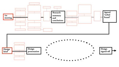
It’s pretty difficult to win large projects without demonstrating that you’re going to follow some sort of process. Gone are the days when you could say ‘it'll be thirty grand and I’ll call you when I’m ready’. Unsurprisingly, clients are expecting to see a little more than for their money nowadays.
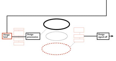
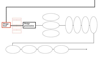
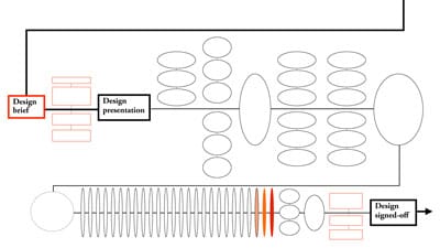
So, above you can see a standard diagram culled from some typical johnson banks paperwork. After the first meetings there’s a longish stage of research, then a stage working on the words and strategy behind a project. Then then design brief, a series of sub-stages and a presentation.
Clearly, what happens at this design presentation and immediately thereafter is of huge importance - the dotted ellipse of the diagram above.
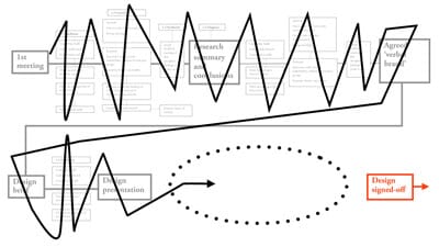
We’ve found that, without doubt, regular client contact and discussion leading up to the ‘dotted ellipse’ can only be helpful - if something dramatic, avant garde or possibly paradigm shifting is coming, it’s best to prepare the ground beforehand.
Now, there’s an old and hallowed school of thought that maintains that, at this meeting, only one route should be shown. As the appointed design consultant, your word should be gospel, and whatever you feel is best should be shown and indeed immediately signed-off. And all that.
And, just sometimes, one route can be shown, and approved. The board presentation for Shelter’s new logo was the shortest I’ve ever done. I turned the board over and said ‘here you go’. They said yes.
The truth is, ‘one route’ is a hugely risky strategy. You only need one naysayer on the board, and things can very quickly unravel. I’ve also found it overly arrogant to insist that ‘there is only one way’, especially if variants and or options can be used to aid strategic decisions as well.
Little surprise then that ‘3 routes’ is much more likely. Sometimes you can try a variant of this where of the three routes shown, two are complete donkeys and only one any good, making the choice (in theory) so much easier.
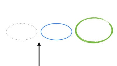
Another variant is the ‘degrees of interesting’ scale shown above (pursued, I believe by a lot of London’s more middle of the road consultancies), where a dull grey route is followed with an entirely acceptable route (usually in blue). Then there’s ‘the crazy route’ which is shown quickly with a few accompanying jokes and it’s assumed the client will be just way too scared to go for that.
There’s usually a decision soon after to go for something between dotted line and blue line. Maybe a combination of the two. Almost certainly a combination of the two.

Years ago I learned a very good variant on this. After I’d presented what I thought was ‘the perfect route’ to my then creative director (it ticked all the boxes, was interesting, was cool, different, etc etc etc) he simply told me to go away and do something ‘even weirder’. That way the weird route was much more likely to look acceptable when it came to presentation. Great tip.
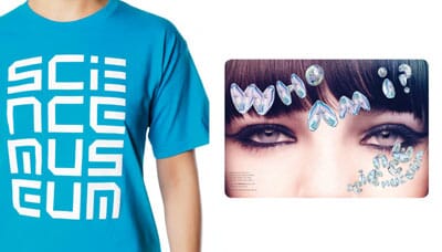
Even now this approach can be helpful. Even though from an early stage, both we and the immediate Science Museum client team really liked the four-line logotype (above left), but it was important to keep exploring other, alternative and indeed weirder routes for as long as possible.
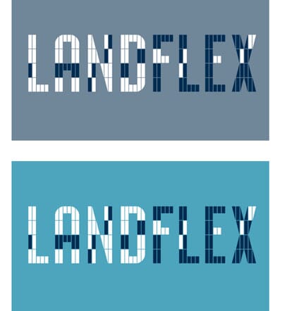
The ‘even weirder’ strategy can lead to interesting decisions. A decade ago we were developing this approach for a flexible office brand called Landflex. This adapted modular typeface route seemed to be working perfectly.
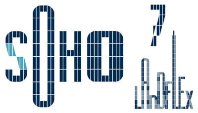
What caught us slightly unawares was that a quite surreal route using blended letters had caught the eye of our clients (remember this is at least 10 years ago).
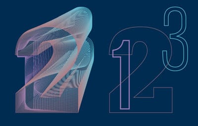
They saw the ‘modular’ idea as just bricks and not much more. And were much more interested in the ‘blends’ of this route and how it could be used to show flexibility.
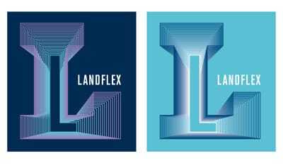
They were probably right, in retrospect.
Of course, showing three routes, even with with a clear recommendation can backfire.
When commissioned to develop a new identity for the St David’s centre in the middle of Cardiff five years ago, we immediately started to look at the Welsh and English together.

Look hard at the words ‘St David’s’ and ‘Dewi Sant’ long enough and you start to see logos that can work in two directions.
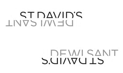
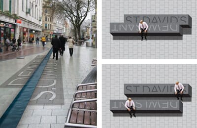
We liked this route a lot. That’s not to say that we didn’t like the ‘dots’ route below, based on people gathering, then extrapolated into a monogram, which actually worked very nicely. There was just something more unusual about the bilingual idea.
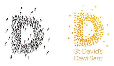
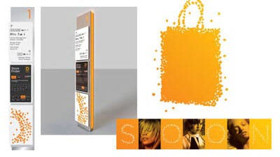
Whilst we and head office liked the bilingual idea, the local Welsh team were much more in favour of the dots - and to be fair it has played out very nicely on site and has ‘done the job’ very well.
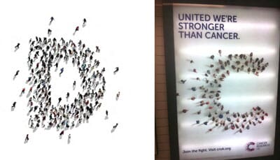
Trouble is, the idea of people gathering could be used for many things - and to our, er, surprise, both the idea of the dotted logo and the gathering people has just been lifted wholesale for the rebrand of Cancer Research. Slightly galling to say the least.
That first design presentation can of course turn out to be the first of many. For all sorts of reasons the first ideas might just be well, first ideas, or it takes a while to establish the right visual steer for the project.
Our original idea for the Pew Center in Philadelphia brought faily non-committal responses. ‘I kinda like it’ was the things that people said, rather than ‘I love it’ or ‘perfect’...
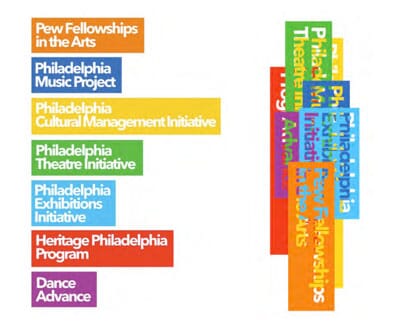
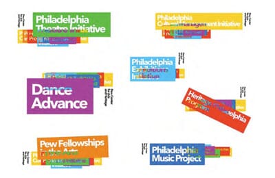
We were onto something with the layered parts idea, but we needed to do more work.
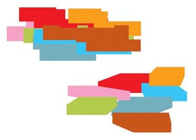
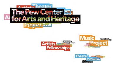
Trouble is, my memory of a little bit more work was of several extra stages...
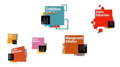
...until we started to find interesting ways to put the organisation’s many different parts together.
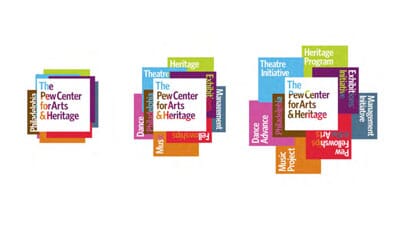
Eventually we had found the solution.
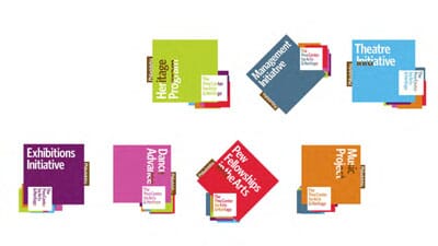
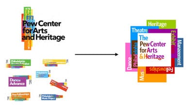
Now, this particular client had a love of graphic design, a very good eye, and respect (I think) for what we did. She just had a feeling that it wasn’t quite right at first. And she was probably right to keep questioning us until we had found the best answer.
The trouble is with the ‘let’s keep searching’ school of project management is that eventually time and budgets, and patience, get in the way. What do you do after multiple attempts to get to a solution have failed? Resign the account?
Truth is, resigning an account does still seem VERY extreme. We’ve worked all this year on a project in New York where agreeing an overall direction was fine, but the precise form of the idea has been a bit elusive. So we developed a new way of working - rather than 2/3 week pauses between presentations of several worked up ideas, we tried something new.
A new design idea a day, via email. Sometimes two. We kept this up for nearly two weeks. A kind of design Blitzkrieg.
While I wouldn’t recommend it as a way of working, it actually seemed to help. No more than half a day was wasted on a route that wasn’t going anywhere, and it’s now pretty much signed-off.

Another challenging design phase was our work for Virgin Atlantic. Agreeing that the name should be written huge down the fuselage wasn’t a problem, it was what to do with the tailfin that took us through hundreds of variants.

Eventually we all came back to the script logo on a red fin. In Virgin’s case, the day-to-day design team were especially keen to examine all the possible iterations, whilst there were contrasting views on the board about the way forward. Which explained the 165 variants and over 300 designs. Kinda.
So, what do we learn from all this?
Well, if your client is a proper project ‘partner’ throughout the initial stages, there’s much more trust, and much more likelihood of the ‘right’ decision when you get to the important stage. If you try to overthink the design presentation too much, something will always catch you out, and never, ever present something you actually think is bit dodgy.
And, every now and again, when the client seems unsure, they might be right. It might just be worth trying again, or looking a little harder. There could be a better solution out there, just waiting...
By Michael Johnson
This is an annotated version of a talk made last Friday at one of London’s Creative Mornings. There is a video of the whole combined talk plus Q&A here.
Follow johnson banks on twitter @johnsonbanks or like us on facebook