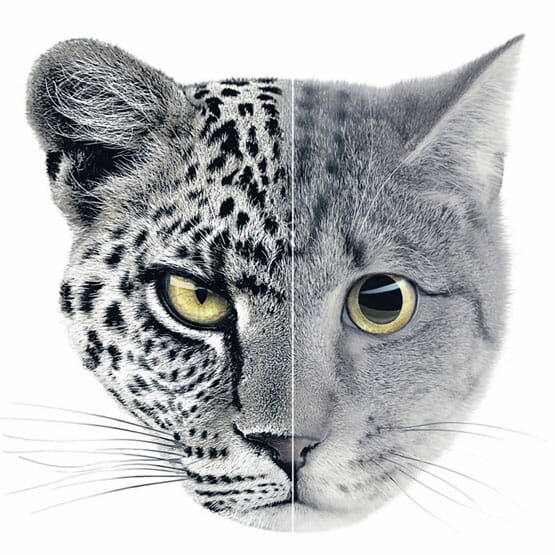

The image that's being used for an Audi campaign here in the UK (above) reminded me last week of a theme that's been running in my head for some time.
It's the idea of the 'half and half' layout ( or 'split screen', or 'cut and shut'). Just when you think this idea has had its time, it re-appears.
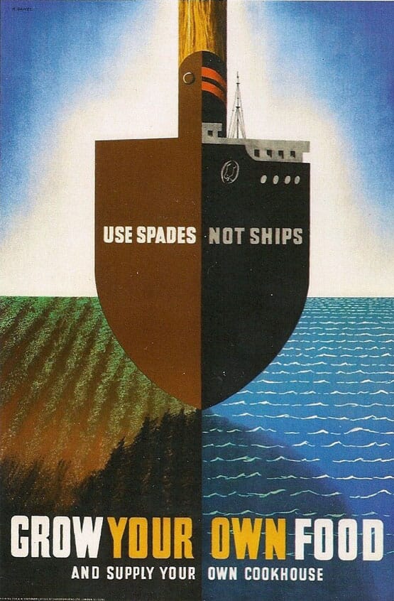
We’ve been racking our brains for the earliest design example, and we’re wondering if it’s this Abraham Games poster, first published as a propaganda poster in 1942.
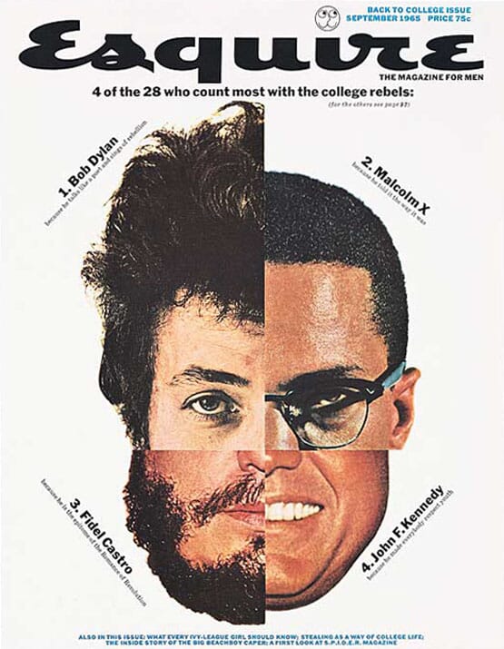
The other early example, twenty years later, is this famous Esquire cover from 1965 by George Lois.
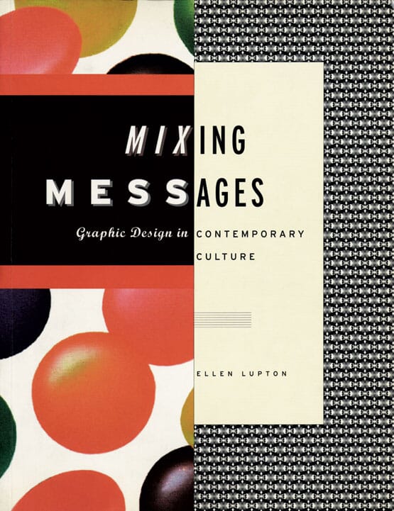
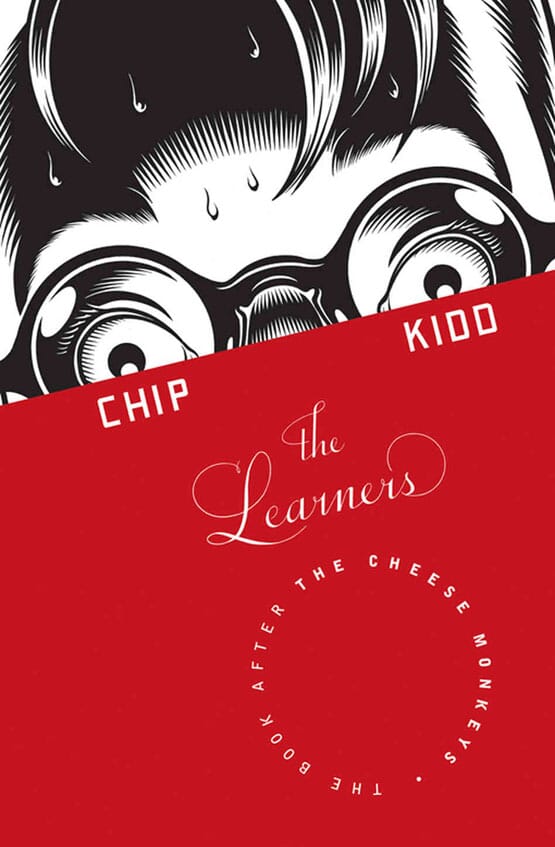
Another twenty years later, and the split screen/cut and shut was back with a vengeance with the early and middle period work of Chip Kidd, who has used the device again and again across multiple projects (see above and below).
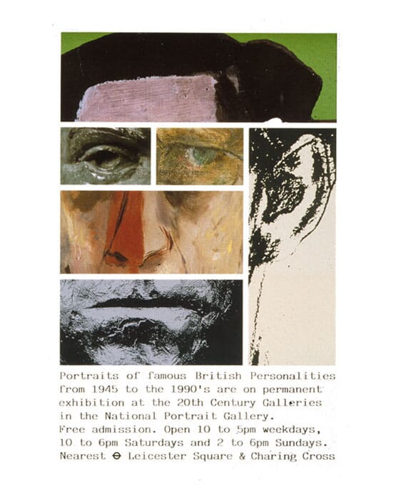
Alan Fletcher used multiple pictures of Prince Charles to make up another, in this famous poster.
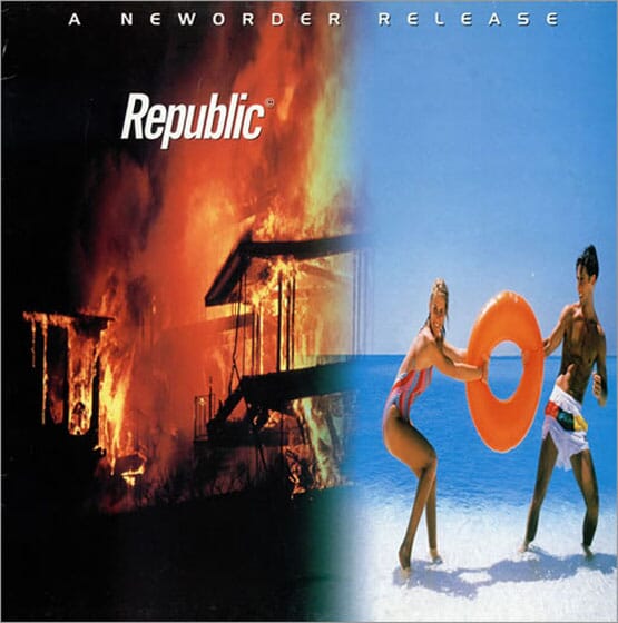
Peter Saville used it in combination with the infamous 'blur' filter for various New Order sleeves (see one example above).
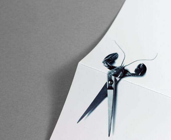
And here's another typical example of the nineties 'spin' on half and half - a nice identity scheme by The Chase in Manchester.
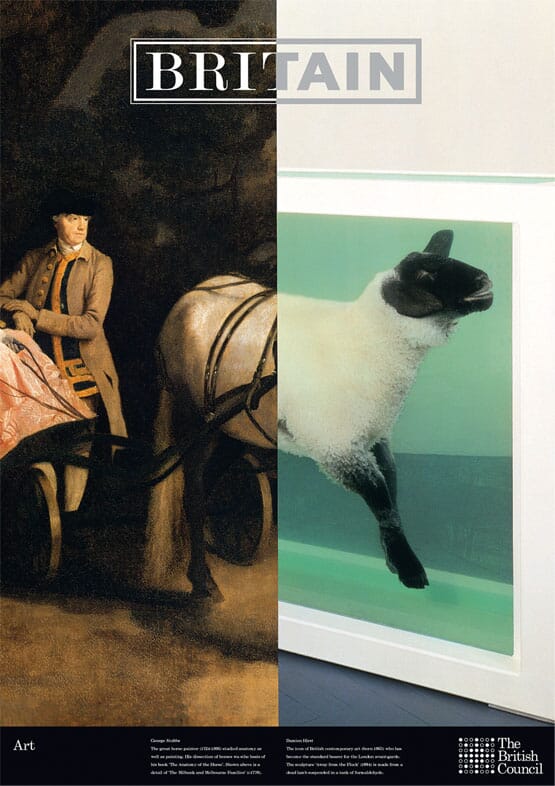
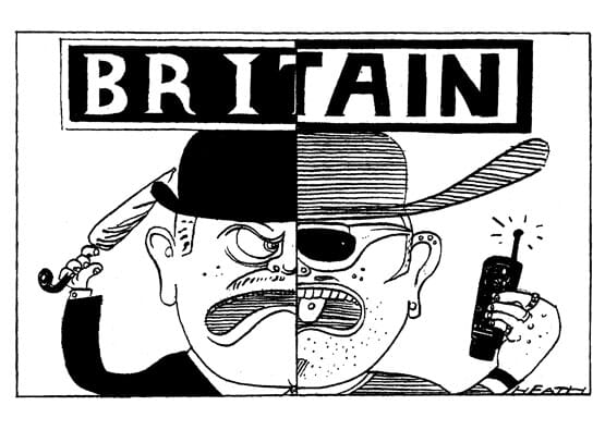
The idea gently infiltrated the johnson banks portfolio in the nineties too: this is a typical example from a set of posters for the British Council (lampooned almost immediately by The Sunday Times, below).
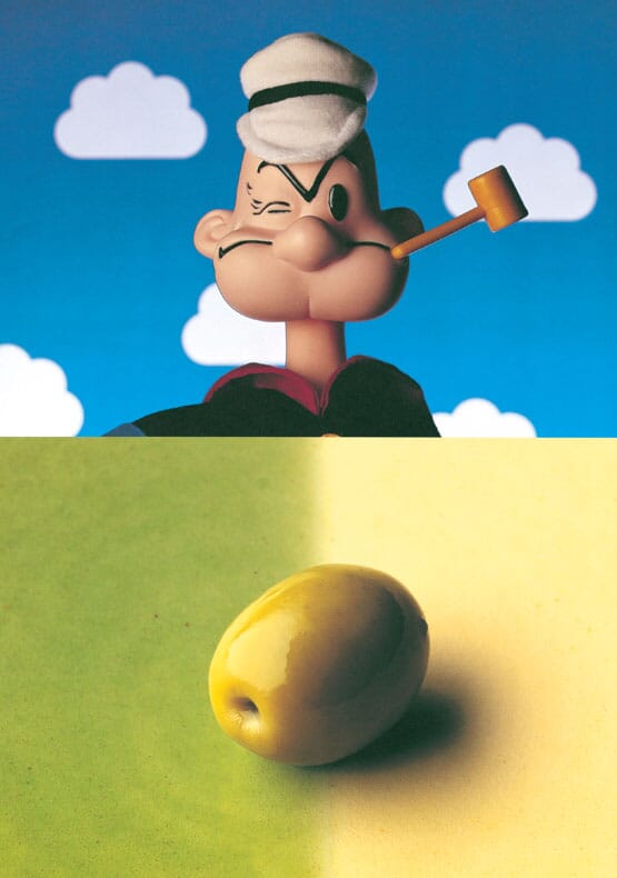
The idea kept recurring throughout various projects, such as the one above for the headhunter Canna Kendall...

...and by the time we'd designed this scheme for Sendai Space Observatory in Japan, we’d decided it was pretty much over. Cut and shut was officially banned at jb towers.
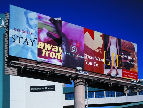
Just because we've banned it, doesn't mean the idea has gone away. Here’s an extended version of half and half, from 1999, by Jonathan Barnbrook, titled 'Stay away from corporations that want you to lie for them' (illustrating a Tibor Kalman quote for Adbusters)...

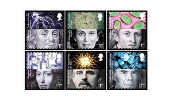
...and a nice set of inventors stamps a decade later by Hat-Trick design.
![]()
Hollywood, always on the look-out for a useful cliché, has grasped it with both hands, usually to show the 'the two sides of a character’, as above and below.
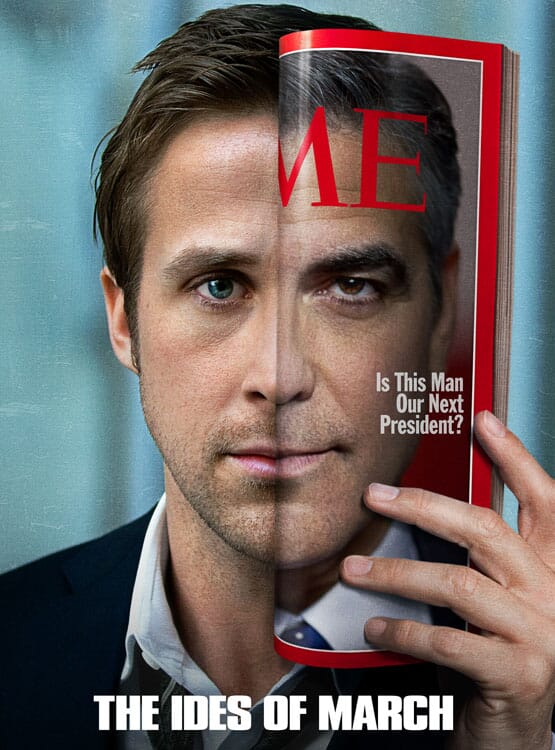
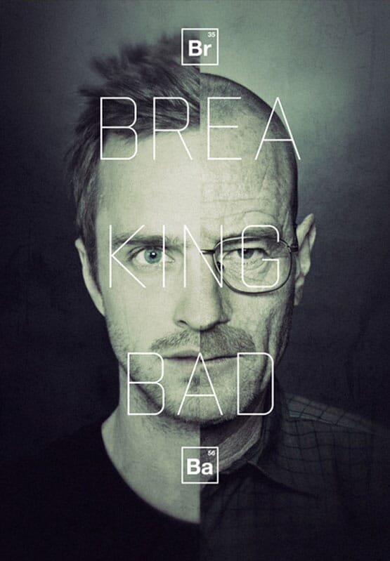
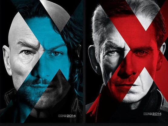
This X-Men example even pushes it along. Well, a little bit.

But, just when you think the idea has gone, back it boomerangs, with this year’s Daft Punk album sleeve.
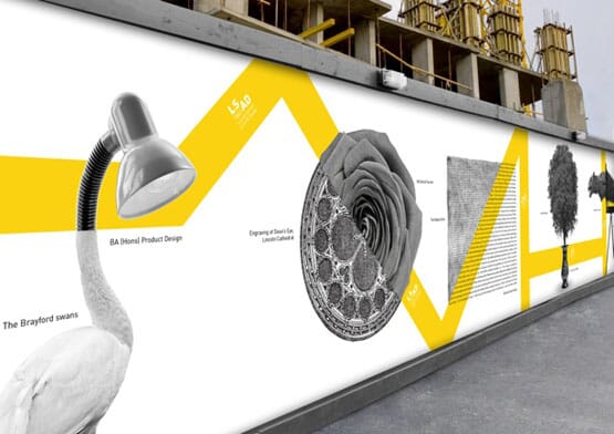
And a really nice example from recent graduate Ash Watkins’ portfolio.
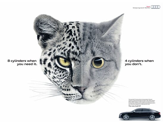
Which brings us neatly back to BBH's Audi ads. And it’s very nicely done - the two sides of a cat, 8 cylinders versus 4, etc etc.
It would be easy to criticise some of these examples, but somehow they all work, almost every time. Even though they all use essentially the same idea, it’s an idea that keeps working. It looks like it will just run and run...
By Michael Johnson
If you have an example you'd like to add, send it to info (at) johnsonbanks.co.uk and we'll update the piece