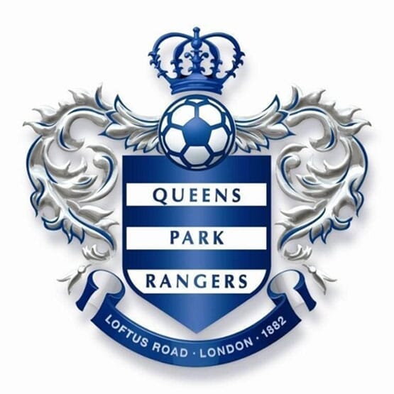

Yesterday’s story about QPR looking to 'crowdsource' a crest re-design from its fans (following recent attempts at both Everton and Crystal Palace) reminds us that once, back in the mists of time (1995 to be precise) we were ourselves asked to look at QPR’s logo.
The one we liked most is shown at the top of this post. Nearly twenty years later, well, perhaps you’d tweak it a bit but it was designed for the then management - Ray Wilkins, Italian suits, all of that. The 'hoops' became a target. Anyway, we liked it. Our client became the next target and got fired, sadly.
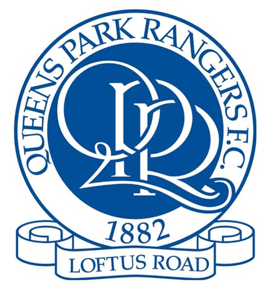
Contrast with the current crest (below).

And predecessor (below). You can see why we were going for something more minimal...
