
There's a major article in October's Creative Review Magazine about the UK Charity Shelter, which is celebrating its fiftieth birthday - an organisation inspired by Ken Loach's famous TV drama, Kathy Come Home, first broadcast in November 1966. As part of the piece, there's a short interview with johnson banks' Michael Johnson about the current Shelter logo, begun in 2003 and revealed in 2004.
CR: Had the studio worked on many charity briefs before? If so, how was the Shelter project different?
MJ: We’d dabbled in charity and not-for-profit work, but at a smaller scale - this was the first time we’d been given the chance to do a ‘household name’ in the sector. Doing Shelter led directly to the next piece of work, for Christian Aid, then Save the Children, and our not-for-profit portfolio began to grow and grow from there.
CR: By 2004, Shelter’s focus had moved on from its core mission of the 1960s. How did the studio go about helping to reflect the charity’s wider work?
MJ: Shelter’s roots were pretty well expressed by their previous identity - it was written in a ‘typewriter’ style font and summed up their anger about people living on the streets in cardboard boxes. It matched well with a battle that they fought throughout a long period of 80s and 90s Conservative rule that paid little attention to human rights.
The advent of a Labour government in the 1990s, and the positive switch in emphasis meant that in many ways the first battle was won - but the new one was now to do with bad housing. In a nutshell, we had to find a way to reflect the change from homelessness to inadequate housing, and a move to providing crucial services for those in need.

CR: Can you tell us about the design behind the logo?
MJ: I’ve been asked many times about this logo and I’ve come to realise that the logo itself is a kind of perfect marriage of a great word - Shelter - and an apt visual mnemonic - the roofed ‘h’. Because the name itself is so evocative, it makes it even stronger. Put the ‘h’ with a word like ‘house’ and it’s just not as powerful, i.e. there’s a kind of symbiotic relationship between word and picture.
Another interesting design fact - the logo was effectively designed in a day. I scribbled the thought, bashed out a first stab at it and stuck it top left of the huge metal boards we have here in our office. Mentally I thought - ‘beat that’. The next 29 days of the design stage were spent trying to do that, and we never did. Just this time, the first idea really was the best.

CR: How significant were the copy-written elements and ‘tone of voice’ in here?
MJ: The work was started by their then ad agency, Hooper Galton, who wanted to ‘wake people up’ to the scale and scope of bad housing. Once appointed we took up this theme and it seemed to me that the combination of both words and pictures would be critical in getting this new mission over (i.e. just images alone were never going to do it).

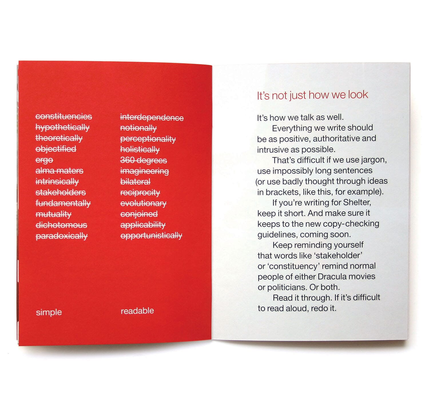
Also, after many meetings with Shelter, we realised that they were using their own quite dense and sometimes impenetrable management speak which made sense to them, but not to me. So we wrote a little brand book about using simple and readable copy which really struck a chord with them, and many other clients! We once had about 50 copies - they’ve all been pilfered (always the sign of a useful bit of work)

CR: Twelve years on, where do you think it has helped to take the charity? Where does it sit for you in the jb portfolio?
MJ: It had an immediate effect in that it made them seem, overnight, like a grown-up, serious, ‘proper’ organisation. Within just months they were attracting sponsorship and partners at a much higher level than they had before, and they seem to have gone from strength to strength ever since. I heard a stat recently that Shelter now has 5 million service users, which is pretty amazing.
As regards the jb portfolio, it opened a lot of doors. At one point I stopped presenting it, but would then ask people how they found us and they would often say ‘you did the Shelter logo didn’t you?’. More recently I guess I’ve realised that we may have designed ‘a classic’ and we should be proud of that and celebrate it more. One always hesitates to say that as designer - it sounds arrogant to suggest that you could have designed a logo that could last for decades. But whilst their emphasis remains housing, it works perfectly for them. Maybe, just maybe, it could last for a while longer.

