
There's a new website commemorating 50 years of 'special stamp' designs for the Royal Mail that's just been launched, and johnson banks' creative director has been asked by Design Week to pick his favourite stamps of each decade. Here are his thoughts.
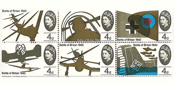
1965 - 25th Anniversary of the Battle of Britain
A really early example of David Gentleman’s skill at designing tiny pieces of gummed paper. They way the aeroplanes criss-cross, the colours overlap and the depth of the compositions is world-class. Stamps had never looked like this before
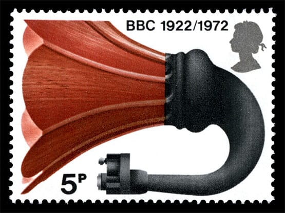
1972 - Broadcasting Anniversaries Another David Gentleman – I’ve always thought this was a masterful piece of cropping of the image and such a singular object to feature on a stamp.
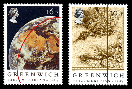
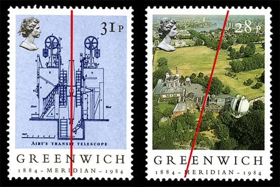
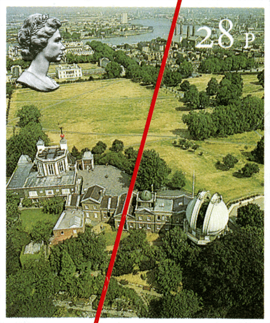
1984 - Centenary Greenwich Meridian Howard Waller’s Meridian stamps have a compelling ‘powers of ten’ feel as we start by hovering above the earth’s surface, then progressively get closer to Greenwich. They also have a great ‘found’ design quality to them – the only unifying factor is the red line.
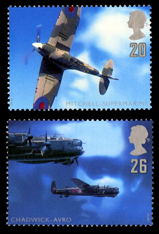
1997 - British Aircraft designers Bruce Duckworth’s ‘designers in the clouds’ must count as one of the best trompe-l’oeil’s ever committed to designs this small.
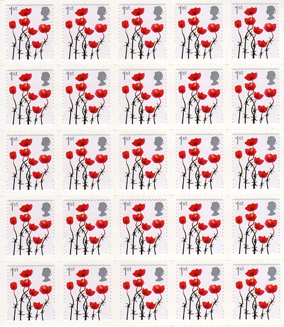
2006 - Lest We Forget On balance I think there are probably too many war/commemoration stamps and not enough forward thinking (sorry) – but – this fusion of barbed wire and the stems of poppies has always stood out for me (Design: Hat-Trick)
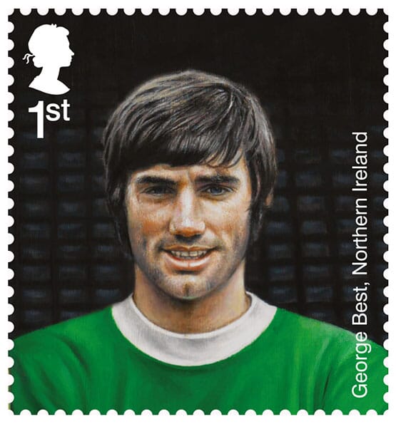
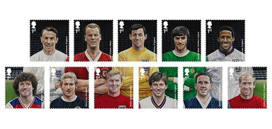
2013 - Football Heroes It’s not the choice of footballers, or the illustration that I love – it’s the genius of having 11 stamps in the set that gets me… (Design: True North)
Here's a quick film about the 50 years...
In case you're wondering, johnson banks have also designed quite a few stamps themselves (46 in fact), some of which are featured here and here. The full Design Week article is here and features one of our Beatles stamps from 2007.