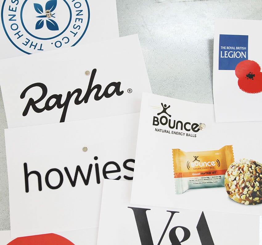

About seven or eight years ago I started running a one-day workshop for D&AD, on branding.
The aim of the course was, and still is, to demystify the branding process and unpick some of that awful 'brand' language that you hear people spouting. Ideally, people interested in the process get a really good grounding in and understanding of the issues, before they get anywhere near the process of designing a logo.
Talk to anyone who regularly runs workshops and they often say 'it's good to get people to prepare'. Now, classically, that took the form of an inane request to 'bring along an object that sums up your view of our company/the issue at hand/whatever'. I once went to a workshop years ago and someone brought a TV remote control. True. (It was a very nicely designed remote control, to be fair…).
Anyway, I didn't take the 'homework' request that seriously, at first. I suggested delegates bring some examples of brands, some they liked, some they didn't, and we'd use them as a kind of introduction.
What became apparent, pretty quick, was that 'mapping' brands on a big metallic board was not only a really useful thing to do, and discuss, but we found ourselves returning to the examples. Increasingly, the 'homework' began to run the workshop.
People are asked to bring four examples:
• An example of a brand you really admire, and be prepared to explain why • An example of a brand which presents itself really well but is disappointing underneath • A brand that you think is a great idea that’s poorly communicated • An example of a bad brand that’s both a bad idea that’s poorly presented
At the end of the sessions, for at least 5 or 6 years, I've photographed these boards as a record of peoples’ views, and they make for interesting viewing.
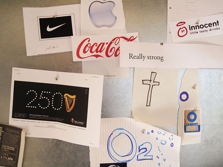
For example, in 2009, the most admired brands were fairly straightforward (interesting juxtaposition of 'cement' and The Church)…
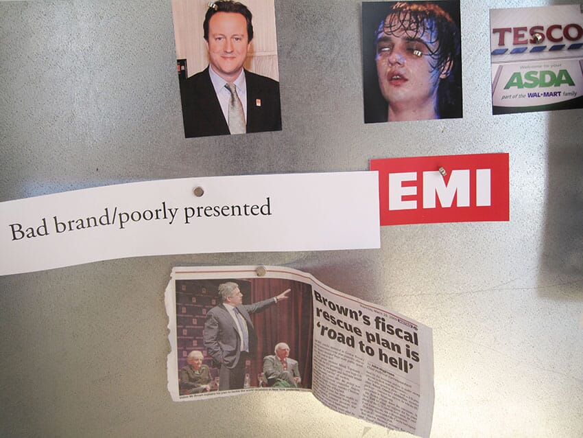
…whilst the 'bad brands, poorly presented' seemed to veer from politicians to music, musicians and supermarkets.
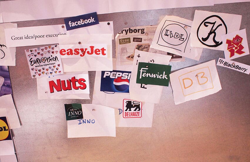
One of the most interesting sectors has always been the 'great ideas that are poorly presented'. In 2010 one group really wanted to like Deutsche Bahn, Lidl and Eurovision (that’s an odd combination), but thought something was wrong.
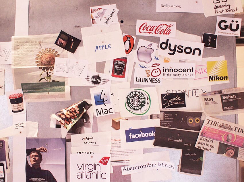
The same group brought these as examples of best practice.
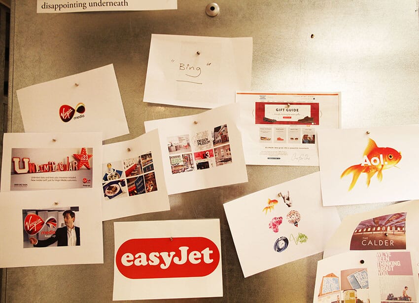
A few years later, a group brought these examples that they found disappointing and over-presented. Note how easy it is for different parts of the Virgin group to be in different segments.
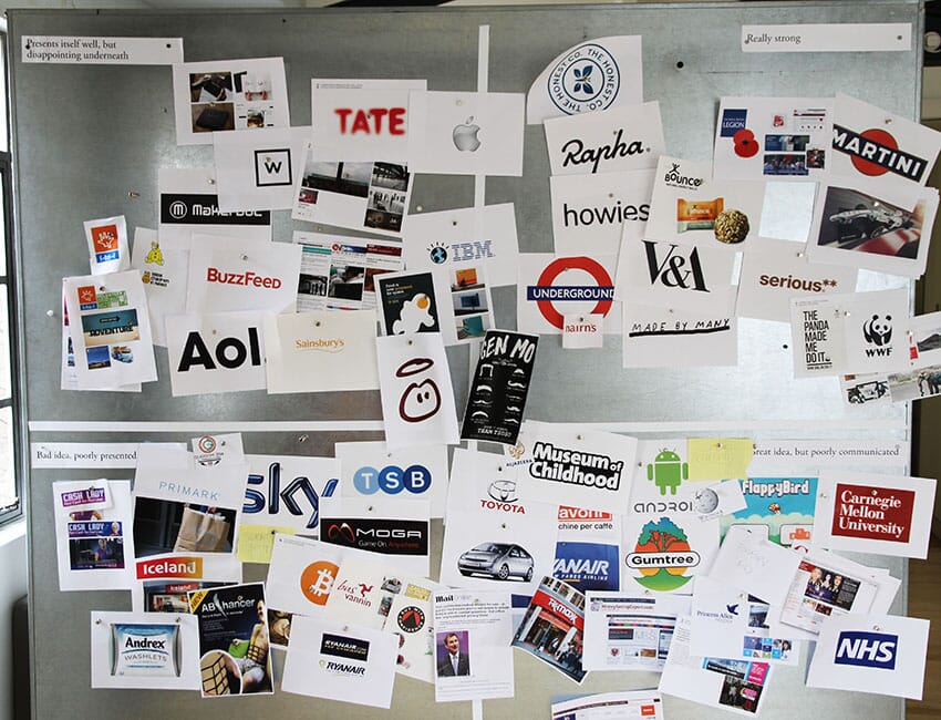
More recently, a recent workshop brought this overall picture …
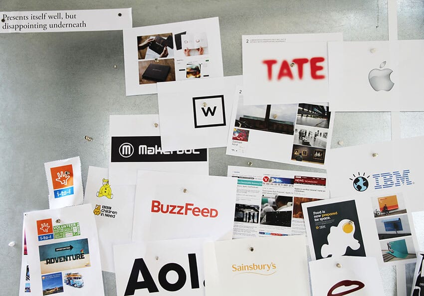
…thought these were over-presented and lacked some 'oomph'…
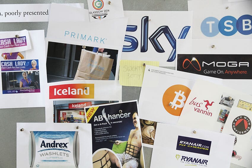
…and laid the boot into these (look how far Sky has slipped).
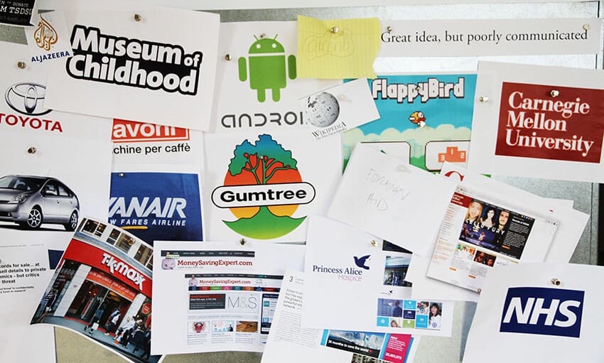
But - they really wanted to like these.
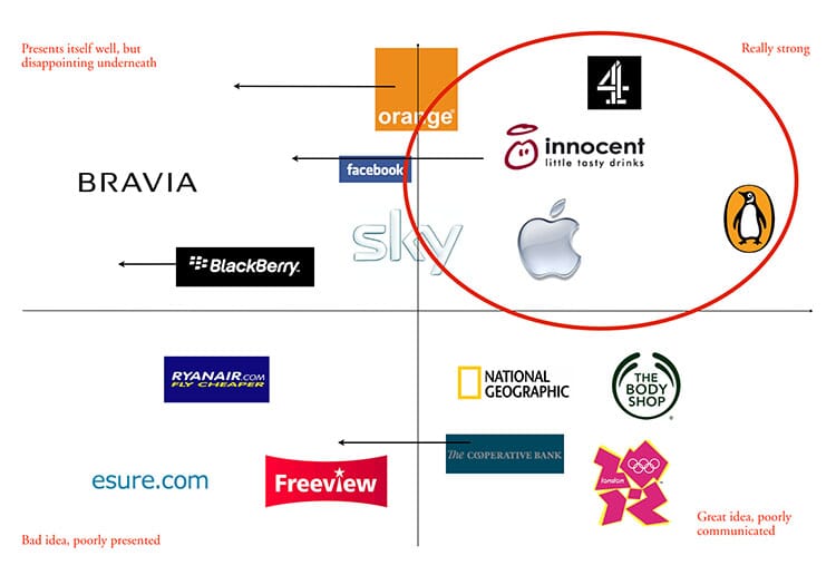
If I were to sum up many years of this ‘mapping’ process, I'd use this diagram (above). What's clear from these workshops is that, whilst everyone wants their brand to be top right, it's easy for a brand to slide.
Sky, Orange and Blackberry started to slide away from greatness a while ago. And many people wanted the Co-op bank to succeed. But it hasn't, and even brands like Innocent aren't completely immune. Brand owners beware: building that brand is one thing, but maintaining it is another challenge completely.
By Michael Johnson
Johnson’s Truth about Branding all-day workshops are held two-to-three times a year. There's one coming up soon, find out here if there are any gaps left.