The British Film Institute (BFI) was already a great and revered film institution, but over several decades it had managed to lose its voice within the clamour of a vast range of activities. Somehow we had to decide, from within its family of brands, divisions and festivals, which was the most important message to take forward. And then stick to it.
Brand strategy
It became clear that two major obstacles stood in the way of any significant progress. Firstly, their semi-feudal structure left few people with a clear idea of what they did, and what they stood for. And secondly, their verbal and visual brand: they desperately needed to speak and seem like an organisation of the 21st century, not the fifties.
The fact that the BFI encompassed the Waterloo IMAX, the London Film Festival, the National Film Theatre, the National Film and Television Archive and Sight and Sound magazine was all great, on paper, but each entity rarely acknowledged the ‘masterbrand’ in its work. And as they revamped their flagship Southbank site, a clearer brand was needed.
After months of discussions, a staff conference and several board meetings, it was decision time. It was clear to us that the Institute had to shorten its name to the BFI and become the clear and ever-present link between all activities. Where possible, historical brands were shelved or demoted, and any surviving ones (such as the Film Festivals) had to make their BFI lineage apparent at all times.
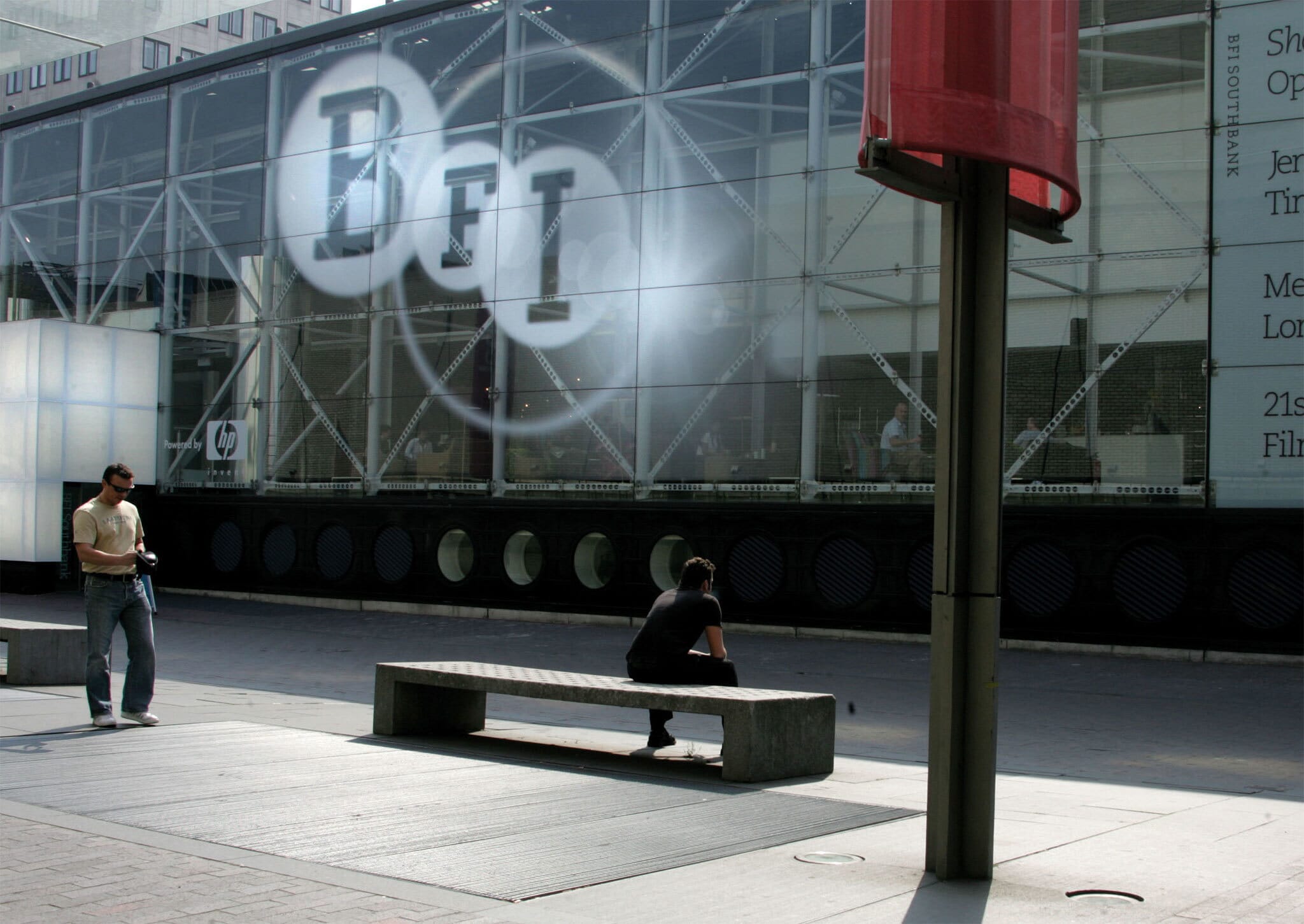
Brand identity
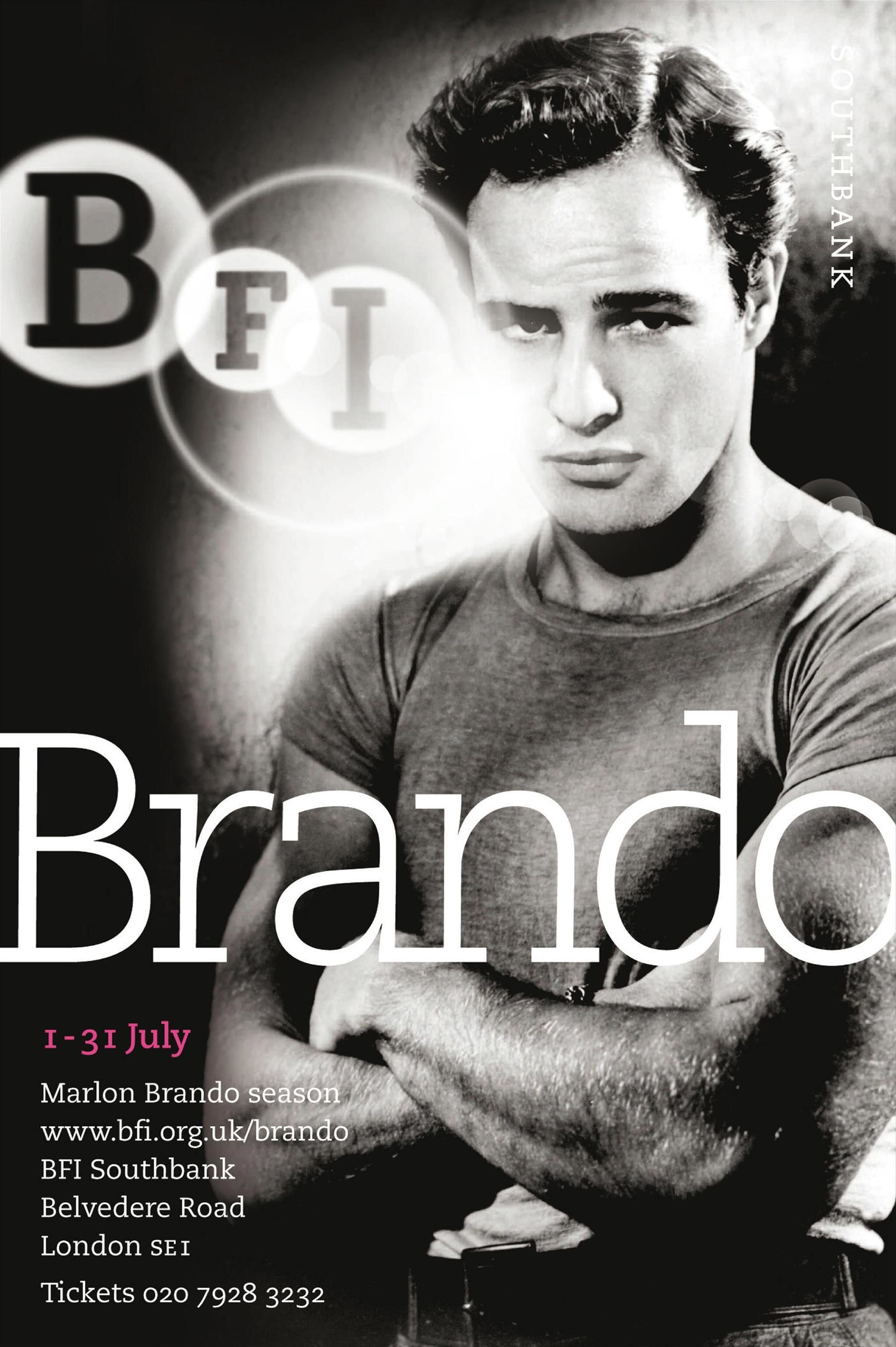
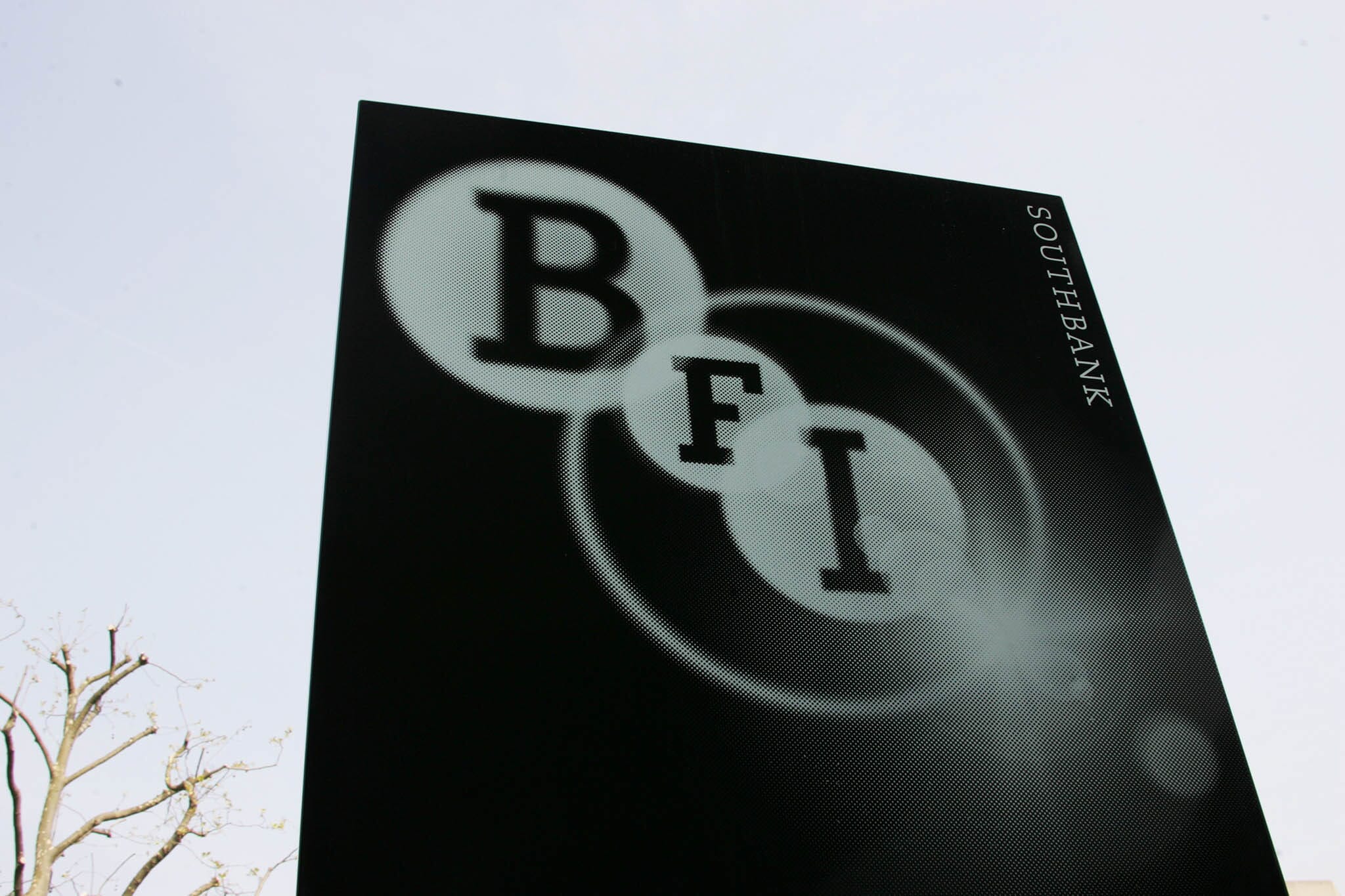
In our audit stage we'd realised that ‘film' logos tended to dwell on traditional clichés such as film sprockets and directors' chairs. As film was transferring over to digital, we wanted something more unusual, and started to work with the camera effect know as lens flare.
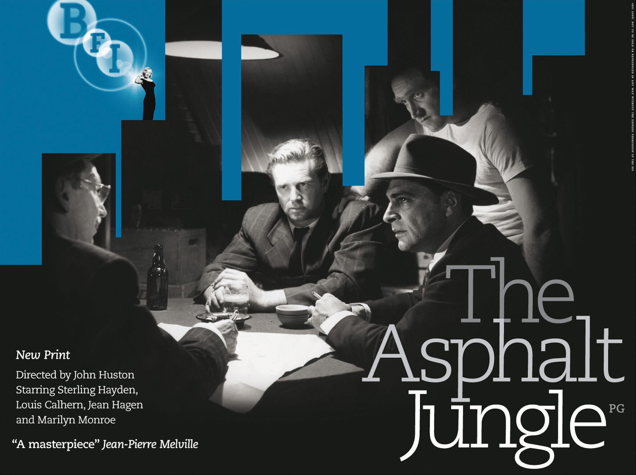
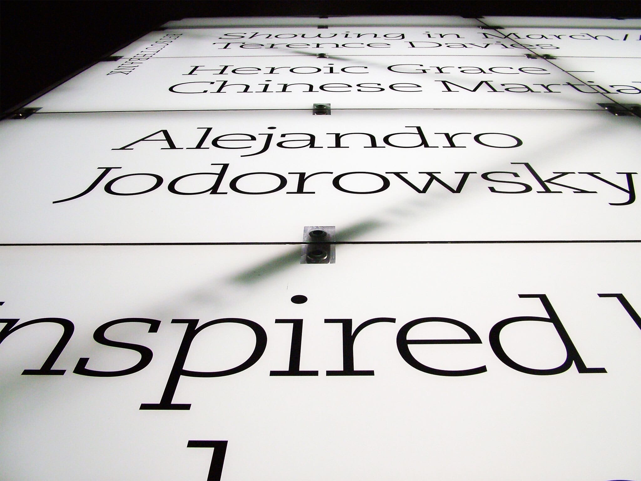
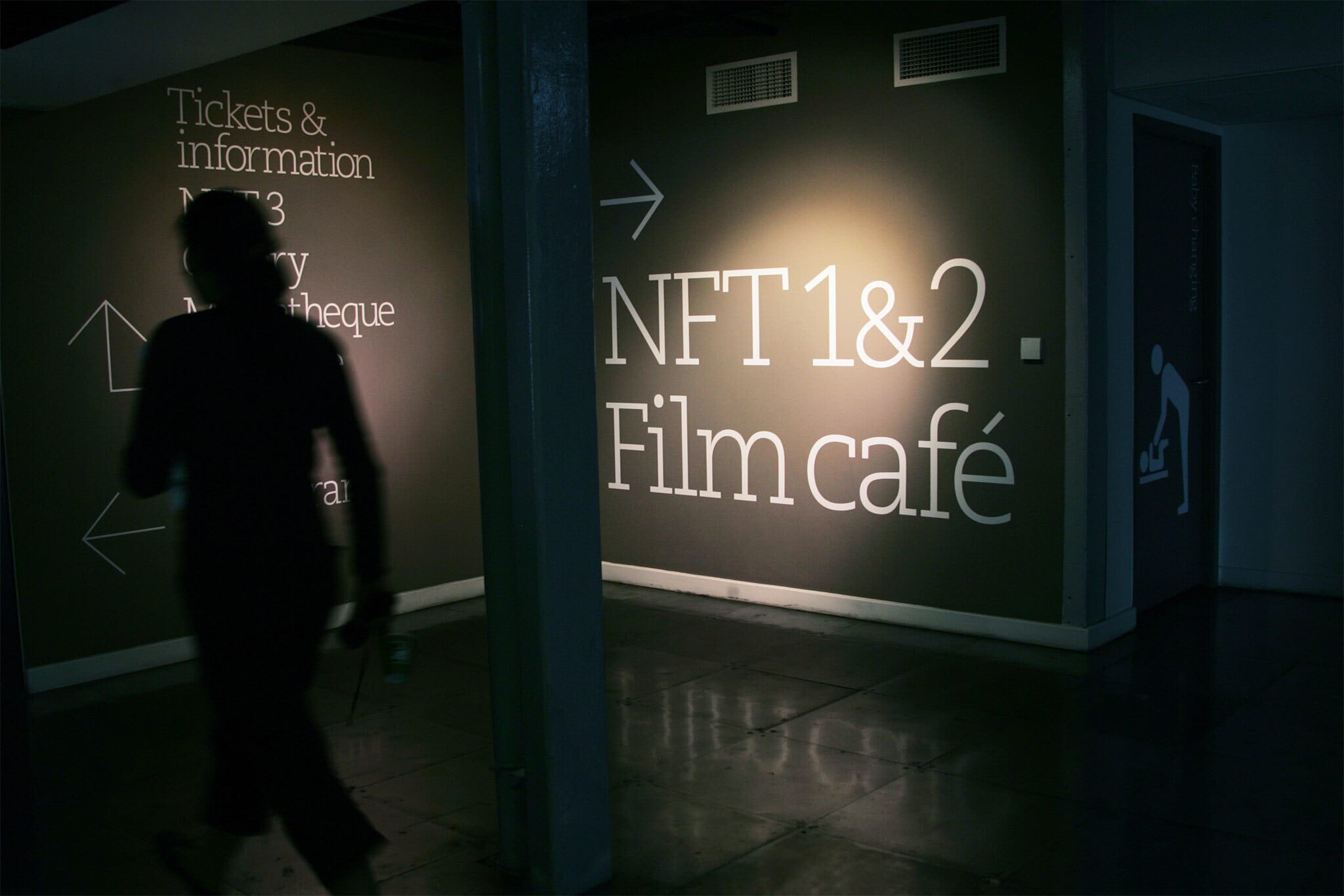
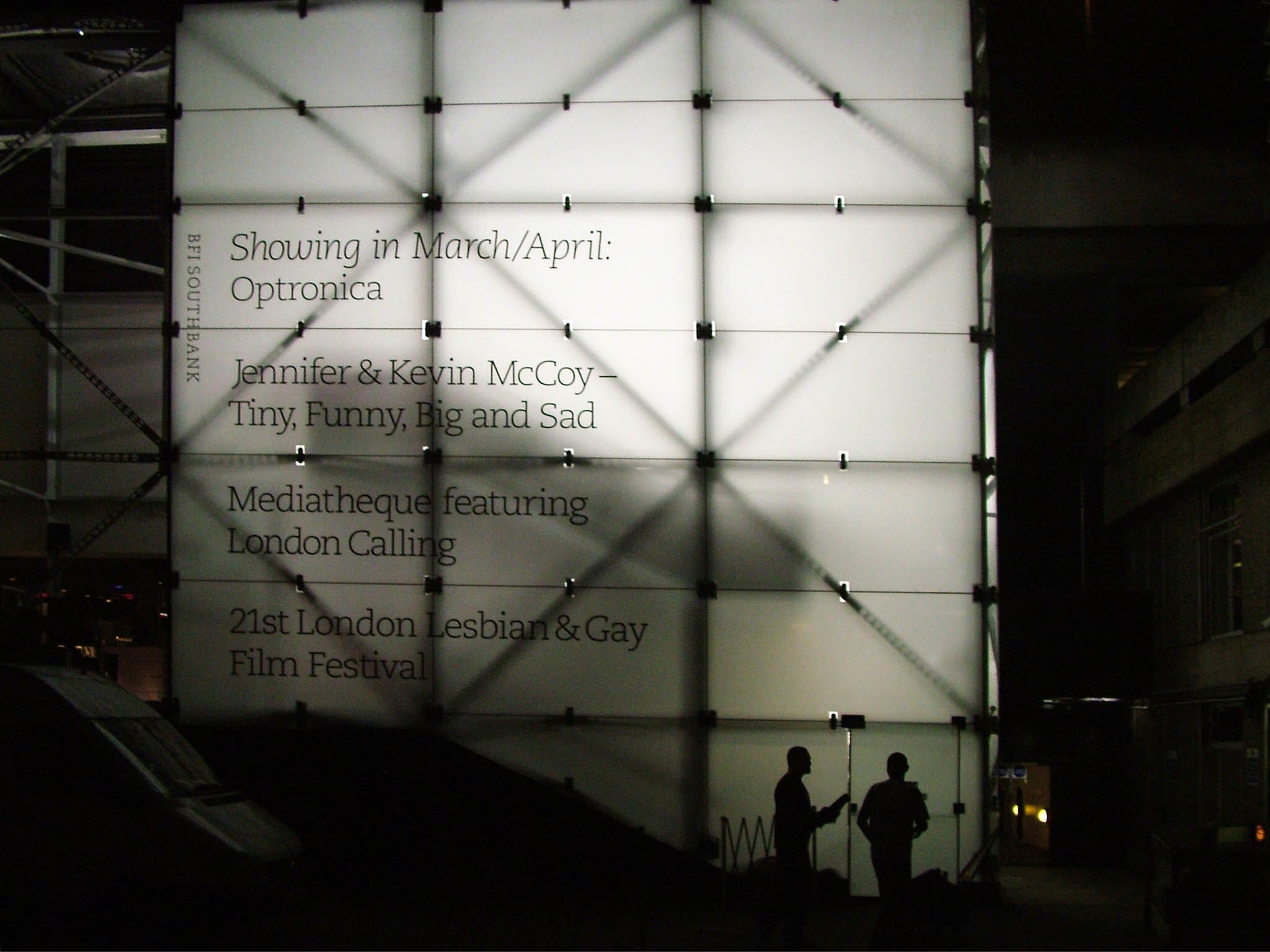
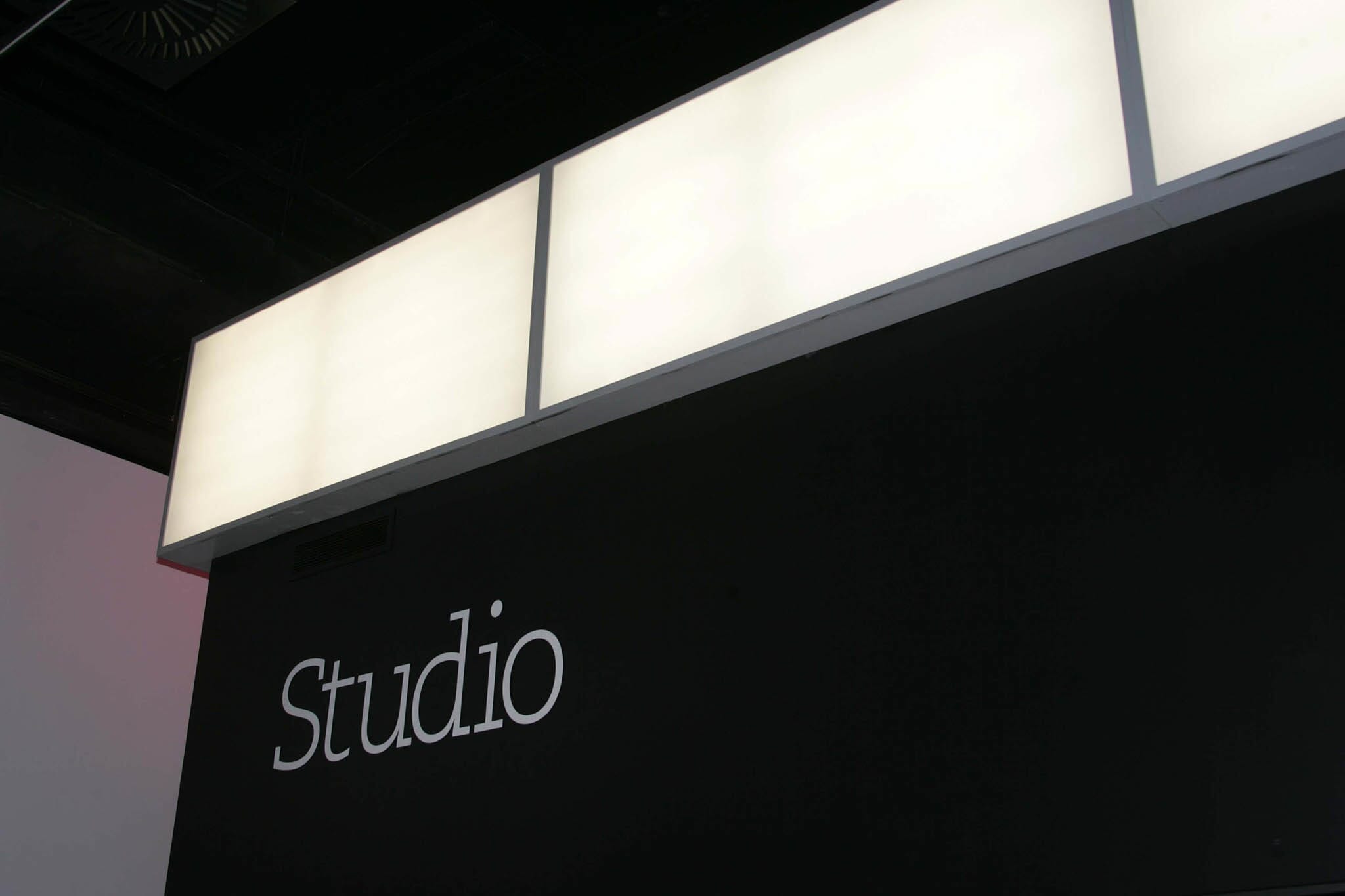
We realized that we could incorporate the lens flare into images and communications, sometimes subtly and sometimes a much bolder and emphatic way. With the use of the strong new identity and a consistent typographic approach, it became immediately possible to bring the organisation's activities together quickly, across merchandise, signage and environments across the refurbished Southbank site.
Awards
2008 Design Week Awards | Commended