To those in the know, the Brighton Dome was a key cog in the city’s vibrant arts sector. Unfortunately, even when standing just yards away, visitors often didn’t know where it actually was due to chronically low visibility. The Dome is on the opposite edge of the world famous Royal Pavilion estate and had struggled to clearly identify itself and differentiate from its famous royal cousin.
Its constituent parts, such as the Brighton Festival, and multiple venues tended to act independently of each other across 11 months of yearly programming. And it had no cohesive identity capable of stretching across a huge range of genres – anything from visiting hip-hop artists to classical orchestras and Christmas concerts.

The new brand identity
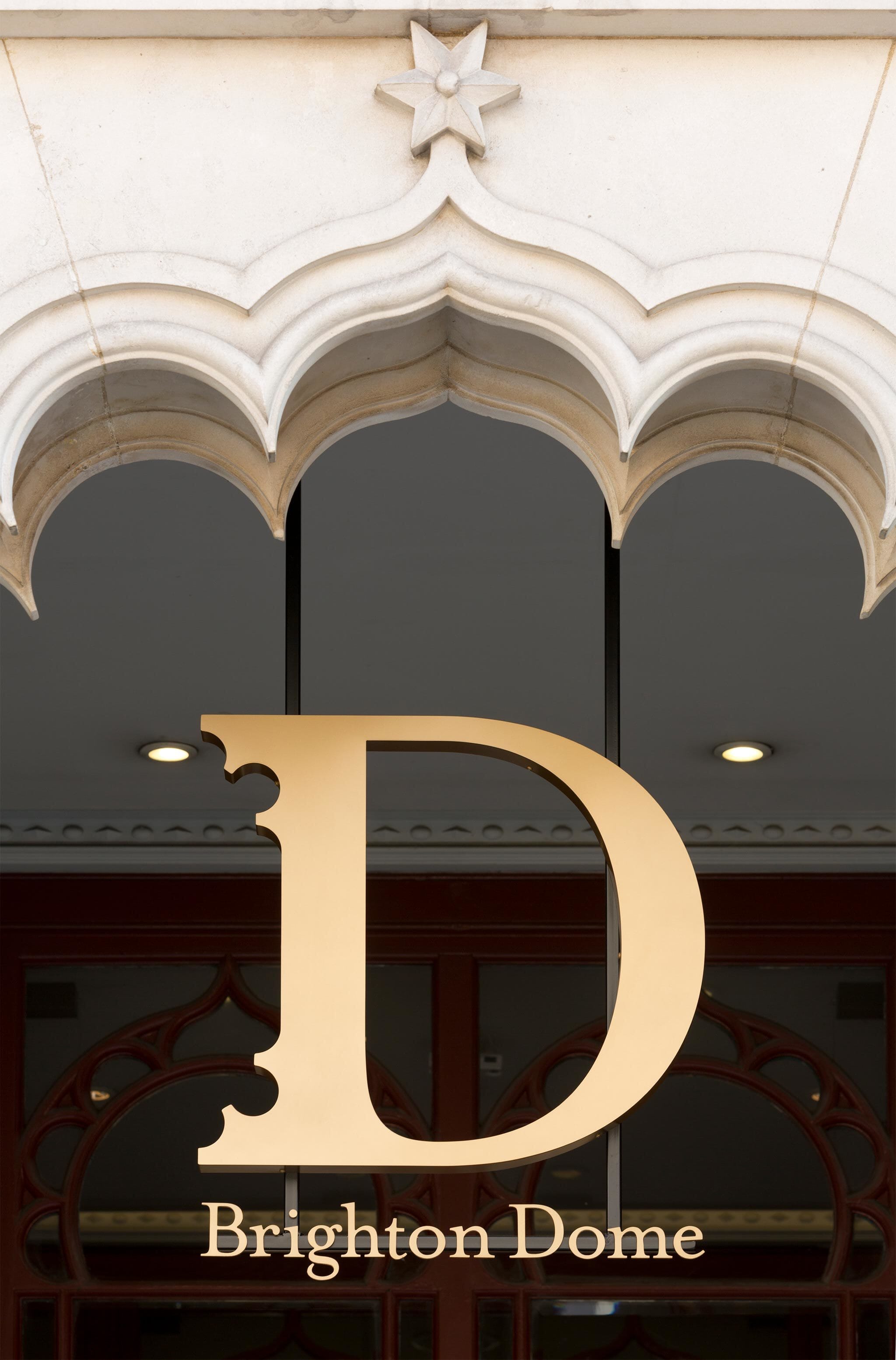
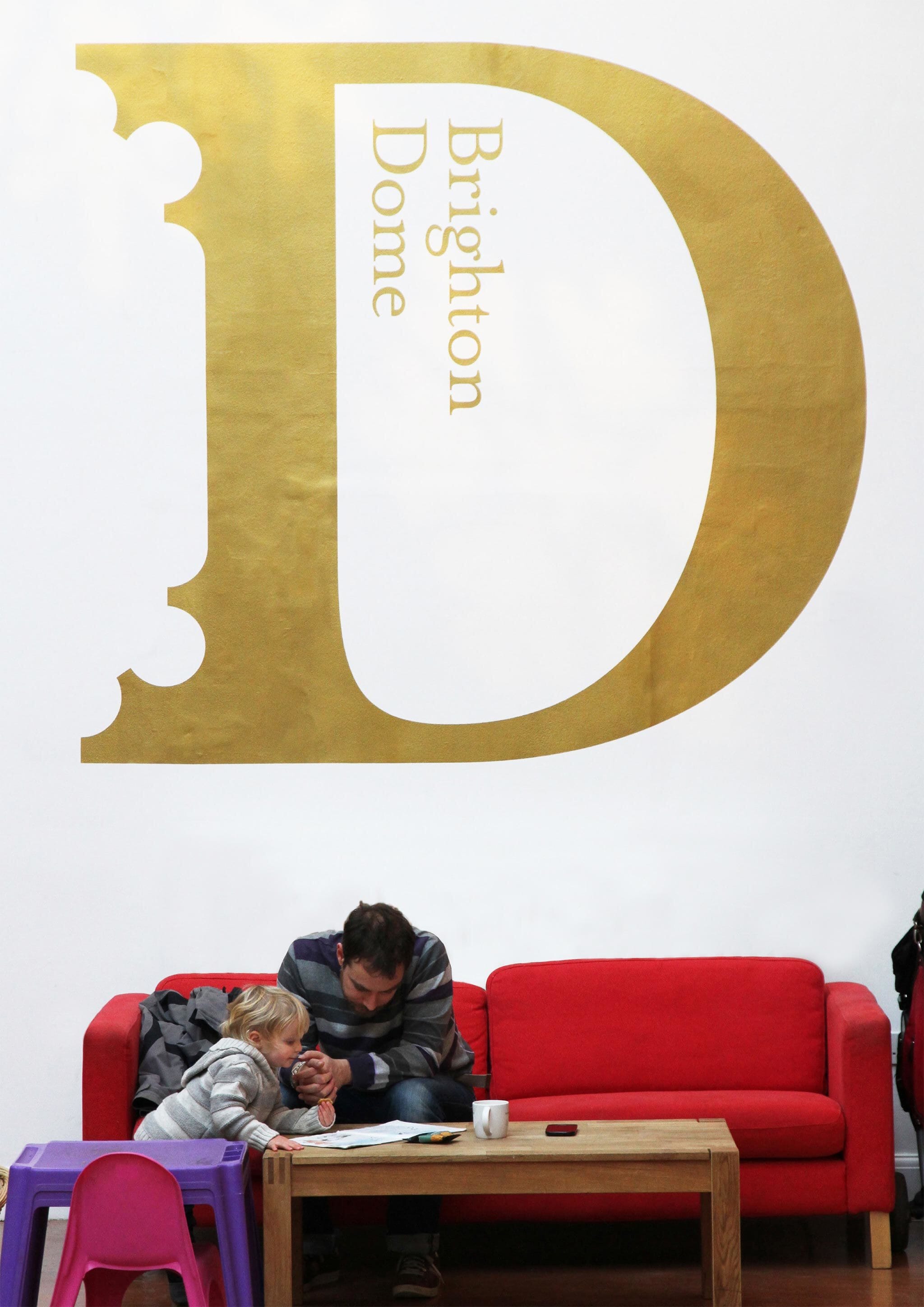
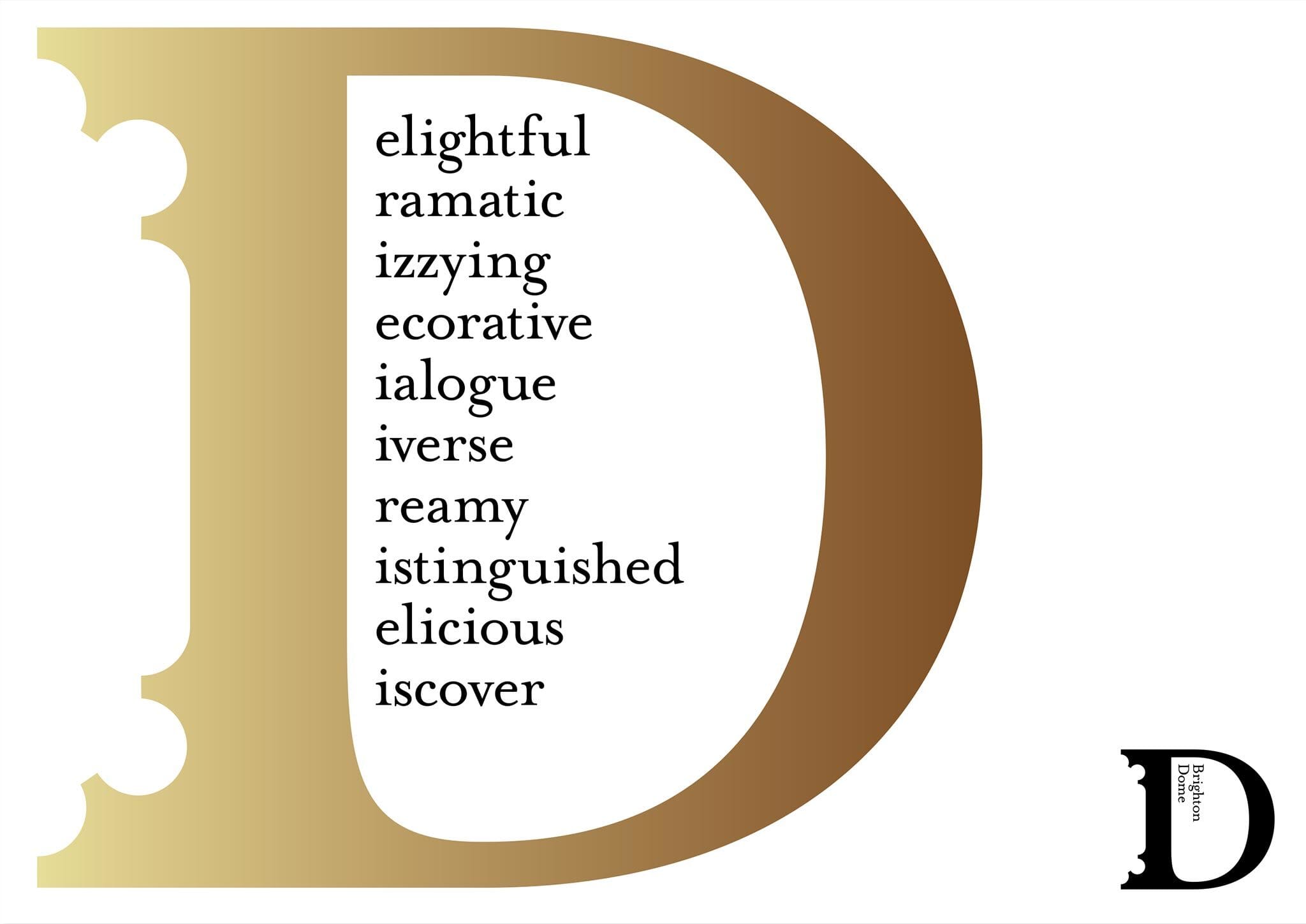
We began with the Dome itself, and took its extraordinary architecture as our starting point. From the entrances to the main building, and the concert hall’s ceiling itself, extravagant Regency era ‘scallopped’ shapes are a major feature throughout the building.

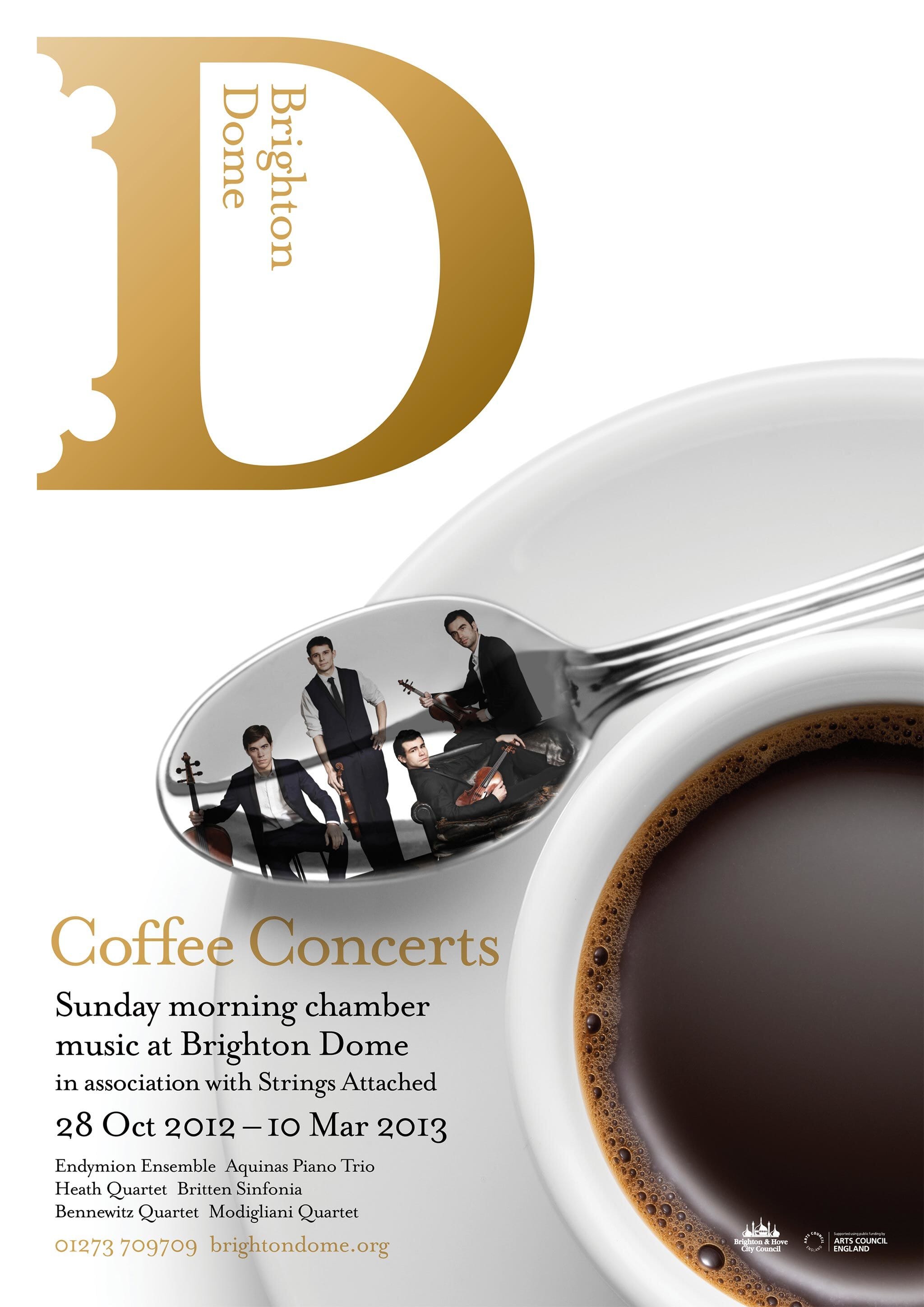
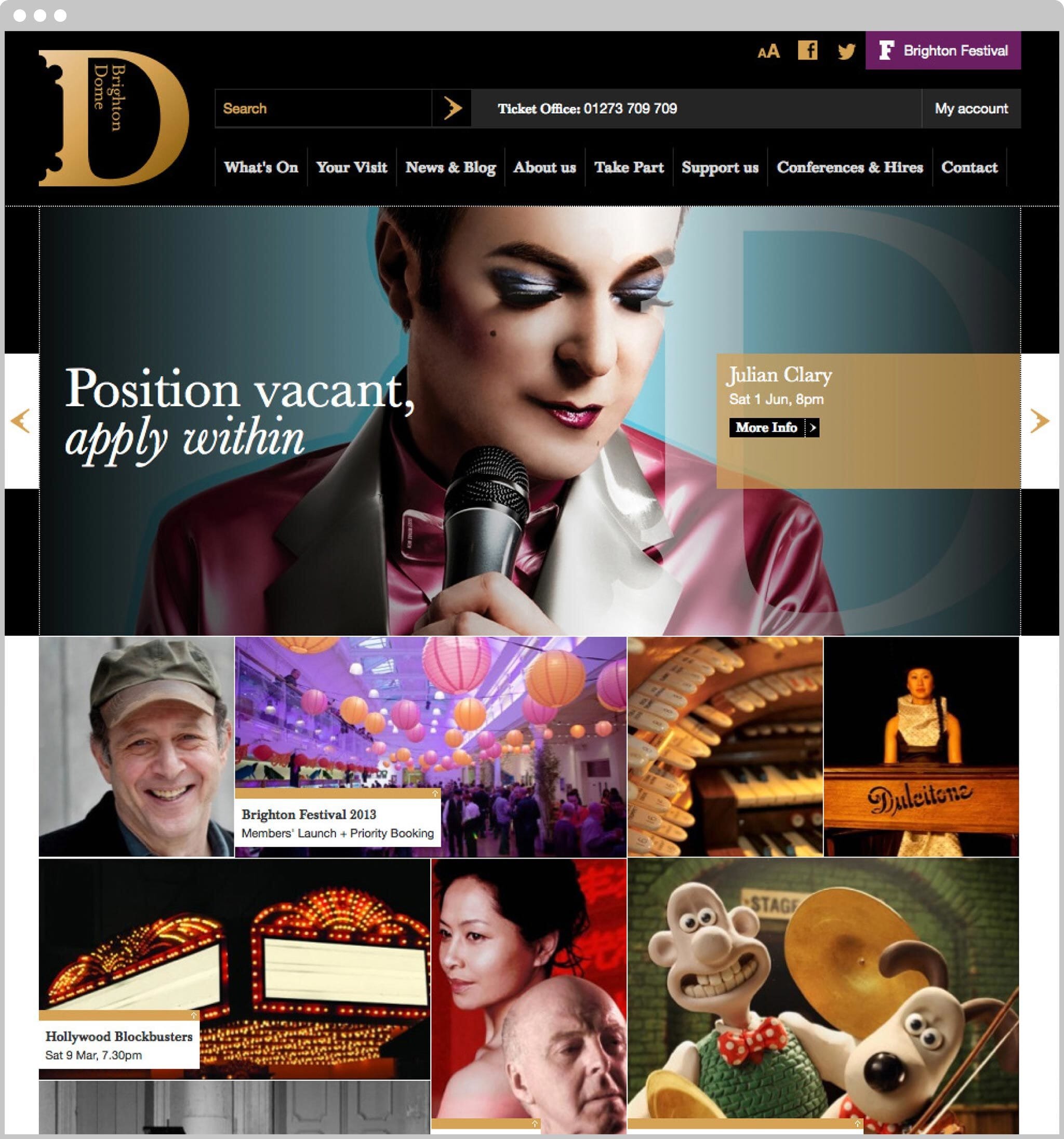
At first sight, our newly designed ‘big D’ is a simple seriffed monogram, then the viewer sees architect William Porden’s careful curves echoed in the outside serifs. The ‘D’ is then used within all digital, printed and architectural applications throughout the site. The palette is restrained – black, gold and white – setting a restrained design ‘stage’ to allow performers and productions to shine and dominate.

What relates to what
Any confusion about ‘which bit was part of the Dome’ is cleared up with a new and clarified structure – everything is simply now preceded by Brighton Dome. This doesn’t squash the identity of a famous venue such as the Corn Exchange, bur merely flags it as one part of a whole.

Clearer way finding and interpretation
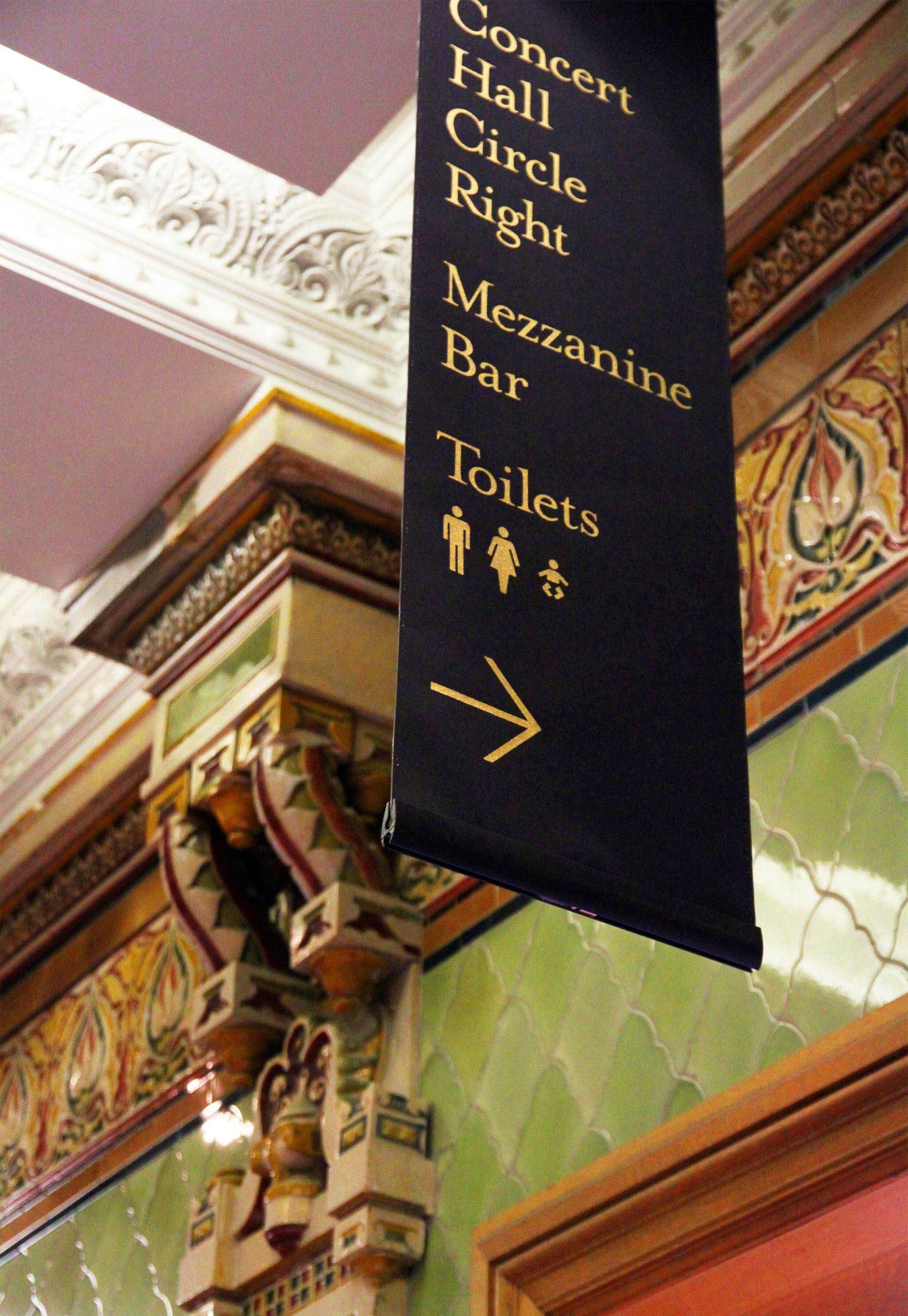
The site itself is a complicated mixture of architectural styles from varying eras, so we were keen to help visitors easily navigate the site, without compromising the details of the architecture. This was done by suspending banners off surfaces wherever possible and the us elf very simple layers of information.
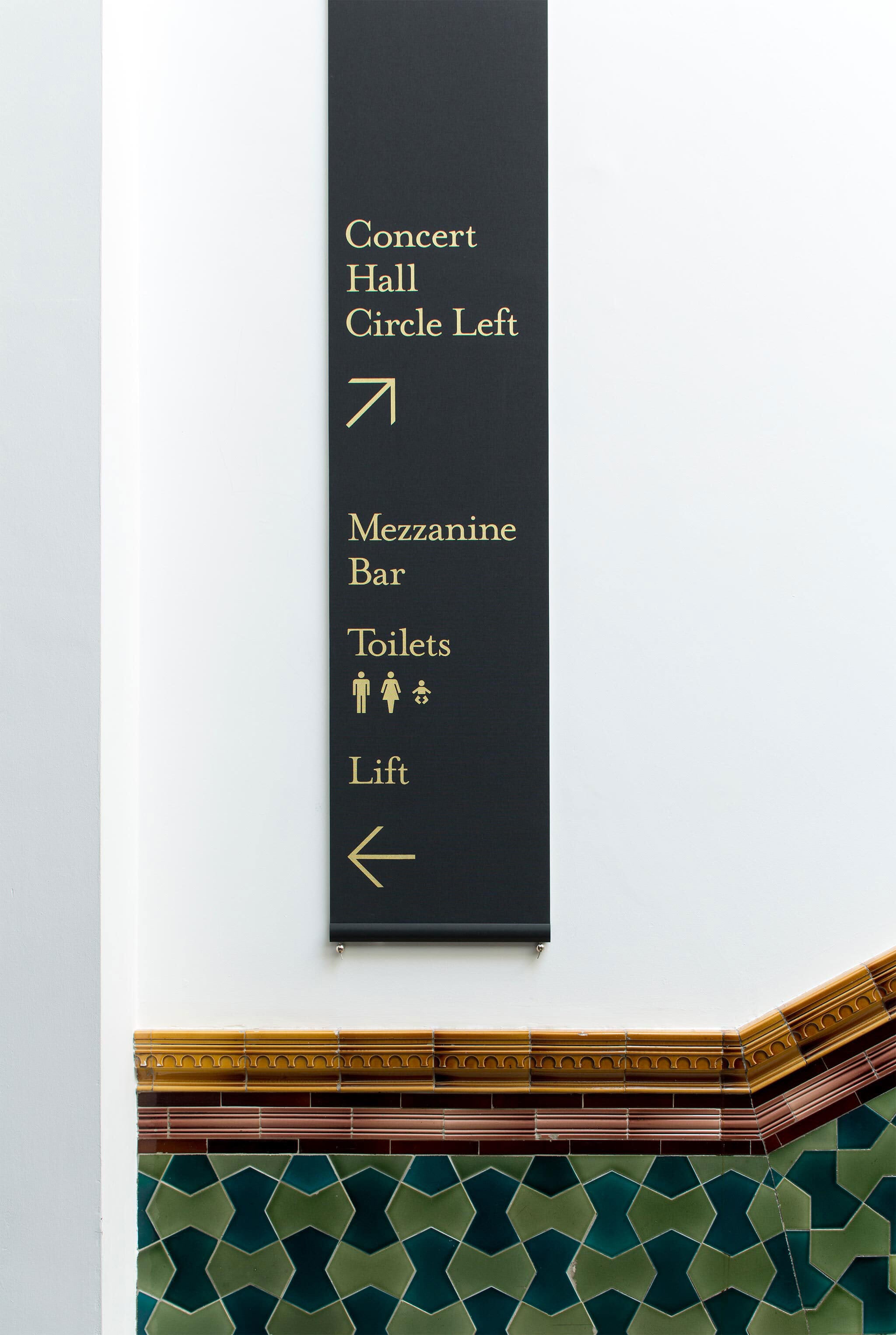
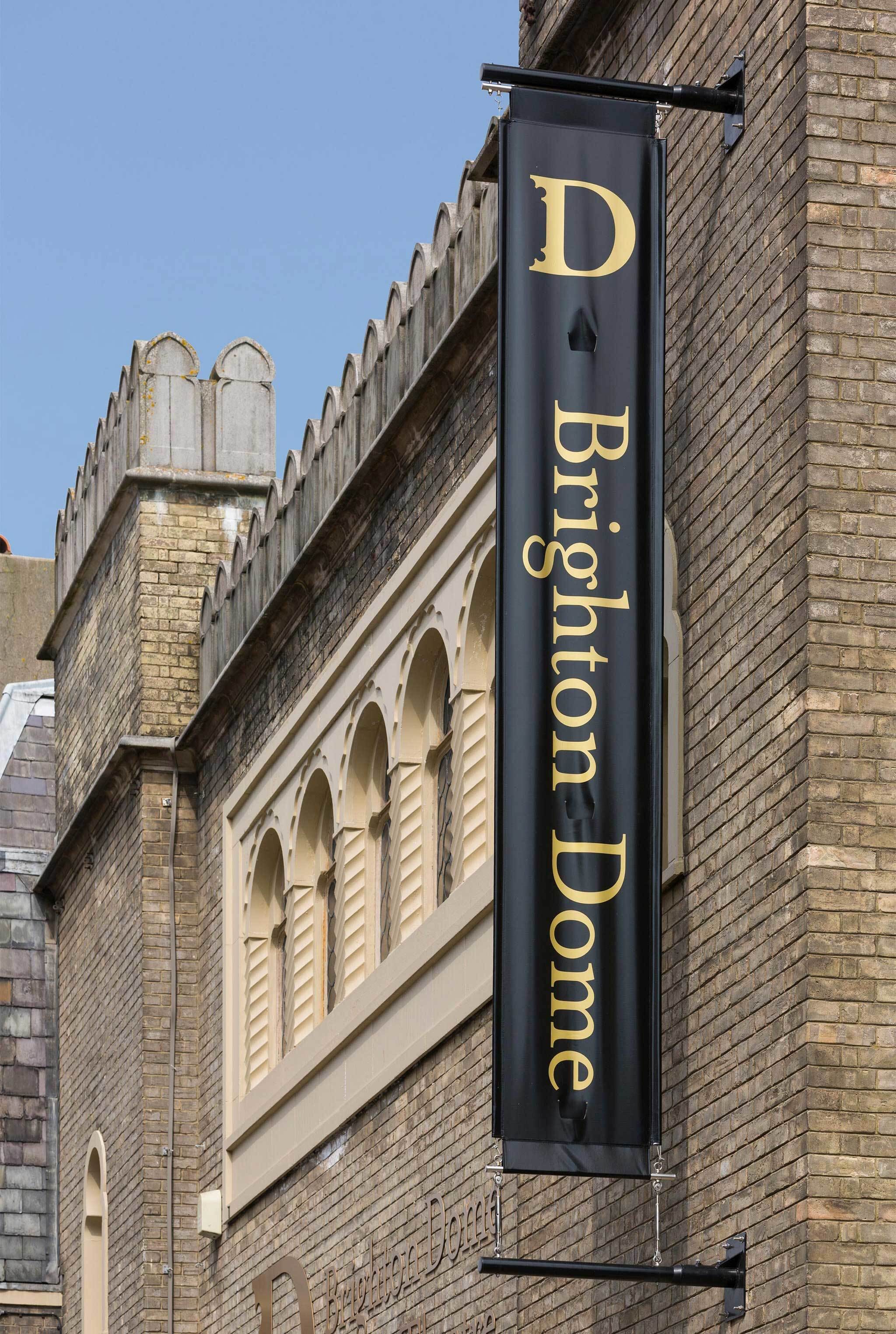
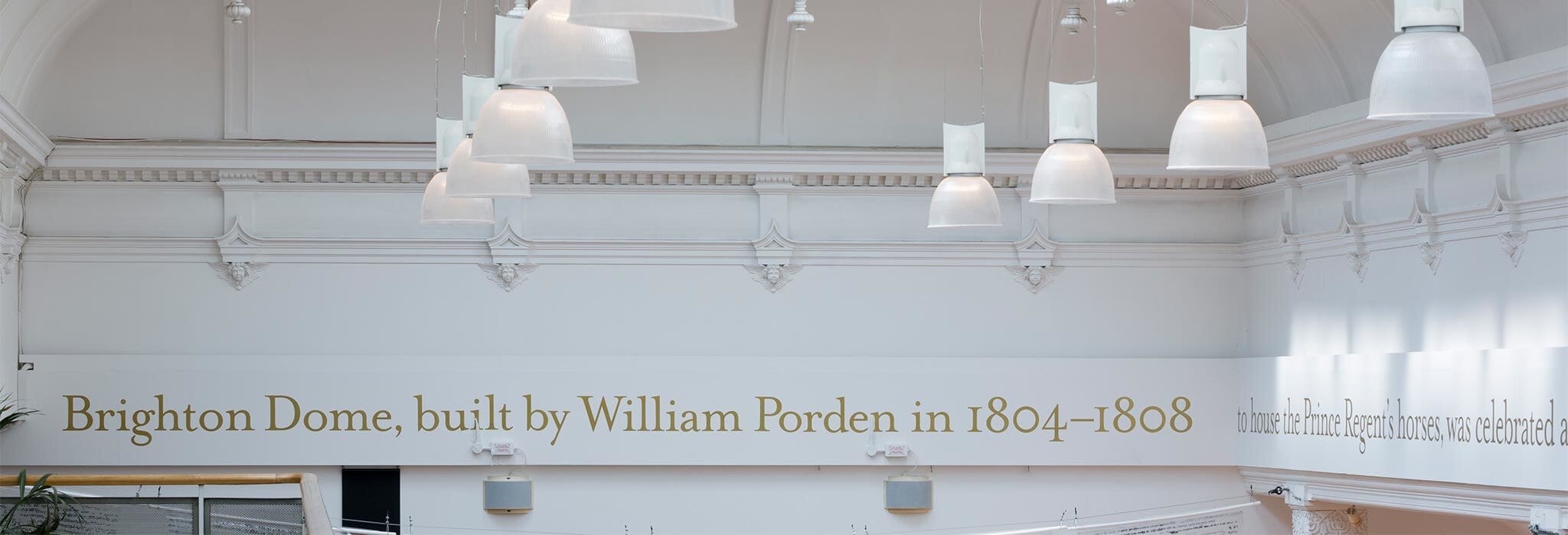
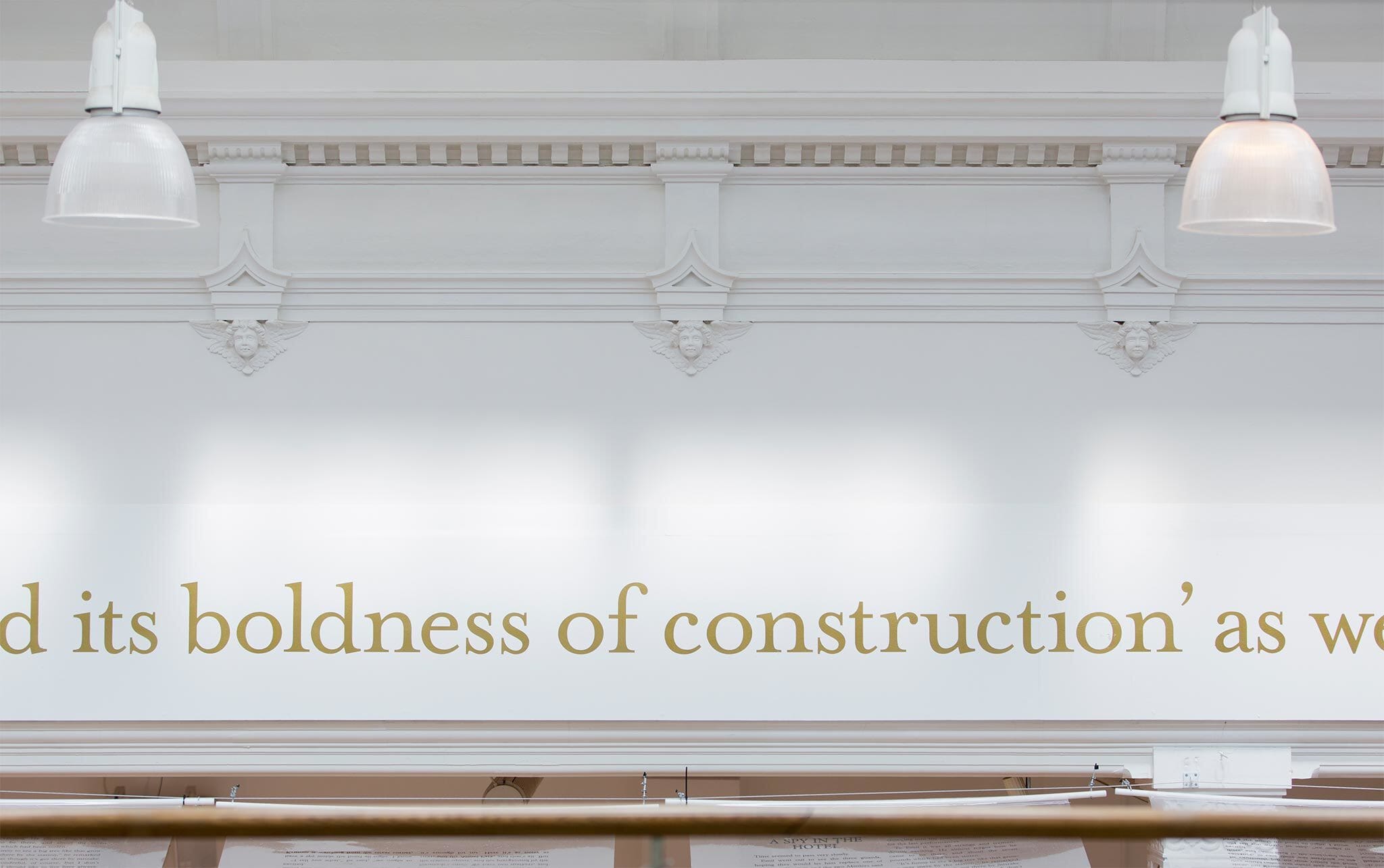
As well as the signage requirements, we were able to interpret some of the sites rich history on the walls. Key facts, figures and phrases about its history are used at huge scale to evoke some of its ancient past and more recent successes.
Awards
- 2014 Brand Impact Awards | Culture - Programmes | Winner
Credits
- Signage consultant: Whybrow Signing Consultants
- Website implementation: They.Create