We began work on this as a sister project to our work on Brighton Dome, but over four years this has taken on a life of its own. Whilst the Dome is open all year, the festival lasts for just 3 weeks — a vibrant smorgasbord veering from modern circus to cutting edge performance art, comedy, music, theatre and dance.
The Dome and Festival are run by the same team, and our initial task was to find a way to explain the relationship between the two parts. After some thought, and design exploration, we realised the answer was to give them distinct, yet related identities – celebrate their differences yet hint at collaboration and crossover when needed.
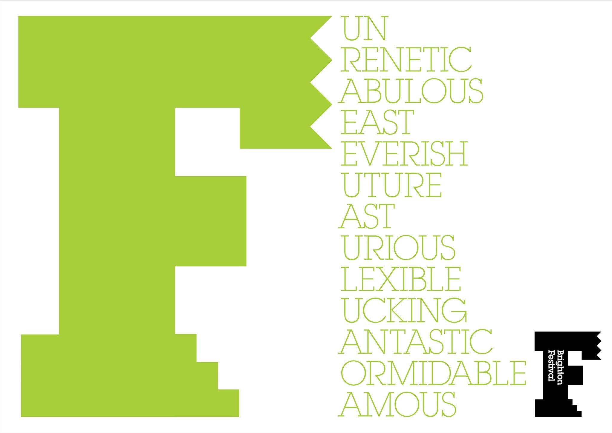
Brand identity
One of the phrases that re-occurred in our research was talk of Brighton as a ‘city on the edge’ – the edge of the country, at the edge of the avant grade, and at the cutting edge of many trends. Echoing the Dome’s D, we developed an ‘F’, but an ‘F’ that is intentionally bold and brutal, sometimes sharp and jagged, able to exist in many colours.
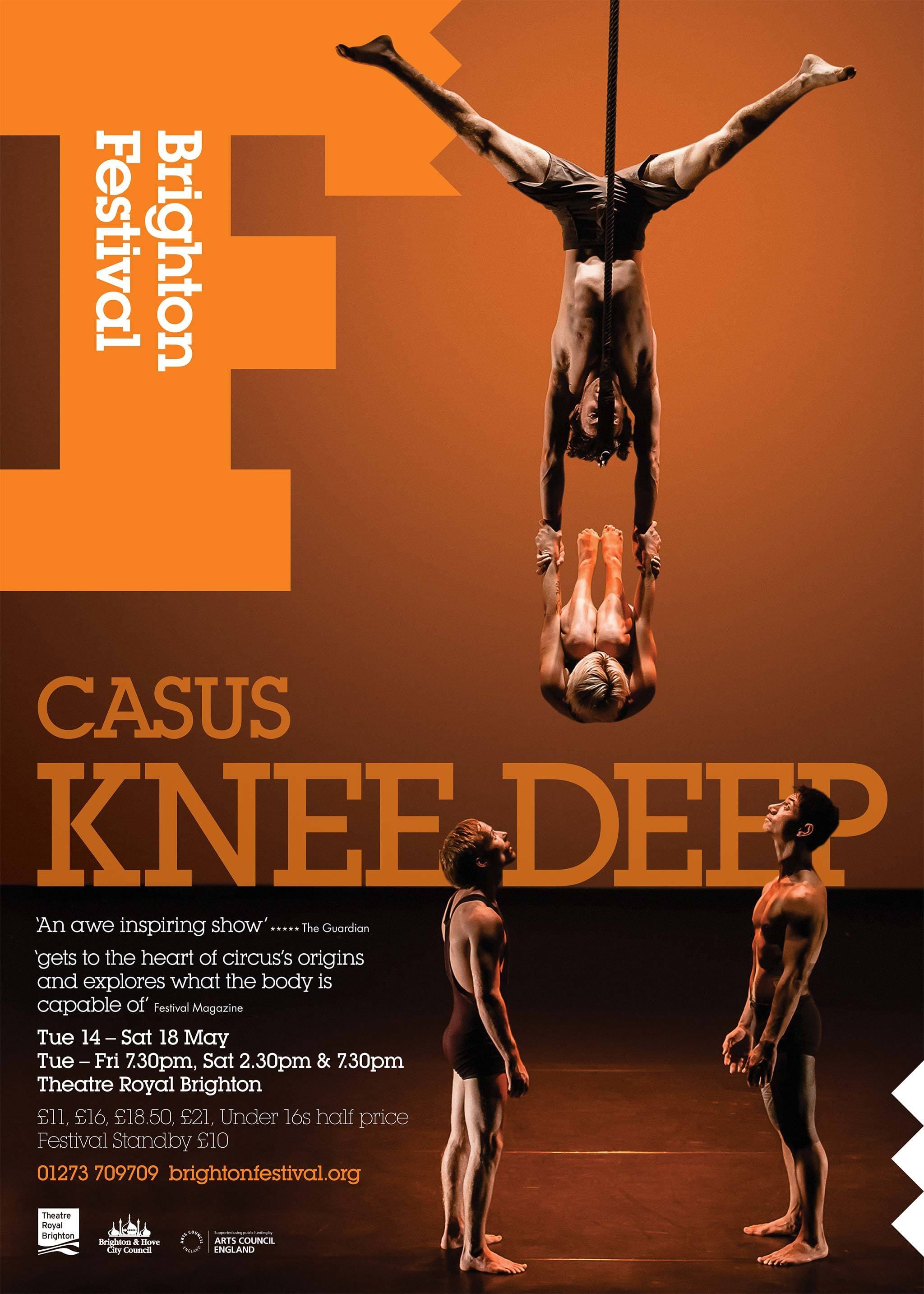
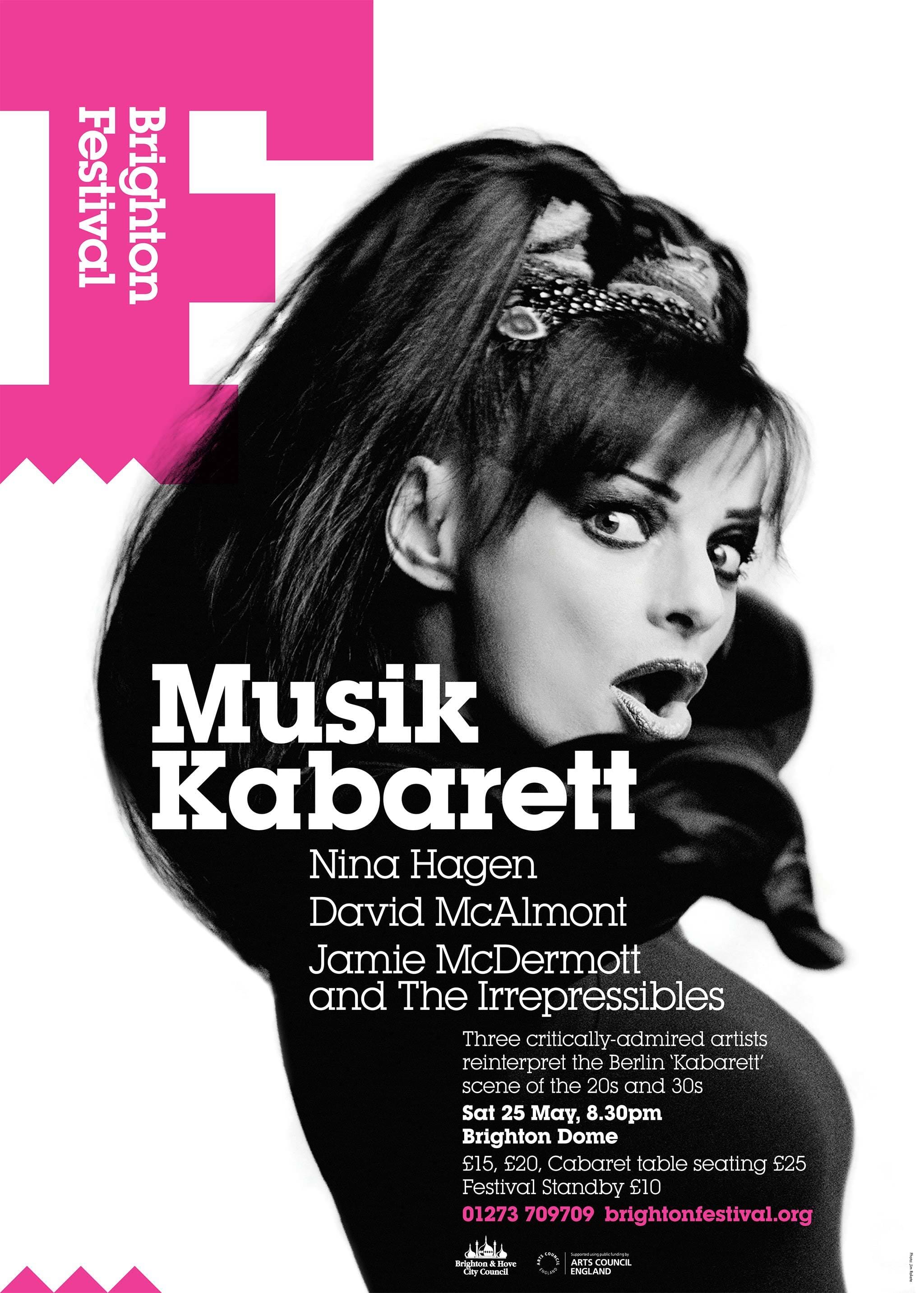
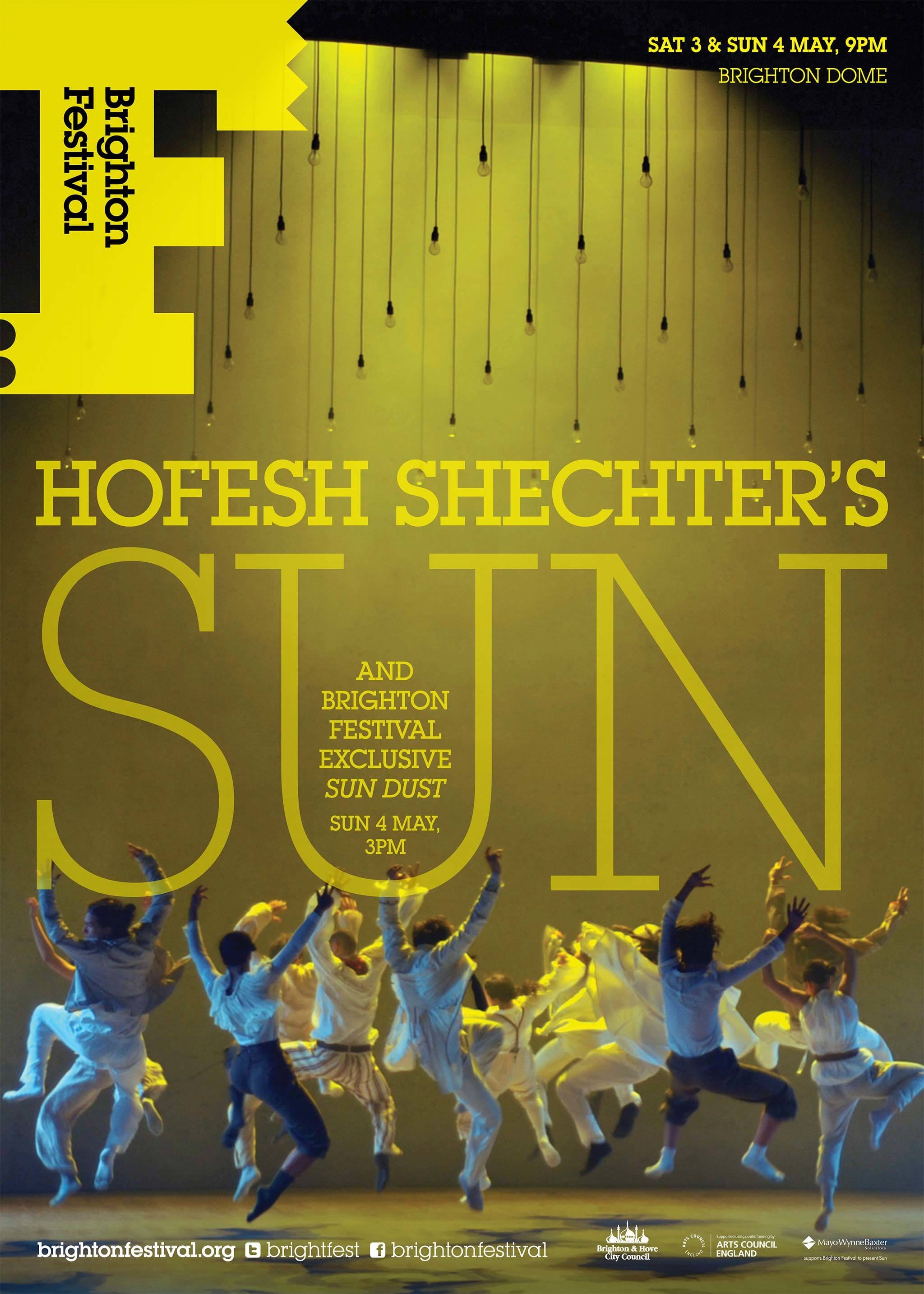
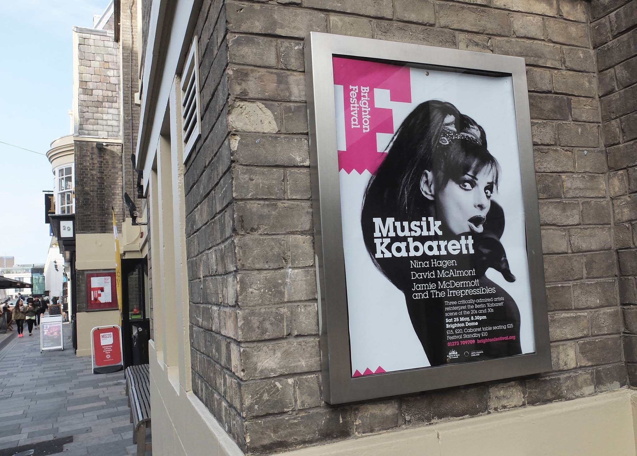
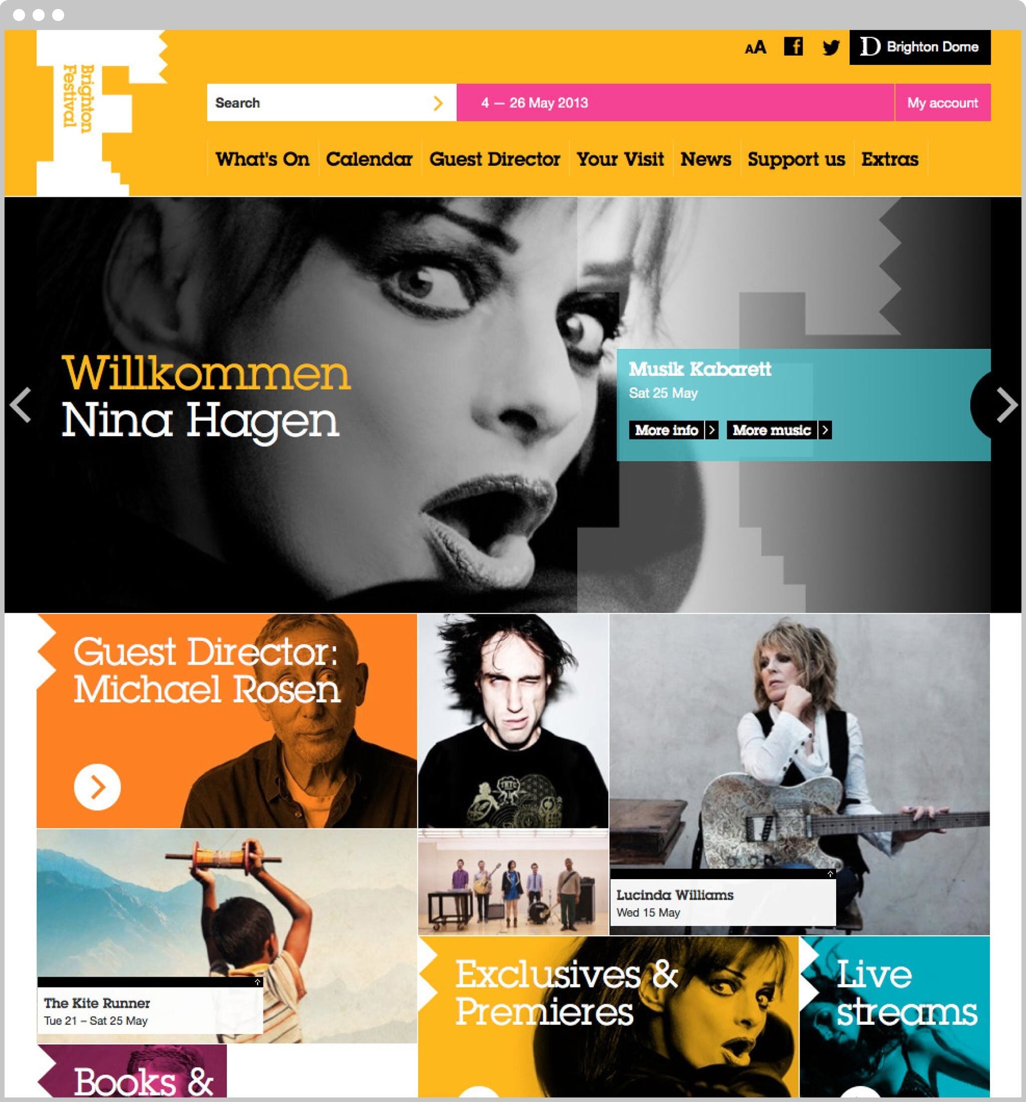
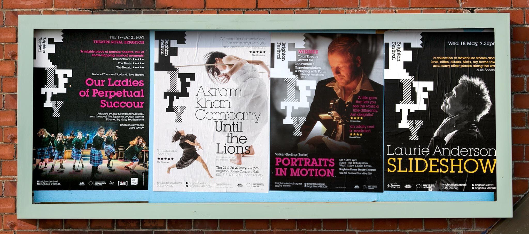
Here are a few of the core applications of the idea — showing how the F is ever-present on the communications and how, with a limited typographic palette, the identity of each show can still shine through.
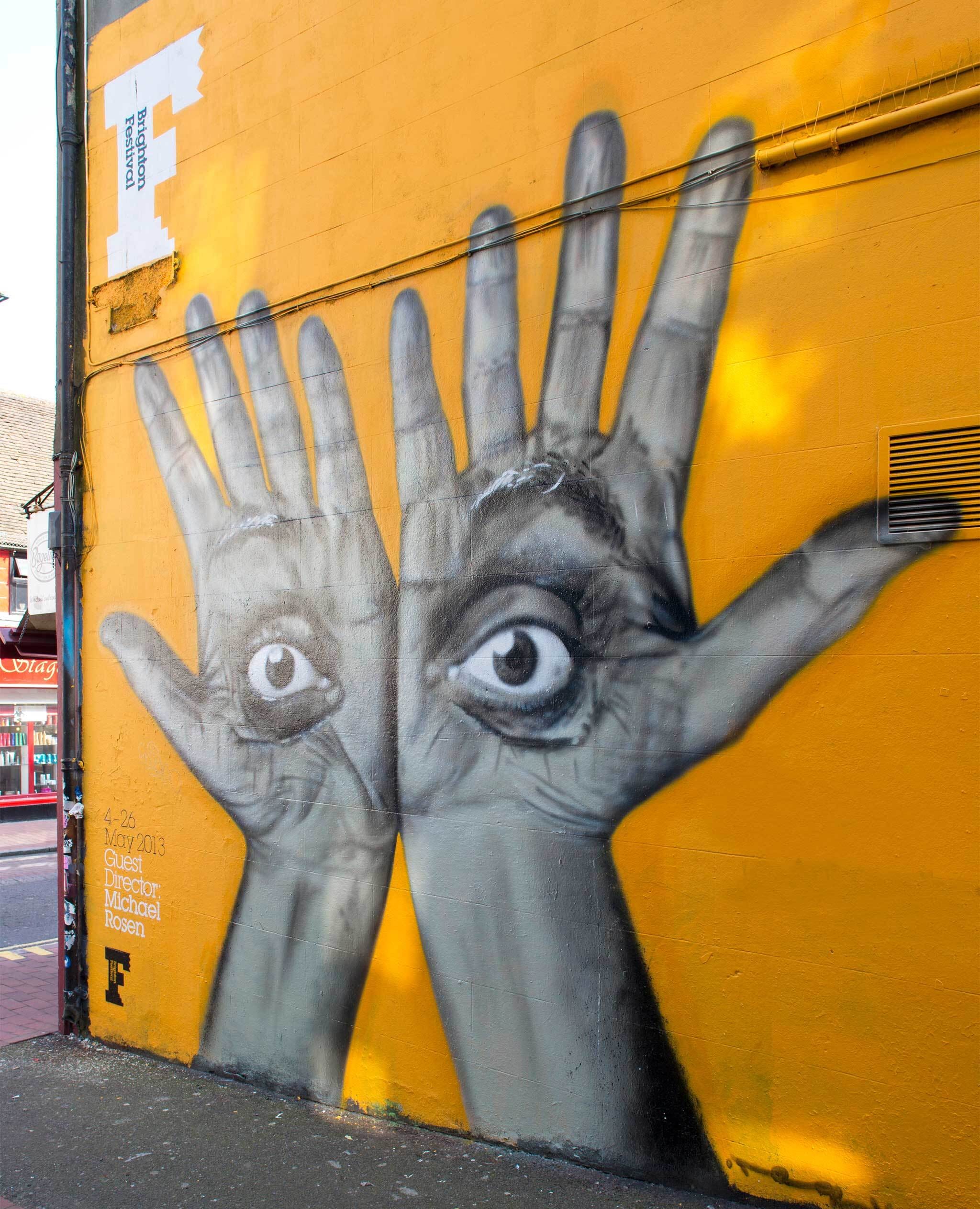
Adapting the identity for annual themes
Each year the Festival has a guest director, so each year we have been tasked with reflecting their input into the programming and design approach. For the 2013 festival, we used guest director Michael Rosen’s hands and eyes to create a homage to one of his favourite periods, the Bauhaus (specifically Herbert Bayer’s The Lonely Metropolitan).
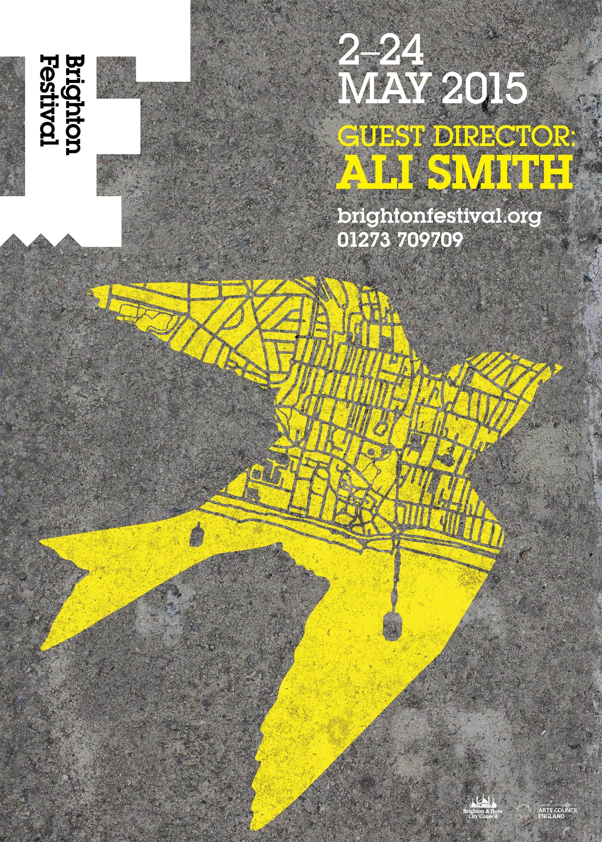
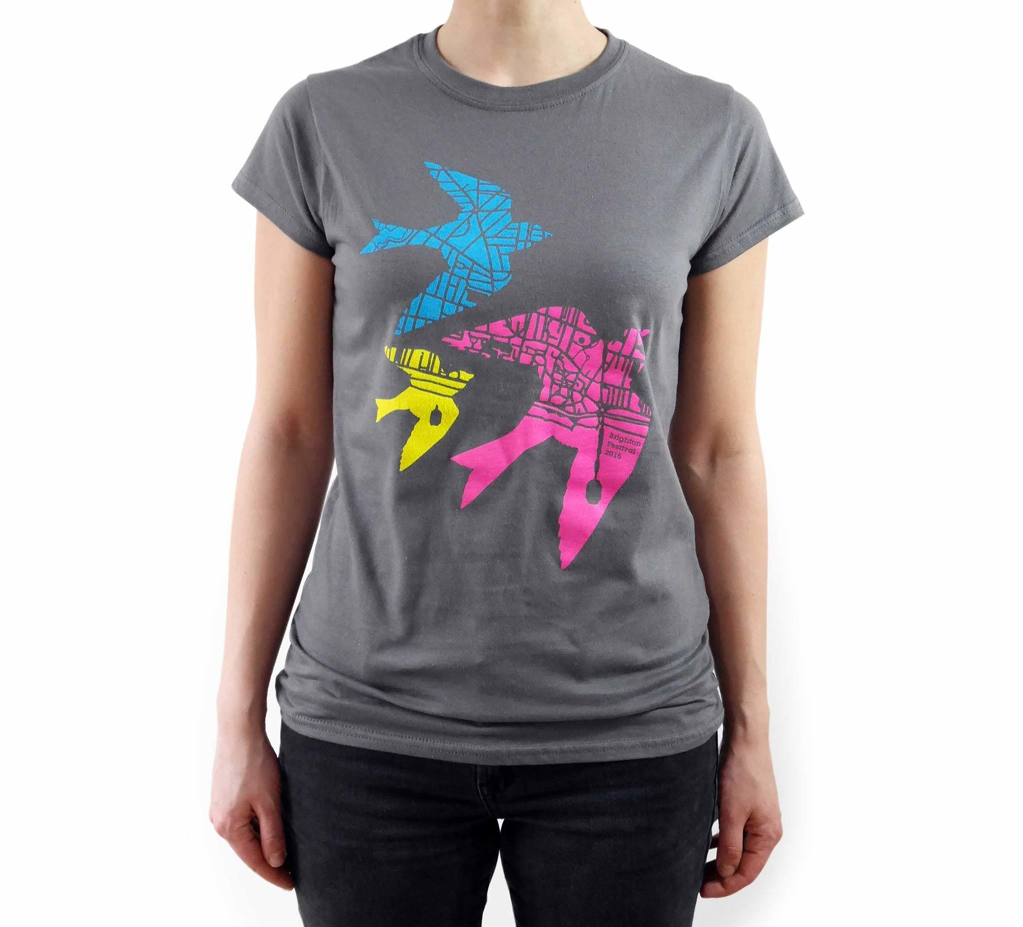
Author Ali Smith’s brief was to ‘imagine the world seen from the eye of a bird’, which we interpreted with the use of swifts (which, on closer inspection are actually maps of the city).

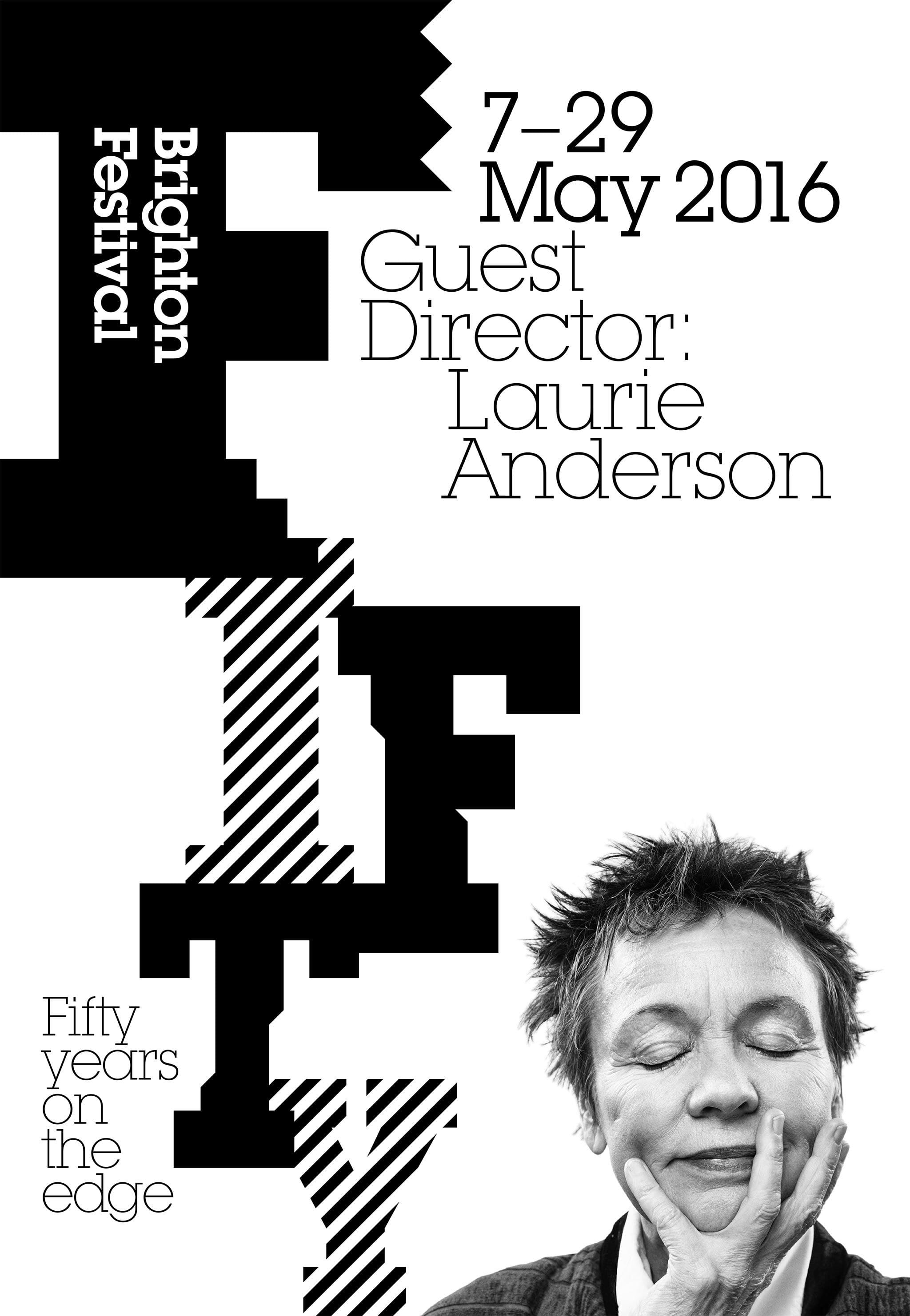
For the fiftieth festival in 2016 we simply adapted the ‘F’ to create a ‘Fifty’ wordmark, and then used that as boldly as possible with an image of that year’s guest director, Laurie Anderson.
In 2017 we asked Brighton based tattoo artist Adam Sage to draw the main image for the year, led by guest director Kate Tempest.

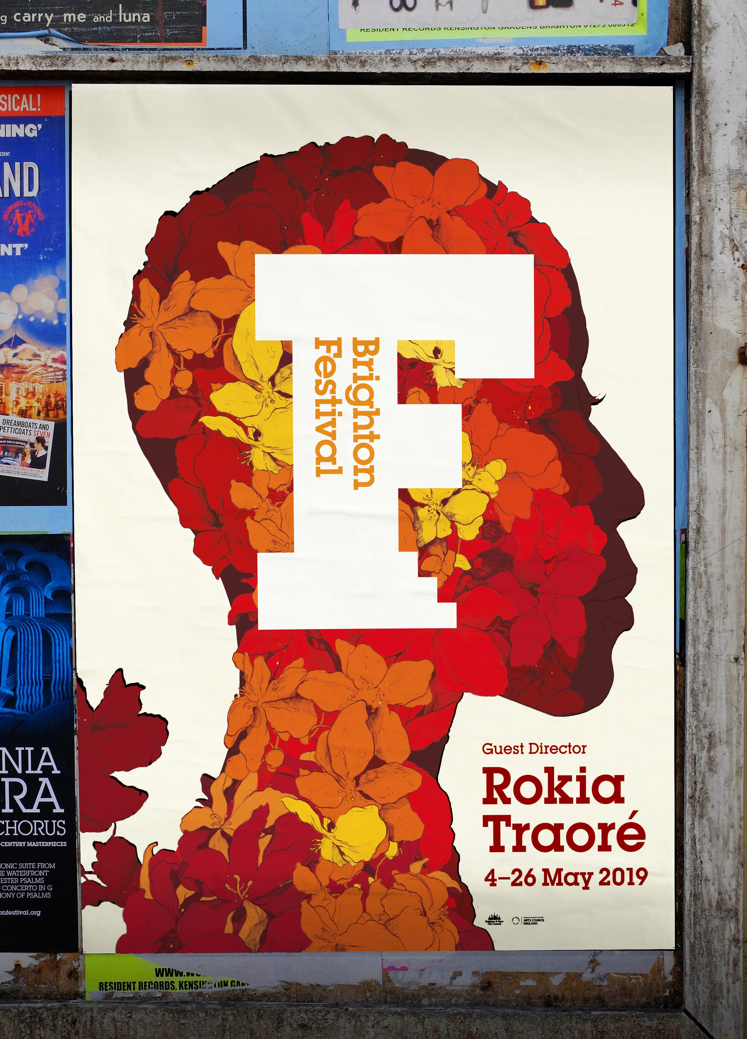
After a year’s hiatus, we returned to the project in 2019 and the guest director, Malian singer/songwriter Rokia Traoré.
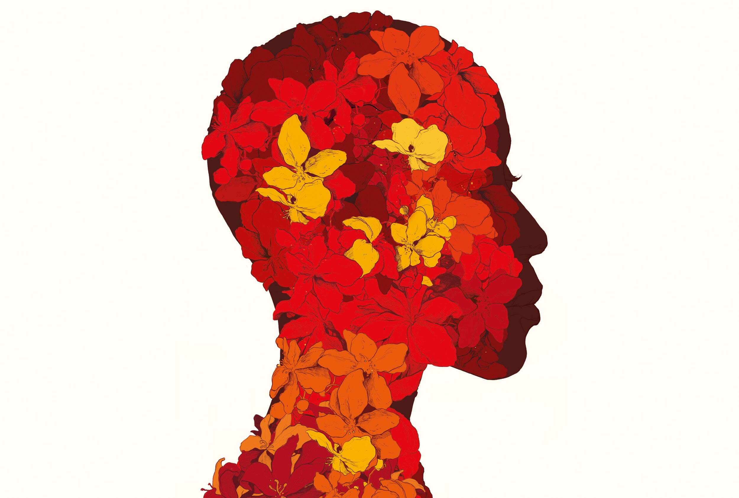
From the very first briefing meetings, we were keen to use her very powerful profile in the designs, to clearly mark it as her festival. We worked in collaboration with illustrator Simon Prades to bring Rokia’s profile to life, using the layering of native flowers to form a striking silhouette that is a celebration of growth, movement and the ‘coming together’ that the festival represents.
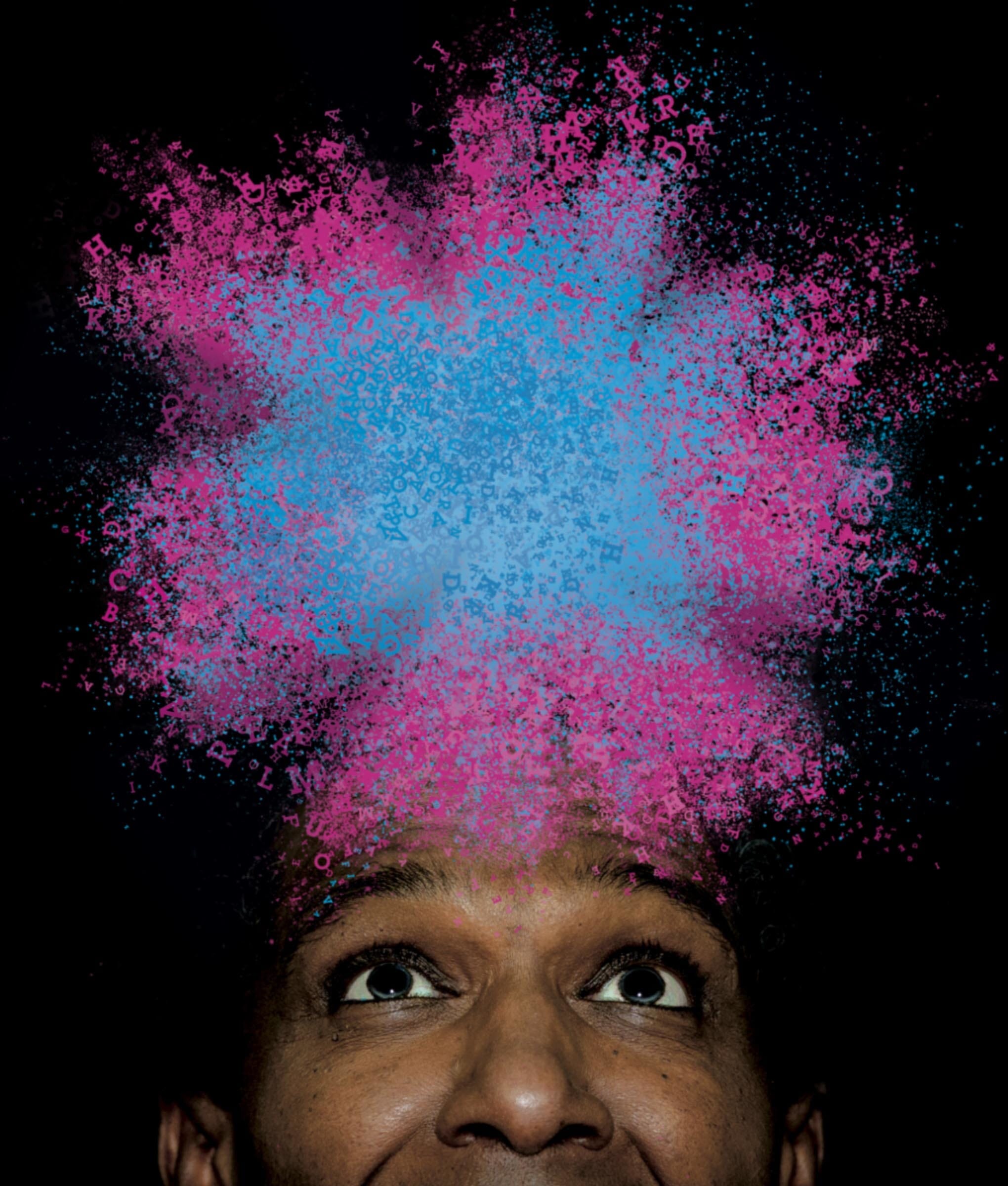
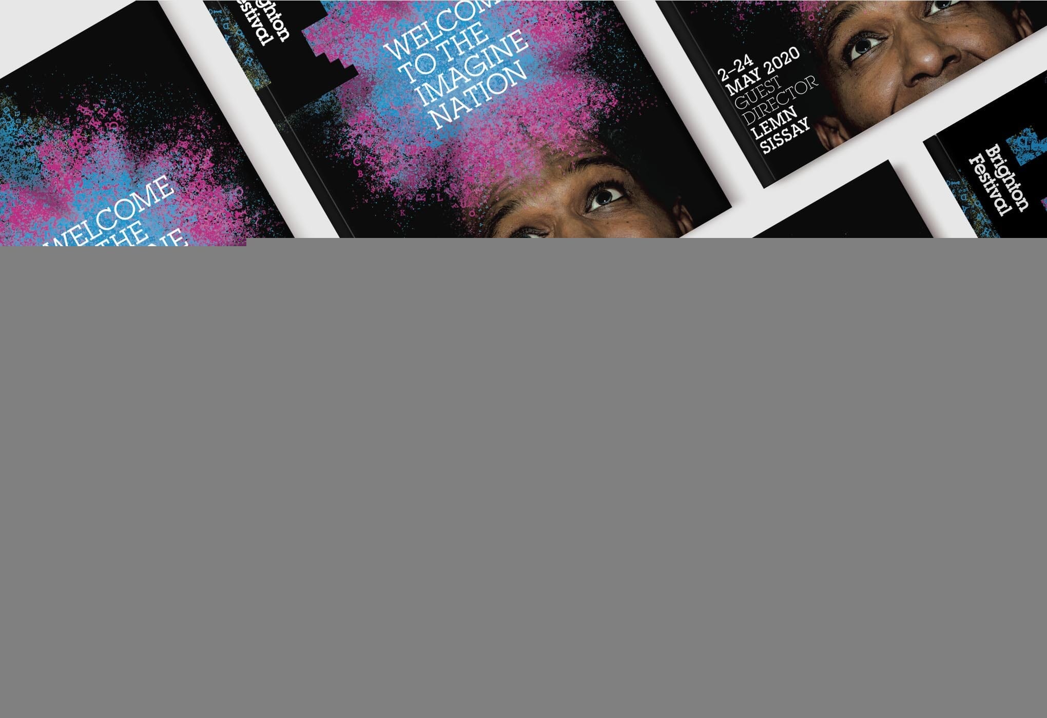
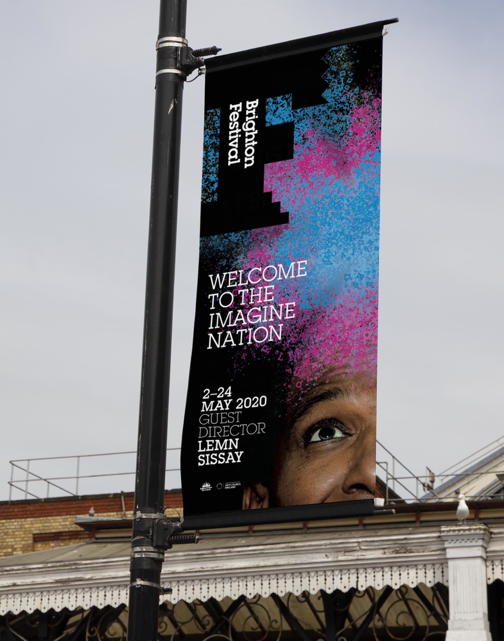
In 2020 the guest director was British and Ethiopian writer and broadcaster Lemn Sissay MBE. He was the official poet of the 2012 Olympics, is a director of the Foundling Museum and has often channelled his own personal journey as an orphan into his writing.
We used his face and his raw material – the alphabet – to create a visually arresting theme that literally explodes out of his head and alludes to the explosion of events and activities that the festival now represents.
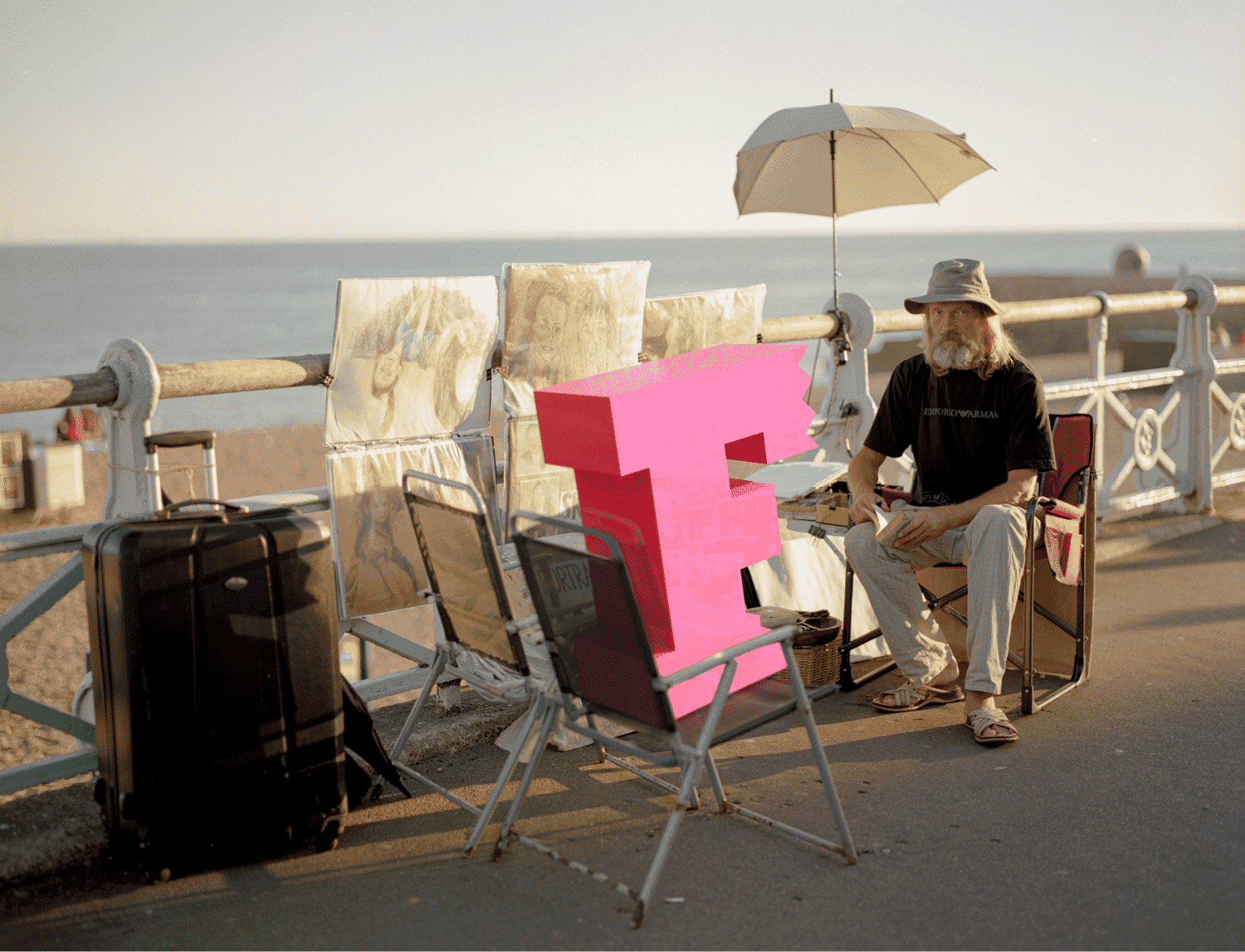
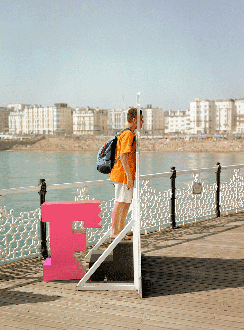
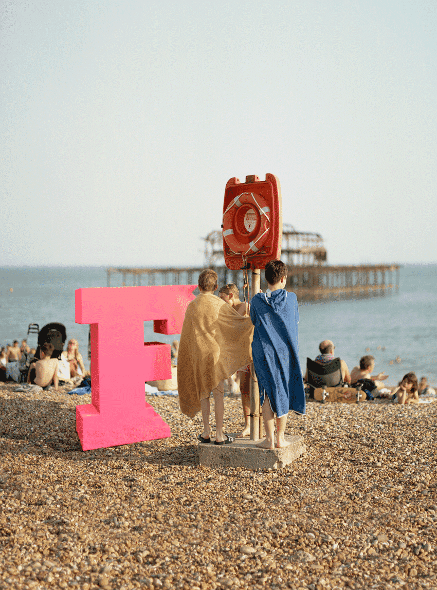
For 2021, after 14 months of lock-down we chose to celebrate the Festival’s return by letting a giant pink ‘F’ loose on the streets and beaches of the city. Here you see it waiting its turn on the pier, having its portrait painted, and summoning up the courage to swim in the sea.
Read more about the 2021 scheme.
Awards
- 2016 Brand Impact Awards | Culture (branded campaigns) | Shortlisted – Brighton Festival Fifty Years
Credits
- Website implementation: They.Create and Grandad London
- Photography of festival graphics: Murray Scott
- 2013 (Michael Rosen) Brand photography: Philip Gatward
- 2013 (Michael Rosen) Reference to Herbert Bayer kindly sanctioned by DACS
- 2016 (Laurie Anderson) Portrait photographer: Tom Oldham
- 2017 (Kate Tempest) Illustrator: Adam Sage
- 2019 (Rokia Traoré) Illustrator: Simon Prades
- 2020 (Lemn Sissay) Portrait photographer: Jamie MacMillan
- 2021 (Lemn Sissay) Street photographer: Oliver Curson with 3D artist Robbie Hancock