When we first met Christian Aid, we were confused. Were they 'Christians who aid', or 'aid for Christians', we asked. 'Neither' came the reply. Whilst they were faith-based, they had effectively become a global aid organisation, and were frustrated that they couldn't get that message over.
As an organisation widely supported by UK churches, a change of name was never going to be on the cards – yet a key part of our brief was to embrace a wider, more secular audience. And we found little or no enthusiasm within the organisation for their old identity and symbol, so we began to explore ways to change emphasis.
Brand identity
Our solution was to massively enlarge the ‘aid' part of their name to make it clearer what they did, and downplay ‘christian', even writing it, unusually, in lower case letters.

We then placed the words into a graphic shape reminiscent of the most powerful symbol of their work, the envelopes delivered to doorsteps across the nation for Christian Aid Week. This meant that when the week arrived, 18 million logos were effectively delivered onto the doorsteps of UK homes.


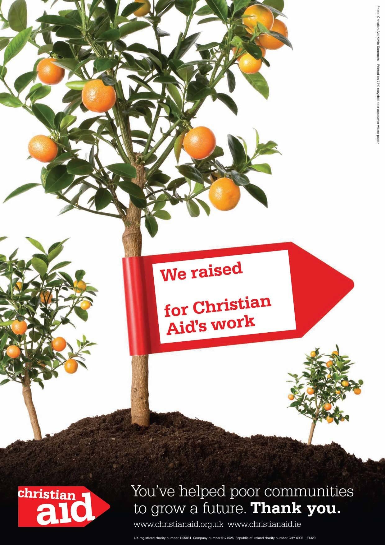
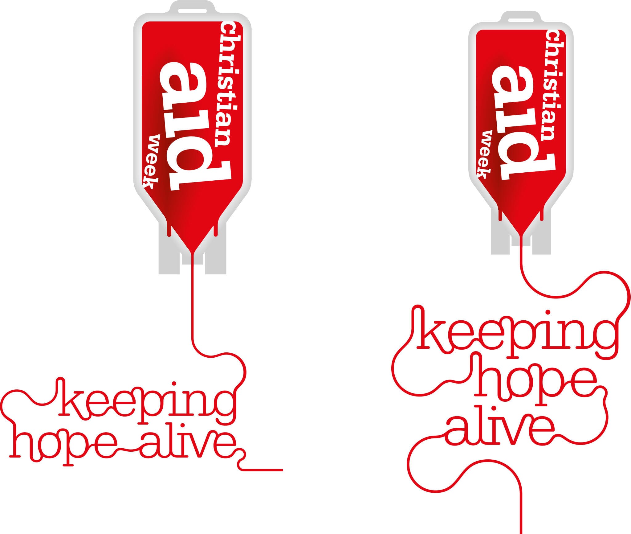
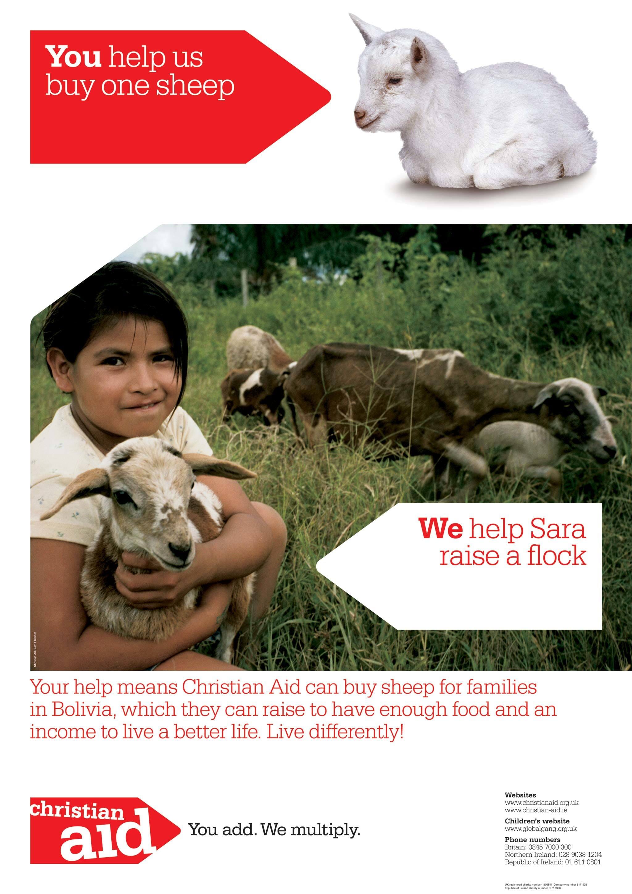
Even though we had based the shape on an envelope, we were careful to draw it in a simplified way that allowed it to be used in different ways – so for over a decade it’s turned from arrows into gro-bags, even blood bags for various campaigns.


Our work continued when branding their ‘Poverty Over’ initiative. Working closely with their agency BMB we developed the Poverty/Over design style that ran throughout all of the work, with a strong use of orange was chosen to help the appeals stand out from competing campaigns.


