Mister Cooper is an ice-cream start-up specialising in alcoholic and gourmet flavours. The company’s frozen fancies are strictly for grown-ups and they needed a distinctive identity and tone of voice to match their unconventional new brand.
From a verbal point of view we were keen to suggest a series of interesting copy lines, such as ‘never vanilla’, ‘ice-cream for grown-ups’ and ‘ice-cream but naughtier’ – intentionally written to position Mister Cooper away from more traditional offerings.
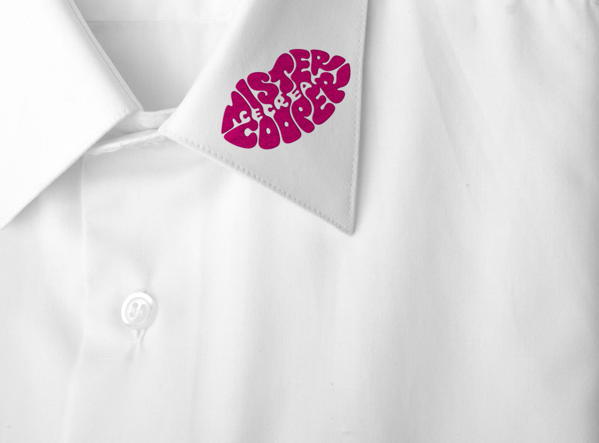
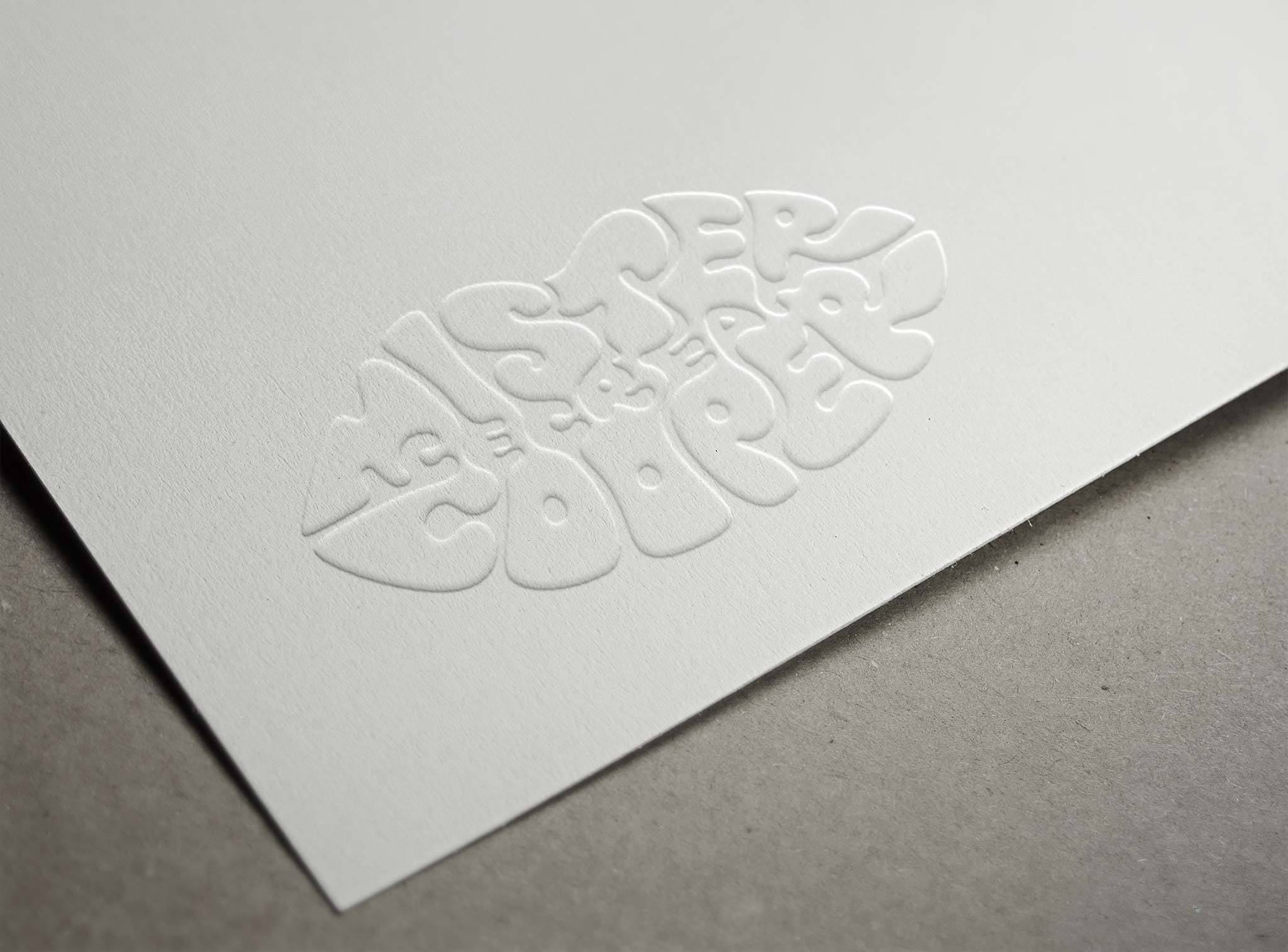
The visual direction
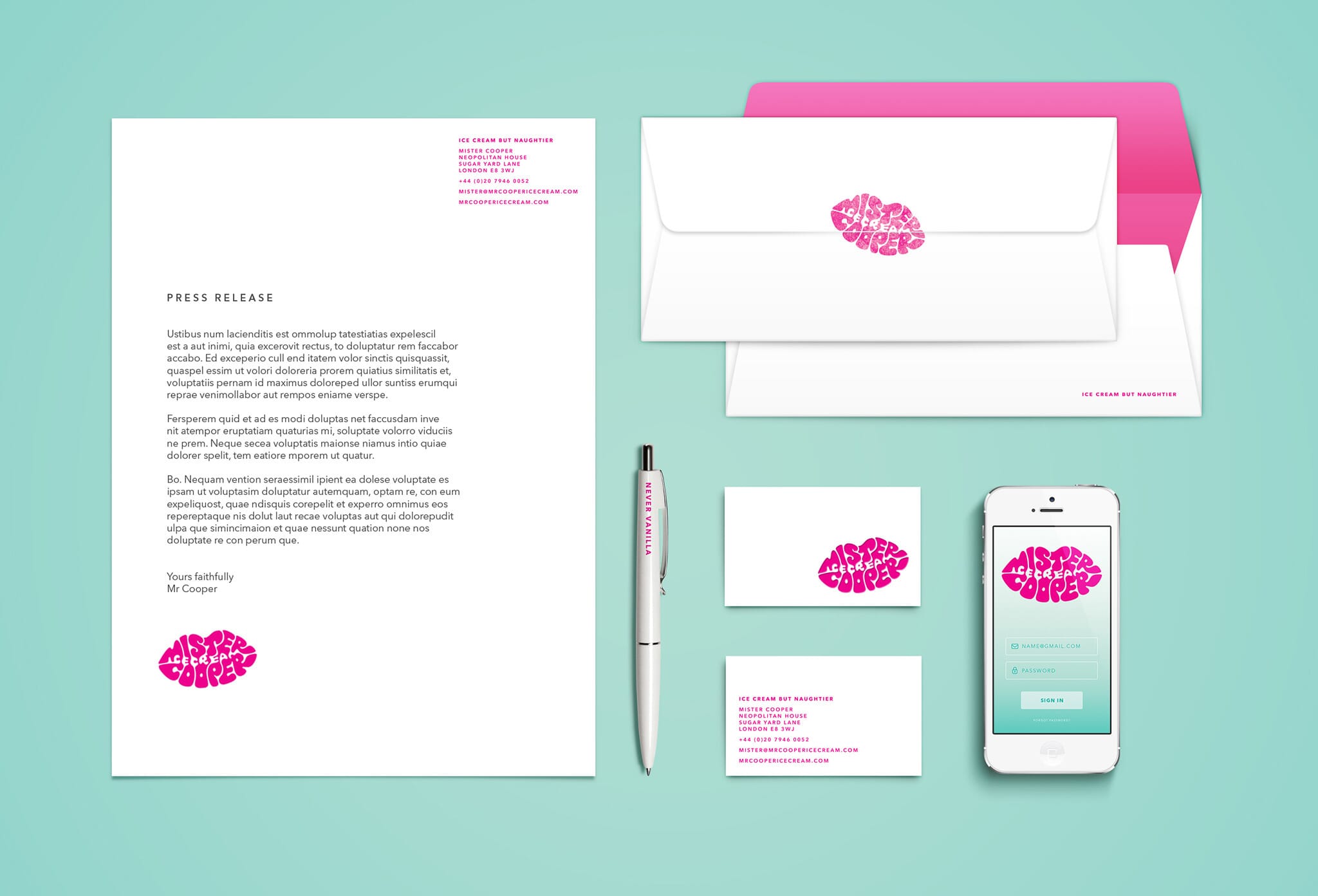
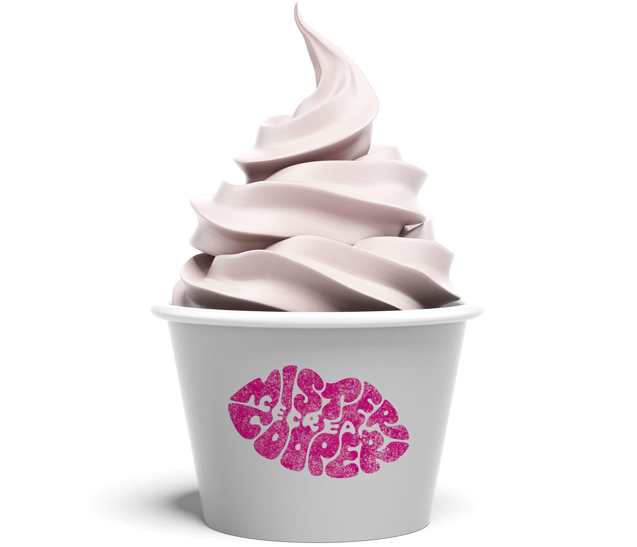
After presenting a number of initial designs we agreed on the thought of a typographic ‘lipstick’ mark. This concept seemed to match well with the hedonistic nature of the product. The logo can be rubber stamped directly onto white paper cups and napkins, as if a cheeky kiss had recently been planted (and helping Mister Cooper keep his costs down for the initial launch).

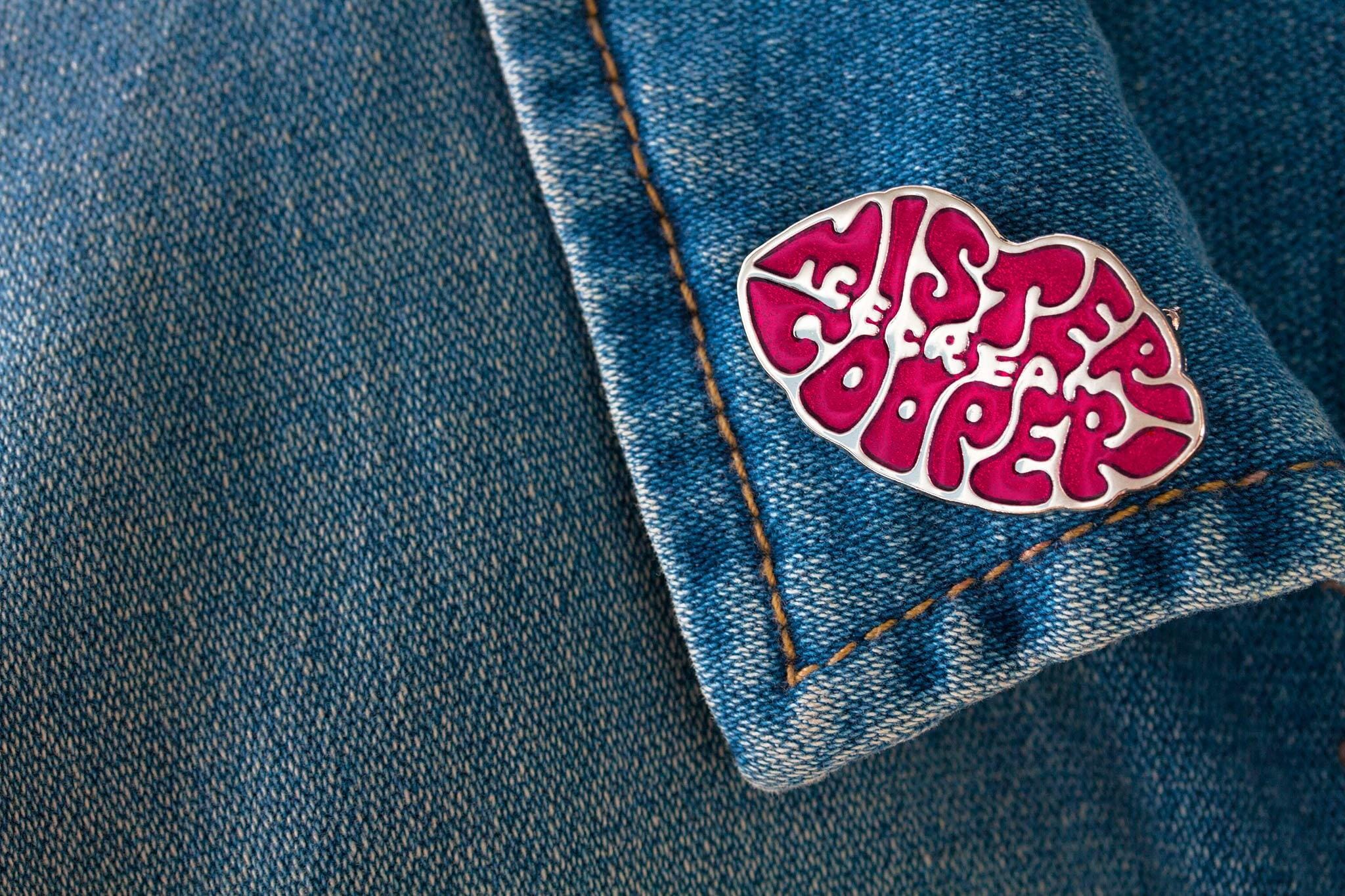
Our challenge was to craft an intriguing hand lettered mark utilising both positive and negative space to spell out the brand name and the words ‘ice cream’ within the shape of the lips. As the logo developed we experimented with a variety of lettering styles and worked through challenges within the design such as legibility and spacing, before arriving at an arrangement and lettering style that made the logo feel suitably voluptuous and unified.
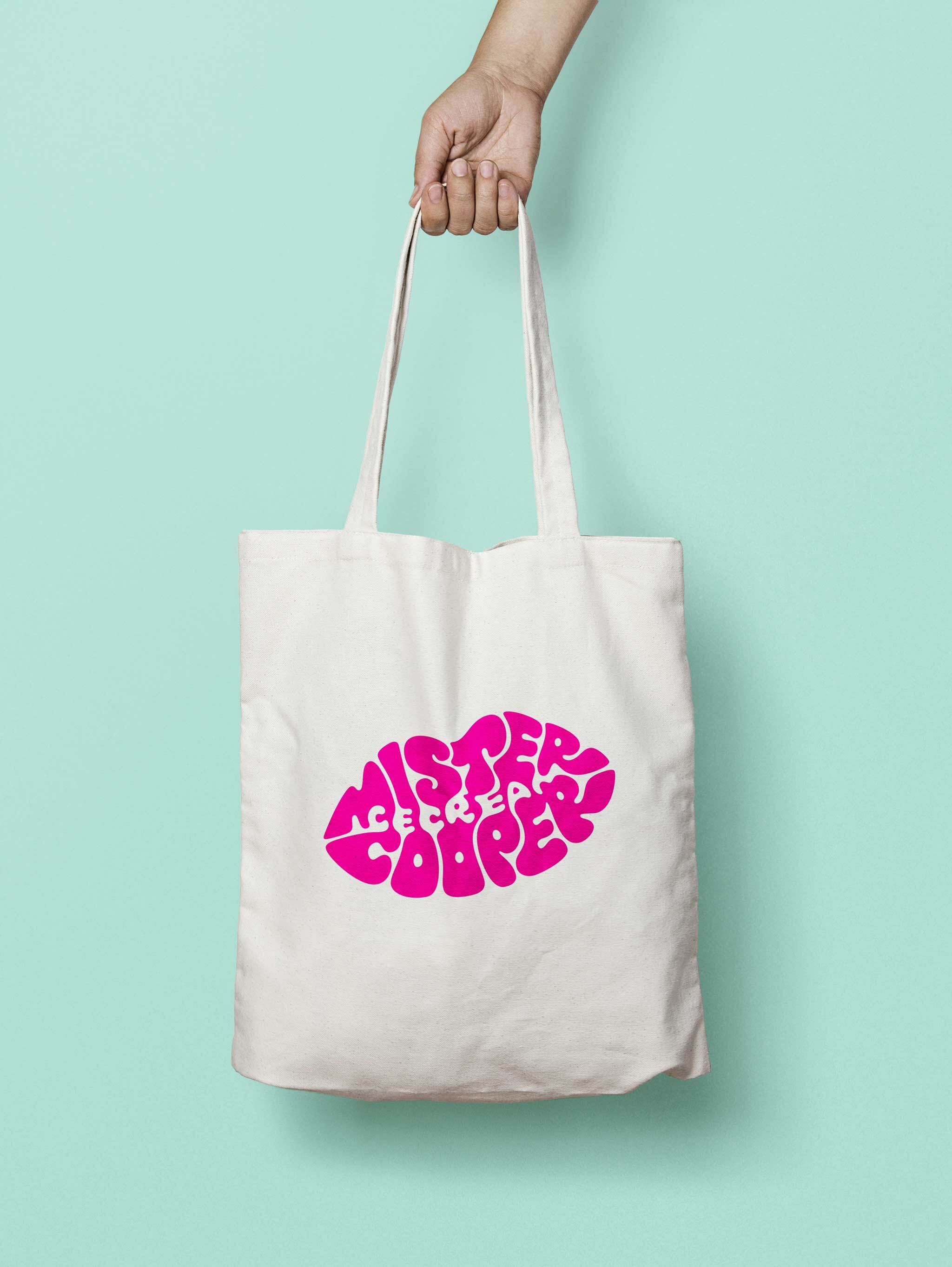
Finally we developed applications such as packaging, uniforms and merchandise and stationery.
Awards
- 2015 Brand Impact Awards | Artisan | Winner
Credits
Thanks to Rob Clarke, our collaborator on the final typography.