When an arts centre in Philadelphia approached us to help find a way to unify all their work under one banner, we thought it would probably be a case of all of their initiatives, projects and activities falling into line. But we quickly discovered that each initiative also wanted their own degree of independence.
The Centre needed the benefits of one unified identity, whilst somehow recognising its work in dance, exhibitions, fellowships, theatre, management, heritage and music. And to make it trickier, they wanted to let the initiatives retain their current names. They had agreed to unite under one name, the Pew Center for Arts & Heritage, and wanted to define a clear ‘parent/child’ relationship, but somehow keep a ‘child/parent’ relationship as well.

Brand strategy, architecture and design
After lengthy discussions, and several unsuccessful design presentations, we began to realise that any of the previous identity ‘models' were redundant and we needed to think of a new way to express this. We started to think of the centre and its constituent parts a little like ‘cards' we could shuffle and re-organise.
The next step was building a uniquely fluid identity system that allowed flexibility in the core mark (where you see progressively more of the initiatives) and then completely inverted logos for the divisions. This identity structure is then applied out across the organisation – the logo itself becomes the navigation device for the website.


Printed applications
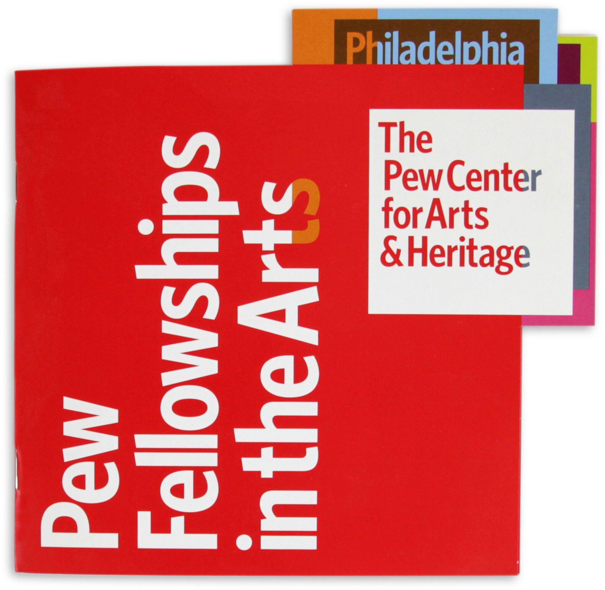
For initiatives such as the Pew Fellowships in the Arts we were able to utilise the distinctly modular shapes of the logos and reflect them in these designs for brochures and invites.

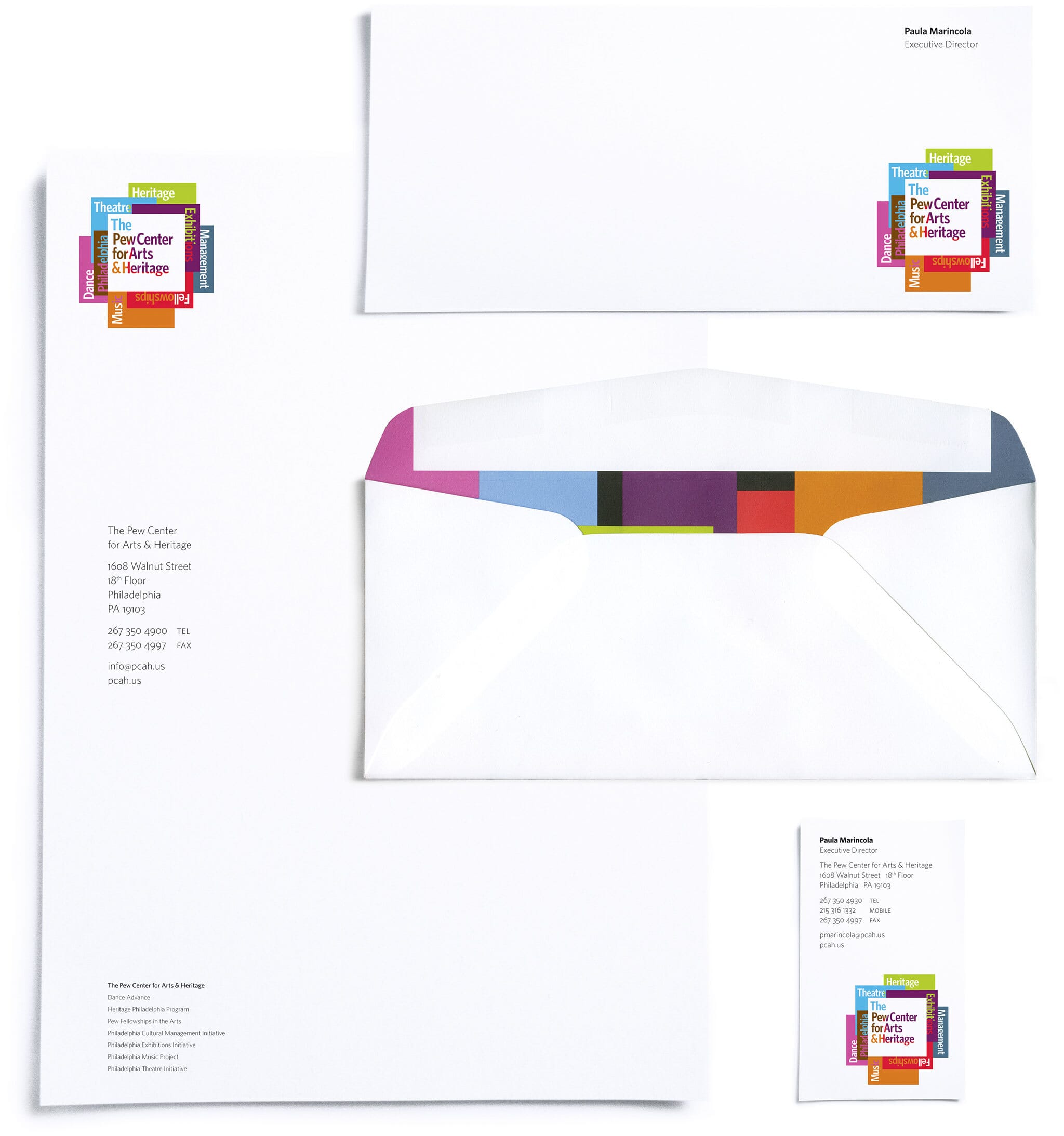
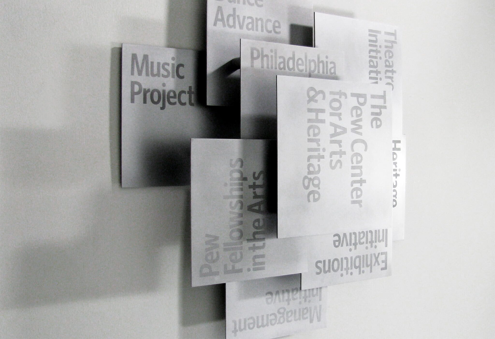
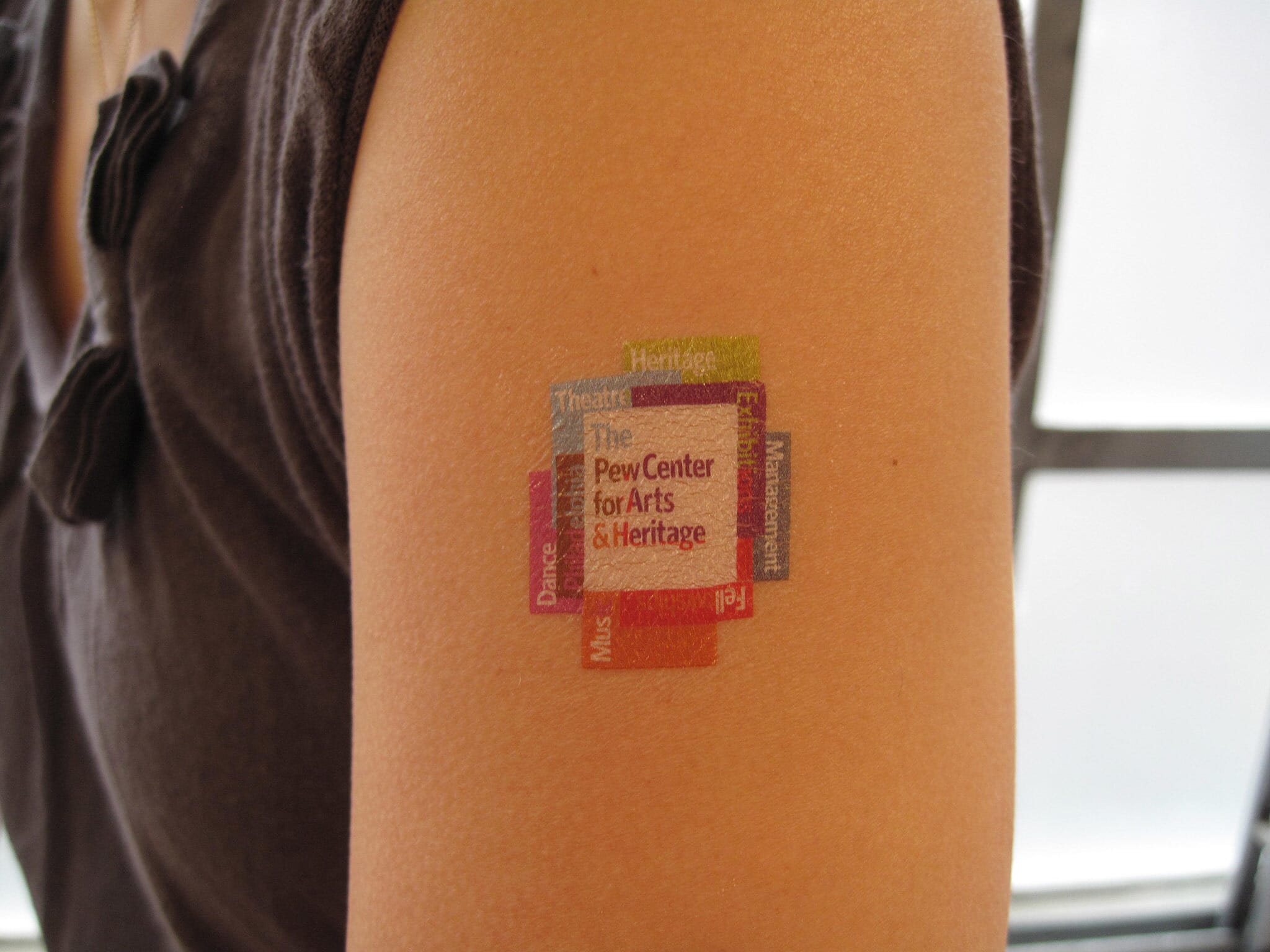
Since the project's launch , we've been applying the scheme out across stationery, animations, websites, signage and a whole array of printed materials. Here are some of the more light-hearted applications (a tattoo and a Christmas card). Below is the large metal signage that hangs in reception — itself a three dimensional representation of the symbol.

Digital and moving image
To explain the brand’s new structure at launch, we also developed a series of simple animations that helped to introduce the unusual idea of the brand’s approach.

Credits
- Animations: Ross Cooper