Shelter's core problem was that, as a famous UK based charity that had fought for decades to get the homeless off the streets, they had largely succeeded in their original task. They were now concentrating their efforts on the issue of the million or so people in the UK living in housing that was simply unfit for human habitation.
But in research, both public and corporate audiences still associated them with people living rough on the streets, in cardboard boxes, and the old positioning, identity and communications were doing nothing to change their minds.
A revised brand narrative
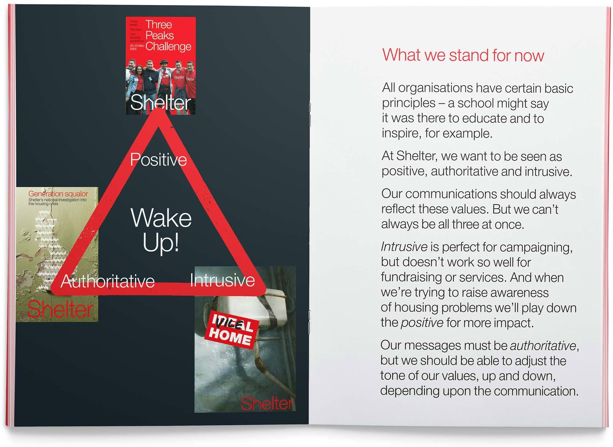
Working in association with their agency, Hooper Galton, new and simpler messages were agreed (such as ‘Bad housing wrecks lives’), and a clear corporate decision was made to ‘wake up’ the public to the issues that the charity now faced, and to force a re-appraisal.
Simplifying the brand identity
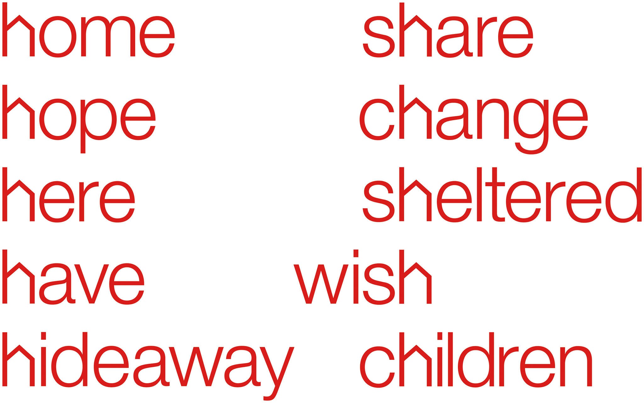
As we began work on the visual identity and tone of voice, one of our earliest identity thoughts proved to be simply what was needed. By slightly adjusting the ‘h’ of the word to show a pitched roof, we had the perfect visual to accompany what was without doubt a great name.
Developing a communications style
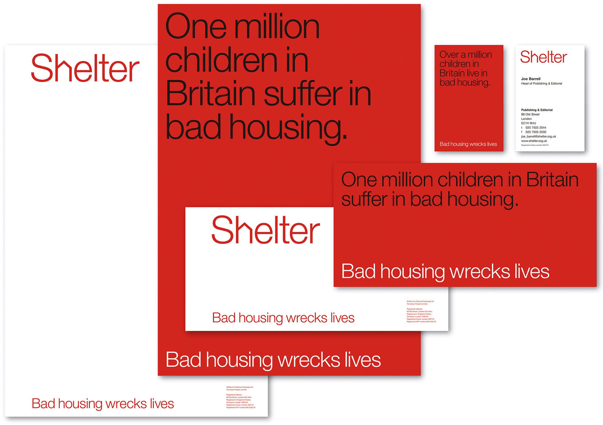
We then carried this simple idea through all their communications and design, encouraging a narrow palette of colours, straightforward typography and no-nonsense writing styles. The idea of writing ‘h' words enabled them to brand words without the constant use of the logo as a back-up.

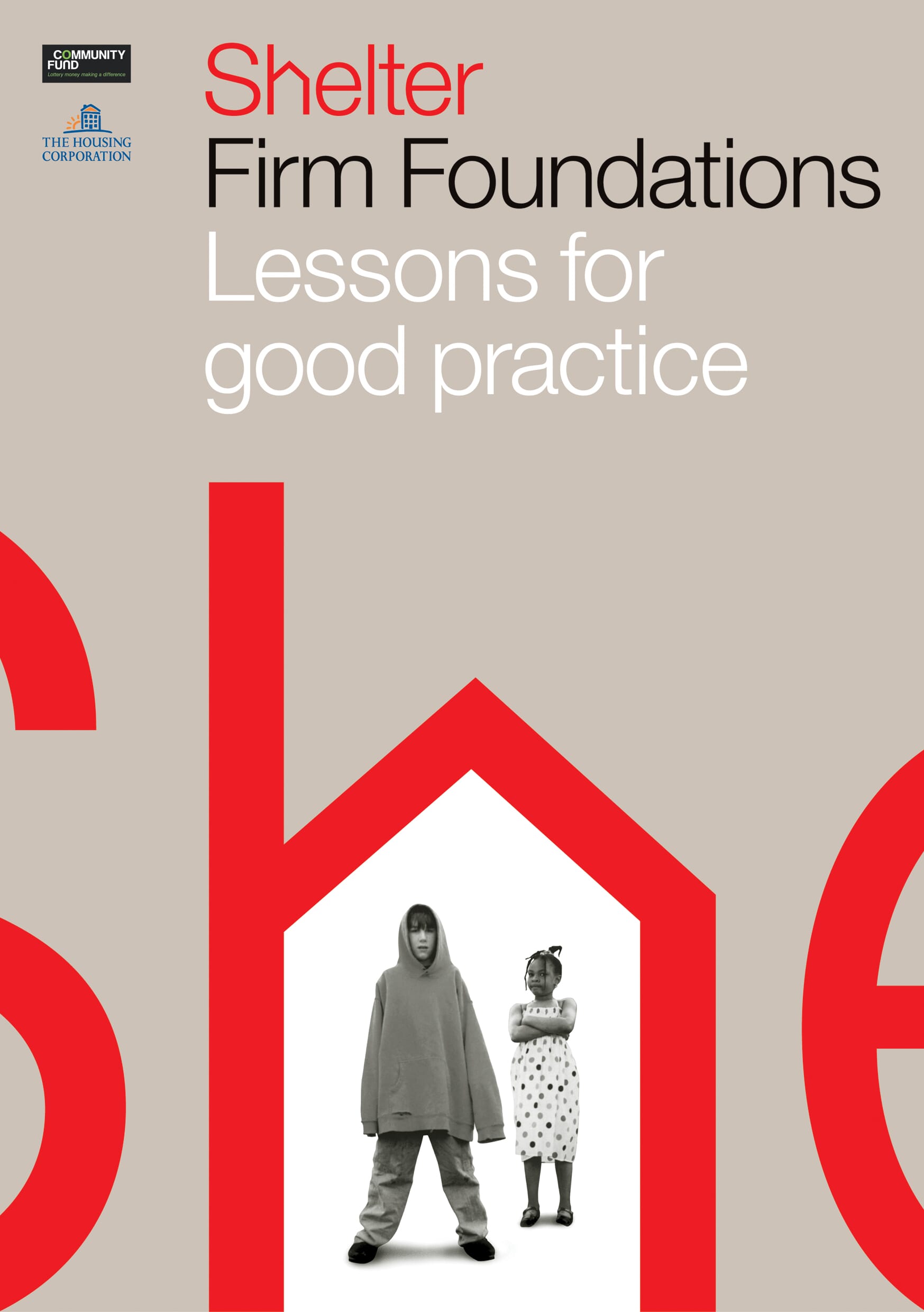
We used the new logo huge across the glass windows of their London headquarters, and then explored where the identity could go in the initial advertising campaigns to adopt the new style.
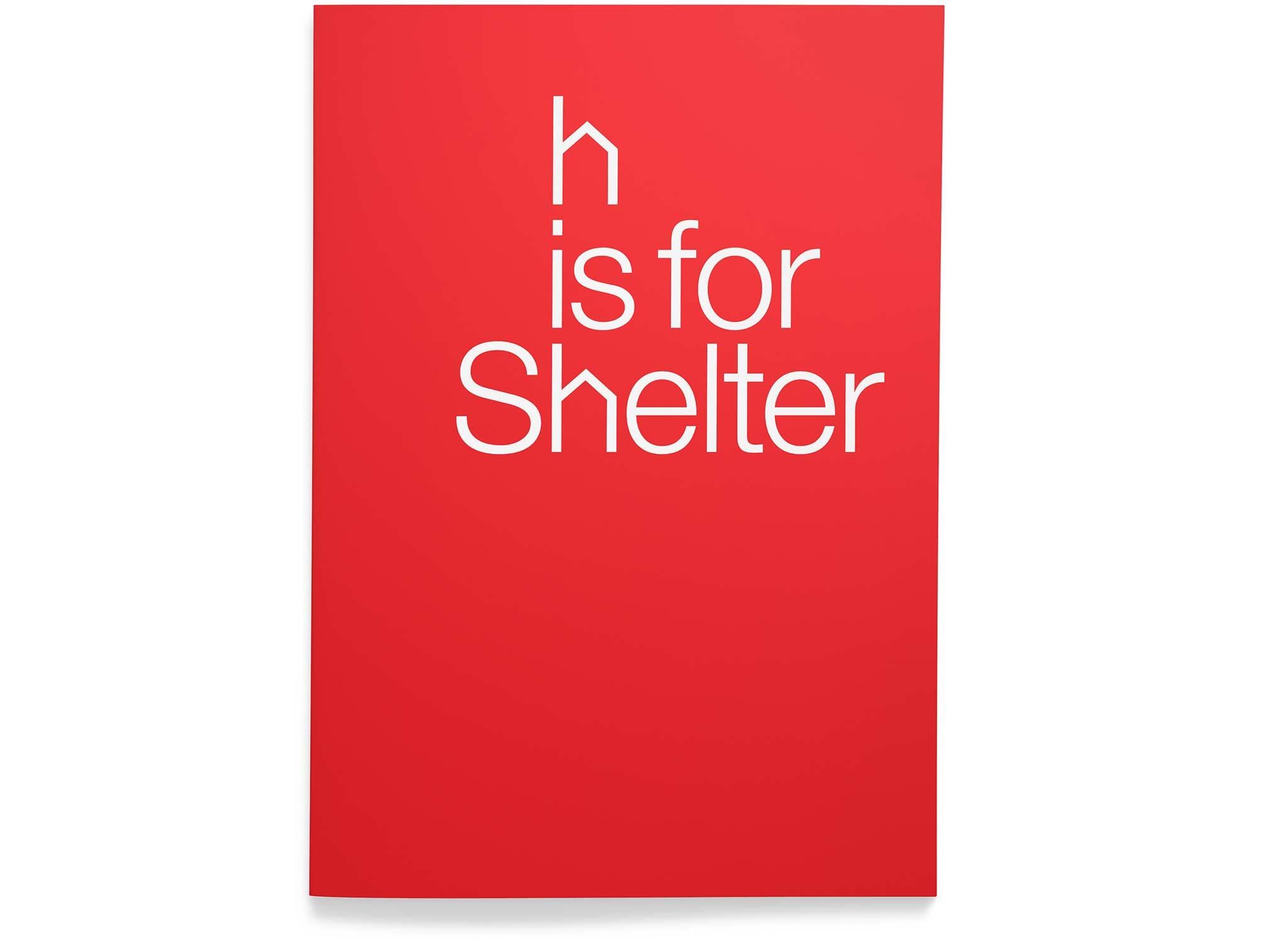
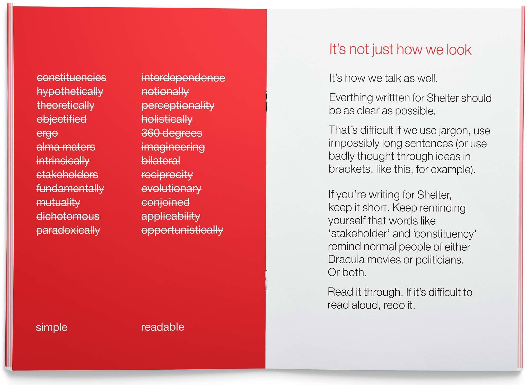
We also developed key tone of voice guidelines that urged the staff to be as simple and readable as possible in their writing.
Brand Impact
Since the project’s inception in 2004, Shelter has gone from strength to strength and now has over five million service users. The identity change helped them move up a gear, and become a more ‘grown-up’ organisation that is clear with its supporters and clearly able to attract new and more powerful corporate supporters. It has also become one of the most recognisable projects in the johnson banks portfolio.


Awards
- 2005 D&AD | Integrated Communication / Integrated Design | Wood Pencil
- 2005 D&AD | Writing for Design / Writing for Design | Wood Pencil