Take just a quick look at the identities, brands and logos for architects and you'll quickly see that they're frequently very similar. A bit like lawyers and solicitors, they often seem happiest with an understated piece of type. But if you're a young company looking to break through, with a lot of work in progress yet not much finished ‘stuff’, a powerful graphic identity can really help cut through.

The brand identity
When a start-up company, Unit Architects approached us, we thought they could have something genuinely different within their market, reflected their unusual choice of name and their modular approach to their work. Soon it became clear that we could design a mark that directly reflected both, by using a grid of six by six units for the letterforms.

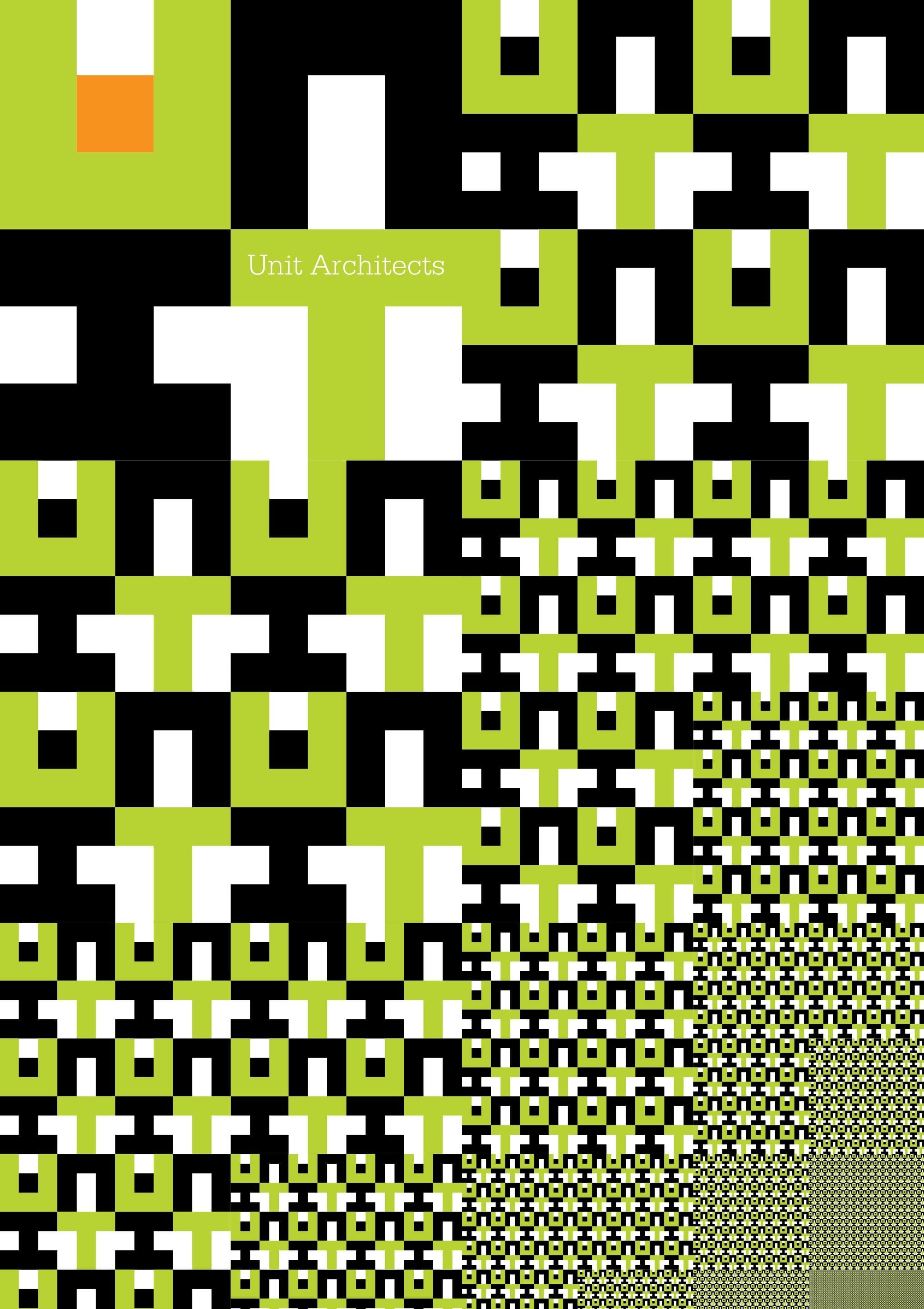
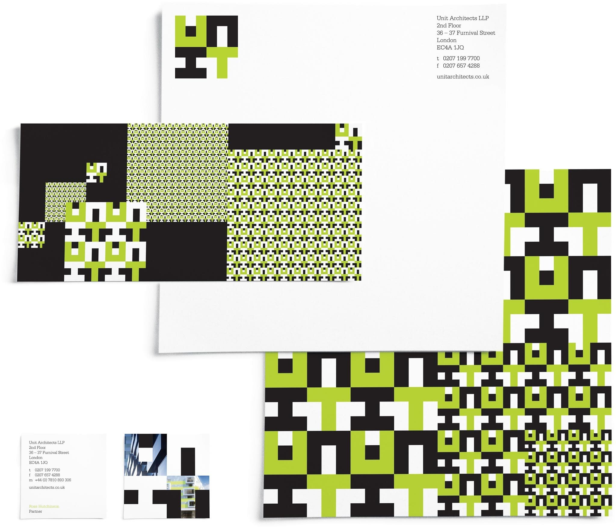
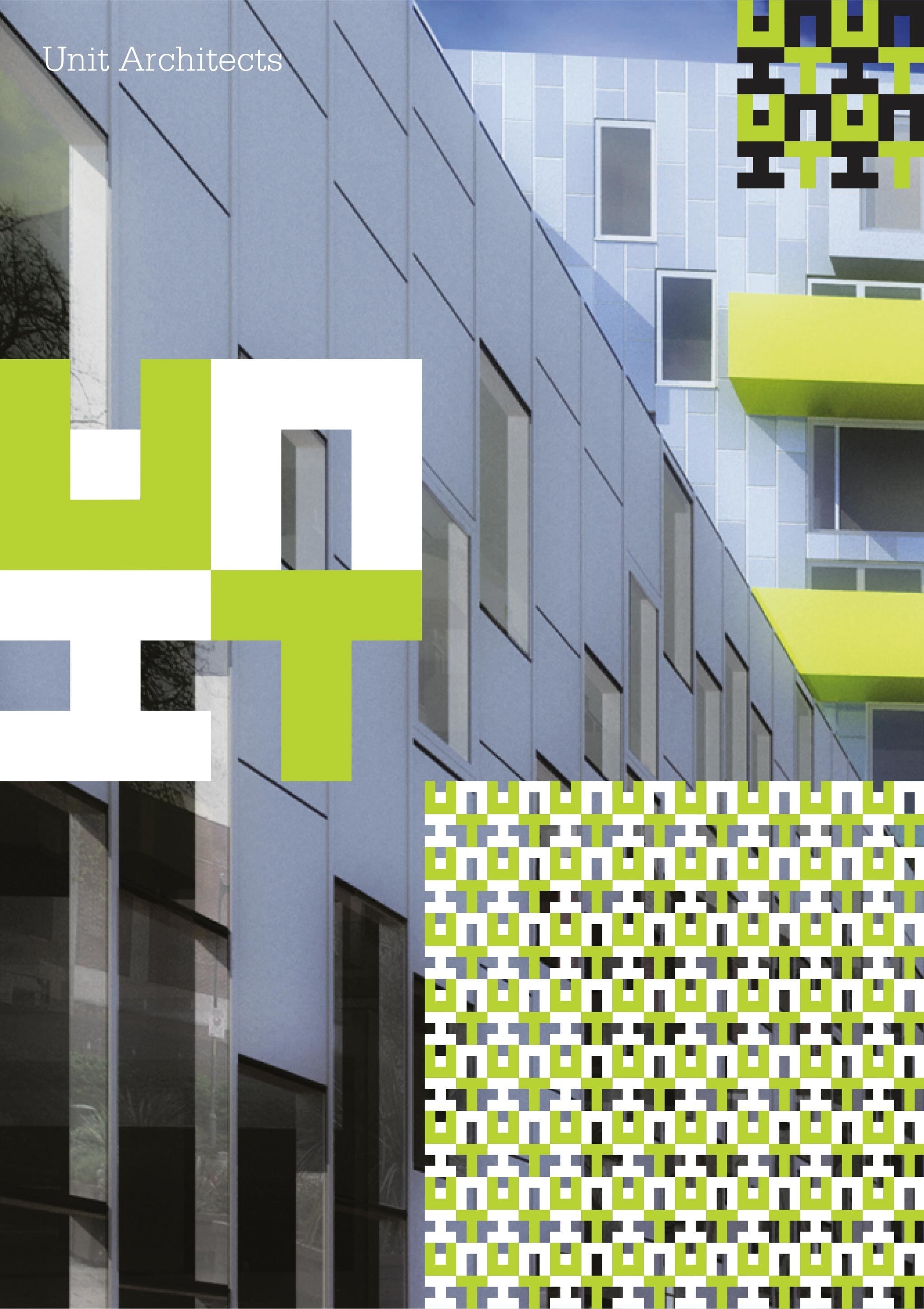
From the earliest presentations, we began exploring how the design could tile and tessellate into repeat patterns, and on the reverse of stationery. Business cards picked up on the square shape of the mark, and we could fill type with images of completed schemes.


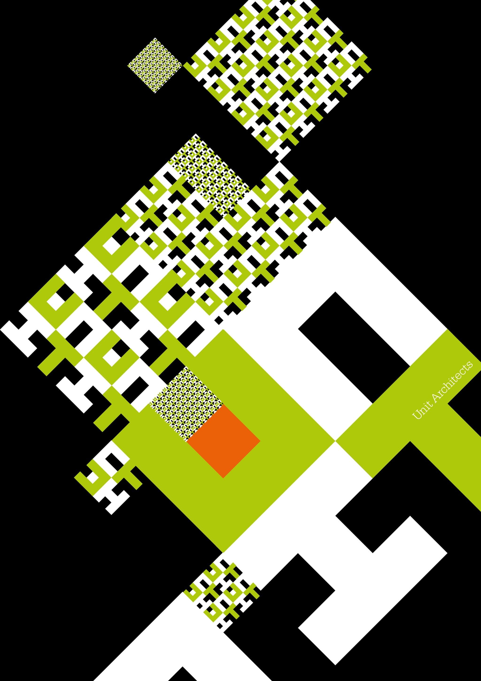
We then moved on to posters and report covers, and the design principles were extrapolated out into headline typefaces and lettering. In addition, we supplied a toolkit of images and illustrations for use within documents, some exploring the use of 45 degree angles.