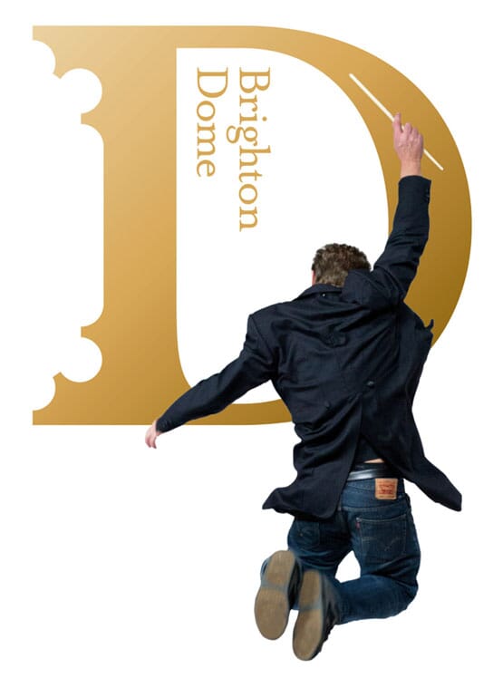
For the last 15 months we’ve been working on a complete re-design of the Brighton Dome and Brighton Festival brands.
Each entity faced particular issues unique to them. The Dome is a vast site on the Royal Pavilion estate that has always struggled to clearly identify itself, even to the local arts community. Each of its constituent parts and multiple venues tended to act independently of each other across 11 months of yearly programming. And it had no cohesive identity capable of dealing with a huge range of genres - anything from visiting hip hop artists to classical orchestras.
Brighton Festival, as a contrast, lasts for just 3 weeks, but is a vibrant smorgasbord veering from modern circus to cutting edge performance art, comedy, music, theatre and dance.

Our task was to give each a distinct, yet related identity – celebrate their differences yet hint at collaboration and crossover.
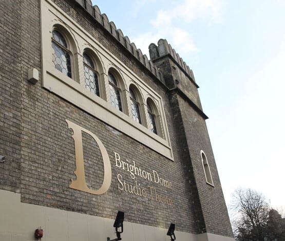
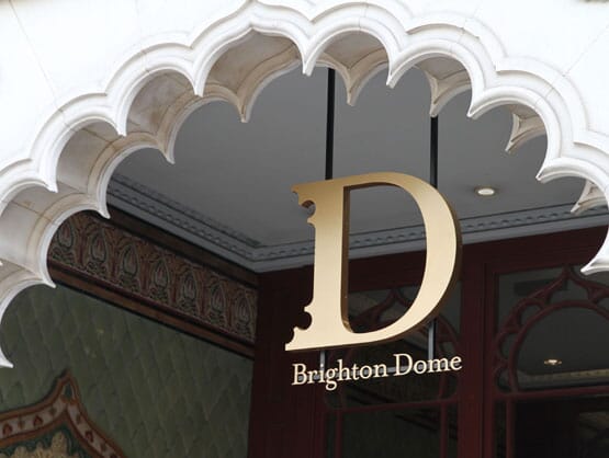
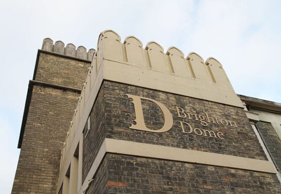
We began with the Dome itself, and took its extraordinary architecture as our starting point. From the entrances to the main building, and the concert hall’s ceiling itself, extravagant Regency era ‘scallopped’ shapes are a major feature. At first sight, the ‘D’ for the Dome is a simple seriffed design, then you realise that the architect’s (William Porden, 1804-8) careful curves are echoed in the outside serifs.
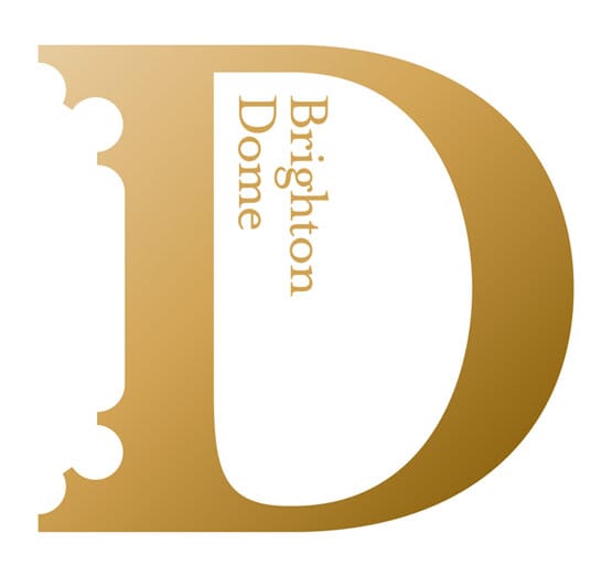
The big ‘D’ is then used within all materials, on walls and signage throughout the site, as shown here.
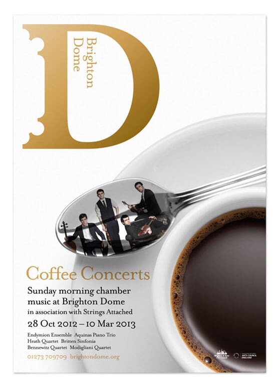
The palette is restrained – black, gold and white – allowing performers and productions to shine and dominate.
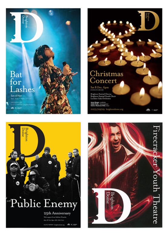
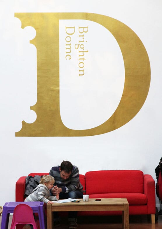
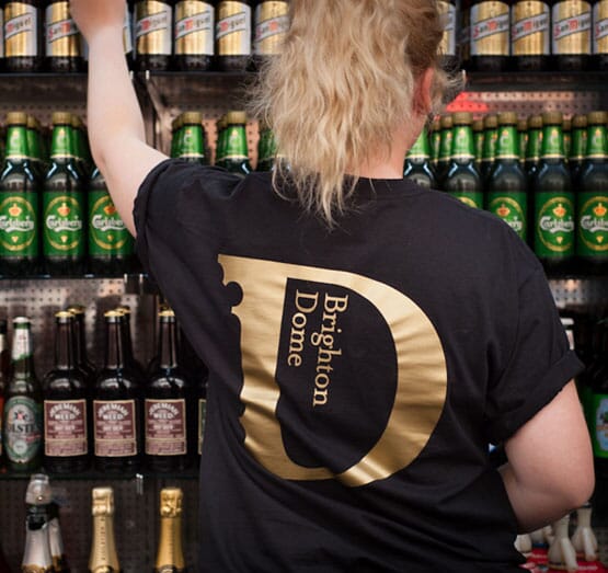
Any confusion about ‘which bit was part of the Dome’ is cleared up with a new and clarified structure – everything is now preceded by Brighton Dome.
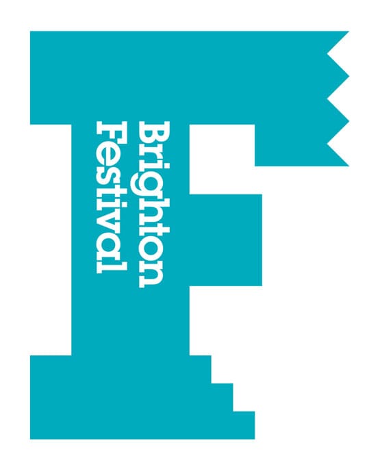
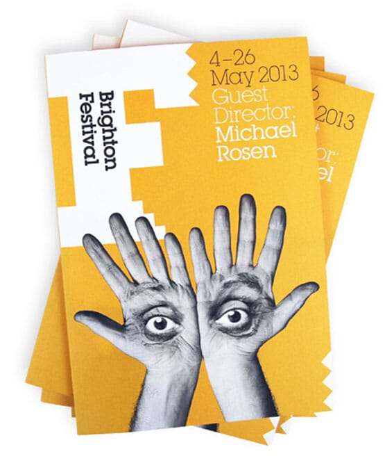
For the Festival, echoing the 'D', we’ve used a big ‘F’.
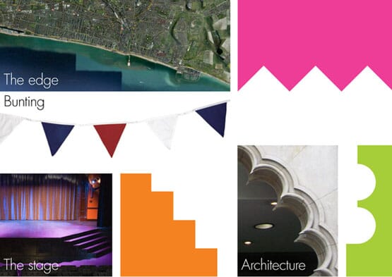
But this time the serifs of the bold, almost brutal letterform symbolise different aspects: the steps up to the stage, the idea of a festival in a ‘city on the edge’, whilst retaining links back to the ‘D’s curves.
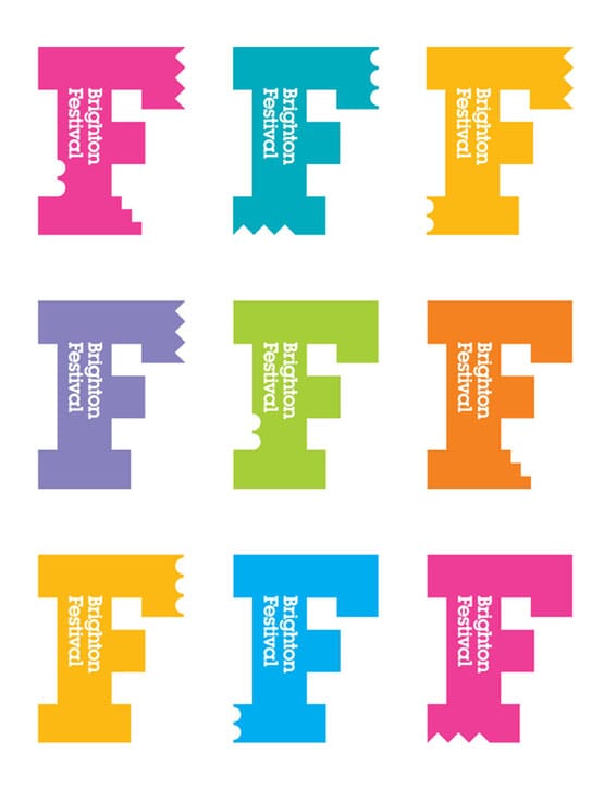
There are many variants on the theme, and multiple colourways.
For this year’s festival, launched last night, we’ve taken guest director Michael Rosen’s hands and eyes to create a homage to one of his favourite periods, the Bauhaus (specifically Herbert Bayer’s The Lonely Metropolitan).
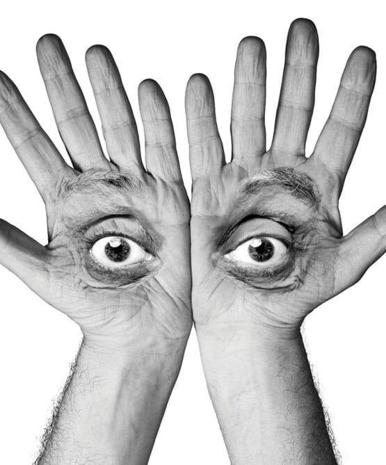
The image also echoes an open book and the sensory experience of the festival itself.
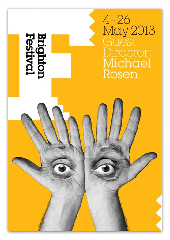
Here are a few early applications, and images from last night’s launch.
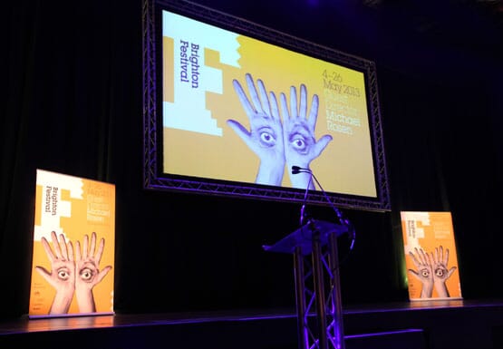
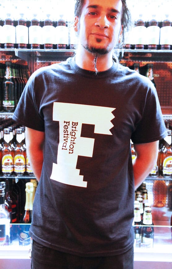
We’re also putting the finishing touches to a complete signage scheme, (which will probably be the subject of another post)...
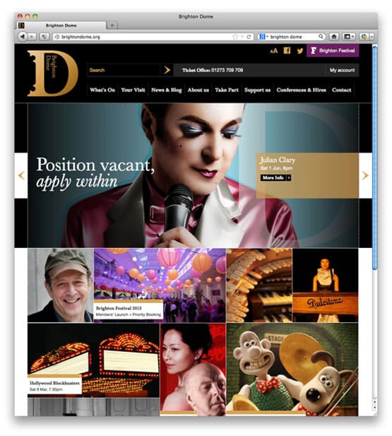
...and both the Dome and Festival websites are now up and running.
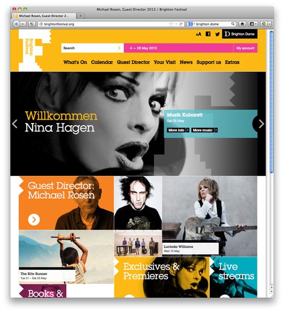
Just occasionally, the two brands appear together...
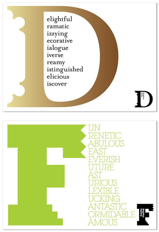
...and we’re hoping, that in time, the ‘D’ and the ‘F’ will take on a life of their own.
Project credits:
Design: johnson banks Designers: Michael Johnson, Julia Woollams Photography (Rosen hand/eyes): Philip Gatward Signage consultant: Whybrow Signing Consultants Website implementation: They.Create Reference to Herbert Bayer kindly sanctioned by DACS
Thanks to Andrew, Catherine, Carole, Maxine, Georgina, Louise at the Brighton Dome | Brighton Festival project team for seeing this through with us, and to Polly Toynbee and the BDBF board.
Follow johnson banks on twitter @johnsonbanks, on Facebook, on Wikipedia or sign-up for our up-and-coming newsletter here