Slightly out of the blue, we've just done a project for an old client, Parc de La Villette, in Paris. Digging out the logos and finding the right typefaces reminded us that working within the rules we'd set down was still really interesting. We also began to wonder if the scheme itself was, in some respects, ahead of its time.
We were originally approached in the late nineties: whilst they had a good 'name' in Paris, their housestyle had imploded. The park itself is a vast area offering exhibitions, museums and concert halls, with a unique architectural style, and famous and varied gardens. But its most famous constituent part (the CitΓ© des Sciences, Paris's equivalent of London's Science Museum) was taking all the attention.
Whilst Grapus' original identity (from 1982) had worked well to help launch the park as whole, the identity's rules had left the park with just a green triangle, which they had tried to turn into their property, but to no avail. They were left with a sort of identity bouillabaise, where sponsors logos were just as likely to have prominence, a kind of reverse gestalt (the sum of the parts being less than the whole).
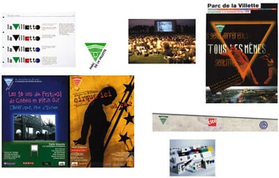
We travelled back from the briefing frantically drawing ideas that would enable the park to 'own' all the myriad activities they put on. This has of course become the classic cultural identity brief, to promote the mothership whilst letting the identities of each circus, play or concert still play on.
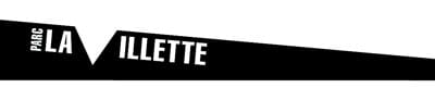
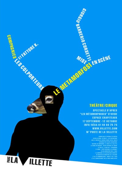
Our first thoughts involved brackets, but the Bibliotheque de France had just started using those. Our next ideas were a bit like rather stale versions of classic Vignelli 'bar' schemes, but then when we put the 'bar' on an angle and let it appear on any edge, we started to get somewhere. We turned the triangle into a 'nick' that punctured the bar and became the 'V' of Villette. We suggested the restricted use of just one typeface.
The ideas went down well, and the client asked us to 'do a few posters', a relationship that at one point meant 30 projects a year, and still continues now.
Our early applications concentrated on establishing the idea in Parisian commuters' minds, and gave us the chance to see if the toolbox of design devices we'd developed would work.
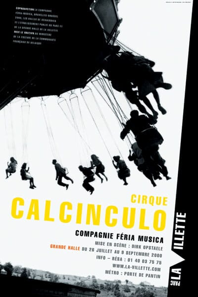
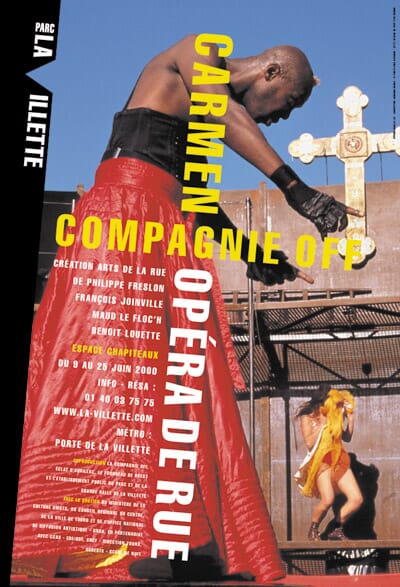
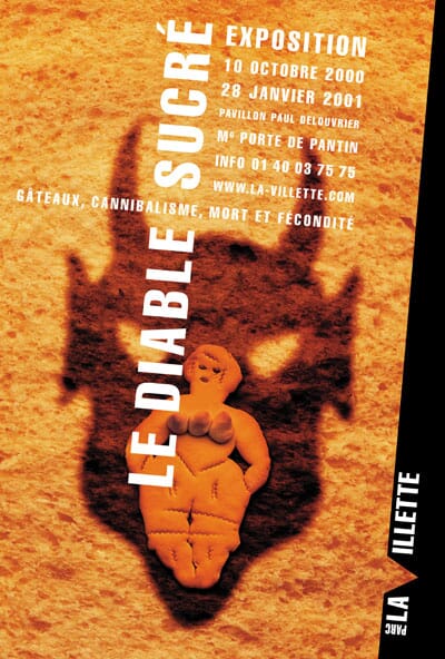
Early on we discovered that when we had the opportunity to influence the poster imagery, there was something about our French client that appreciated slightly odd, quite surreal ideas. This early poster from 2000 was for an exhibition on cakes, cannibalism, death and fertility (obviously). Our brief? 'You could explore the idea of the devil if you want. But please make sure you use the triple breasted cake woman'.
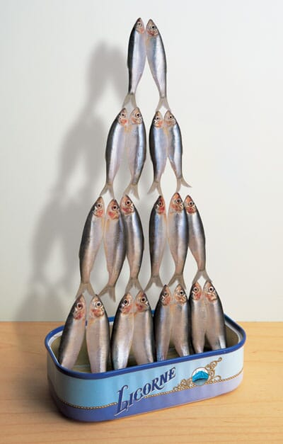
From then on, the gate was open. We've always liked these acrobatic sardines, for the circus troupe Licorne...
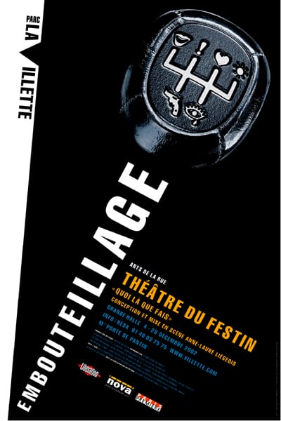
...and this gearstick of emotions for a play about a traffic jam.
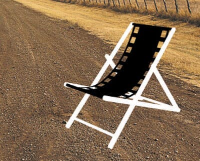
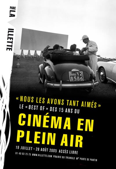
From an early period our client gave us the freedom to explore that we still sometimes miss in our English clients. Rather than criticise our lack of moving image experience, they simply asked us to get on with it. Our first attempts were pretty awful, in retrospect, but this identity for their famous outdoor film festival still stands up.
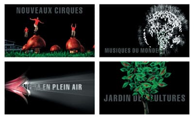
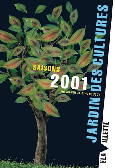
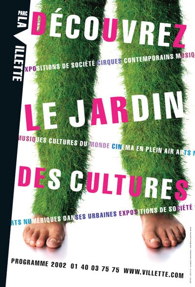
A few years later, with slightly more budget, we pulled the stops out on this 30 second cinema commercial, based on a revised positioning that had been developed for the park as a 'garden of culture' (jardin des cultures). Sounds much better in French, doesn't it?
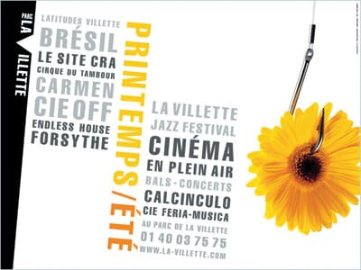
Meanwhile the scheme itself was expanding - four years ago we turned the bar into sky to show that this was was a La Villett-Γ©tΓ©
(a Villette-summer). Using the identity as a container in this way (an idea that seems to have become popular more recently) seemed to allow us to make that summer's posters more dramatic than before.
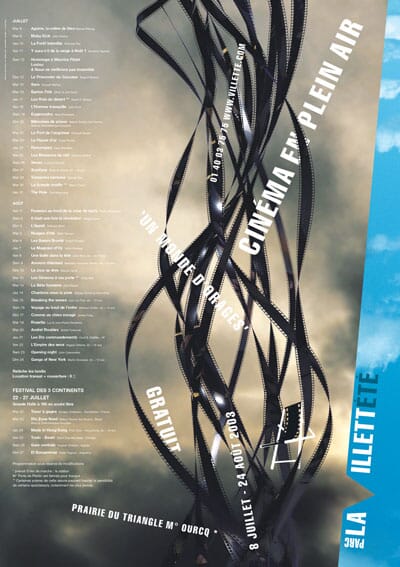
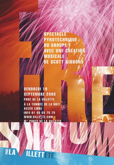
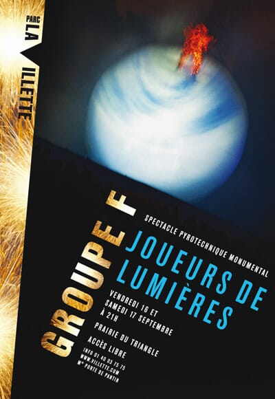
We used the container idea again for another Groupe F poster a year later.
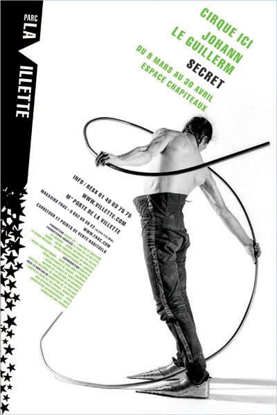
For another year, we developed a series of bars that began solid and then developed into different symbols, whether they be words, hearts, stars, ink-splats, you name it. Rather than undermine the idea it seemed to give it added emphasis, and let us choose a logo that suited the communication.

Here are some more examples.
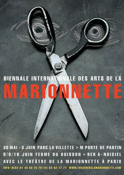
When we were asked to develop ideas for a marionette biennale that would be held in multiple locations (and hence not use the bar) we simply retained the typography - this still gave the posters a 'La Villette' feel, a kind of branding by stealth. The scissor face happened by accident and nearly didn't get accepted until we suggested that it 'cut the strings of traditional puppetry' (and then it sailed through).
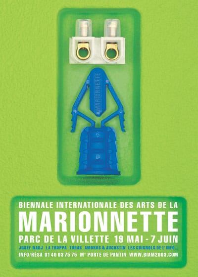
Then we had to find ways to emulate it in subsequent years: in 2003 inspiration came from a humble tool box.
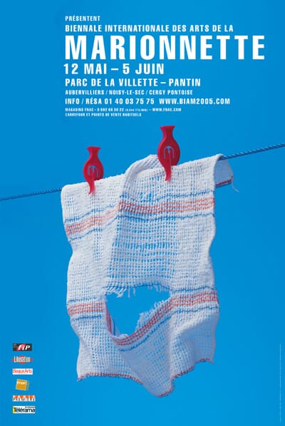
2005's poster was inspired by laundry.
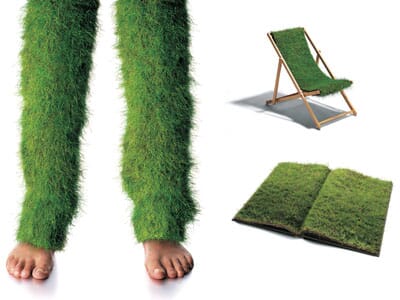
One year, our concept for the year's events involved bringing the park's grass off the ground and onto symbols of the different events. Looks great, but was incredibly tricky to do.
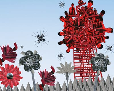
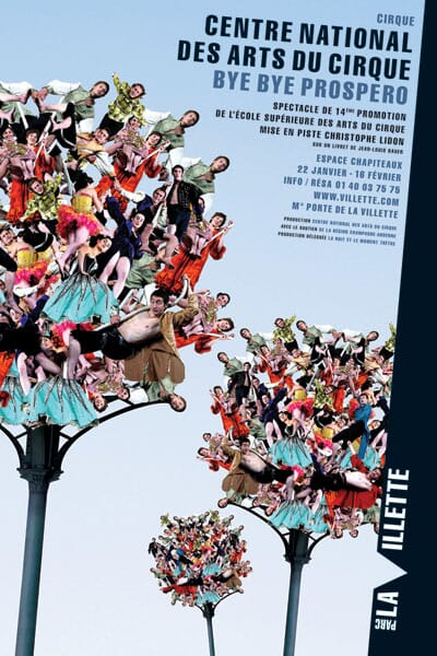
For another year, we used the events held in the park to construct a kind of mechanical garden.
All the time were finding more ways to experiment with the typographic and visual rules we'd laid down.
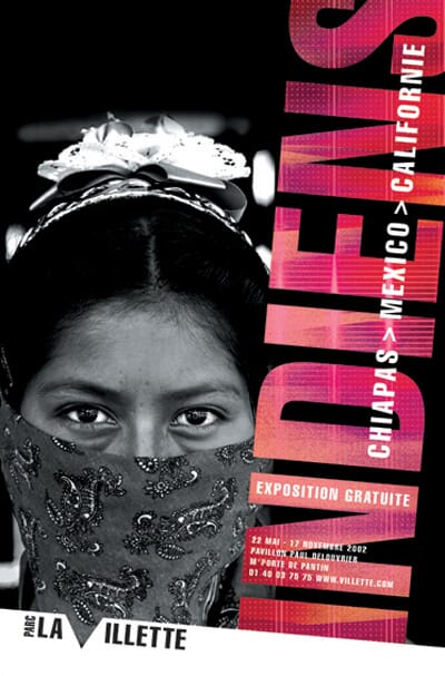
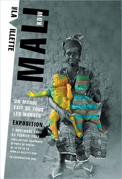
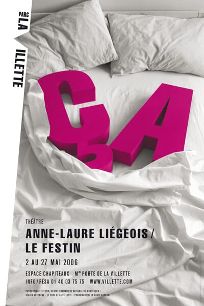
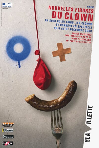
 Which brings us back to TAOUB, the Moroccan dancing troupe whose poster we've just finished. Their acrobatic tour de force fuses traditional and modern dance and involves a huge carpet, 12 acrobats and one big piece of fabric. If you're in Paris this winter, it's supposed to be great.
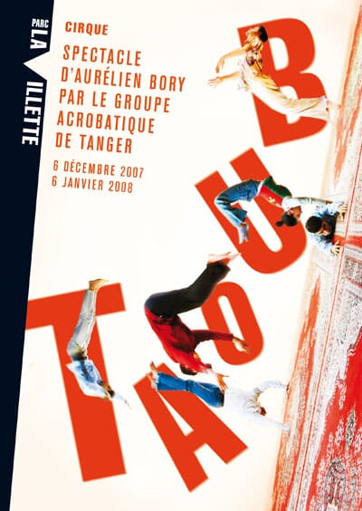
When we talk about this project, probably our longest running cultural identity scheme, we tend to talk about the design elements as a kind of 'frame' into which the events can fall. At other points we'll point out that by owning an edge of any piece of communication, it then leaves the rest of the poster for the subject itself.
It's true that working in this asymmetric, five degrees off-centre way is a challenge, but it seemed right for this project, for a client keen to be seen as dΓ©calΓ© (which loosely translates as sticking out, being edgy). Just that five degree shift also, somehow, makes the scheme feel much more French, somehow.
The challenge will be to make the scheme stick out for another decade. We hope it will.
Postscript: only months after writing this, the relationship with La Villette finished. Shame.