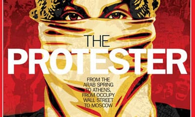
In a year of riots, uprisings, famous deaths, that wedding, phone hacking revelations and a double-dip recession in everything but name, it seems a bit superfluous to sit down and write a normal review of the year, from a design and communications perspective. Staying in business or keeping/getting a job has been most people’s main aim of the year rather than pushing the envelope. So this year’s review is a bit less celebratory and a bit more grounded than normal.
You could argue that designers and technologists were instrumental in many of the key moments of the year. Twitter and BBM fuelled riots and uprisings, then helped reconvene troops for the next wave. Lulzsec hacked their way into the history books. Smartphones recorded Gaddafi’s last hours whilst headsets equipped with live-streaming video let Obama and his generals observe Bin Laden’s downfall from the safety of their White House sofas.

But the technology was just the delivery mechanism: we watched the tsunami in Japan unfold in real time on our computer screens then tracked the quake on blogs. (Sadly, all that some designers seemed to be able to do was design posters to mark the event - the increasingly common phenomenon of ‘Disaster = Poster’).
Thankfully Mark Dytham’s wonderful Pecha Kucha network was able to immediately respond with its series of Japan themed events and plans for a ‘one-year after’ PK in London remain (hopefully) on the table.
Someone, somewhere designed the amazing cathedral-like space that is the Hadron Collider, and we’re all cramming frantically about Higgs Bosons whilst also worrying that Einstein might have been wrong about neutrinos and the speed of light (obviously). But it’s what the collider hints at and discovers that amazes and astounds, not its uncelebrated architect. Amazingly, our other favourite cathedral of last year, Thomas Heatherwick’s celebration of all things seed-like, was passed over by many design juries (more of that later).
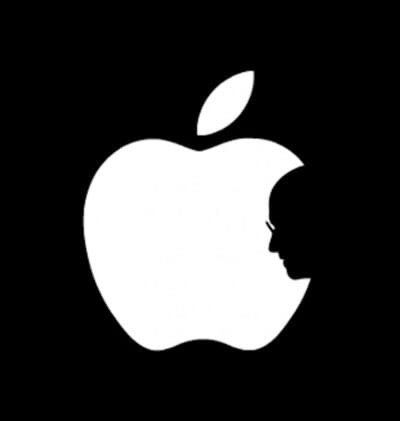
Of course a million column inches (and one of the images of the year, above) have been devoted to Steve Jobs’ passing – his death was a seminal moment and leaves a gaping hole in that category marked ‘worldwide chief executives who we really look up to and admire’.

It raises interesting questions for the newly knighted Jonathan Ive – perhaps we will now begin to see Apple break away from it’s Braun-inspired design roots and show us what he wanted to try all along.
Unfortunately timed quote of the year has to go to Ken Grange who, when interviewed earlier in the year as part of his own excellent career retrospective at the Design Museum, suggested that ‘they're a bit up their own arse, to be honest. Their things are overdesigned’. Grange may be even grumpier still when he considers that Ive is now newly knighted for designing beautiful objects in California, rather than the portfolio of functional/useful objects that Grange can offer.
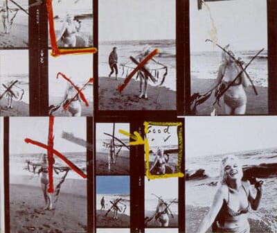
All the rioting, hacking and hoo-hah rather took away from the passing of one of our favourite polymaths and artists, Richard Hamilton, beautifully remembered in this piece by Rick Poynor. Hamilton’s influence, we would argue, has yet to be truly tracked and celebrated - perhaps his passing will finally inspire someone to curate what would be an amazing show of his work and influences across both art and design.

The year’s doom and gloom is echoed by the best TV of the year: the continued mystery of how anyone can make that jumper look that good (The Killing, of course, from Denmark) and the magnetically disturbing family drama The Slap (from Australia). If you missed them both, it’s box-set time in the sales. Hypnotic, geeky, and with a slightly grating voiceover, yes, but The Story of Film, an Odyssey has us entranced as we continue to work though all 15 episodes. Strangely forgotten in other people’s thoughts seems to be The Hours – great British drama set in the slightly forgotten era of late-fifties Britain and the Suez crisis.
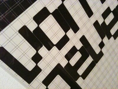
The most talked about exhibitions of the year? Top has to be the Leonardo at the National Gallery in London, but close was Talk to Me at MoMA. The V&A once again pulled off a couple of crackers with The Power of Making and their much-discussed and post-rationalised show on Postmodernism. Earlier in the year, graphic designers got to get all griddy at the Wim Crouwel show at the Design Museum, another great retrospective.
It seemed to be the year when logos were discussed constantly, perhaps to time with what seemed like weekly releases of collections of logo compilations in the world’s creative bookstores. Here's Creative Review’s first round-up of ‘The Best’ (as compiled from many different sources, including ours).
In terms of brand of the year, it seems to be fashionable in a kind of ‘no-logo’-esque way to discuss the Occupy movement – and yes it seems to have become a prefix brand that can become whatever it wants (Occupy London, Occupy Wall Street, Occupy My Front Room etc). And now it even has a designer logo to boot, courtesy of Jonathan Barnbrook.

The truth is, it’s pretty hard to pinpoint breakthrough identity projects for 2011, apart from perhaps several education projects that continued to push the definition of flexible identity along (for Design Academy Eindhoven, MIT and OCAD).
There’s no doubting the most controversial of the year – a rebrand for Eurostar that seemed to polarise the design community, and a ‘will-they-won’t-they?’ project for HP that never made it into the public domain for more than 36 hours.
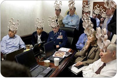
Picture of the year? So many to choose from but let’s try and lighten the mood a little with Obama, Hilary et al wearing Beatrice’s famous fashion faux-pas.
If you sit and think about movies of the year, the best came early (King’s Speech, Black Swan). The breakthrough film of the year proved that girl-ettes in the cinema were actually viable, with Bridesmaids. Most polarising movies of the year: We need to talk about Kevin and of course, The Tree of Life. If you stayed the course, it was worth it, honestly. Maybe have two triple expressos and watch the DVD.
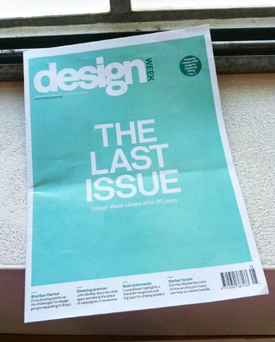
In publishing terms, following on from the demise a year before of ID magazine in the USA, British trade mag Design Week was axed. Whilst some of its content may have irritated regular readers, it was the world’s only weekly Design magazine and hence deserved its status as the ‘voice’ of the industry. Its demise leaves just its sister publication (Creative Review) to track communications in general in print and online.
DW's website is reinventing itself as ‘design news’, but as for where you can go for pithy, considered design writing other than Eye, and occasionally Design Observer? It’s a little bleak. Since writing over 400 words on any blog is asking for trouble (this is word number 1,139 of over 2,000 and many of you will have linked out by now) the answer is that original, objective design writing is getting harder and harder to find.
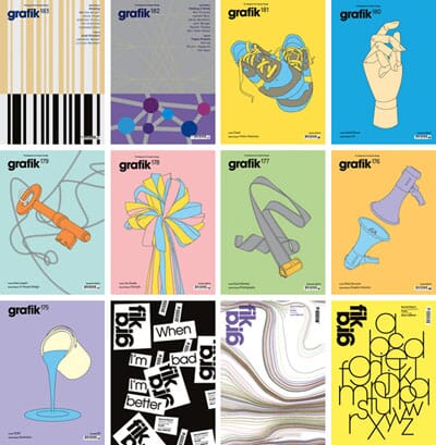
Grafik magazine closed, then relaunched, then closed again, prompting more discussion about the role of design criticism, the unfortunate topic of the last shelved edition. ‘Design criticism – yes/no’ has bubbled under all year (see here and here). Whilst it may have sometimes ebbed and flowed, Matt Judge’s design blog Design Assembly sadly closed its CMS after three years, marked by a ‘best-of’ publication.
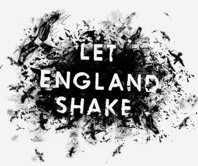
Back to easy and more familiar musical territory, PJ Harvey stormed the musical barricades again with this year’s album that certainly got hammered at johnson banks towers (although at least one of us thinks it sounds like a wailing banshee attempting to sound like The Unthanks whilst attacking an autoharp). Our other ‘most-played’ albums of the year have to be James Blake, more falsetto wailing from Wild Beasts, Sbtrkt, the Kings of Limbs remix album and Bon Iver’s 2011 offering, apart from the last track which sounds suspiciously like Phil Collins.
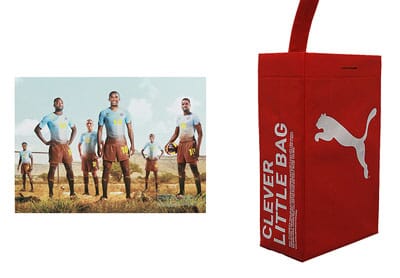
Design Group of the year? Well, we think that accolade should go to GBH in Chiswick in London for brilliantly winning three (count them) yellow pencils at D&AD for various Puma projects, and very well deserved they were. If time permitted it would be interesting to get the annuals down and see how many eons it is since a design company other than Apple won three yellow pencils in the same year?
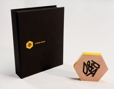
The obligatory D&AD hoo-hah of the year has to be their decision to publicise running shortlists of work that was still to be edited and removed, swiftly described by Creative Review as ‘the shortlist where nobody wins’. Ex-president Mike Dempsey also caused a bit of a stir later in the year when he queried the sense of sending out ‘slices’ of pencils to commemorate ‘in-book’ projects, amongst other things.
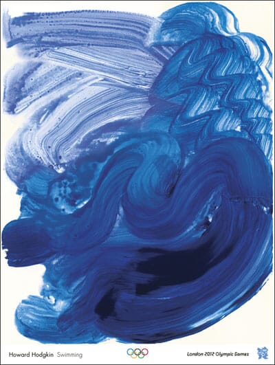
The equally obligatory Olympic debate has to be the release of its ‘artist’ posters that seemed to annoy everyone (although the swimming one is great). Kingston University promptly followed up with a nice set from just one year at one course in one university which made us all wonder what could have happened to this brief had designers been involved.
Our Favourite Opera of the year? Had to be The Damnation of Faust (and we can’t wait for the 2012 performance of John Adams’ The Death of Klinghoffer. Gig of the year? A toss-up between the Penguin Café Orchestra/Portico Quartet at the Barbican and Andy McKee at Union Chapel (but that’s a pretty subjective list, it’s fair to say).
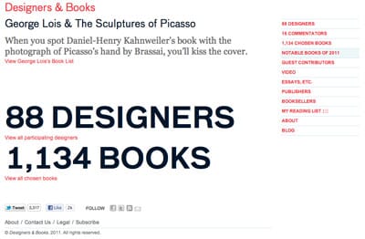
The most interesting website of the year helps us deal with two categories at once, since Designers and Books.com also has a great list of the finest design books of 2011 which saves us from having to compile it (we’d go for the Saul Bass tome if we had to vote for just one). Fiction-wise we’re (slightly predictably) going for the excellent recent Murakami, IQ84.
Mention in website dispatches has to also go to Gurafiku, dedicated to Japanese graphic design, and Clients from Hell continues to delight. From the twittersphere, there’s so much going on at any one time it’s tough to single out any one feed but you’ve got to admire the way Adrian Shaughnessy (@AJWShaughnessy) cranks out those thoughts and links, very impressive. Mention must go to Jamie Wieck, he of 50 things fame who managed to produce something genuinely useful across multiple platforms. (Here’s to the top 100 Jamie…)
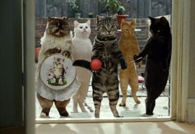
Ad campaign of the year? We’re going to give it to Cravendale’s Cats with thumbs, and en passant give a little nod of respect to W+K London’s Neil Christie for writing one of the most, if THE most, honest appraisals of an agency year, ever.
We also loved this Converse Wall from Perfect Fools...
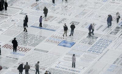
The design project of the year we wished we’d done: has to be the Why Not’s comedy carpet in Blackpool. Awesome.
Our list of challenges in 2012?
Thinking of ways to get computer science taken seriously again in British schools (not just reserved for spotty geeks). Also in schools: what’s to be done about the threat to take DT out of the core curriculum?
Here’s a nice big issue: making design relevant as a creative business tool, not just the bit ring-fenced for prettification and decoration. Related to this, we’re watching and hoping that the Design Council is going to roll up its sleeves and get stuck in this year.
Here’s another thought – is it just us or has design become something that’s only mentioned when something goes wrong (as in ‘the design of the airplane’s wing was at fault’ or the ‘design of RIM’s European server was to blame for loss of BBM for three days?’). Clearly the fact that businessmen and teenage girls were a bit put out for a few days is actually quietly funny, but Design = something invisible = something you take to task is a worrying trend.
We’re hoping for some actual great design for the Olympics (more than just these) – let’s face it things have been pretty thin on the ground so far. Perhaps the actual event itself will be a blast and no-one will care about the graphics anymore? Perhaps.
We’re watching out for the much discussed next phase of Twitter, to easily include images (so, we guess, functioning a little like China’s Weibo?) and wondering if true micro-blogging will further hasten the demise of macro-blogging?

To end, #1, the weirdest mash-up of music and design this year was this ‘city as score’ from the ever-readable City of Sound.
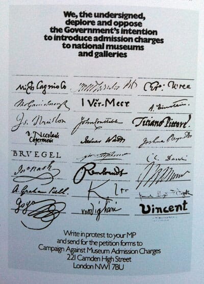
To end, #2, finally proof that design can influence at the highest levels – one time Labour minister Chris Smith who abolished museum charges reveals he was inspired by a 40-year-old poster. (via Mr Asbury).
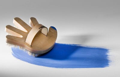
To end, #3, this is our loveliest example of ‘that is truly great but we’re not really sure why’ of the year, via DesignBoom.
Thank you for following Thought for the Week as it enters its seventh year of publishing.
Here’s to a happier, more prosperous, more employable New Year for all. Fingers crossed. We will follow soon with our own set of Designer resolutions – in the meantime these are a pretty good start.
Let us know what we forgot, or what you think, as ever on Twitter @johnsonbanks.