We’ve spent the last two years working on our largest project yet in Japan, a space observatory a short bullet train ride out of Tokyo in the city of Sendai.
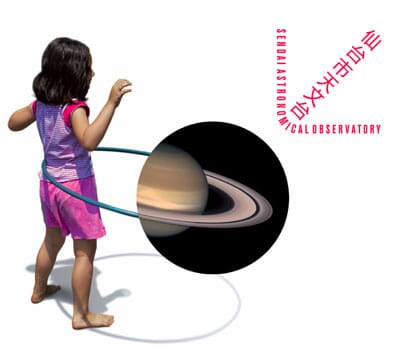
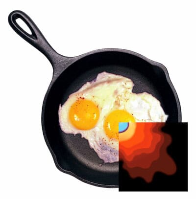
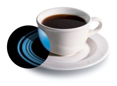
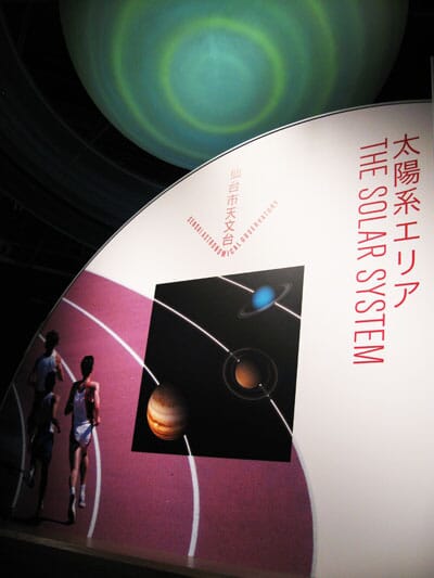
Our identity for the observatory is based around the notion of ‘bringing the cosmos down to earth’, by combining space images with everyday things to illustrate and explain aspects of the cosmos and astronomy.
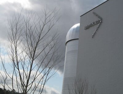
We then combine these images with an arrow shaped device formed from the Japanese for ‘Sendai City Astronomical Observatory’ (仙台市天文台) and it’s English-language translation.
Here are a few examples of the image pairings: this compares a double star cluster to the way eggs can merge in a frying pan.
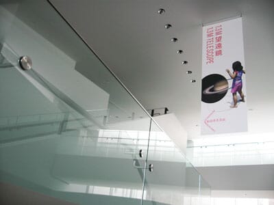
This image compares the rings around Uranus and with a cup and saucer (and the image at the top of this post compares a little girl’s hula-hoop with Saturn and its rings).
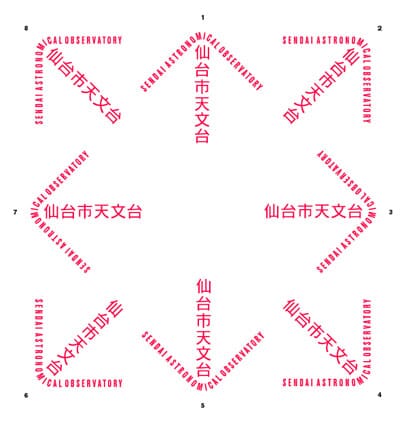
The logo itself comes in nine different angles.
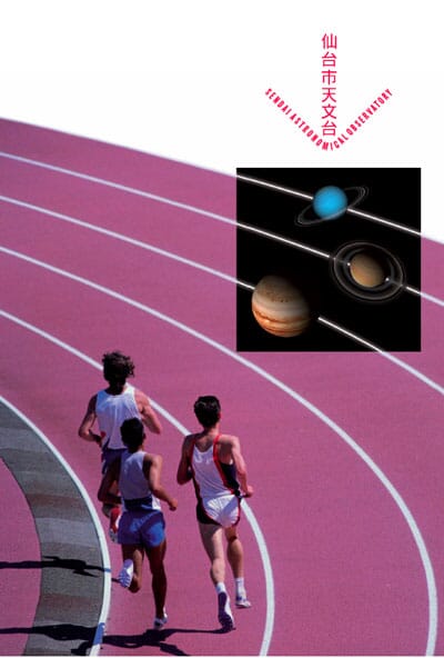
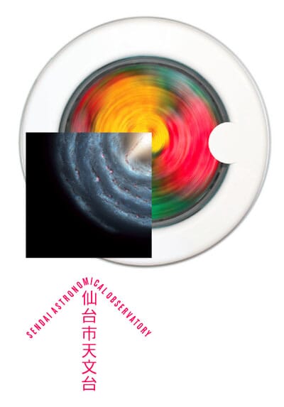
This is how the logo interacts with examples - firstly to illustrate orbiting runners around a track, secondly likening the swirling of the Milky Way to the motion of a washing machine.
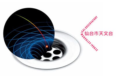
This example compares the behaviour of a black hole to a plug-hole.
Here the crust and core of a planet is likened to an ice-cream.
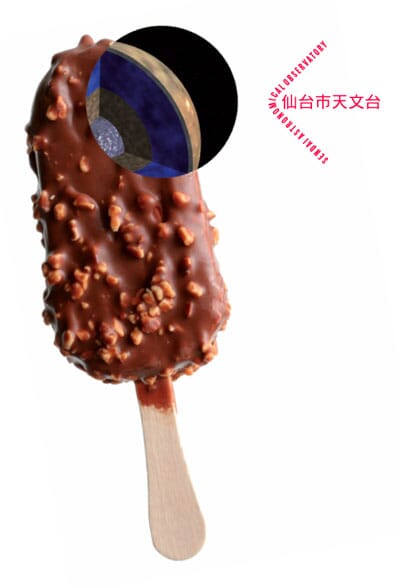
There are fifteen image pairings in total, the intention being that the observatory can pick and choose from this palette to explain concepts within the building, or use them on everything from bags and banners to vehicles.
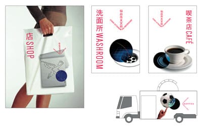
On a recent visit to the site, we recorded some of the applications of the new identity so far.
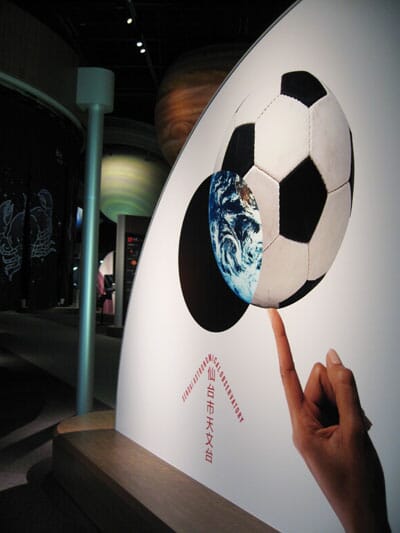
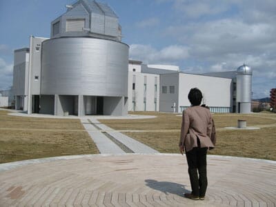
From the outside the observatory looks like this.
We suspect the idea for this came from the initial research we did into astronomy - the most useful books for us were children’s introductions to space. We seemed to be drawn towards a solution that explained space first and foremost to children and families (one of the key audiences for the new building).
Presenting this project in Japan has also forced us to learn a particularly specialised vocabulary - for example, the Japanese for hula-hoop is fura fu-pu. A double star cluster is a nijyuseidan. If we were feeling especially brave we would sum up the scheme as ‘Uchuu o chijou ni motte kita’ (宇宙 を 地上 に 持って 来た) which roughly translates as ‘cosmos brought down to earth’.
Johnson banks was appointed in 2006 by Japanese exhibition design group Total Media Development Institute, which created the observatory’s interpretation and exhibition space. The building was designed by architect NTT-F Co, a division of the Japanese technology giant NTT Group.
The Observatory will open to the public in early July.