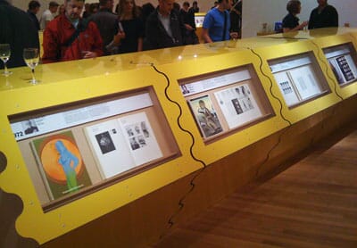
When D&AD rang and explained their idea for a little exhibition to celebrate 45 years of D&AD, our first reaction was ‘well, that's going to look awful’.
The idea was to have two copies of each annual in a case, and ask the president from each year to write about their favourite project of the year with one of the annuals open at that page.
As it turns out we were completely wrong and it’s actually a fascinating run through four and half decades of advertising and design. We’ve reproduced a few of them below, with their captions, but it’s definitely worth going to see it for yourselves.

Larry Barker 2000
I wasn’t going to pick this.
I was going to be a bit more ‘street’ - see if there wasn’t something we’d all forgotten in the ‘Interactive’ section.
Possibly something obscure from ‘Packaging’.
But this isn’t about the obscure and forgettable, is it?
I remember ‘Surfer’.
I remember when it arrived, hot from the editors.
I remember the unholy scramble to get a look.
I remember how long it took to get my jaw off the floor.
How the soundtrack made your speakers rattle.
The astonishing casting.
I remember the ungracious pooh-pooh-ing it received from some quarters.
Mainly from people who couldn’t hope to do anything half as good.
I also remember the story about the account man who said,
‘Do we really need the horses?’
So, here’s to talent, here’s to bravura, here’s to sheer bloody-mindedness. Here’s to waiting.
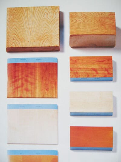
Mike Dempsey 1997
A decade or so is just about the right time to reassess work. One can see it in the context of the period and the prevailing influences. For me Mark Farrow’s music packaging for Deconstruction stands up beautifully. I haven’t got a clue as to what is behind the idea, but the design is a delight to behold.
Martin Lambie-Nairn 1991
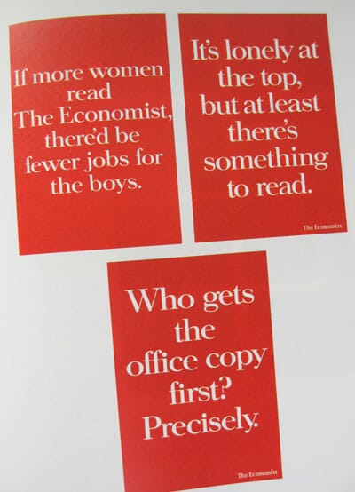
The first twenty five percent of the 1991 annual features page after page of red rectangles surrounding white type. Having said just that, I expect you’ve already guessed which campaign I am referring to. Yep, The Economist.
1991 seems to have been the year when this wonderfully elegant and powerful campaign swept the board, and rightly so. Not only that, but seventeen years later the same format continues to entertain, inspire and no doubt sell countless copies of The Economist.
This one campaign has had more influence on me, and the way I try to solve design problems, than any other piece of work. For me it contains all the virtues of great design and advertising; one simple idea continually refreshed and expressed in dozens of ways, consistently holding to the basic idea with dogged confidence, and demonstrating the very highest standard of wit, writing and art direction.
May this campaign run forever.
Allen Thomas 1985
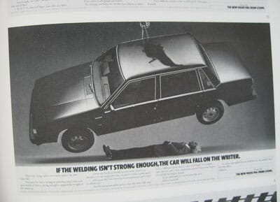
My favourite item in the annual didn’t actually win a prize. It was for Volvo and showed David Abbot lying under a car suspended from on high. The headline read, ‘If the welding isn’t strong enough, the car will fall on the writer’. This was followed by some long copy which was a pleasure to read. It was part of an outstanding campaign which made this somewhat worthy brand almost sexy. No mean feat.
Tony Brignull 1983
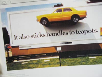
My choice for the outstanding item in the 1983 D&AD annual is easy: it's the one all juries voted for that year, the Araldite poster, ‘It also sticks handles to teapots’. You probably know it as the one where they glued a car to a super site in the Cromwell Road. Some days a man sat nonchalantly reading beneath it. News programmes discussed it. Magazines showed it. People actually went to see it. It rightly won the only Black pencil awarded that year. Its triumph lay not merely in a sudden, phenomenal and dangerous creative leap (will it stay up?) but in the fact that it took demonstration, until then the exclusive property of television, and moved it outdoors. It added a new dimension both physically and aesthetically to a medium, which was considered static and peripheral. In a single stroke it enlivened a brand, the poster industry and all who saw it.
Alan Parker 1976
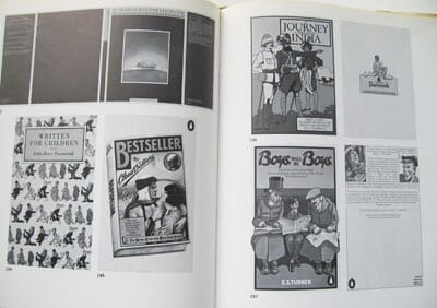
It was pleasantly surprising to revisit the work of over thirty years ago since much in this annual looks modern and has dated little (well, apart from my picture at the front, which makes me look about eleven years of age.) I avoided opening a page at one of my own commercials and avoided even more those of Ridley Scott. I then came upon a spread of work by the late John Gorham. John was one of the great graphic artists of the time, working alone; he was a humble genius whose purist quintessentially English eye and immaculate craftsmanship influenced his peers and a generation of designers that followed.
David Abbott 1975
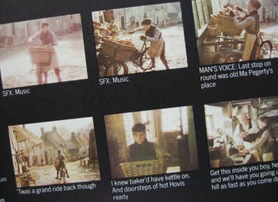
It wasn’t exactly a boom year; the economy was flat and the 1975 annual reflected the general lack of confidence.The Hovis campaign, however, raised our spirits with its beauty and calm assurance. It is still remembered to this day and is included in all those ‘Favourite Ads’compilations. The image of the young lad pushing his bike up the cobbled hill is unforgettable. In the 1975 annual it won a Yellow Pencil for the most outstanding film photography. It should have been a Black.
The Pencil Exhibition (45 years of creativity from the D&AD Annuals) is on until the 23rd September at the Royal College of Art, London