Now this is a challenge. The second in our series of LoGoReDo’s is the BT logo.
In case you missed the first, the idea is to take a current logo that isn't working that well and improve it, without changing it radically. These aren’t real commissions (not yet), just graphic food for thought....
Some history is needed before we start: the current logo evolved from Wolff Olins’ original type + piper combination from 1989. When it was decided to update the logo, the type was retained whilst the piper was dropped, to be replaced by the swirling ‘worlds’ logo which had been developed for BT’s Concert brand (which was phased out in 2001). Technically speaking it was meant to be a ‘C’ (for Concert) but hey, let’s not dwell on that.
Obviously, swirly/globe/world symbols are all the rage at the moment, but it’s our view that the symbol isn’t the problem.
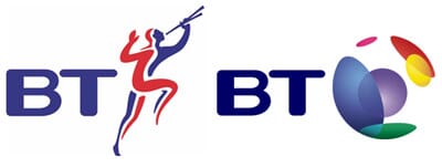
The problem is the type. It looked a bit odd next to the piper, and it looks even odder next to the world/worlds.
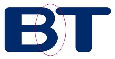
Some of the problem lies with the outside strokes of the B. In almost every typeface that we all read and use, the outside strokes are least as thick as the initial downstroke.
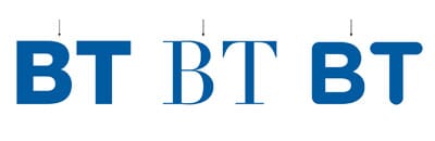
Here are some examples: always thicker on the outside loops, in order to keep the letter balanced. So the BT ‘B’ contravenes most of the rules we’re used to when it comes to type.
The other reason why it looks lopsided is because, er, it is. Perhaps in an attempt to re-balance the type someone made the inside crossbar longer. Weird.
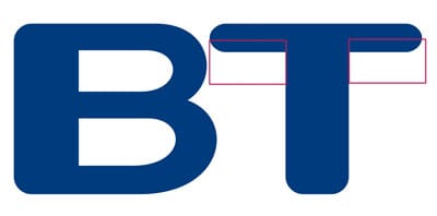
Just by reducing the white space (the counters) in the ‘B’ can help. Trouble is, now the loops of the ‘B’ look badly drawn.
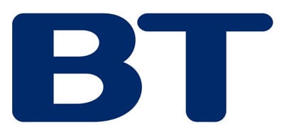
So the logical next step is to redraw it, properly, with constructed curves and all that.
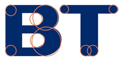
That brings you here, but a bit of typographic trickery is need were the little arrow is - optically that bit looks too thick so you pull that section in a bit and cheat it, optically.
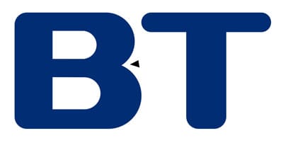
Which gives you this.
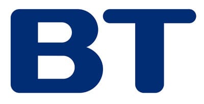
So that’s better. Funnily enough it looks OK on its own, but back in combination with the worlds it still looks heavy (below), even if we lighten the blue a little.
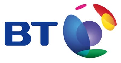
Granted, it's better than where we started (below), but let’s be honest, that’s not difficult. It’s probably what BT should have done when they made the switch, just improved the type whilst introducing the new symbol.
Maybe something more drastic is needed?
What we’ve tried below is to use a slightly expanded, rounded typeface in caps. And we’ve lightened the blue. Looks alright.
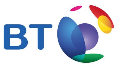
Funnily enough it looks better in red, it seems to balance the red dot on the right hand side of the symbol a little better. It still looks a bit weak somehow. This is harder than we thought.
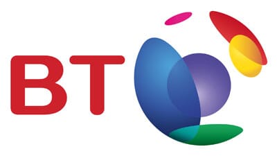
Perhaps something even more drastic? How about curved ends to the type, but asymmetric? Perhaps this will link better with the ellipses in the symbol?
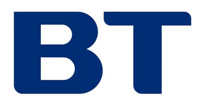
Here we’ve tried the combination, again with a lighter blue.
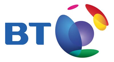
Or in red. Still not sure. Better though, it’s starting to work as a complete ‘mark’ rather than two elements that don’t quite match.
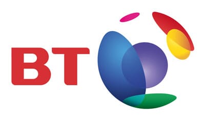
At this point, slightly frustrated, we tried a completely different tack. If ‘bp’ can be determindly lower case, why can’t ‘bt’?
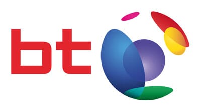
The angular typeface looked great for about half an hour then stopped working, for us. But we liked the lower case and tried some more rounded variants.
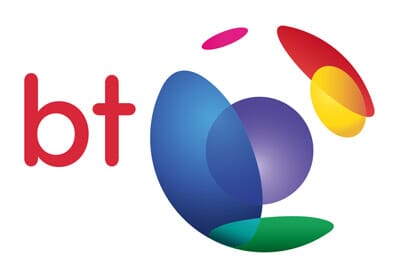
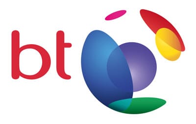
We even wondered what would happen if we let the type be part of the symbol, making it completely self contained?
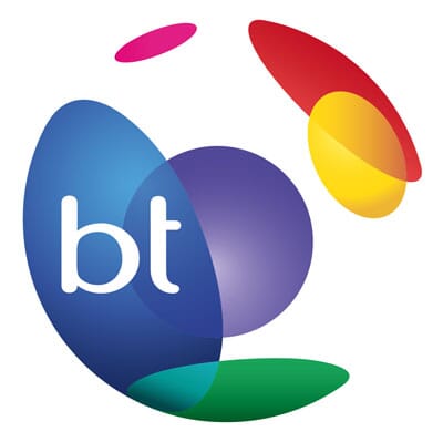
That’s almost nice. We never thought we’d say that about this logo. Just as a memory jogger the original is below.
Conclusion? Well, that was harder than we thought. Have we found a definitive alternative? Not sure. Are any of them better than the original? Well, you decide.
Our first LoGoReDo was the T-Mobile logo. There will be more. We had some hilarious suggestions after the first post; feel free to email info[at]johnsonbanks[dot]co[dot]uk with your nomination of our next victim.