A few weeks ago, Creative Review magazine asked us to nominate a list of our favourite logos. They’ve combined ours with about 20 other lists and come up with a ‘top twenty’ for their new edition. Here follows our top 18, in no particular order.

London Underground Frank Pick/Edward Johnston 1918
Canadian National Railways Alan Fleming 1960
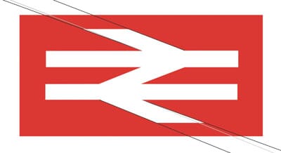
British Rail DRU 1964
We’re surrounded by mass transportation symbols every day of our lives, so it’s no great surprise that these three keep appearing on lists of the ‘greats’ of logo design. London Underground’s, as one of the oldest, didn’t look much like the finalised symbol above for a while. But it’s always involved a blue line through a red circle, which eventually became a key part of the map, and has become ingrained in our collective consciousnesses. Many people might not even ‘think’ about this as a logo, so everyday has it become. It’s without doubt the unofficial symbol of London.
I’ve included these two Railway symbols because they are true trailblazers. Plaudits should really go the CN symbol – the first rail symbol to simply imply travel, rail, linkage and ‘a route’, and highly influential on countless rail symbols worldwide ever since, as well as opening the door for NASA’s ‘worm’ logo a decade later. How much it influenced British Rail’s is open for debate, but there’s no doubt that the DRU design inspired many others too (including the Dutch version in 1967).
One little known fact about the BR symbol is that it looks painfully simple but is actually beautifully drawn: to make the outer arrows work, optically, they are drawn splayed so that they appear parallel…
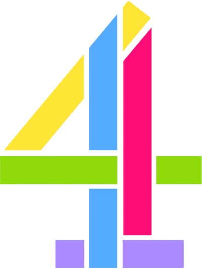
CBS Bill Golden 1951 Channel 4 Robinson Lambie-Nairn 1982
There are many, many candidates for TV idents but these are the two for me. One, the CBS eye, because it has effectively ring-fenced ‘eye’ symbols for its own use (try designing one and you soon stop - it dawns very quickly that Bill Golden’s geometry steals it every time).
Martin Lambie-Nairn’s stencilled 4 may actually have looked merely ‘of its time’ had it just been presented as a multi-coloured block, but from the outset it was a moving, exploding and rebuilding device and they have managed to keep that principle in all its different forms for thirty years (and it still feels up to date). For me it’s a pre-cursor to the flexible, mutable identities that we are interested in now, across all media.
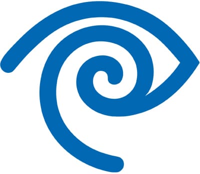
Time Warner Chermayeff + Geismar 1990
A decade later, Steff Geissbuhler’s eye/ear symbol was drawn for the merger of Time and Warner, and although it’s been shunted around the organisation a little, and recently redrawn, it’s one of the few true symbols of the recent era which has genuinely attempted to create something new in terms of its symbolism. An idea that worked fine as a scribble, legend has it that all attempts to draw it on a computer failed until eventually Geissbuhler tried painting it at home one weekend with big, fat paint brushes.

Amnesty International Diana Redhouse 1963
Designed by member and artist Diana Redhouse (and tweaked and twiddled but never changed since). Having worked for many charities and NGOs, and tried to design symbols with ‘emotional’ qualities you soon run up against brick walls. But this design, chosen for Amnesty’s first christmas card, somehow manages to encapsulate the entire organisation. Fantastic.
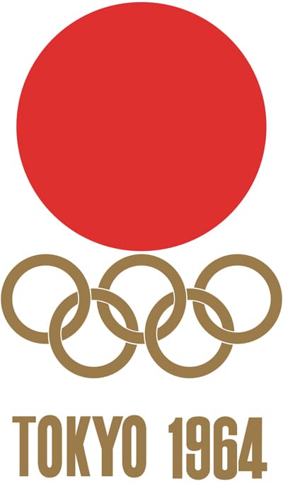
Tokyo Olympics Yusaku Kamekura 1964
At first sight, you might wonder why this would be hailed as a great symbol. Red dot for Japan, Olympic rings, bit of type. So what? But this is the first time that modernism and the Olympics combine – prior to this all we saw were posters of discus throwers and medal designs but no true symbolism. Kamekura stripped everything out, took the dot from his flag and locked it to the rings. So simple. So great (and you can just see his iconic posters in your head as you look at it). No Olympic symbol has even come close since.
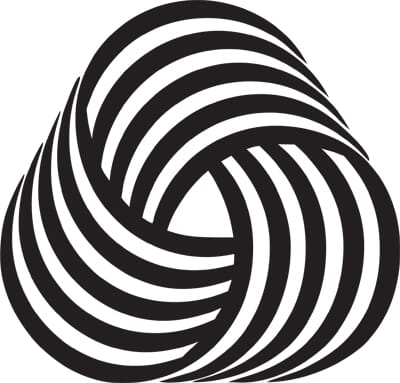
Woolmark Francesco Saroglia 1964
From the same year as the Tokyo Olympics, and again familiarity should breed contempt but Saroglia’s mark is an op masterpiece, done before Bridget Riley really got into her stride and a full 4 years before Lance Wyman’s Mexico Olympics scheme.
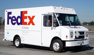
Fedex Landor 1994
Of contemporary logos, this is the one that steals it for me every time. Painfully simple, the carefully worked typeforms reveal an arrow, perfect for a delivery service. But it’s not overstated, and Fedex themselves have always shied away from making a big deal of their ‘invisible’ asset. In fact, show it in a lecture and it’s always guaranteed that gasps will go up from the dozens of people only seeing it for the first time.
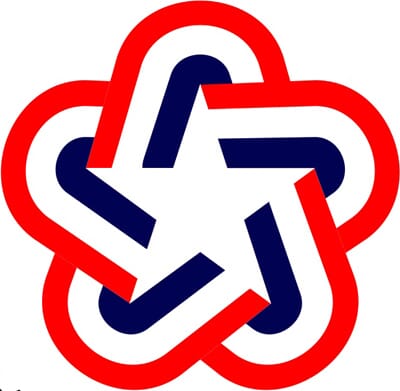
American Bicentennial logo Chermayeff + Geismar 1976
Not included for it’s typography (which I’ve judiciously removed) but for its wonderful symbol, the three American flag colours swirling beautifully around a single five pointed star. To me it’s the highpoint of post-war American modernism.
Musee d’Orsée Bruno Monguzzi 1986
V&A Alan Fletcher 1989
I hadn’t meant to put these two together, but when you look at the dates, and the typography, you start to view them as a classic ‘pair’ of museum idents from the late eighties. Monguzzi’s is the forgotten classic (certainly to a transatlantic audience) but look at that typographic sleight of hand, the removal of the ‘d’ and M’O gets me every time (especially in its cropped form).
Fletcher would have known of Monguzzi’s masterpiece, for sure, but I don’t think it’s a steal (even though both share the same Bodoni/Didot lineage). Whilst Monguzzi removed the ‘d’, Fletcher removed the side of the ‘A’, and the ampersand neatly fills the gap. Both great, both timeless.
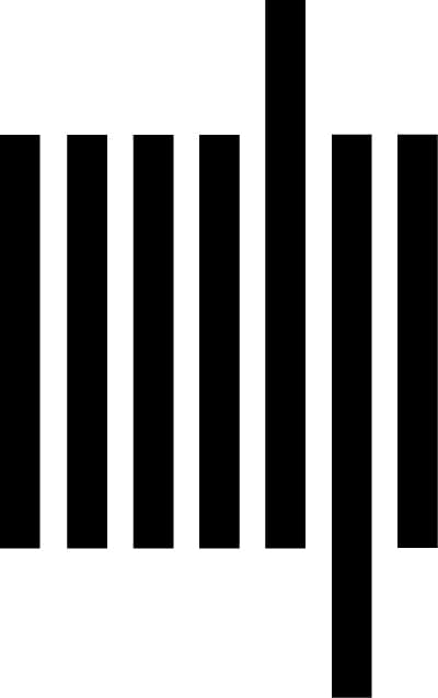
MIT Publishing Muriel Cooper early 1960s
I’ve included this because I think a lot of people have neatly forgotten about this great piece of reductionism from Muriel Cooper – the M,I,T and P of MIT Publishing are boiled down to seven vertical bars. Hugely influential.
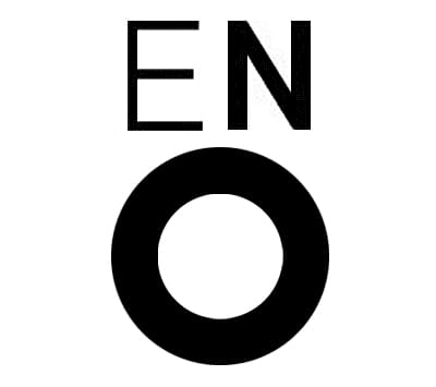
ENO CDT 1990
It seems to be out of fashion to love this symbol but Mike Dempsey’s singing face remains one of my all-time favourites, with cap ‘E’ making a perfectly closed eye and that bold ‘O’ for a mouth. Great. Already twenty years old, and unless the English National Opera change their name, no reason to change for at least another twenty.
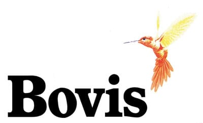
Bovis Wolff Olins 1971
Included more for its symbol than the type, but the sheer chutzpah it took to persuade a British construction company to adopt a hummingbird (native of tropical islands, not our windy and rainy one) takes some beating. Those with long memories insist that the original proposal was for an orange goldfish, not a hummingbird…
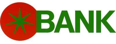

Tomato Bank Shigeo Katsuoka 1989
It’s not clear if Tomato Bank is still in existence, but this is one of my favourite examples of Japanese corporate design, and their ability to look at a problem completely differently. Just for starters, ‘Tomato Bank’ is an odd name, then a tomato stuck onto the word ‘BANK’ is even odder. But you never forget it. This taught me to look across the world for inspiration, not just close to home.

Parcs Nationaux de France Grapus France 1991
Included because, in true Grapus-style, it breaks all the apparent rules of logo design yet succeeds brilliantly. Rather than try to pick one or two of the National Park’s inhabitants for a symbol, they simply arranged hundreds of them into a twirling shape. When you see it large, you see everything, see it small and it’s a memorable spiral. Messy, ‘wrong’ but brilliantly right and a constant inspiration to try things a little differently.
By Michael Johnson
There’s a link to the edition of Creative Review here. We don’t actually know what their ‘top twenty’ includes yet, but we’ll keep you posted.
Don’t forget to follow us on twitter @johnsonbanks