Last week’s furore over whether certain bits of wood and metal did or didn’t go to the right place has by now become an annual event. Within days of each other, schemes that won gold in New York’s pre-eminent scheme (the ADC) have barely registered in London (at D&AD), and this will doubtless continue with no discernable pattern until awards season reaches its end.
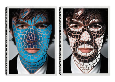
Some projects that many of us would have marked down as our ‘projects of the year’ have yet to win a thing, such as Pentagram’s Sak’s packaging. Stefan Sagmeister’s extraordinary 15 part book won gold in New York but only just scraped into the selection in London.
Our Beatles stamps went one worse, winning big in America but not even making the annual in London. Ouch. ‘In the book’ anonymity nearly beckoned for the Partners’ Grand Tour project, but they had the foresight to enter it into an advertising category too (assuming, correctly, that the design judges would mark it down) and it rightfully won D&AD’s highest prize.
To outsiders this seems odd, but actually all it should do is remind those in the design industry that ours is a notoriously fickle business and we should give up trying to objectify the process - predicting end results is, essentially, a waste of time. As Harry Pearce (of Pentagram) memorably described it recently, the whole thing is an ‘aesthetic lottery’ anyway.
But designers, being sensitive souls, can become scarred by the whole process.
Their memories of the ‘ones that got away’ can make for entertaining reading though (once enough time has passed). Quentin Newark tells a great story about this nice logo for Trees for Cities that Atelier Works designed several years back.

‘I thought it was a work of genius. I blew it up huge. And that’s Alan Fletcher's thumb print. At least a Silver. I was a judge that year, and as I strolled down the aisle, I saw not one but three other logos using thumb prints. The D&AD girls has helpfully hung them in row, side by side. A glut of thumbs. It looked like an infant school wall. We had gone years, if not decades without thumb print logos – I can’t remember one since Aziz Cami’s wonderful Green Thumbs gardening company – and the very year I launch mine I am but one of four. When the judges came to that section, I cringed when I heard one of them say: ‘oh its finger print alley’. None of them got in’.
Many years ago johnson banks designed an extremely unusual ‘brochure’ for the V&A to raise funds for its proposed extension (designed by Daniel Libeskind) that took the form of a paper sculpture of the building constructed from one continuous spiral of white card.


We couldn’t fathom why it hadn’t featured in one particular award scheme, and some muttering started in the studio. Then one of us came to judge another scheme soon afterwards and discovered that with enough jiggling about the model simply fell apart. Ooops. So when faced with a miserable pile of deconstructed cardboard stuck on some polyboard you couldn’t really blame a set of judges for marking it down.
Sometimes savage judging can sometimes leave entrants baffled: Carter Wong probably still don’t understand how this marvellous project for Howies DIDN’T win – in case you don’t remember, the discarded wardrobes were selected by the designers and then hand painted for Howies stores by a selection of illustrators.
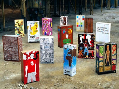
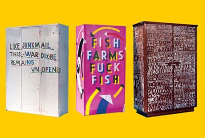
Extraordinary. Nominated, yes. Pencil? No.
How, exactly, a set of recycled hand-painted wardrobes for a green clothing retailer didn’t win is beyond most of us, even now. We’re not sure that Phil Wong is really over it though: ‘There isn’t a credible alternative to D&AD - although on the occasion when the wardrobes were overlooked, I could have lined up the jury and gouged their eyes out with a blunt pencil’ he recently admitted.
This beautiful set of packaging by North for London eatery Yauatcha was the straw that broke the camel’s back for Sean Perkins – when it wasn’t accepted he saw it as final proof that he was wasting his time with D&AD and hasn’t entered since.
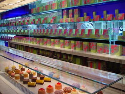
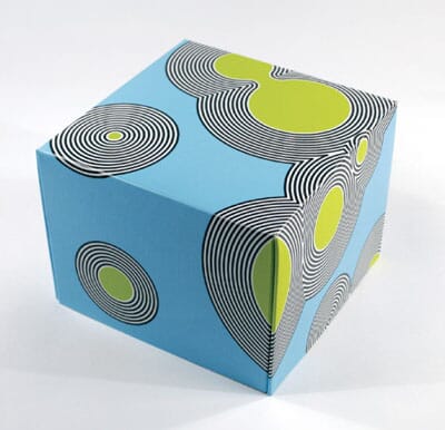
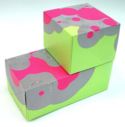
This type of high-concept, ‘packaging as art’ approach has sometimes failed to be appreciated by more commercial designers. If judged by a set of designers intent on searching for ‘shelf stand-out’ and ‘clever use of back-of-pack’ then it would have confused (and scared) them completely – ‘where’s the logo – where’s the appetite appeal?’, and all that. Shame on them.
Luckily of course clients couldn’t give two hoots about all of this – North can show their Yauatcha work to foodie clients and they will eat them up – Carter Wong can include their wardrobes in retail presentations and they’ll gather appreciative noises every time they’re projected onto a boardroom wall.
So the trick seems to be to not take it remotely seriously, and the next time someone tells you that one particular scheme or another is the only objective record of the best work of the year remind them that yes, lotteries offer the biggest prizes, but winning them is still entirely down to chance.