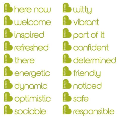
A few weeks ago Belfast unveiled a new logo which has since been critiqued all over the press and the blogosphere. We held back from comment, partly because others have done it, partly because we figured that a town like Belfast probably could do with some good PR, not bad. And partly because our initial reaction was that their heart had some similarities to a recent project of our own.
Yes, we did do a heart logo a few years back, for The Art Fund, yes we used a geometric heart and yes there are applications in the scheme that use multiple hearts ‘coagulating’…

But the truth is that anyone designing a logo that includes what the lawyers would call ‘a generic shape’ – ie a heart, or a circle, or a rectangle or a diamond - has to face up to the fact that that there will, by the law of averages, be other versions close to the version gleaming at you on your computer screen.
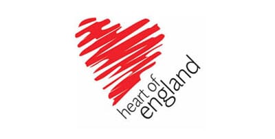
When we designed The Art Fund’s ‘love/art’ heart 3 years ago, we did very longwinded trademark checks to see if anyone had combined a frame and a heart in this way. Luckily, no, but we saw quite a few heart logos on our legal travels. We looked back this week and reminded ourselves of several, including this shocker for ‘the heart of England’ (a tourist board logo).
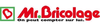
You’d be amazed just how many heart logos are registered. How about this for Tesco stores?
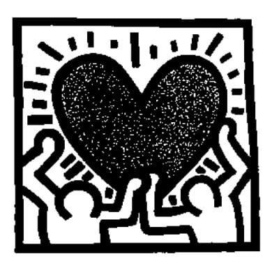
Or Keith Haring?
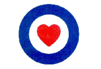
Or even ‘The RAF Benevolent Fund?
Unfortunately, for Belfast and its designers Lloyd Northover (also the recent recipient of flak for the possible provenance of its ‘Tottenham’ logo)...
...it transpires that there are more than one or two people around the world using a turned ‘b’ as a heart. Here are some, as pointed out by those hardened bloggers on Brand New.
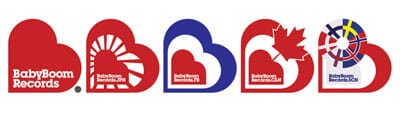
But the really tricky one is that earlier this year, not one, but 2 towns in northern England beginning with B revealed logos, based or B’s, rotated left, based on hearts. Oops.
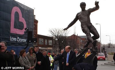
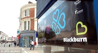
Now, perhaps, in mitigation, these logos hadn’t yet been registered, or failed to turn up in the checks. Or perhaps Belfast didn’t actually do any trademark checks? There’s little one can say at this point, other than commiserate with all parties and admit that ‘it happens’, especially with such common symbols. But for three towns and cities to share the same brand idea is a little unfortunate, to say the least.
But only recently it nearly happened to us – we presented (slightly half-heartedly it must be said) this initial thought to a charity symbol, based on tears/ripples with the nagging thought in our heads that ‘we’d seen that before somewhere’.
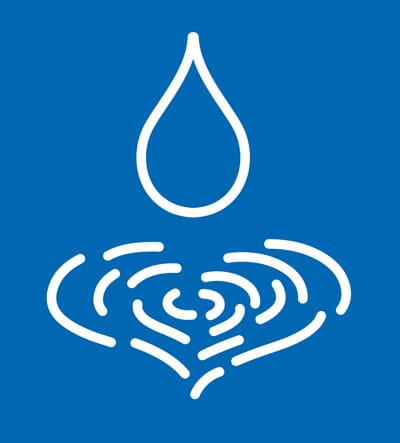
Sure enough, in researching heart logos for this piece, there it was, registered already for Smithkline Beecham. Ouch. That could have been expensive.
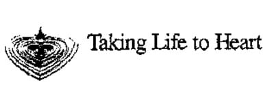
(Apologies for the awful quality of the pic).
Lucky then that the client admitted that it made them think immediately of checking their gas supplies, not making a donation. Harsh (but probably true).
The overwhelming feeling from all of this is if your design contains any hint of ‘cliché’ you’d better check it pretty thoroughly, perhaps even before you present it. It’s still better to bomb an idea in private before it gets public, and potentially very messy.