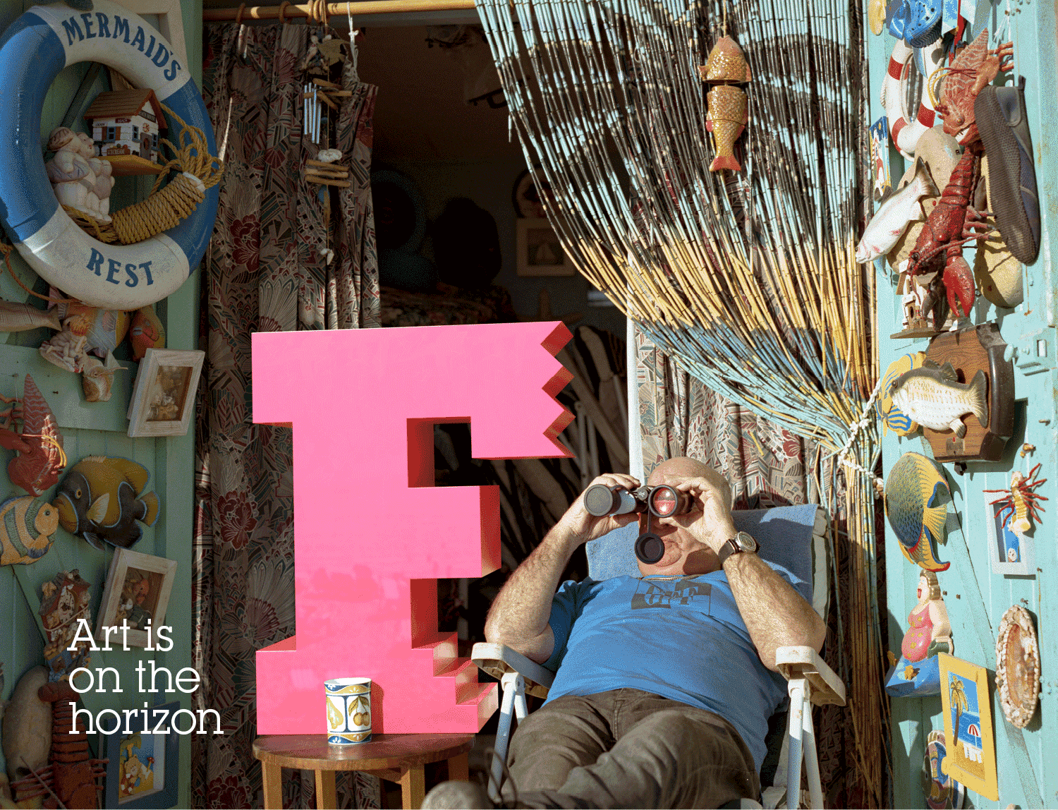
Almost every year since 2013 we’ve produced the lead graphics for Brighton Festival. We usually modulate the lead imagery to reflect each year’s guest director, always including the visual identity which is anchored by the Festival’s ‘F’ symbol.
For 2021, the brief was a little different. First, the events had to be pared down and mostly held outside due to the pandemic. And second, it felt that this year’s theme should be more about the Festival itself – back after 14 months of lockdown – and that art and culture was finally on the horizon again.
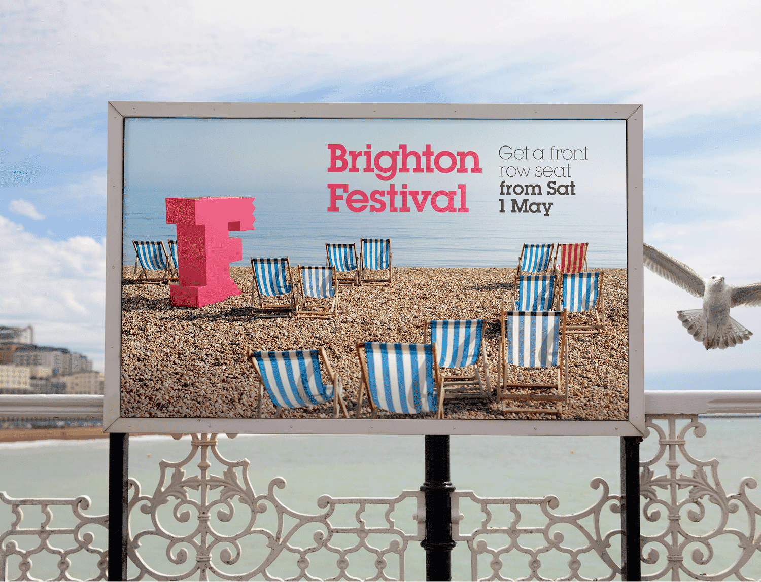
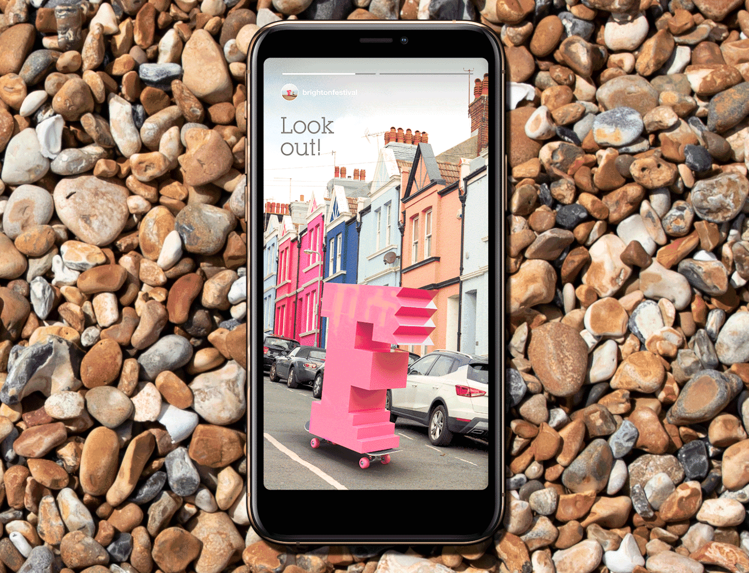
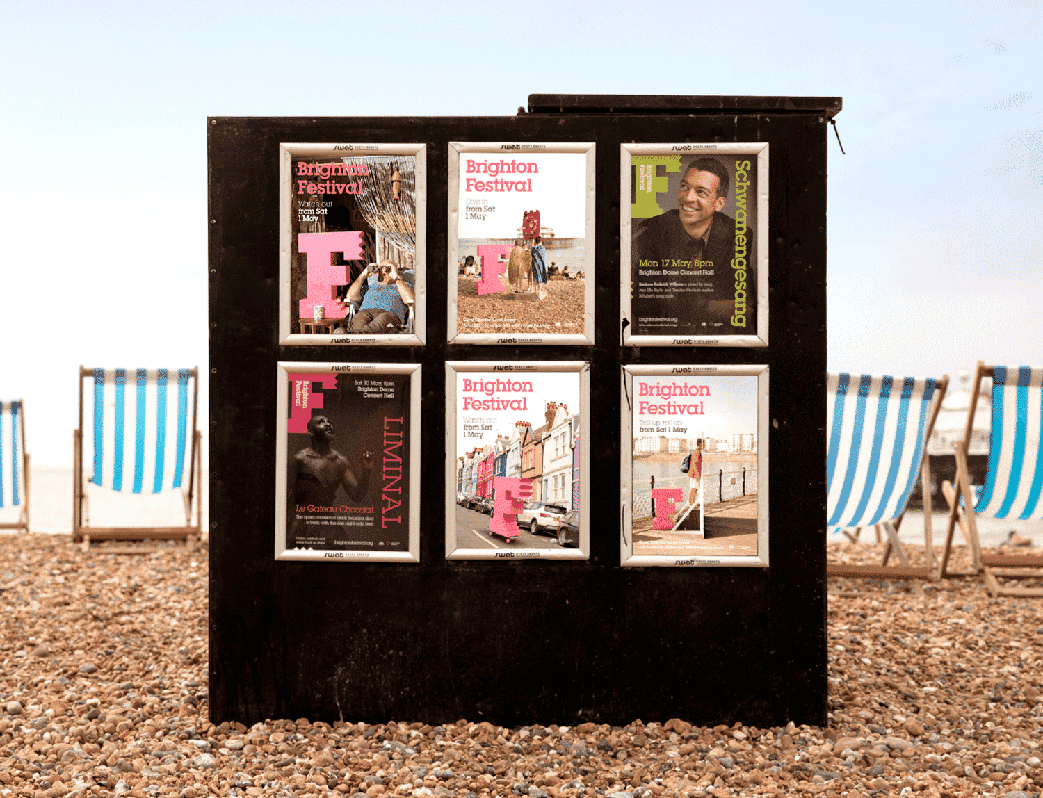
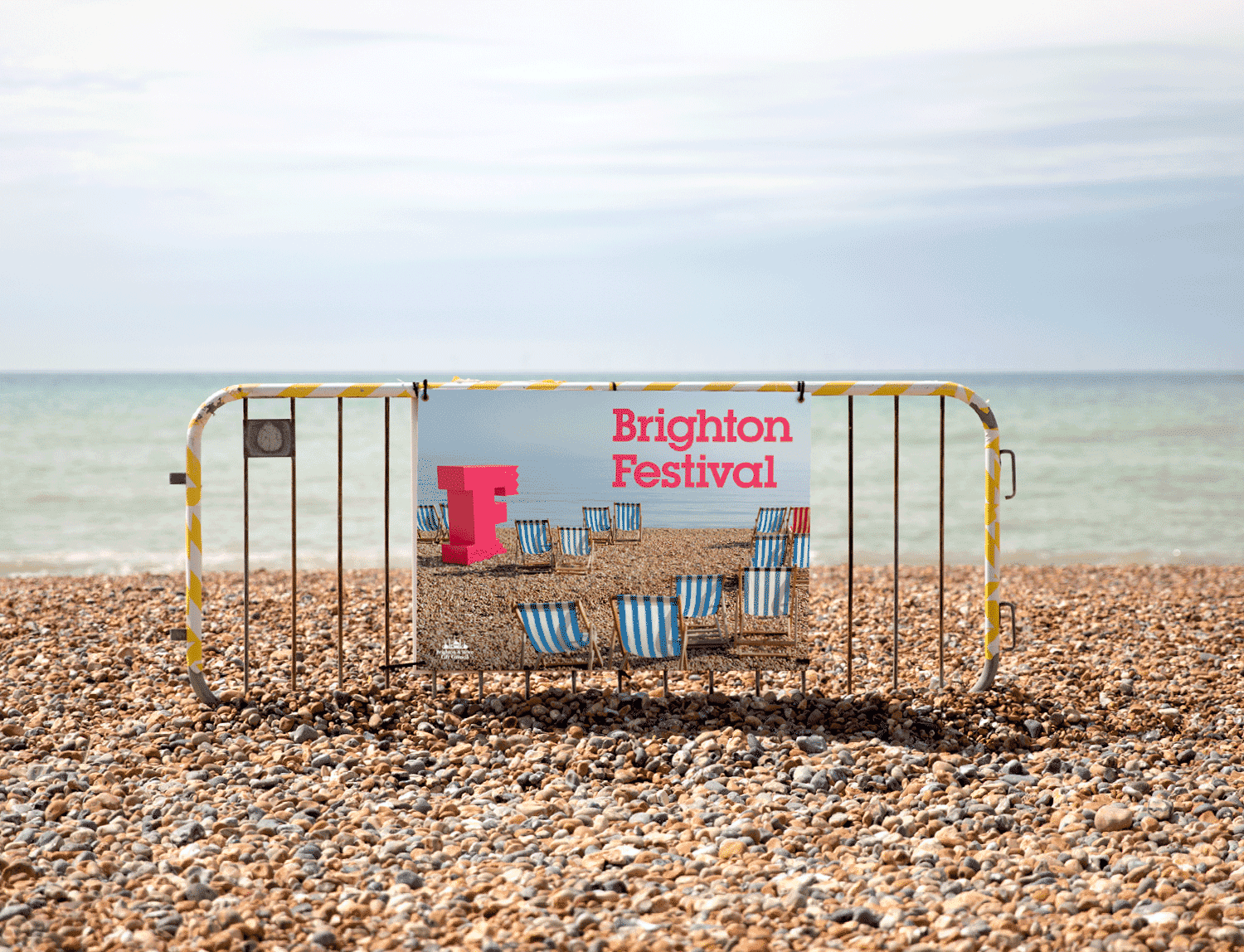
So our theme this year has been very simple – a giant bright pink ‘F’ has been pictured around Brighton – gazing out to sea with a group of deckchairs, waiting its turn on the pier, skateboarding, having its portrait drawn or summoning up the courage for a dip in the chilly English channel.
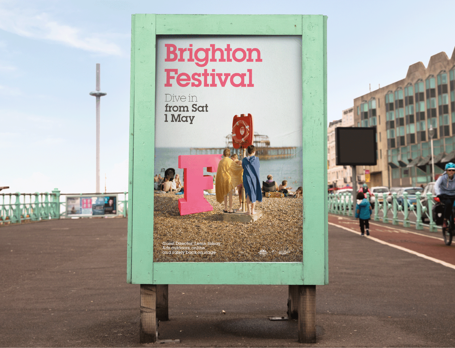
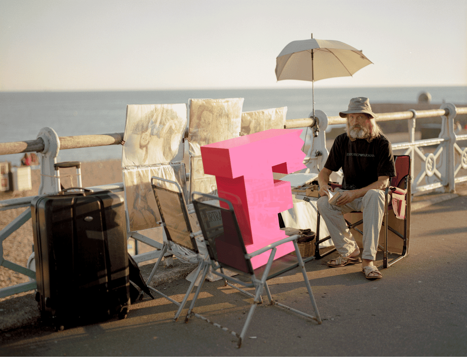
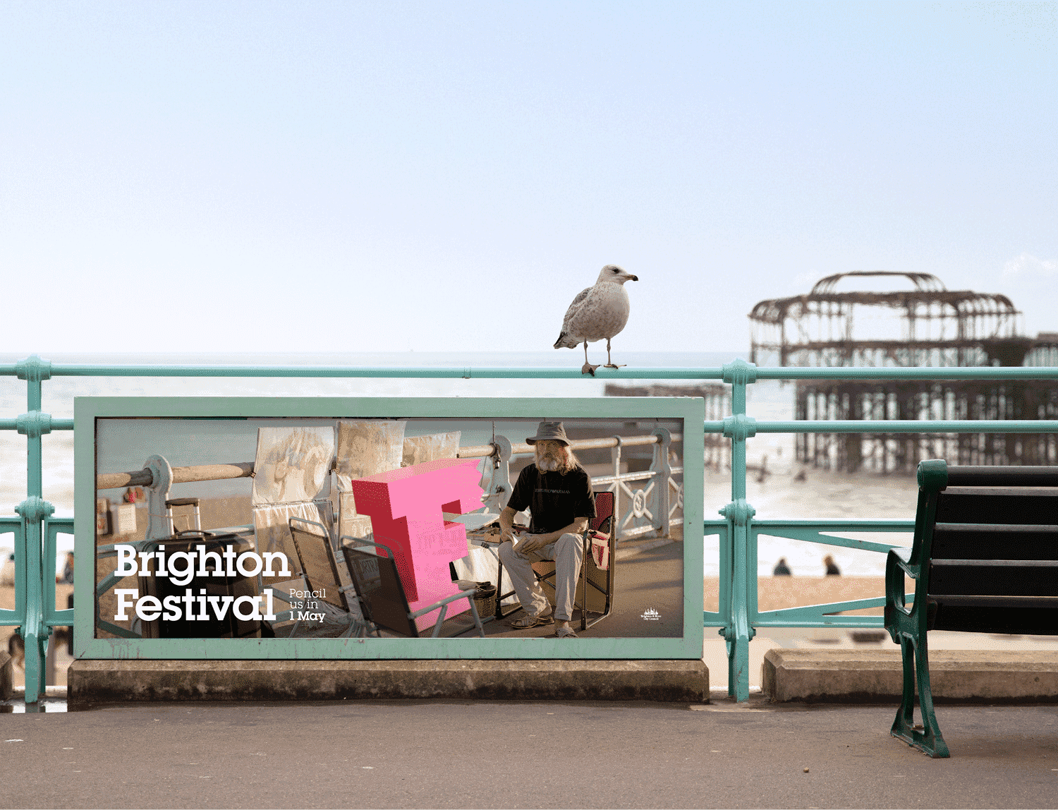
Working with local Brighton street photographer Oliver Curson, we carefully developed a suite of images that capture the hazy, sun-drenched early summer Brighton that many of us know and love.
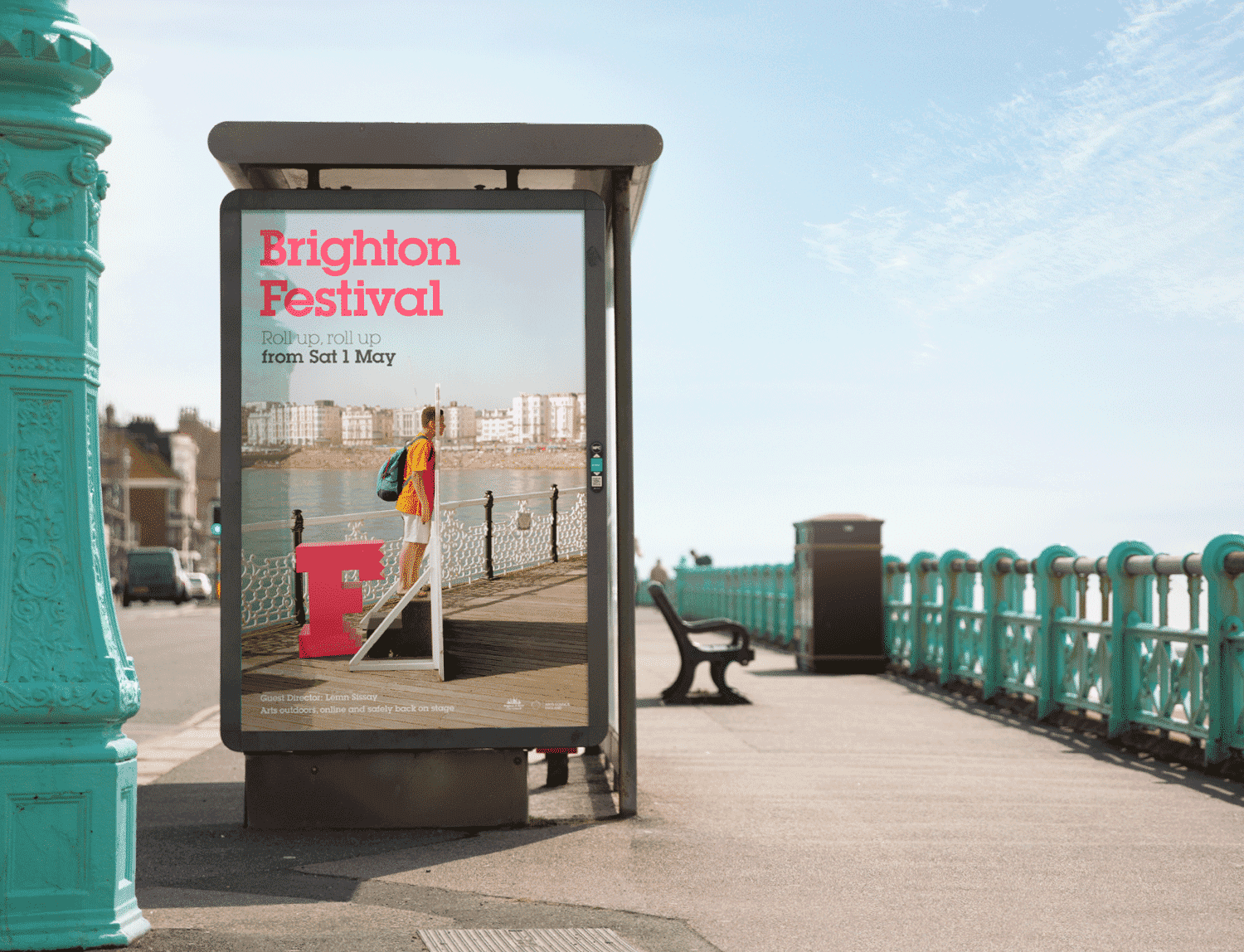
We’ve applied the idea out far and wide – from bus-backs to banners – and Brighton’s poster sites have been plastered in the images too.
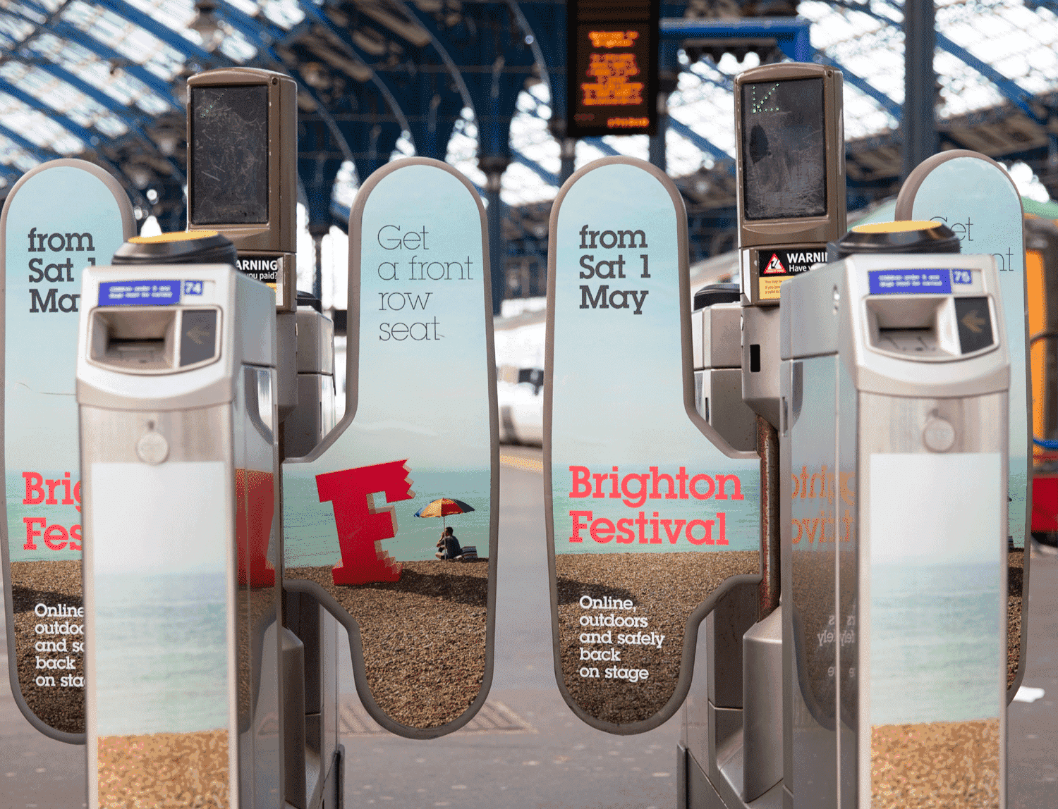
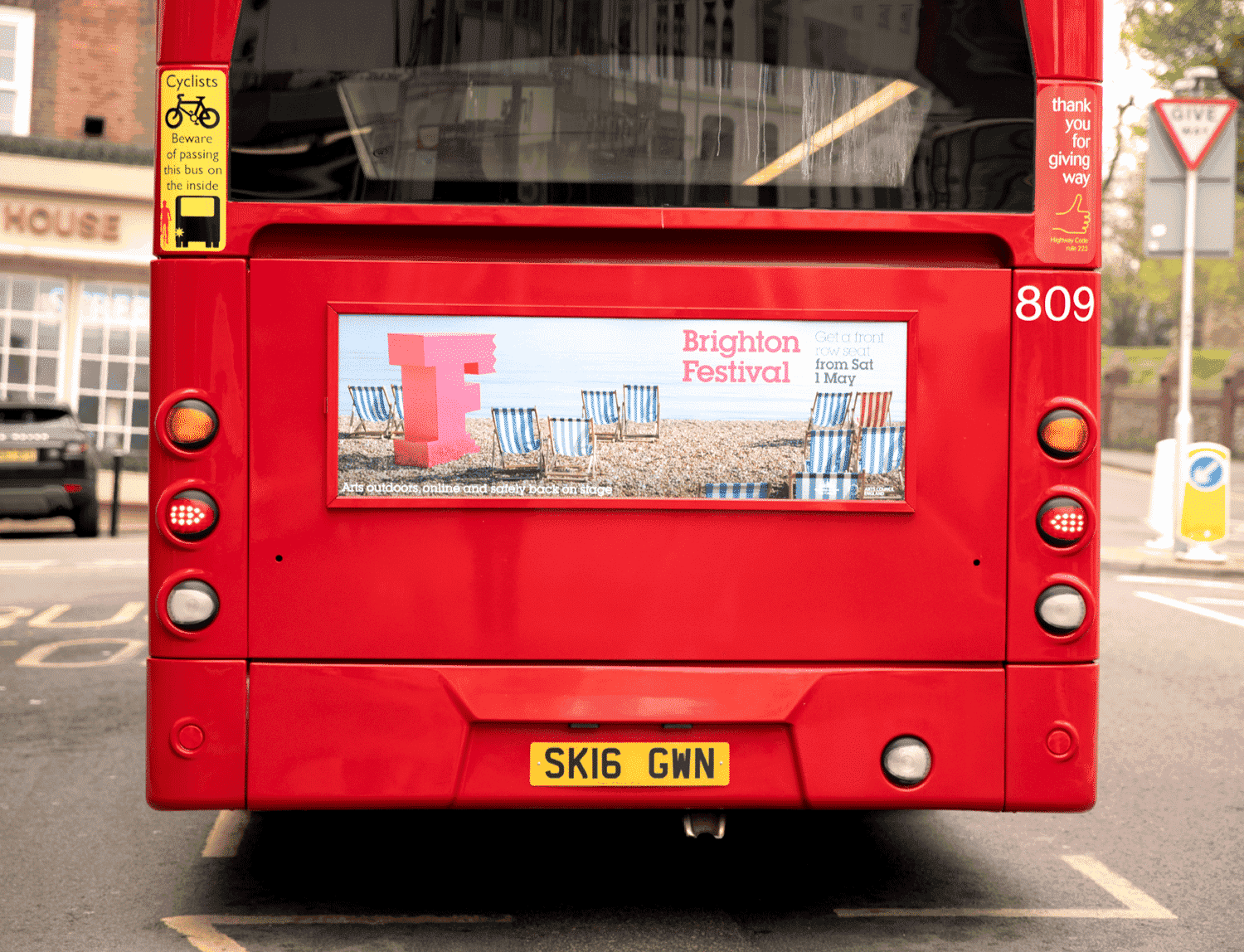
Here’s a crazy animation that we also developed for the website and social media.
Our next task is a wholesale review of the Dome and Festival brands, plus a re-design of their newly added Music services. More on that soon.
Read about our festival identities from previous years and our parallel rebranding of Brighton Dome.
Our thanks to: