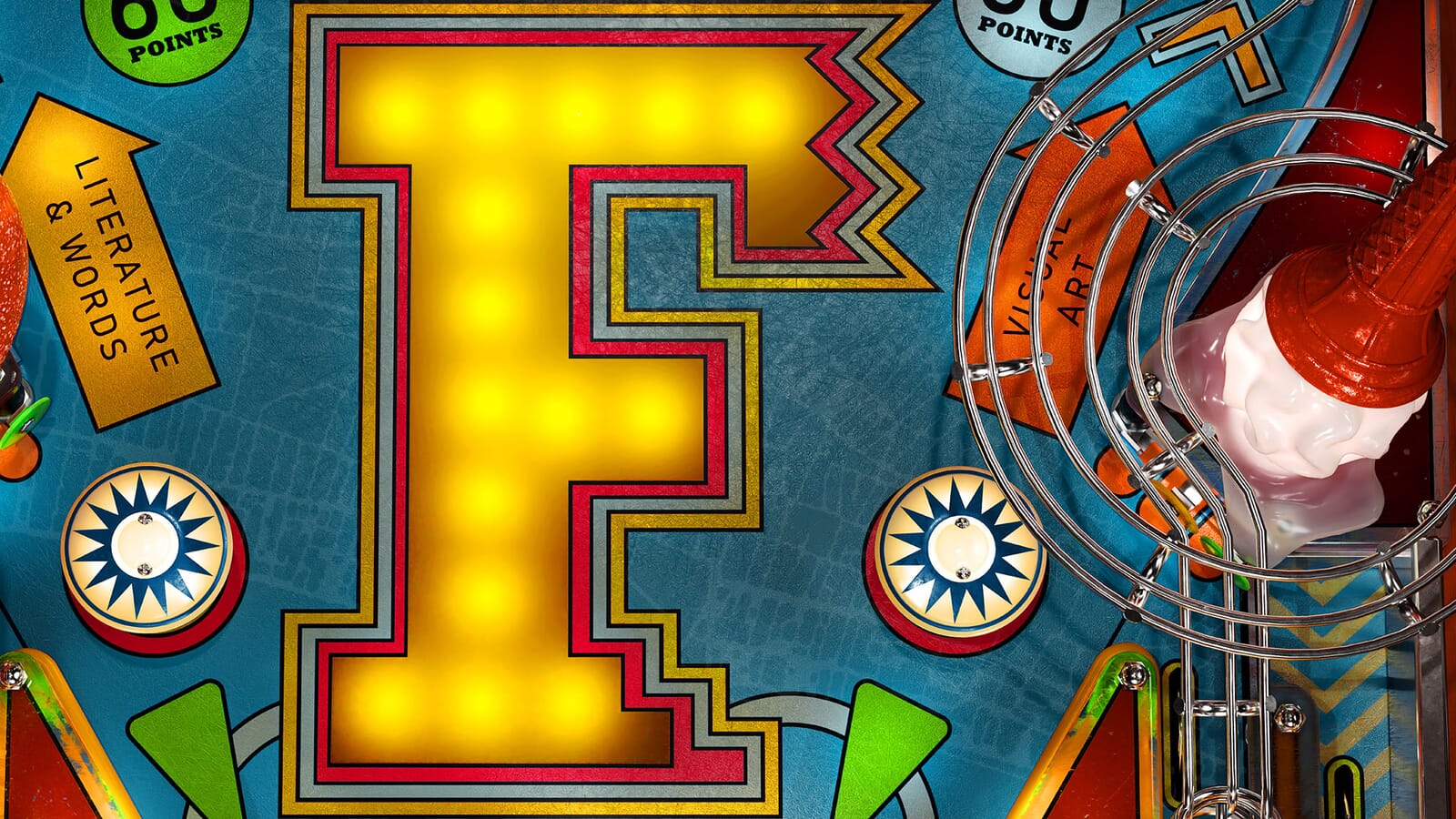
Ever since our rebrand of Brighton Festival over a decade ago, we've often worked on annual remixes of the branding. This year's 60th edition didn’t have a guest director, so the brief was more open than before.
The Brighton team asked us to look for a way to sum up the festival, the city, celebrate a big birthday, but still feature the big 'F' which always anchors the branding.
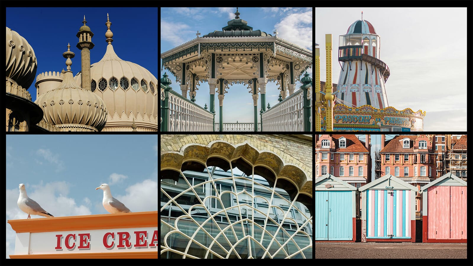
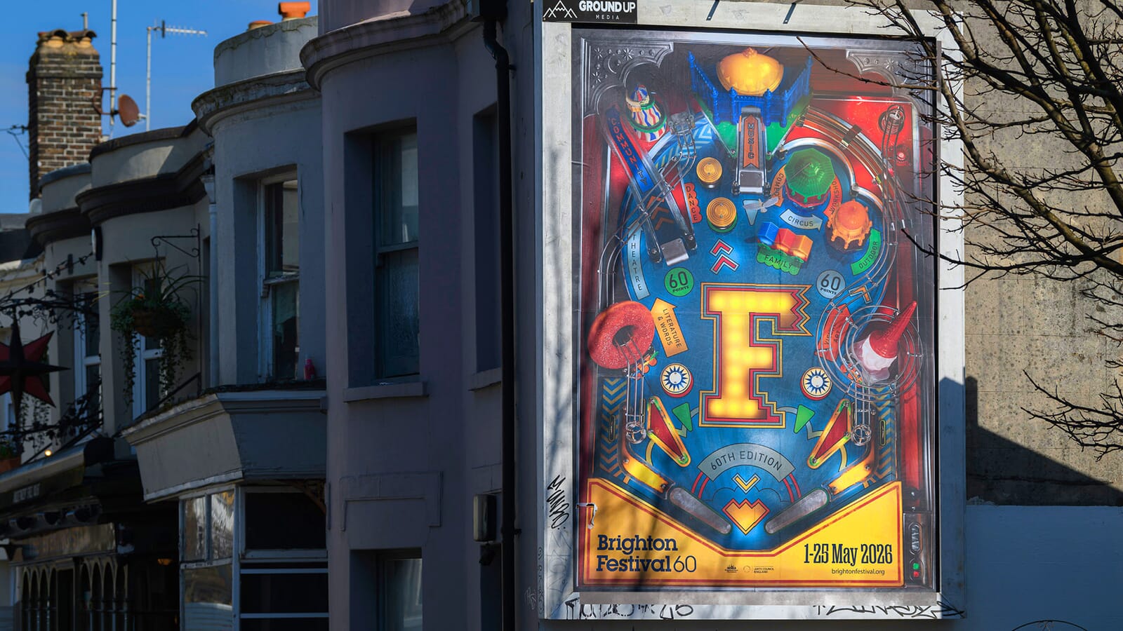
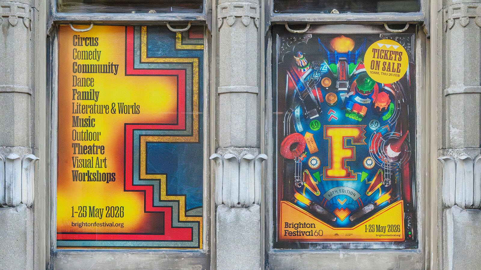
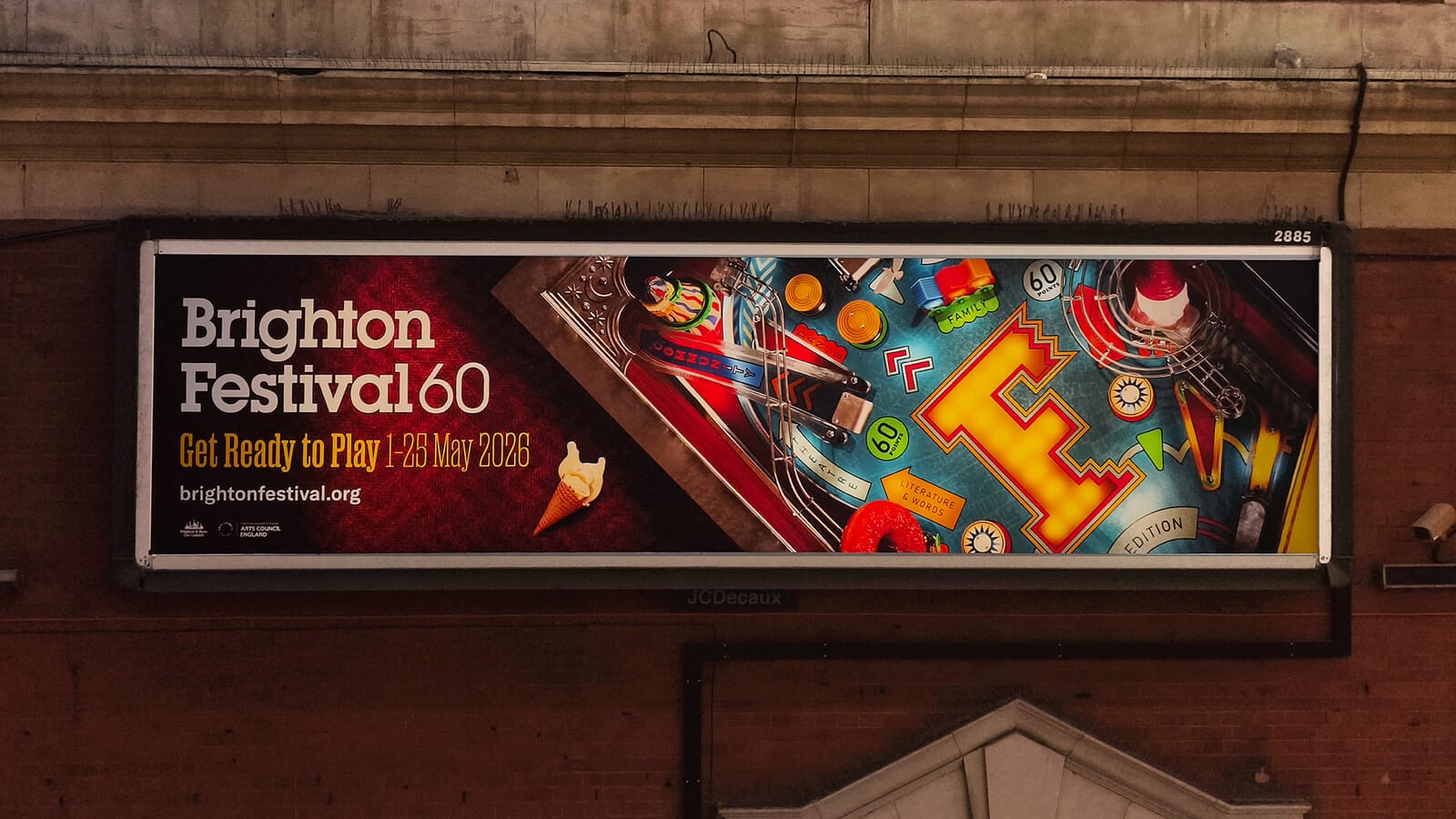
We realised that in over a decade of projects in the city, we’d never really turned to the amusement arcades or seaside architecture for inspiration. So we started looking at how we could turn the city and its festival into a crazy vintage pinball table full of uniquely Brighton architectural features – beach huts, helter-skelters, donuts, squashed ice creams and spinning pigeons.
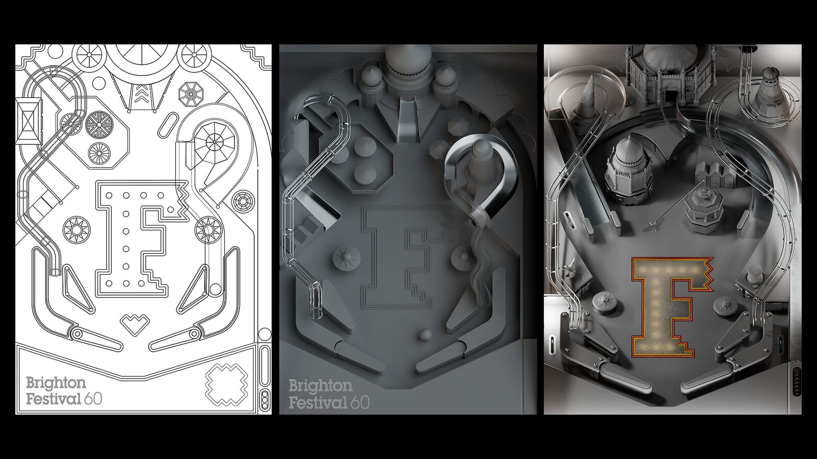
This proved a much easier idea to describe than do, but slowly the idea started to take shape.
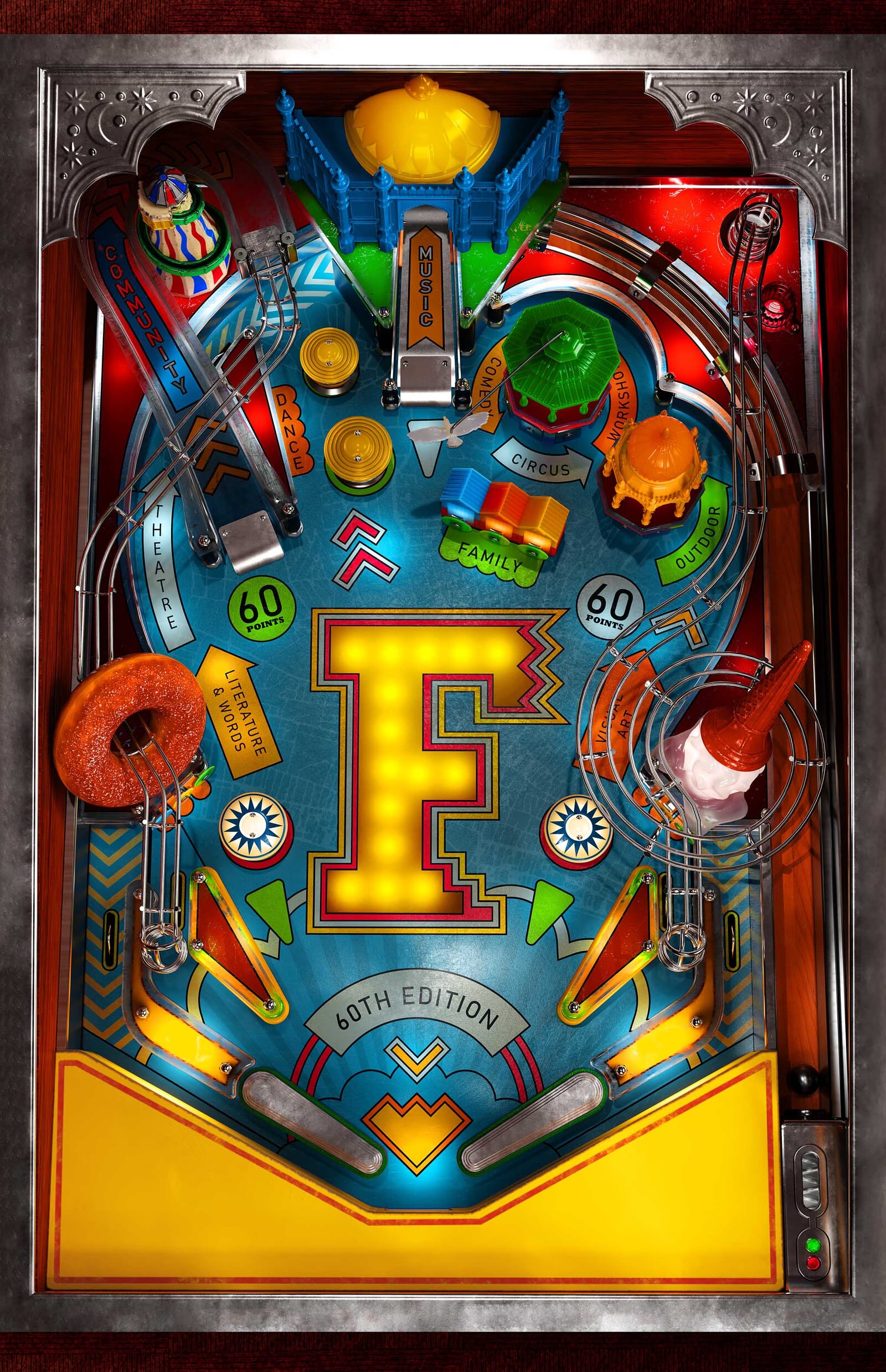
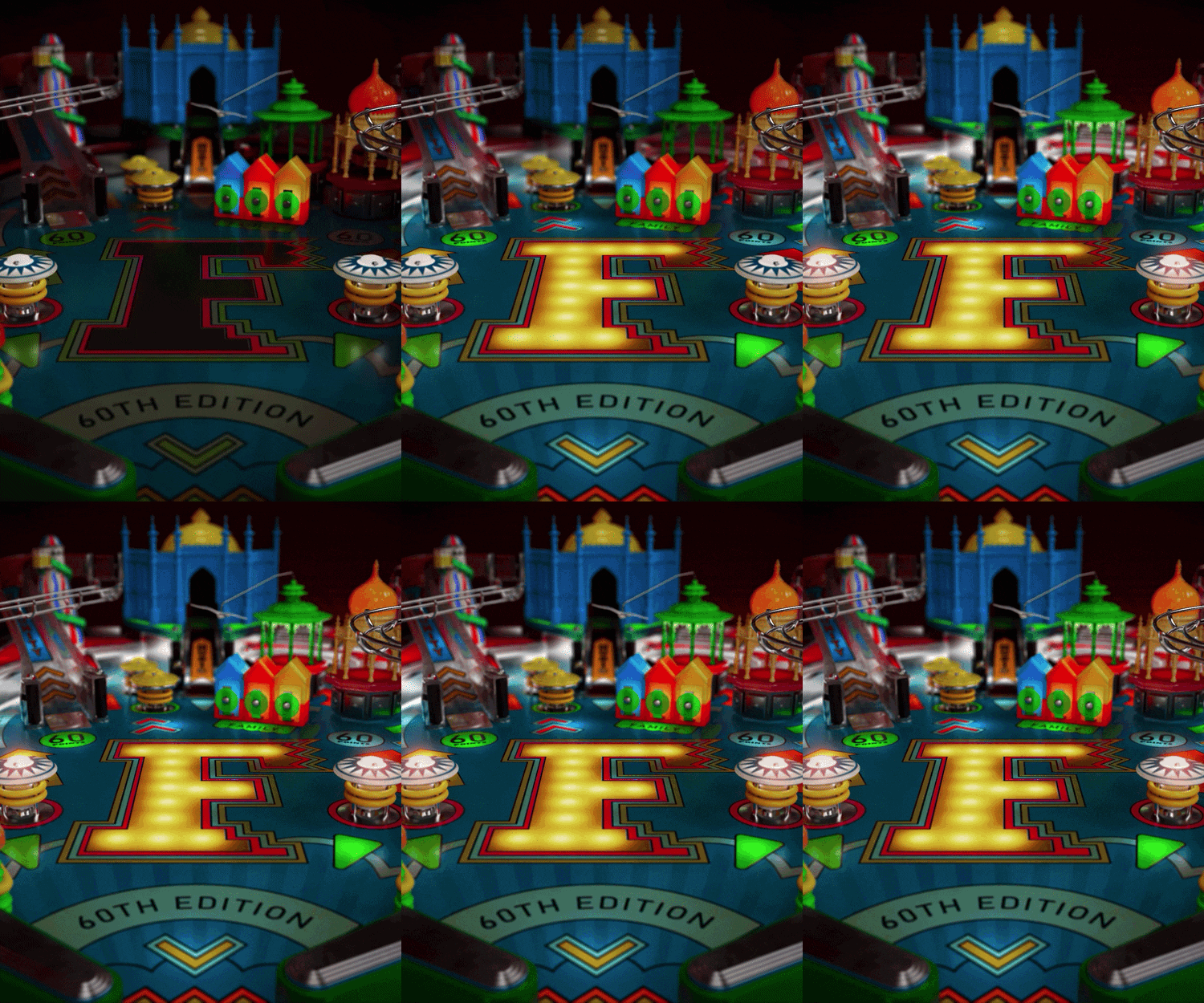
Our hunch was that if we could make the elements on the table successfully express different aspects of the city and the festival, we could then animate the table tuning on and off, balls flying, flippers flapping – all to the sound of the bleeps and bloops we all associate with vintage machines.
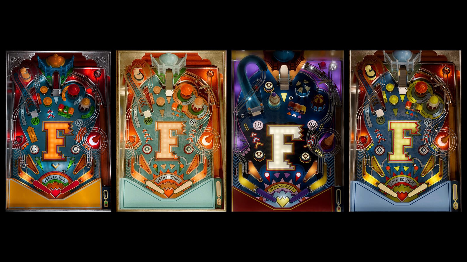
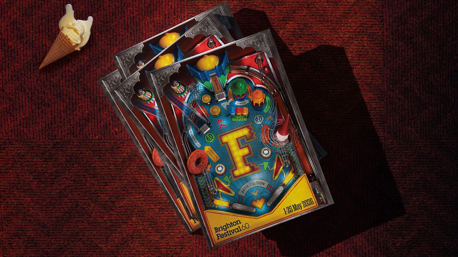
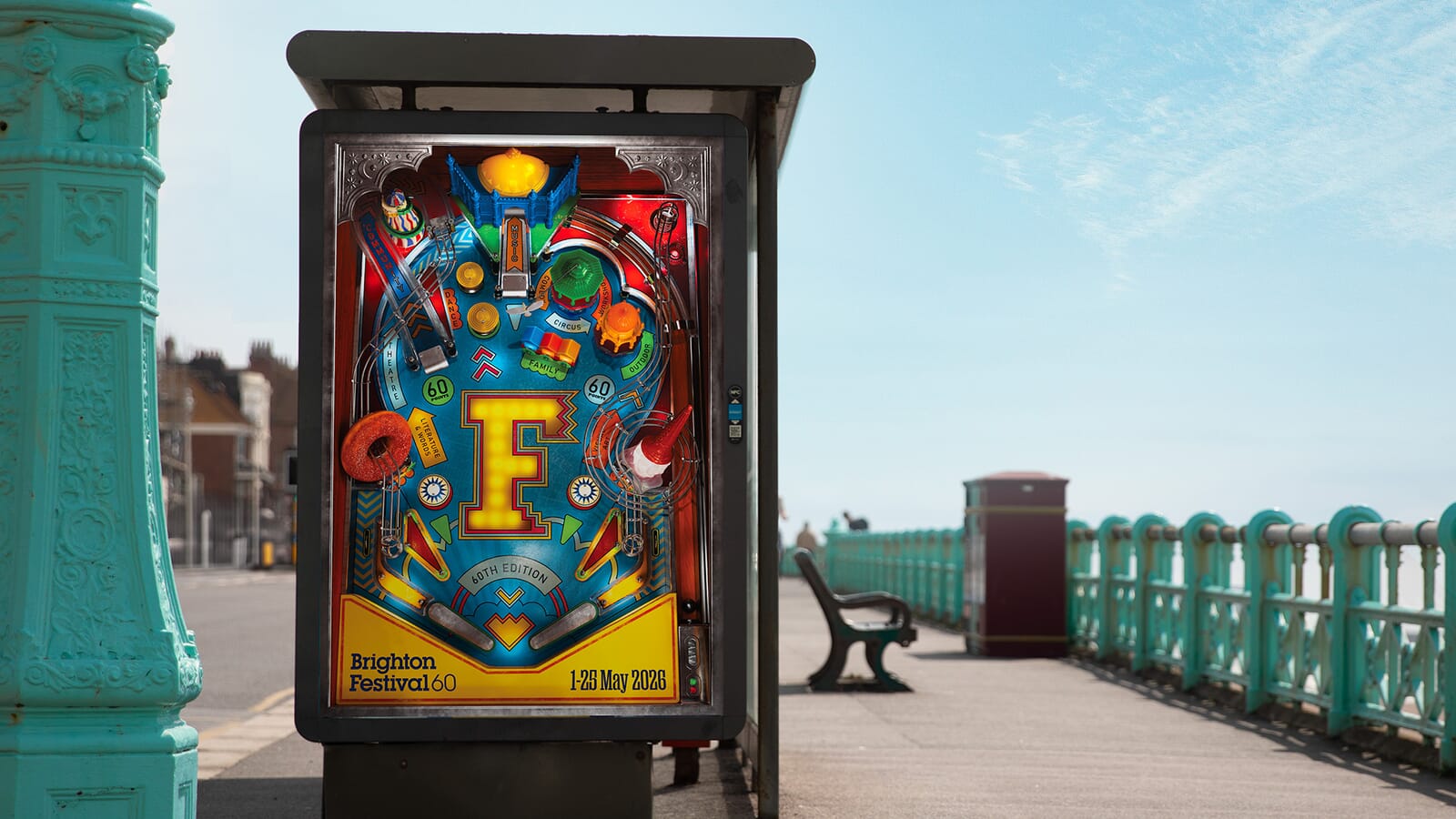
And then we had flexible set of elements that could be applied across posters and brochure covers across Brighton and at Victoria Station in London.
Here’s a short film that pulls all the elements of what has been a fun project together. And you can read about our festival identities from previous years and our parallel rebranding of Brighton Dome.