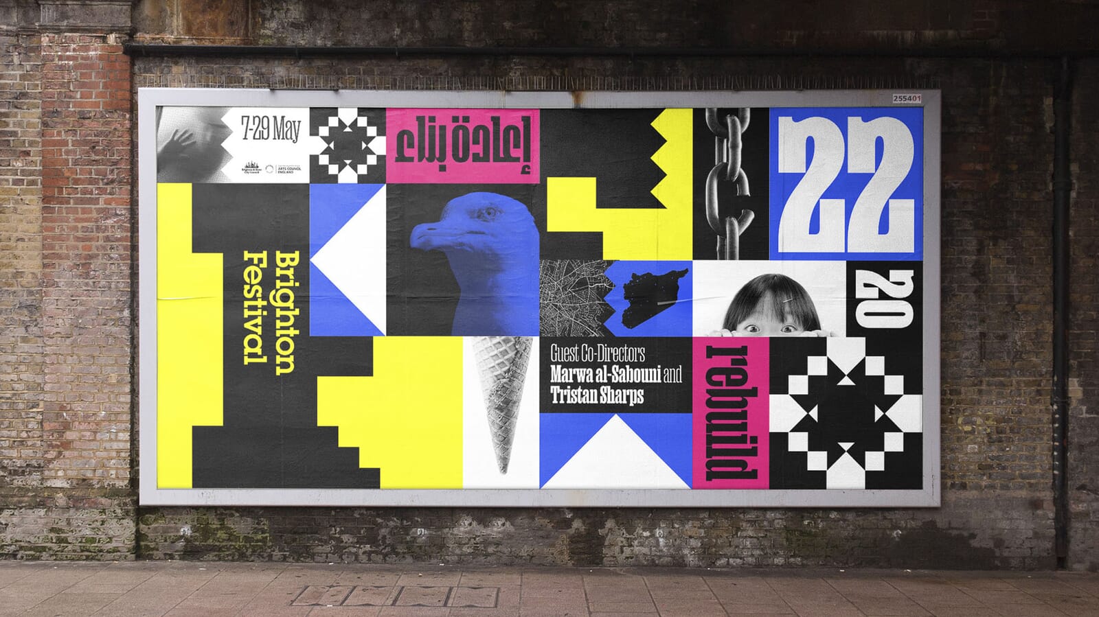
After two years of either cancellations or truncated events, this year’s Brighton Festival was the first full festival for two years. For the first time, the festival had two guest directors, Syrian architect and author Marwa Al-Sabouni who runs a studio in the Syrian city of Homs, and acclaimed Brighton-based theatre artist Tristan Sharps.
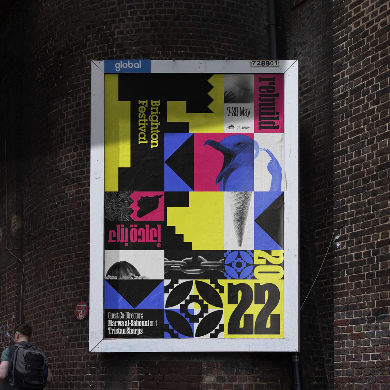
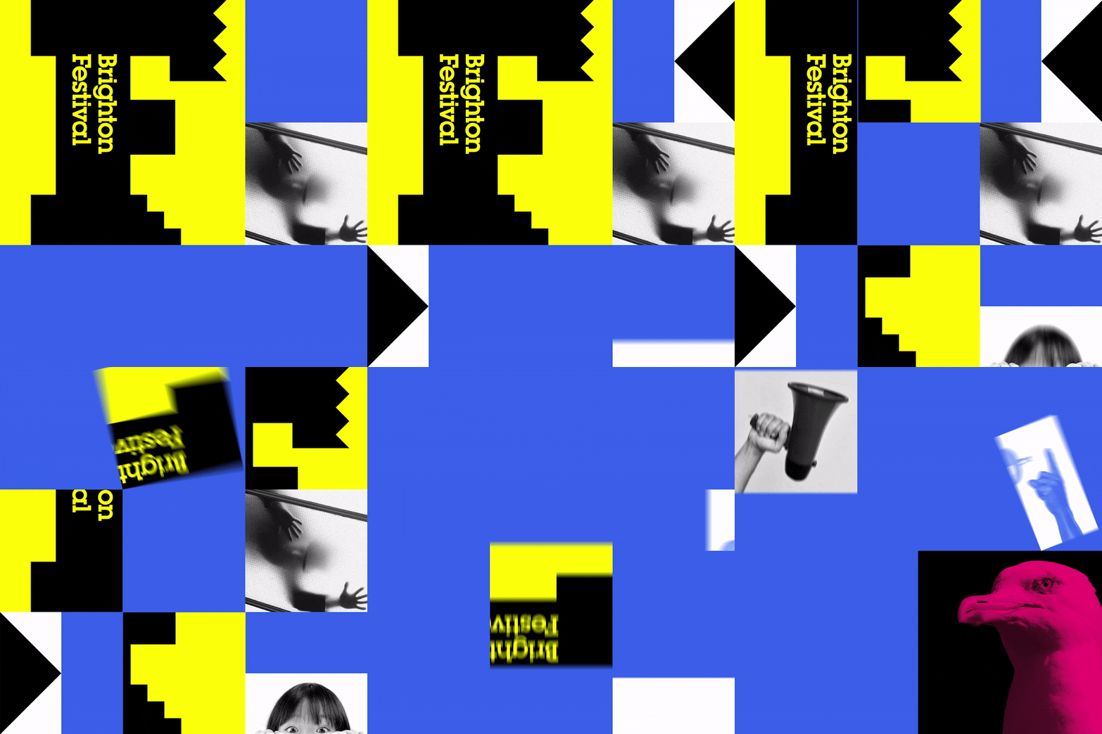
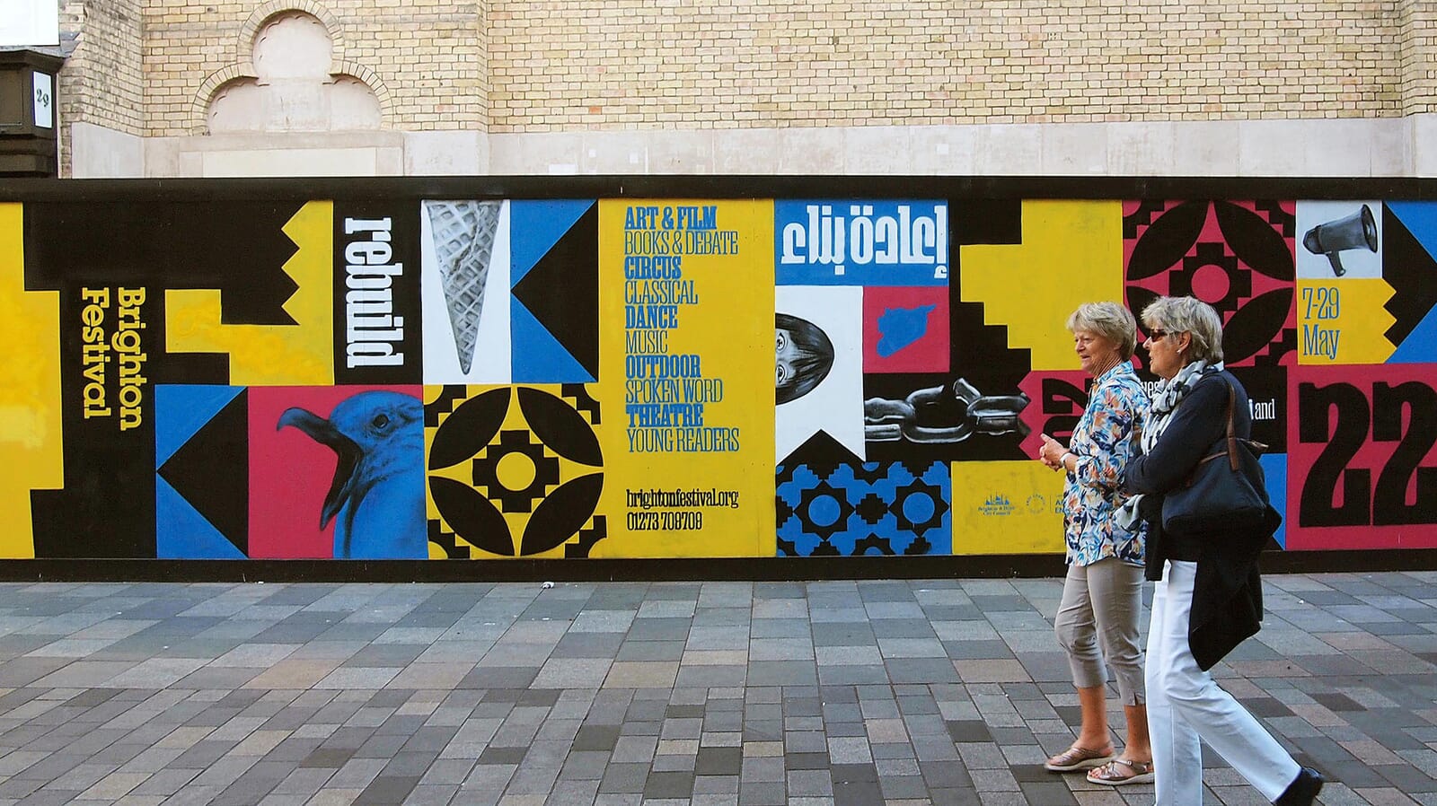
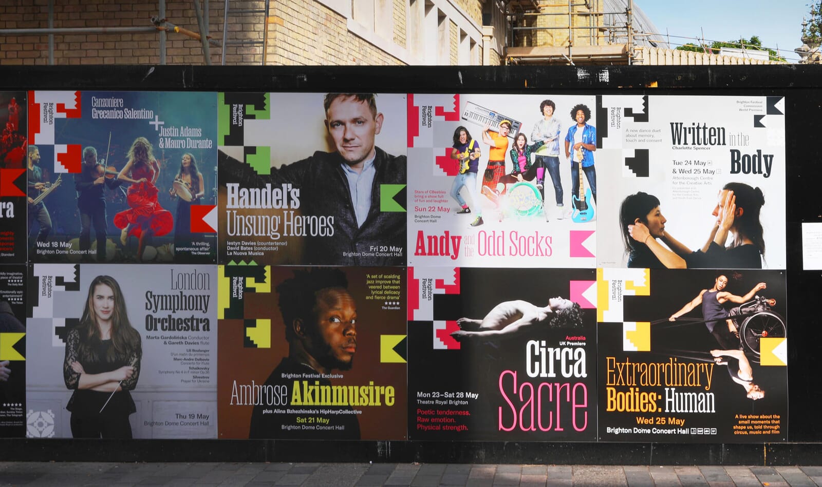
As with previous years our design task was to interpret the co-directors’ ideas and create the graphic ‘glue’ to bring three weeks of events together. Picking up on the metaphor of ‘rebuilding’ – in both the literal and metaphorical sense after wars and the pandemic – we created a tiling and shuffling design system which endlessly iterated throughout the festival, across printed and social media.
Working from the Manuka typeface and in collaboration with with arabic lettering specialist Lina Hadi, we developed bilingual versions of the festival title, plus keywords to be used across the campaign.
The core Brighton Festival identity itself iterated across the applications, as shown below.
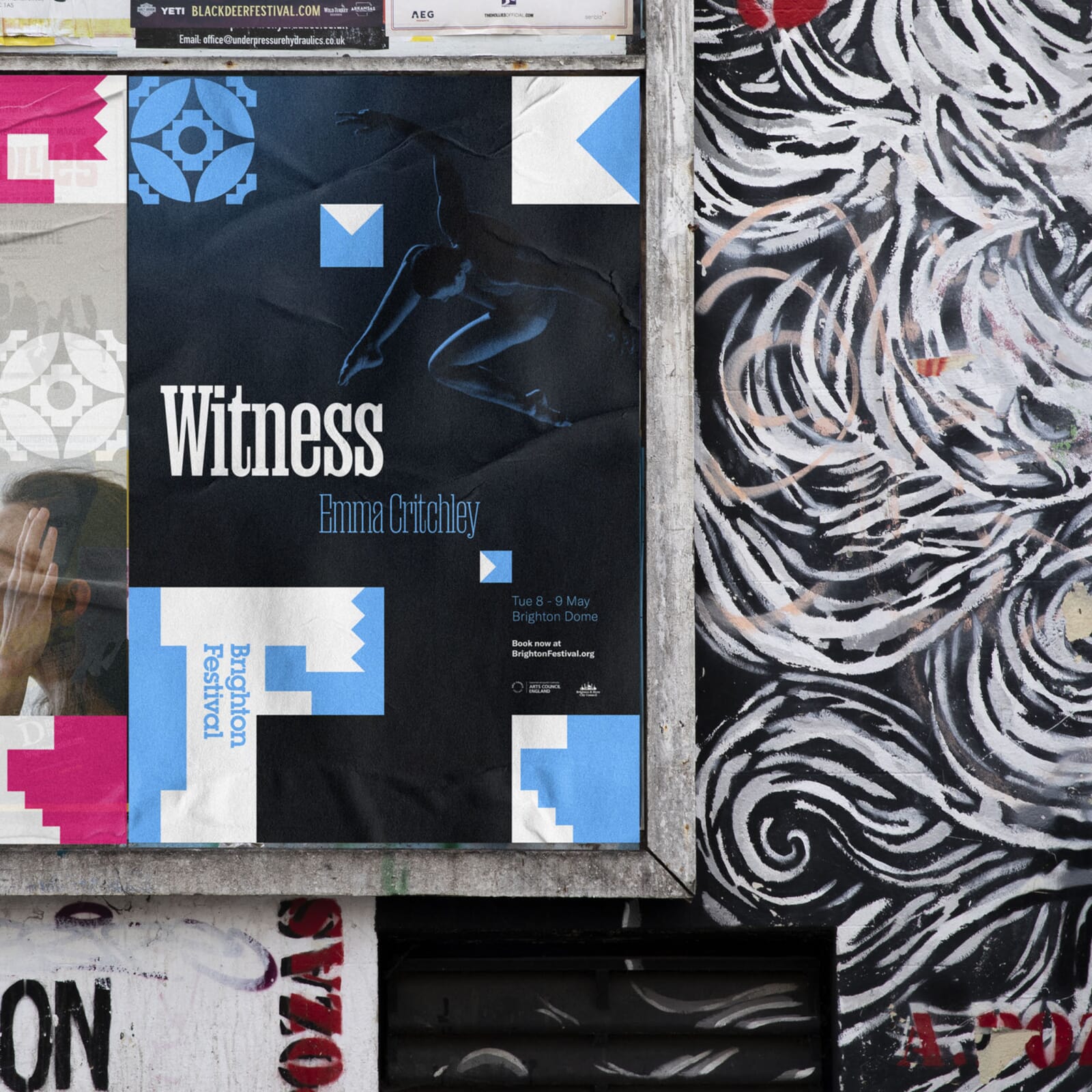
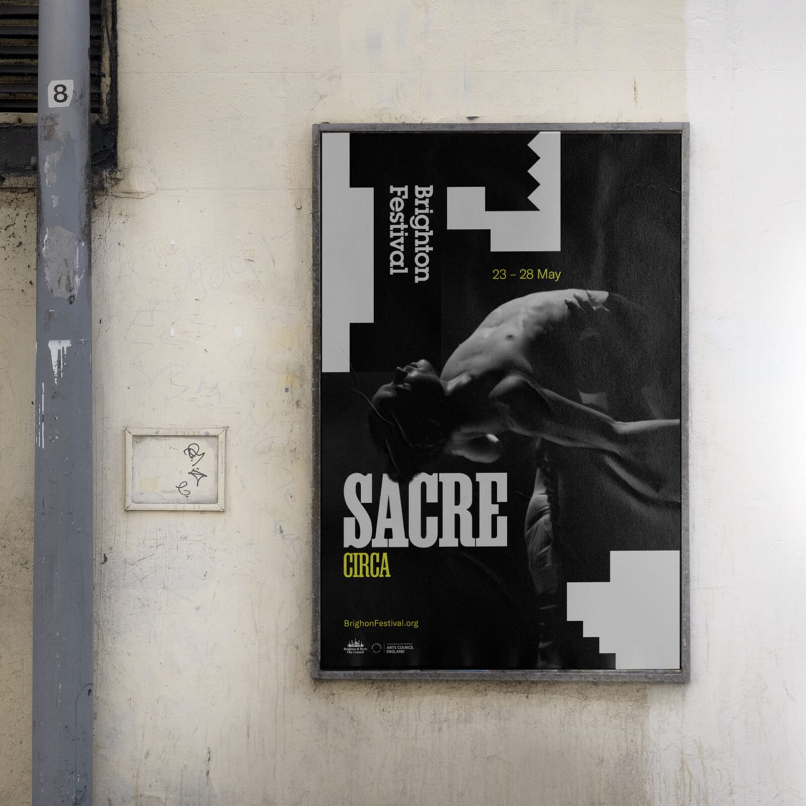
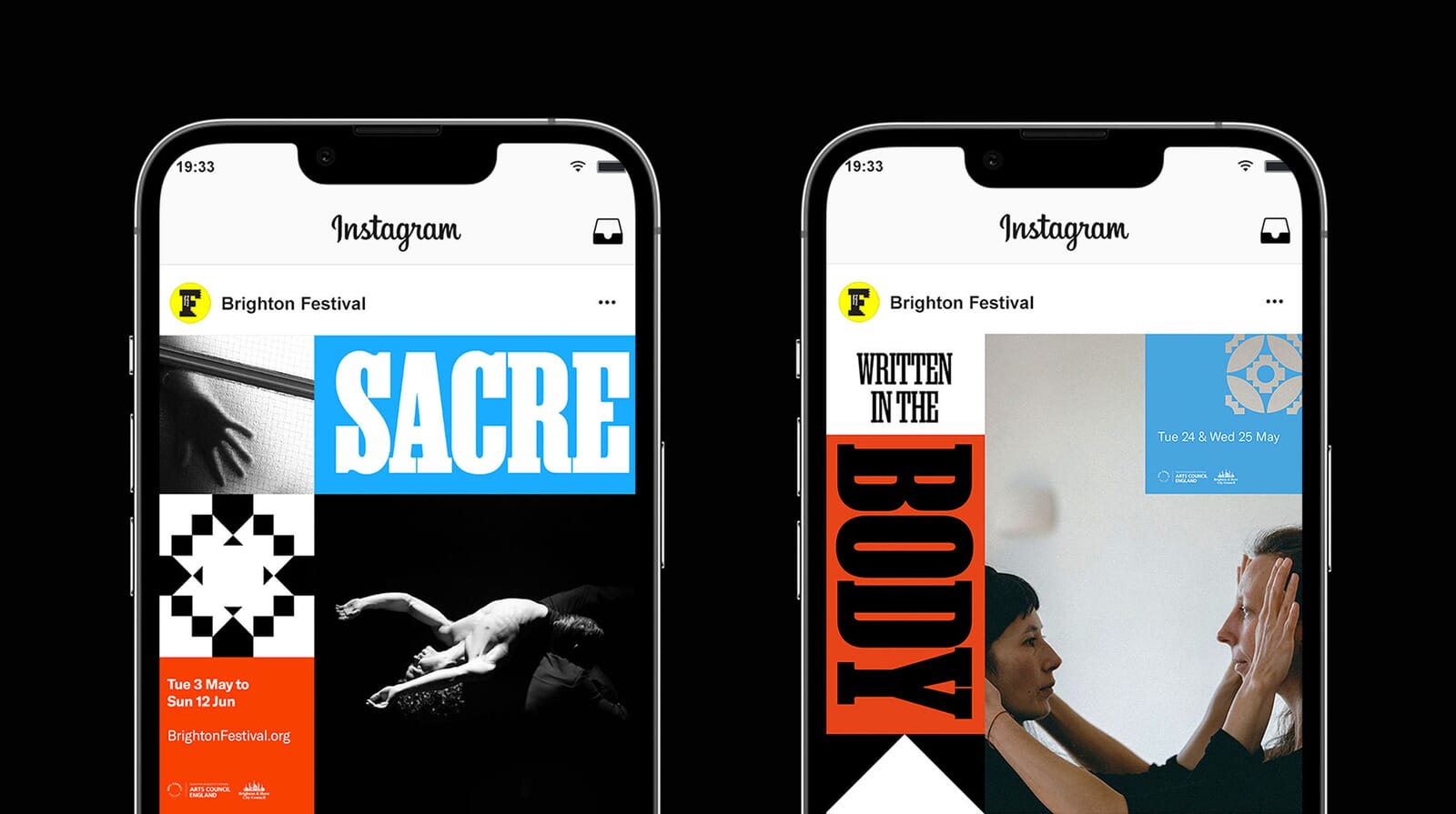
In addition, we developed multiple graphic patterns picking up on the English/Arabic theme, reflecting the two co-directors.
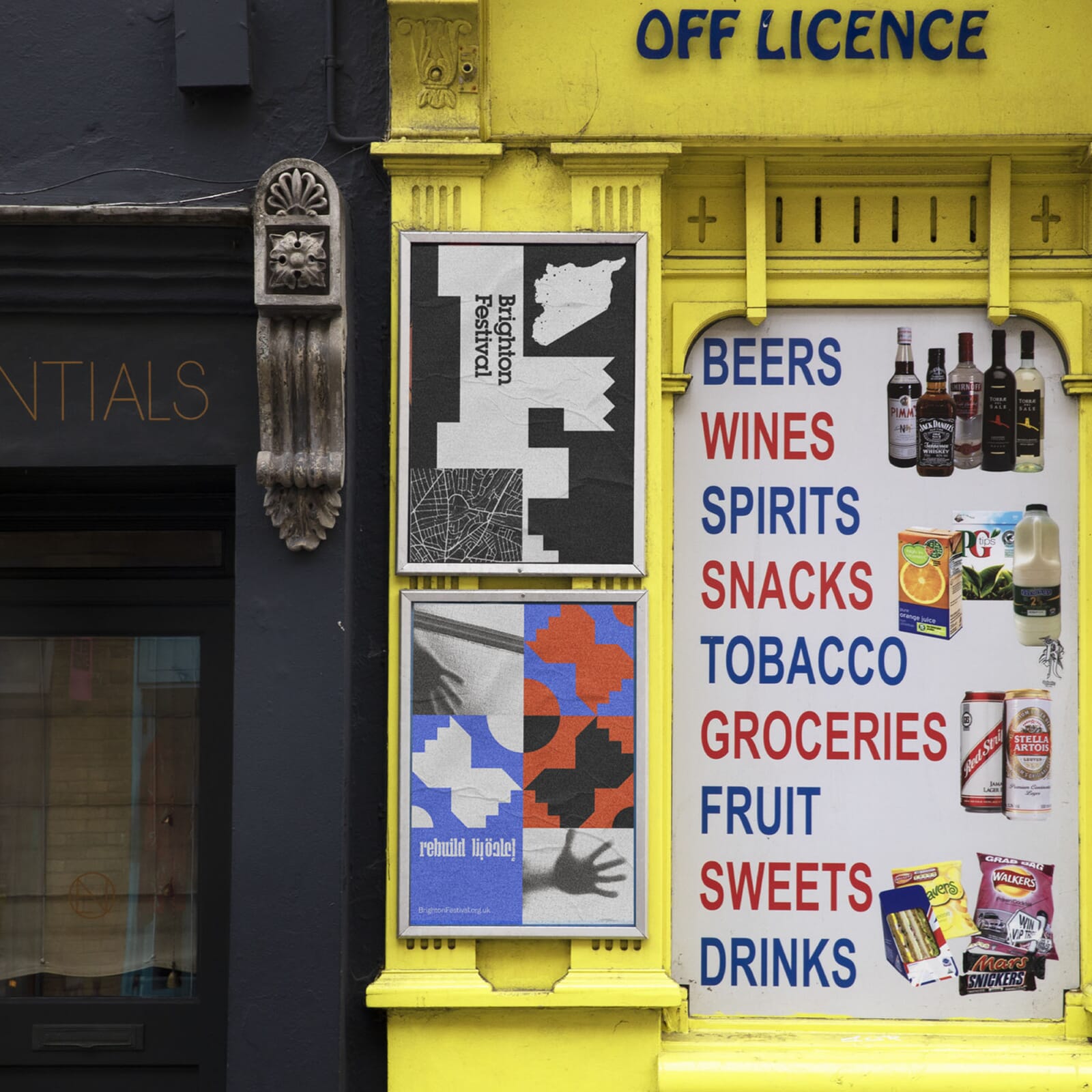
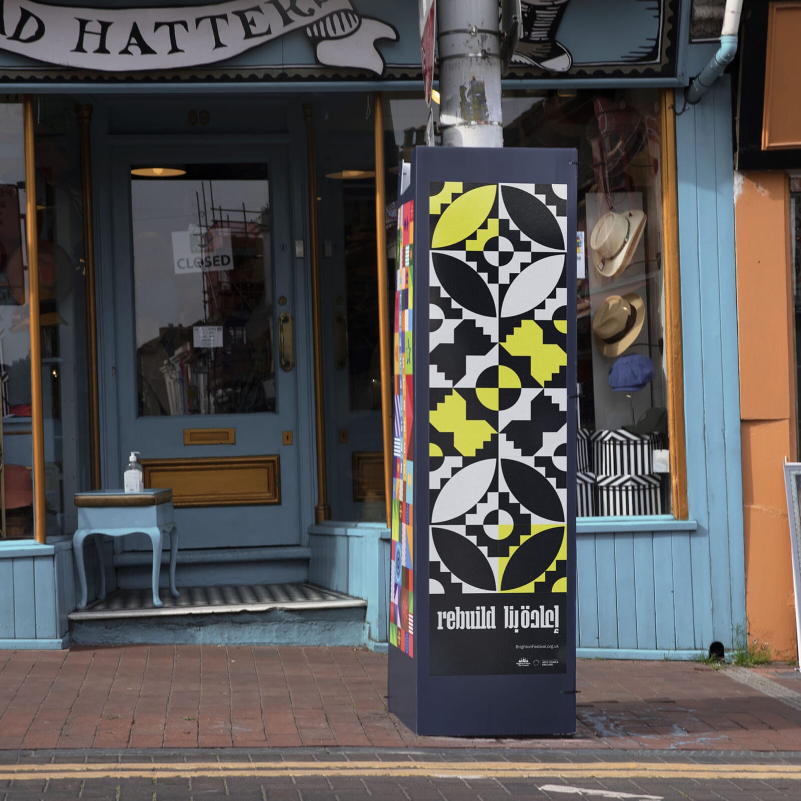
Here’s the design scheme working across multiple billboards and poster sites.
Read about our festival identities from previous years and our parallel rebranding of Brighton Dome.