In 2013 we rebranded Brighton Festival and for almost every year since we have extended and developed the Festival’s branding by designing its annual campaign.
Each year takes its cue from the guest director and for 2020 that will be British and Ethiopian writer and broadcaster Lemn Sissay MBE. He was the official poet of the 2012 Olympics, is a director of the Foundling Museum and has often channelled his own personal journey as an orphan into his writing.
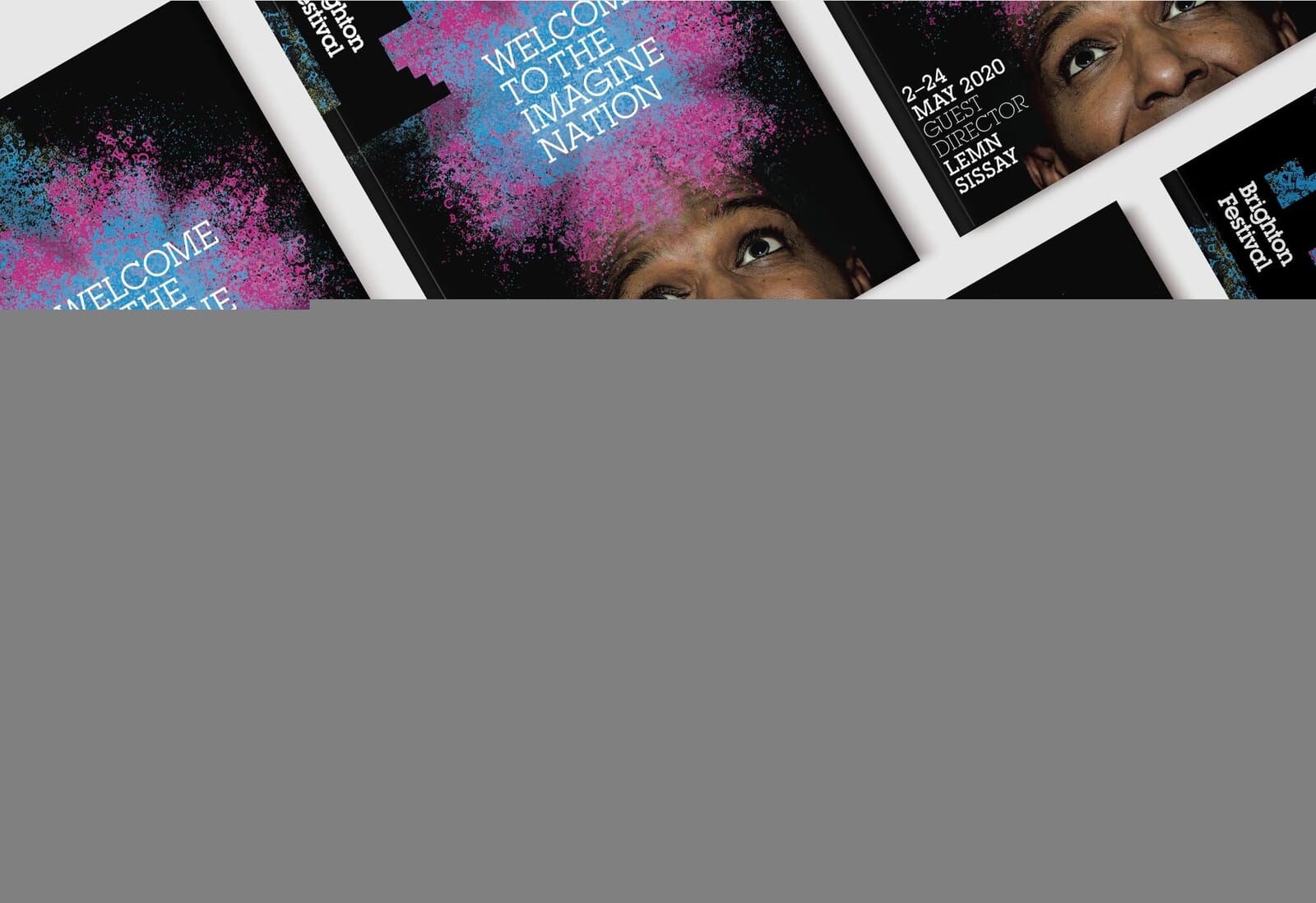
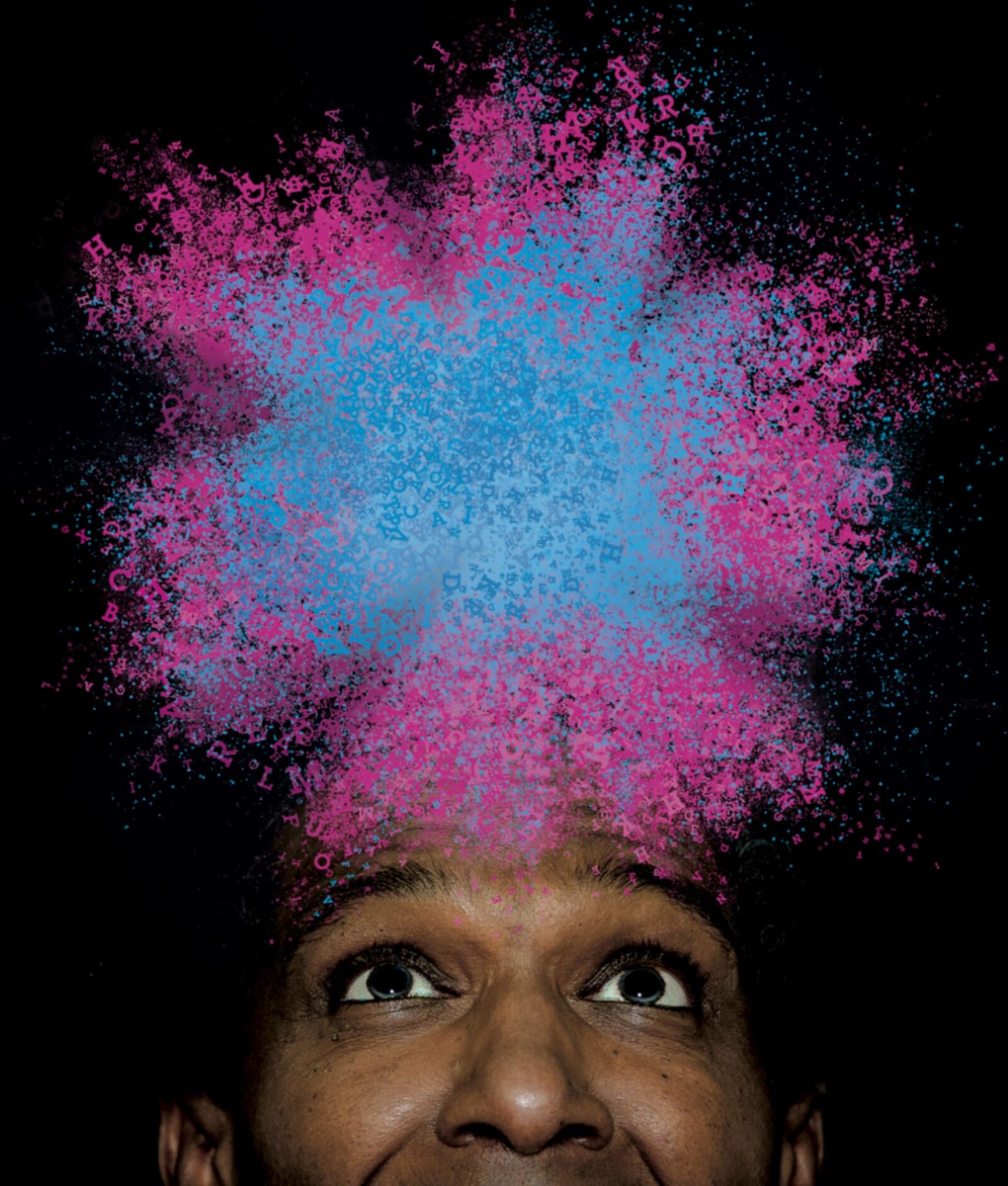
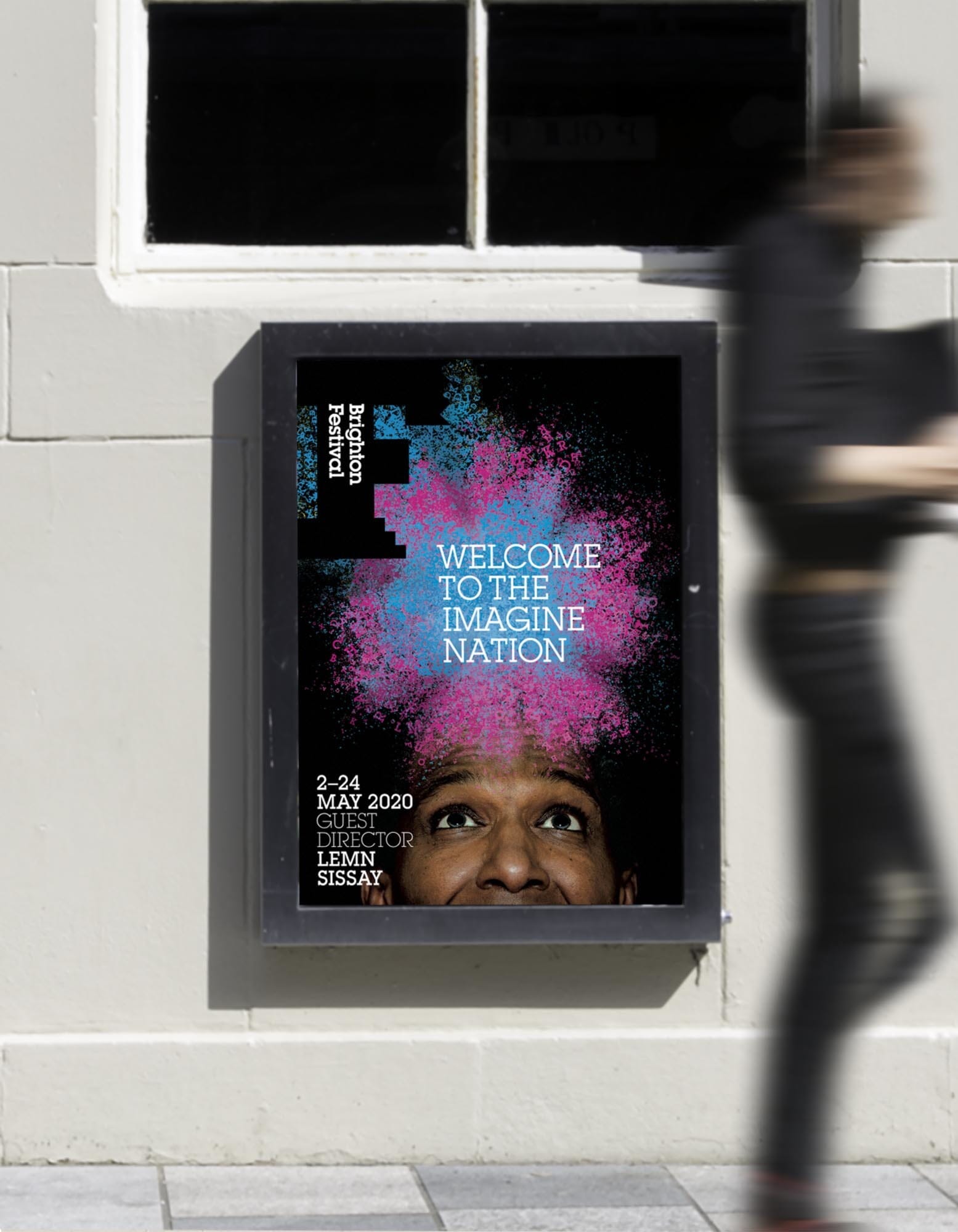
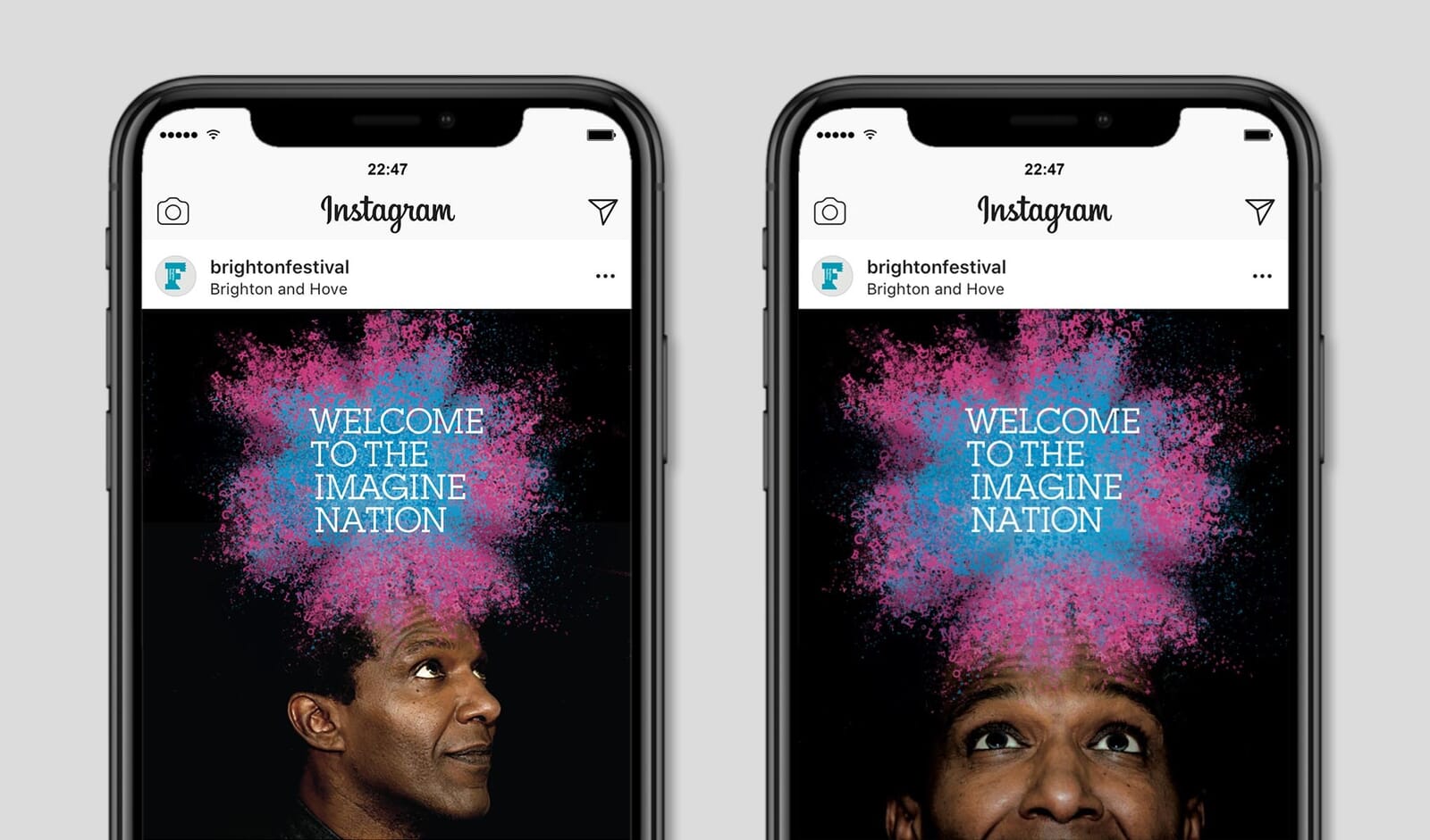
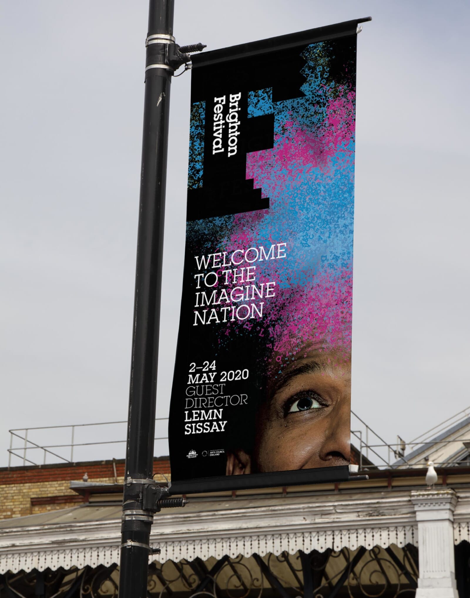
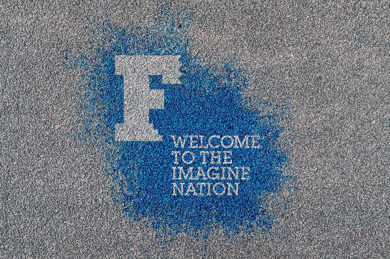
We were keen to use both his face and his raw material – the alphabet – to create a visually arresting theme that literally explodes out of his head and alludes to the explosion of events and activities that the festival now represents. After careful experimentation we found a powerful way to combine paint and typography which is then used in combination with Sissay’s verbal summary of the festival as an ‘Imagine Nation’.
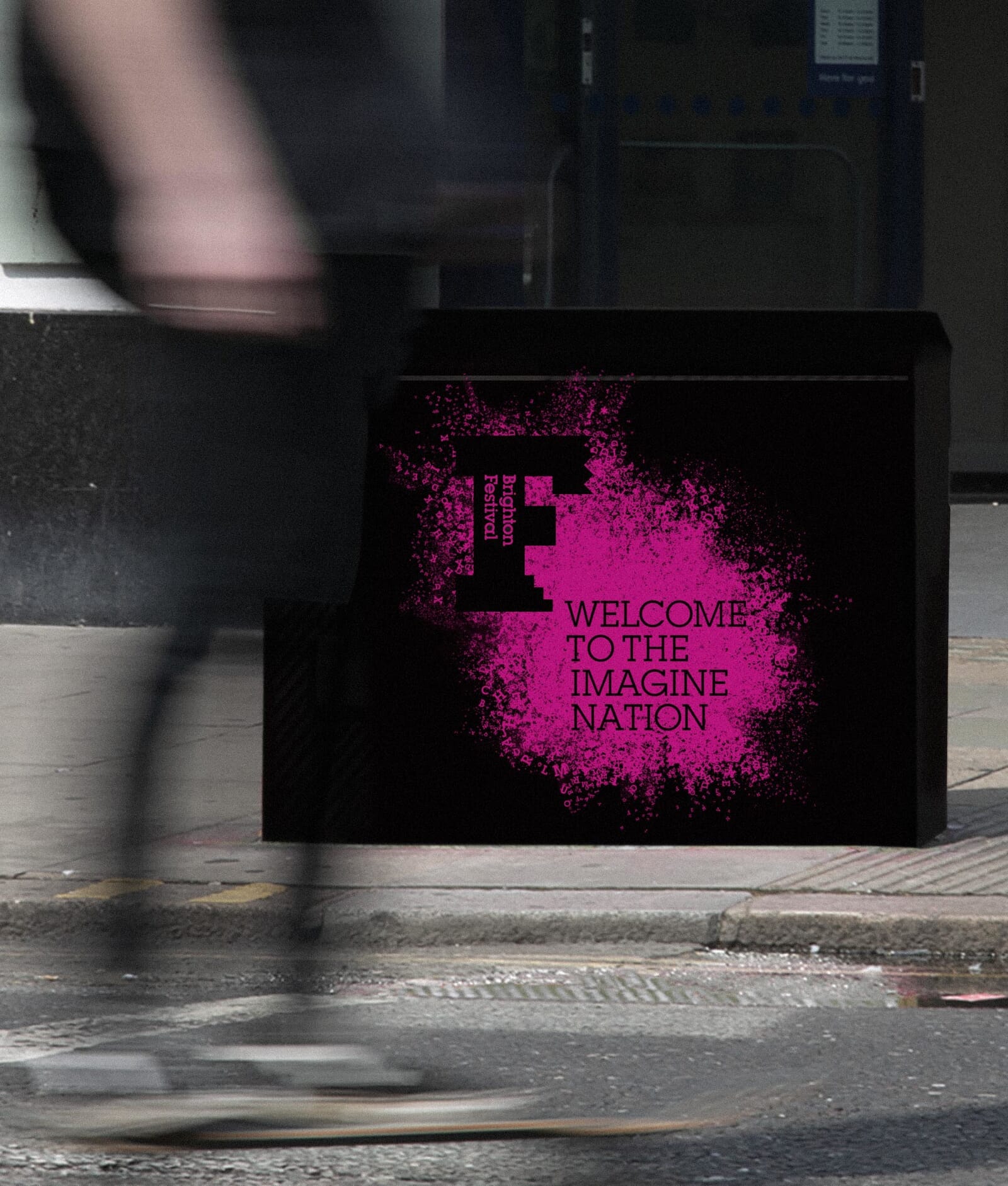
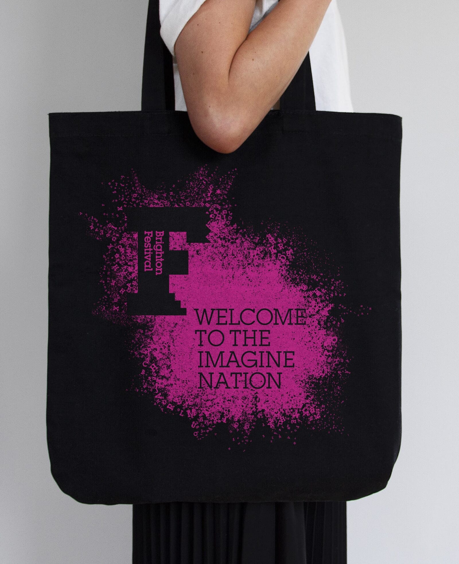
The paint and typography creates a stencilling effect behind the ‘F’ of the Brighton Festival branding which will act as a linking visual device across all of the festival’s communication materials.
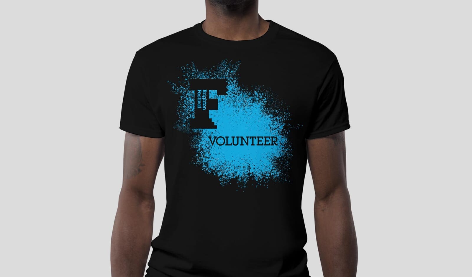
Here’s an overview of how the visual theme will appear over a wide variety of items, from digital to t-shirts, bags and environmental signage.
The Festival launches this week and runs from the 2nd to the 24th of May.
Read about our Festival identities from previous years and our work with Brighton Dome.
Photography: Jamie MacMillan