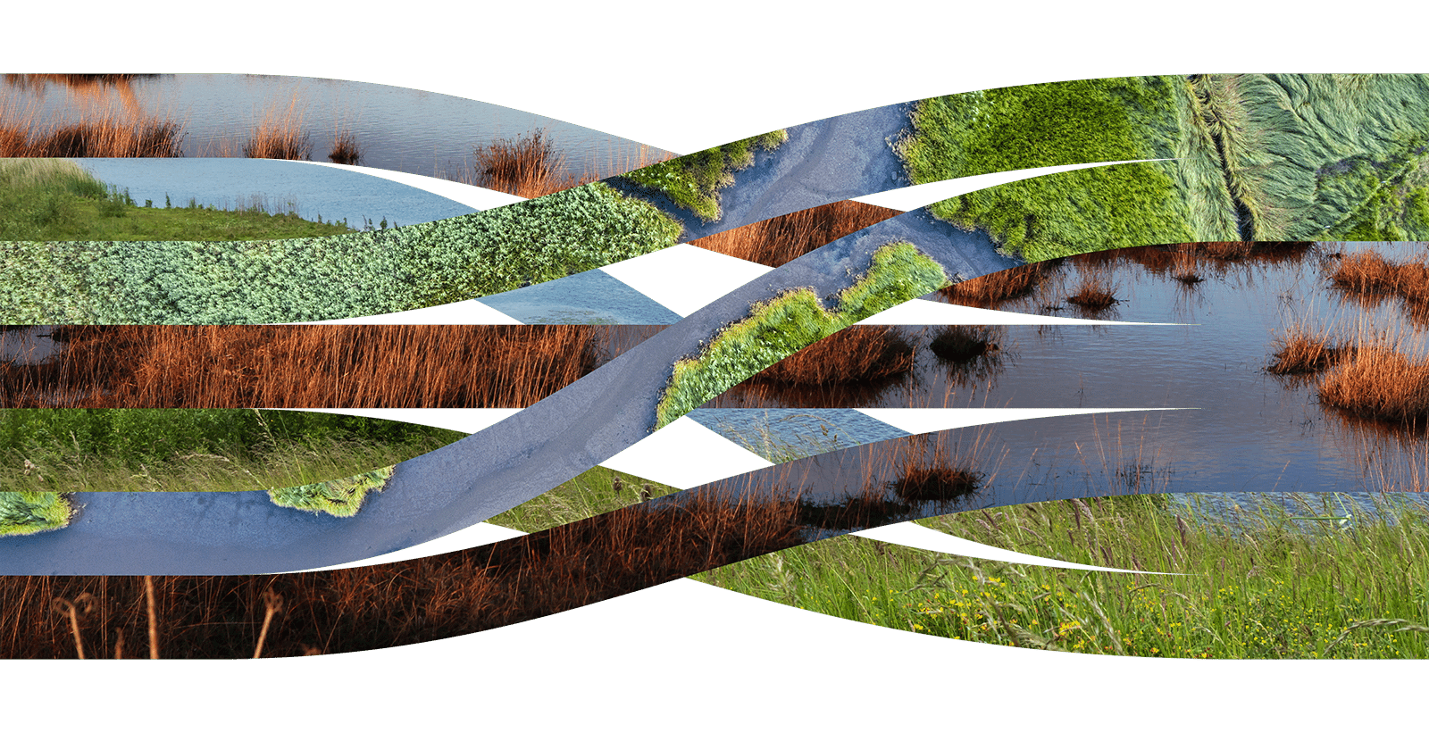
A polar bear stranded on the last remnants of a shattered glacier? Trees bent sideways by hurricane winds? Smokestack chimneys spewing smoke ever-upwards? From Al Gore’s An Inconvenient Truth to today, these images seem to have dominated every article, documentary or social post on climate change.
And sure enough, when asked to provide a poster for a climate biennale in the mid-noughties, our response came straight out of the doom and gloom playbook: a meticulously drawn melting globe placed above the words ‘are you warm enough yet?’
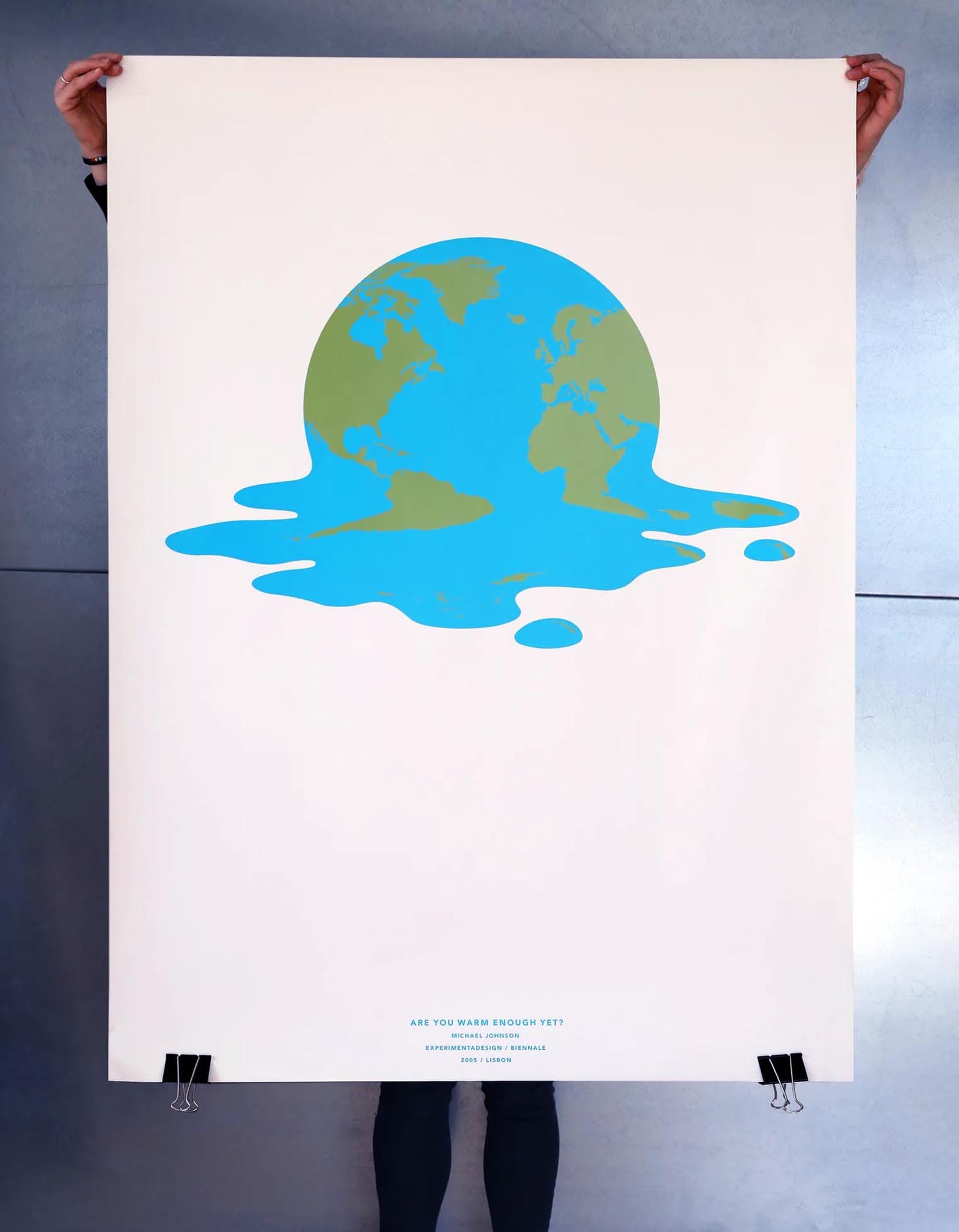
The kind of layout that graphic designers carefully craft, enter into awards then tissue-paper away into their plan-chests, waiting for that longed-for career retrospective. Yet rarely do they move the dial even one iota.
Fast forward to now and we are trying to shift that dial. Not with pretty posters but with real, live branding projects. From global alliances to museum initiatives, from clean-tech innovation accelerators to nature-based solutions, the topic is on all our doorsteps and in desperate need of some better frames of reference. And while ‘we’re all going to die’ may yet prove to be true, we don’t believe the ‘doomster’ narrative will change behaviours and shift mindsets. ‘We all need to step up’ might be a better mantra.
Pivoting away from catastrophe to can-do is possible. From the first meetings about branding the United Nations Climate Change Conference in Glasgow (COP26) the idea of expressing ‘hope with sense of urgency’ felt appropriate. An early idea about a world in flux coupled with a powerful line – ‘the climate has no borders’ – soon transmogrified into a spinning, swirling icon. A world endangered, yes, but not without hope.
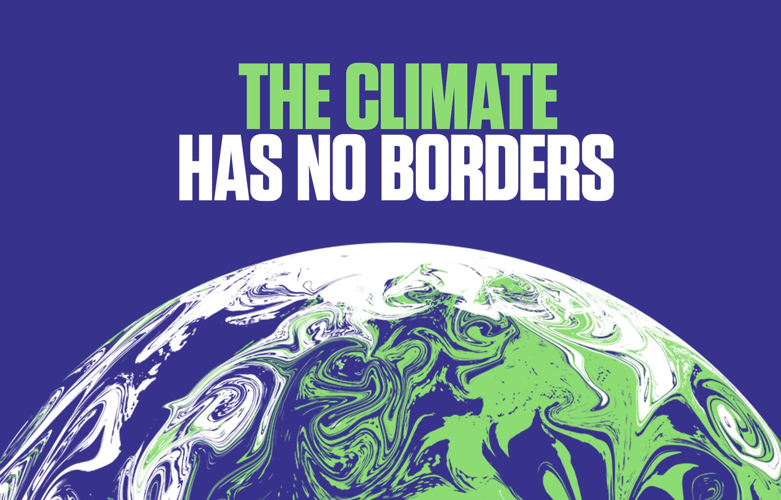
In headlines and messaging we began to challenge delegates into realising the enormity of the work – and decisions – they were taking.
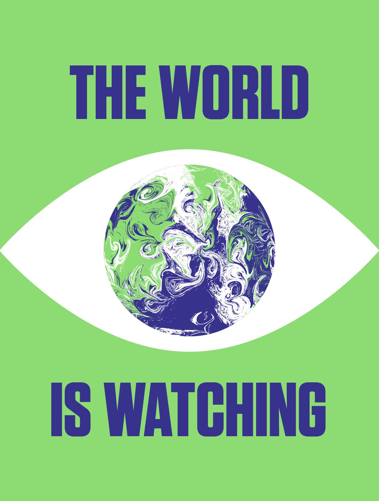
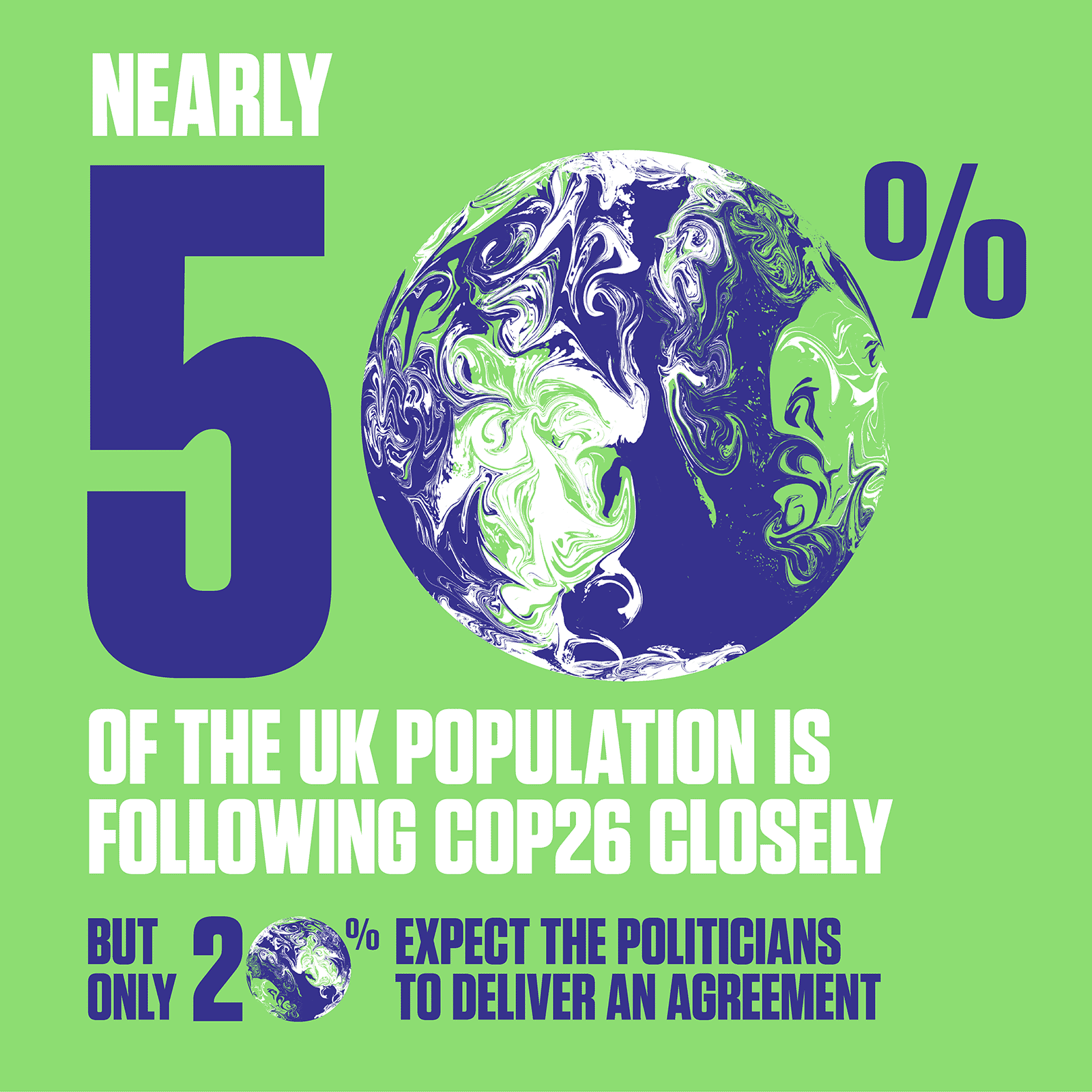
After weeks of blanket media coverage in late 2021, it began to feel that the world really was watching what was happening in Glasgow. And it was true – in one poll nearly 50% of the UK population was tracking the outcome of the conference closely.
Whilst COP26 was determinedly big picture stuff, a new ideas accelerator from The Royal Institute and Imperial College’s Grantham Institute wasn’t happy with their fledgling brand. Their working name, the Centre for Climate Change Innovation didn’t match with the team’s aspirations, or the collective task facing its young innovators – searching for new ways to mitigate or adapt to the effects of climate change.
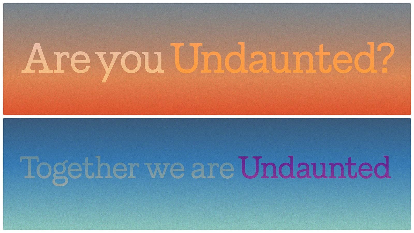
After an exhaustive search where we looked at (and checked) hundreds of names, their final choice – Undaunted – encapsulated their indefatigable determination and opened up a bold new way of communicating.
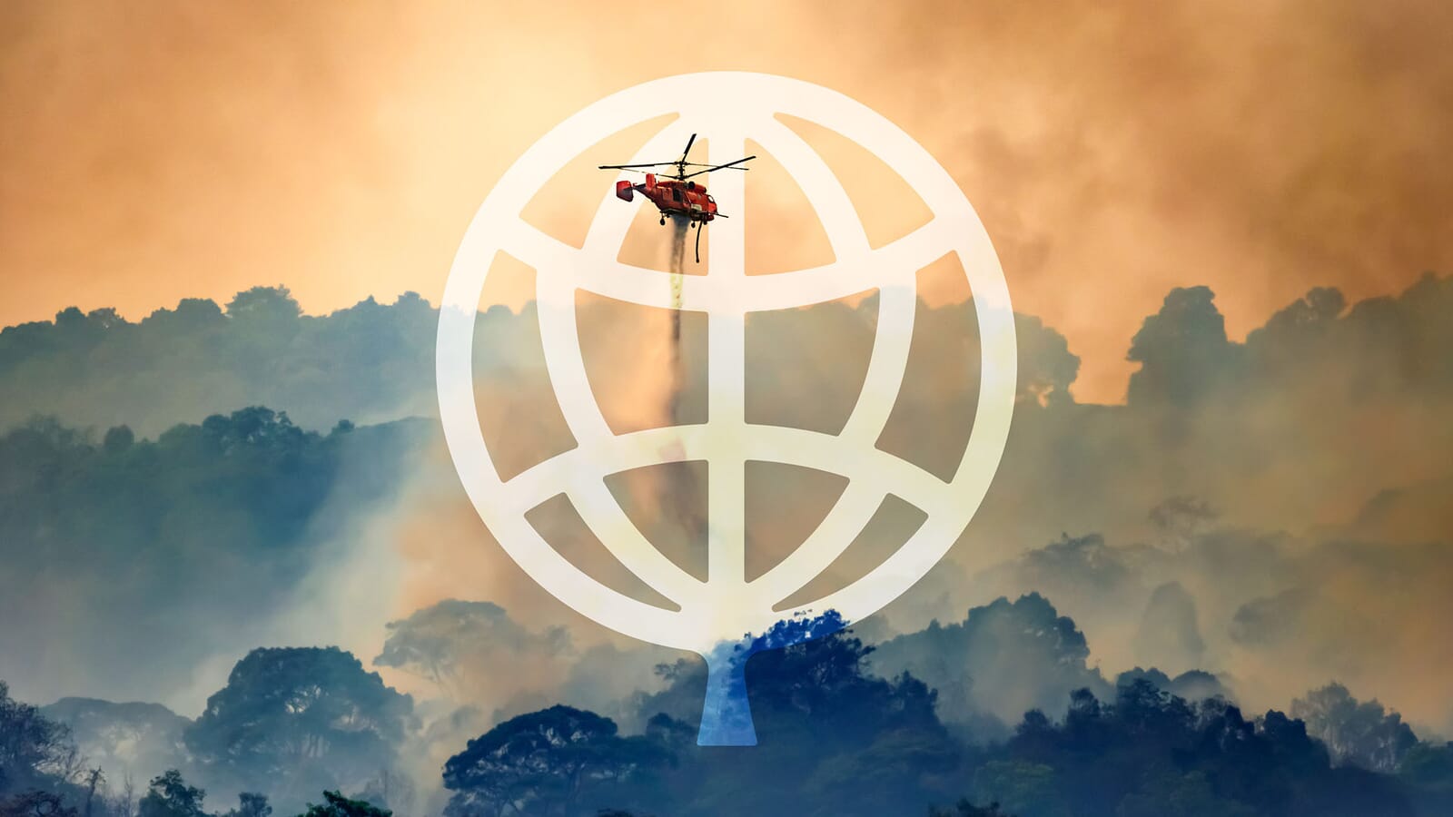
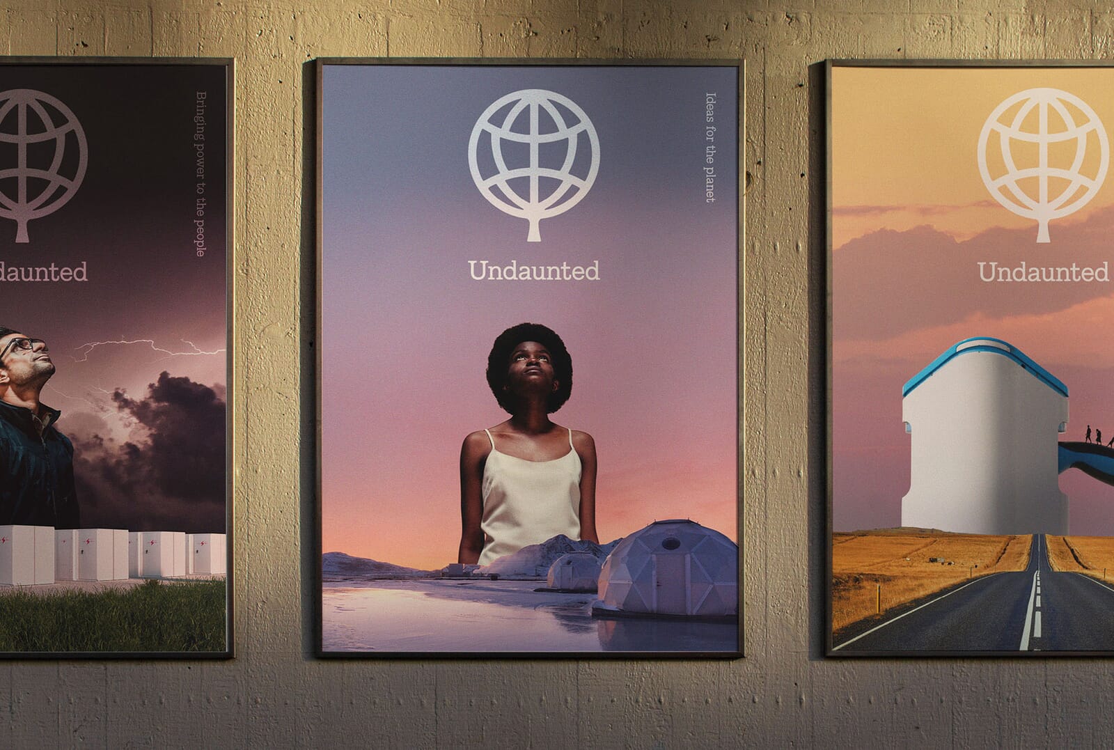
As well as having an unusual name, Undaunted’s symbol takes one of the most persistent clichés of this sector and turns it into something new. By carefully bending the inner bars of a globe pictogram into the shape of a leaf, it symbolises two things simultaneously, and sums up Undaunted’s worldwide ambition.
For the Global Commons Alliance, which advocates for all which is common to us all (the Arctic’s sea ice, the Amazon rainforest, critical ocean currents and our freshwater network), something slightly ‘familiar’ felt wrong. Especially as so many of their peers have settled for such strikingly similar iconography.
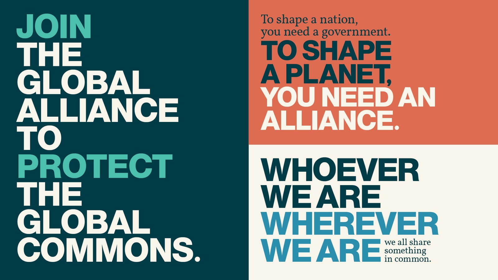
Explaining such a huge and complex remit needed punchier and more strident language and visually differentiating from their sector was a strategic imperative. In addition, we felt that their overall vision, of a ‘planet with life’, deserved an approach that was overwhelmingly positive and celebratory.
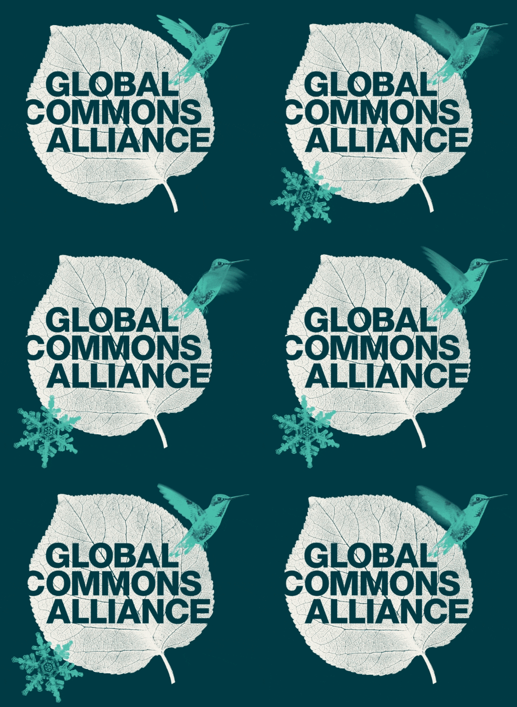
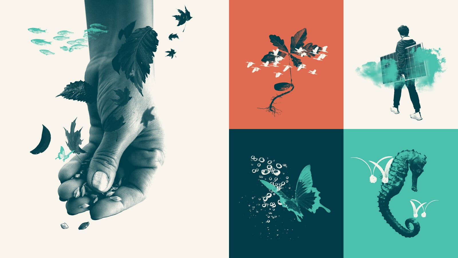
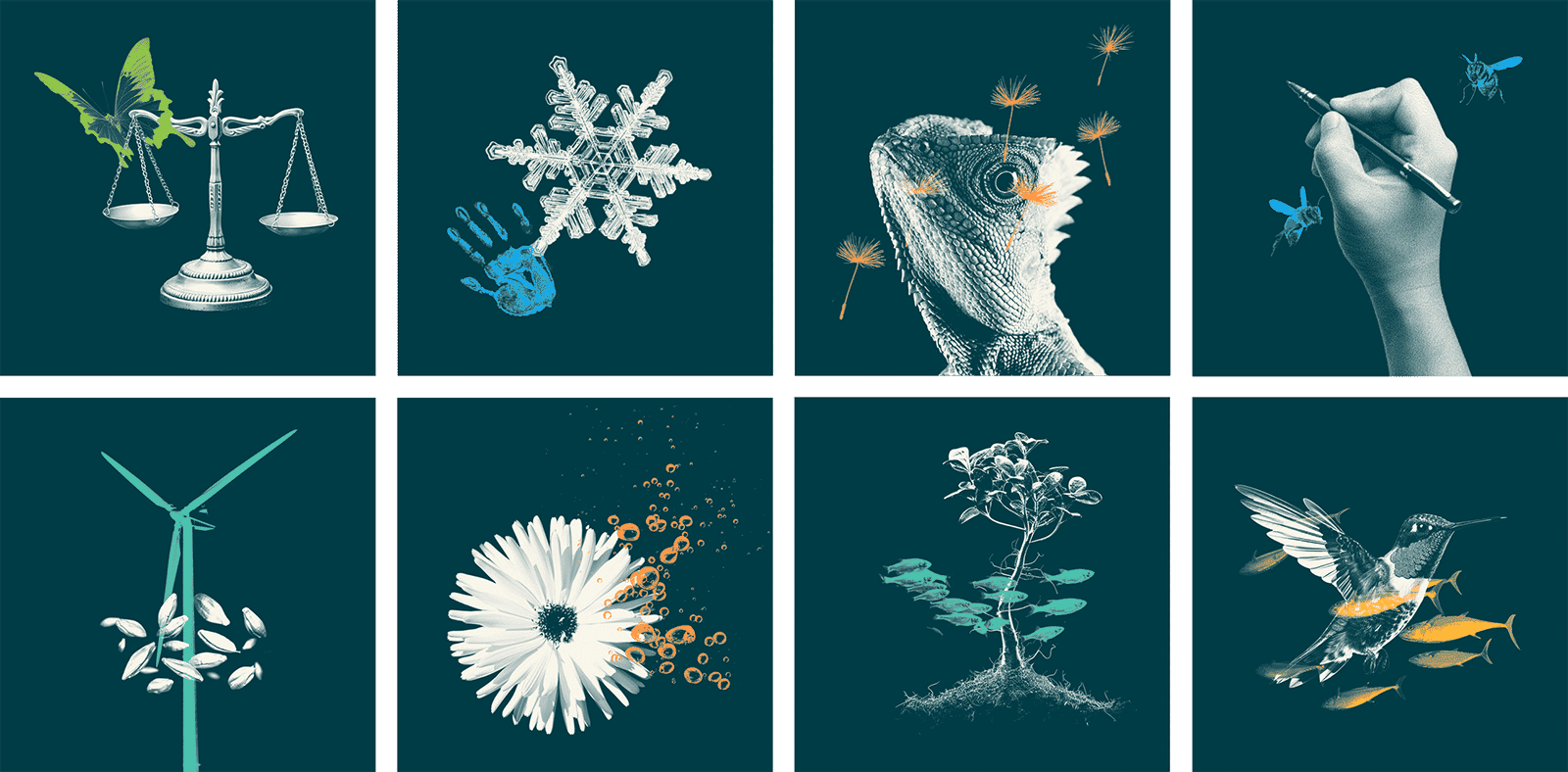
An early idea – to create symbols and components out of photographic collages – slowly began to gather support. You’re not supposed to create logos out of photos of leaves, birds, frost-flakes and fish, but that’s exactly what we did.
Bit-by-bit we collected and created an image library of over hundred images and collages, coupled with free fonts and easy to use templates.
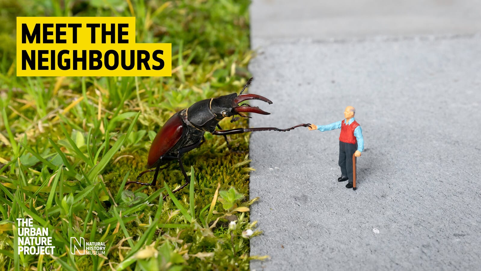
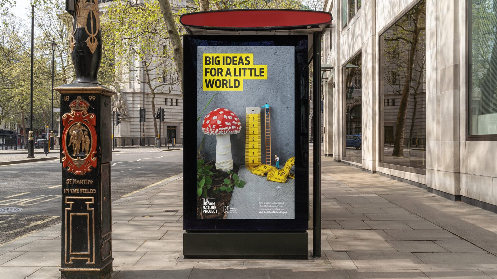
This search for standout isn’t an easy journey. It means assiduously auditing sectors and competitors, pushing ourselves to find new approaches and asking for bravery from our clients in return. The Natural History Museum could have chosen a safer route for its Urban Nature Project, but once they saw humanity ‘shrunk’ to the scale of mushrooms, birds and bees, they understood how it could explain their project in an instant.
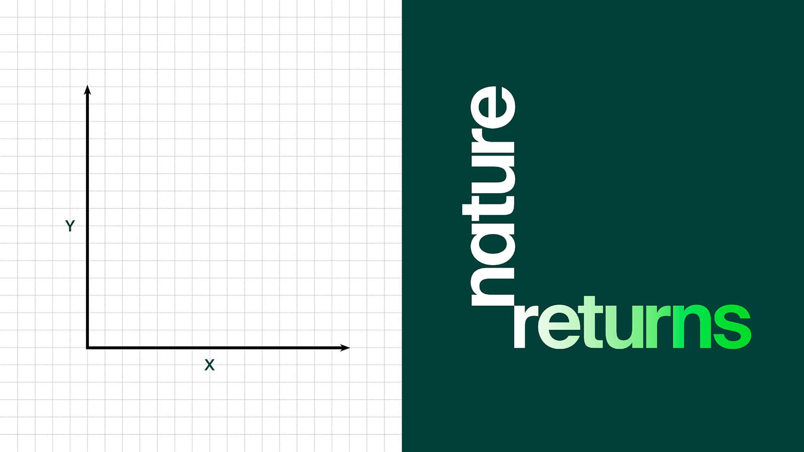
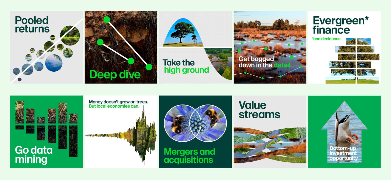
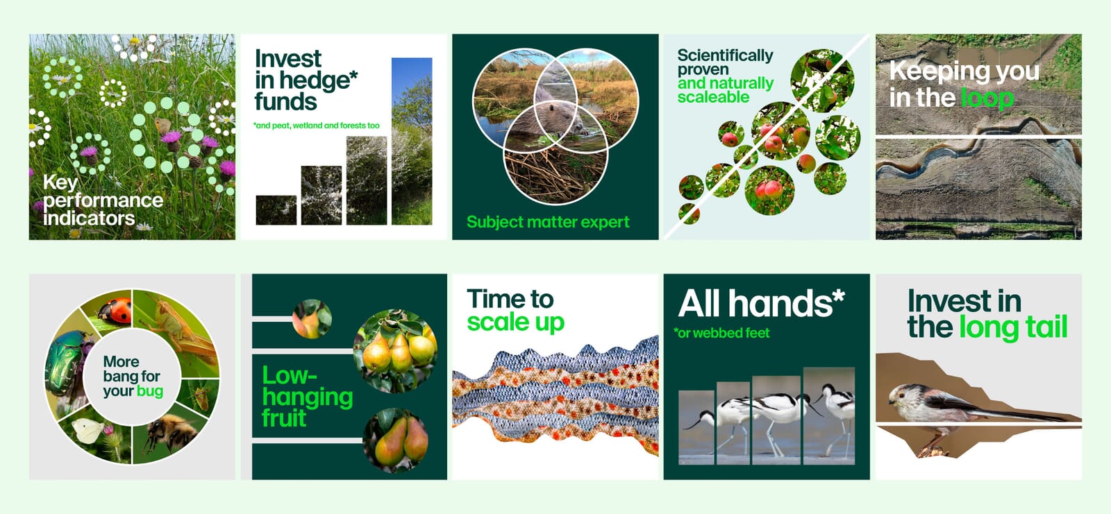
For a project digging deep into the science of how nature can help mitigate climate change and biodiversity loss, calling it Nature Returns was a deliberate ‘zag’ away from what was expected.
Our clients – led by Natural England, in partnership with the Environment Agency, Forestry Commission and Royal Botanic Gardens Kew, Wakehurst and co-sponsored by two government departments – were clear from the outset that a steelier edge was needed. Because for ‘nature-based solutions’ to gather meaningful support, they also have to be cost-effective investments.
By deliberately hinting at both types of ‘return’, both natural and fiscal, we opened the door to a unique visual language that merges the languages of science, nature and finance.
After five major projects in the the climate and environmental sector, we’re beginning to spot the patterns and pitfalls. ‘Doom and gloom’ doesn’t have to dominate. And we have the hard facts to prove it.
Yet, even as we think we know what’s right, new projects such as Nature Returns make us think anew, or the immensity of a task such as the Global Commons Alliance’s forces us all out of our comfort zones.
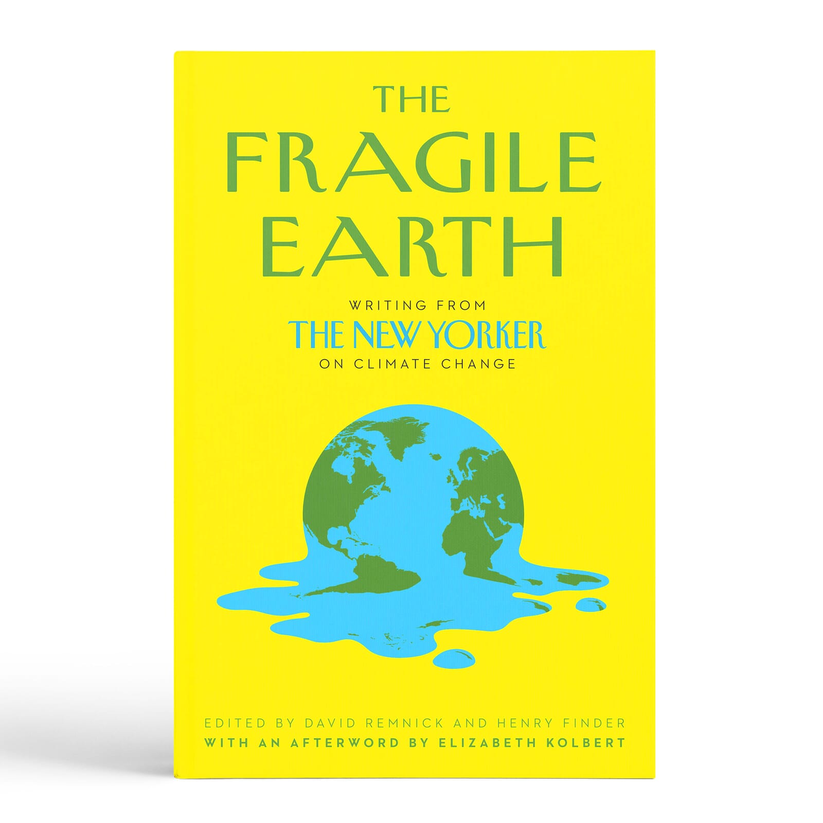
And, just occasionally, those older ideas can be put to use. The melted globe poster that sat in a plan chest for nearly two decades? It found a new life, recoloured and revisited for a collection of climate essays from The New Yorker. A message about catastrophe, remodelled to do good.
By Michael Johnson, Founder and Creative Director, Johnson Banks