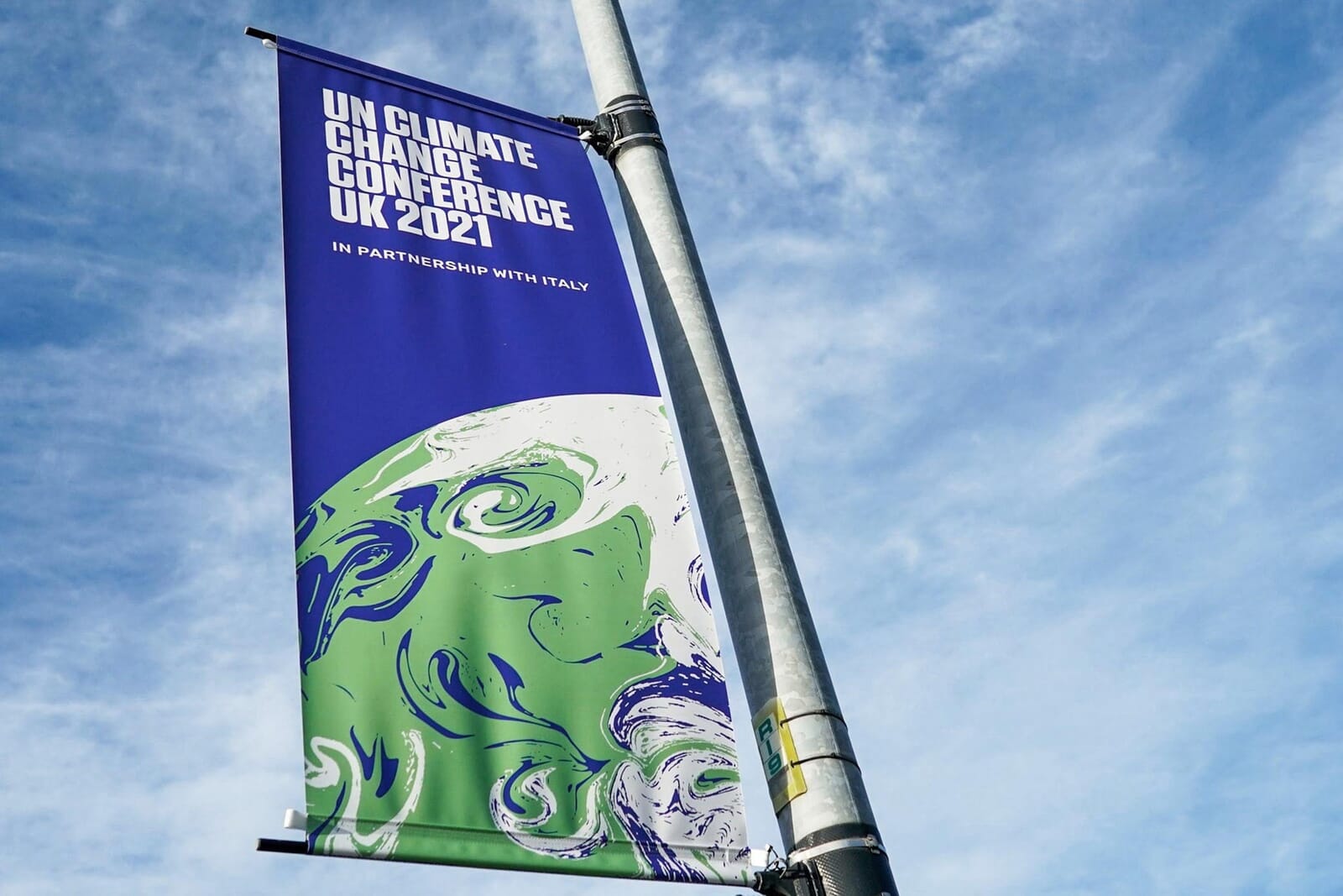
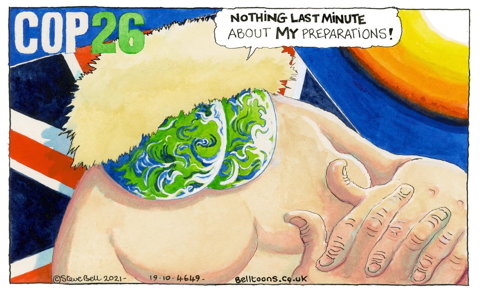
It’s not every day that one of your designs becomes the backdrop to two American presidents. Or appears on the face mask of the world’s most recognisable teenage activist. Or forms the buttocks of a Prime Minister in a newspaper cartoon.
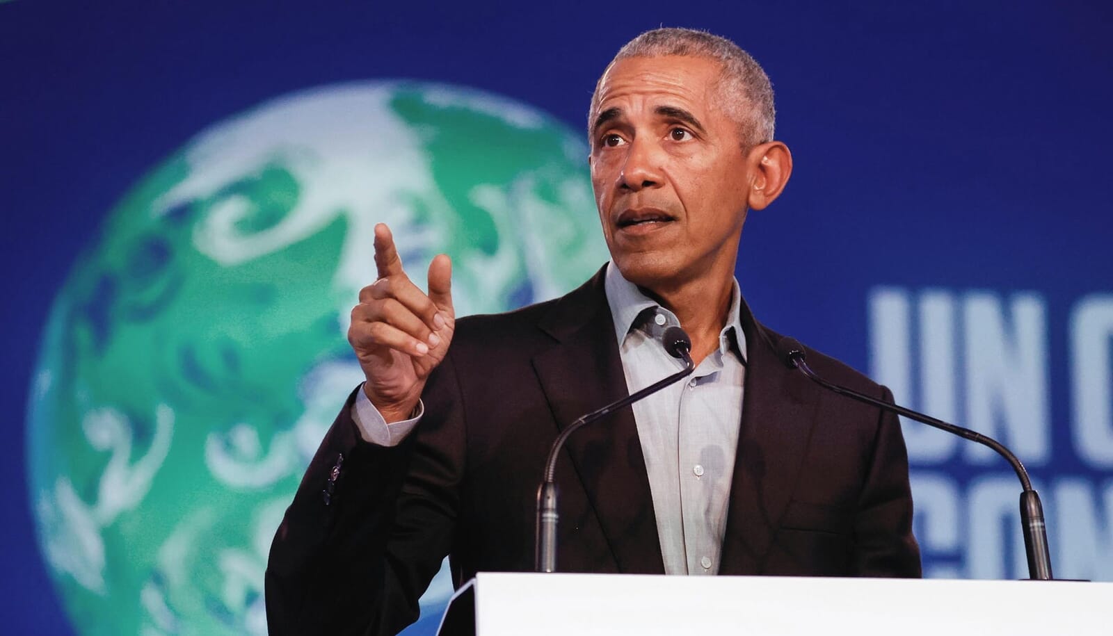
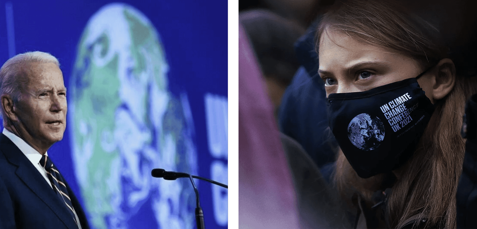
Welcome to the roller-coaster ride we’ve just experienced as our identity for the United Nations Climate Change Conference – more commonly known as COP26 – has been, well, everywhere.
But now that the banners have come down and the posters put away, what have we learned from the experience?
The work originally began in 2019, then followed a perfect storm – a pandemic, the collectively heightened awareness of our endangered planet and multiple, recurring climate disasters. All of sudden, COP26 had become the most important meeting since Paris in 2015 (itself the architect of the famous 1.5 degree target), and whoever worked on it was in the firing line.
We initially approached the project with trepidation as regards subject, and client. Would the conference be a success? And – even though we’d be working with civil servants at the Cabinet Office – should we be getting close to an administration with whom we didn’t exactly see eye to eye? Maybe the feeling was mutual – we discovered once appointed that we had been vetted by one of the internal team. They’d probably realised that our politics were clearly centre-left, and we’d hardly been backwards about coming forward with our views in the past.
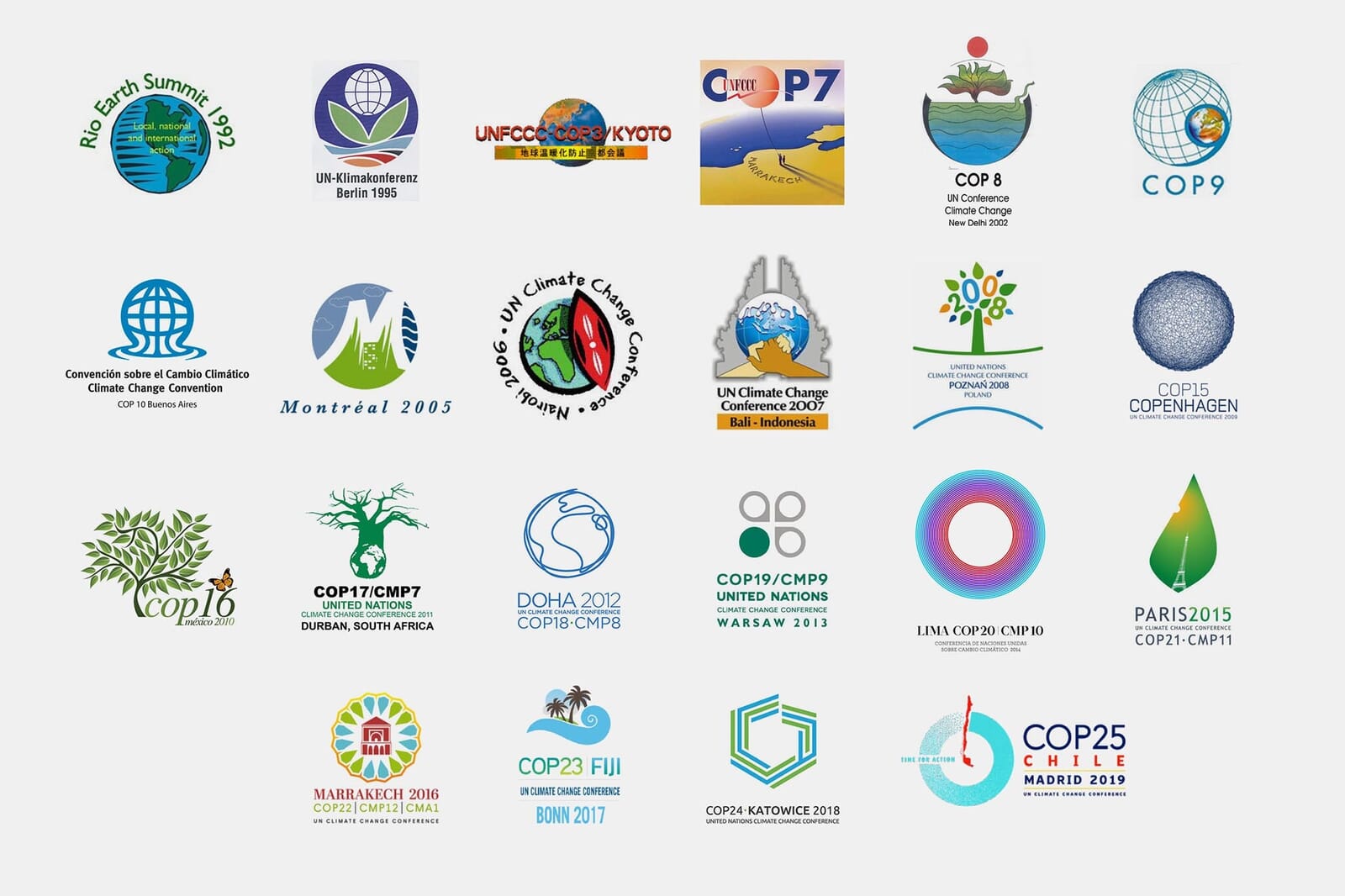
But the first meetings went surprisingly well, and the bar set by previous conference designs (shown above) wasn’t very high. We were determined that a big event of this importance needed an equally ‘big’ idea, and from the very first meeting, the swirling, marbled world we’d begun to create was always the preferred solution. We were given free rein to develop it and animate it as we saw fit.
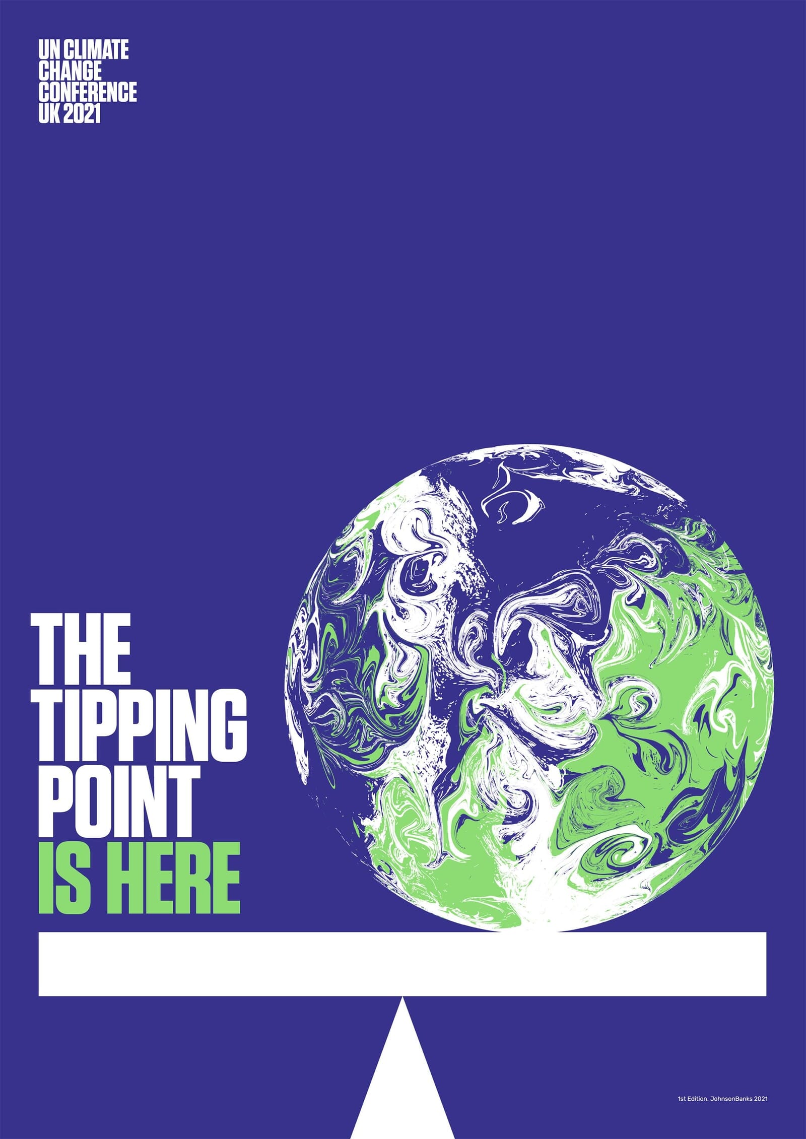
When the end of our contract was reached and we handed over assets, guidelines and animations, in truth we had no idea how it was going to pan out. And by the beginning of 2020, we were worried – the designs that had appeared seemed haphazard and rarely linked to the main brand.
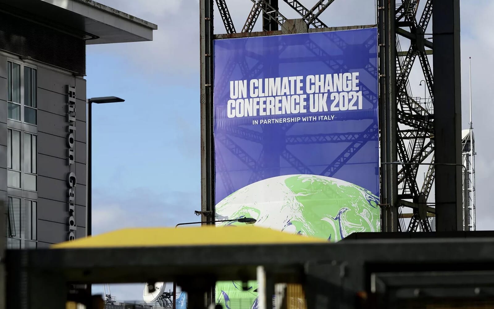
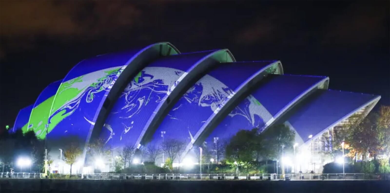
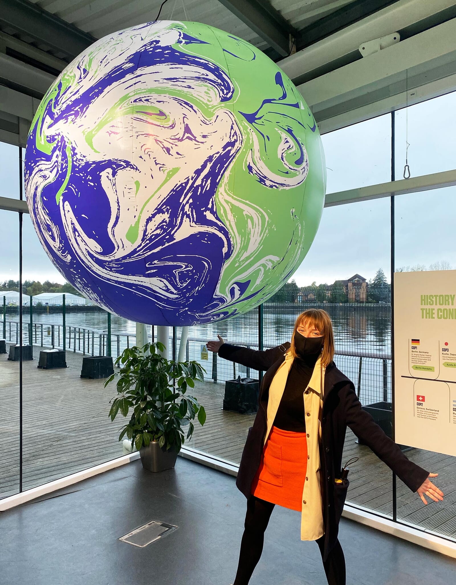
However the year’s delay seemed to help. When November 2021 finally came around, the scheme had found its feet and for three weeks it was omnipresent – plastered over cranes, railway stations, landmarks, beanies, backdrops and badges. You could even go online and order your COP-themed duvet cover, should you want ‘the world to be watching you’, in bed.
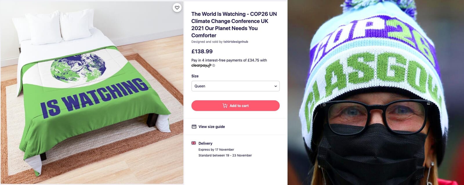
It became its own twitter icon and even received a redesign courtesy of Extinction Rebellion.

It’s rare for such a conceptual idea – that of a world in flux, ‘earth-like’ yet otherworldly – to get agreement in government circles, let alone see it embraced and expanded on so publicly. And given that a decade ago journalists were doorstepping the designers of the London 2012 logo as that scheme came under fire, we were braced for similar impact.
So there were moments when we wondered if our solution would get its legs chopped from under it, or end up minimised in the corners of billboards and websites.
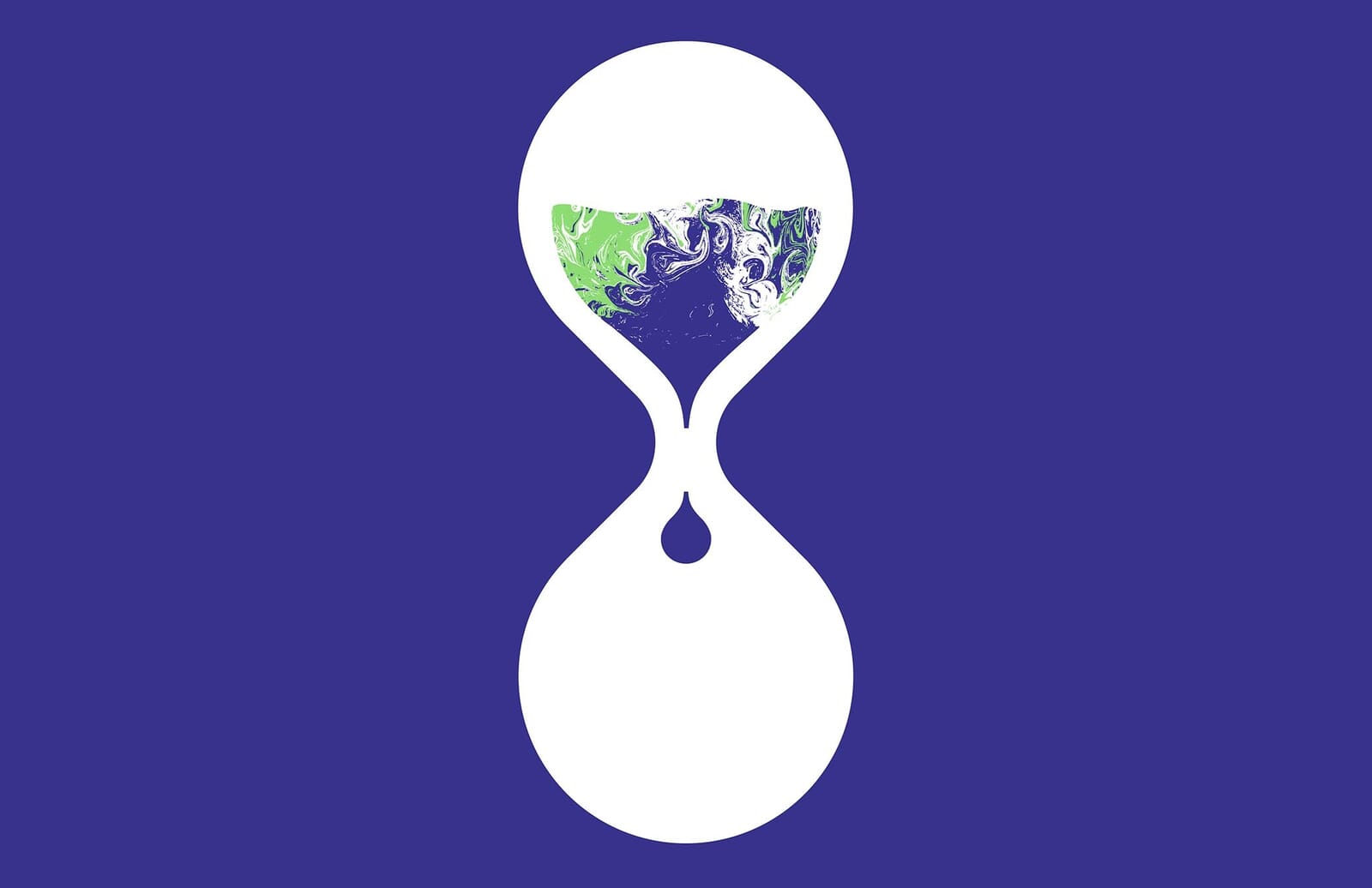
Yet it’s fair to say that the take-up of the branding took us by surprise. The analogy with major sporting events holds true – the scheme was on every surface, every newspaper, and in every news bulletin for three weeks, yet has now gone, much like an Olympics or a World Cup.
As with any public event, the ‘success’ (or not) of its visual identity is probably umbilically linked to two things: how well and consistently it is used, and the achievements of the event itself. For example, whilst some designers admired Copenhagen’s logo in 2009, the actual meeting is commonly cited as a disaster – crucial negotiations only took place with a few member nations, excluding many developing nations.
As we write this, two weeks after COP26’s conclusion, there seems to be a consensus that it frustrated many, either by going too far (if you’re a fossil fuel lobbyist) or not far enough in terms of the national commitments and hard, binding targets (if you’re anyone else).
Perhaps, in the end, a world in flux – or a climate agreement in progress – was actually the most apt solution. And the fact that it was used by all, generally lauded, and only occasionally lampooned? We’ll admit that we’re both relieved, and proud to have been involved. For once, graphic design had cut-through, was noticed, and made, we think, quite a mark.
Read more about our identity for the UN Climate Change Conference (COP26).