
The change of an organisation’s brand or logo brings many strong feelings to the surface. There are countless web articles on the pros and cons, articles in the press and even pieces on TV in the case of the London Olympics furore.
Many of the discussions focus on the ‘before and after’, the A/B comparison. Views get very polar, very quickly. Sometimes the twittersphere explodes (more of that later). But very little of the discussion revolves around ‘why’ that particular company or organisation had to change. Why is that?
One of the most powerful and legitimate reasons to change is a fundamental change in business circumstances – a merger, or a takeover, for example. Recently two London based property companies, Development Securities and Cathedral Group merged, and rather than subsume one into the other they created a new brand, U+I (United and Industrious). When Singapore airlines sold their majority stake in Virgin Atlantic, there was a point at which the Delta board would have looked at the Virgin brand and had to decide – do we keep it, or do we ‘fold’ it into our brand? Thus far, they have established clear links between the brands without formally merging them.
Sometimes an organisation’s core market changes. This might mean that a brand that was created to ‘fit’ with one product or market no longer works. So Shelter’s previous symbol used a piece of typewritten, ‘angry’ type, which matched their original mission to concentrate on the homeless. But a gradual switch in focus to bad housing meant that needed to be reflected in their rebrand.
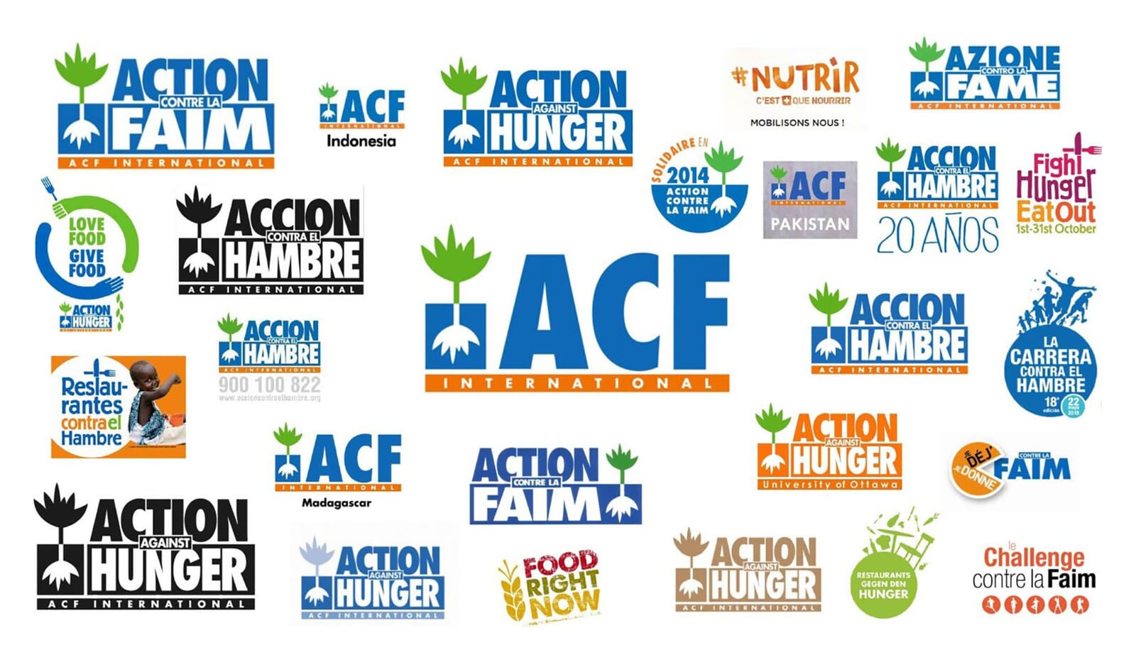
Another reason might be some form of structural realignment. Action Against Hunger, in its many guises in 54 countries across the world, wanted to present itself as a global expert in malnutrition (which is true) – but from country to country their names, logos and sub-brands varied significantly. They didn’t come across as a serious force. So a key part of their change was to gain some consistency from country to country.
You also see this type of change with ‘groups’ of companies – hotels coagulate under banners such as ‘Leading Hotels of the World’ and then reflect this ‘membership’ in the straplines they use, and the group marketing strategies then can all share.

That seems to be the underlying reason for the recent Science Museum rebrand – it’s actually part of a bigger branding change which affects what was NMSI (National Museums of Science and Industry) and has now become the Science Museum Group. This repositioning and name change has clearly sparked the desire to bring all the group’s constituent parts ‘into line’. Thus far the group, the Science Museum in London and the Science and Media Museum in Bradford have changed (and presumably, in the future, the other group members).
Increasingly we’re seeing rebranding used to clarify and restate what an organisation is there to do. This is especially prevalent in the not-for-profit sector where branding and campaigning has almost merged into one activity. So Macmillan’s rebrand catapulted them back into the public eye, and has a huge affect on their fundraising abilities.
The DEC wanted to move from a loose collection of aid agencies ‘popping-up’ in times of need to a clear and decisive response mechanism to worldwide disasters and emergencies. And this new stance has transformed their money-raising abilities too – in some cases 300% of what they could achieve before.
Sometimes ‘clarify and restate’ gets interpreted as ‘needing a refresh’ and this can be a contentious area. If nothing about a company or organisation’s offer has changed, and rebranding is used purely as a cosmetic makeover, then often customers and consumers can smell a rat.
When the original commissioning team moves on, branding’s biggest biggest problems arrive. The first issue is boredom. After about three years, an internal team, their agencies, their advisors – everyone – has had enough, and people start to tinker. Yet, paradoxically, about two-to-three years in is precisely when a new brand has just started to seep into the public consciousness, and arguably that’s exactly when a brand should become more consistent, not less.
The next big problem is ‘not invented here’ syndrome. New teams, often new directors arrive, and the human desire to ‘make a mark’ kicks in. Someone lets the internal team tinker, and slowly things unravel. Every new business manager for every major branding company in the world keeps an eye out for changes at the top of major organisations – because this is when existing branding schemes are at their most vulnerable, new brooms are brought in, and the sweeping starts.
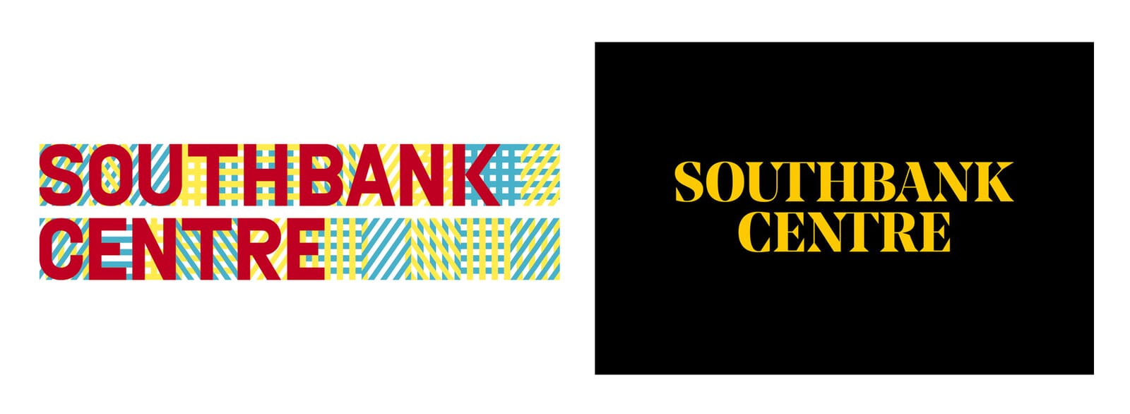
With some recent rebrands there’s also a sense of if in doubt blame the brand. At launch in 2007, the previous Southbank design scheme seemed like a powerful and flexible idea that could flex and modulate across the institution’s communications, but within five years had been relegated to just the ‘logo at the bottom of the poster’.
Now, was this the fault of the scheme, lack of interest from the internal team, a misunderstanding of the scheme’s original intentions, bad brand management, or a toxic mixture of all of the above? Who knows. What’s not in doubt is that rebranding multi-part cultural institutions, with their many layers, and many voices, is one of the toughest tasks to pull off successfully. And to carefully ‘police’ these kind of projects, for years, is another task in itself.
For years, a graphic designer’s role in branding and rebranding has been far too reactive. A trusted long-term client moves to a new job and the emails and the lunches start – all in pursuit of the desired rebrand – but rarely is this done from a strategic point of view.
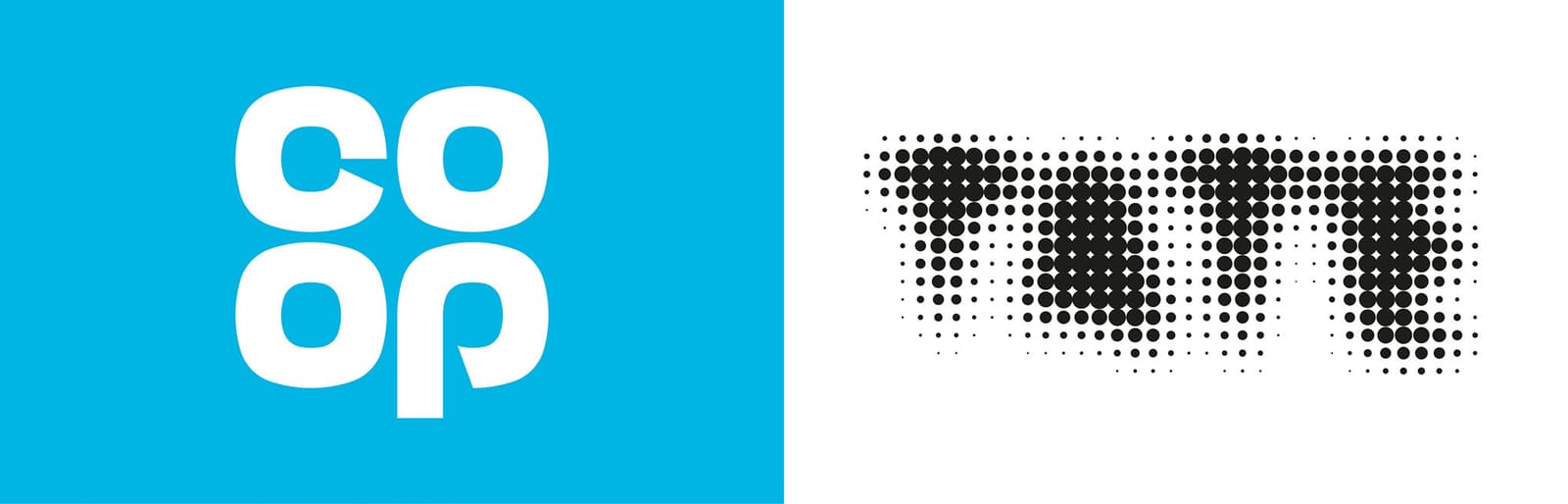
But we’re starting to see a new pragmatism at play. The Co-op reverted to and revived a version of an old logo, rather than inventing something new. The Tate recently cleaned up their famous scheme rather than change it. And after much discussion, it became clear that Action Against Hunger’s legacy symbol had recognisability and decades of use on its side, so an ‘evolved’ version was required, not a revolution.
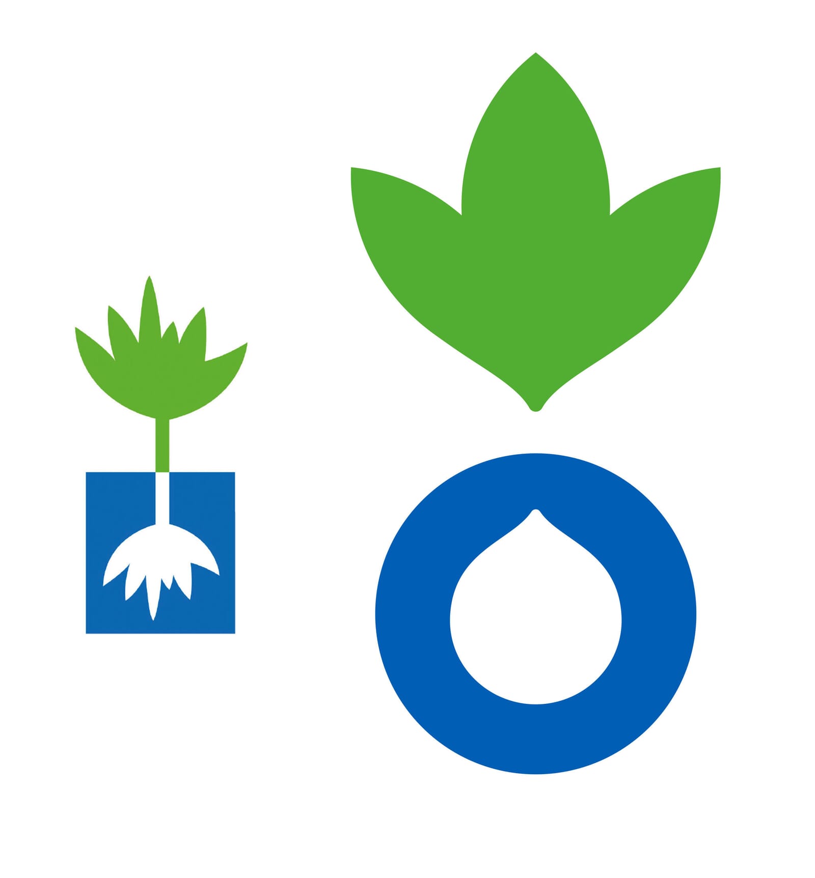
When a logo is a recognised ‘classic’, such as the V&A’s, then it seems that all parties pull together to protect it. But, cast your mind back to the nineties and the V&A’s logo was often used as an afterthought, nestling quietly and almost unseen in the corners of posters, before the penny dropped that it was an asset in itself and could become an active design element on everything.
There’s clearly a question here about the ‘equity’ of the branding that any company or organisation has built up. Yet the tools on offer to measure this aren’t clearly understood. You can research ‘awareness’ and, theoretically, logo recognition, but far too often decisions are made purely on hunches, or a dangerous mixture of questionable strategy plus an ego-driven desire to simply change what’s there.
We’re currently working with a major education brand with a five-year old logo. And whilst our hearts might long for a clean sweep, our heads know that we should take what’s there, knuckle down and just make it work better. Teeth-gritting at times, but that’s what the job needs.
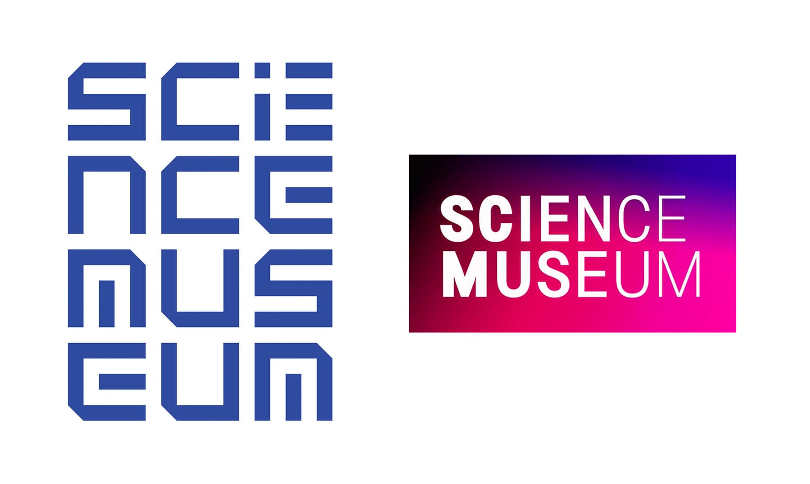
As for how a design team should react to a change of their logo, well, going straight onto Twitter and saying ‘this is a bit of a clunker’ (as we did last week about the Science Museum’s change) is NOT to be advised. Whoops. Now we’ve had a good look at the ‘why’ – the changes to the Science Museum group and its parts – we understand the reason for the change a little better. And we can see the ‘idea’ of the fading type working more successfully with the longer blocks of type, rather than the two word version. Our logo had become quickly recognisable as the Science Museum’s – but how would it have coped as the visual link across the group of museums? We’ll never know.
It does beg the question as to how you should react when one of your babies is killed. You should probably shrug your shoulders, say ‘it happens’ and move on, not start composing a tweet. When you’ve invested months, sometimes years of your life into something, it can be tough though.
As for ‘how long should a logo last’, well that’s a question for another day. If you take into account all the strategic reasons for change, add in all the emotional factors, then after five years it seems all bets are off. But perhaps if more rebrands were approached from the head, not the heart, some of them might last a little longer.