Duolingo is easily the world’s most popular way to learn a language. Since its inception in 2011 by two alumni of the famous computer science course at Carnegie Mellon University in Pittsburgh, the app has been downloaded by an astonishing 300 million people. Its uniquely ‘gamified’ approach has made language-learning fun, and free, for a vast array of different users across the planet.
The brand’s visual elements had been built for an on-screen environment and weren’t always coping with the needs of a rapidly expanding product line and growing list of sub-brands. In addition, it didn’t truly reflect Duolingo’s mission, upon which every staff member agreed – that the provision of over 30 languages, for free, can genuinely transform lives.
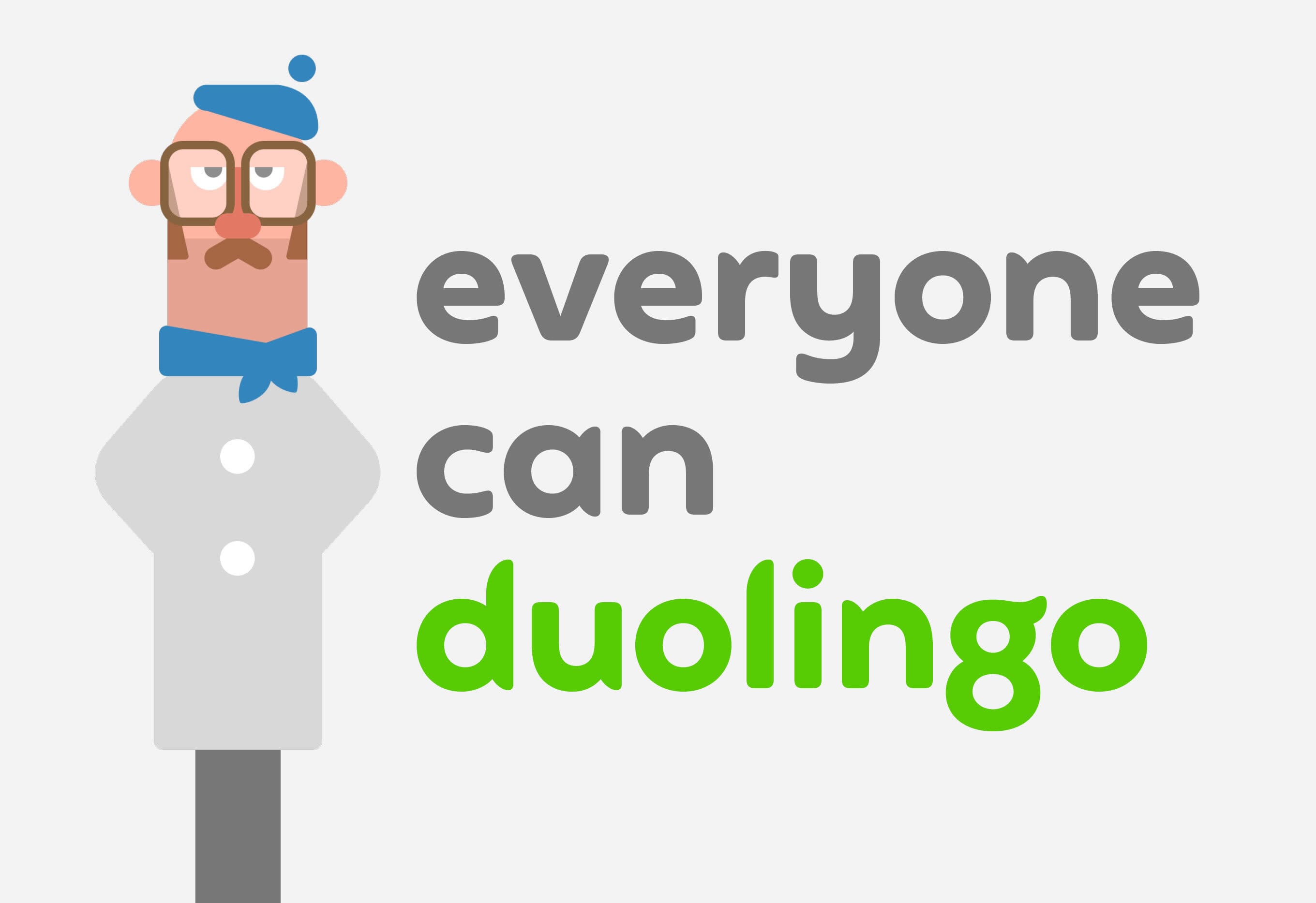
We began by drafting new narrative and trial messaging around what Duolingo makes happen, and makes possible. Using workshops and an internal staff ‘expo’ we soon agreed an approach that echoed their commitment to universal access – that everyone can Duolingo.
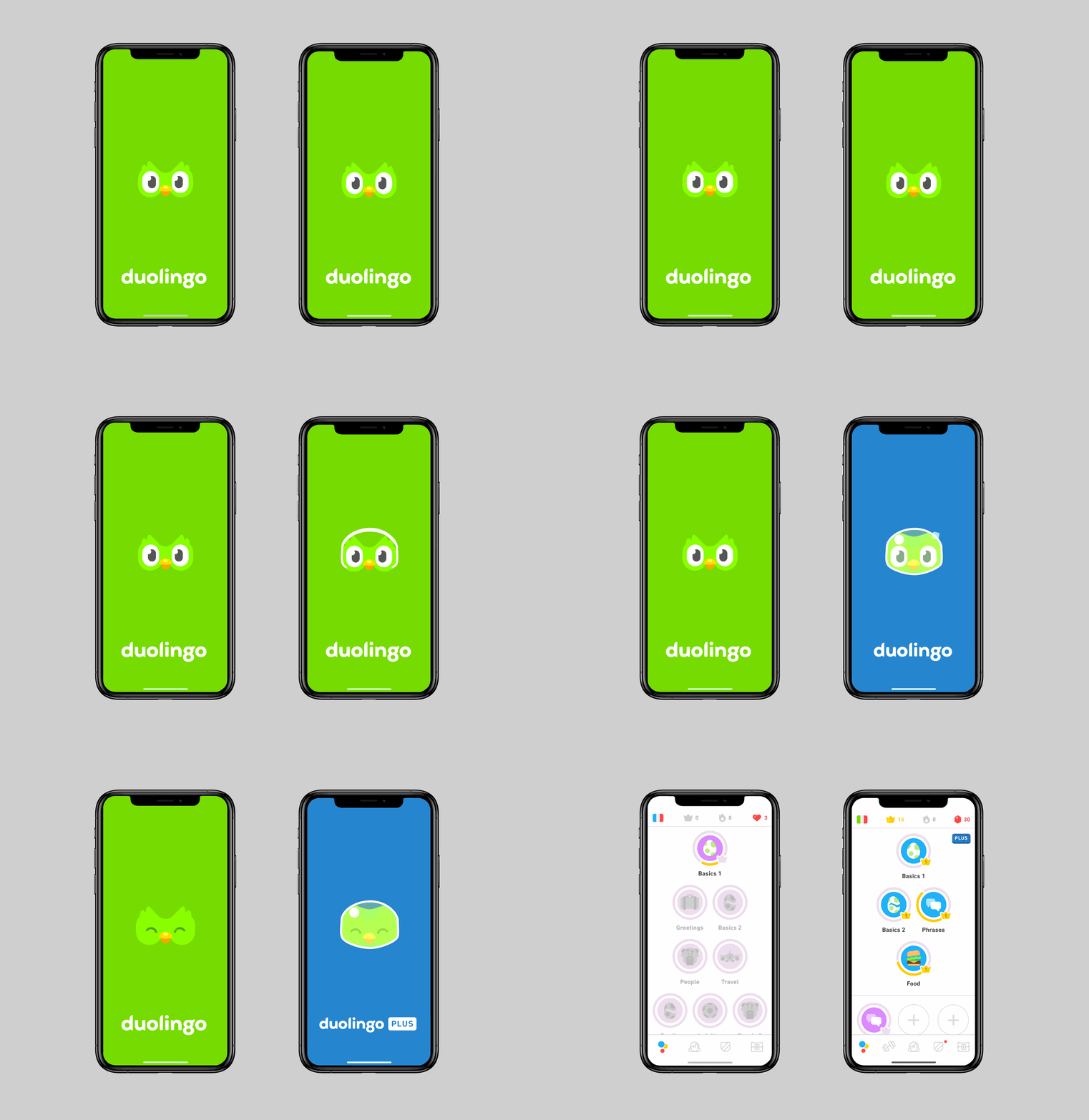
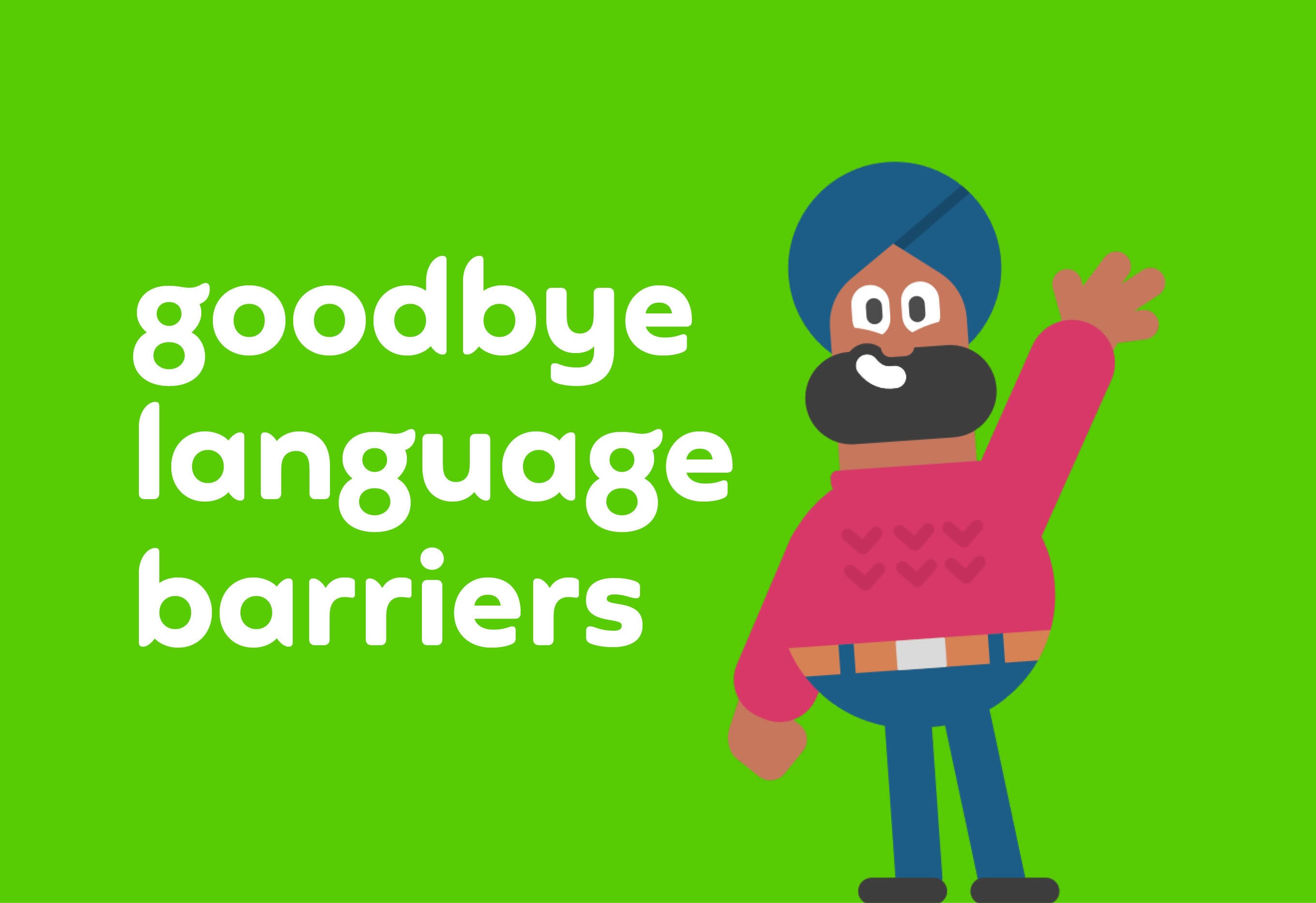
Visually, their owl mascot (Duo), the core colour, and their illustration style were broadly working. But they lacked clear guidelines on how to use the brand ‘away’ from the app environment. A growing list of projects and initiatives – such as their ground-breaking online English test – were also pushing at the boundaries of the brand structure.
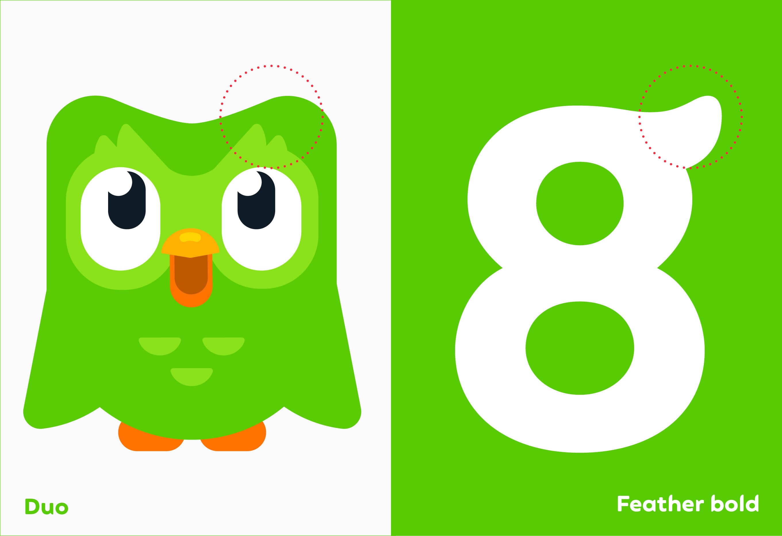
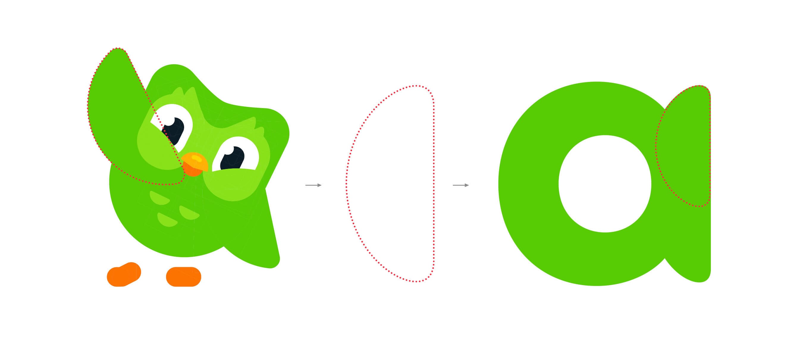
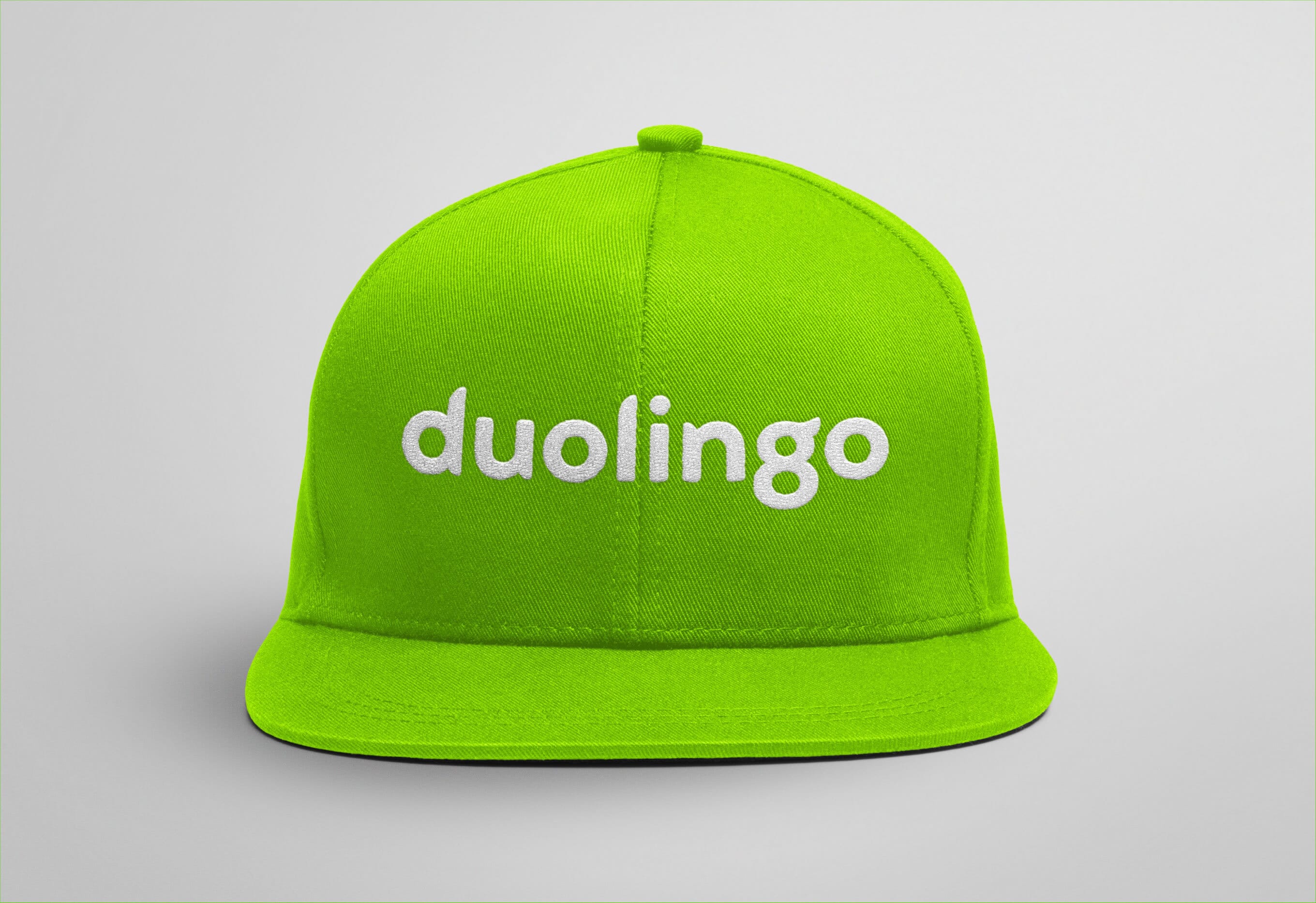
As we experimented with juxtaposing the mascot with their name, a ‘what if?’ unlocked the solution. Instead of using neutral typography alongside the symbol (like every other tech company), we redrew the logotype drawing inspiration from Duo’s feathery form to reflect the company’s quirky personality.
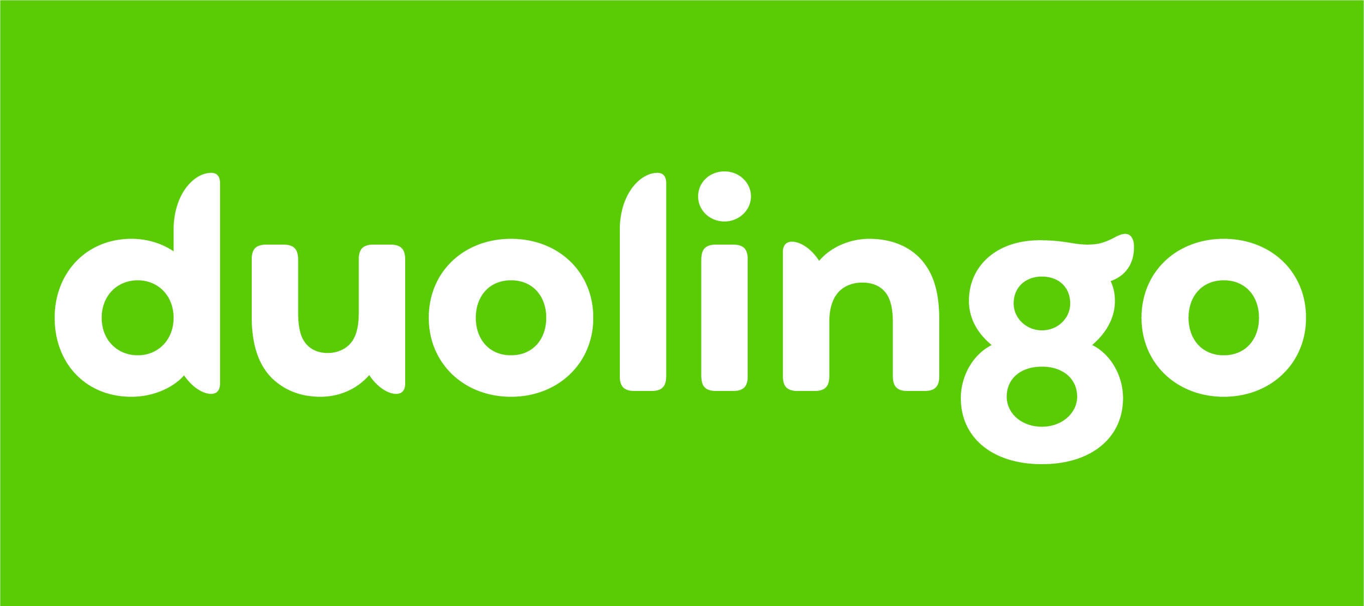
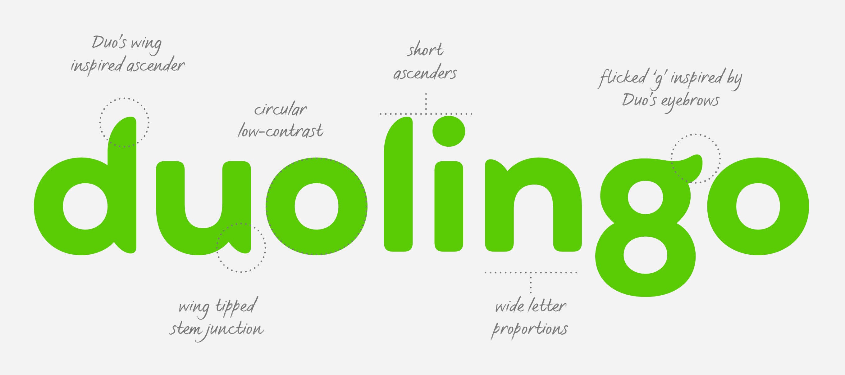
Our initial attempts to do this looked odd. But bit-by-bit we began to solve the logo conundrum, and started planning a bespoke typeface. With the help of typography specialists Fontsmith, we fine-tuned the logotype and then extrapolated the idea out into more characters.
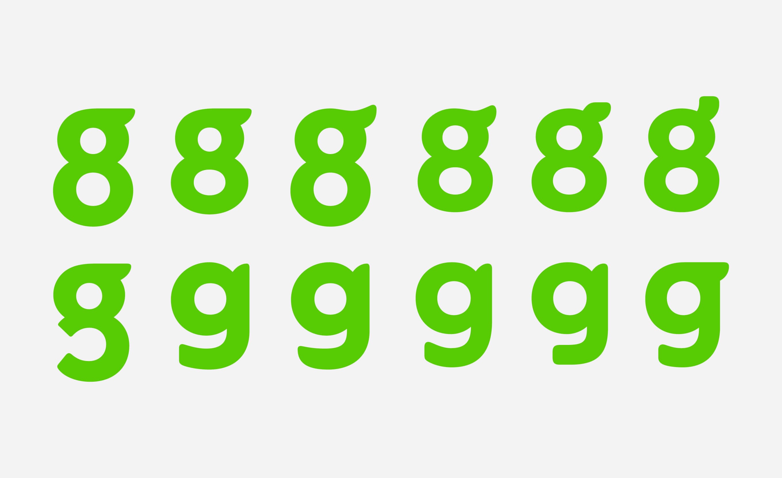
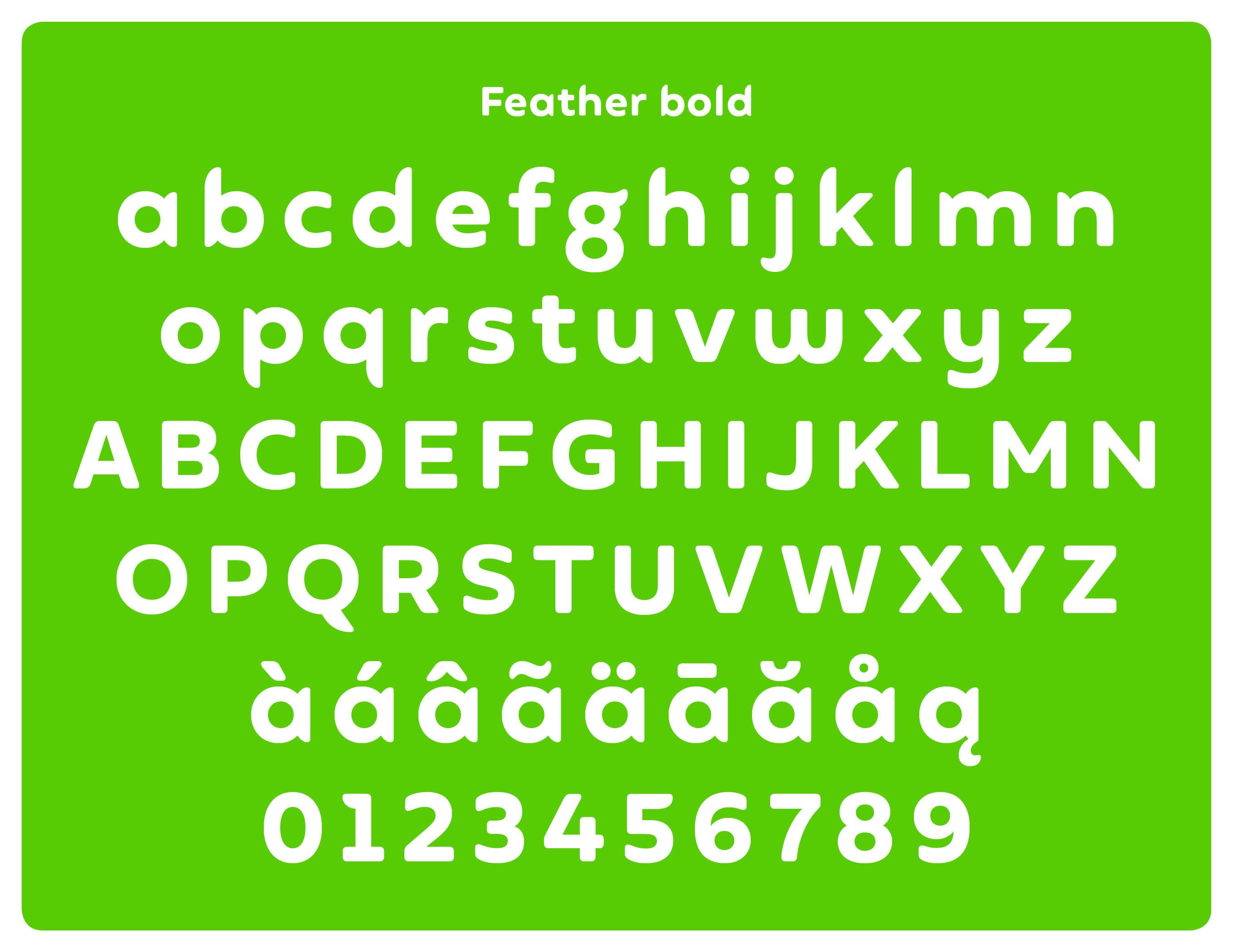
Certain letters such as the ‘g’ proved to be troublesome – never has there been more animated discussion of one lower-case character – but the looped and more memorable ‘spectacle g’ won through. Little quirks, such as the flick of the lowercase ‘g’ were used sparingly, beta versions were crash-tested and eventually ‘Feather Bold’ was ready.
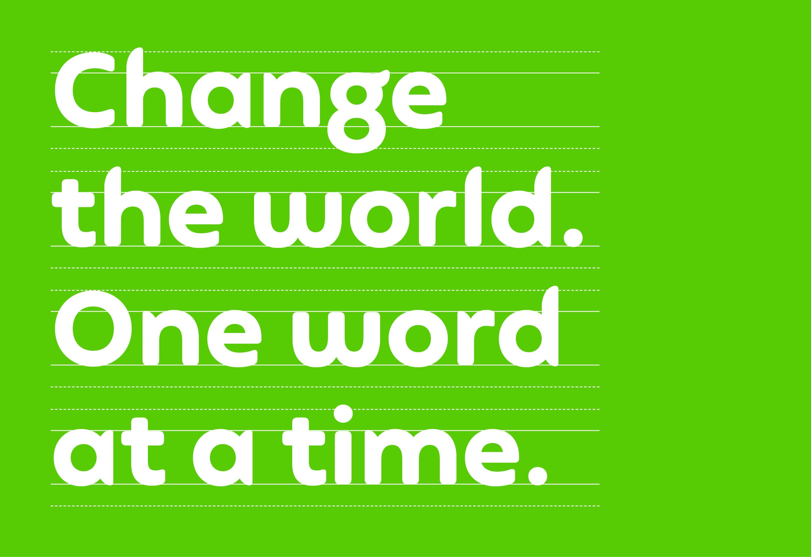
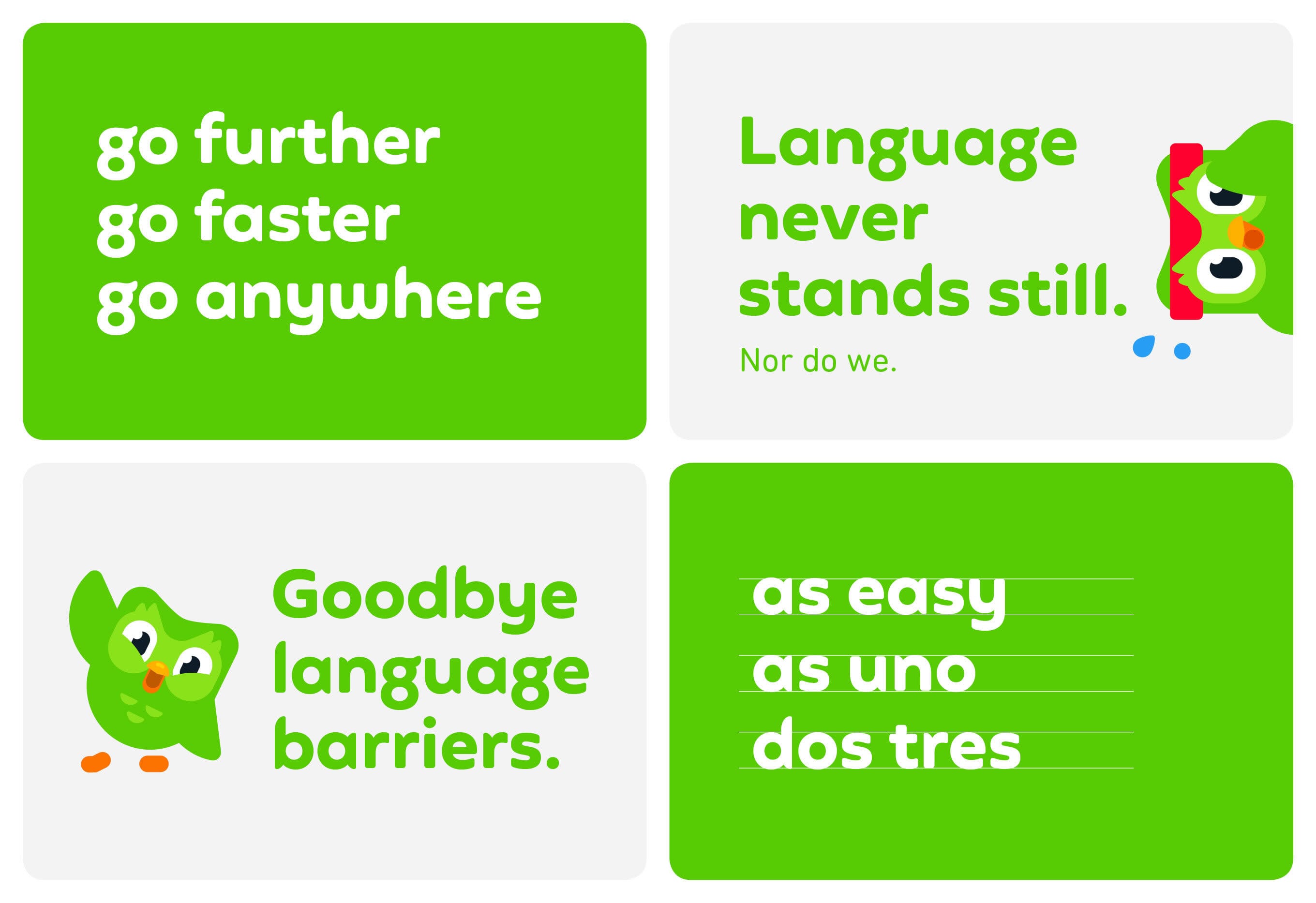
In parallel, we had developed a clearer tone of voice and messaging approach so the next task was to take all the elements and composite a clear set of guidelines that brought all the new elements together.
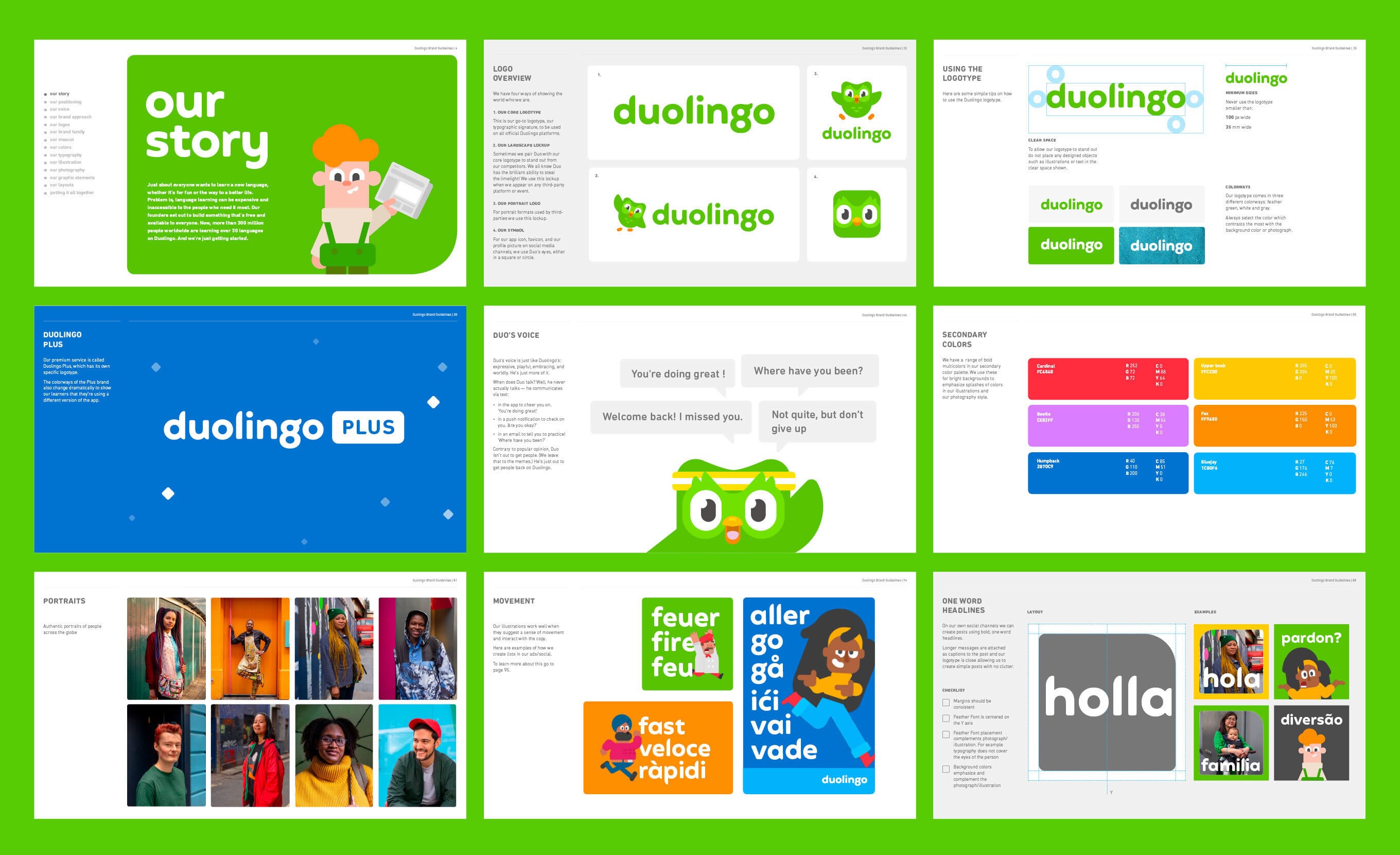
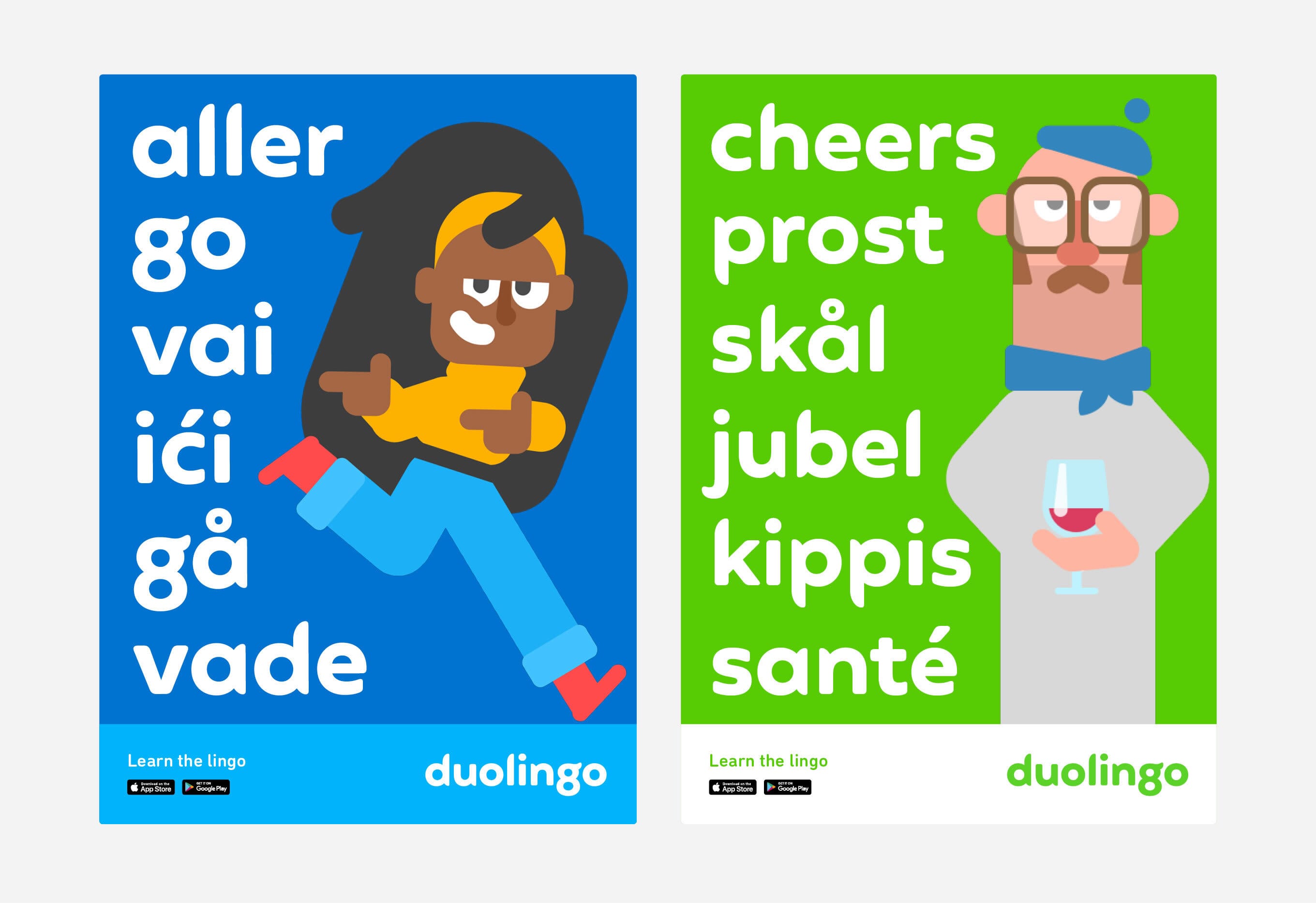
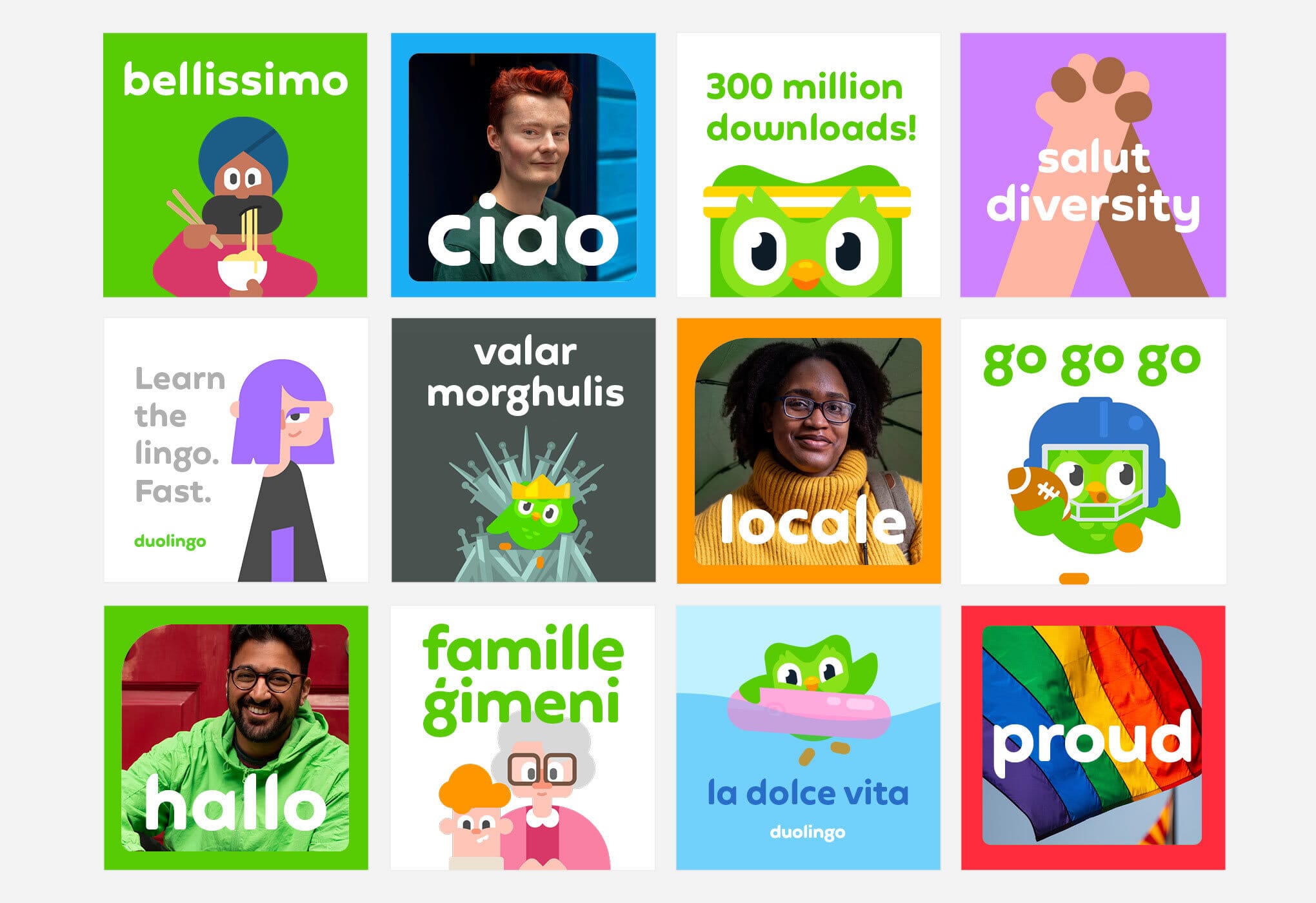
This included new logo lock-ups, revised core colours, typographic styling, illustration guides and other graphic elements.
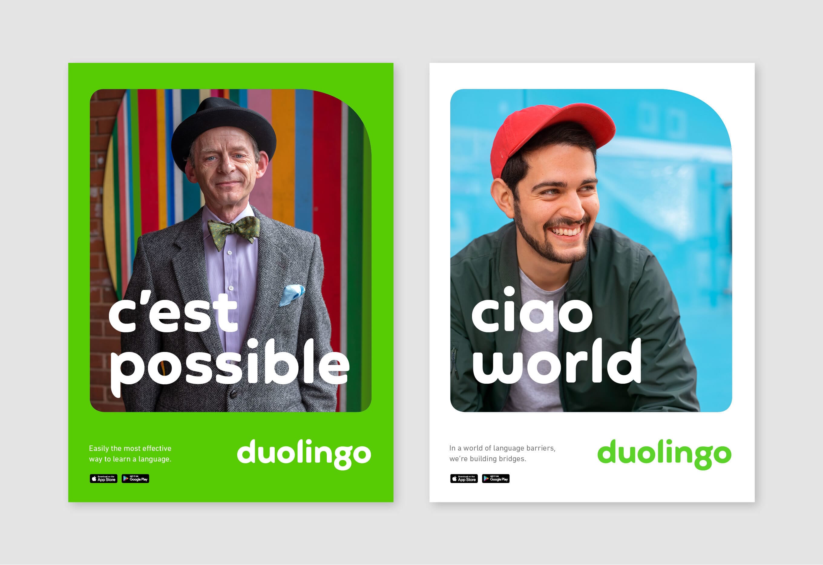
A shoot by photographer Niall McDiarmid curated street characters and members of the global Duolingo community to better reflect the mission and show the brand’s impact on real peoples’ lives.
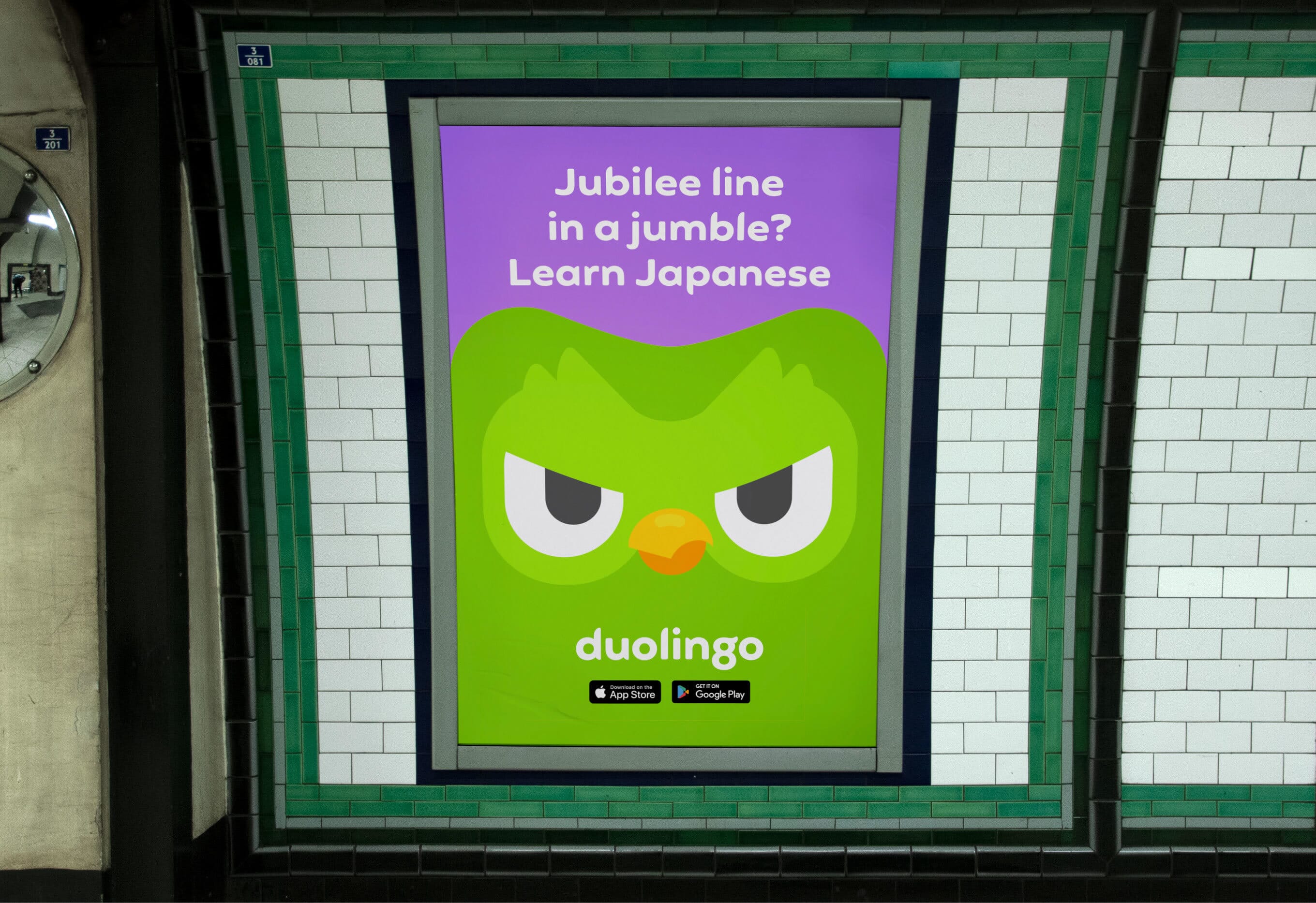
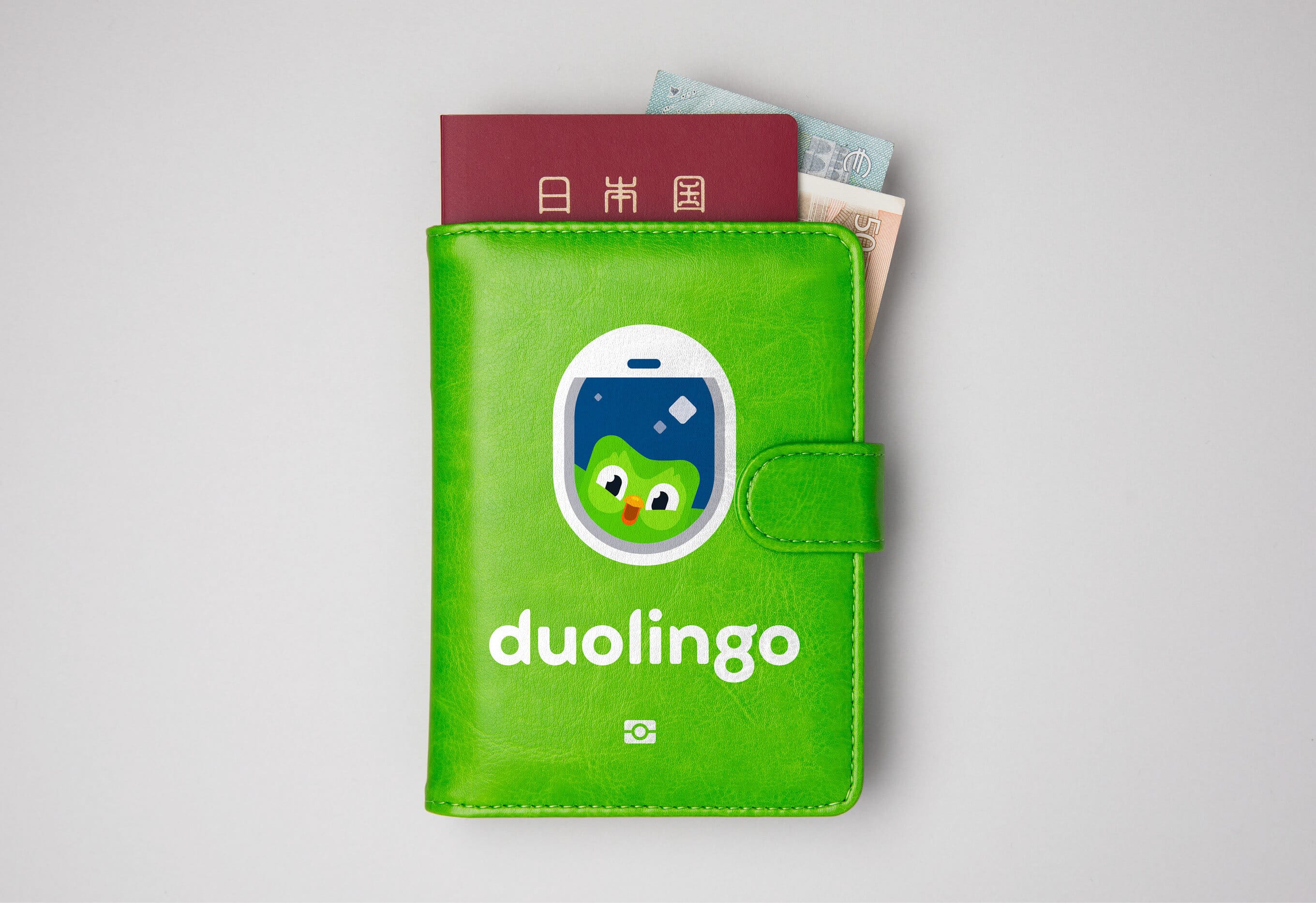
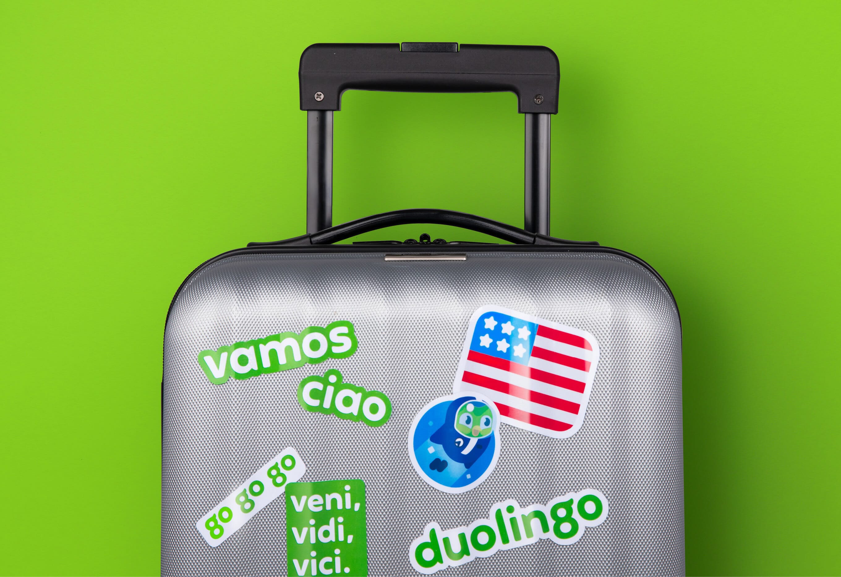
All these new elements are now being rolled out across multiple digital and physical touchpoints, including a brand ‘takeover’ at Pittsburgh airport, advertising campaigns in Europe and many plans for future merchandise.
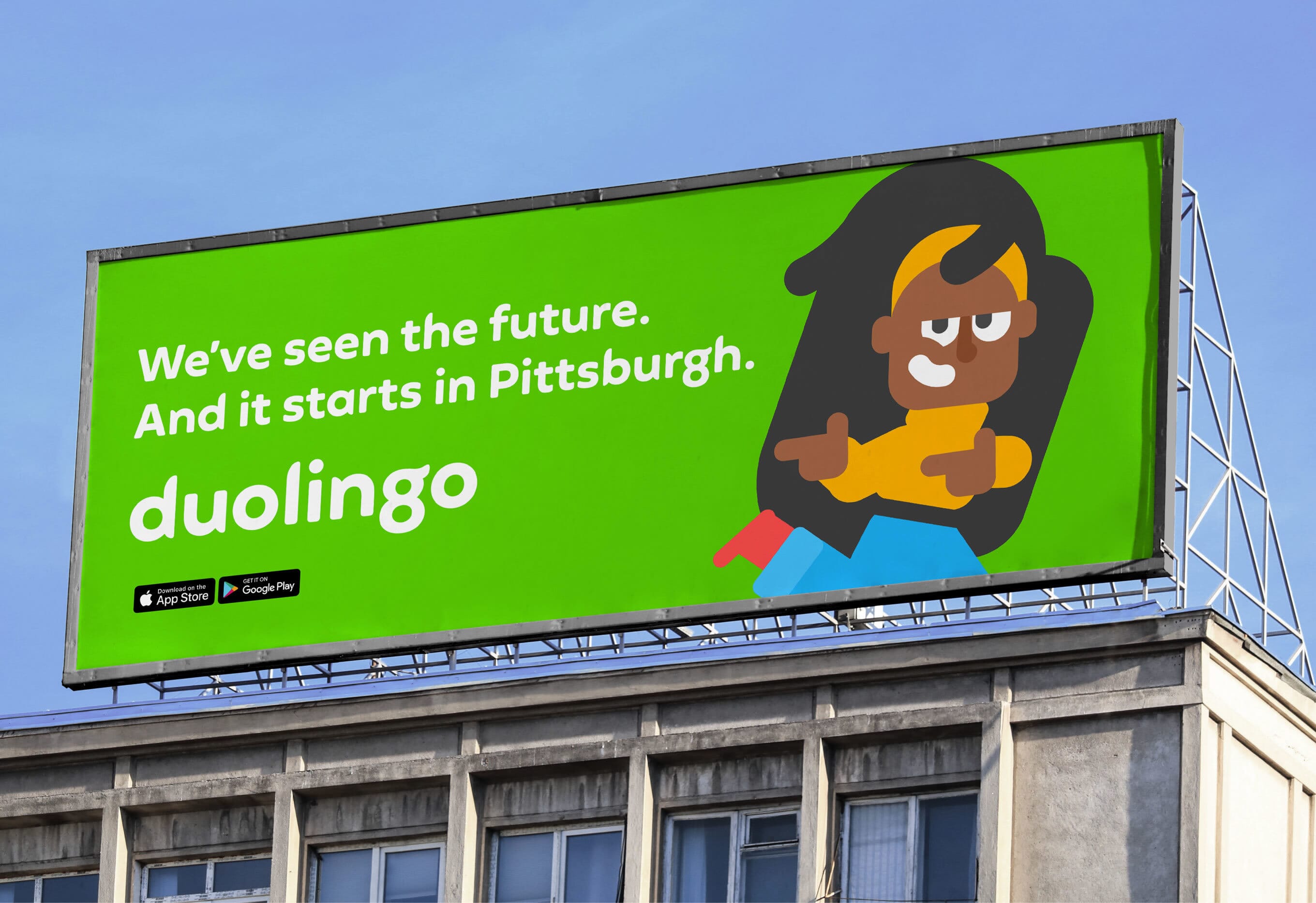
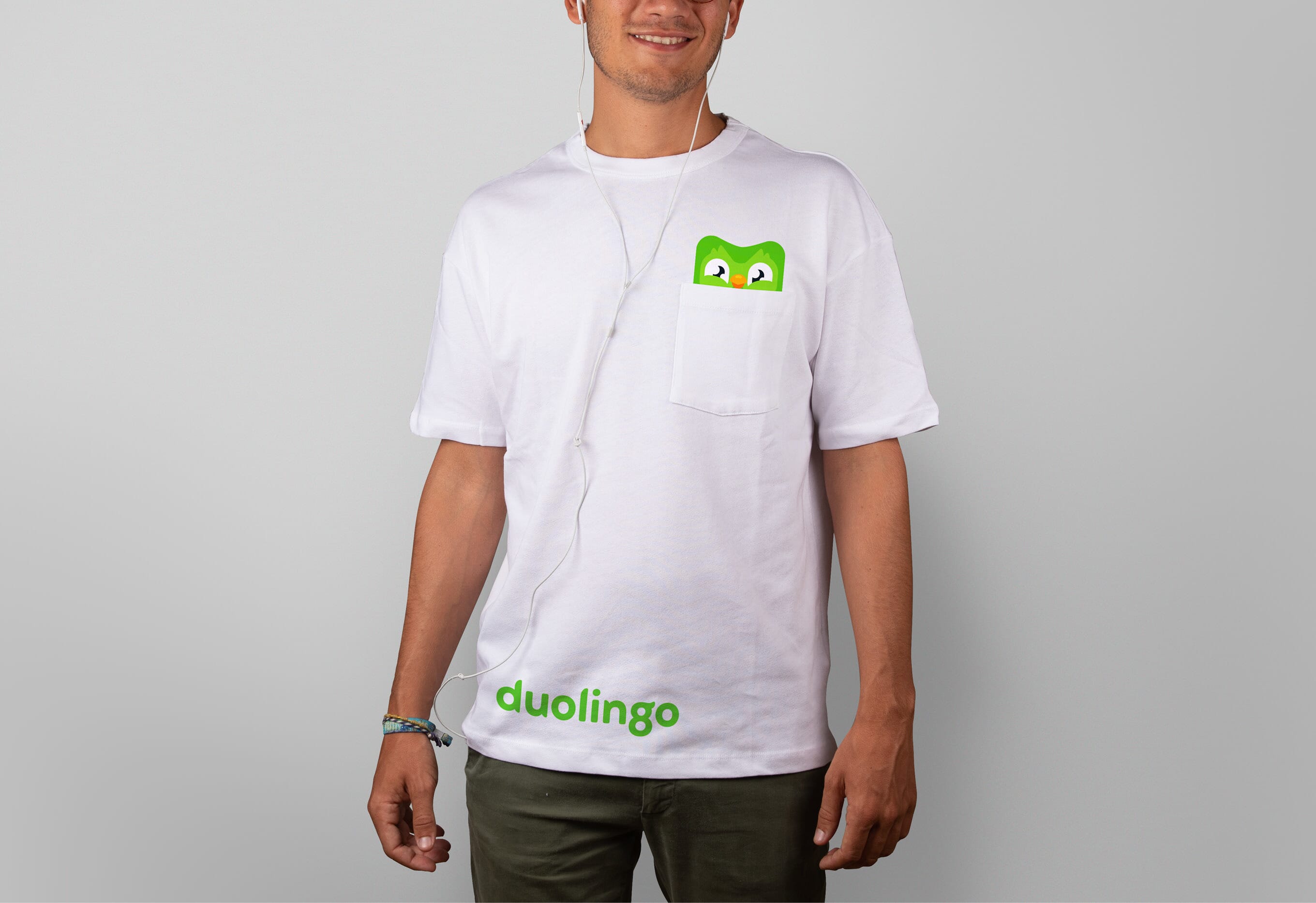
What was already a much-loved brand by its community is now ready to be the world’s favourite – and most famous – language resource.
Credits
- Brand strategy, narrative and design: Johnson Banks
- Tone of voice and messaging: Johnson Banks, Nick Asbury, Mary van Ogtrop
- Strategy associate: James Wu
- Font design: Fontsmith
- Brand photography: Niall McDiarmid
- Illustration: Duolingo design team
- Implementation: Johnson Banks, Duolingo design team, And Rising
- Media: Bountiful Cow