In the late 2000s, scientists began to discuss the idea of a ‘safe operating space for humanity’ and the concept of ‘planetary boundaries’. Their discoveries were highlighting that humankind was crossing a number of crucial borderlines related to climate, biodiversity and deforestation.
The phrase that began to be used to describe all the interconnected elements – Arctic sea ice, the Amazon rainforest, critical ocean currents and our freshwater network – was the ‘global commons’, and in 2019 the Global Commons Alliance was born, bringing together a coalition of scientists, philanthropists, civil society groups, businesses and innovators to work together to safeguard what’s common to us all.
Only four years later, in 2023, it’s clear that our climate, biodiversity, nutrient cycles and freshwater systems are way beyond those safe levels, which is having a devastating impact on global temperatures, nature, harvests, homes, livelihoods and lives.
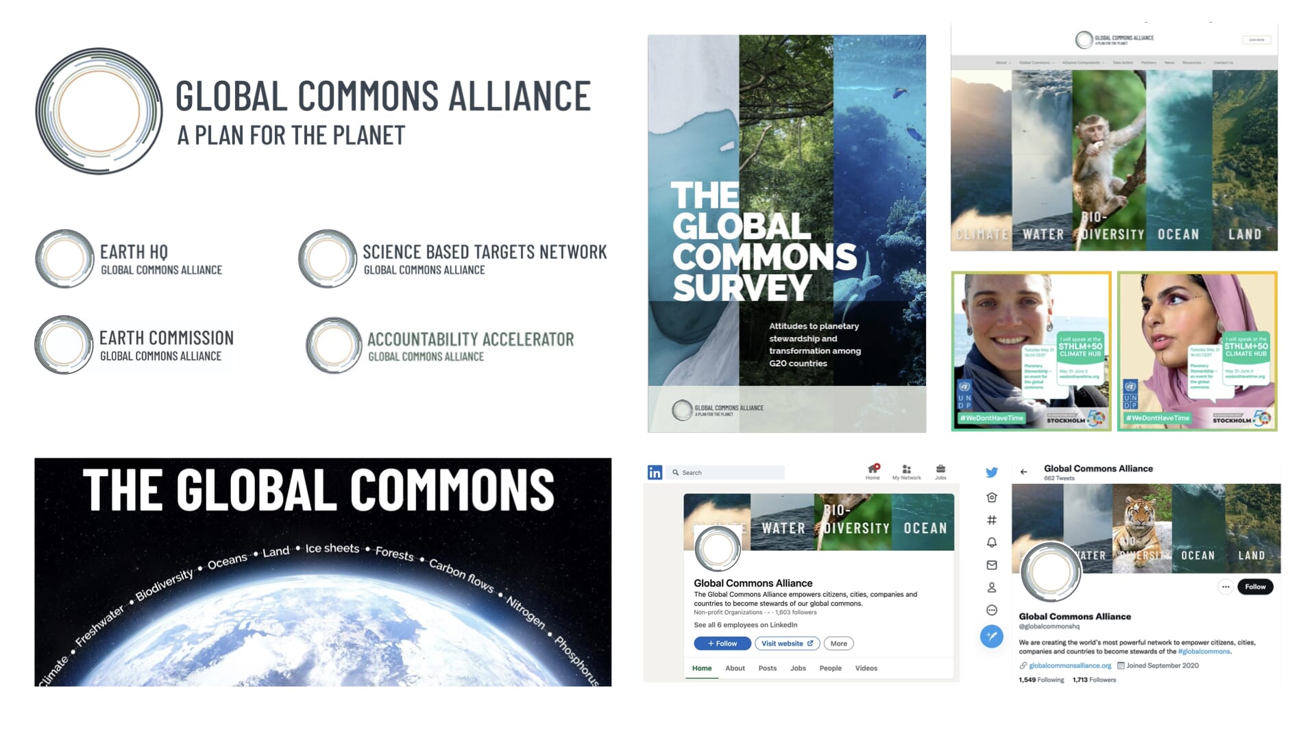
Our task was to take this groundbreaking organisation, its ideals and aims, and turn it into a far clearer and more persuasive brand. It was presenting itself neutrally, often academically, within a sector that is gradually developing a generic style that often shares the same colour palette, ‘doom and gloom’ imagery and planet-like symbolism.
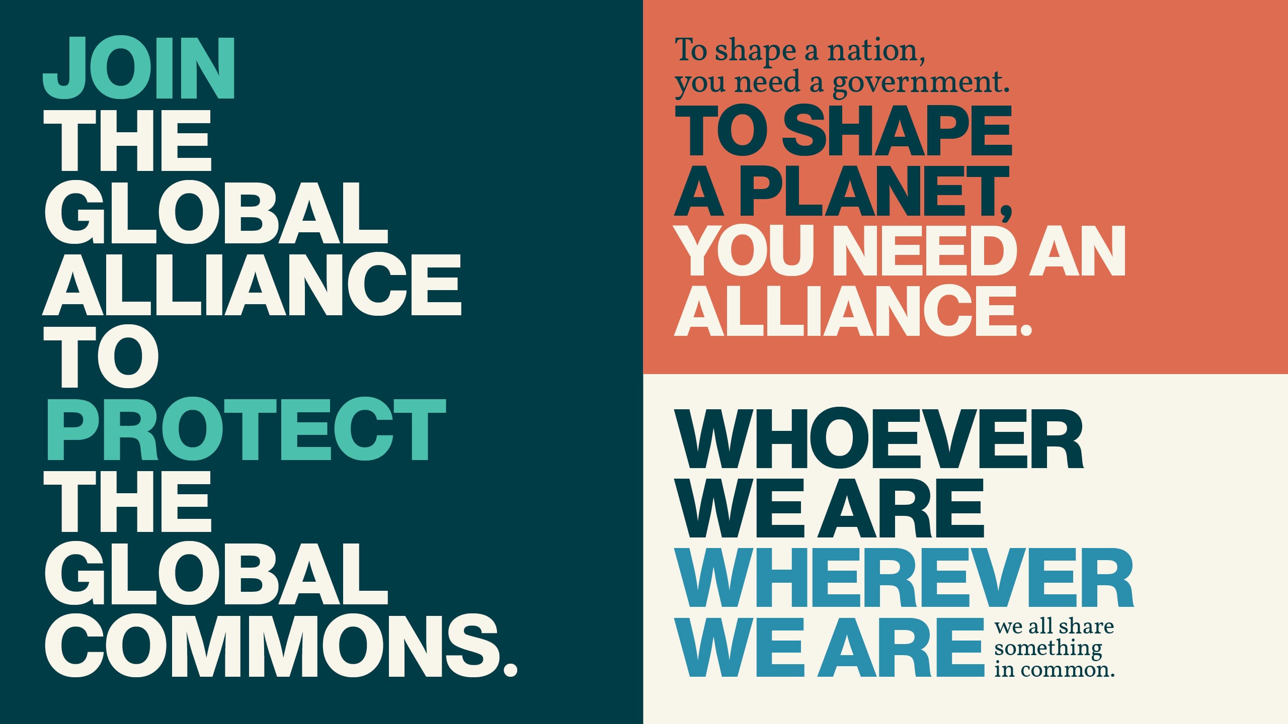
After multiple workshops and wide-ranging discussions, a clear narrative began to emerge that began to encapsulate the scale of global collective effort needed to make a genuine impact.
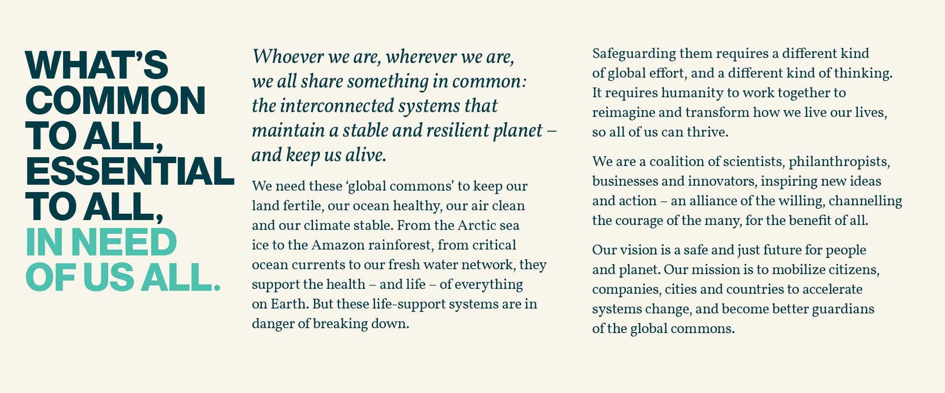
This far more strident language then began to inform a new tone of voice that is clear, determined and solution-orientated.
From the beginning of the design stage, we wanted to reflect their unusual and vast task with a design toolkit that stood them apart from the clichés of the sector. One route, based entirely on photographic collages, won through.
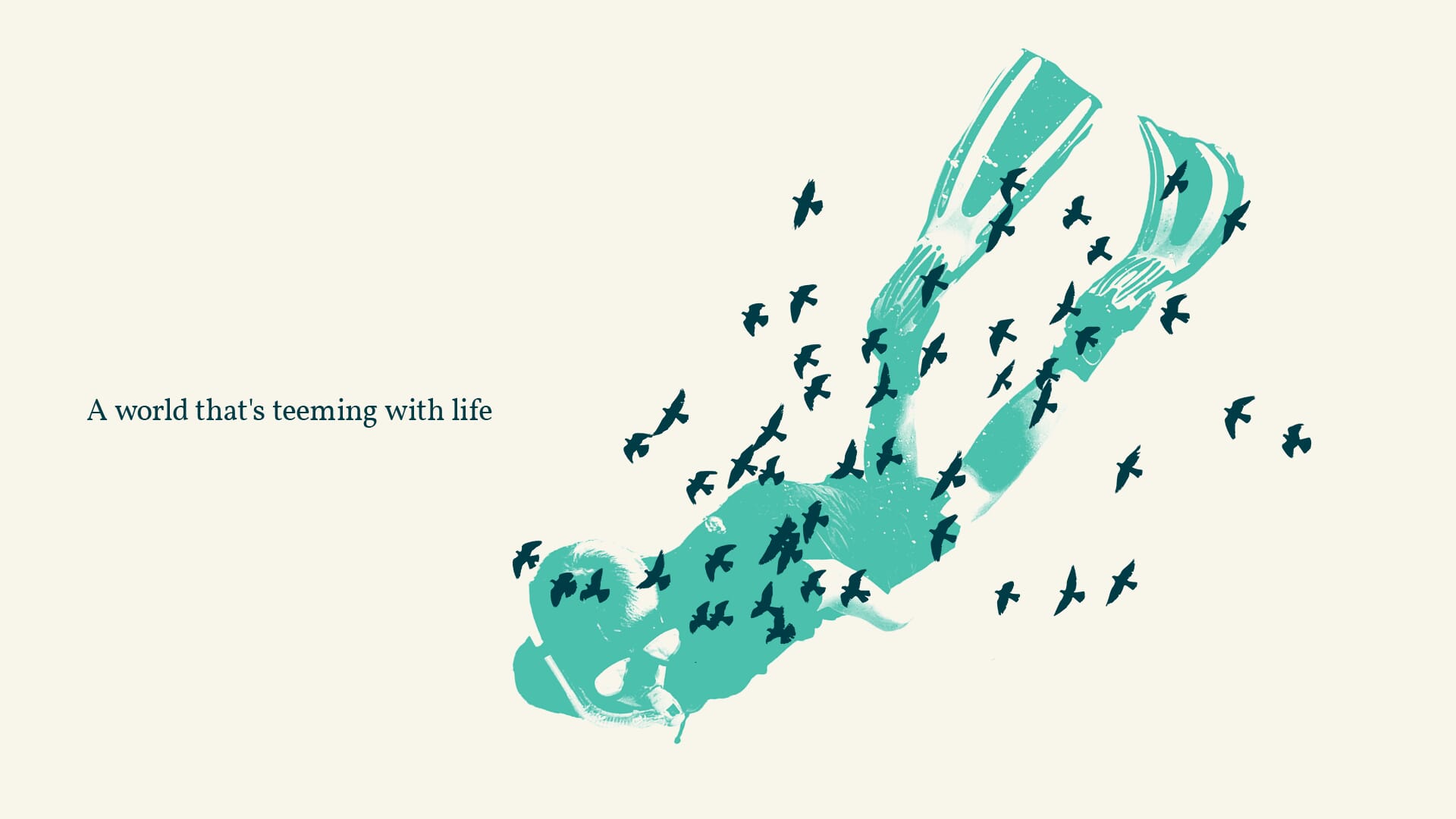
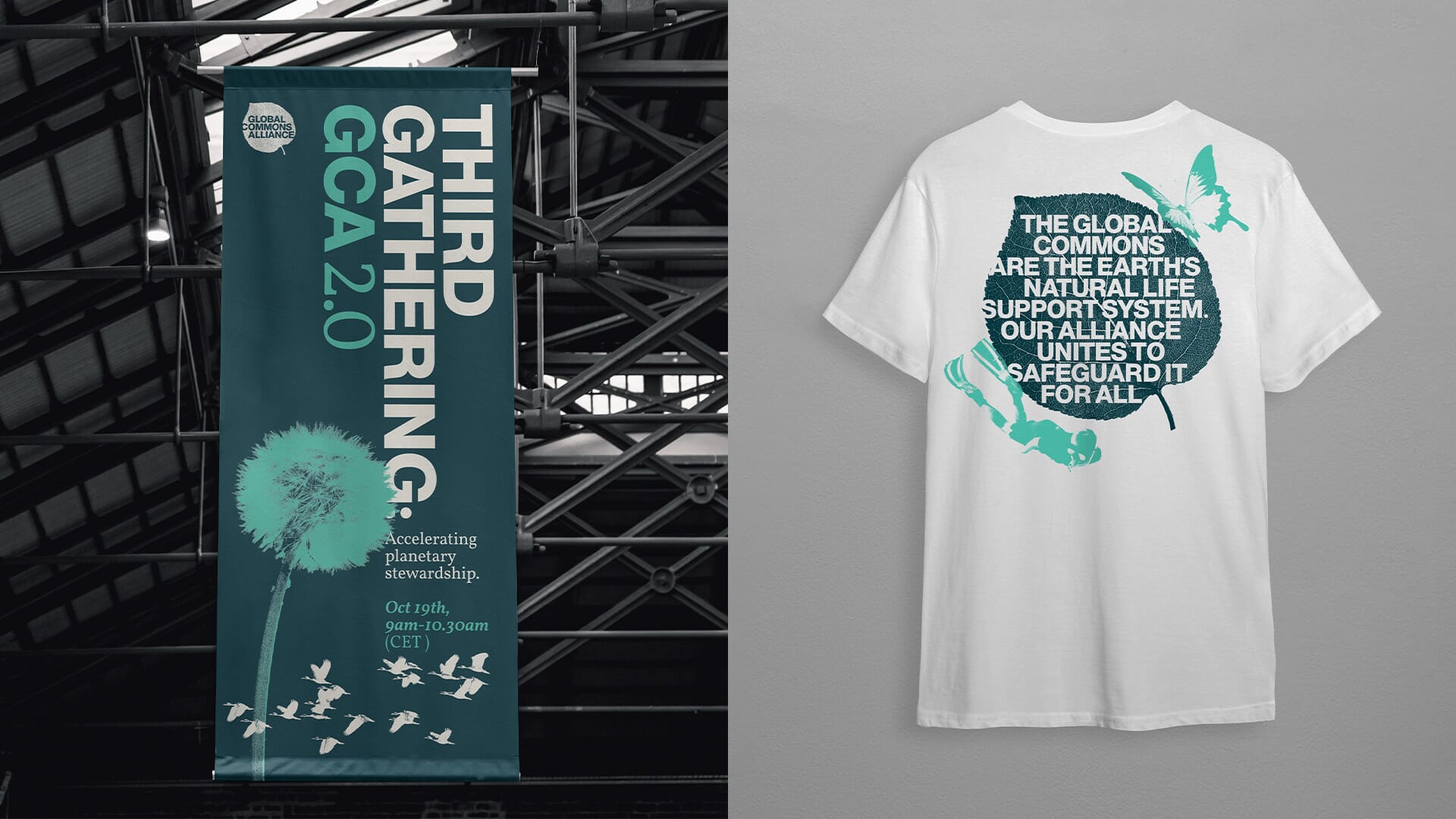
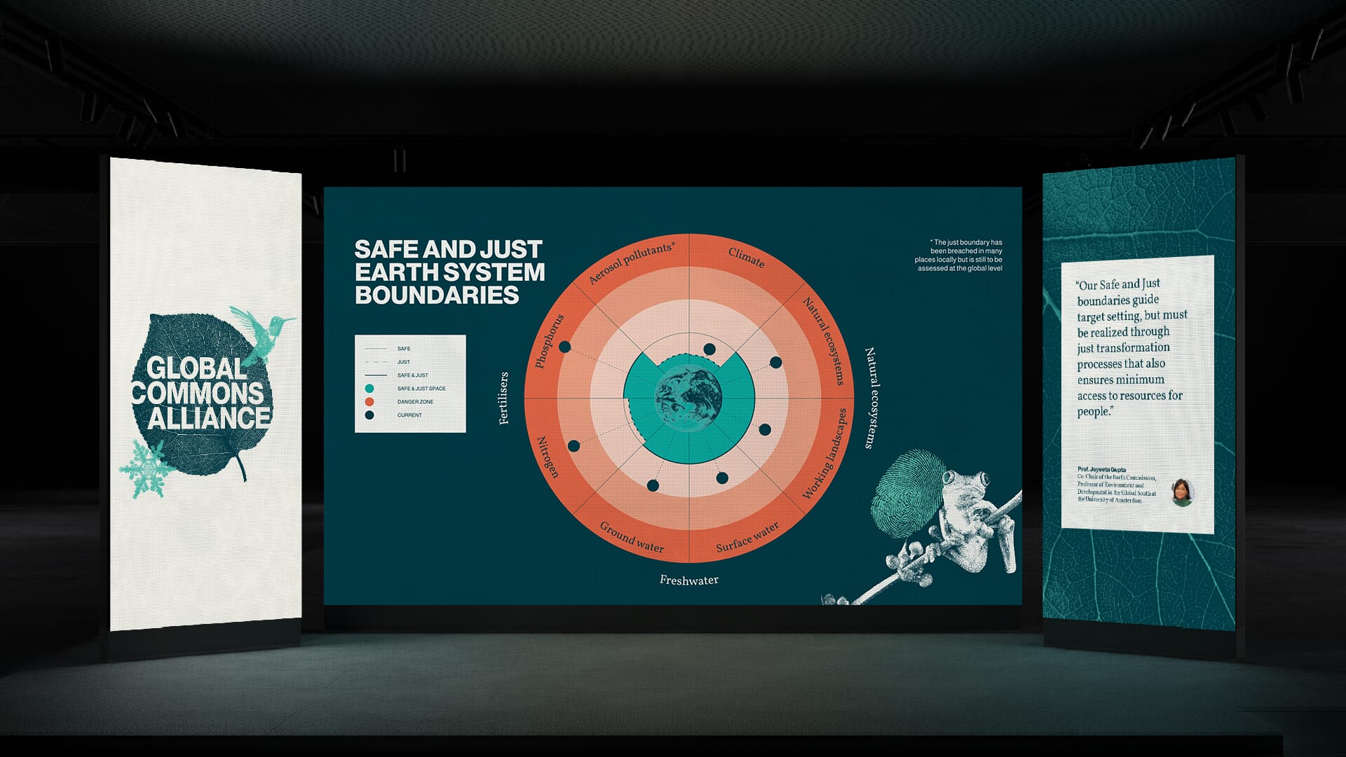
We believed it was important to remind people of the beautiful world we live in – a world teeming with life. So the core mark for the whole alliance uses a collage of an apricot leaf (symbolising forests and vegetation) with their name punched through, a snowflake (for climate, water and permafrost) and a hummingbird (for insects, animals and biodiversity).
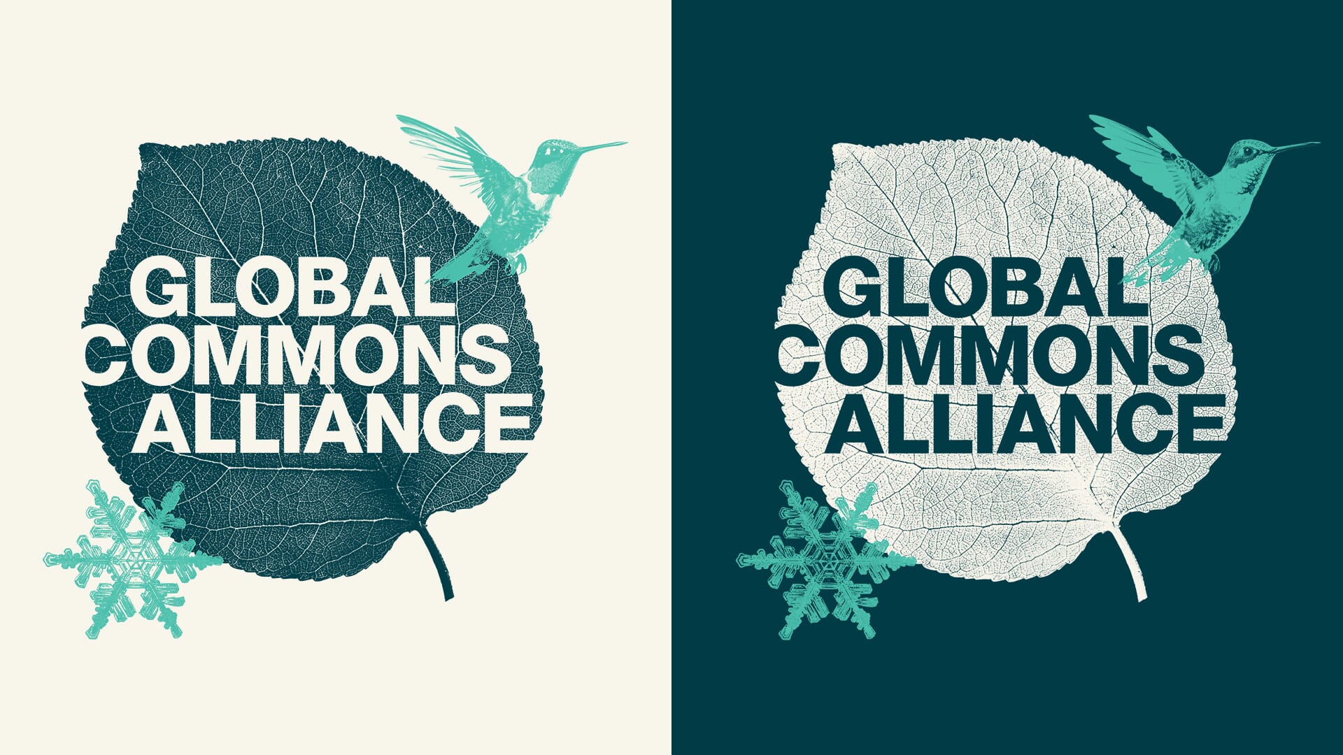
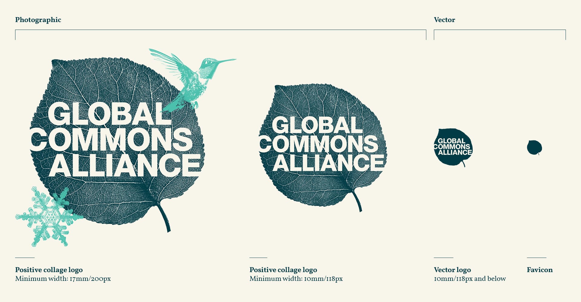
By carefully balancing colours and key elements, the core elements can behave much like a ‘traditional’ logo, with positive and ‘reversed’ versions, and a clear set of rules for how the collages behave and amend at different sizes.
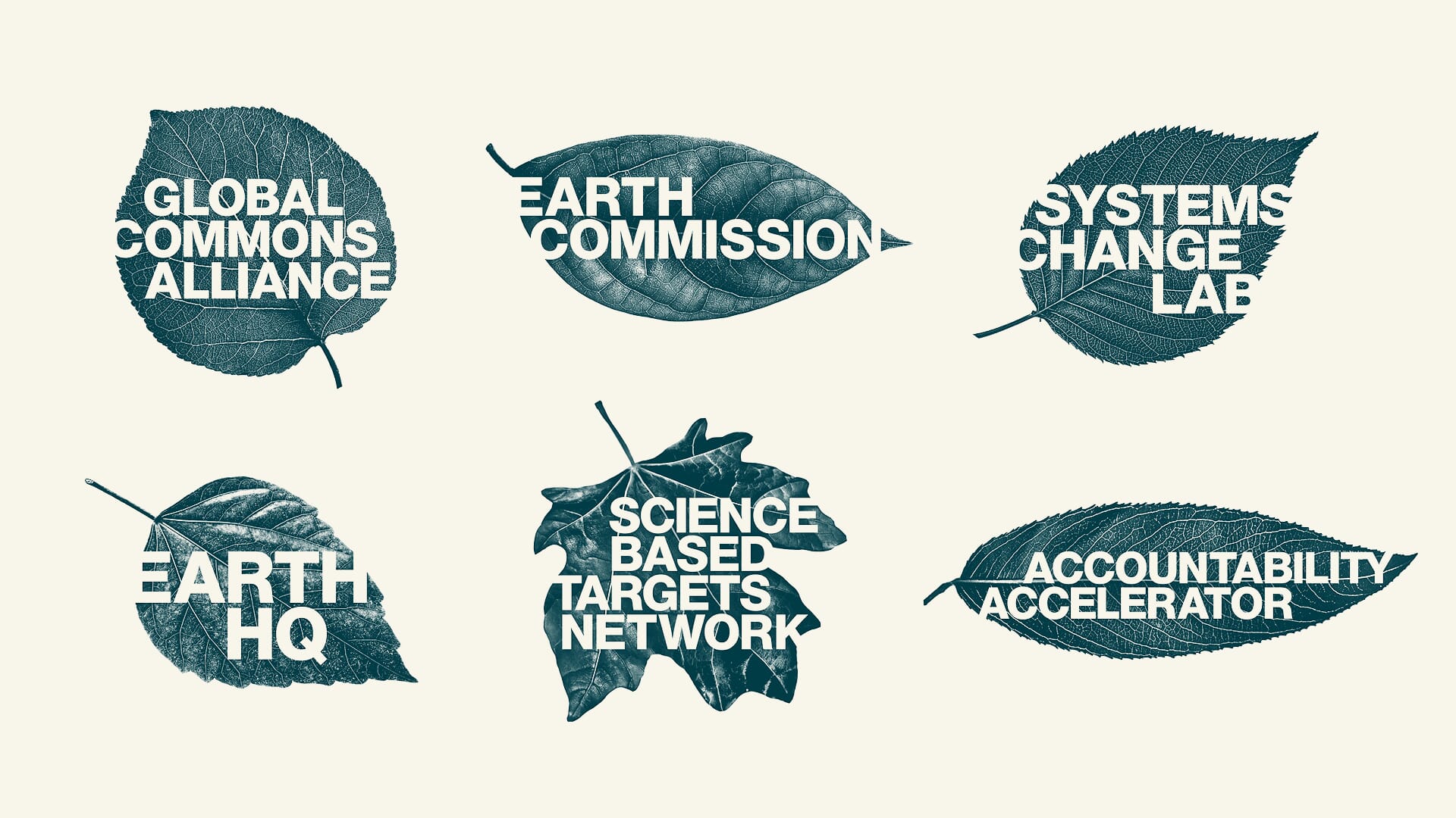
The parallel, and equally challenging task was to create marks for their components: five related sub-brands that sit within the alliance, each in need of related, but differentiated visual identities. The solution to this conundrum was a family of individual leaves for each component that can expand out into more detailed collages for larger use.
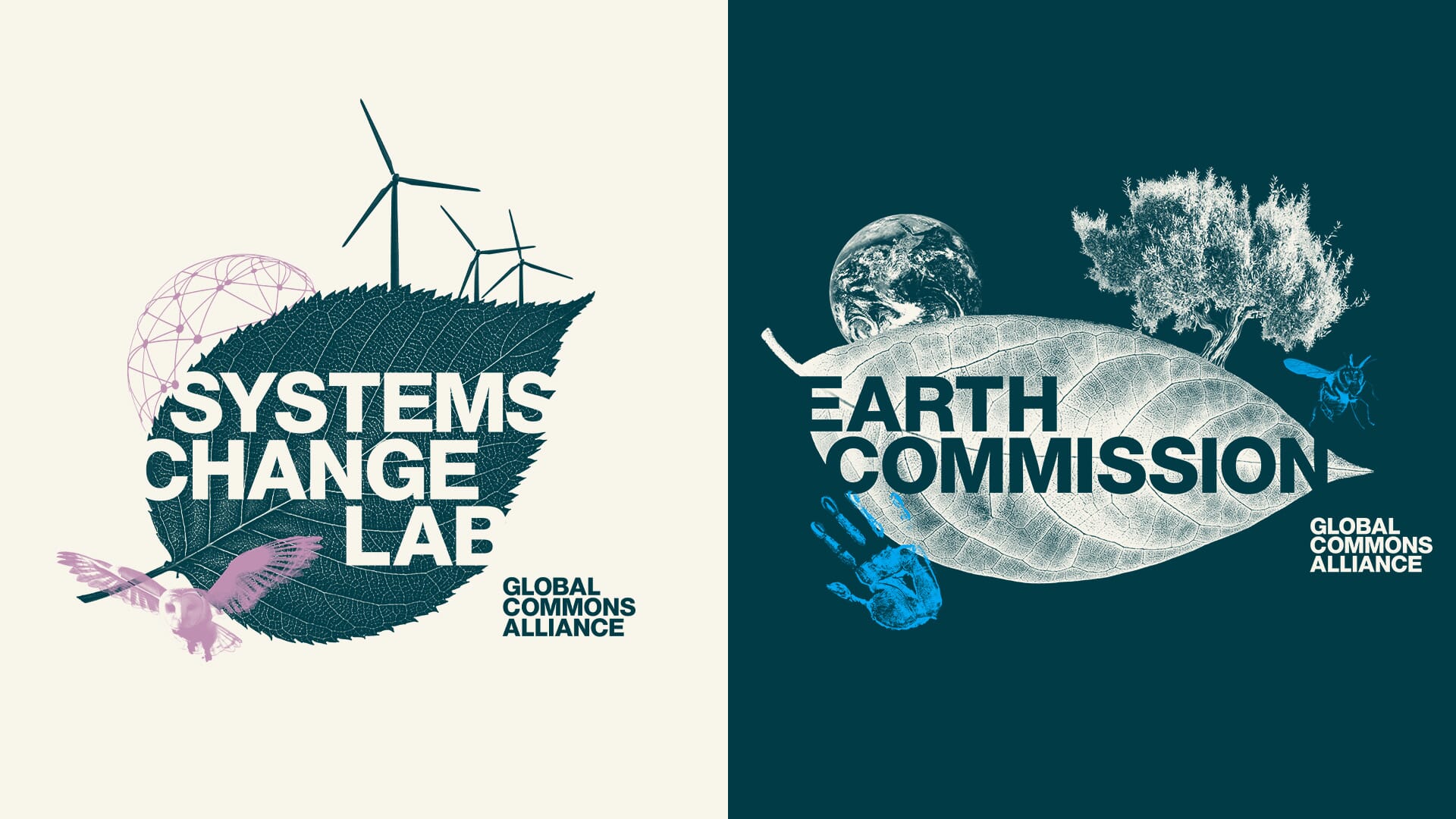
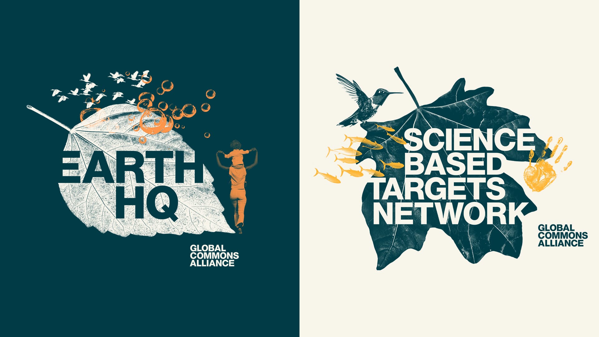
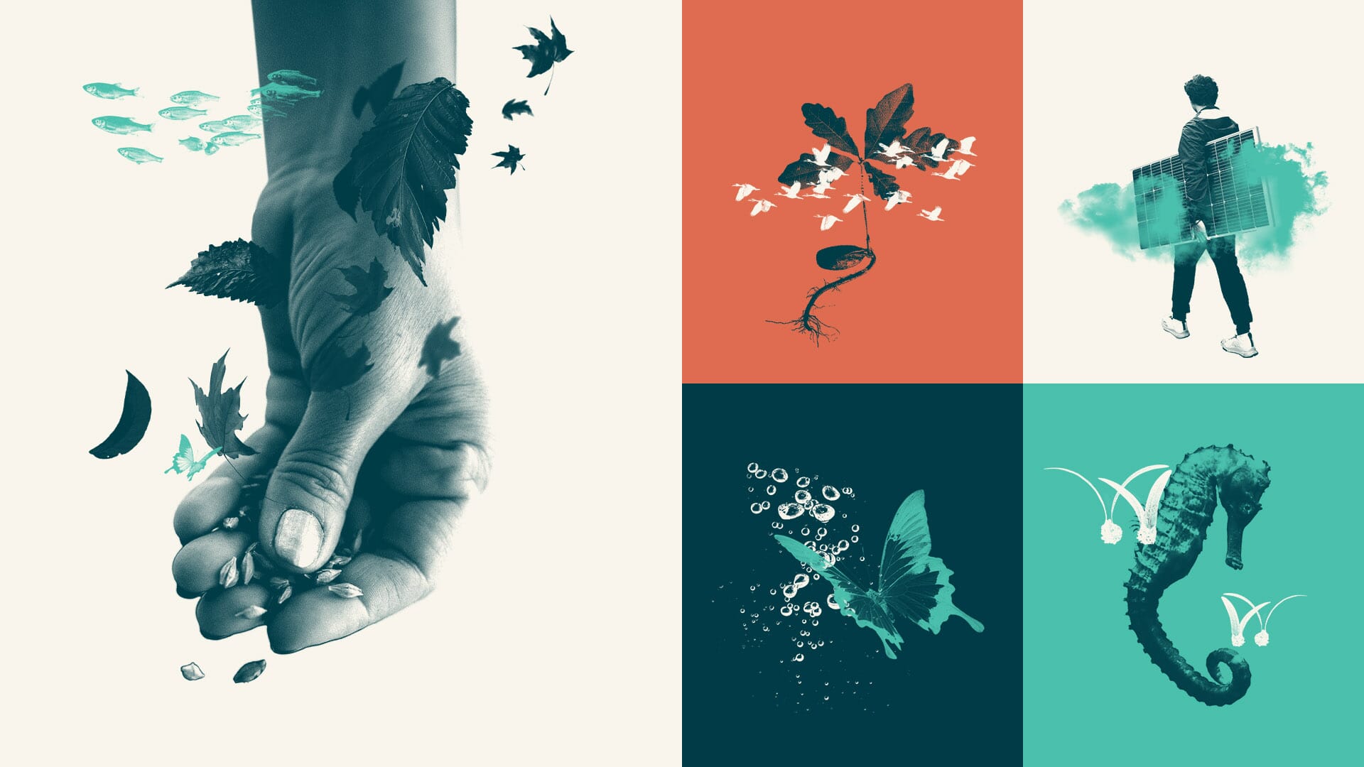
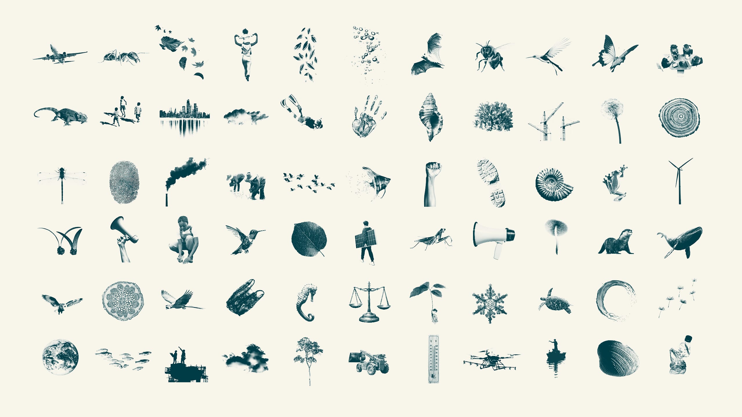
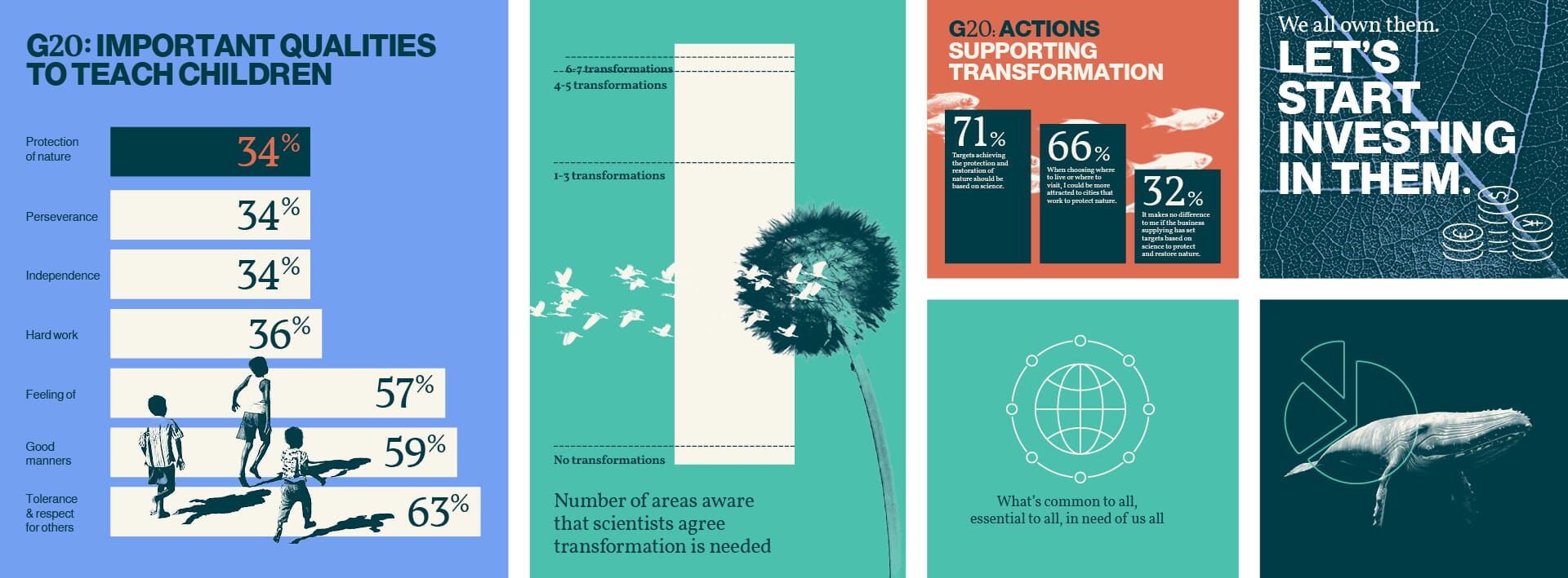
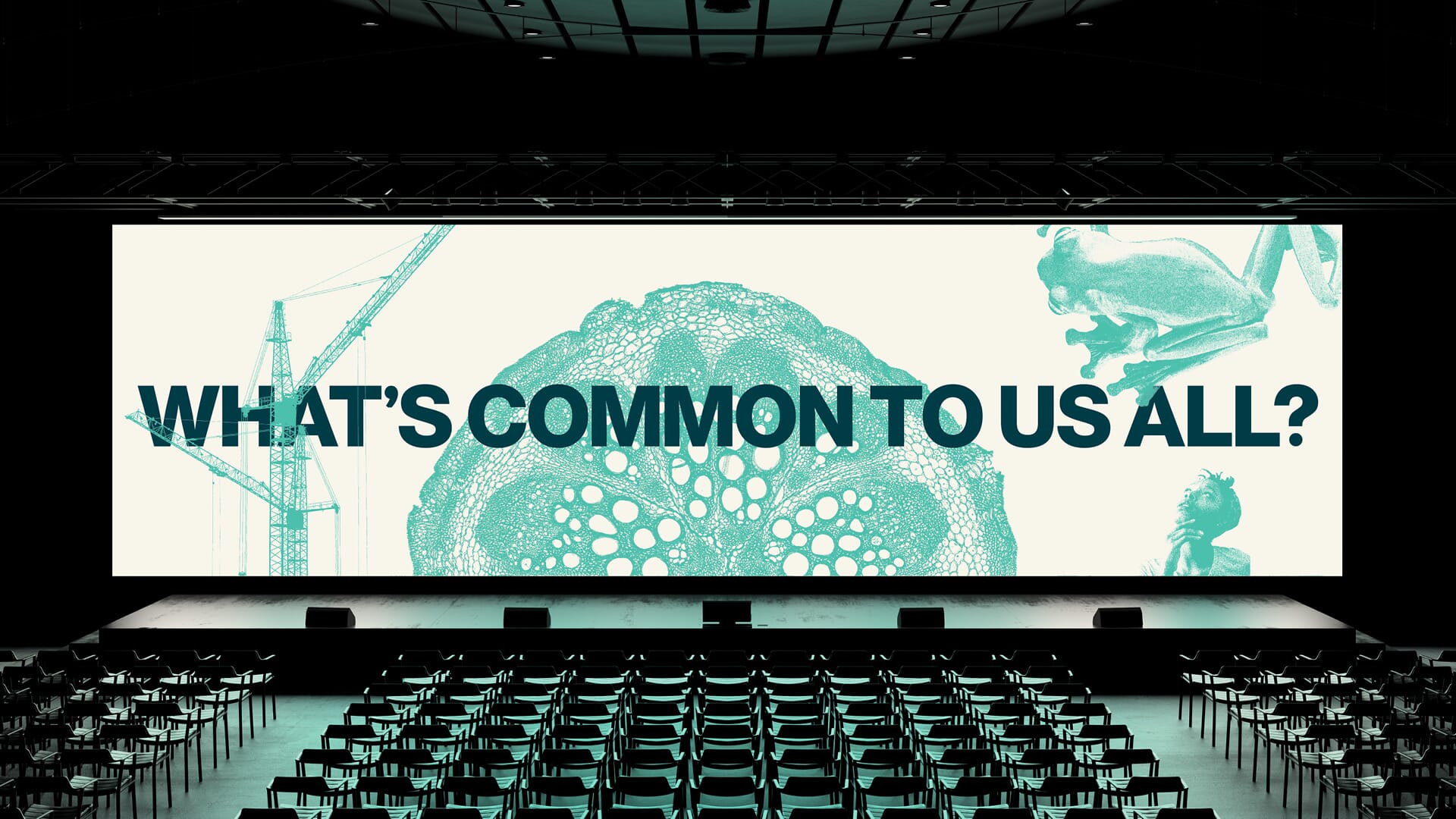
The principle of colourised slate-coloured, cream, ochre and turquoise photographic collages then carries through into a huge set of photographic imagery that we have sourced for both the overall scheme and the components.
This provides the alliance with an image bank that immediately sets them apart, allows them to talk in detail about the interrelationship of people, industry, business and nature, and sidesteps the more usual ‘climate’ stock shots of ‘trees in hurricanes’ and ‘stranded polar bears’.
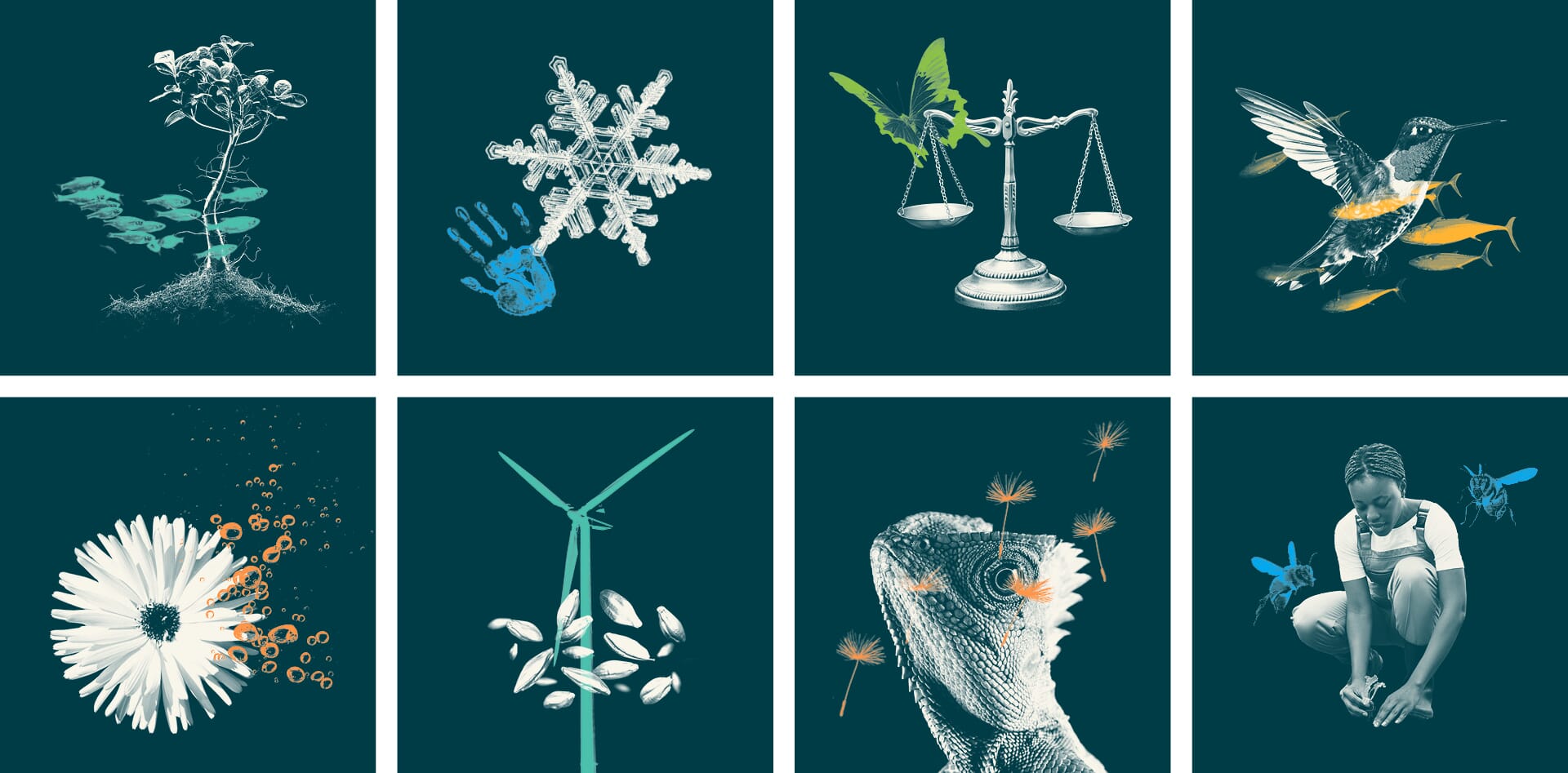
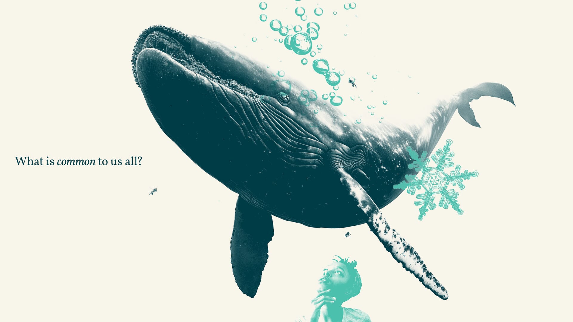
The core elements come together in the new design toolkit, using two free fonts throughout – a system that is being applied across Canva templates, Google slides and Google docs. Our aim is to put high-quality, consistent and differentiating graphics into their hands, at the lowest possible cost.
The team
- Strategy and narrative: Johnson Banks and Rebecca Walton
- Design: Johnson Banks