Human Appeal is a Manchester-based humanitarian NGO that has been in existence for over 25 years and has strong links with the Muslim community. The organisation's aim was to revitalise their brand in a way that would allow them to broaden their humanitarian work and appeal to more secular audiences, without alienating their historical supporter base.
In our initial discussions, it seemed that ‘what’ they do – reacting immediately to humanitarian emergencies, restoring shattered lives and reinforcing communities – could be our verbal ‘hook’. But as the project progressed it became clear that we should take our steer from their name to drive the core narrative:
In an increasingly fractured world, we are united by something powerful: our common humanity. We sprang from a simple human instinct: to help other humans in trouble, regardless of creed or colour. We began as a few students in Manchester – now our work spans the globe. Our task? To tackle the effects of humanity at its worst, by appealing to humanity at its best.
We sum this up in six words – all of humanity, one human appeal.
As we began the design stage, our initial ideas focused on typography. Then we realised that in the field, across 25 countries, a symbol that could be identified from 100 metres by non-English speakers would be invaluable. So we started a search for a new, universal symbol of humanity.
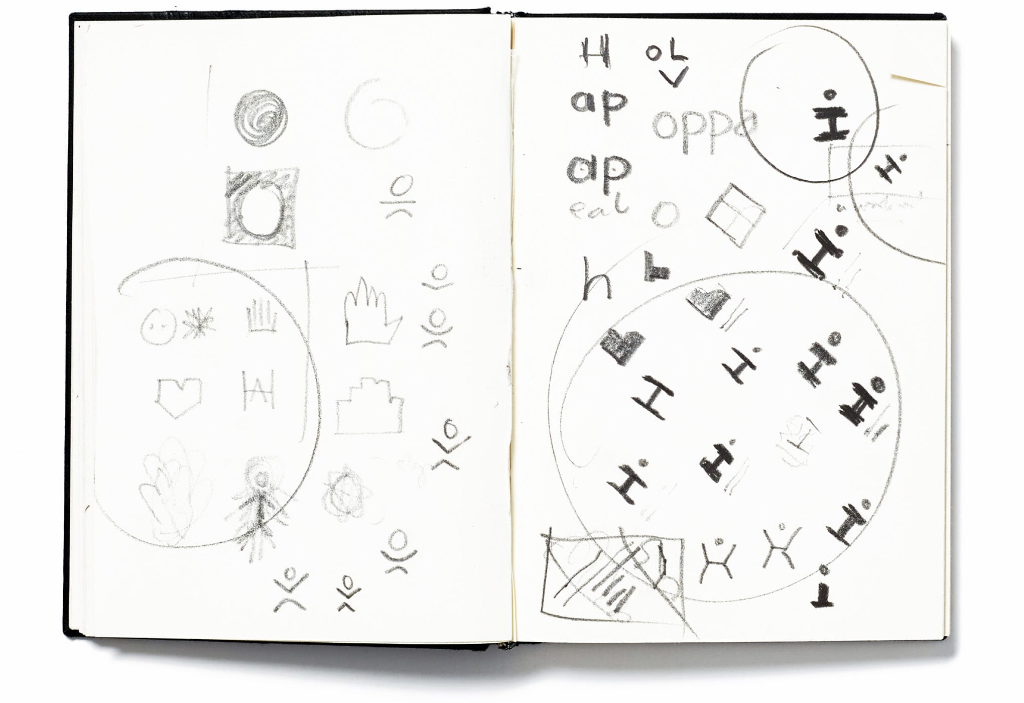

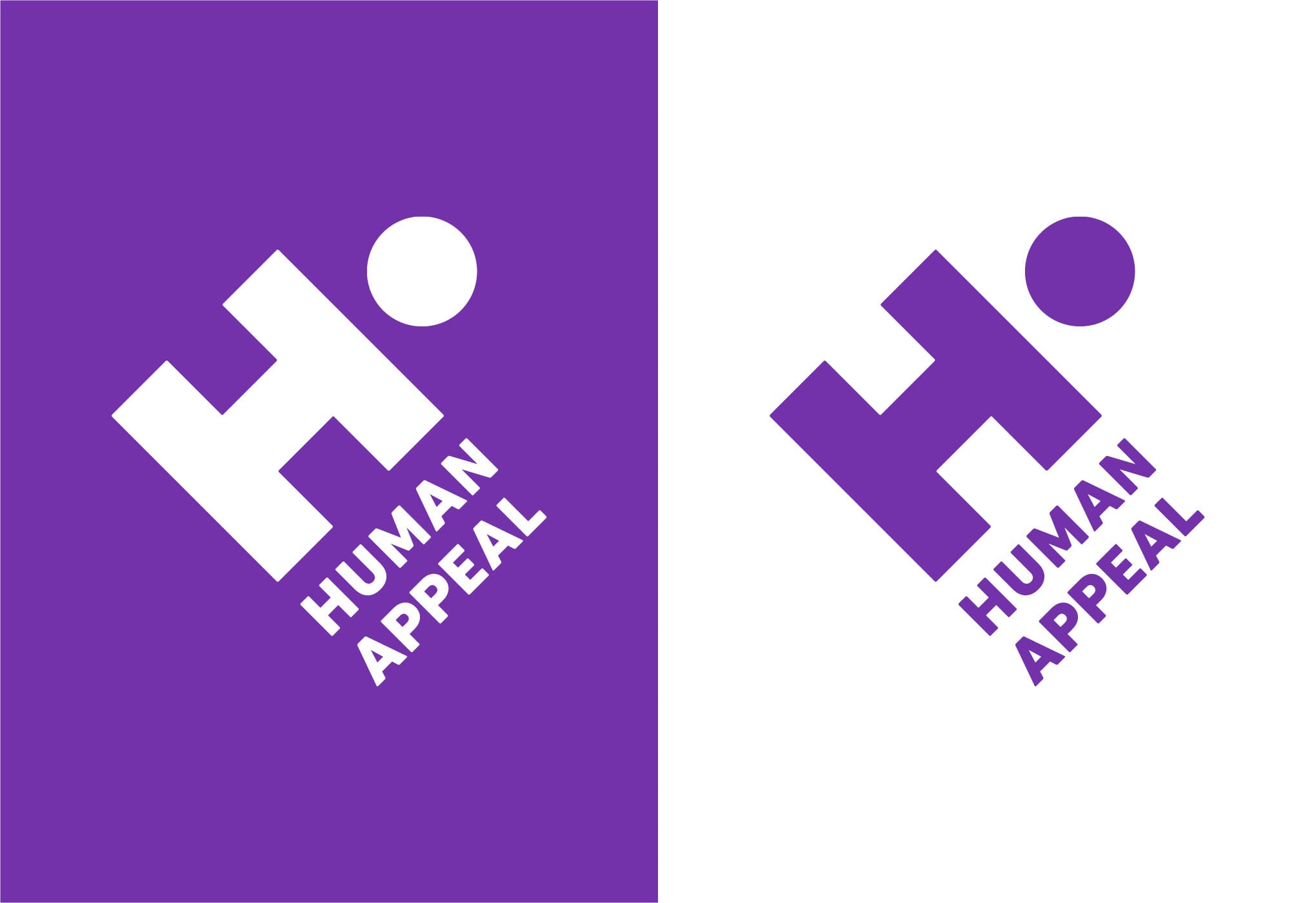
This proved to be challenging – until we combined an ‘H’ for ‘human appeal’ with a symbol of a person. By simply turning the marque 45 degrees, we had uncovered an image with the two meanings we were searching for – and the angle added a useful sense of urgency.
Throughout the summer, and in conjunction with Human Appeal’s in-house team, we’ve been working on the design system, which picks up strongly on the 45 degree angle theme. We’ve strengthened their original purple and also added a new palette.
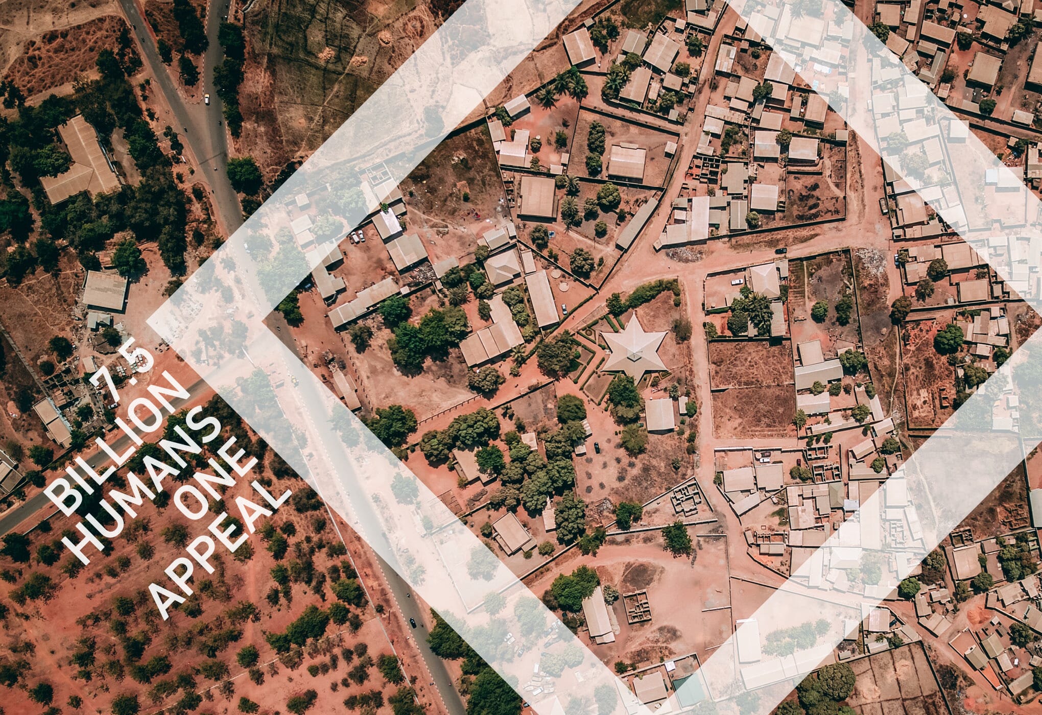
We’re suggesting the use of dramatic, wide-angle immersive photography or unusually high angles – a different point of view from the images used by most other NGOs.
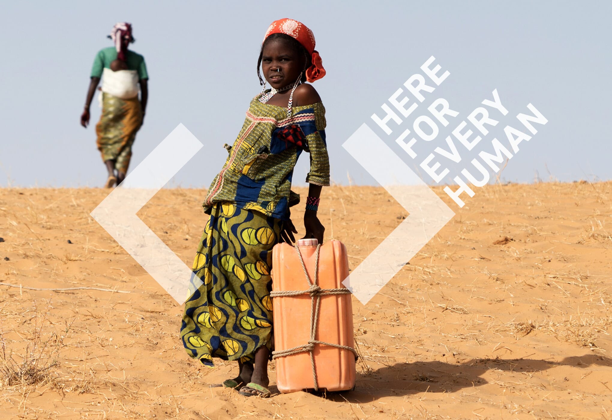
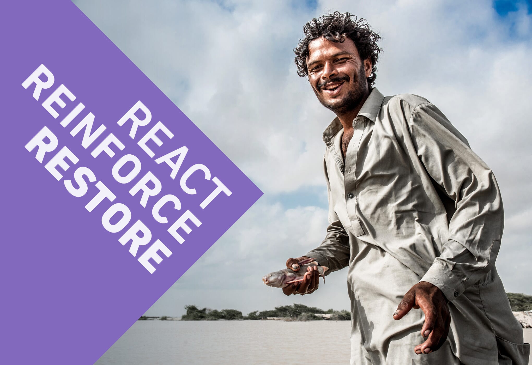
Human Appeal does a vast array of work and reaches out to multiple audiences, so typographically we’re using the entire DIN Next family, which allows us the use of a stencil in times of crisis, and a very good Arabic equivalent.
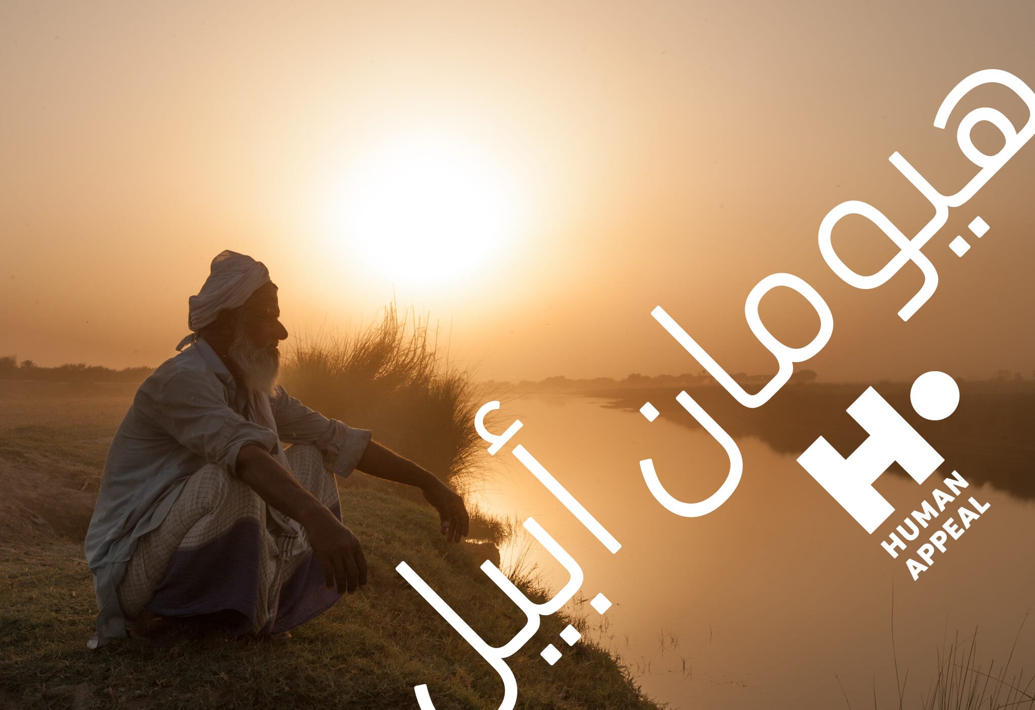
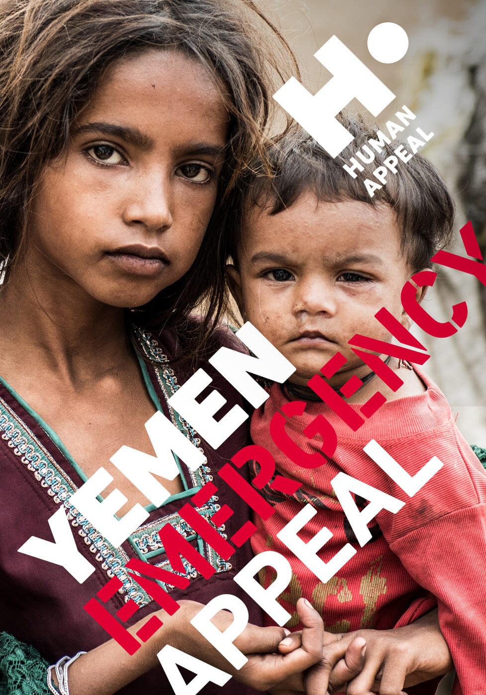
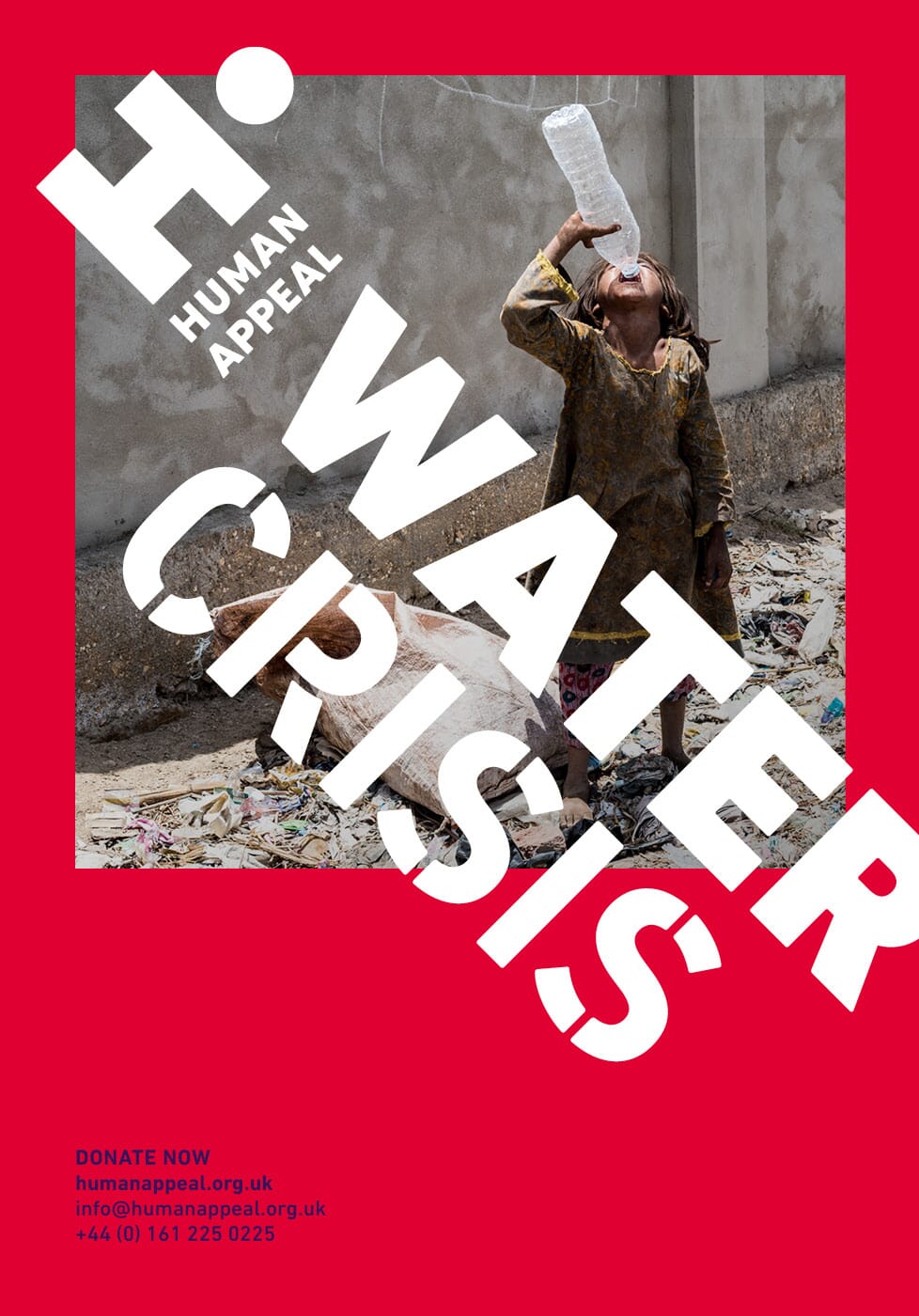
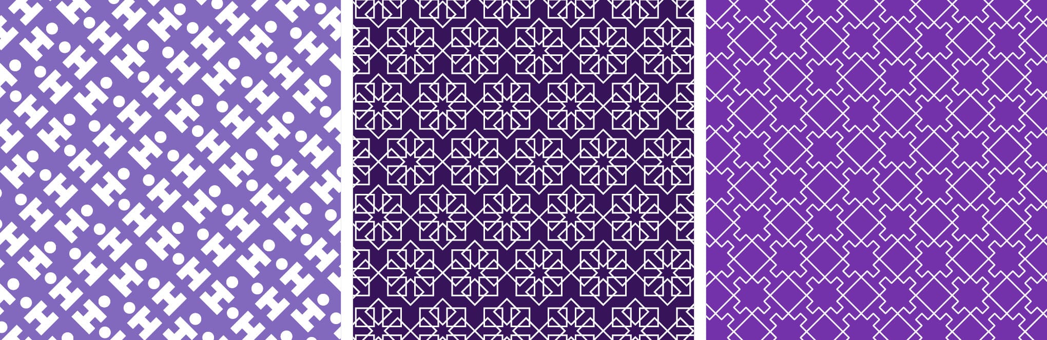
We’ve also developed a whole series of patterns to add a further layer of identification. The scheme is now being rolled out across print, merchandise, advertising, web and social media.
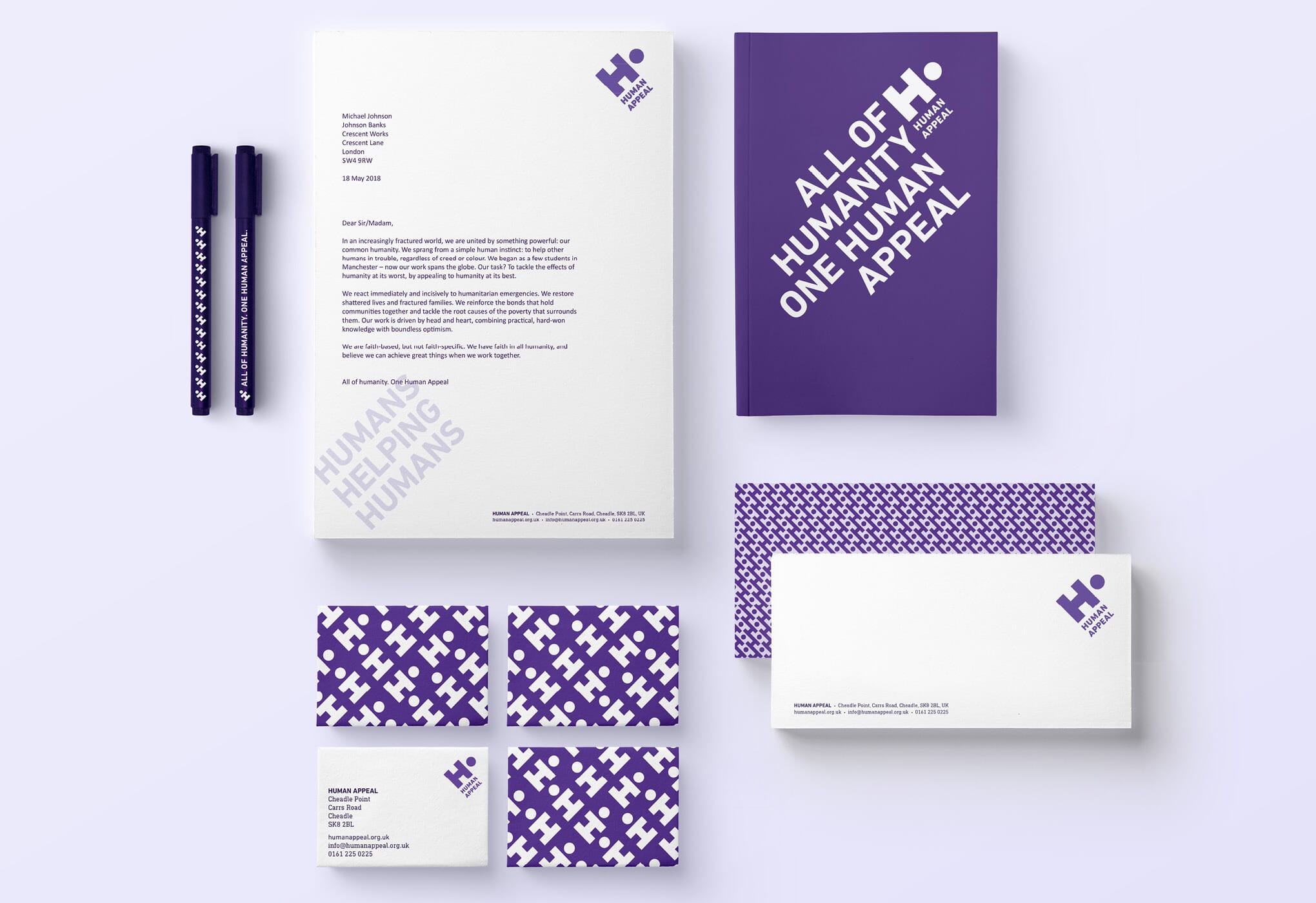
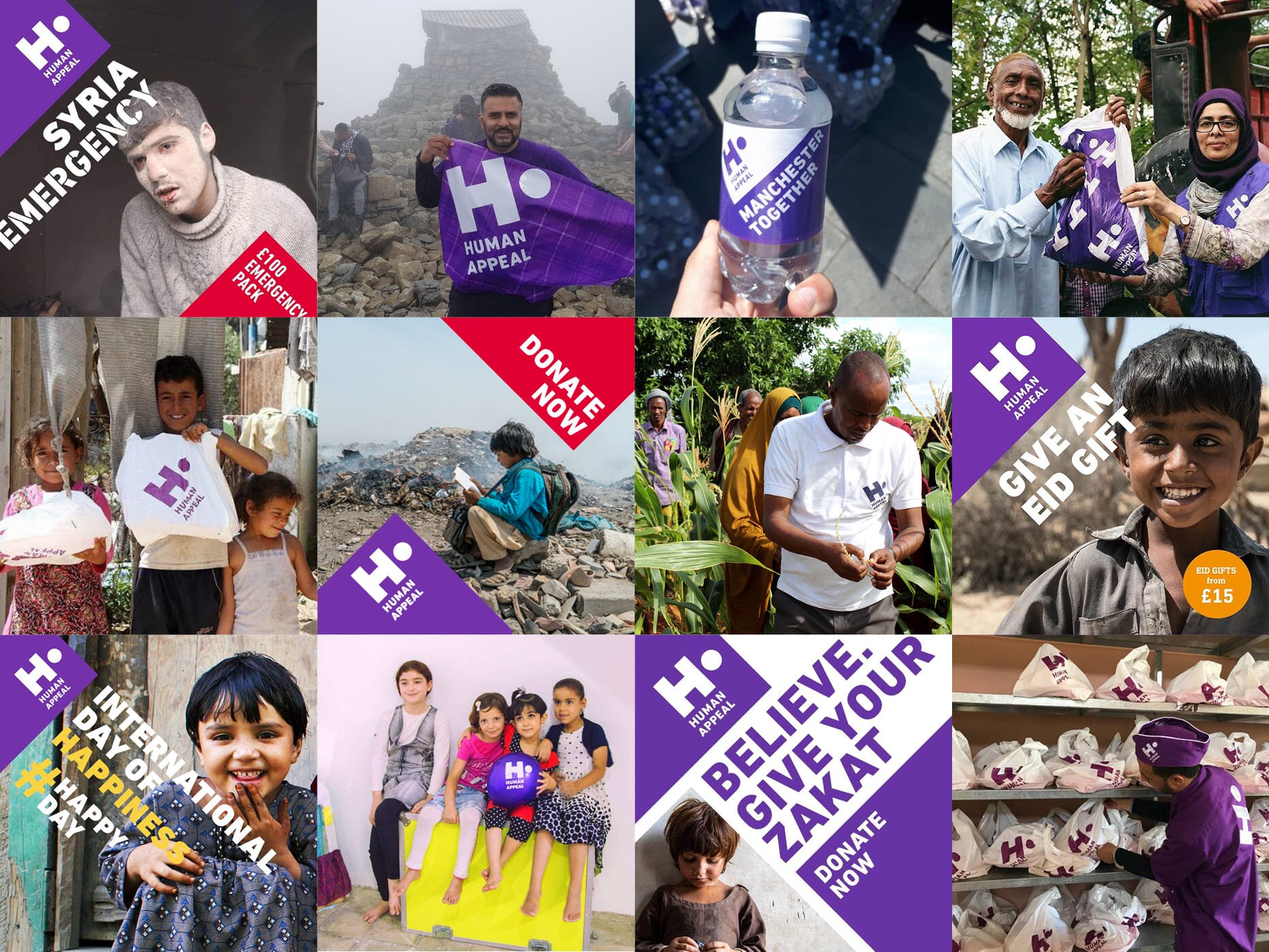
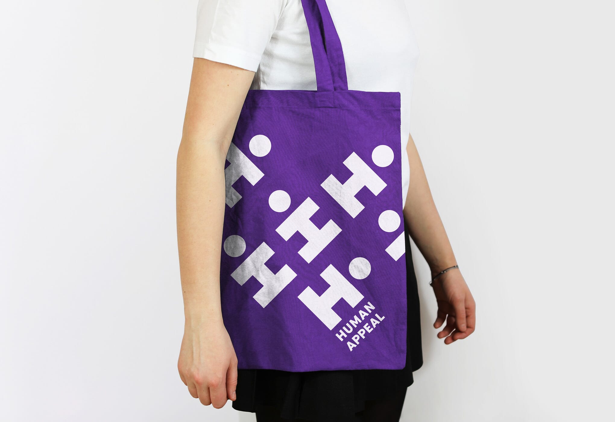

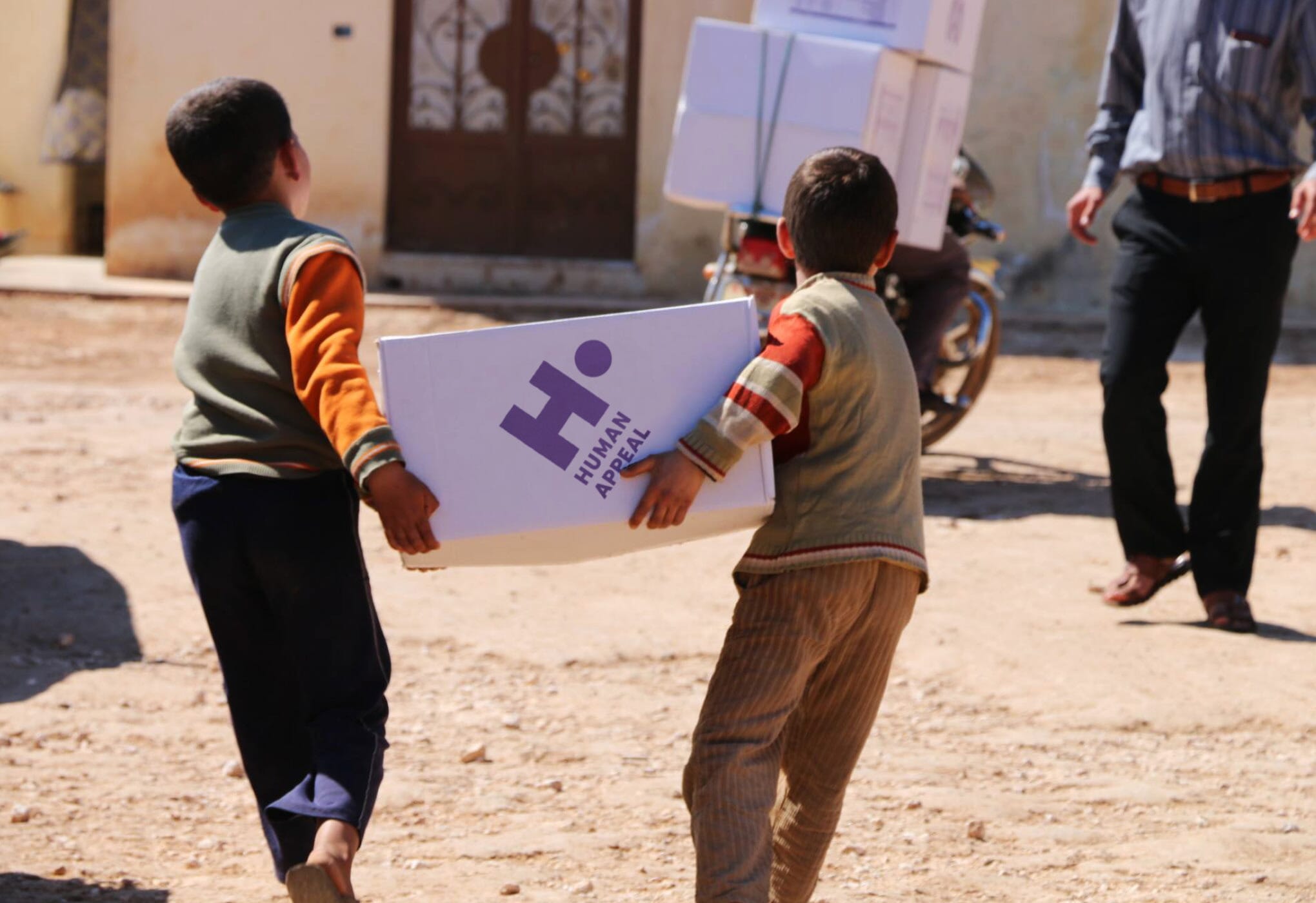
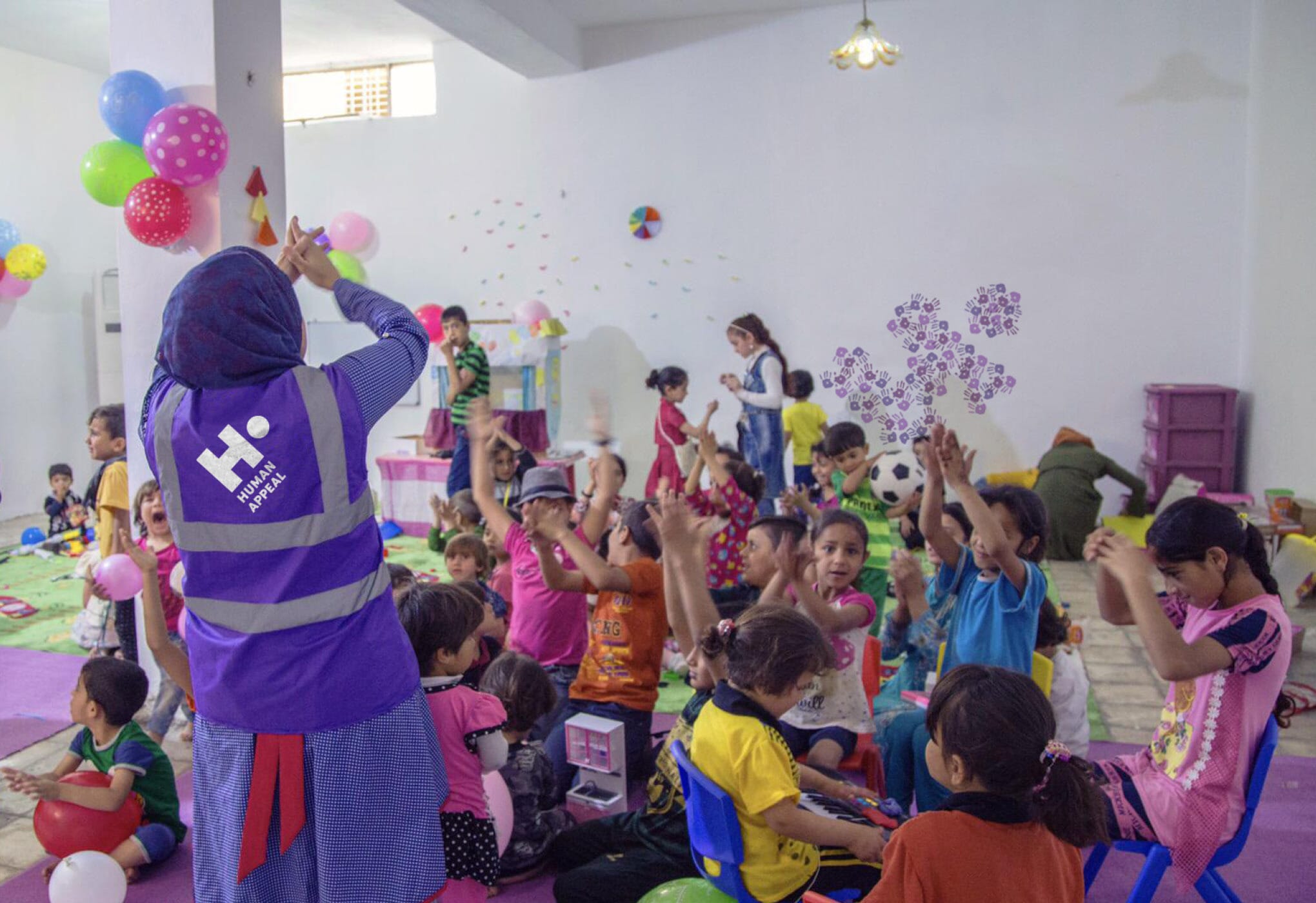
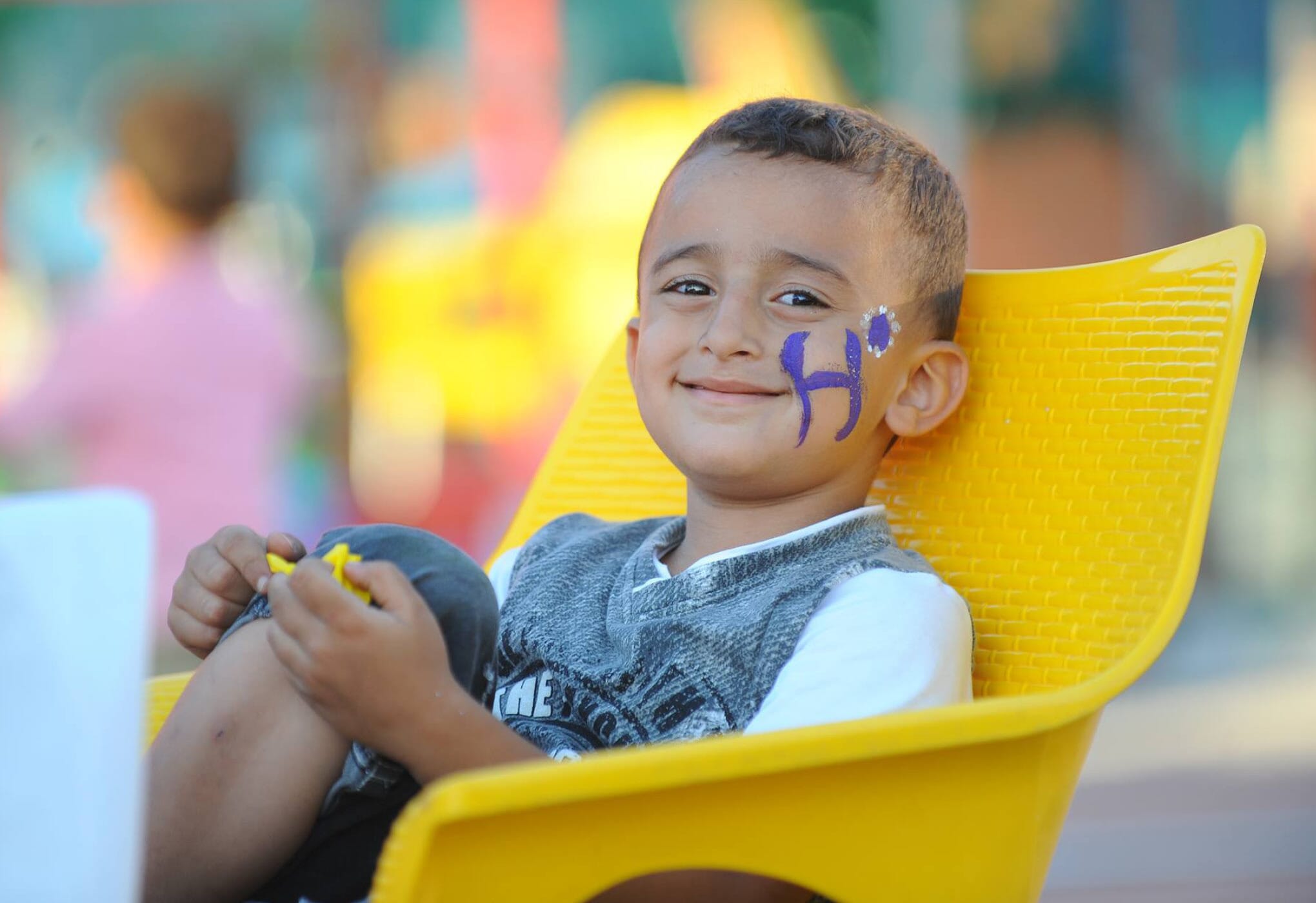
It’s already in use in the field as a simple identifier on clothing and much-needed supplies, and is being incorporated into children’s workshops and photo-shoots.

Credits
- Image of refugees in boat © Sergey Pononarev