Across the world at least three billion people aren’t getting enough nutrition from their food, causing severe and lasting health issues. One of the ways to tackle this deficiency and malnutrition on a massive scale is to ‘fortify’ staple foods such as rice, edible oil and flour – a process that has been taking place for decades in the northern hemisphere, but is often underutilised in the Global South.
Millers for Nutrition is a new global coalition of micronutrient suppliers and food producers, backed by the Bill and Melinda Gates Foundation, aiming to help milling businesses improve the fortification of the staples they produce. By sharing tools, expertise and training and by encouraging, enabling, and celebrating the millers who join, they can build their recognition and brand awareness, boost community access to healthier food whilst creating a business advantage.
The aim of the project, up and running in eight countries, is vast: to reach one billion people by 2026 with adequately fortified flour, rice and edible oil. In the longer term, the three billion target is the goal.
For our work, it was crucial that we created a brand that every type of miller – spread across multiple continents – could see themselves as part of, and be proud of. It needed to be authentic, grounded and real, featuring working millers from companies of every shape and size. It couldn’t feel slick, westernised or overly corporate, and had to side-step any ‘NGO’ tropes of starving children and any sense of ‘hand-outs’.

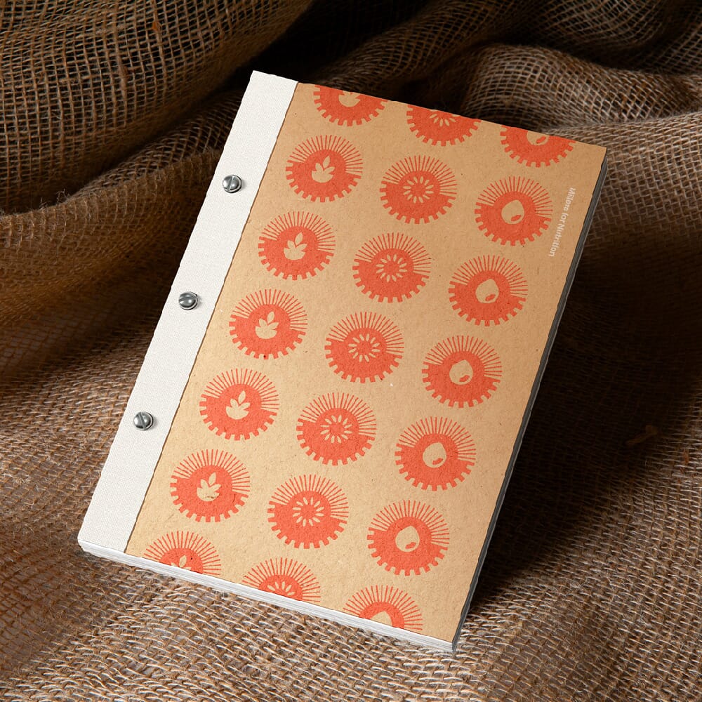
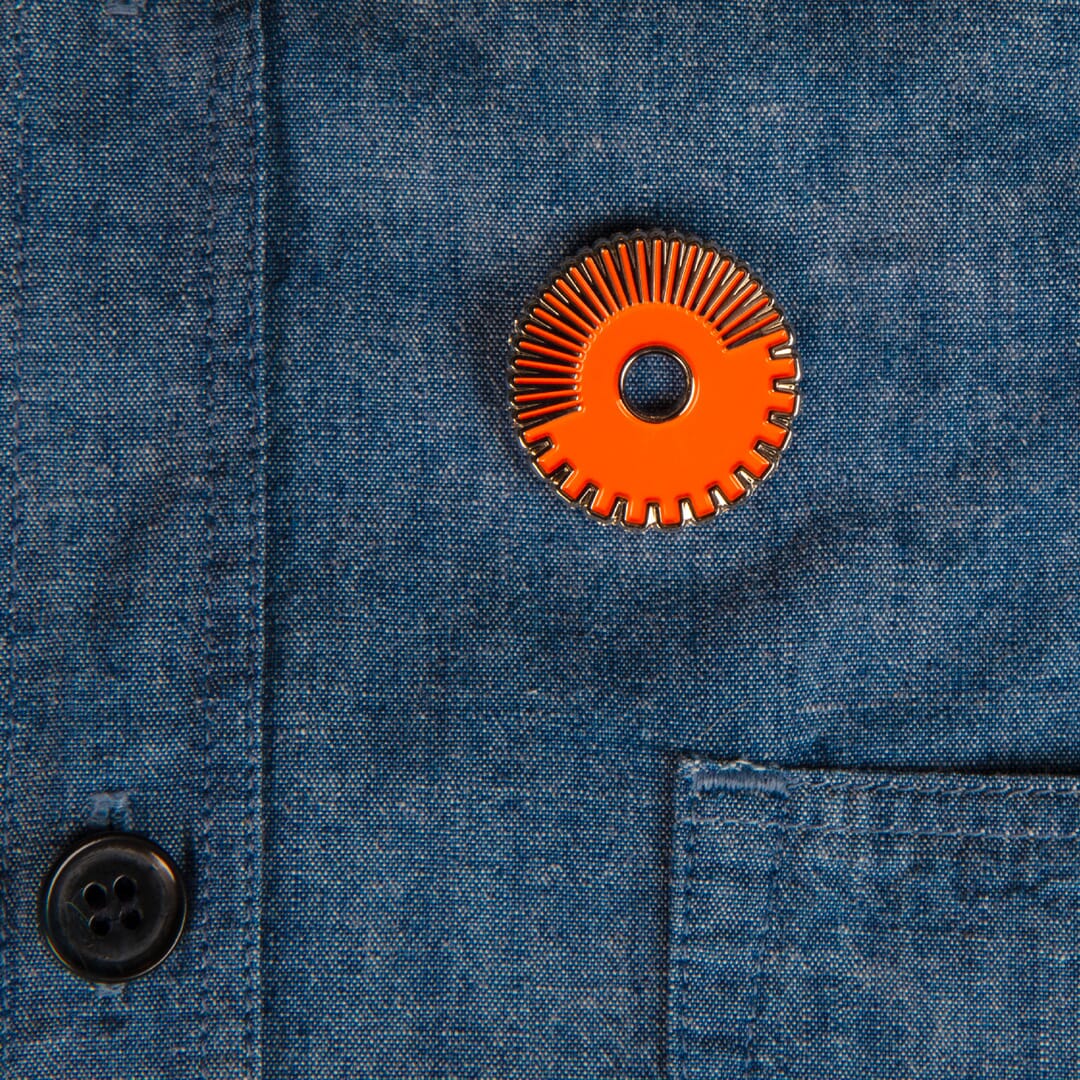
Our solution hinges around a simple symbol that fuses a ‘rising sun’ icon with a milling ‘cog’ to create a unique device that anchors the scheme with simple, easy-to-use icon.
But the true stars of this scheme are the millers themselves, who we photographed across four countries. In each location we briefed local photographers (to avoid any northern hemisphere bias) and asked each to shoot the Millers at eye level, head on – naming them where possible and portraying them as the active ‘heroes’ of the scheme, not the passive beneficiaries.
The design toolkit had to be easily adopted by staff across all countries. So we used the free font Poppins (itself designed in India) that supports Latin and Devanagari typesetting. We added extensive patterns and a vibrant colour palette to create a visual effect that is bold, eye-catching and of the Global South, without being overly associated with any one country.
Here’s the scheme in action.
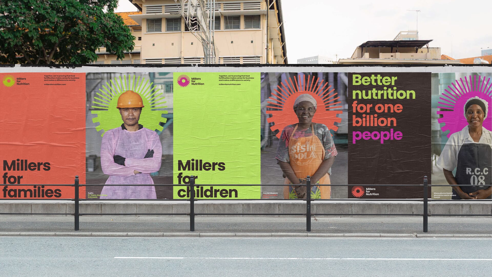
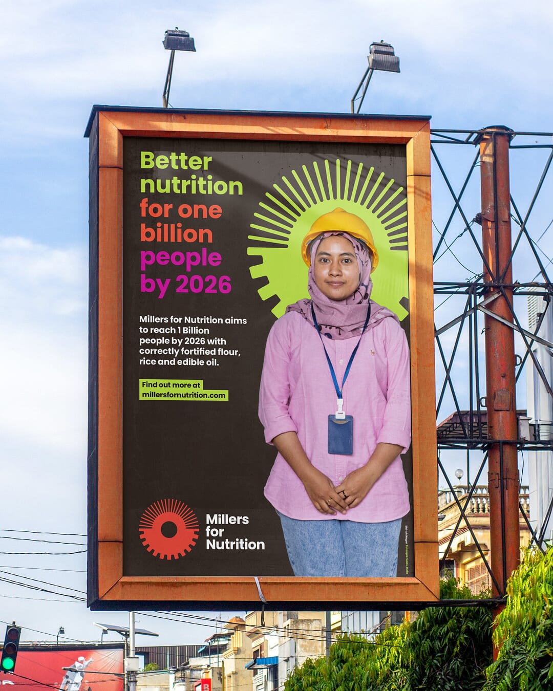
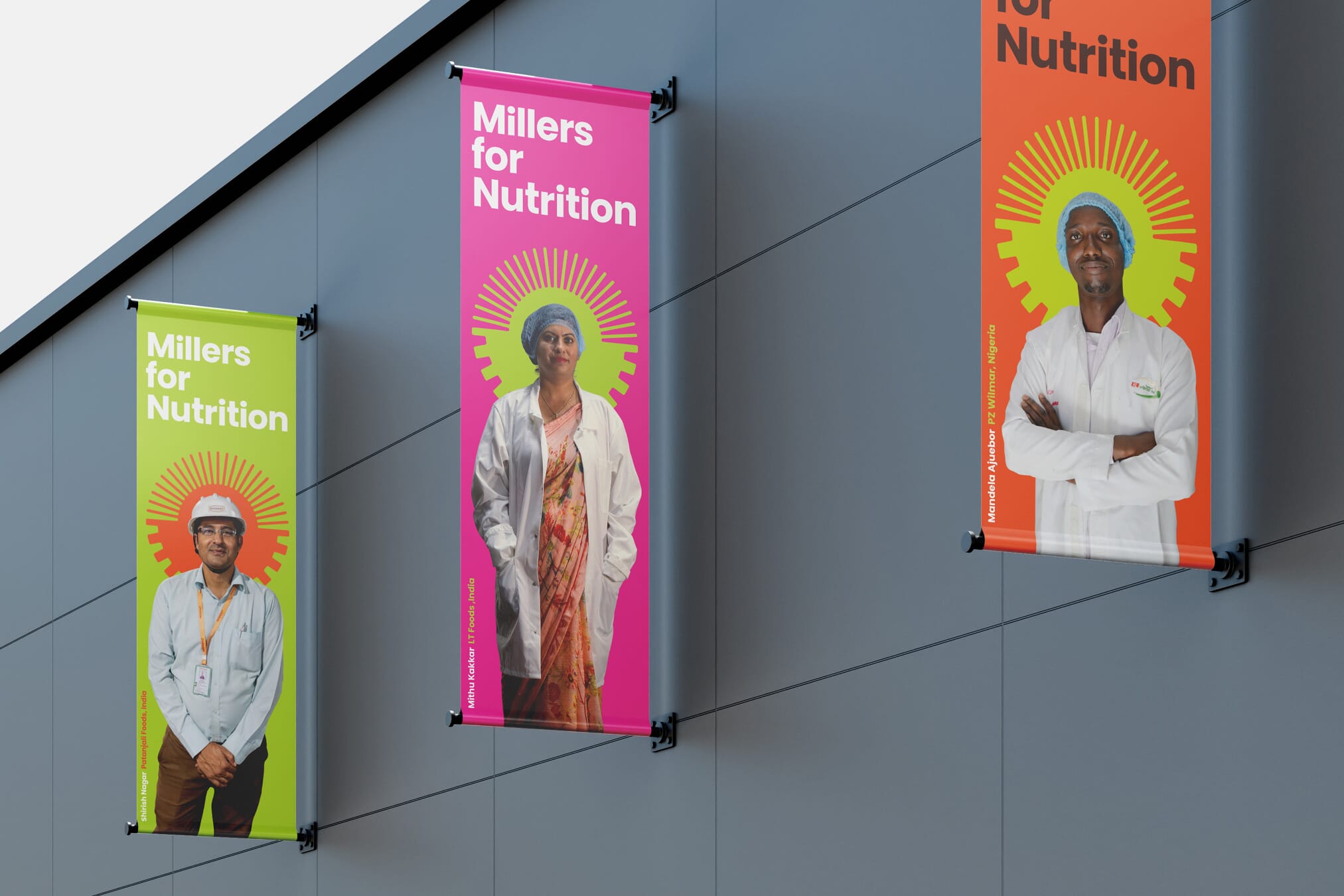
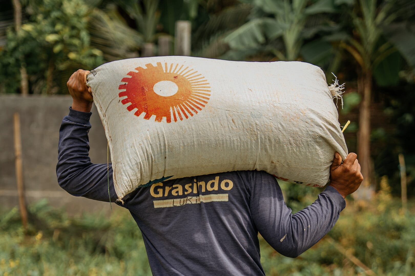
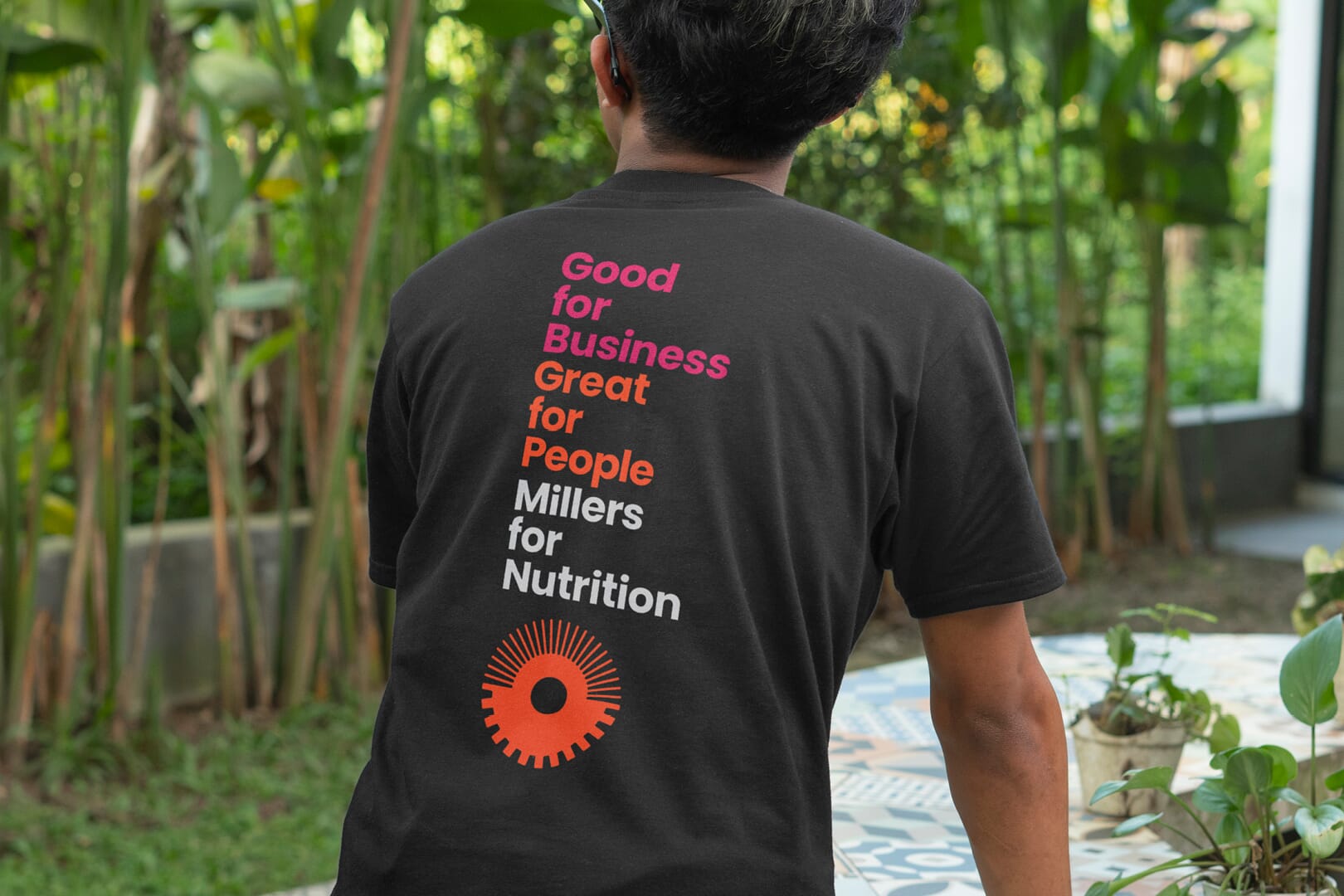
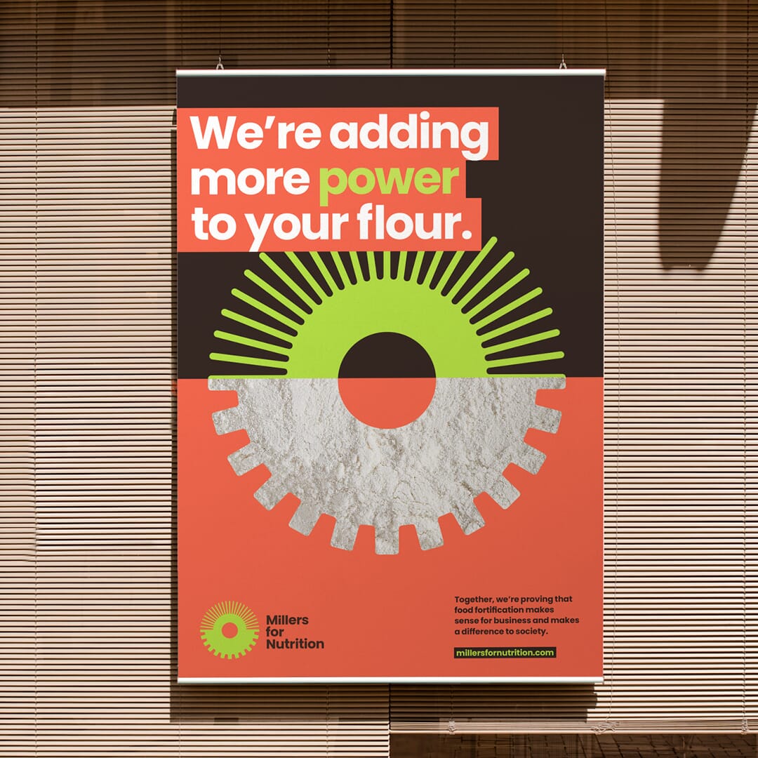
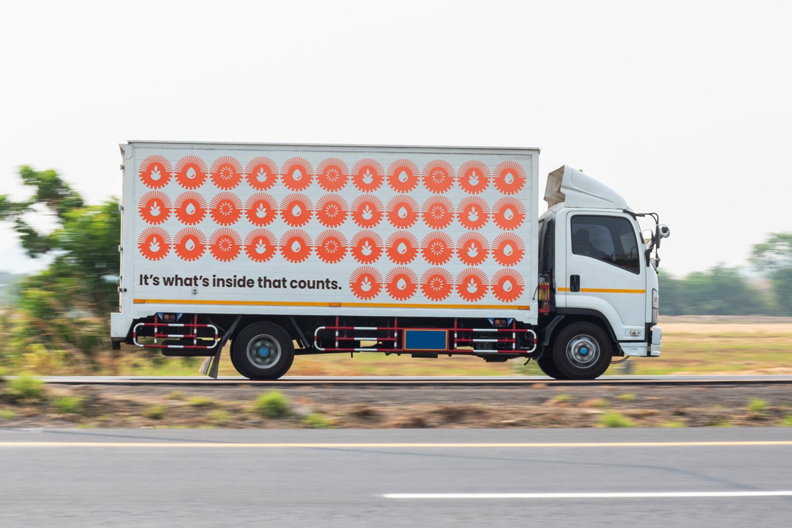
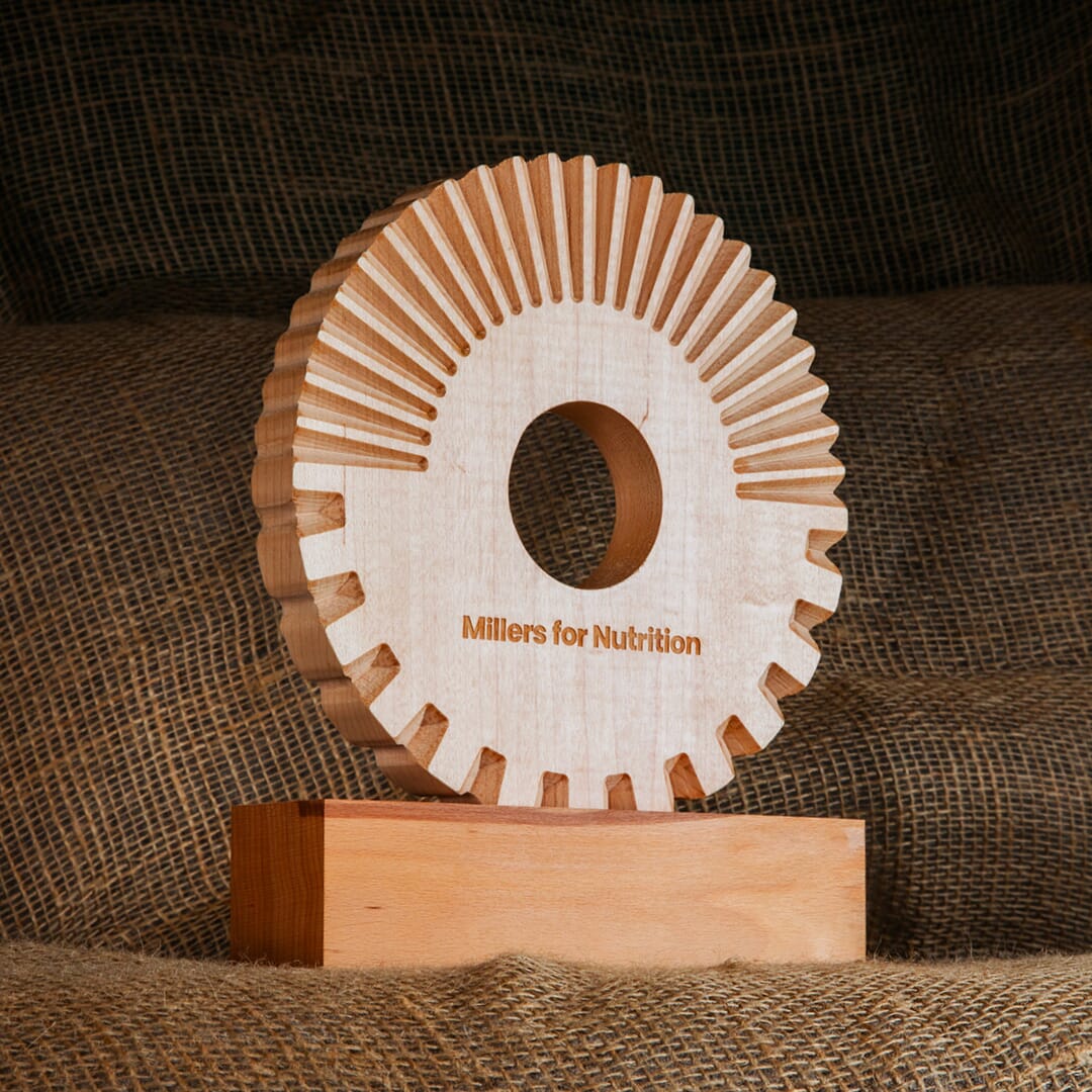
To celebrate new members of the coalition at annual conferences and meetings, we also designed and produced a meticulously computer cut wooden award that is given to founder members in each country.
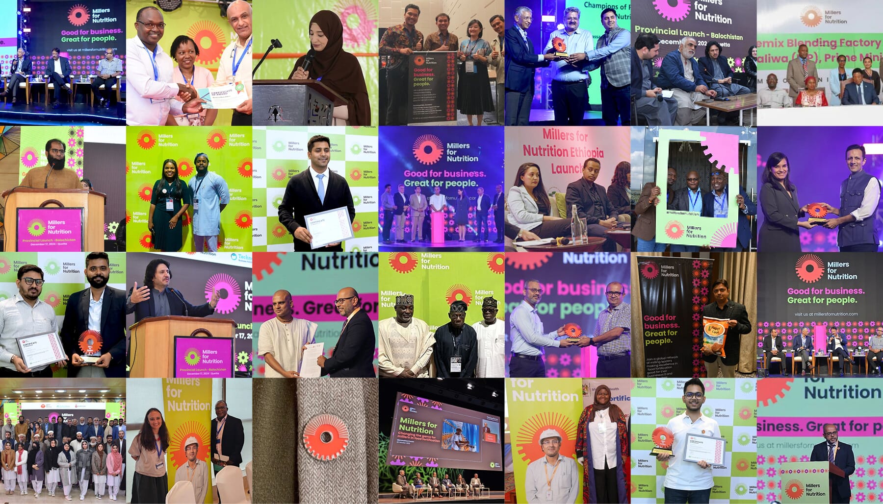
Above are a few glimpses of the multiple events and meetings across the world as new millers join the scheme. Below are excerpts from a short film that explained the project in more detail.
For us, this project adds to a series of system-change projects we’ve carried out over the last two decades, from our rebrand of impact investment leaders Acumen to our global rebrand of Action Against Hunger and previous work with the Bill & Melinda Gates Foundation.
On the surface, these projects are quiet, and sometimes unassuming, but the underlying impact can have massive impact on billions of lives.
The team
- Messaging, production, design and branding: Johnson Banks
- Client team: Bill & Melinda Gates Foundation, Endeva, Technoserve
- Photography coordination: Thomas Damgaard, Culture & Commerce
- Kenya photographer & videographer: Paul Mbugua, Rubanipix Ltd.
- Indonesia photographer & videographer: Putu Sayoga & Wayan Martino
- India photographer: Ruhani Kaur
- Nigeria photographer: Hayenichukwu Okoh
- Film script, production and editing: Johnson Banks, Thomas Damgaard, Ian Anderson
- Film music: Xiaotian Shi
With thanks the following mills and their staff for taking part:
- Mombasa Maize Millers, Kenya
- Grainora, Kenya
- Vipingo Industries, Kenya
- Kitui Flour Mills
- Sanghvi Foods, India
- Patanjali, India
- LT Foods, India
- PZ, Nigeria
- Olam, Nigeria