Many charities are facing an increasingly bleak fundraising environment. The after-effects of the pandemic and the cost of living crisis has affected both public donations, and volunteer numbers. Even for the UK’s largest charity, Cancer Research UK (CRUK), this has proved to be a challenge.
While some progress is being made in the fight against cancer in its multiple forms, many cancers and their causes remain a mystery, so the need for increased research funding is even more urgent.
CRUK approached us to help campaign to the philanthropic and high net worth market, one traditionally targeted by universities.This is an audience that takes a deep and often personal interest in the links between stronger medical research and tackling cancer – but getting their attention takes strong and compelling communication.
The project’s aim was to drive a sense of urgency, build momentum, mobilise donors around a shared goal, and enable CRUK to accelerate the impact on thousands of cancer patients’ lives.
But while the ambition was clear, it took time to align all of CRUKs many internal audiences around a shared task. The needs of the team at the world-famous Francis Crick Institute are different to those in their global Grand Challenges team – and then adjust again across their leadership work and innovation teams.
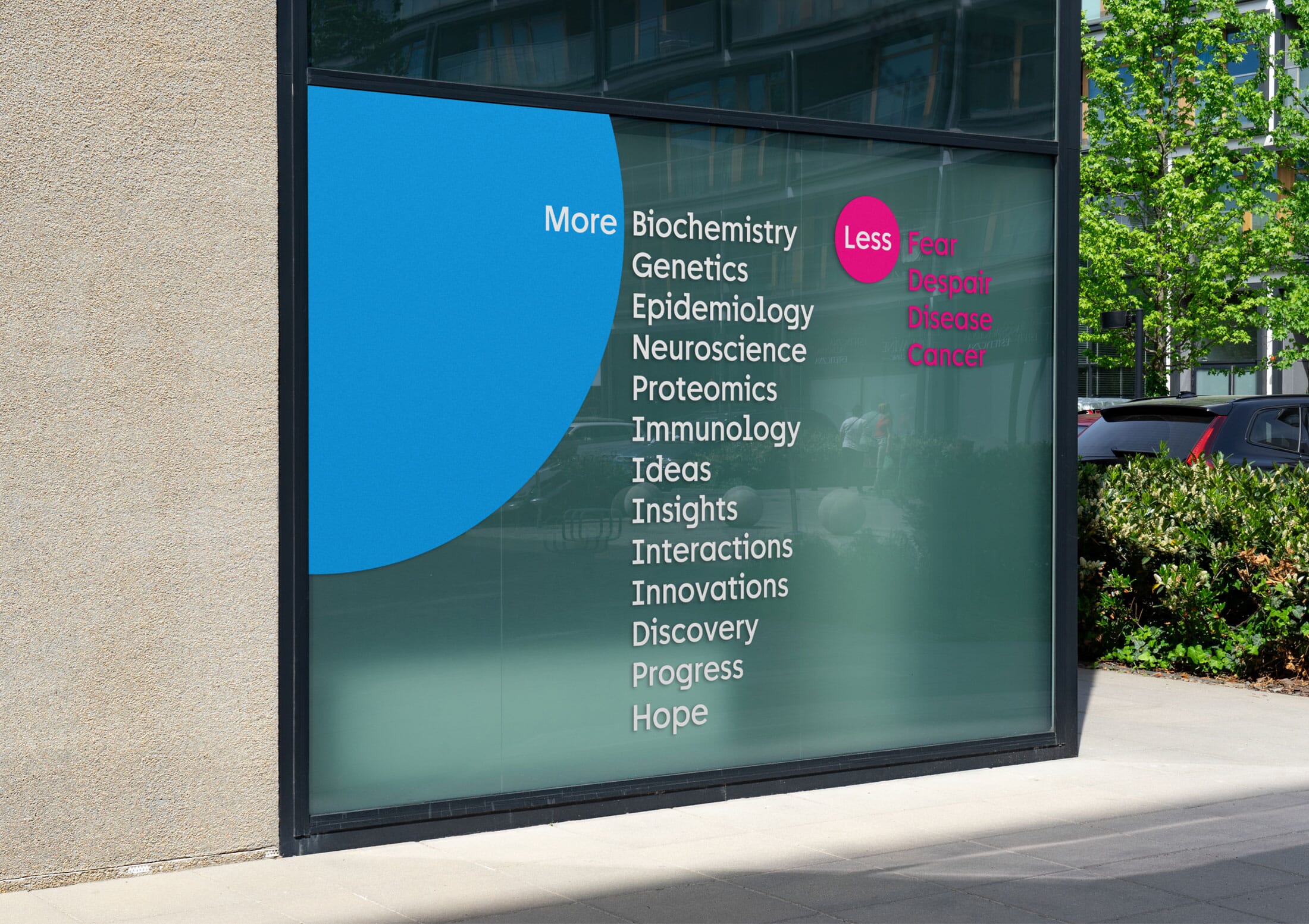
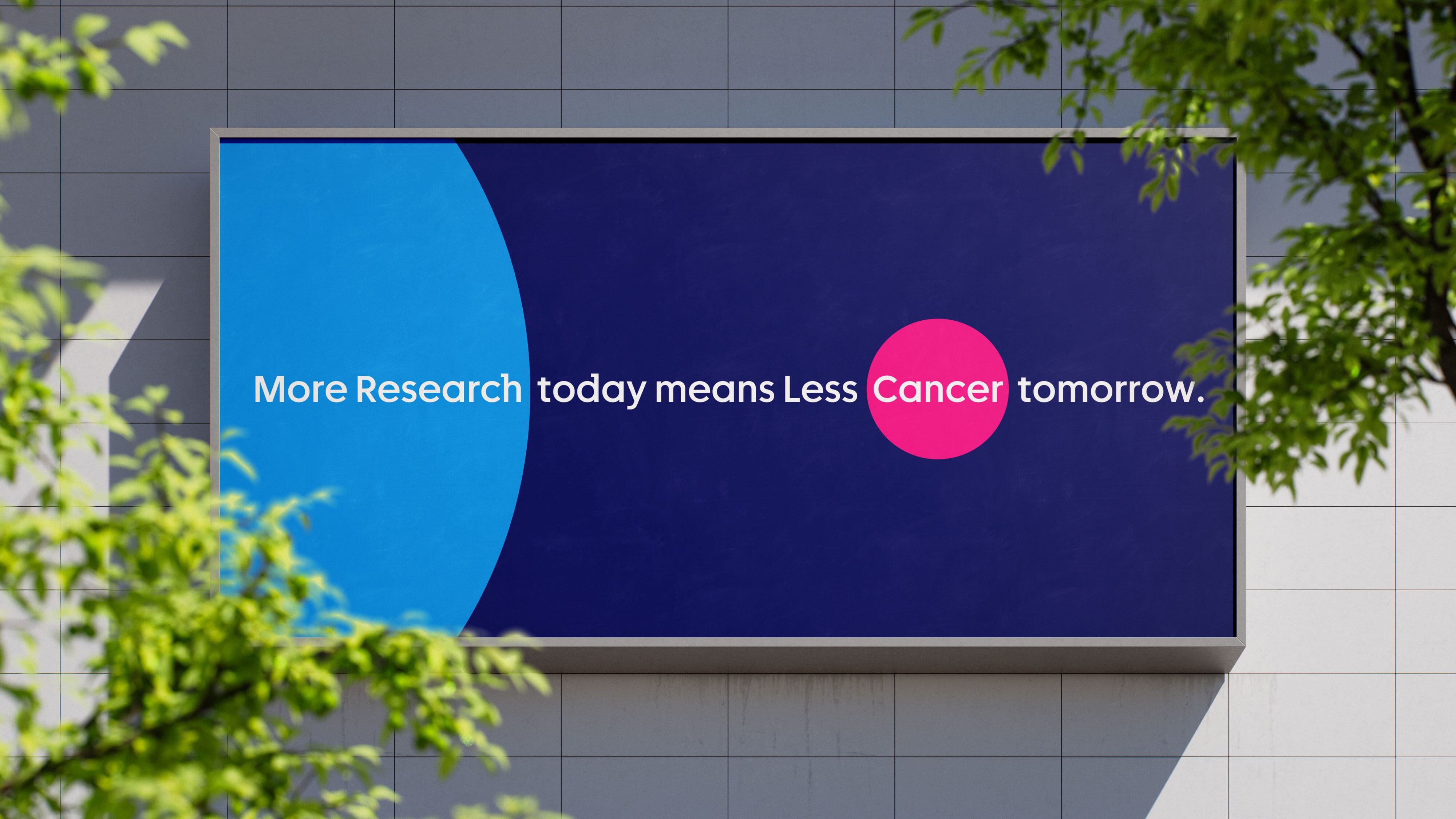
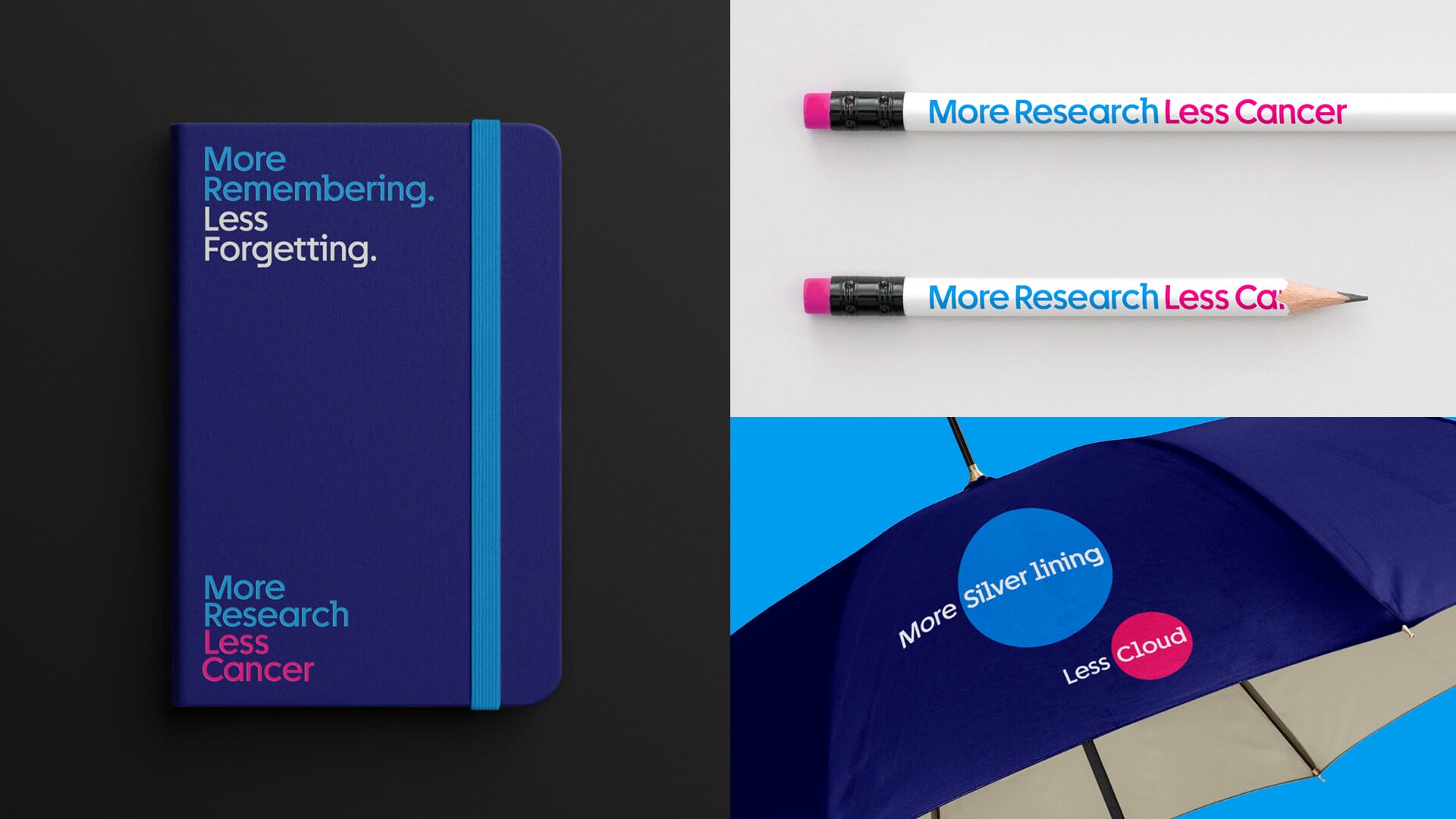
Eventually a compellingly simple idea emerged for the campaign’s name: More Research, Less Cancer. It’s short, it uses both ‘Cancer’ and ‘Research’ and opens up a powerful verbal platform using the more / less device: ‘more hope, less fear’; ‘more discovery, less despair’. We can also extend and broaden the metaphor: ‘the faster we create a map of oesophageal cancer, the sooner we find the exit’.
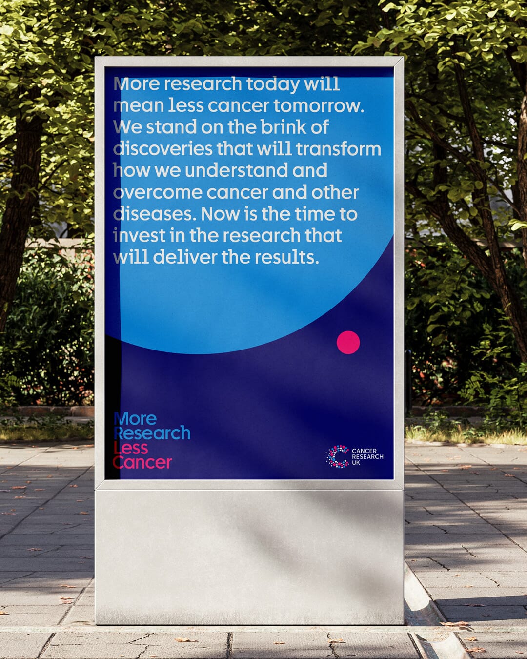
This is the core campaign narrative:
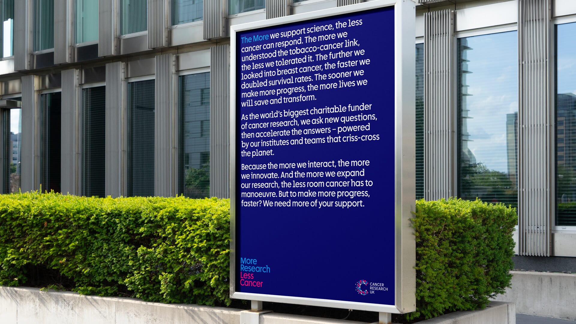
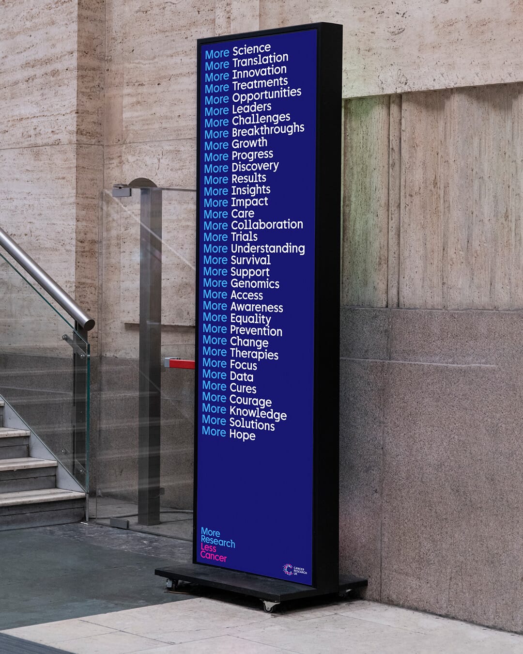
For the campaign’s visual identity the design solution hinges around a simple typographic ‘masthead’ – written in CRUK’s new typeface – which can work alongside the multiple brand and sub-brand identities that will often appear nearby.
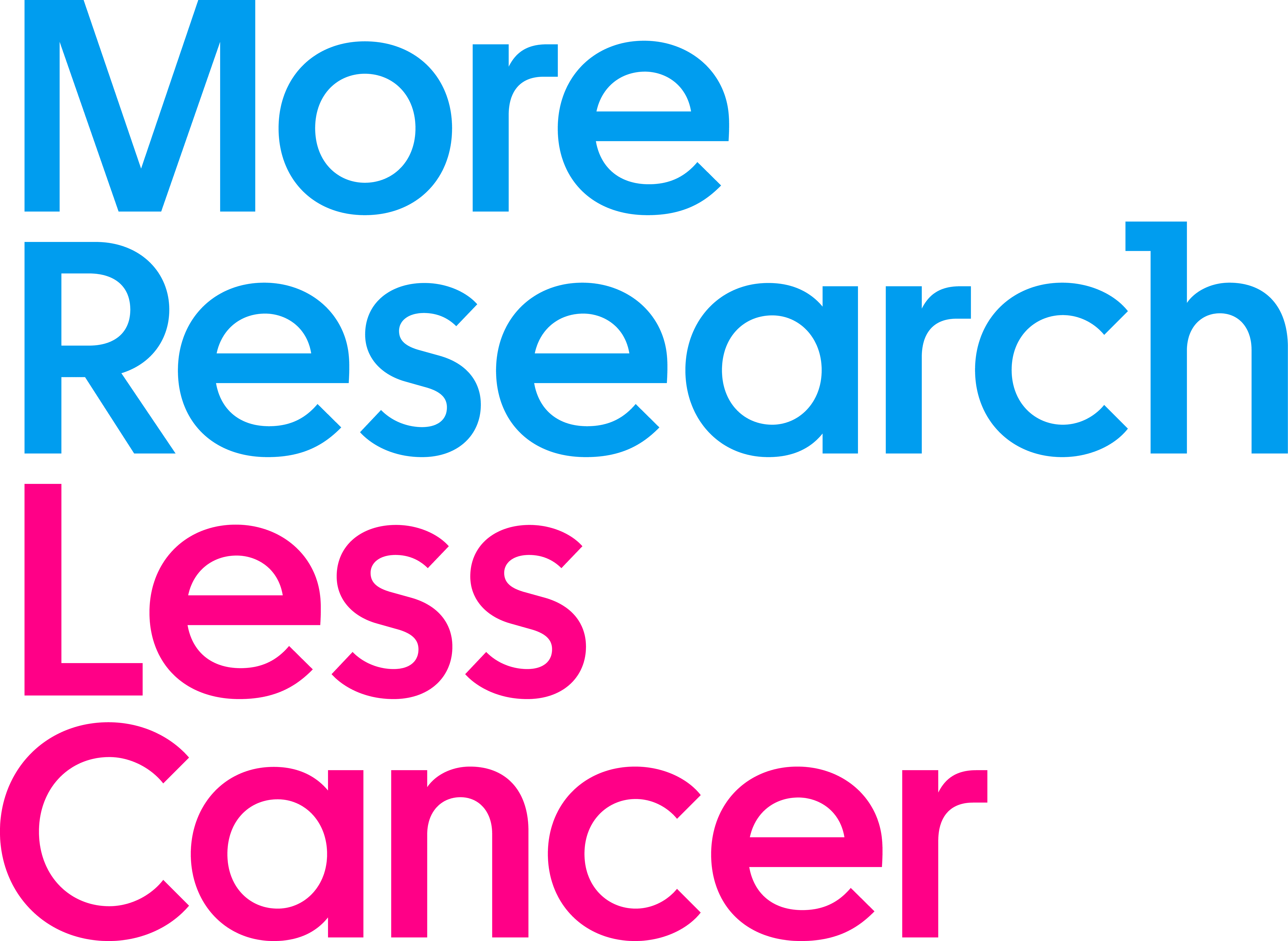
Then we used the language of blue and pink circles to work as mnemonic devices to symbolise ‘more’ and ‘less’.
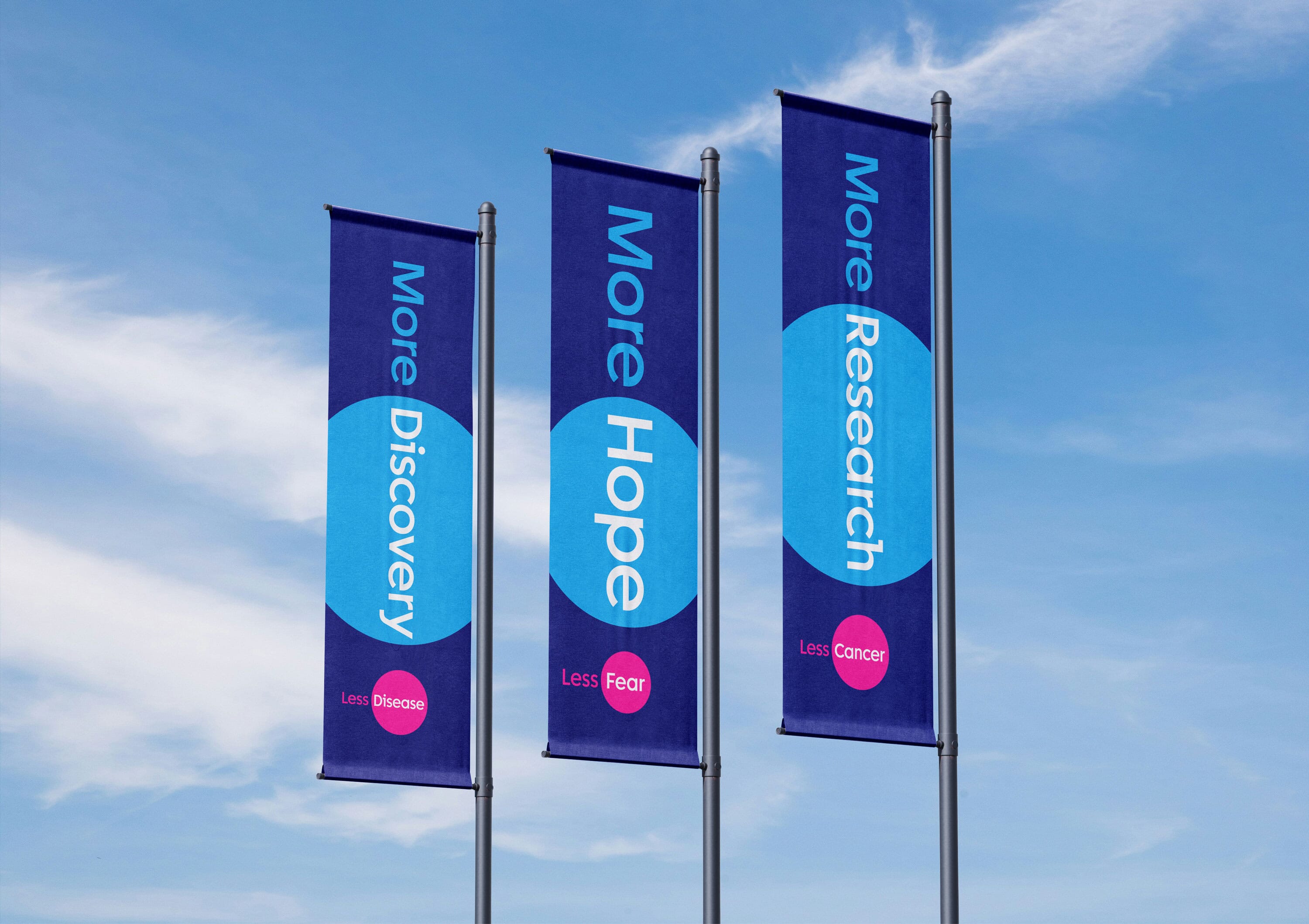
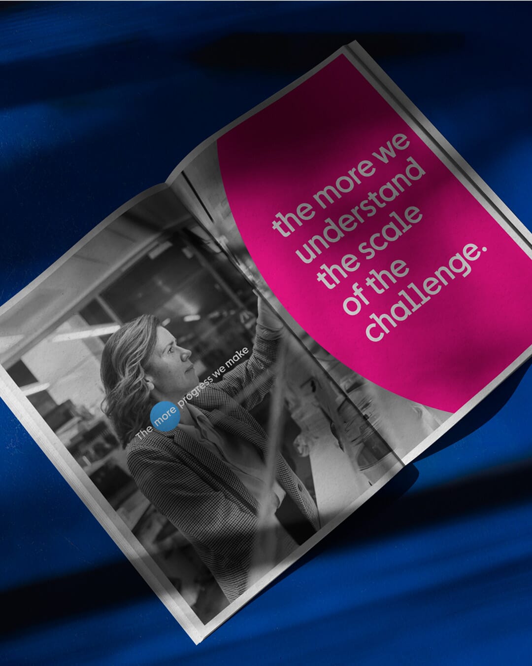
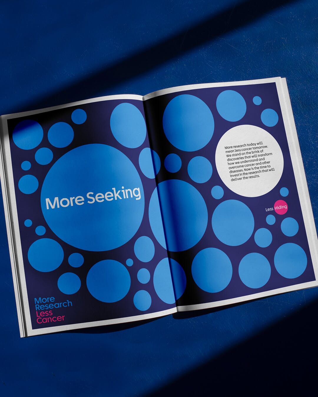
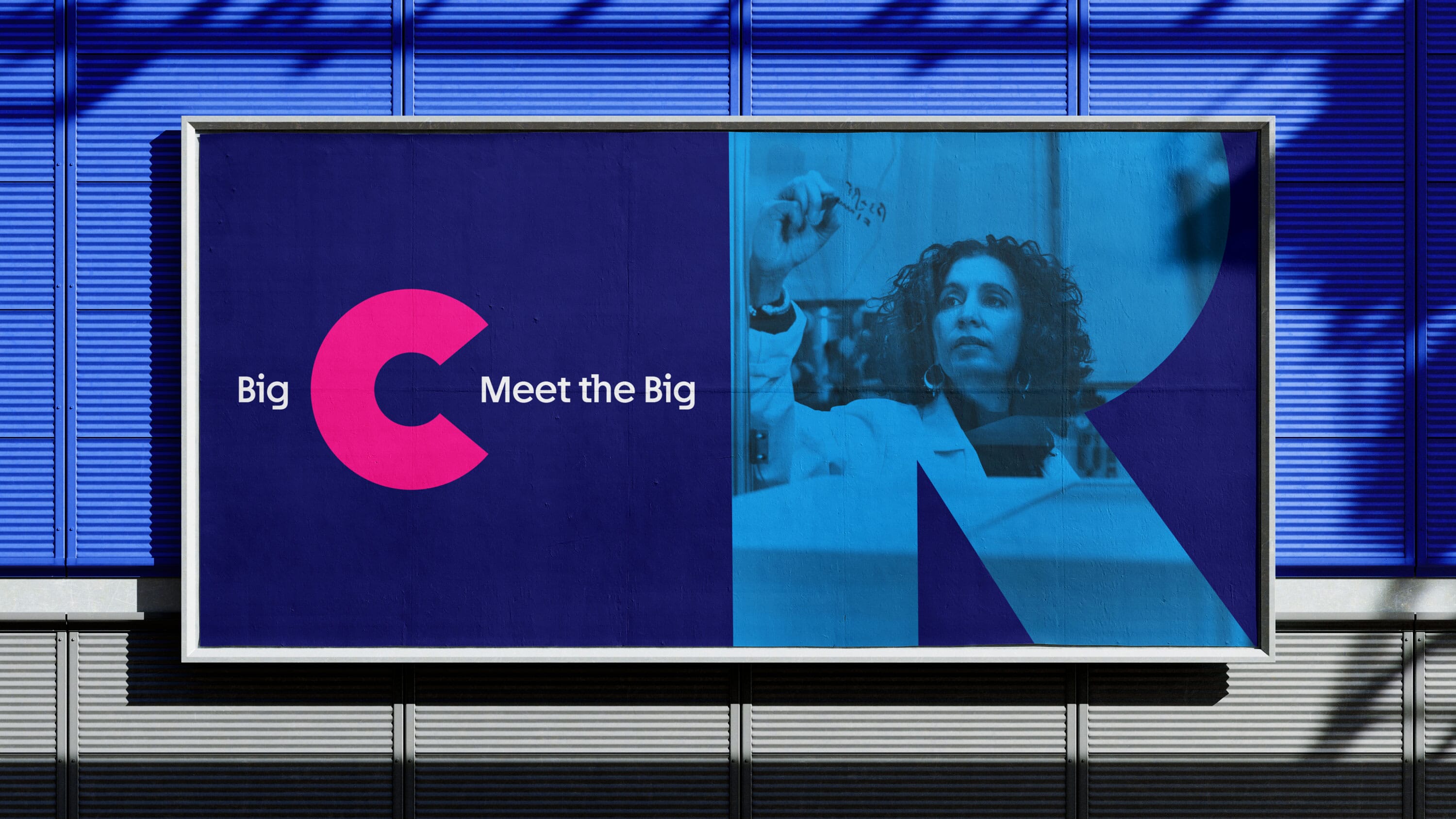
By using strong graphic and photographic images, and an intentionally limited design toolkit, it has enabled us to create a powerful campaign style across multiple media.
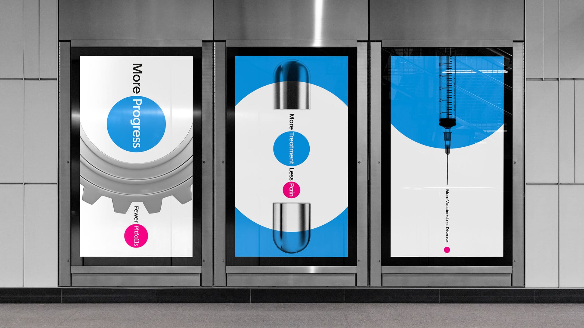
To mark a clear difference from CRUK’s public fundraising we commissioned black and white imagery and portraits of key scientists in London and Cambridge from leading photographer David Vintiner.
The language of dots and circles also flows through the filmic, animated and event work that we’ve carried out on the project.
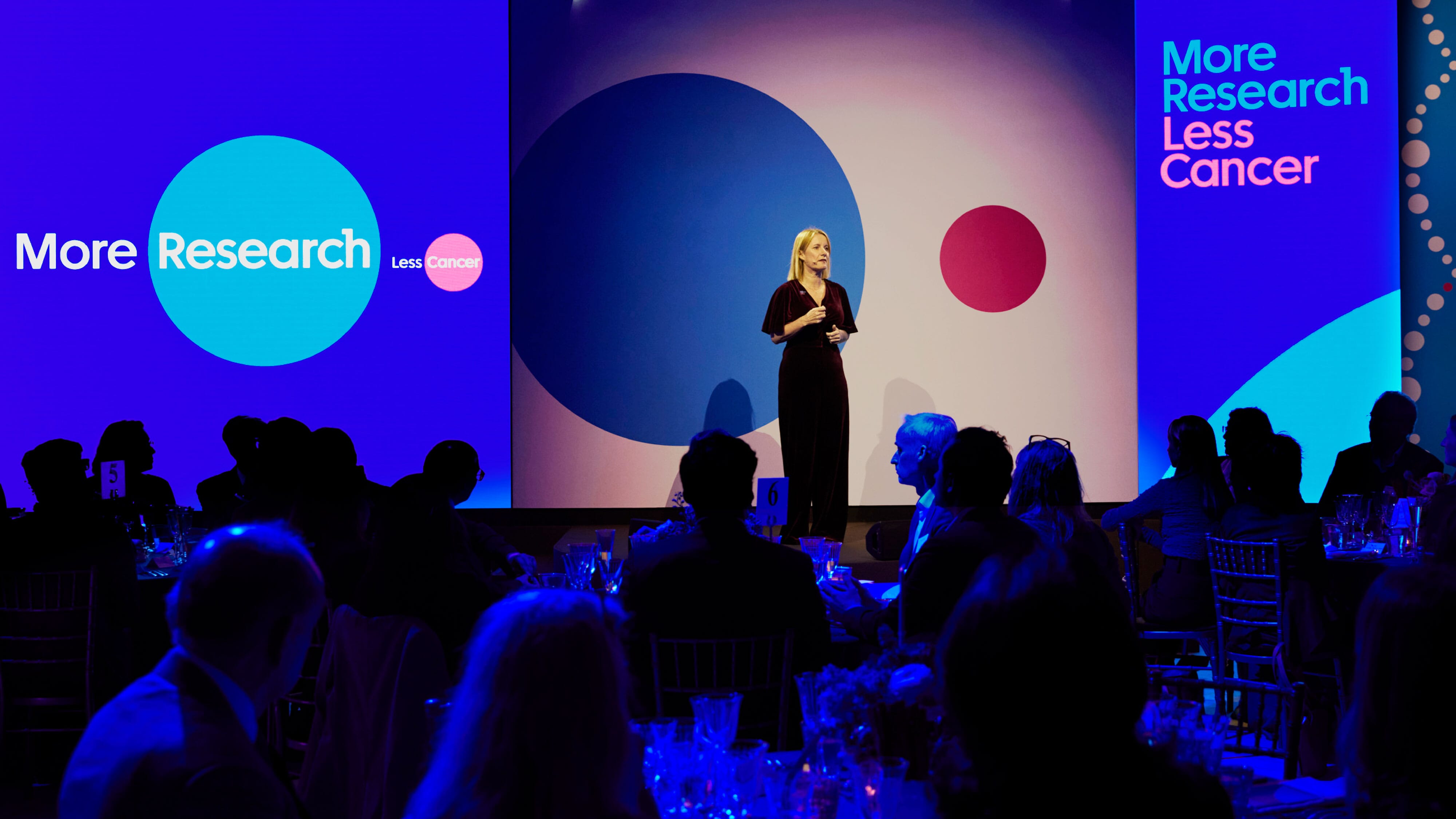
Here’s a short film, anchored by UK broadcaster Victoria Derbyshire (herself a cancer survivor) that we scripted, art directed and filmed for the launch.
The campaign’s original target was raised before launch from £250 million to £400 million, and after just over 12 months fundraising is already at £230 million – more than halfway towards its target in one year.
The team
- Strategy, narrative, naming and design: Johnson Banks
- Copywriting: Michael Johnson and Nick Asbury
- Photography: David Vintiner
- Film scripting and production: Johnson Banks and Ian Anderson
Awards
- 2025 Brand Impact Awards | Brand Strategy | Bronze