It’s over a quarter of a century since the Royal Institute of British Architects – commonly known as RIBA – last looked at its brand.
The institute represents a global community of up to 50,000 thousand architects, architectural practices and students. It’s the gold standard for architectural education worldwide and celebrates architectural excellence through its world-famous award schemes, from the Stirling Prize to the RIBA Gold Medal (won by all-time greats such as Le Corbusier, Frank Lloyd Wright and Zaha Hadid).
But as it approaches its two hundredth birthday, it urgently needed a stronger brand to help it grow and support its members, across the world. And when asked ‘what is RIBA for?’, it needed a better answer.
So for several years we’ve been carefully consulting, discussing and debating the way forward – a process involving multiple RIBA presidents, hundreds of staff and members in interviews, workshops, surveys and global research.
RIBA is now crystal clear about its purpose: to make the future a better place. Drawing on its original charter, it wants to advance architecture for all, by building the world’s greatest community of architects. And by educating, supporting, inspiring and championing architects everywhere, it will help them deliver better, safer, more inclusive and sustainable places for everyone.
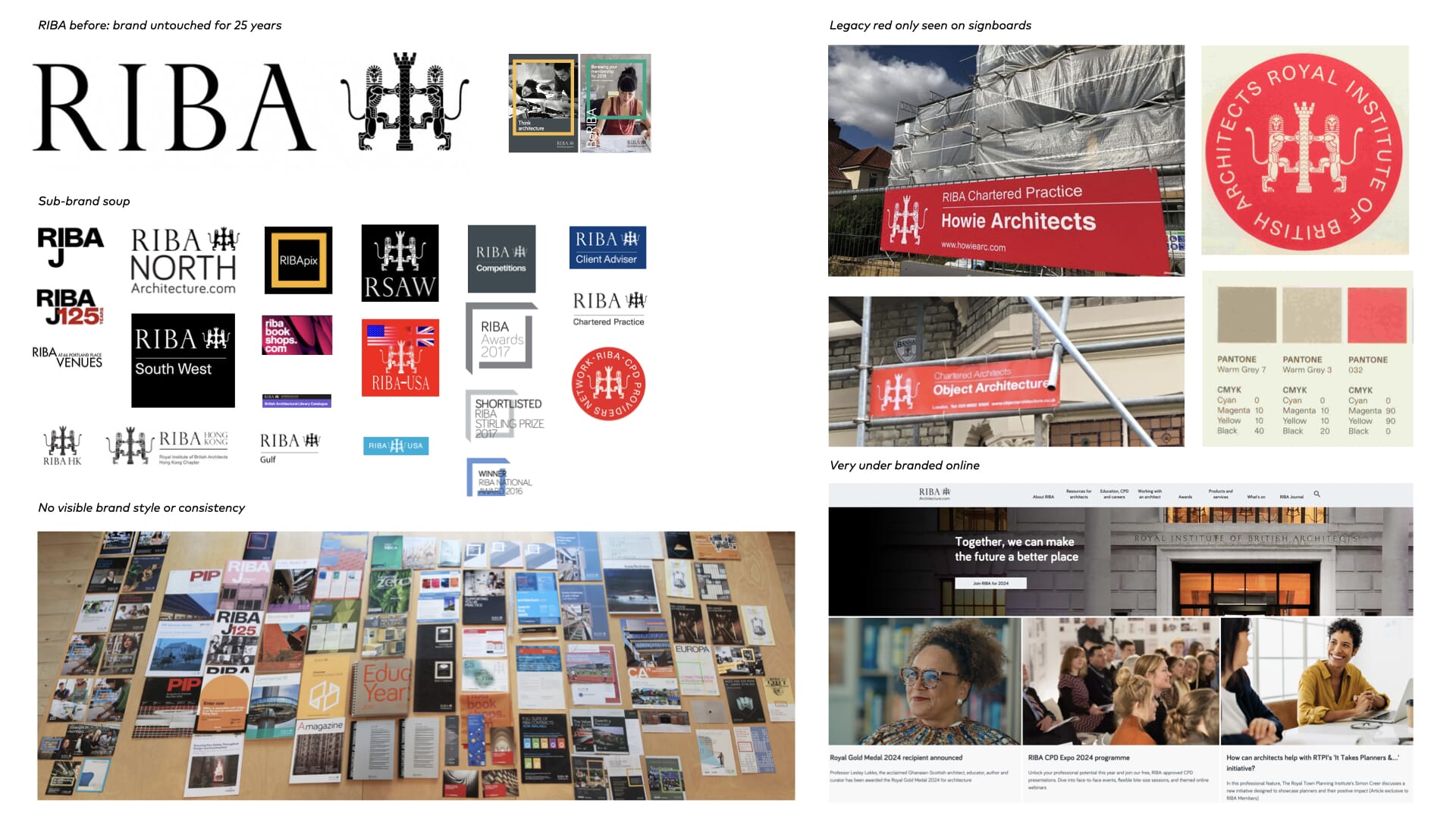
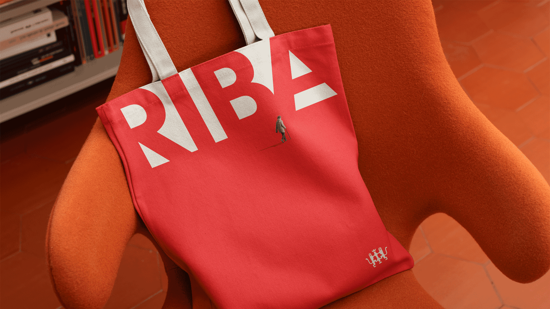
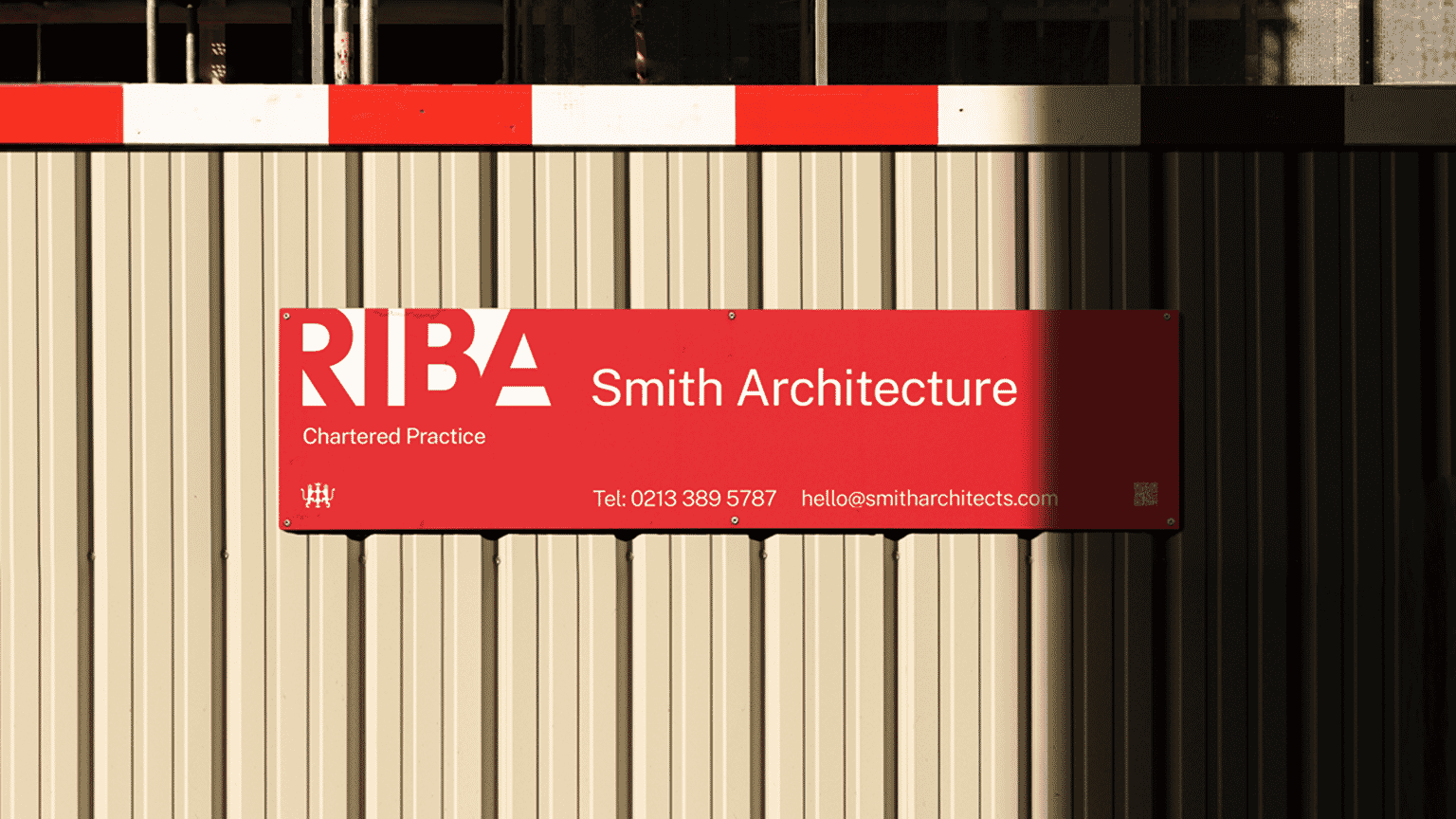
The core elements of RIBA’s last visual identity, using letters drawn by Eric Gill and a highly detailed symbol, felt out of step with a digital world. Hundreds of sub-brands had sprung up, and its red – the colour the public most associate with RIBA due to its signboards – was underused. Any sense of a coherent house style had been lost over a twenty-five year period.
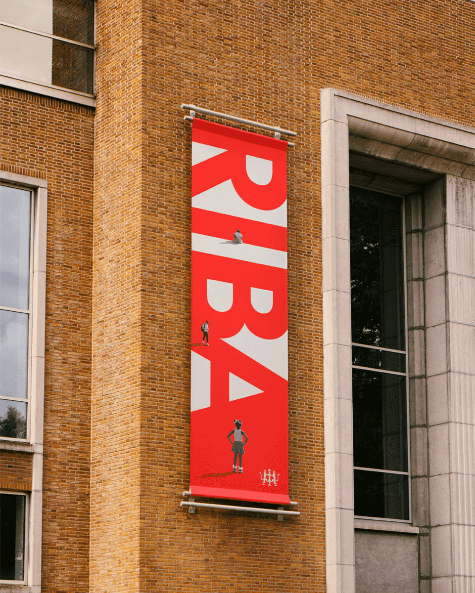
Architect Philip Johnson once said ‘all architecture is shelter, all great architecture is the design of space that contains, cuddles, exalts, or stimulates the persons in that space’ – and RIBA’s new logo is inspired as much by the spaces between the letters as the letters themselves.
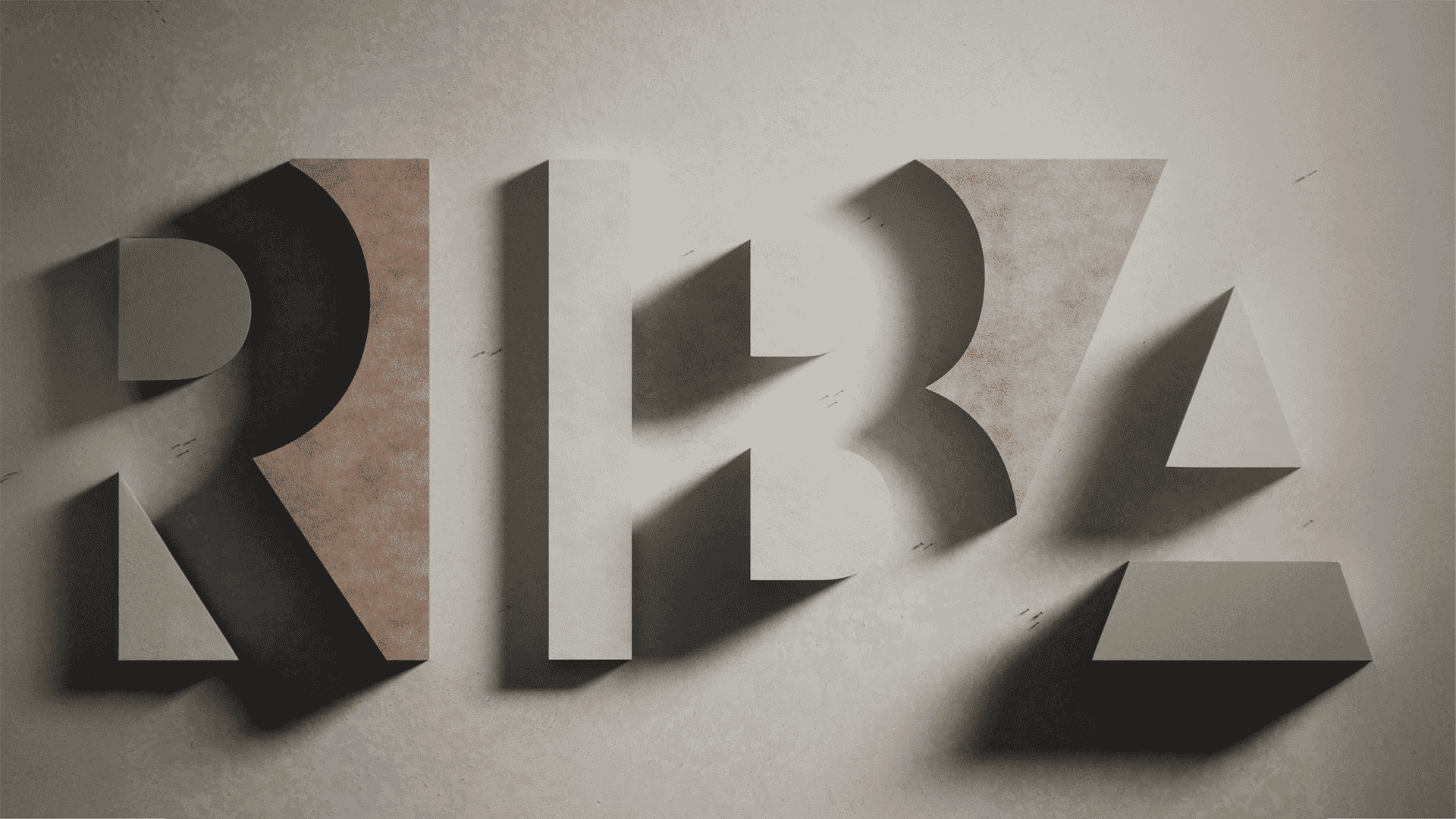
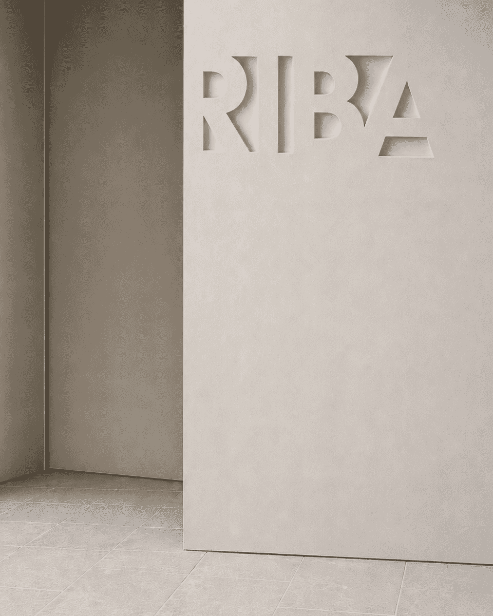
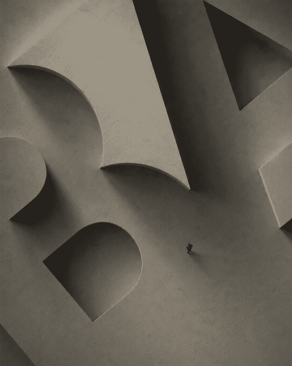
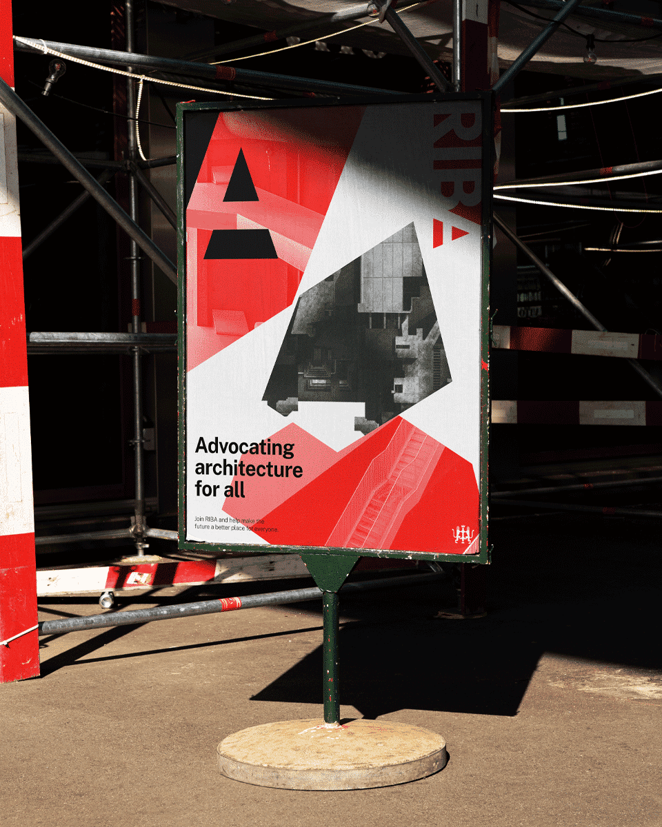
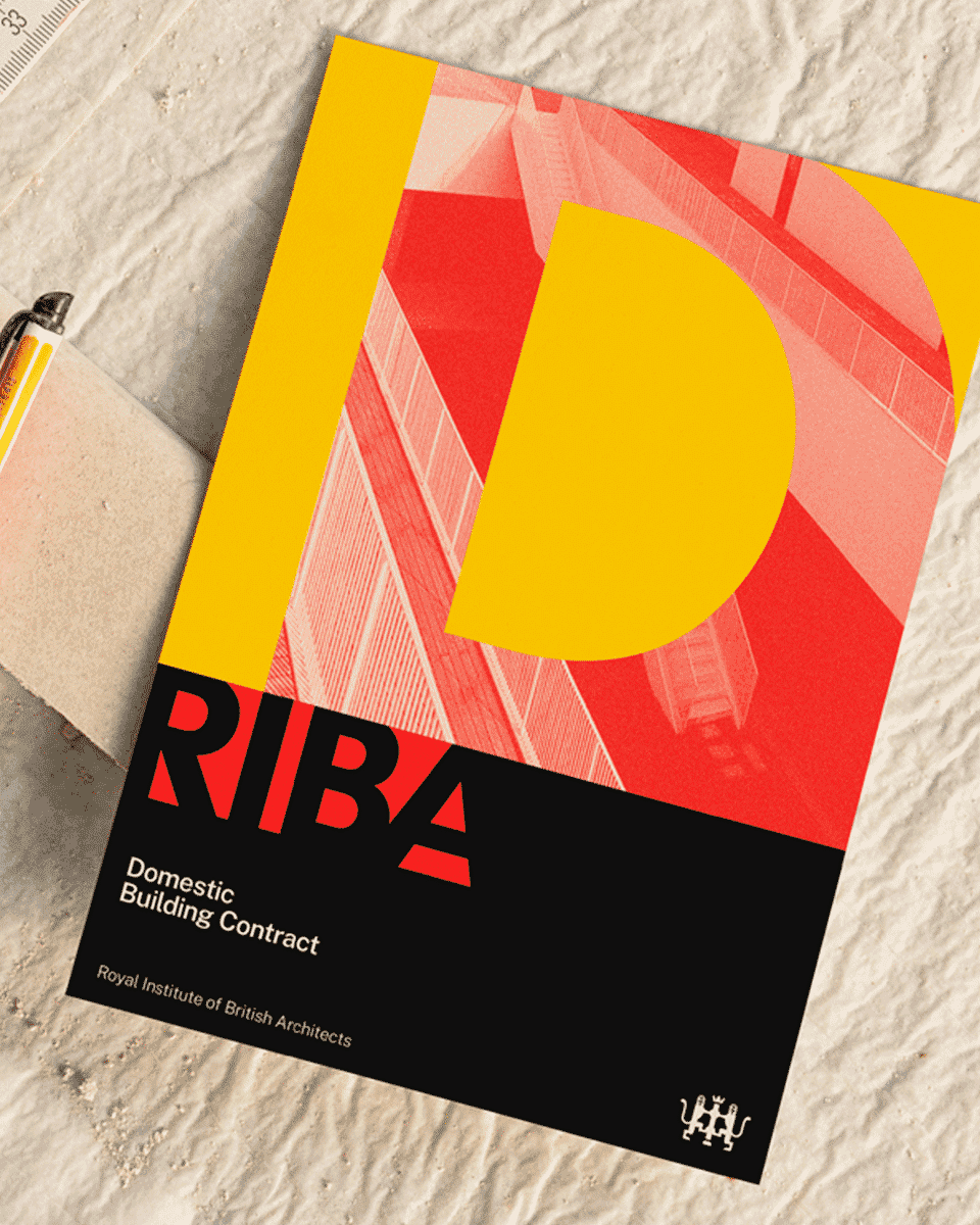
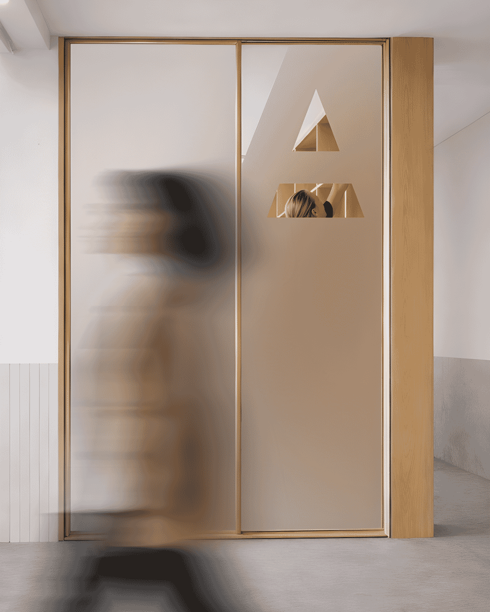
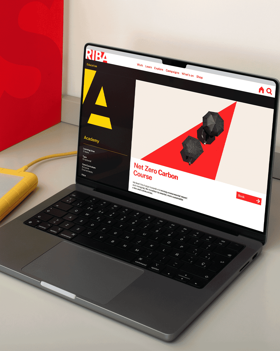
After much experimentation, we found a way to use the negative space to build a bold new typographic mark which can be placed on and into imagery, anchor corners and edges, and be brought to life in digital and animated form.
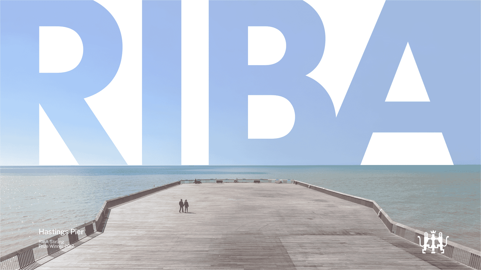
We’ve brought the historic shade of red back to life, and put it front and centre. There’s a flexible new design toolkit that uses accessible fonts, and clear guidelines to ensure that the new brand is both useful, and durable.
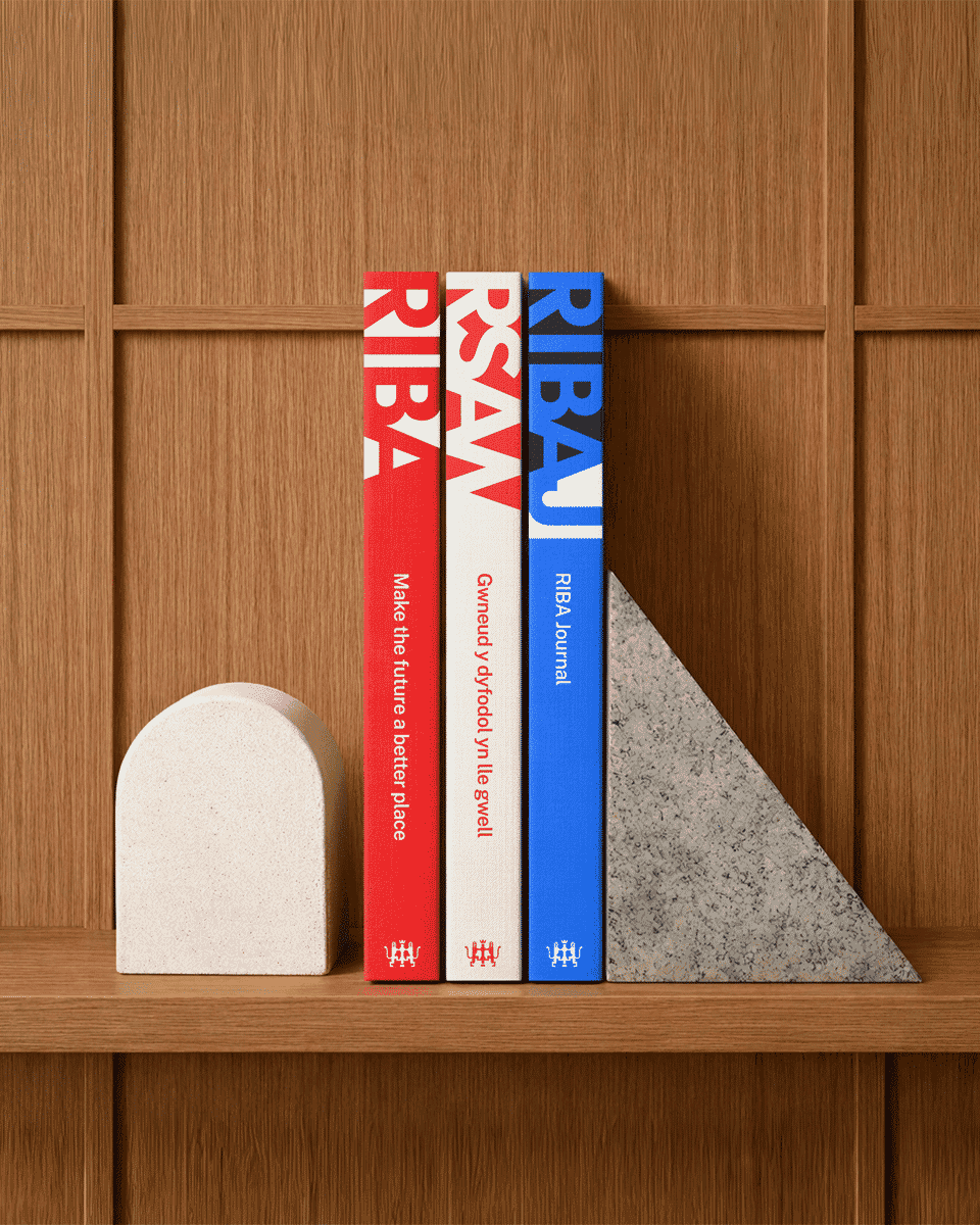
And a new system has been put in place to help bring those hundreds of sub-brands back into line, and key sub-brands such as RSAW (the Royal Society of Architects in Wales) and RIBAJ (its famous journal) have their own related identities within the overall approach.
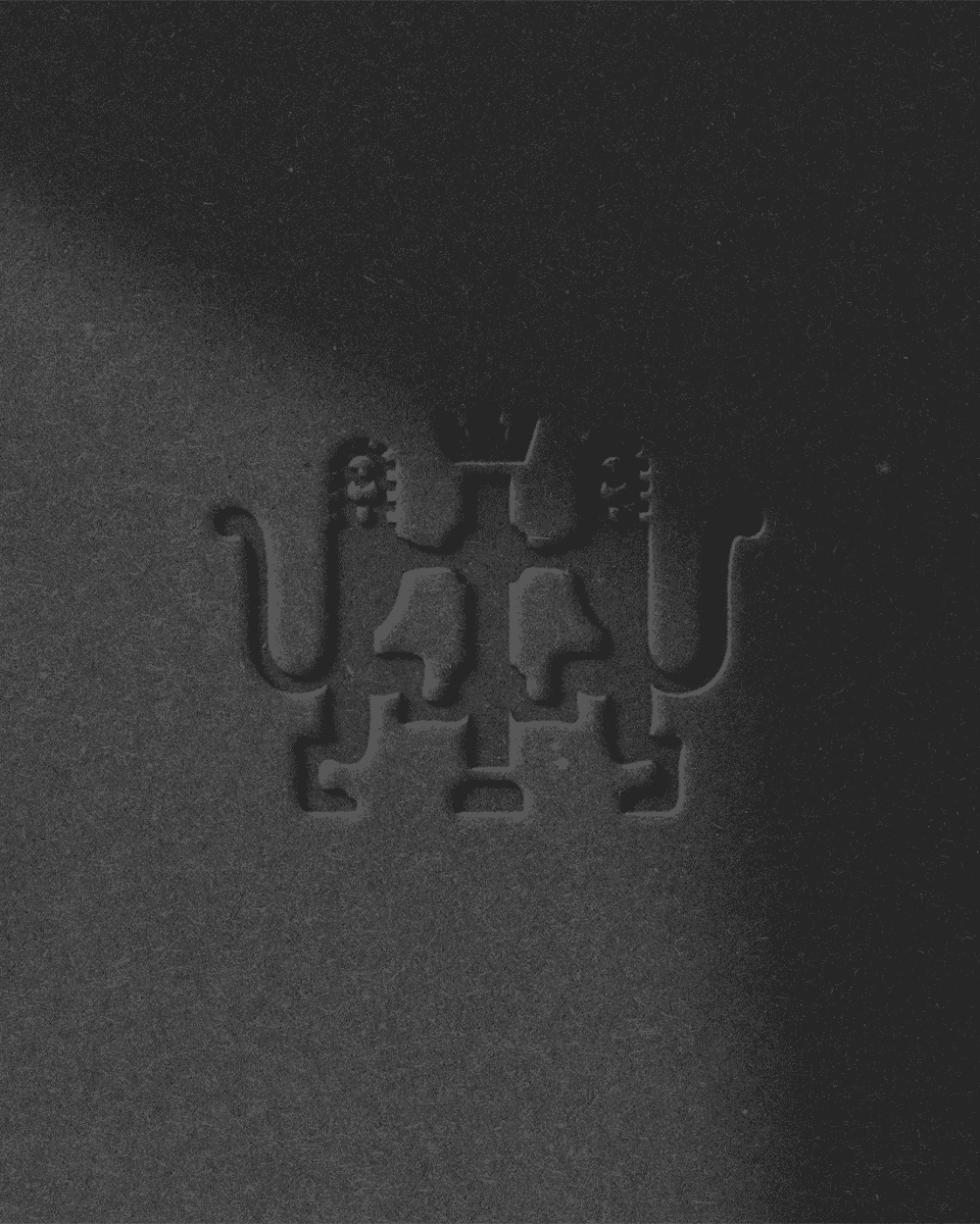
The ‘two lions’ crest still has a role to play – so we have simplified it, softened it, and retained it as a subtle sign-off.
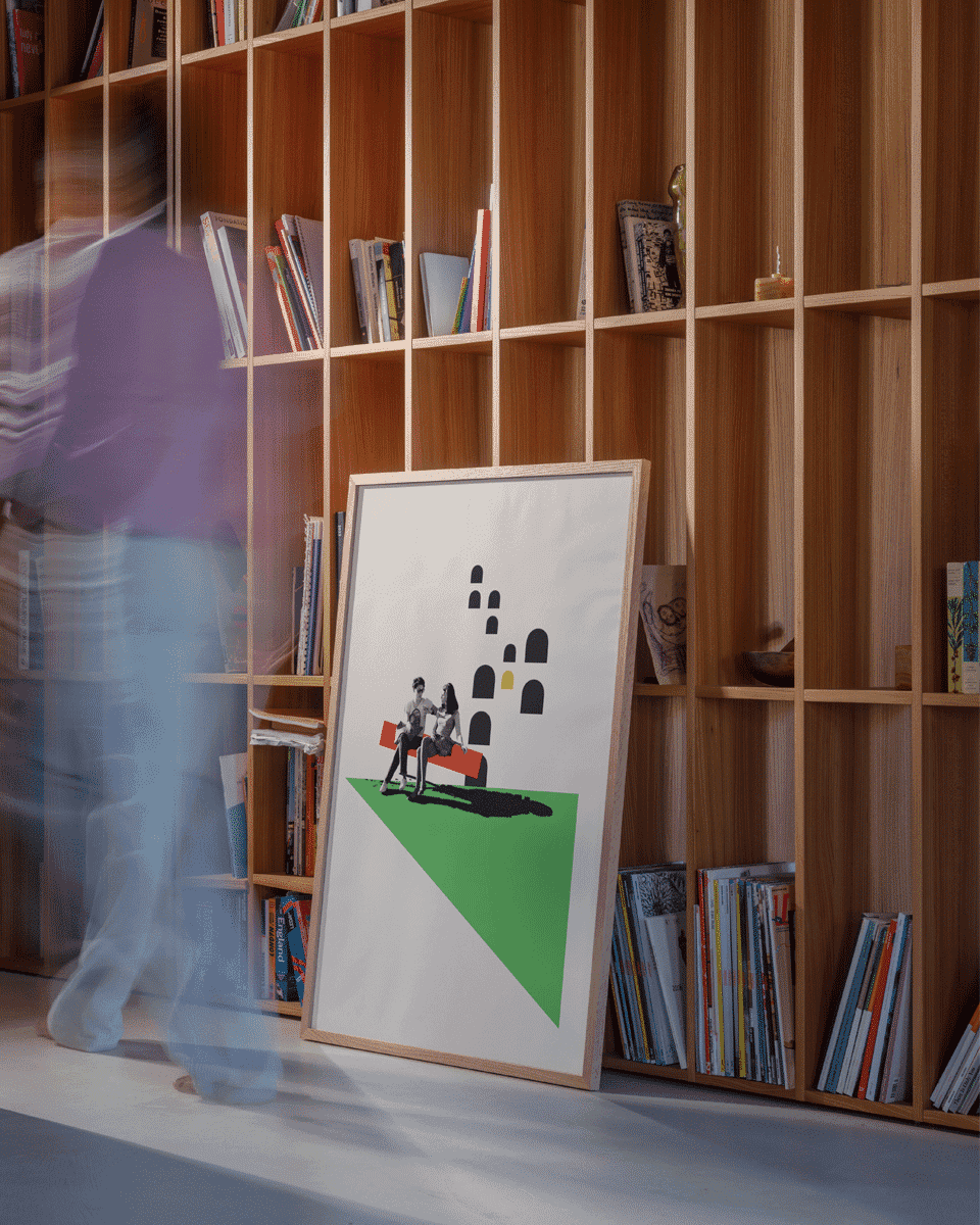
The scheme also contains graphic elements that will play a key role in the future as the brand develops: geometric shapes that draw upon the new identity, an ownable illustration and animation style, and a carefully constructed alphabet of letters that function as drop capitals.
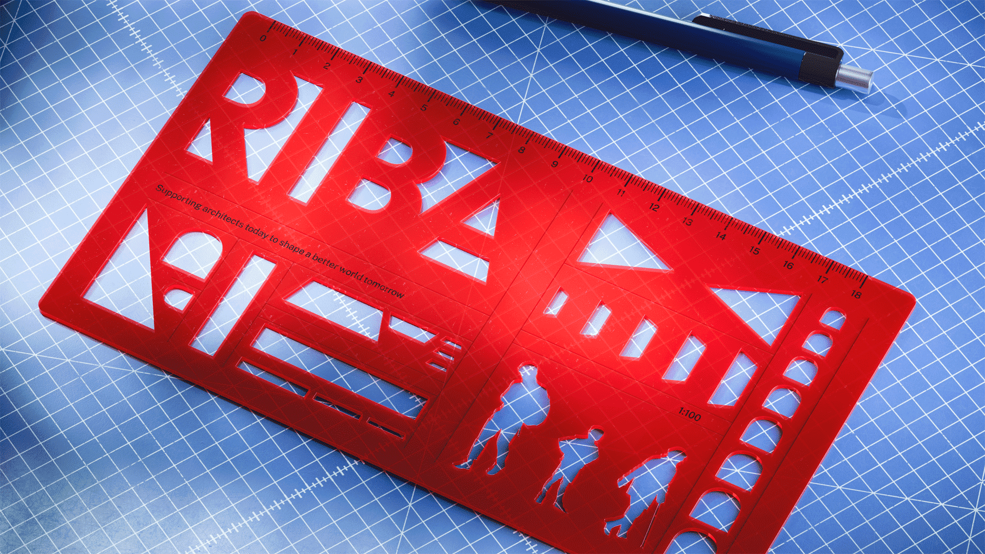
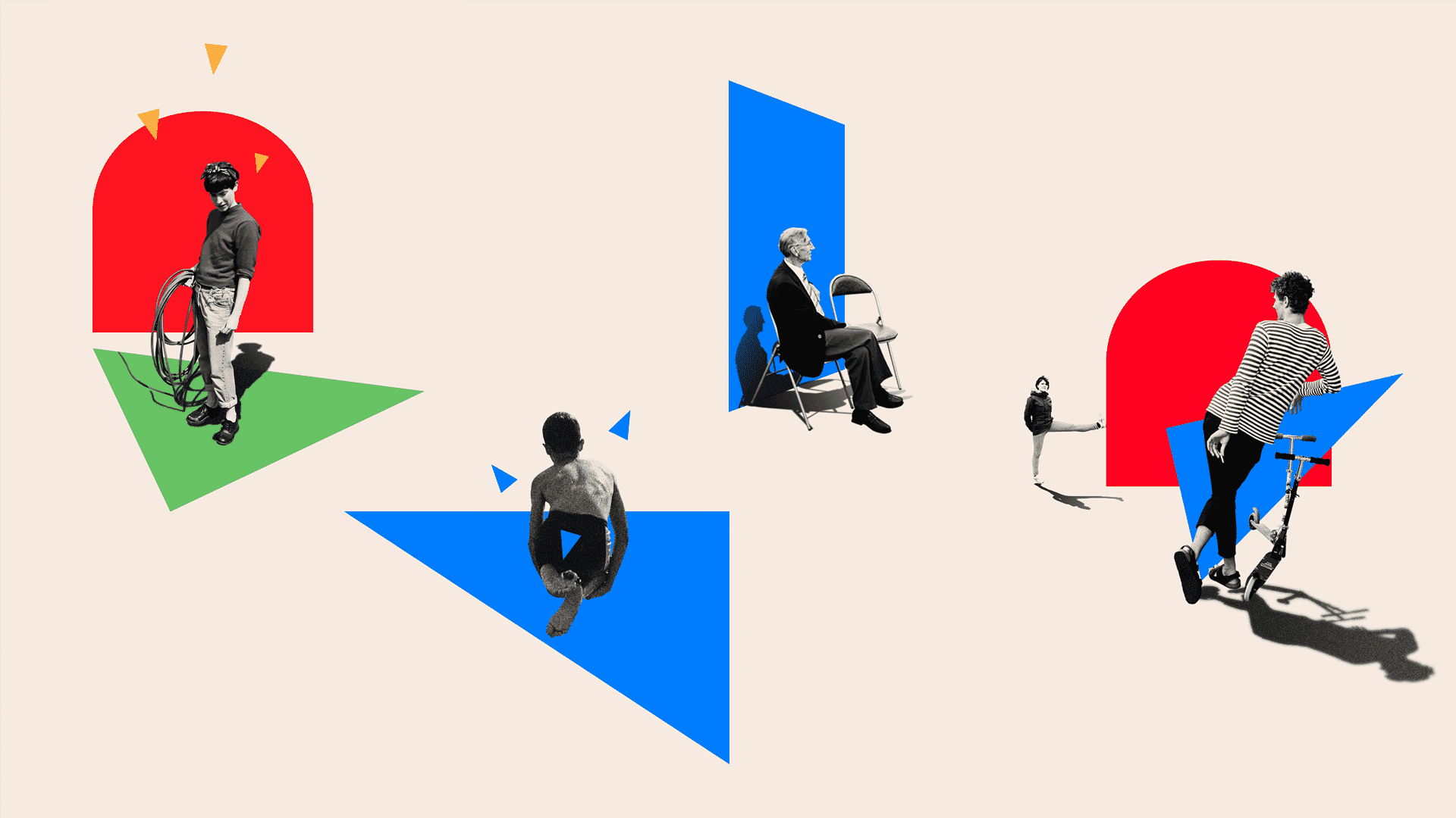
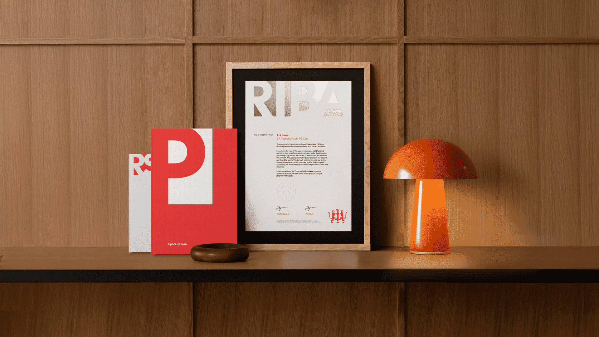
RIBA’s brand can now speak with a clearer and more consistent tone of voice, delivering more impact and increased awareness with audiences old and new, across the world. RIBA has never been more vital, and its architects have never been more important. And now it has a brand to match.
The team
- Strategy & identity: Johnson Banks
- Research support: Jill Hogan
- Writing: Johnson Banks and Nick Asbury
- Typographic support: Monotype
- 3D animations: Fakery
- 2D animations: Johnson Banks and Richard Coldicott