Swanswell is a drug and alcohol rehabilitation service operating across the UK.
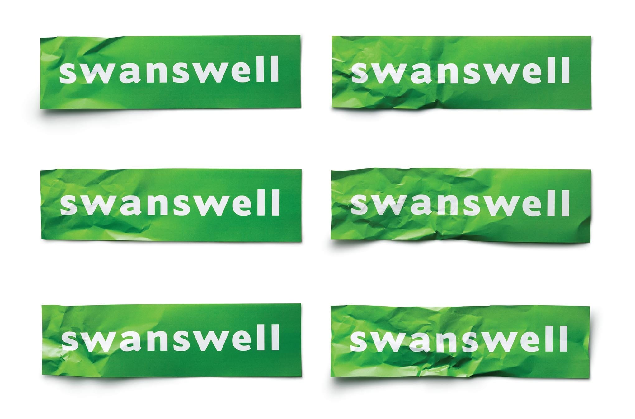
Their name derives from the river Swanswell running through Coventry, and our initial reaction to the name was that it wasn't ideal. But slowly we began to realise that a word that ended in 'well' could be a very useful visual hook for an organisation focused on turning people's lives around. After weeks of typographic exploration, we realised that simply crumpling one end of the word was the best and most visceral demonstration of their work.
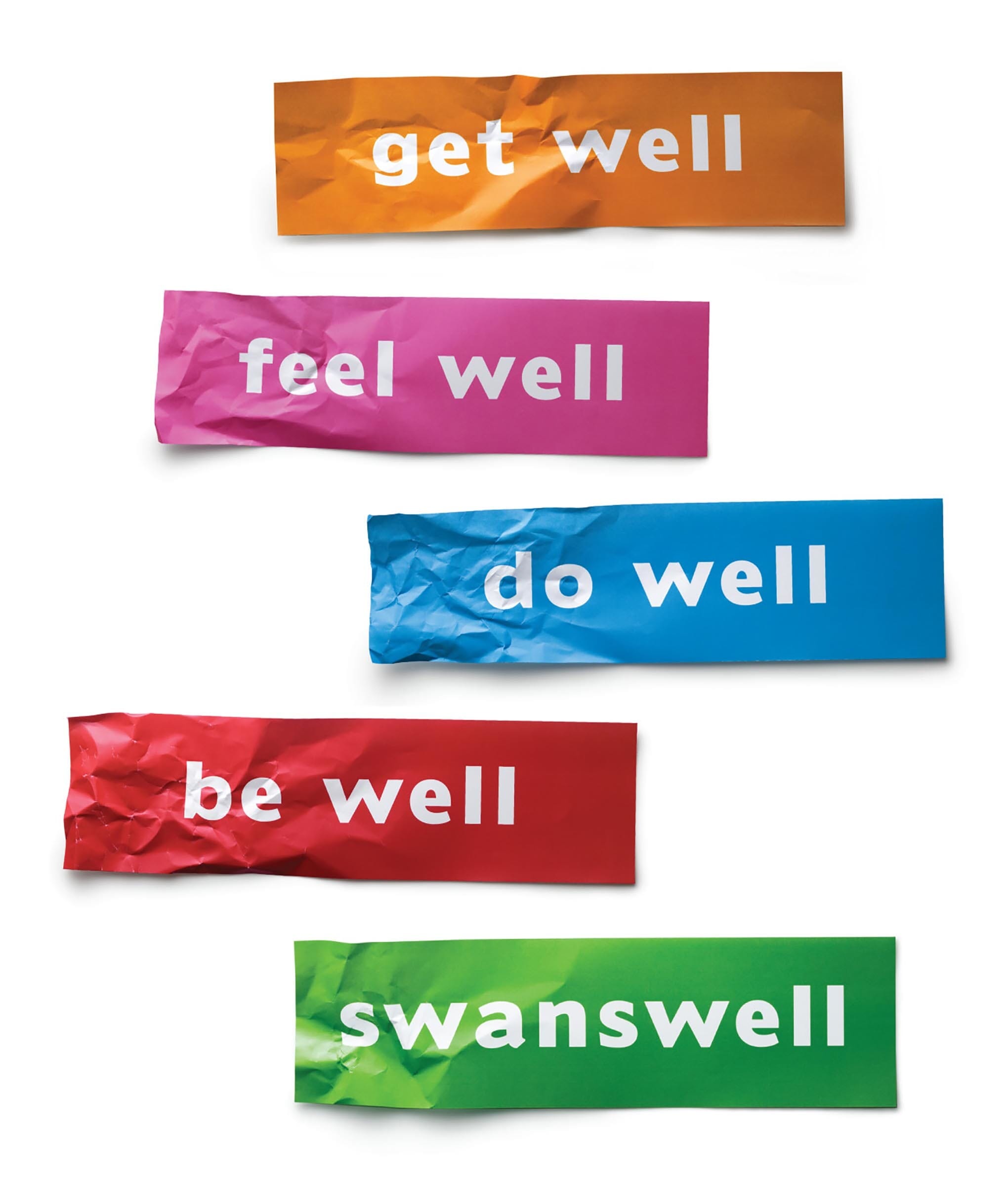
This idea was then carried though across their printed and digital media.
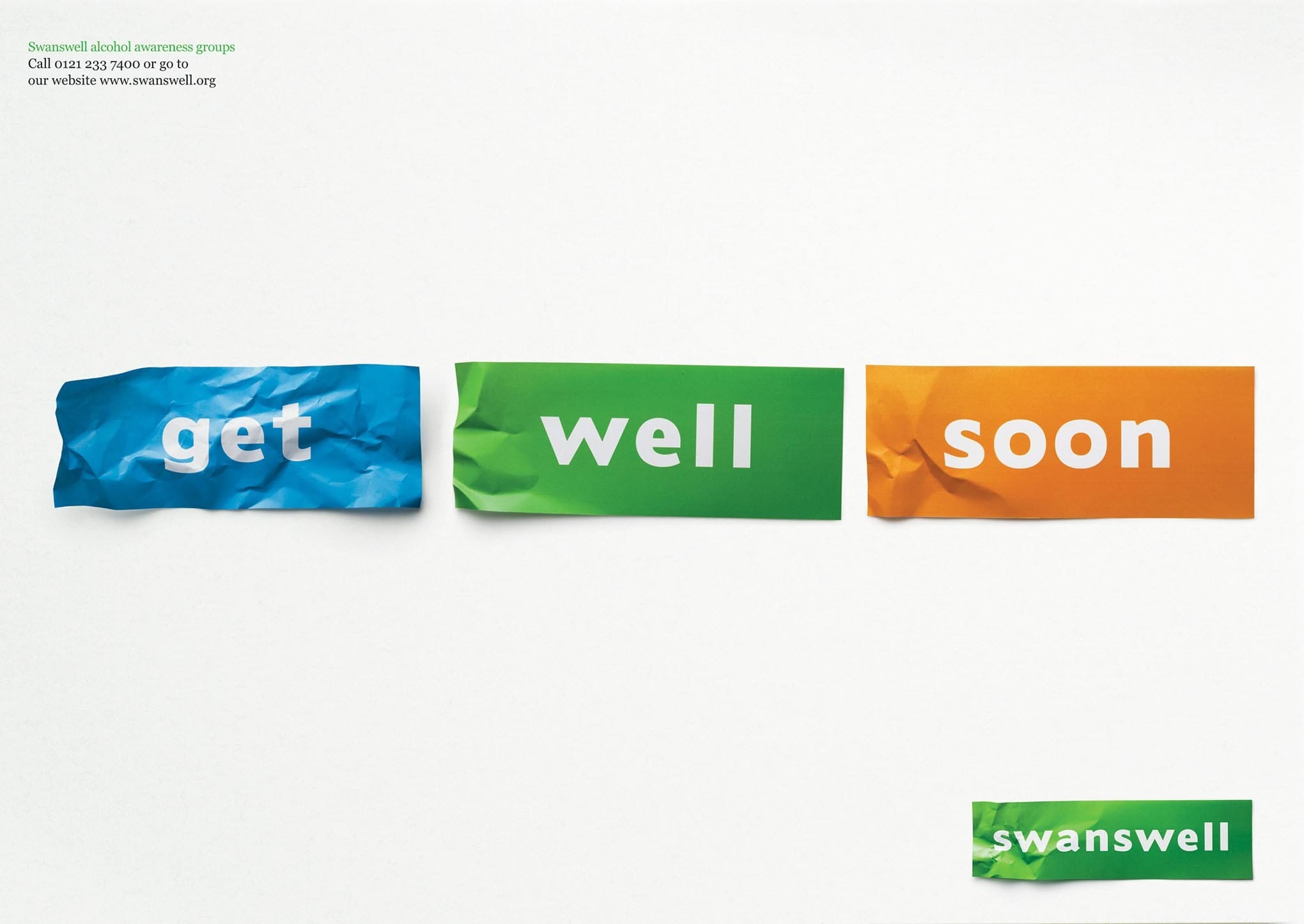
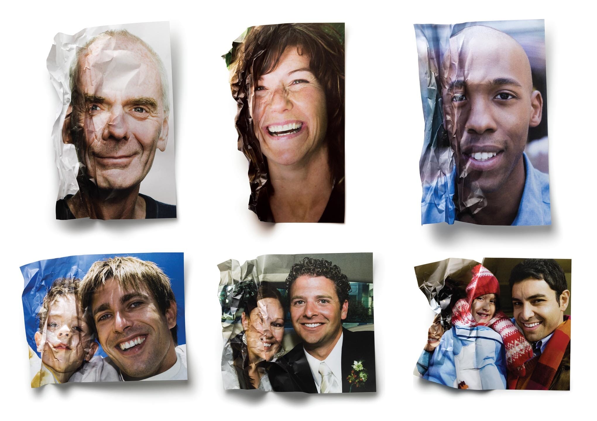
Initially the client team baulked at the idea of using the idea on photographs, feeling that it was too graphic a way to show lives in distress. But when tested with service users, many of whom had gone on to become advisors themselves, the crumpling and uncrumpling of faces was precisely what hit home for them, and encapsulated what they had been through.
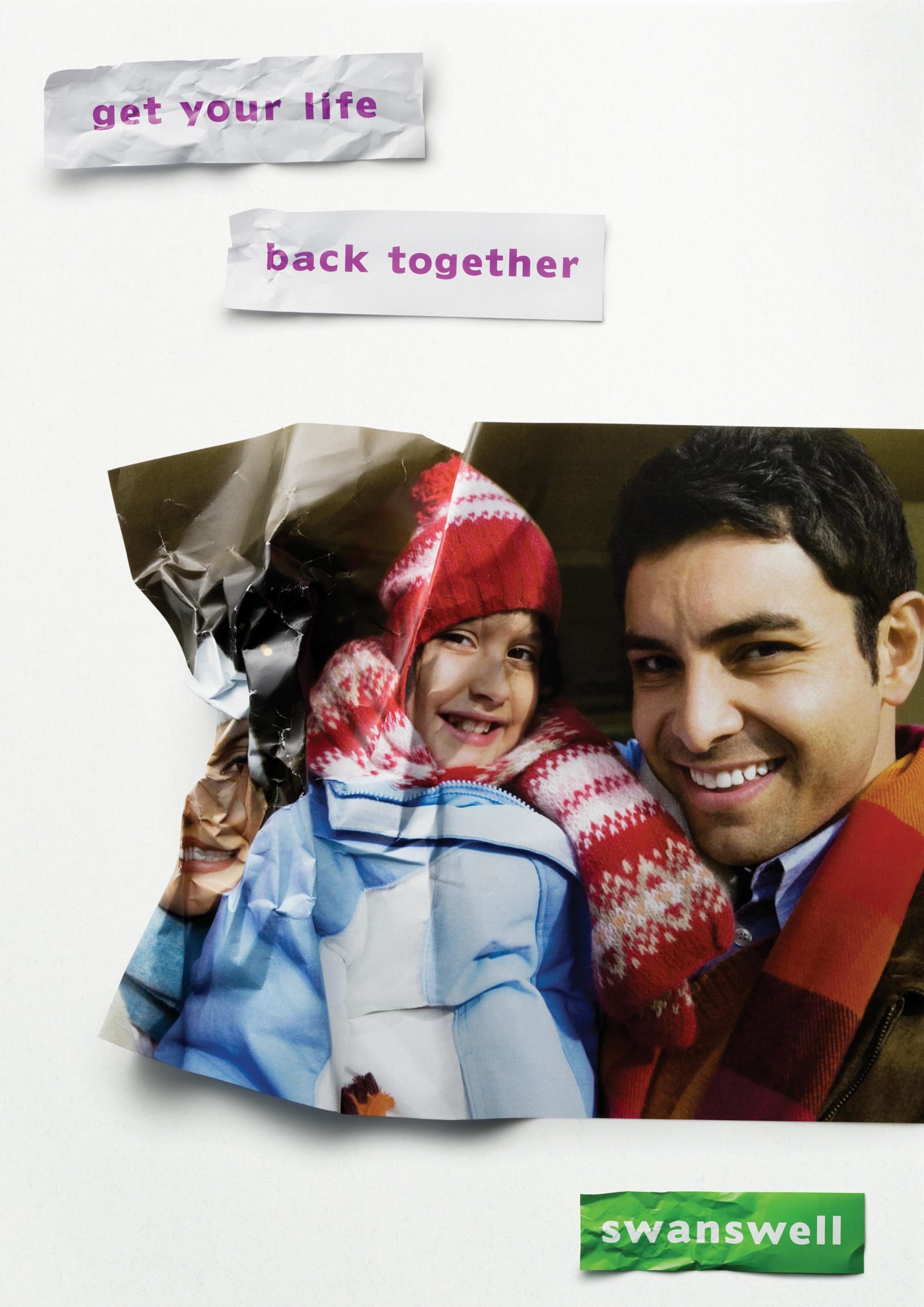
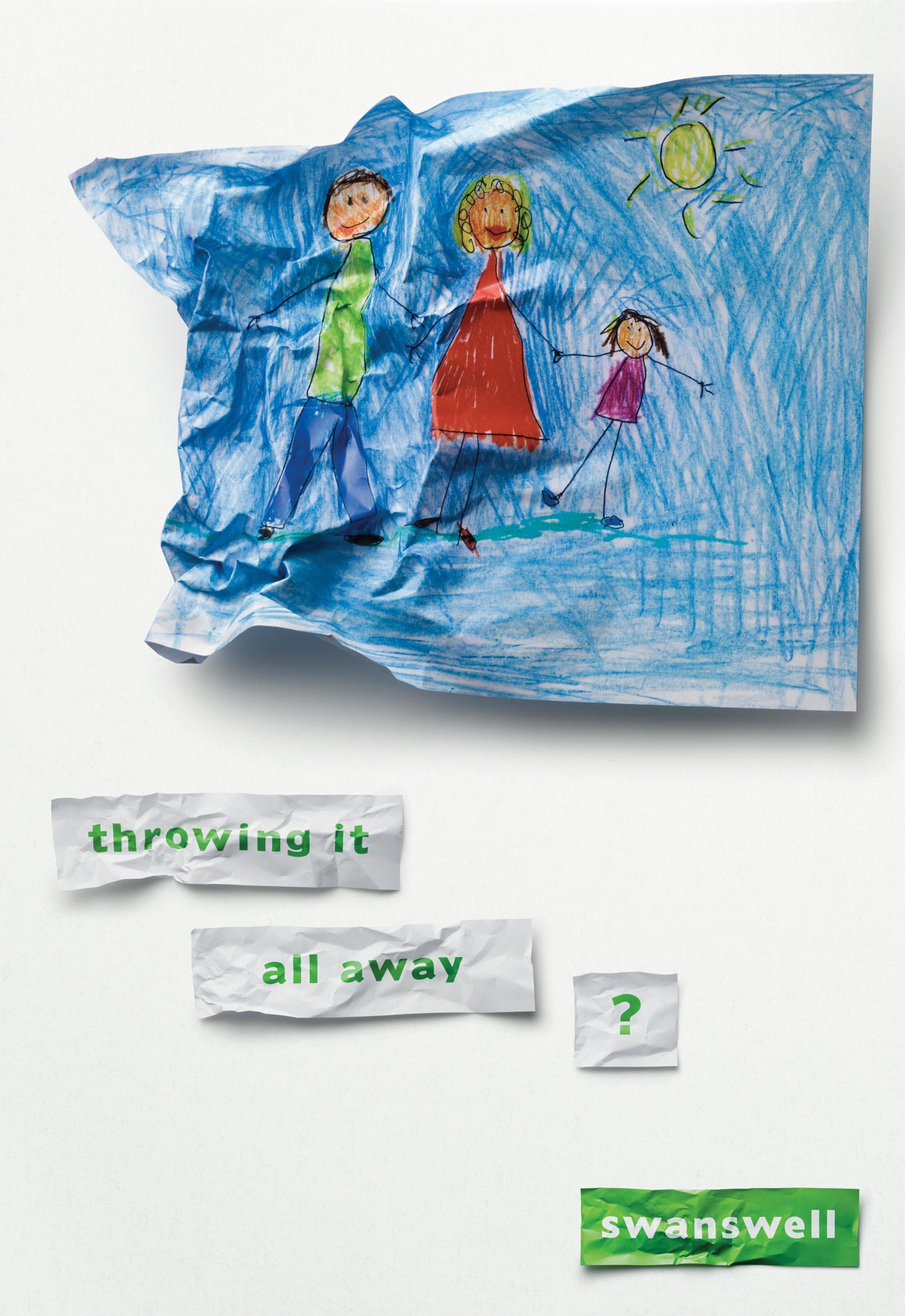
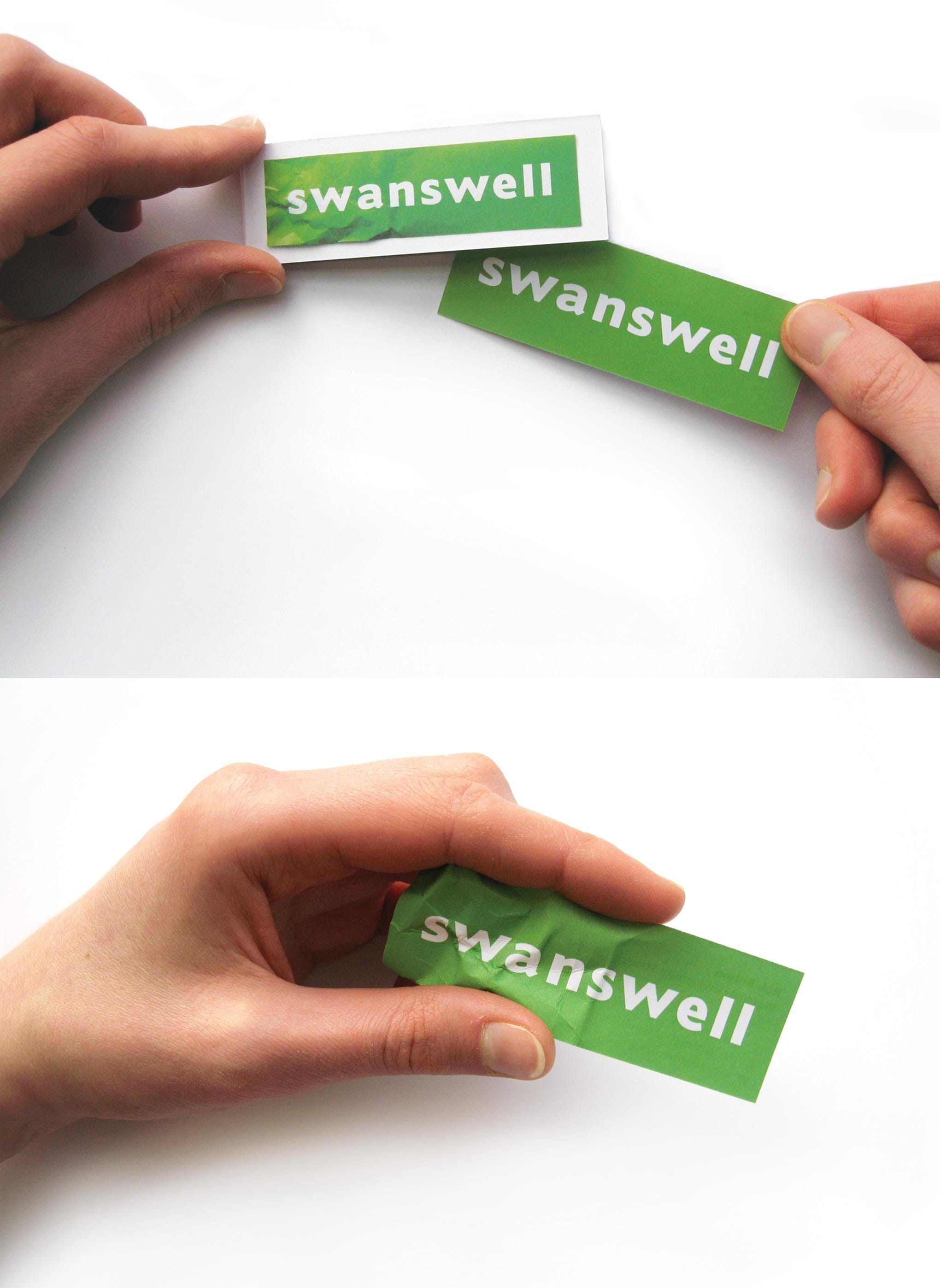
We even managed to apply the idea to business cards. Each employee has a small book of paper 'cards', and when meeting someone new, they remove a card, but crumple one end before handing it over.
Awards
2009 D&AD | Branding / Existing Brand Schemes: Medium Business | Wood Pencil
Credits
Strategy partners: Brand Guardians
Photography: Alex Ken