Mid-way through 2018 we were approached by two meat-lovers whose first enterprise had focussed on an innovative way to sell and deliver hamburgers. For their second venture, they were determined to create a plant-based meat alternative, but with a twist.
Instead of guilt-tripping people into changing their diet, they wanted to tempt people by harnessing the irresistible smell of bacon and the satisfying texture of chicken. After extensive testing with pea and soy protein, they had found a way to develop great tasting products for the burgeoning ‘flexitarian’ market – those wanting to reduce their meat consumption, not stop it all together.
Our branding challenge was to help create and launch a disruptive, challenger brand into a market mainly aimed at vegetarians, dominated by major brands such as Quorn.
Much of our initial work was taken up with a search for the right name. After a few false starts, THIS was chosen. It’s short, it’s different, and most importantly, it allows us to immediately talk about their product line – THIS isn’t chicken, THIS isn’t bacon, etc.
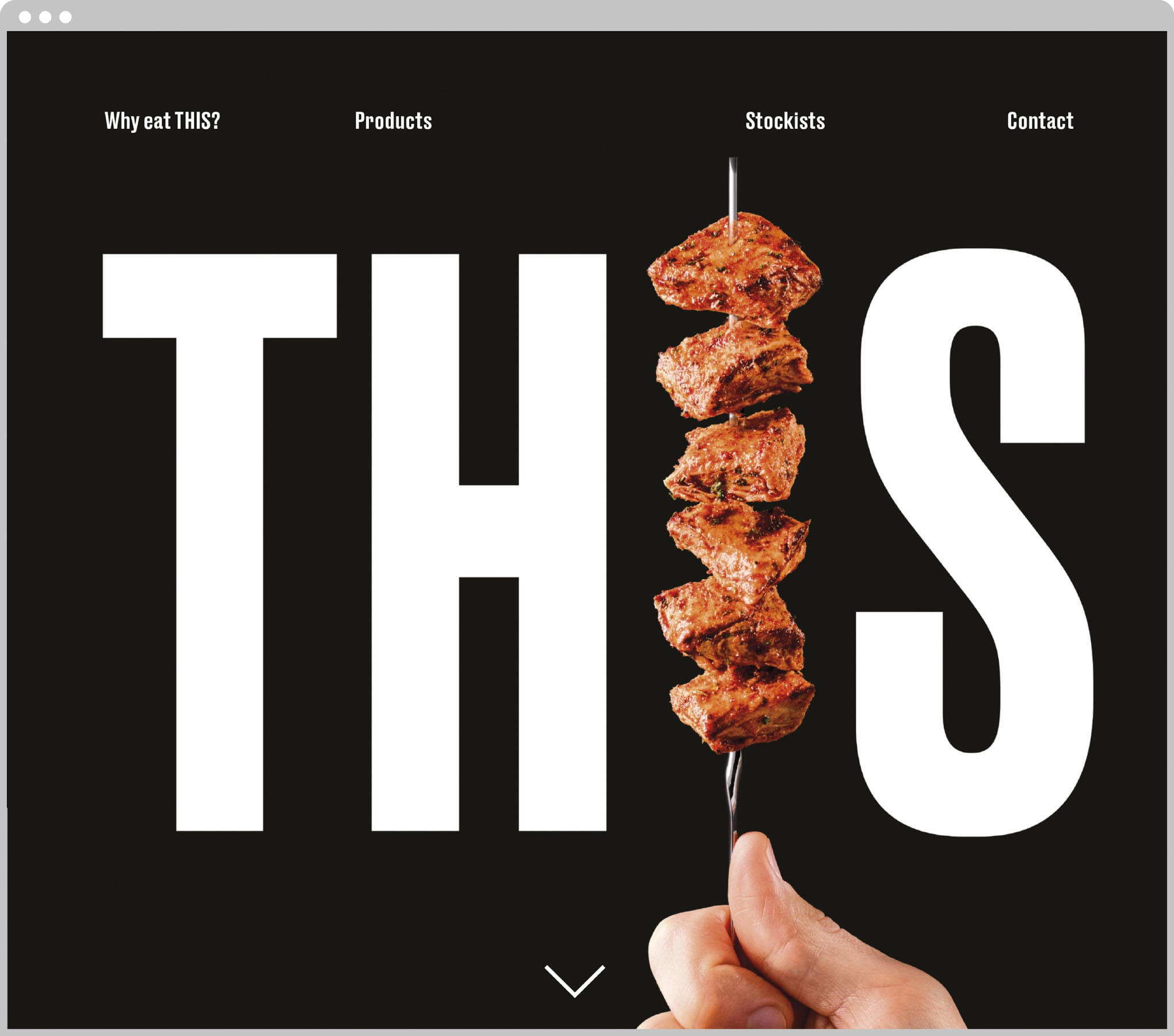
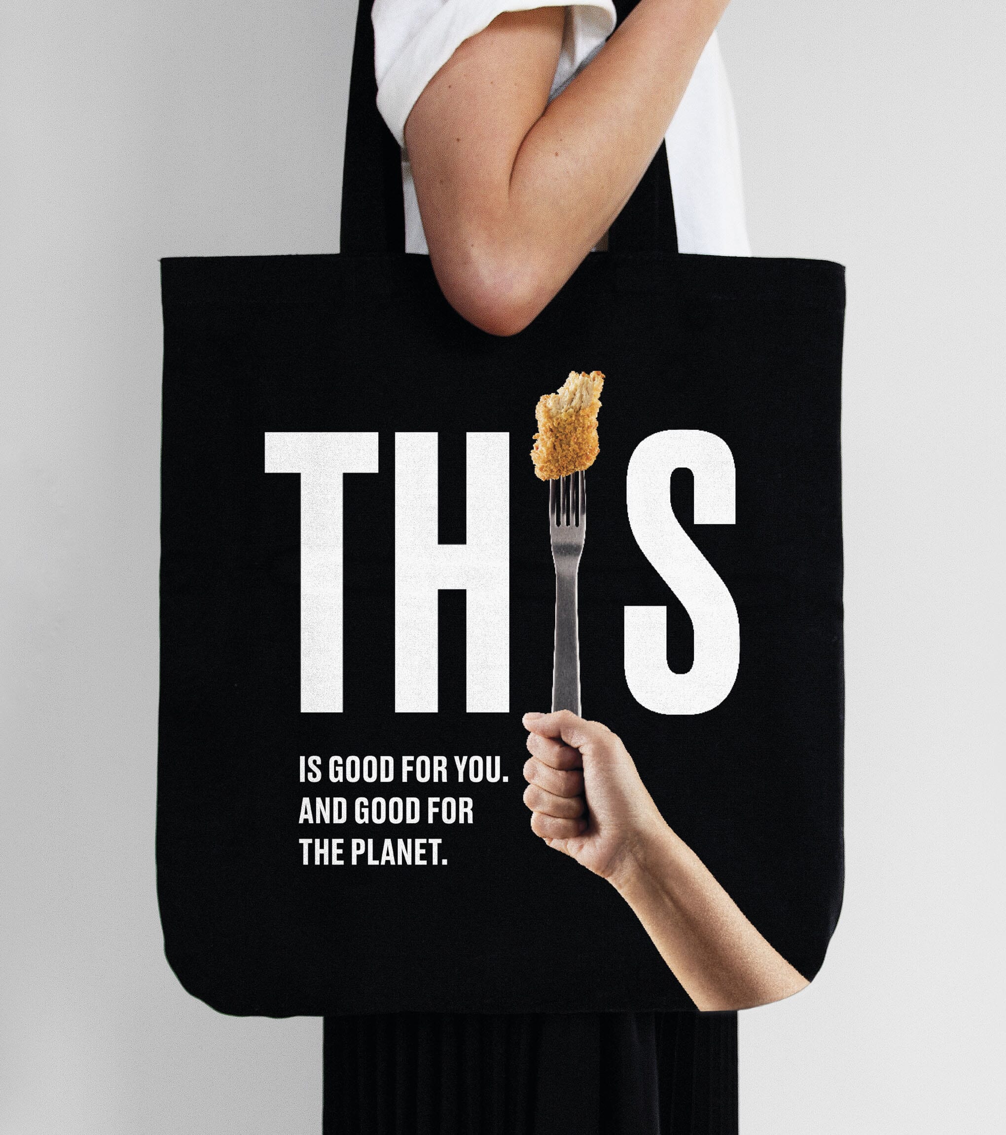
The branding approach we created centres around a monochrome palette and strong and consistent use of the brand name. Forks, skewers, knives – you name it – are topped with the product and replace the ‘I’ in each product logo, of which there are eight in total.
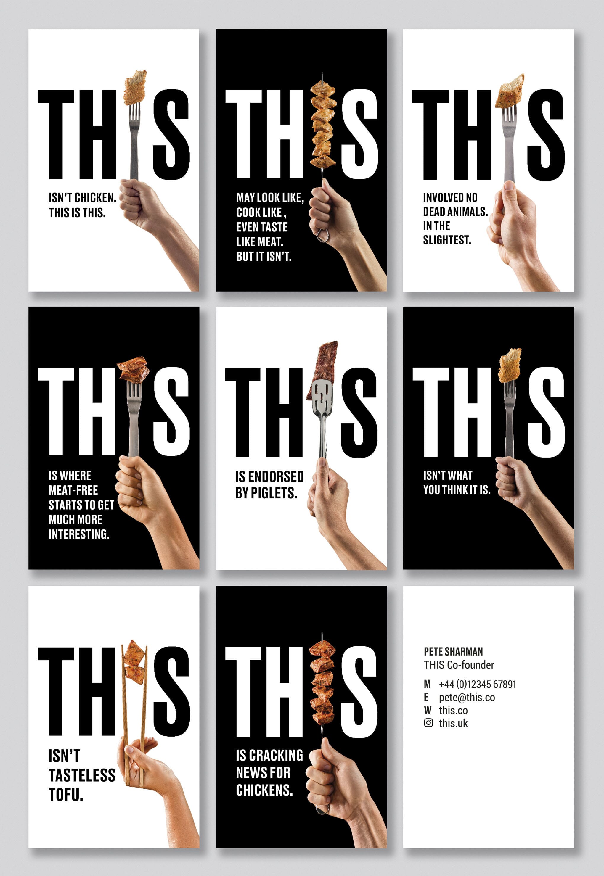
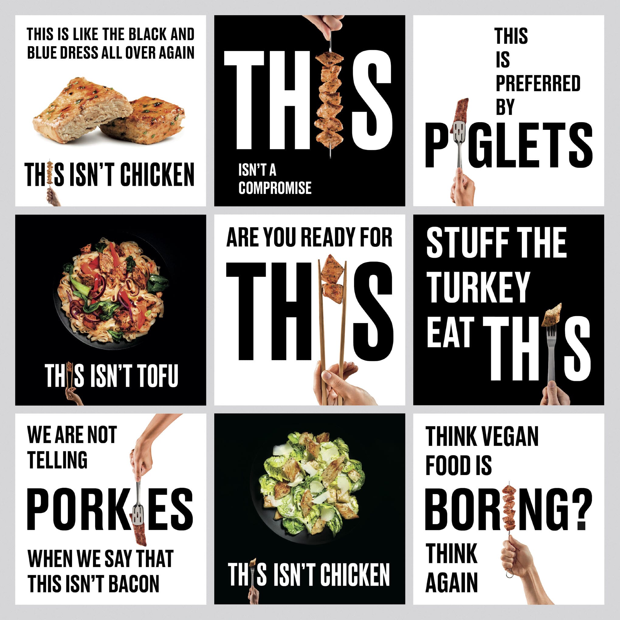
Working with the client team we’ve developed a provocative, challenging tone of voice that embraces and promotes the idea that meat is no longer a necessity – and makes the most of a very unusual name. We commissioned photographer Ben Monk and food stylist Seiko Hatfield to photograph the product. Unlike most food photography our art direction was to shoot the product 'naked' – no garnishes, serving suggestions or other embellishments. We then rolled out the identity – designing their website, social media posts, stationery, merchandise, and most importantly the product packaging.
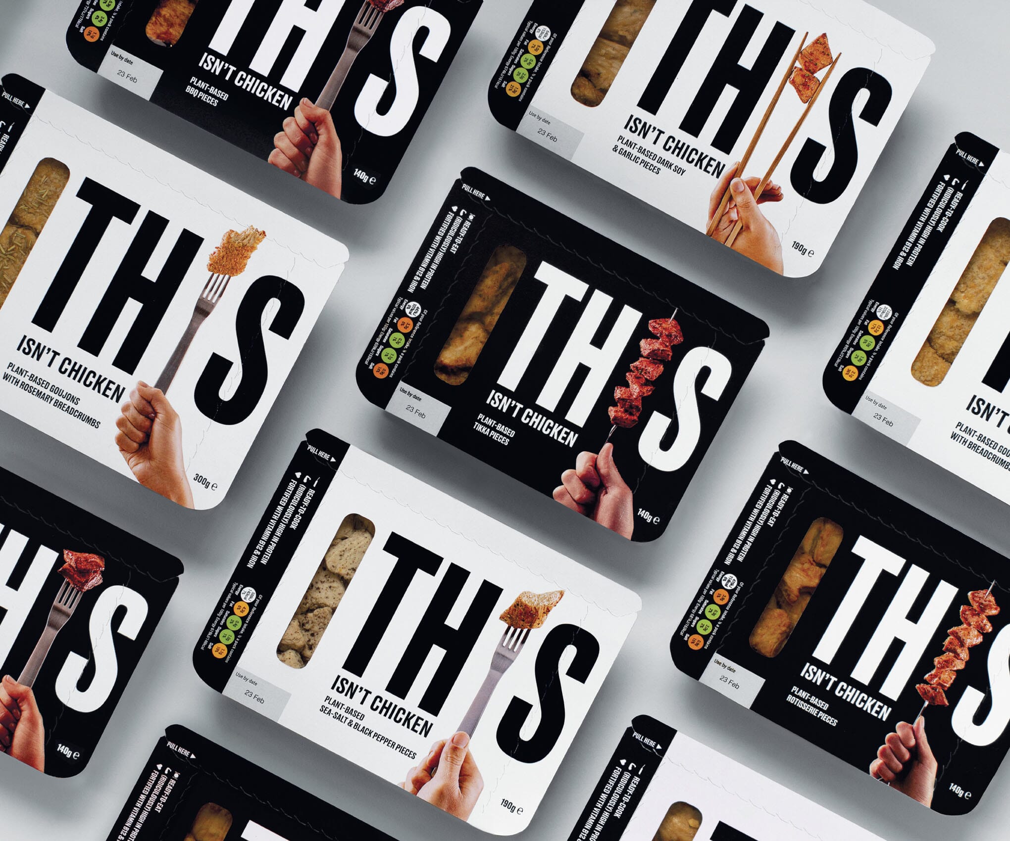
The product packaging is an innovative new design – a cardboard tray which uses around 90% less plastic. We alternated the monochrome palette to differentiate between the ready-to-eat products (black) and ready-to-cook (white). Many of our packaging design discussions concentrated on quite how to get the brand name as huge as possible to give the products maximum ‘shelf stand-out’.
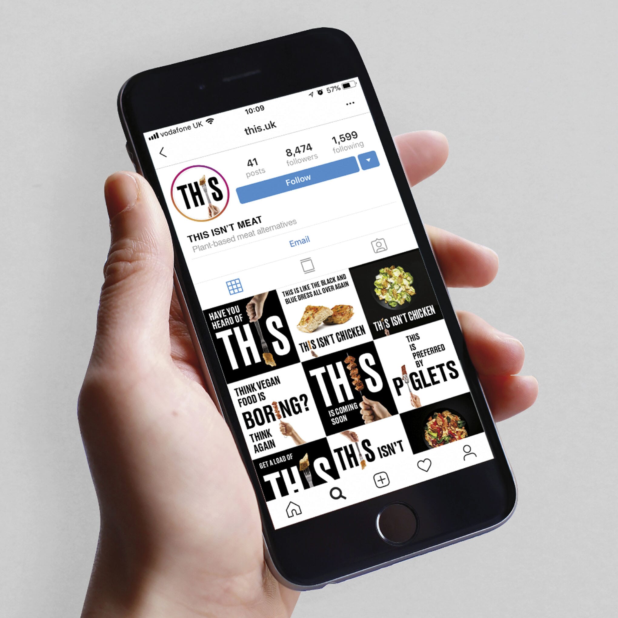
The product launched on social media in late 2018 and the first products are appearing in health food stores and supermarkets across the country in 2019.
Awards
- 2019 D&AD | Writing For Design | Shortlisted
Credits
- Photographer: Ben Monk
- Food stylist: Seiko Hatfield
- Website build: Lee Borowiak
- Retouching: Steve Warner
- Additional copywriting: Nick Asbury