We were appointed in 2016 by University of the Arts London (UAL) to help define their brand. Over the previous decade, UAL had delivered verbal and visual brand projects, leading to a cohesive expression of its visual identity through a new brand marque and college logos in 2012. But as the market for creative education, both domestically and internationally, became increasingly competitive, it was time for the scheme to work harder.
After a detailed examination of the University’s brands it was clear that the ‘UAL’ mark was being used consistently at both University and College level, but below this there were myriad examples of sub-brands, programmes and initiatives.
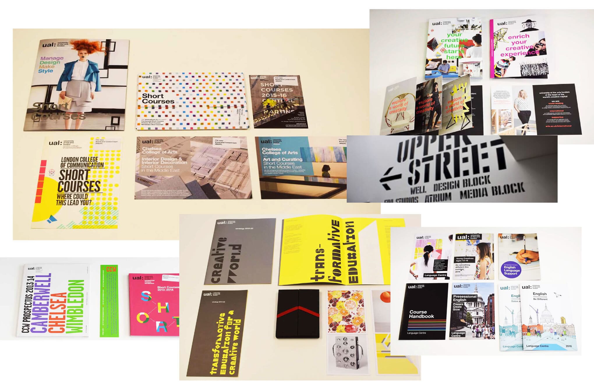
Two things became apparent: first, the University consistently defined itself by its parts (Camberwell College of Arts, Central Saint Martins, Chelsea College of Arts, London College of Communication, London College of Fashion and Wimbledon College of Arts), not by the whole. Second, there was no agreed ‘core purpose’ for the University itself. This seemed to be a case of bad gestalt – the whole was not greater than the sum of its parts – and this needed to be addressed.
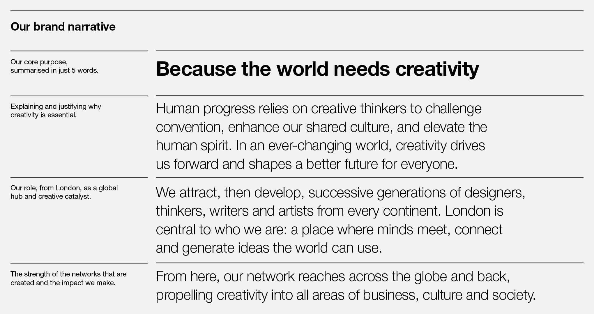
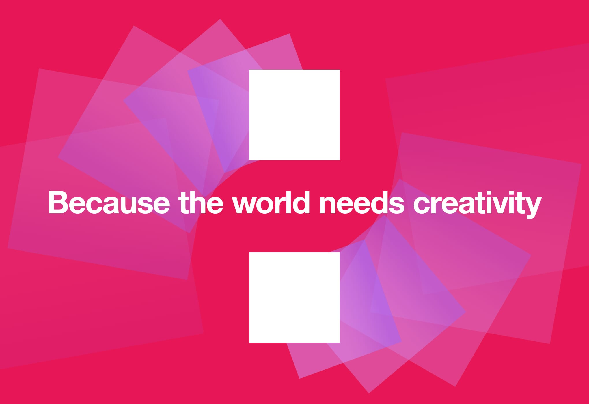
Multiple brand workshops followed, addressing UAL’s core purpose as we strove to differentiate them conceptually from their key global competitors. None of the arts universities were addressing what seemed to us to be a clear gap – to make the case for creativity in its own right and show how creativity shapes a better future for everyone. So we began to draft a brand narrative that responded directly to the question, ‘why are we here?’ – and the answer soon became clear: ‘because the world needs creativity’.
In parallel to this strong and powerful assertion of UAL’s purpose, we drafted and agreed the verbal foundations which informed a content framework now being rolled out across the University and its Colleges.
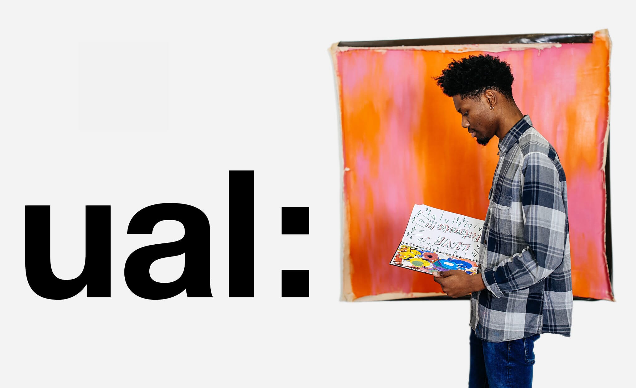
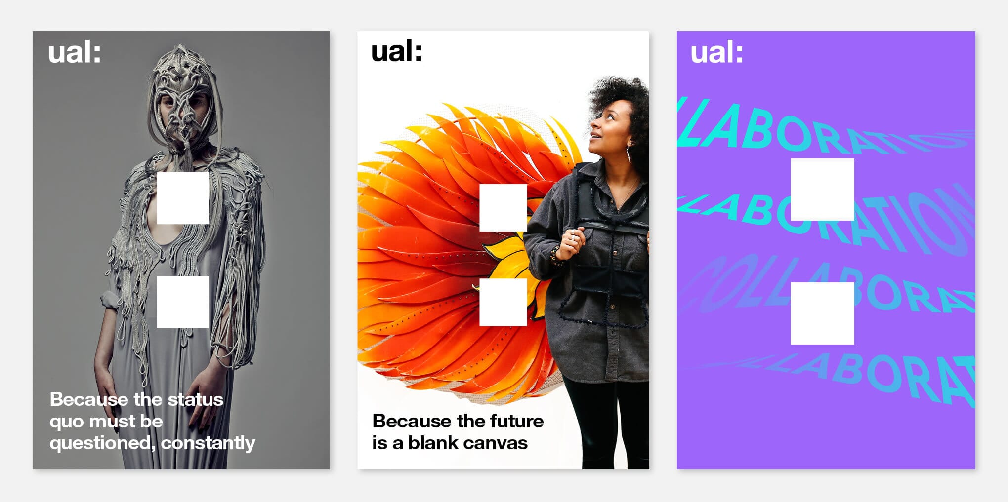
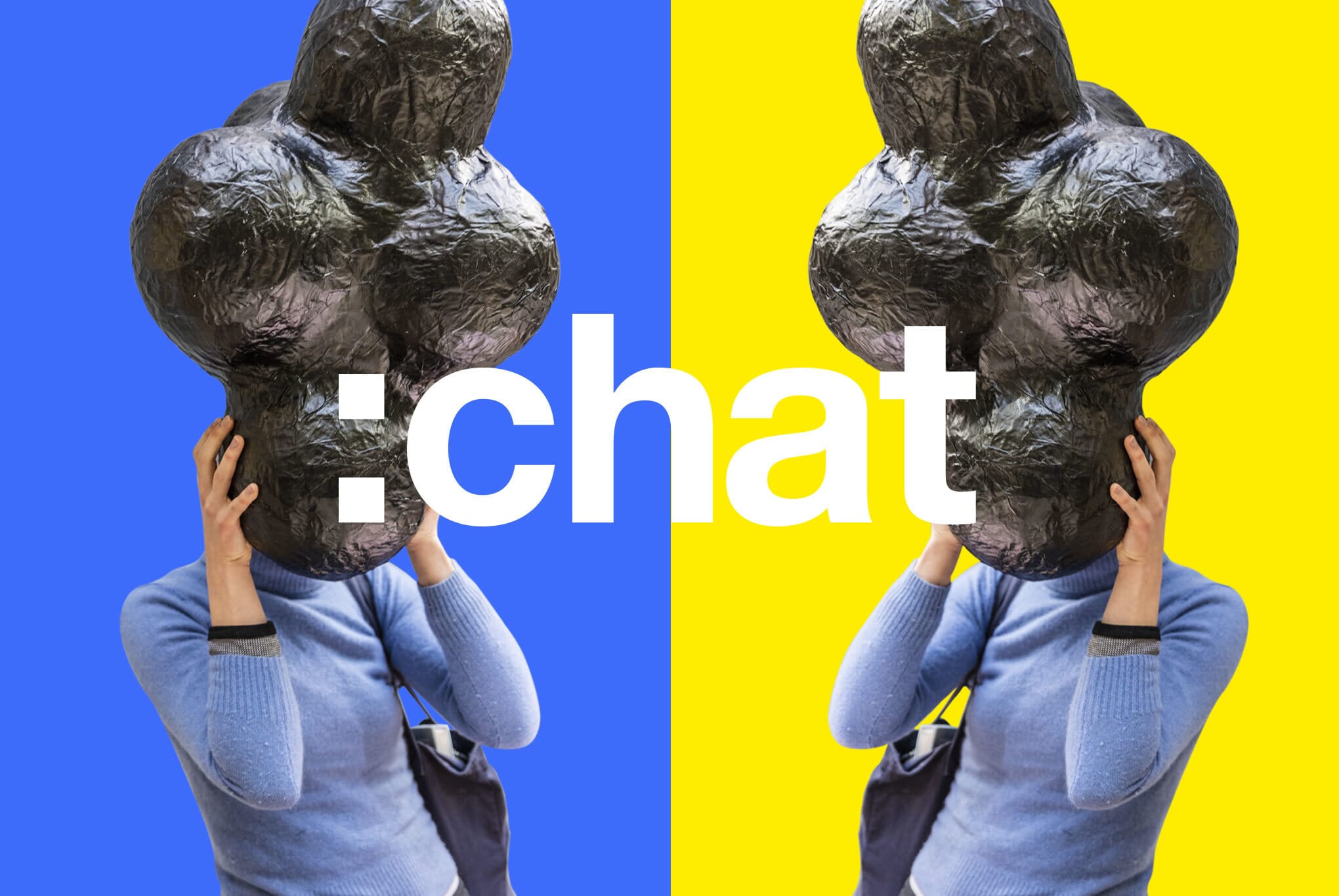
We then turned to the visual identity. This was not the time to change the master logo (then only five years old), but we needed to bring the initial thought ‘out of the corner’ and be more than a suite of logos. We wanted to encourage more of the visual chutzpah you’d expect from a world-leading creative organisation. Eventually it became apparent that a design solution was staring us in the face. Even though the typographic ‘colon’ had been embedded within the logo for years, the principle of using it as an active element within text, or as a stand-alone symbol, had never come to the fore.
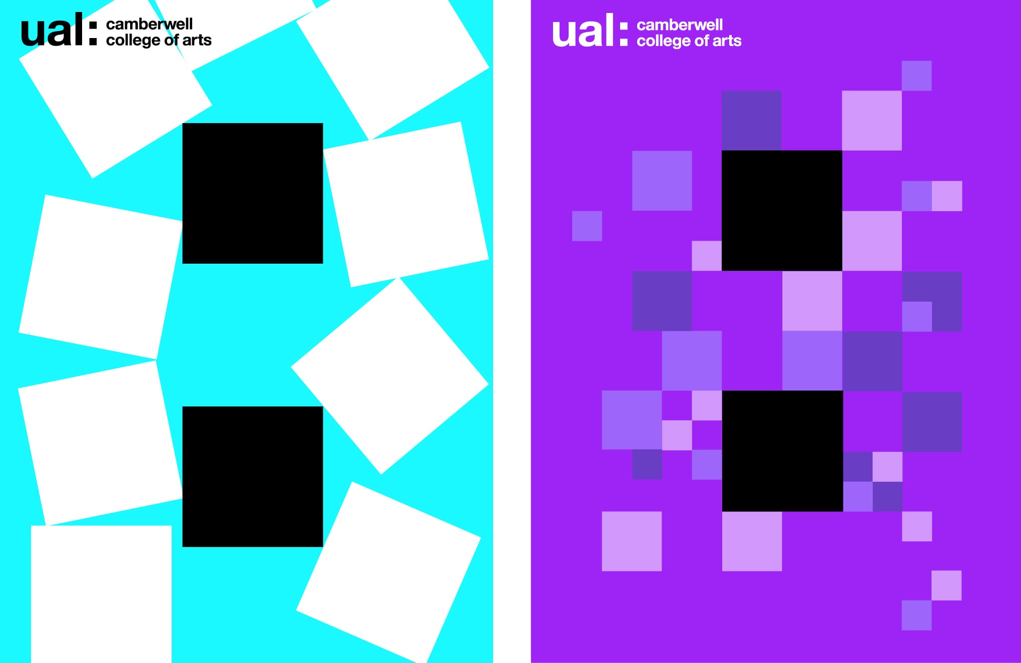
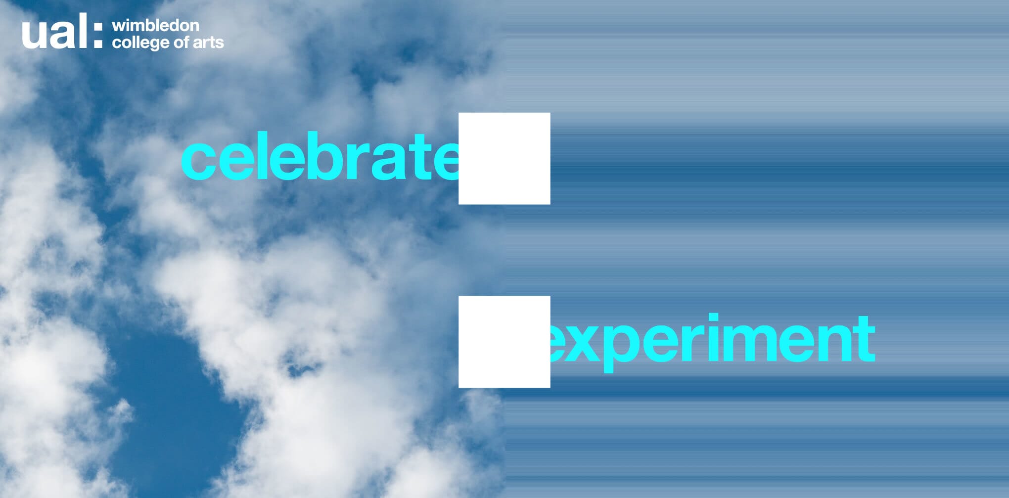
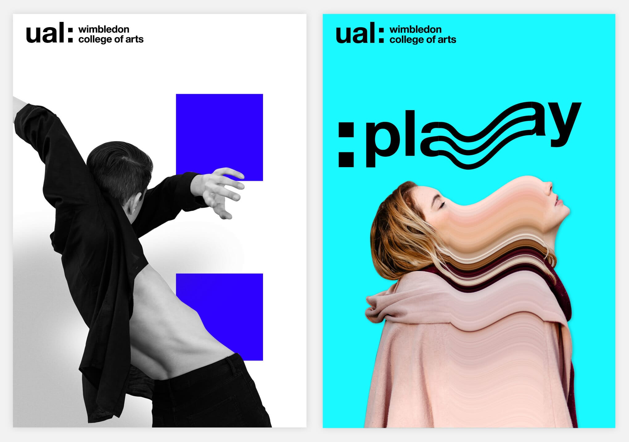
We began to explore how it could begin to function as a symbol in its own right. It became clear that it could become the foundation of a genuinely ‘ownable’ graphic style to unify the visual communications, helping to bring ‘because the world needs creativity’ to life, whilst keeping the college identities subtly separate from one another.
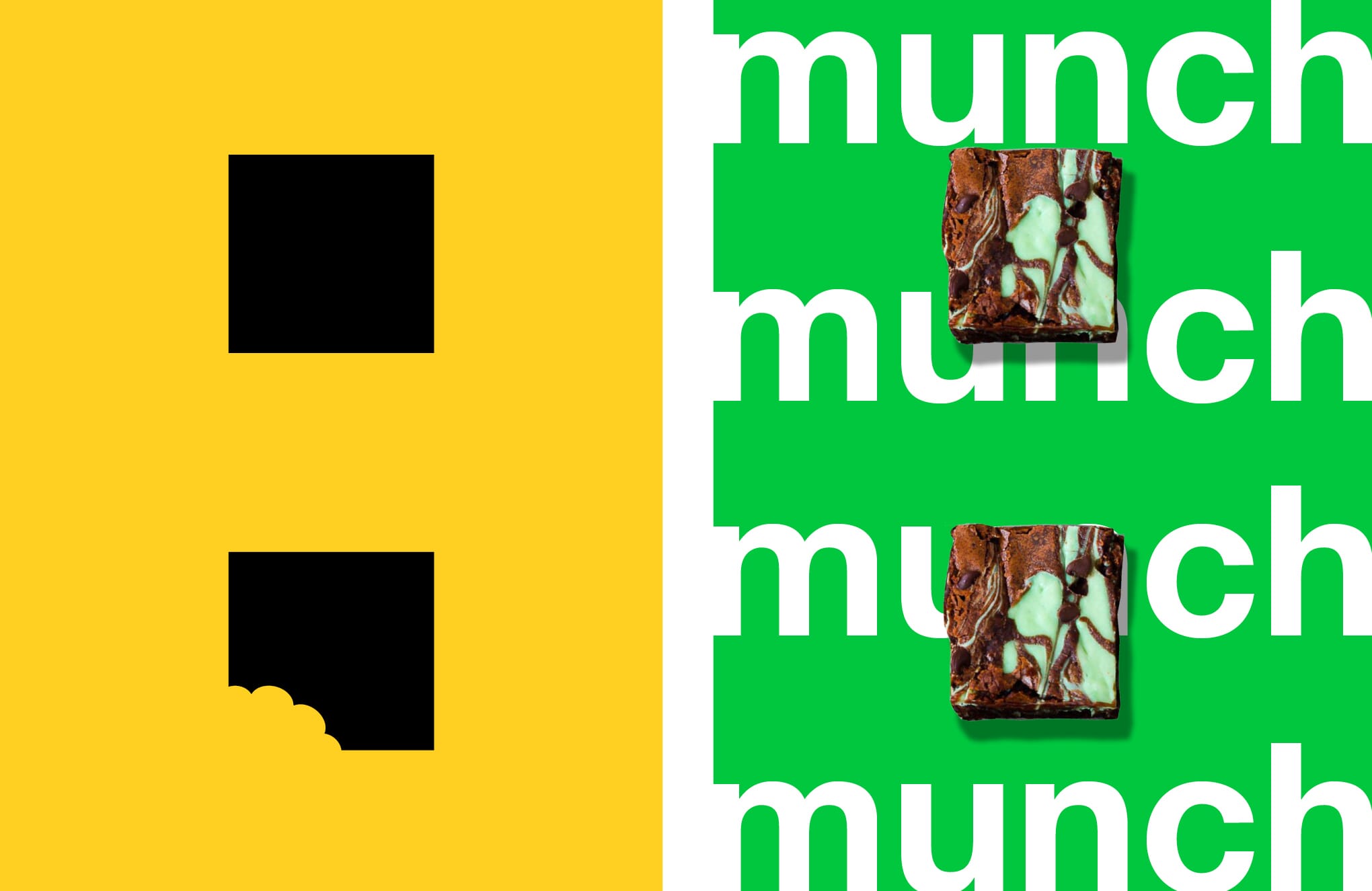

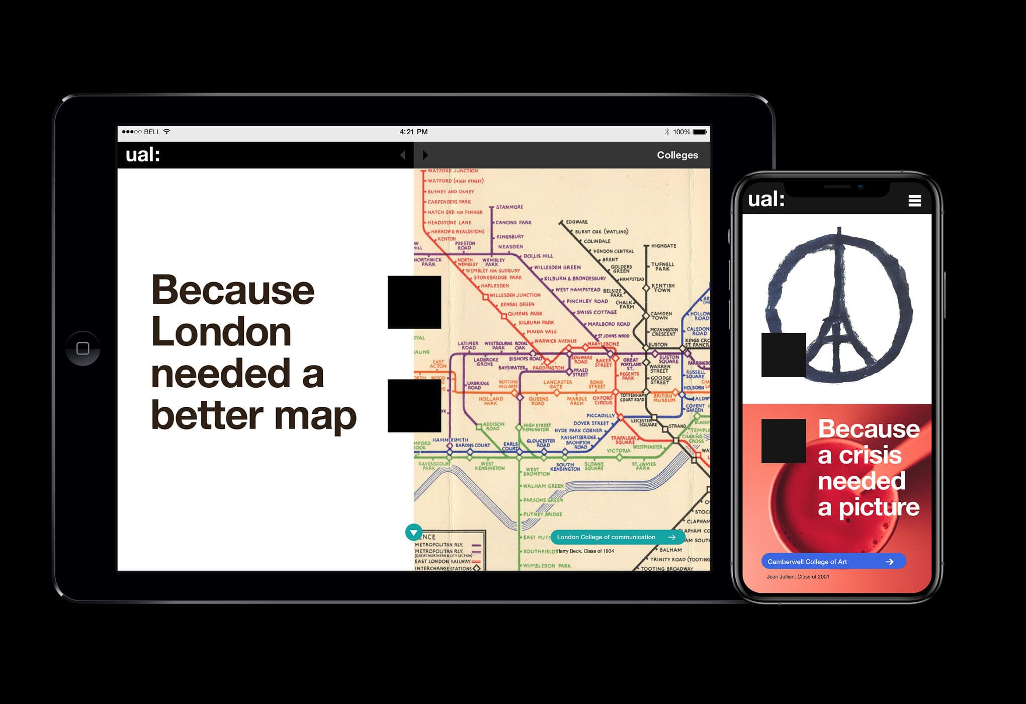
Workshops with representatives from across UAL helped us to gather feedback and encourage buy-in, using example layouts illustrating how different colleges could interpret the guidelines in different ways. In some cases just the colon is enough to brand an item, in others ideas can be expressed typographically, or with added graphic elements. In addition, consistent typography and more digitally-friendly colour palettes were agreed.
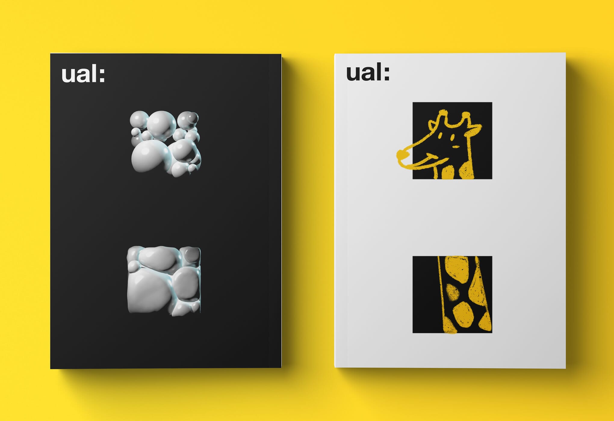
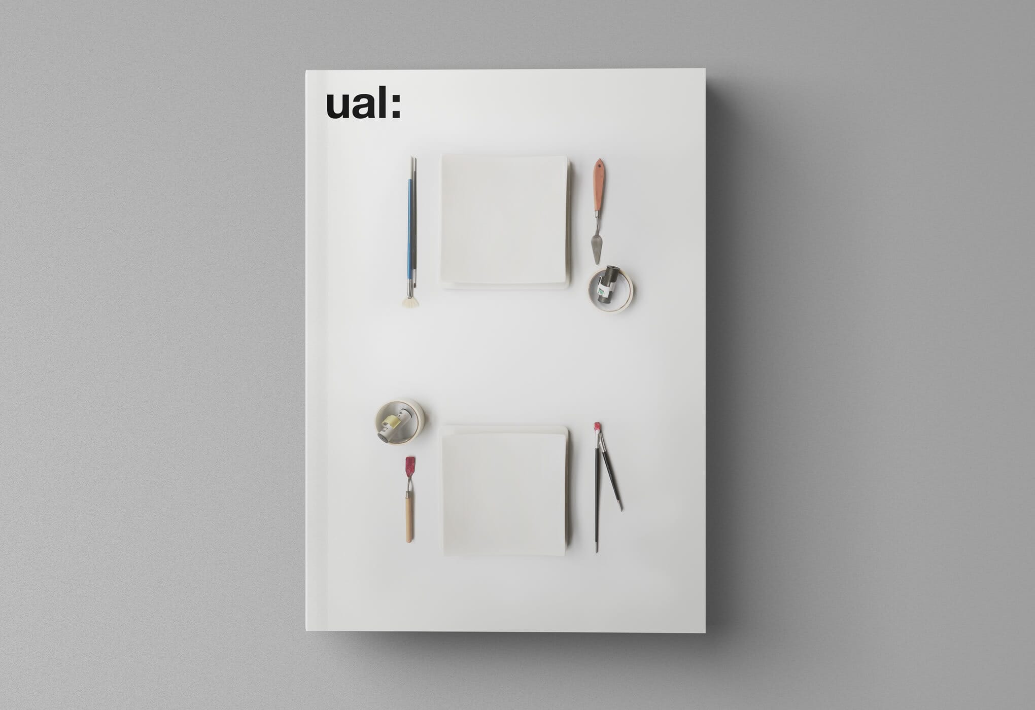
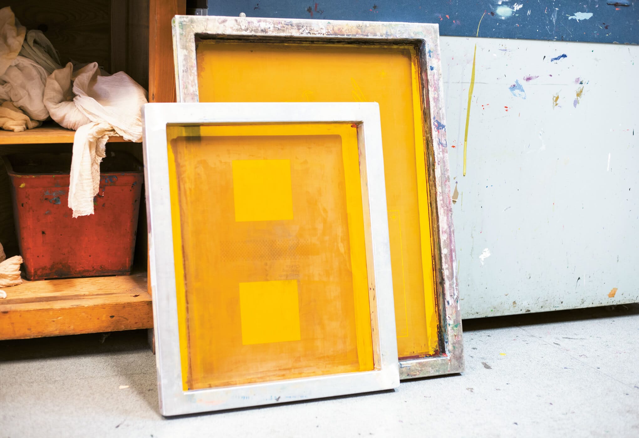
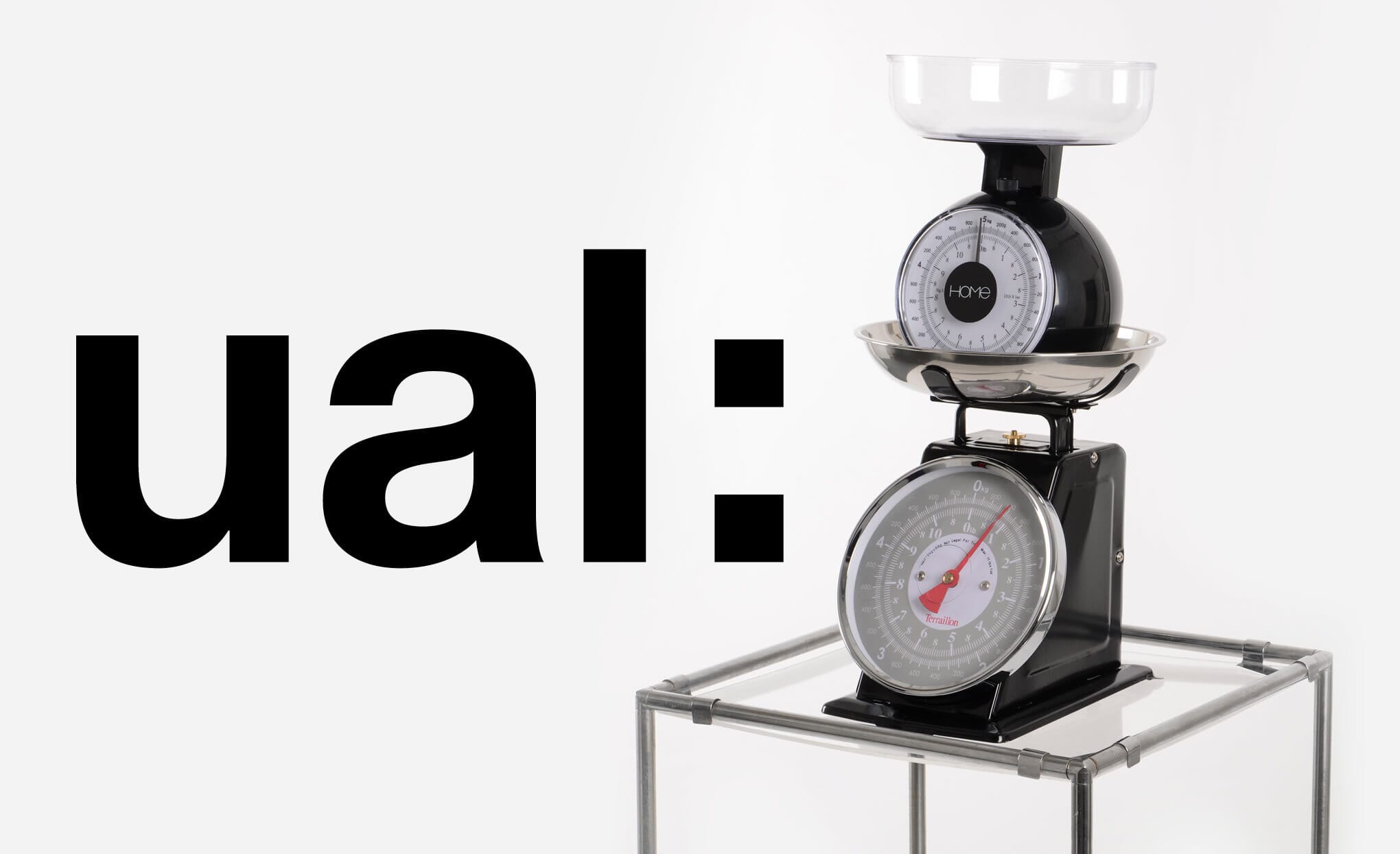
Finally, we involved groups of students from across design, photography and image-making disciplines from across the colleges to explore where the idea could go – ‘crash-testing’ it, extending the design approach and then generating a series of new images for the roll-out.
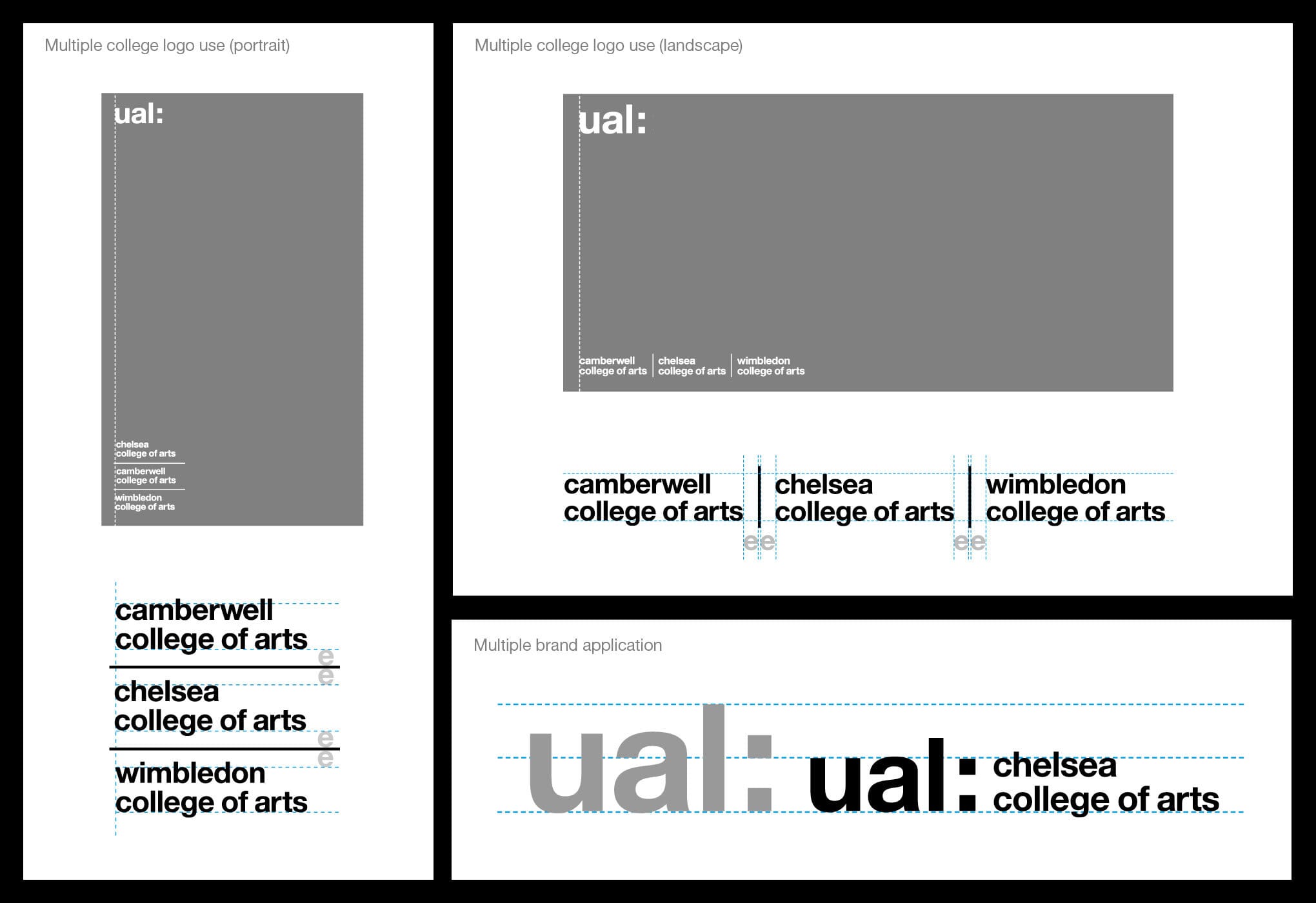
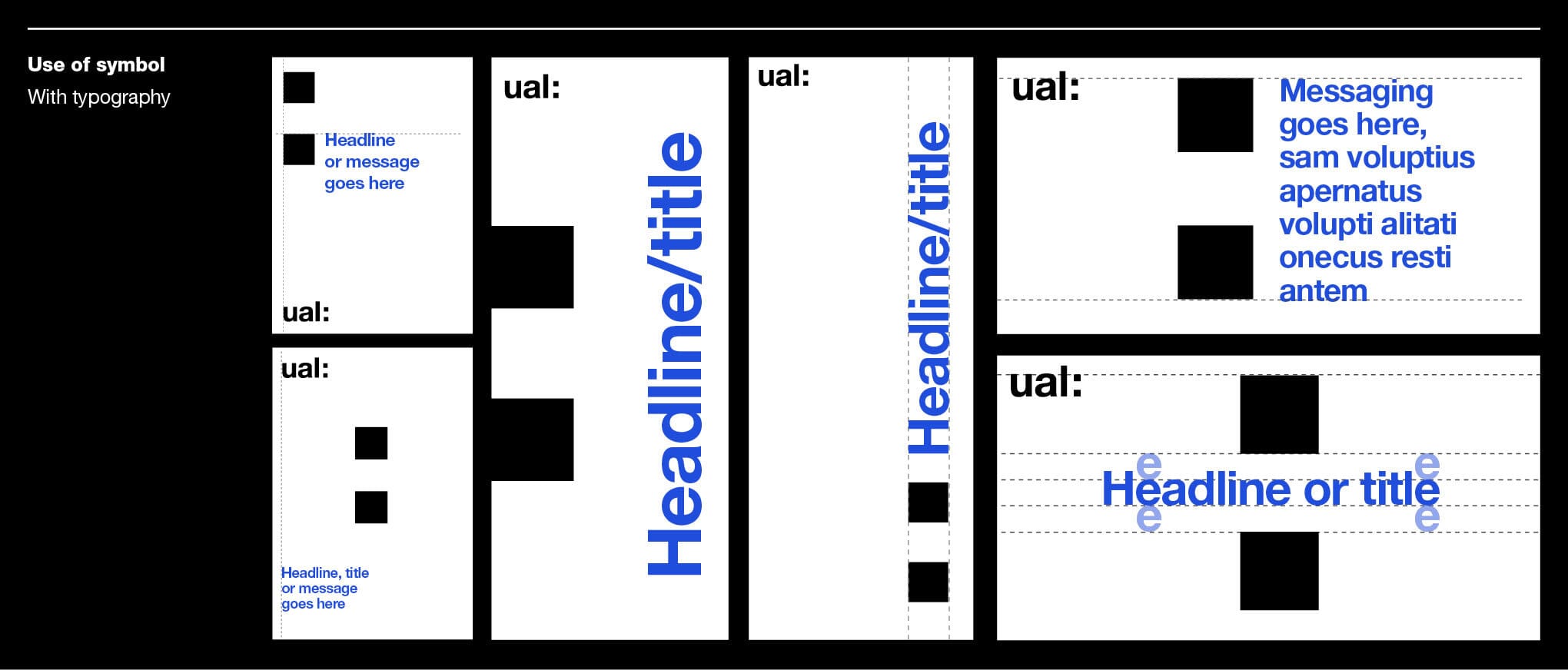
What resulted was a working set of brand guidelines (see sample pages above) which were then shared with UAL’s rostered design agencies. Over the last 12 months we’ve begun to see a steady stream of exciting designs using the new design principles – and here are some of the highlights.
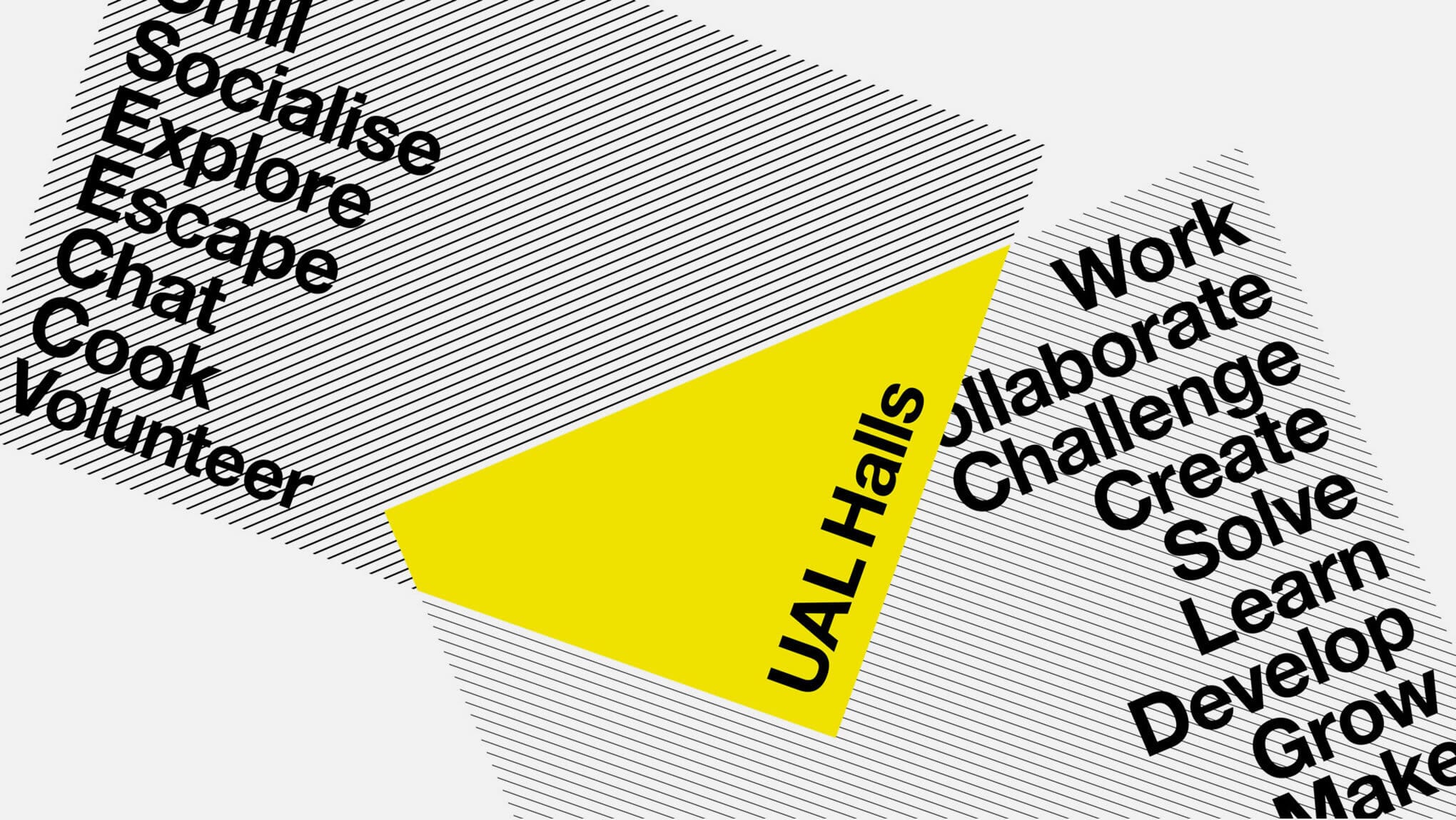
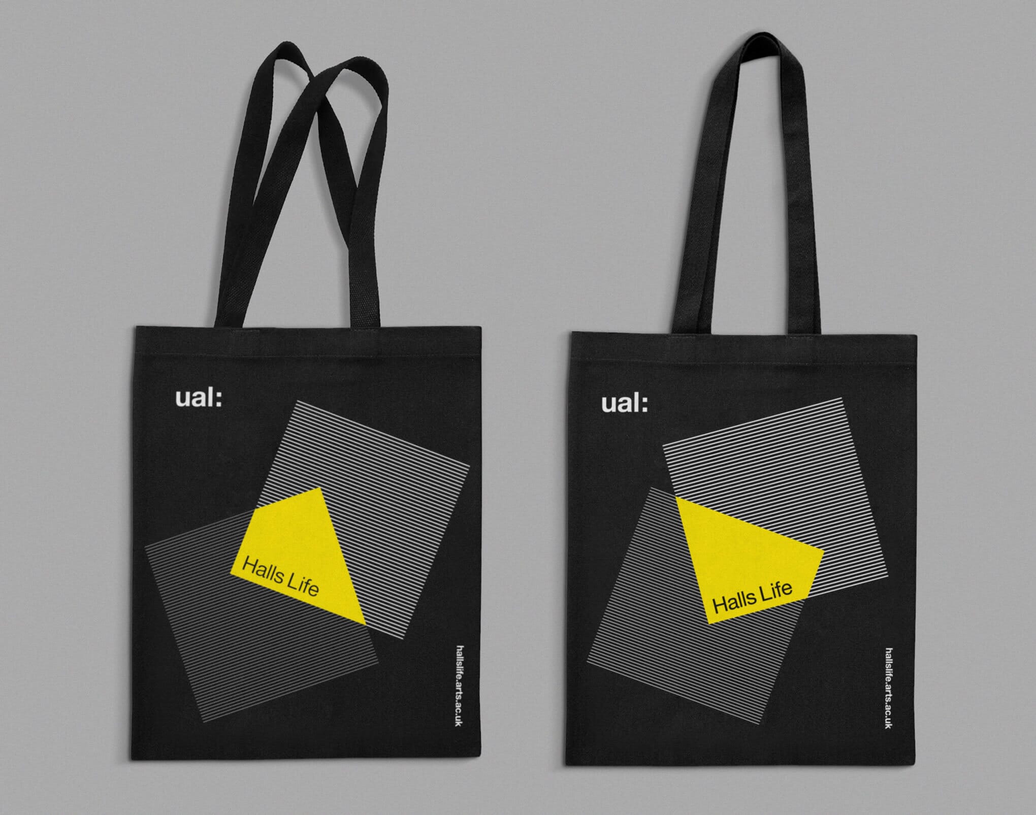
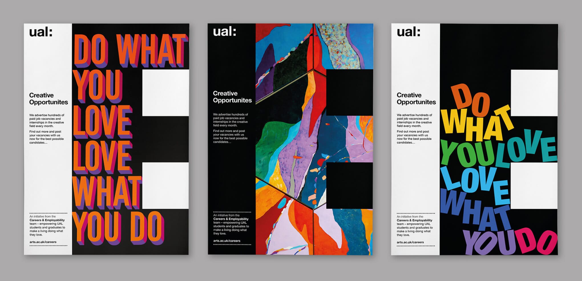
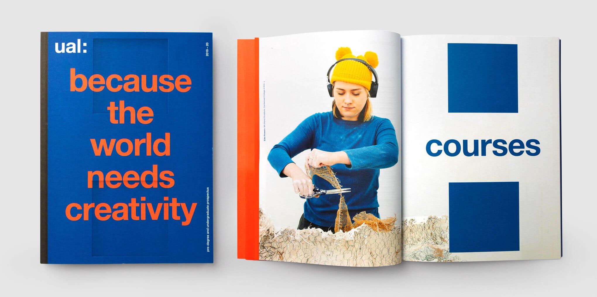
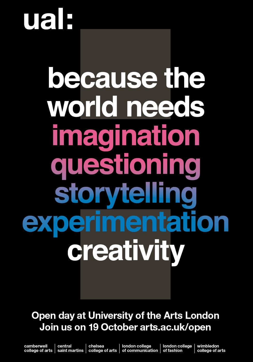
The next steps are to embed the new narrative, content framework and visual approach across all six colleges – a major task which has only just begun. Bit by bit, UAL’s brand in its own right is beginning to emerge, rather than one defined only by its colleges.
Credits
- Brand strategy, narrative and brand design: Johnson Banks
- Student design team: Mingyue Wang, Scene Peng, Christine Geiger, Keng Wu Lin
- Featured student artworks: Kourtney Stuart-Mason, Fiona Barnes, Lauren Pilgrim, Nicole Paskauskas, Levi Naidu-Michell, Manuel Thiessart
- Implementation: UAL brand team, Supple Studio, The Studio of Williamson Curran
- Original UAL and Colleges marques: Pentagram
Every effort has been made to credit the creators of work featured. If we omitted or wrongly attributed work please let us know on web@johnsonbanks.co.uk