West Dean College was born out of a post war desire to create a community where artists and craftspeople could be nurtured, and unique craft skills preserved. This was the vision of its founder Edward James: poet, philanthropist and patron of the surrealists.
50 years later West Dean has become a worldwide beacon for the arts, design, conservation and crafts. It provides a vast range of courses, ranging from clockmaking to conservation, from ceramics to creative writing. Across weekend courses to foundation degrees, diplomas and masters, thousands of students have almost unlimited choice of where to go next.
By many metrics West Dean had already achieved success, but it was a fragmented one. Its existing logo, featuring crenellations and rolling hills, felt more akin to a stately home than an art college. Its relationship to its founder's trust was confused. The pandemic had shone a harsh light on its web-based courses, and it wasn’t clear how the merger with London-based design college KLC would be resolved.
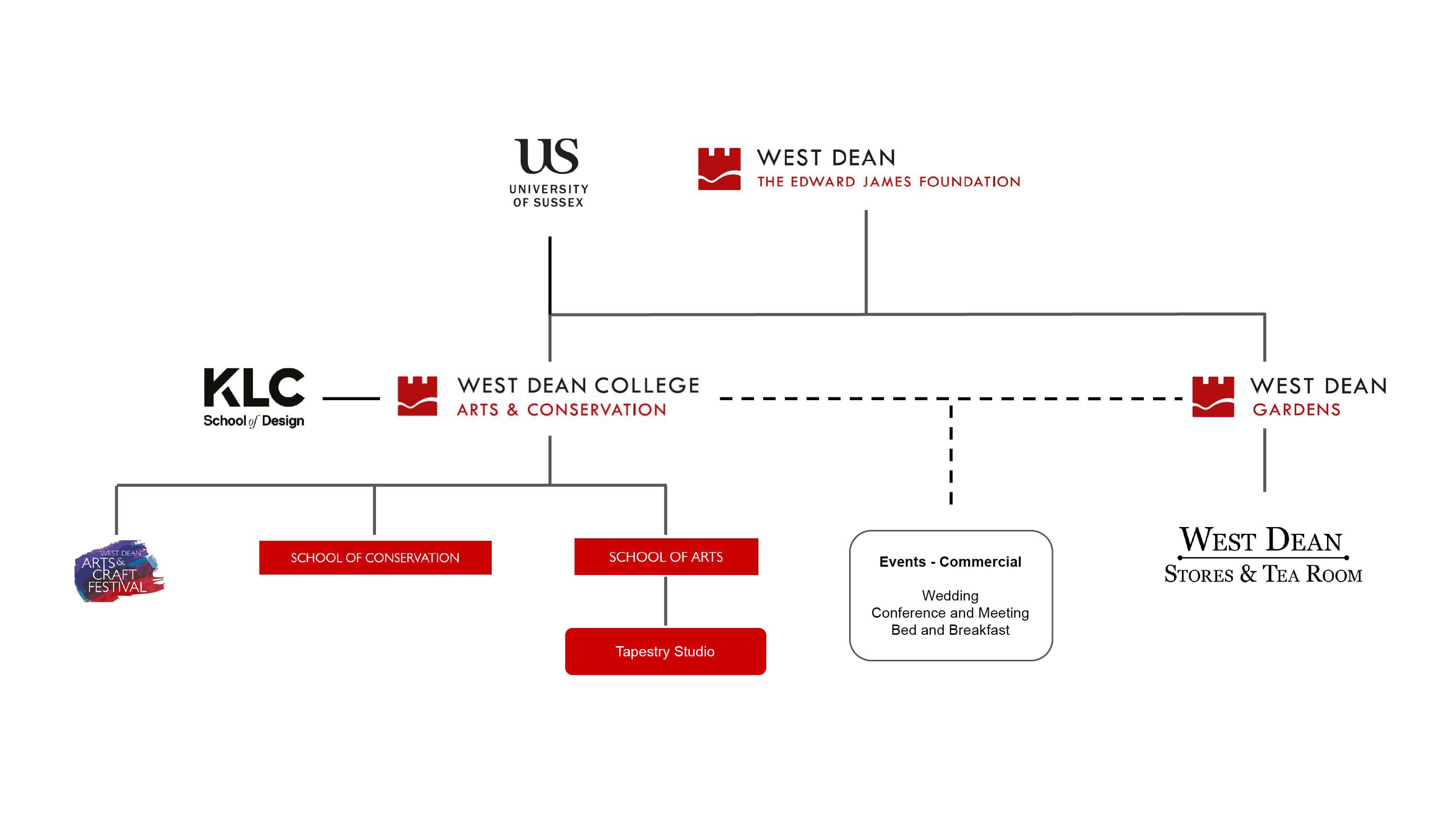
By its own admission, West Dean’s audience was perceived as older and more conservative, and we felt strongly that there was an opportunity to tap into the resurgence of interest in the hand-made and hand-crafted. A new ‘Etsy generation’ is challenging the assumption that mass-produced must be the only way, and West Dean is perfectly placed to reach out to them, both in-person and online.
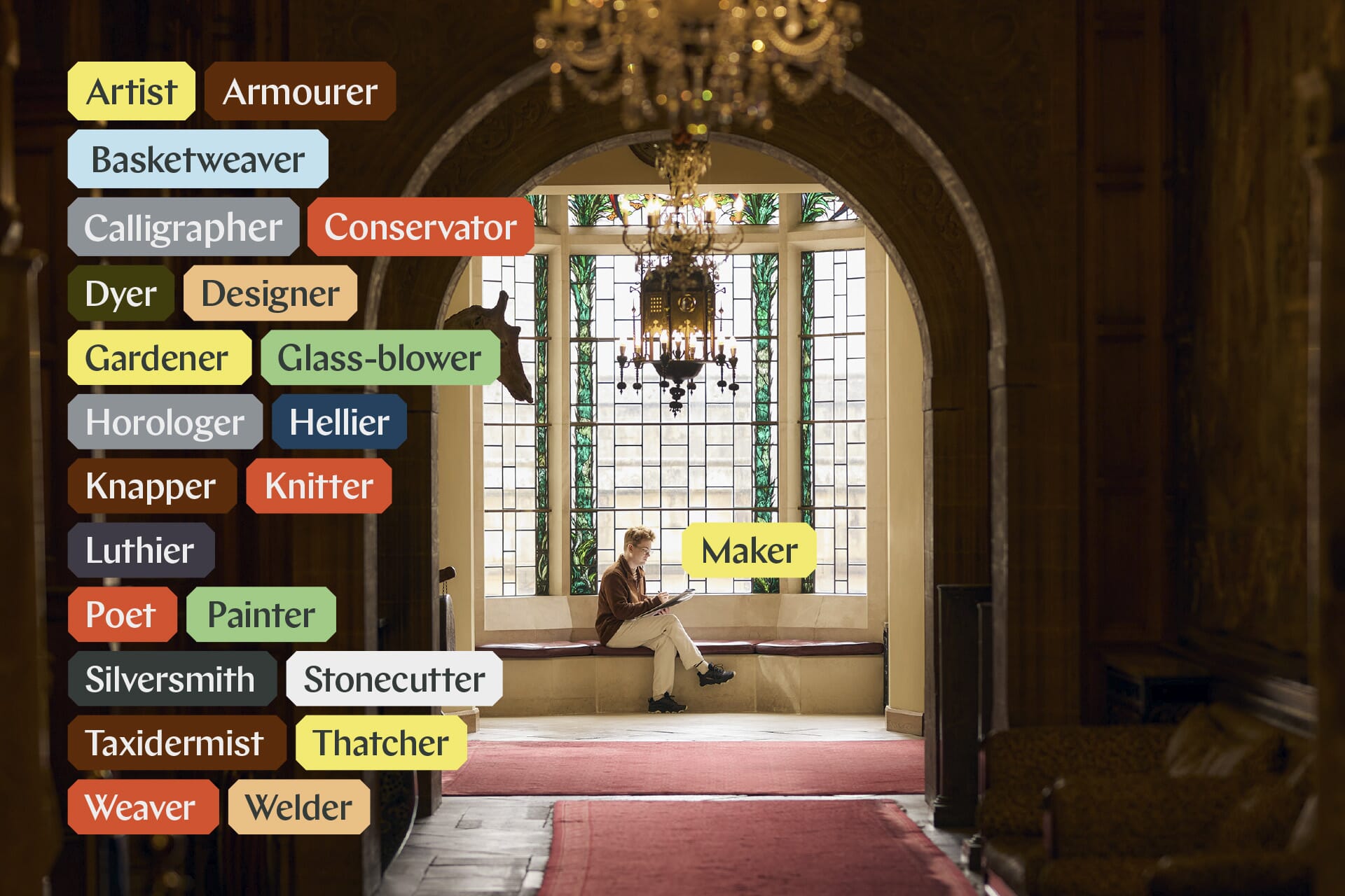
West Dean’s new strategy encapsulates this in just four words: making makes the difference. And it is ‘making’ that is the core to their new brand – whether they are conserving or crafting, discovering or designing, at West Dean they will make their mark.
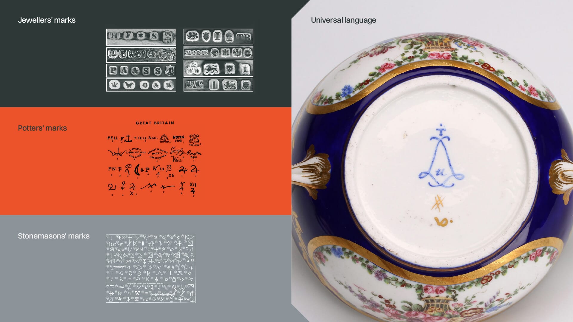
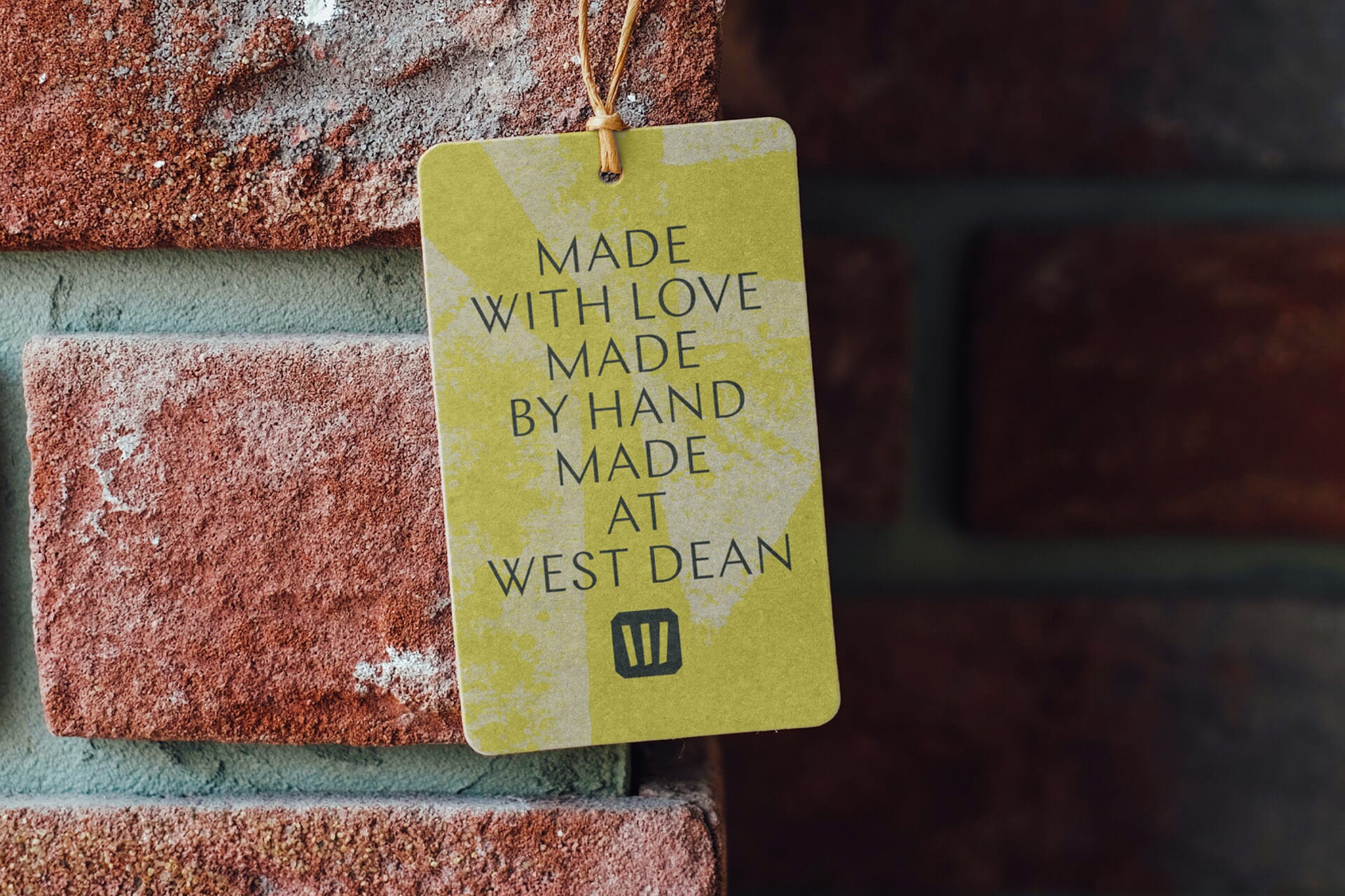
Their new symbol stems from extensive research on stone mason and ceramic marks – the symbols of authenticity left behind by craftspeople for millennia.
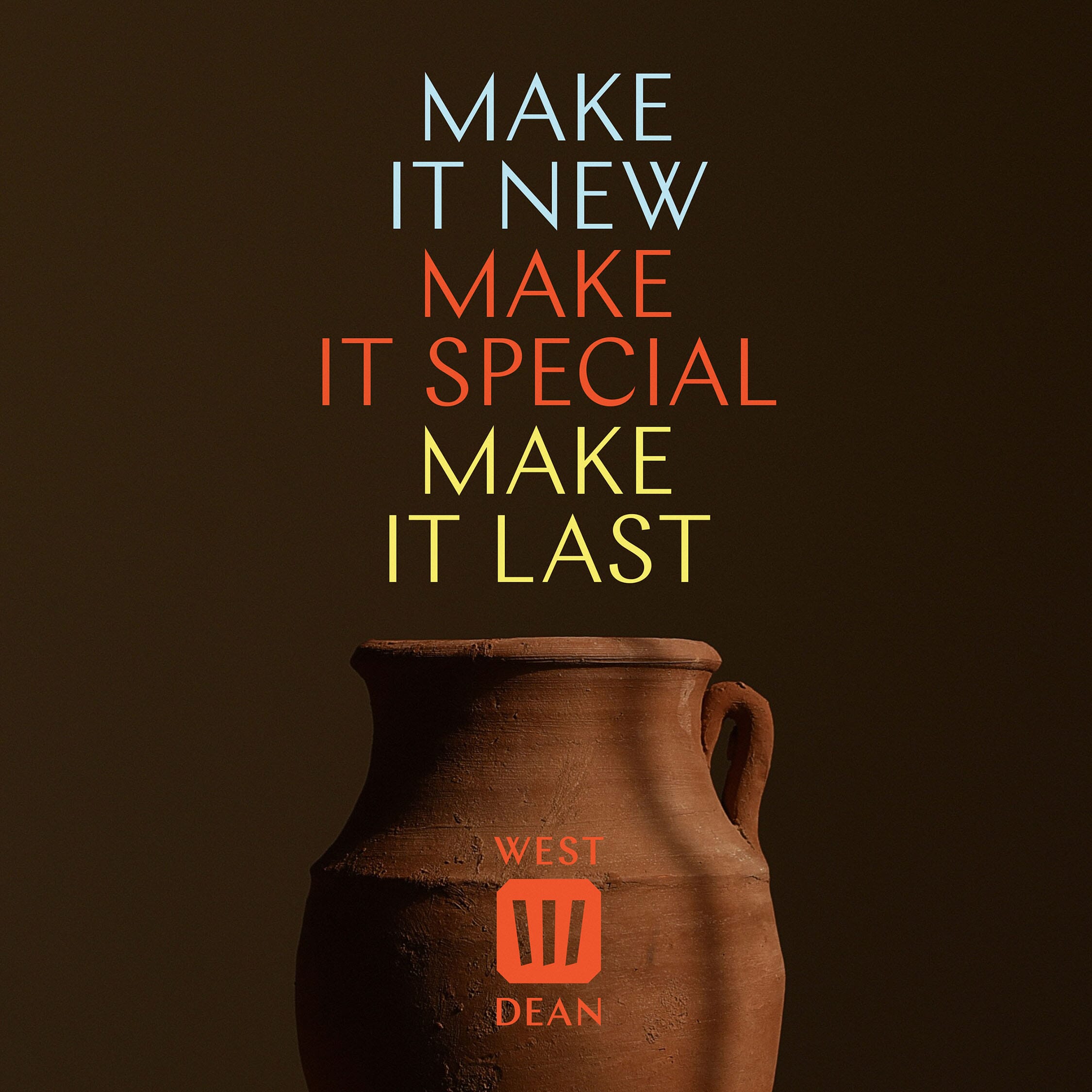
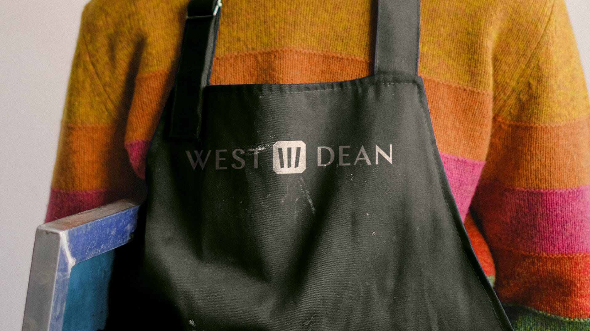
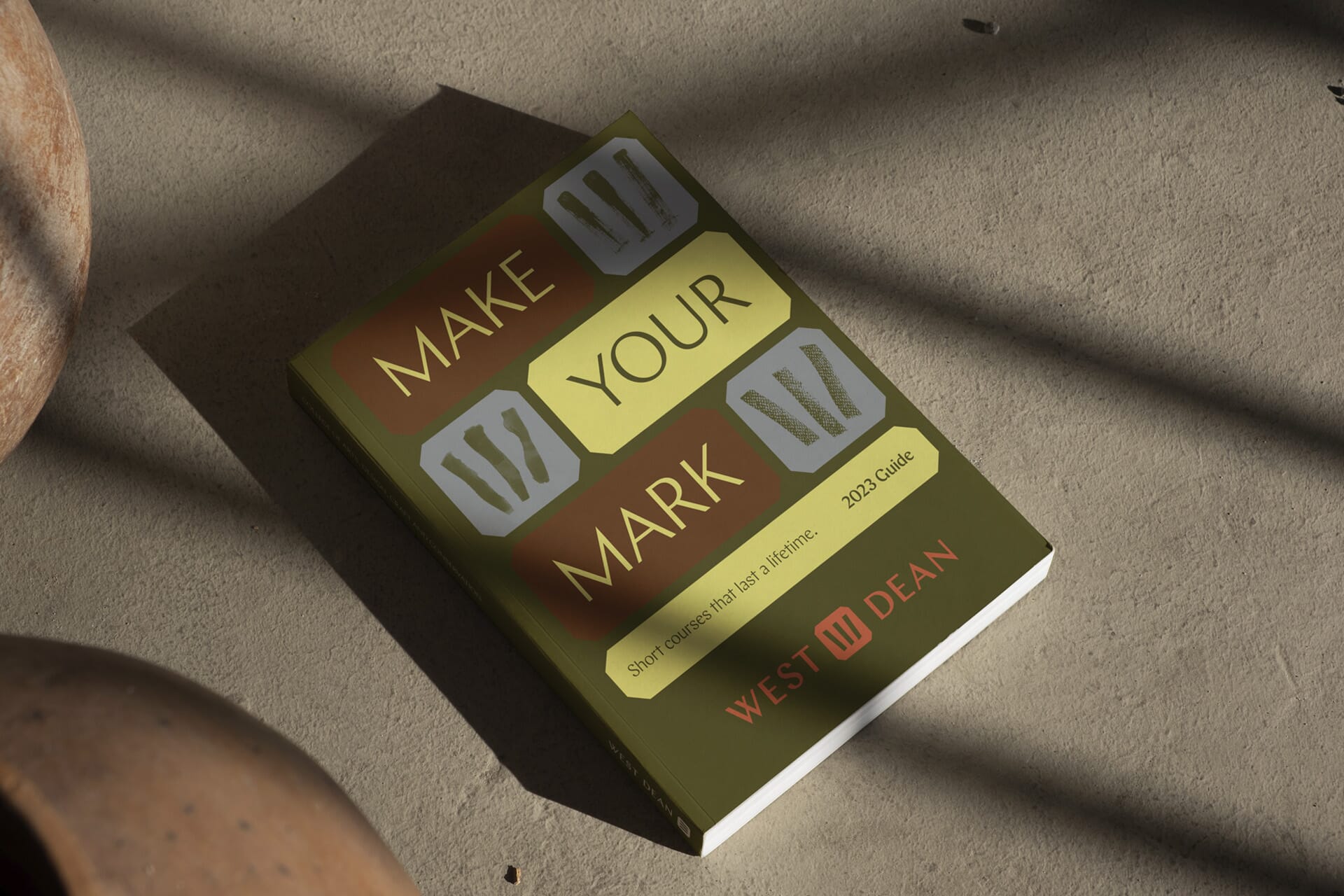
The final version borrows from the vernacular of metal hallmarks to create a ‘W’ monogram formed from three vertical strokes (representing their three schools of arts, design and conservation.) By shortening their name to the more colloquial ‘West Dean’, we can create an unusual centred master lock-up with the two words either side of the new symbol, and secondary mark for different uses.
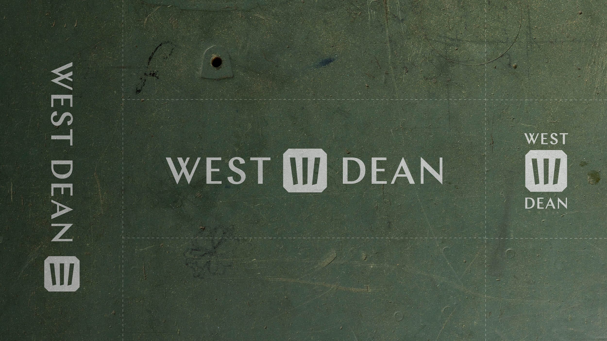
Their name is now written in Chap – a chiselled typeface from the Schick Toikka foundry that has a suitably ‘craft’ feel and which flows throughout the visual identity.
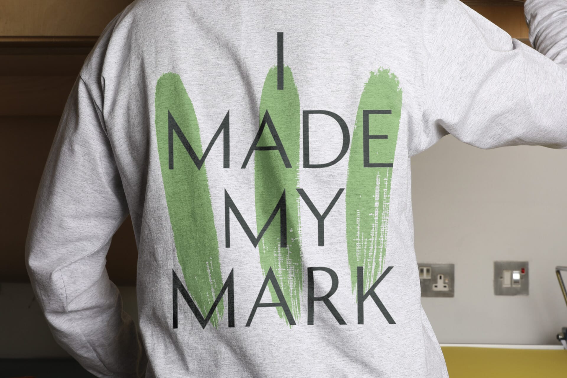
A key creative asset embedded into the scheme is the ability to express students’ individuality with a whole array of ‘W’ marks. These have been drawn, scraped, chiselled and torn, and are used liberally throughout the scheme, across stills and animation.
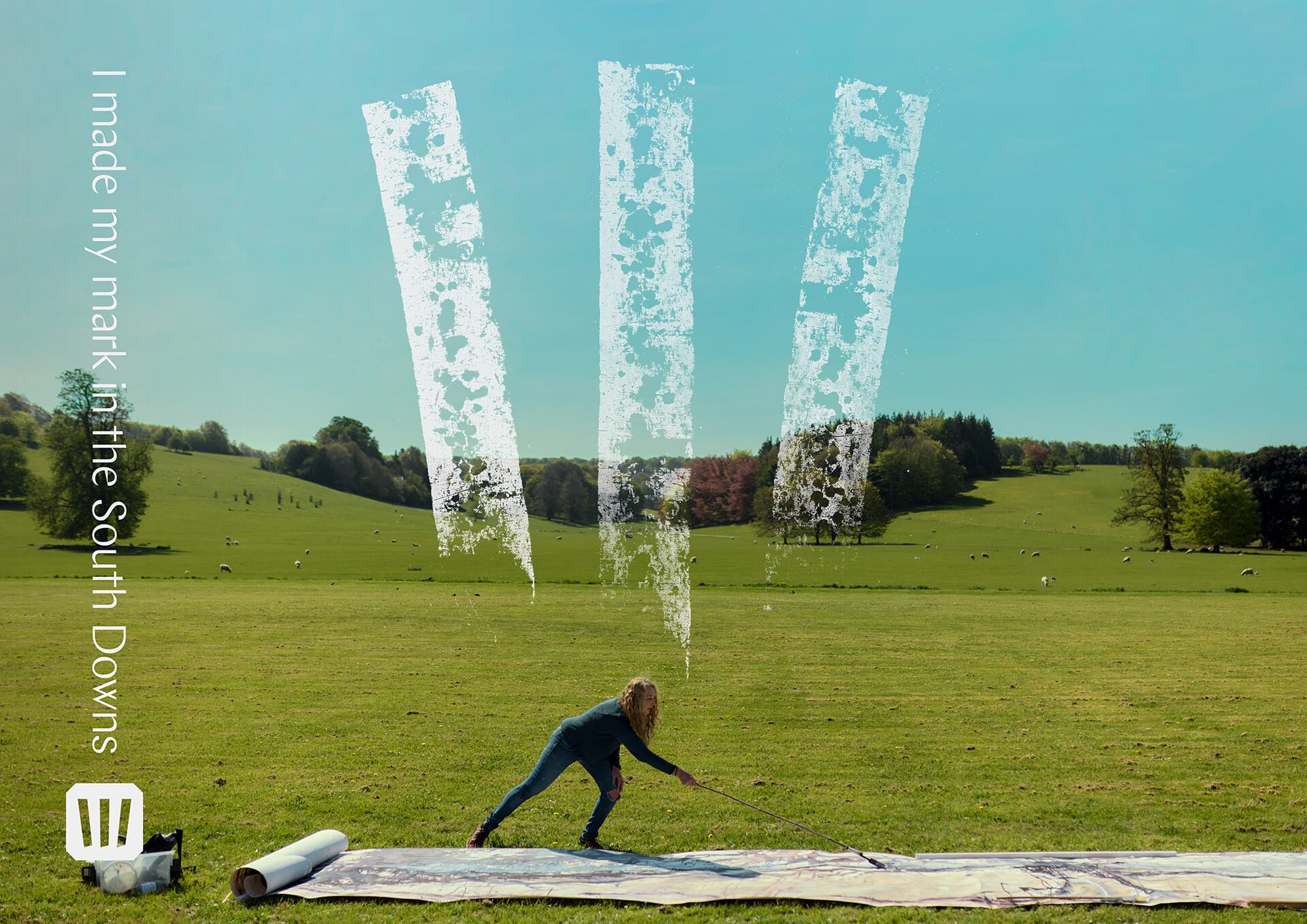
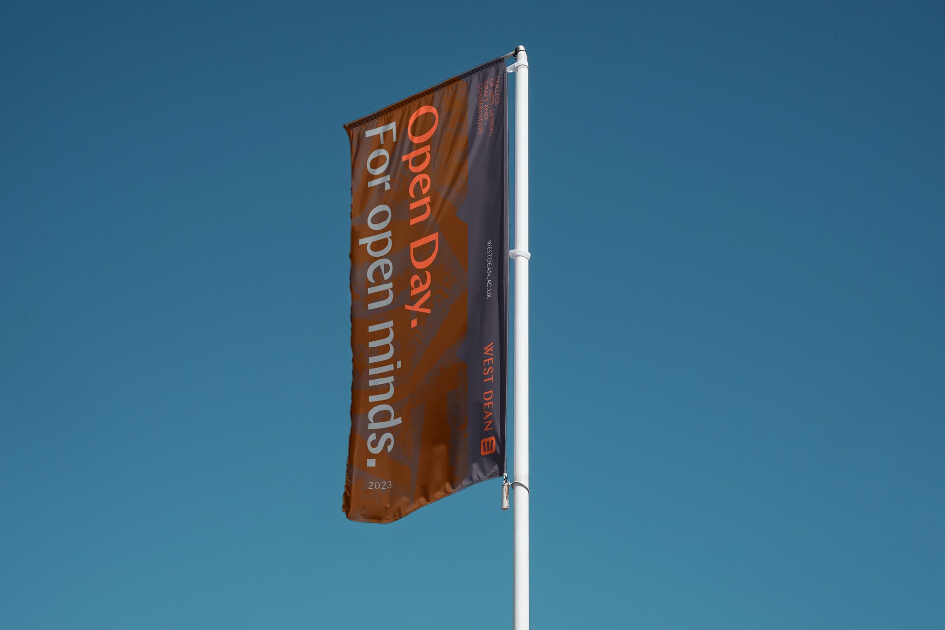
Slates and burnt oranges – inspired by one of Edward James’ favourite surrealists, Salvador Dali – plus a palette of unusual darks and lights combine with the core graphic elements to hint at ‘mid-century’, with a timeless design feel.
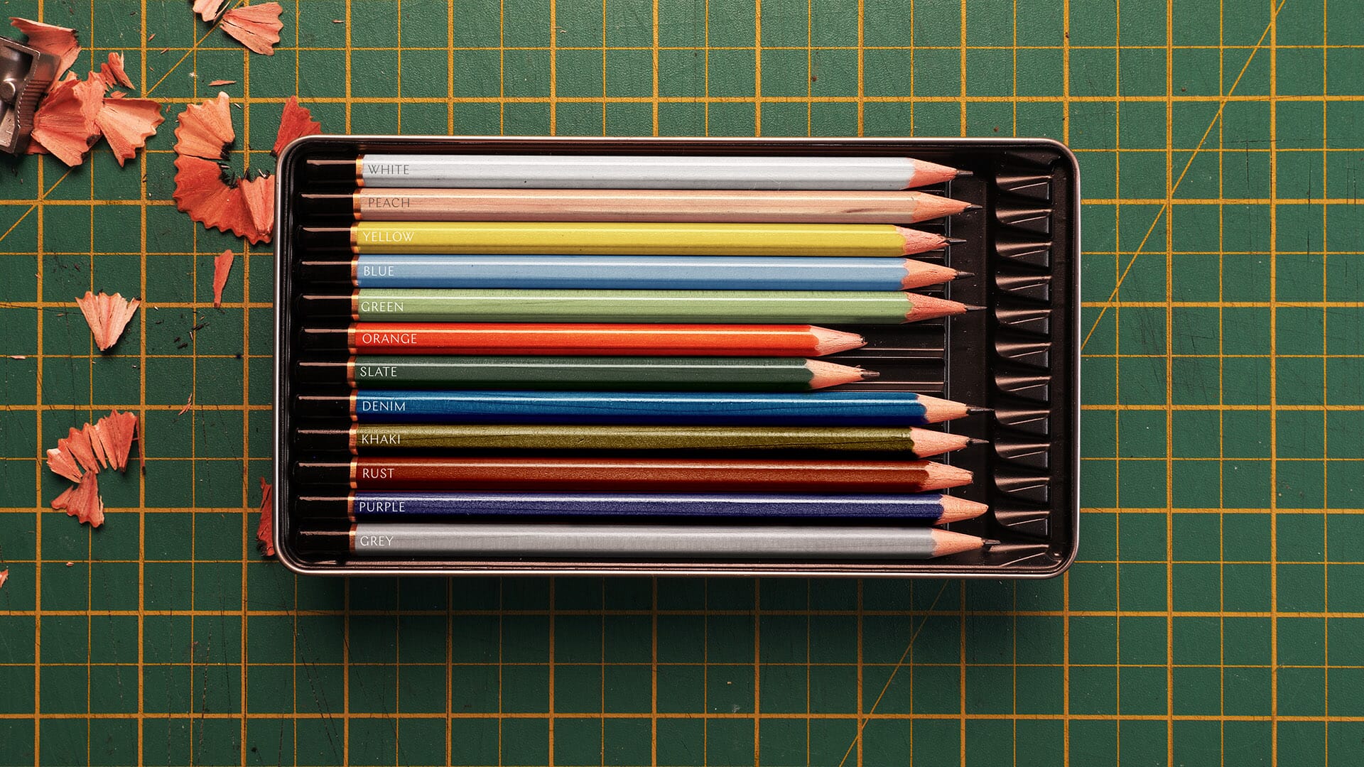
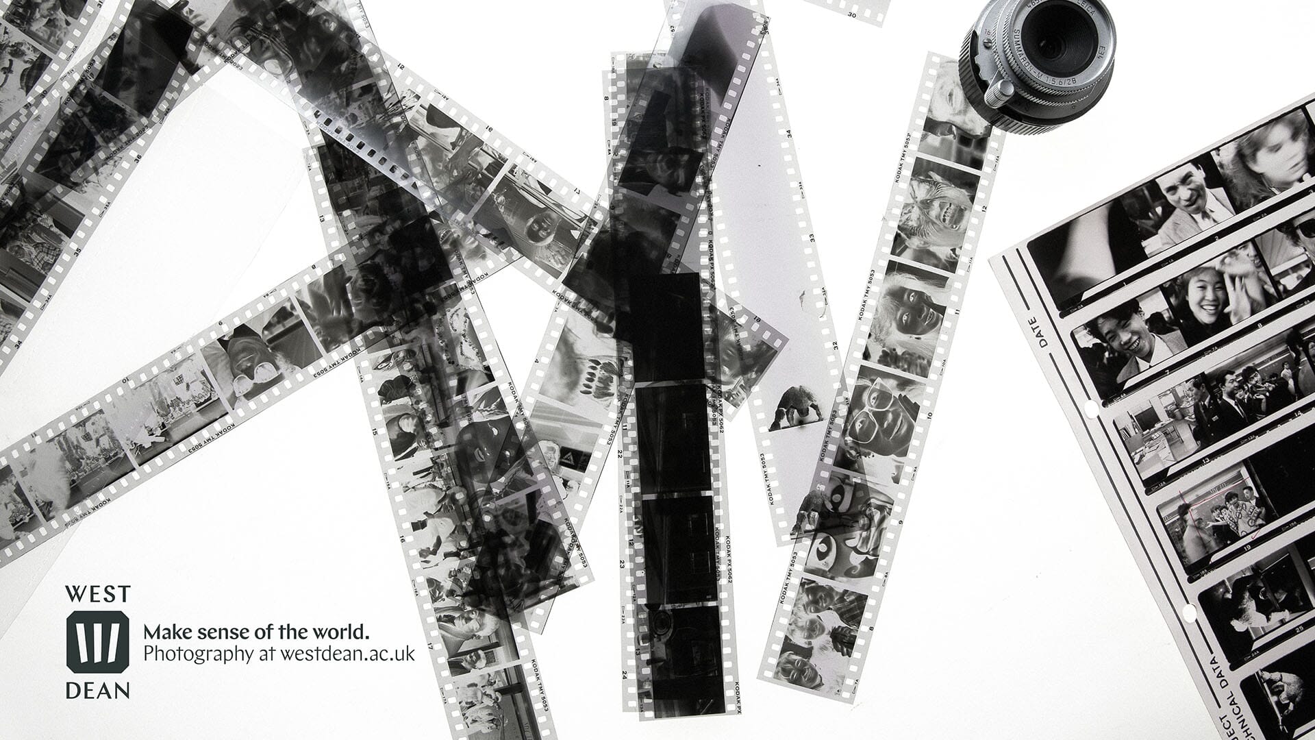
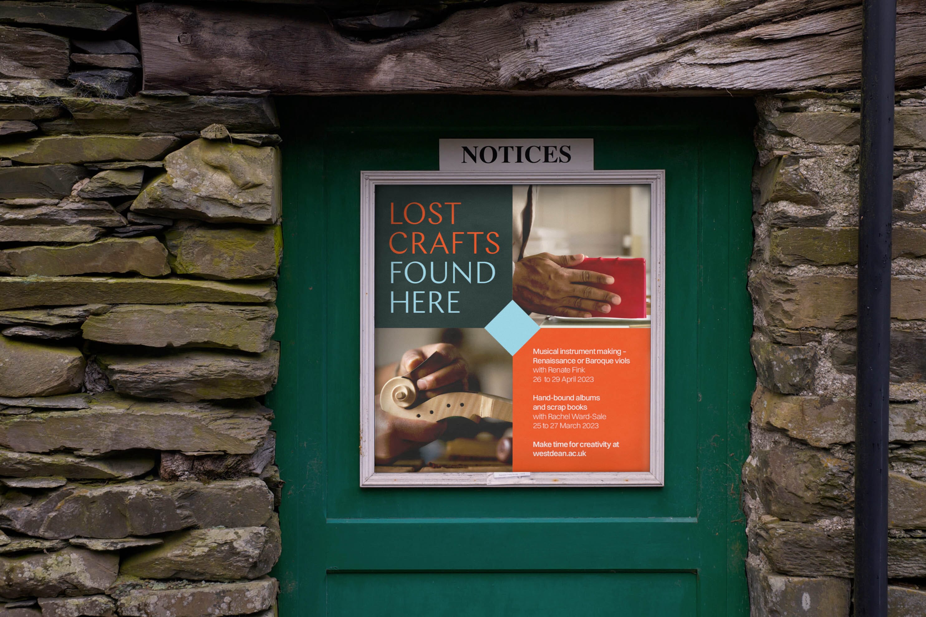
One of the greatest opportunities of working with the college has been the ability to spend time photographing the students and tutors, their studios and the grounds of the South Downs campus.
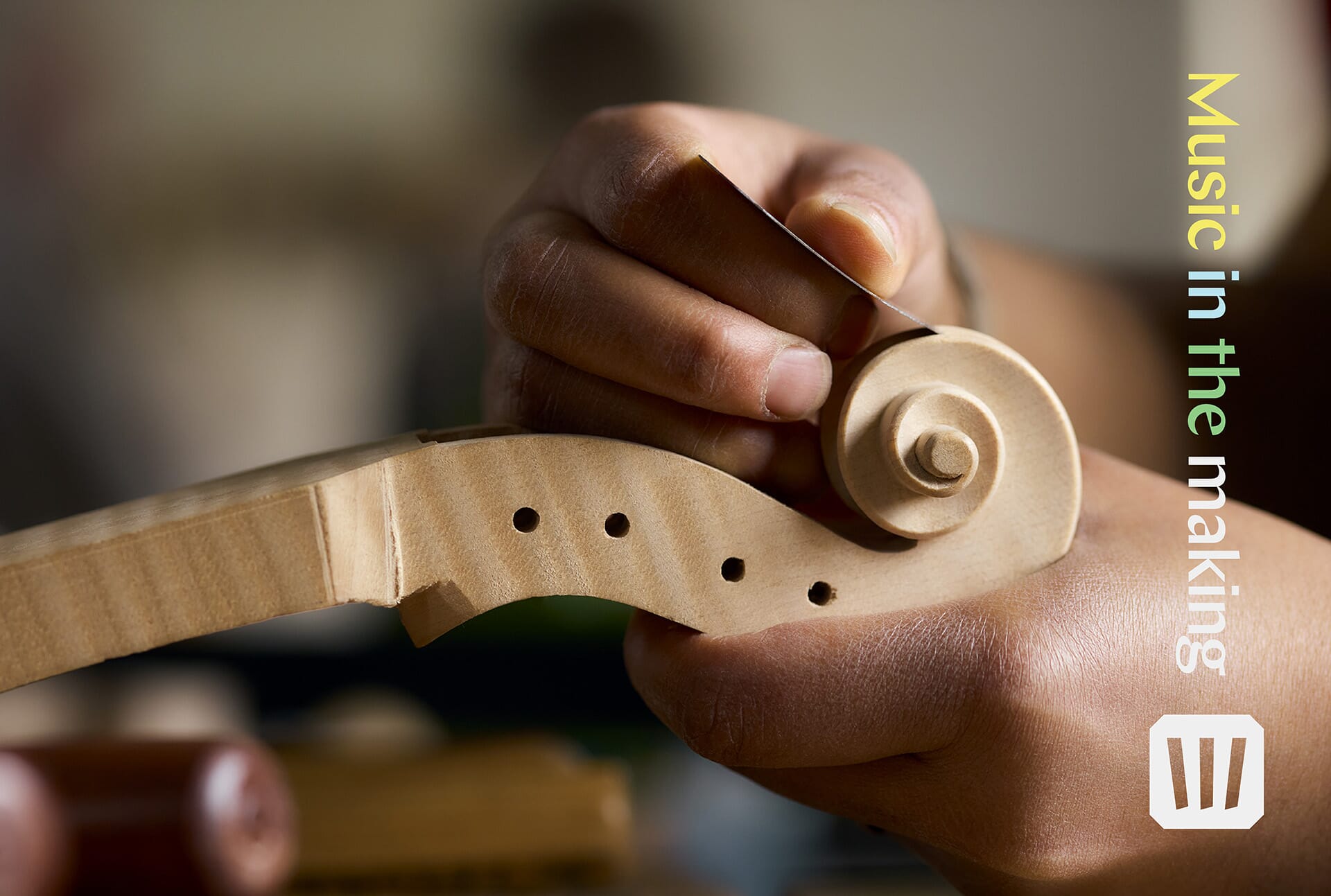
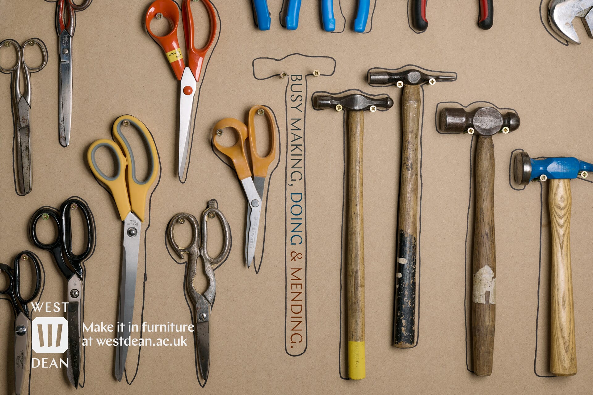
These have then become the core source material for a series of posters and magazine adverts, both portrait and landscape. These are used to reach out to the wider local community & county to advertise the breadth of courses on offer, change the perceptions of the archetypal ‘West Dean student’ – and those who teach them.
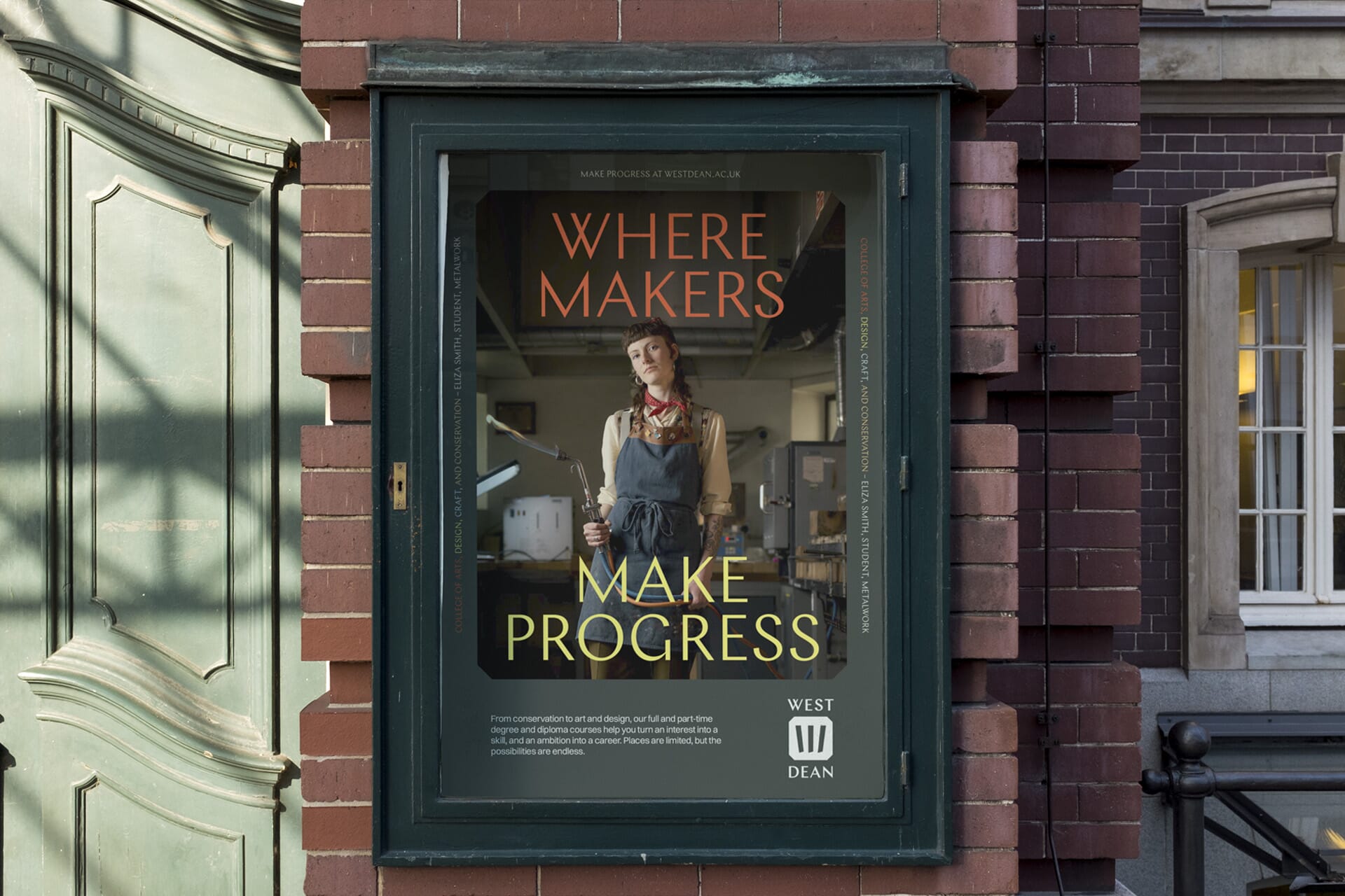
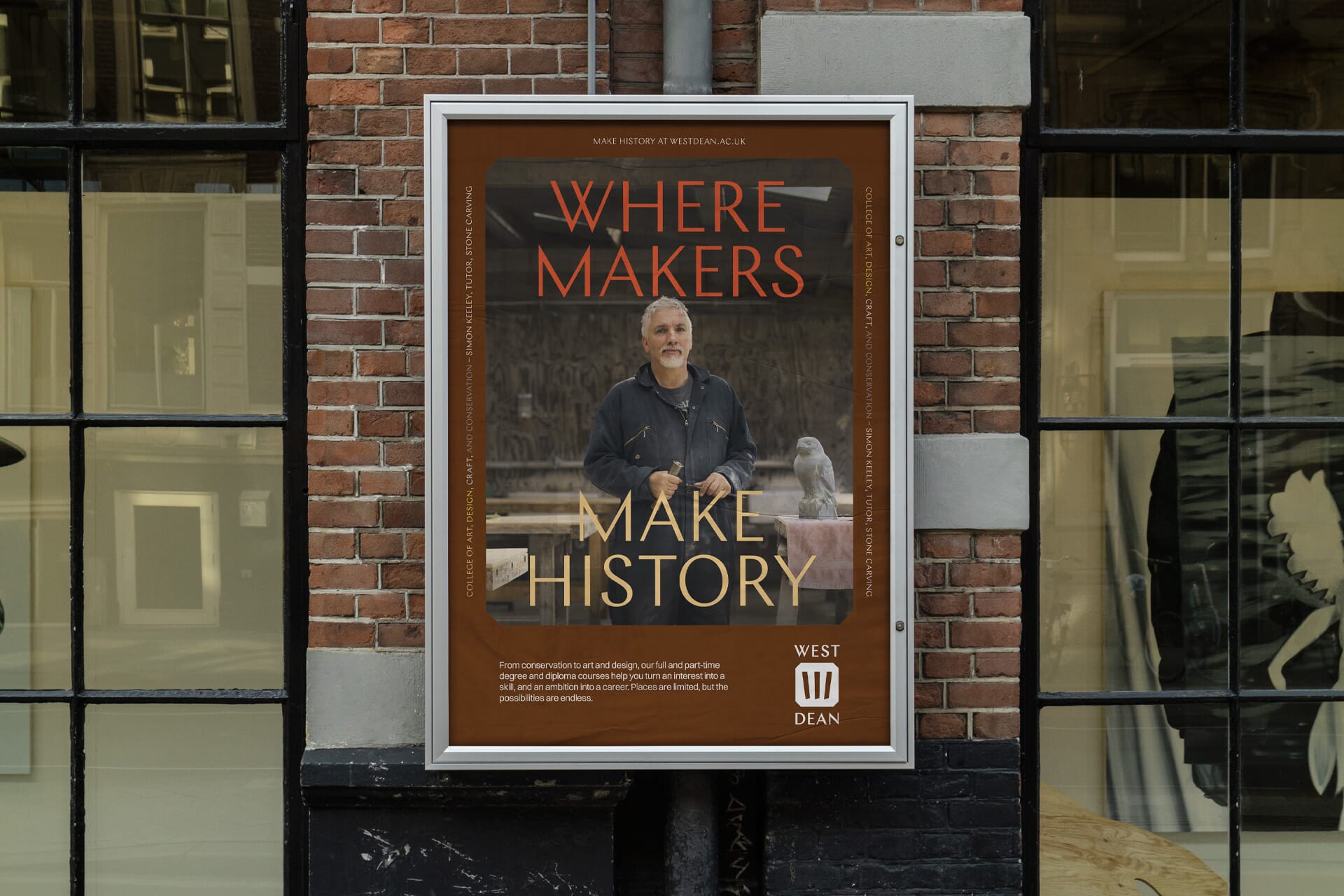
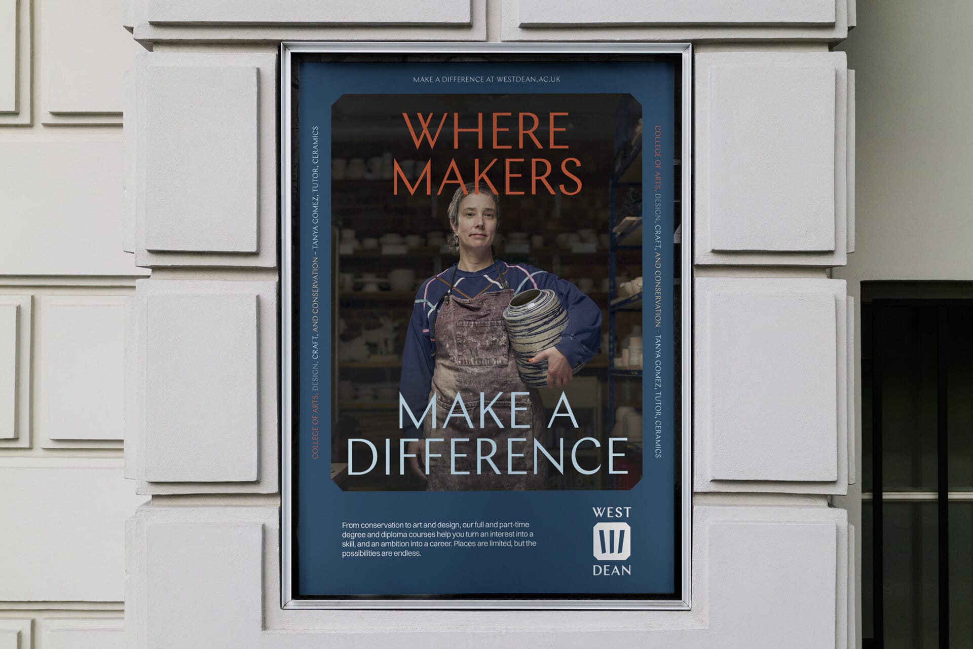
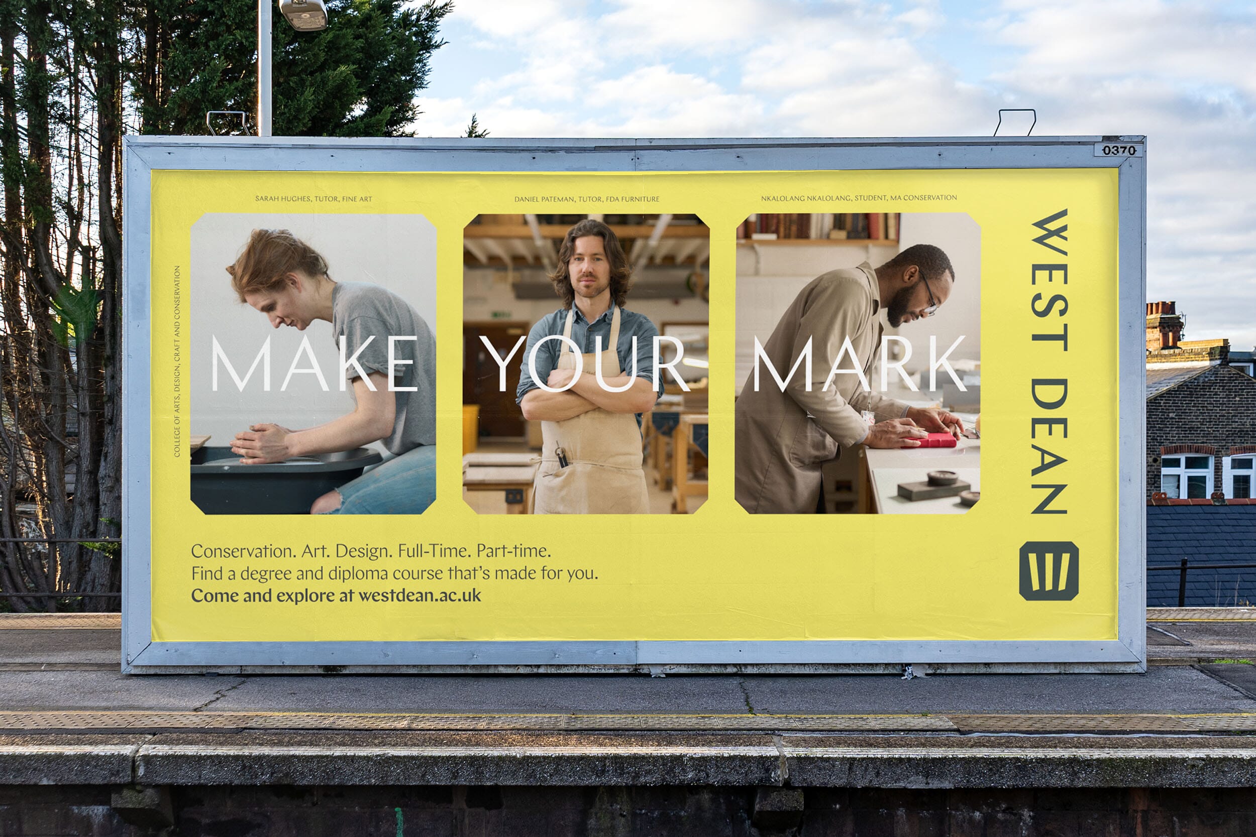
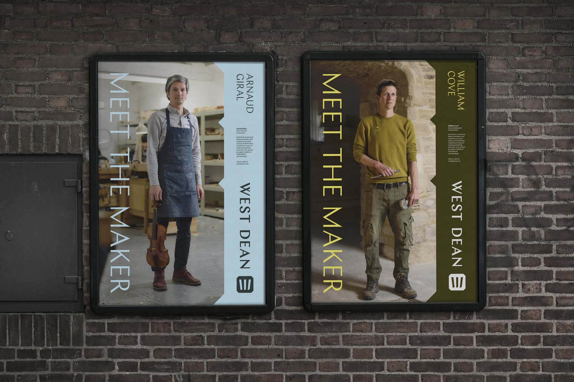
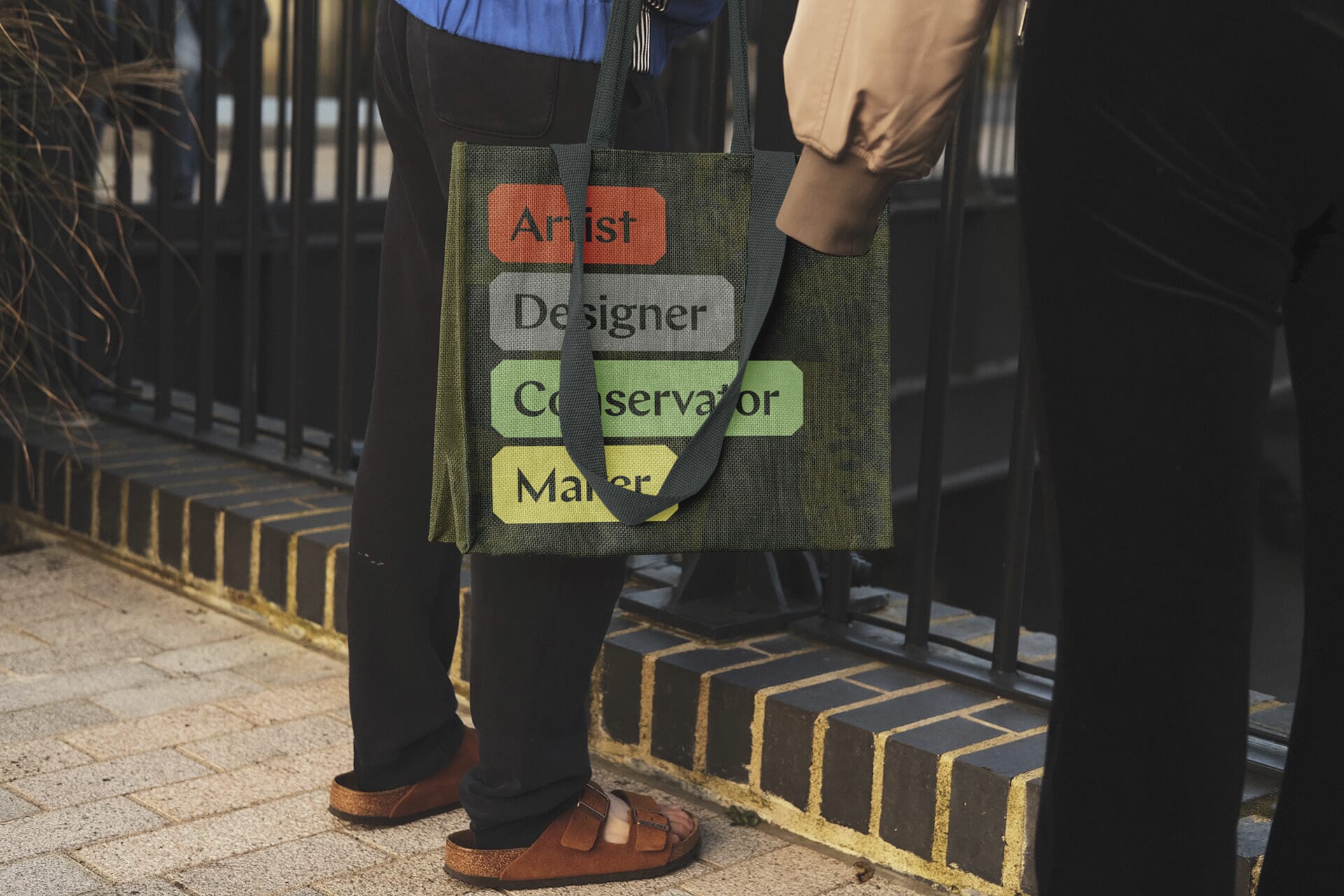
All of these elements then come together across print, merchandise and social media to demonstrate that West Dean is the best, most authentic place to study – and preserve – these amazing skills. A place where you can truly make your mark.
The team
- Brand narrative and design: Johnson Banks
- Photography: Thom Atkinson
- Animations: Johnson Banks and Robbie Hancock