
For about a year we've been working on a wholesale re-positioning of Unicef in the UK. In research, they had discovered that whilst people recognise the charity, they're not front of mind. There was an overall lack of familiarity with the brand, and many don't even realise that it is a children's charity.
Unicef is actually the world's largest children's organisation and already ensures more of the world’s children are fed, vaccinated, educated and protected than any other. They have done more to influence laws, policies and customs to help protect children than anyone else in history.
Yet, right now, a child somewhere is being trafficked into slavery, a young girl is being raped and a toddler is slowly starving to death. The charity’s scale and reach means it is ideally placed to stop this, but needs to raise more funds to do so.
Our task was divided into two parts:
1) clearly establish a consistent link between the charity and children
2) form a much stronger emotional connection with the public and potential donors of all types and ages.

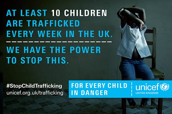
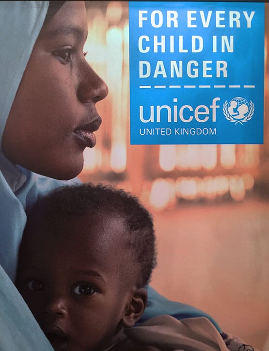
After an extensive research and scenario stage, and nationwide focus groups, the new approach is based around five words: 'For every child in danger’, which always appear adjacent to and locked to the logo.


‘Danger’ is a very powerful positioning which enables the charity to illustrate the millions of children facing violence, disease, hunger, and the chaos of war and disaster, then ask for the public's help to keep children safe.


From today, the campaign will begin to roll out across all media: here is a sample of some early examples and applications, demonstrating the use of a new headline typeface, a toolkit of graphic devices, much bolder use of their signature cyan colour, clear and direct calls to action and blue-tinted photos that try to avoid the generic images of the sector.

There is also a softer side to the campaign, allowing the charity to talk about their work for 'every child' and 'safety'. This gives Unicef inbuilt flexibility within the campaign to speak to different audiences when a more subtle approach is required.

In addition to the overall style and tone of voice going forward, there are some key initial applications: the launch centres around a hard-hitting report on the worldwide epidemic of violence that children now face…


…and the 'safety' aspect of the work is encapsulated in a blue pin that has just been released to demonstrate people’s support of the campaign.
To help explain the campaign's aims, we've also scripted a brief explanatory film based on the everyday dangers that children face, both in the UK and abroad.

We'll update this blog as the brand launch gathers more momentum: it's our aim that in the increasingly competitive UK charity market, Unicef will now be able to raise the profile of its work in a clear and consistent way, using a far stronger, more uncompromising and more memorable identity than they had before.
Our ‘Safety pin’ for Unicef will be available to buy from Unicef's shop, from 1st November.
Credits Strategy, brand narrative and design: johnson banks Additional copywriting: Nick Asbury Brand film: Directed by Glen Milner, scripted by johnson banks
Follow johnson banks on twitter @johnsonbanks, on Facebook or sign-up for our newsletter here