
We've been working for about a year on a new identity for the technology pioneers, the Open Knowledge Foundation. Since 2004, they've been the leading organisation opening up data across the world, and are now at the forefront of a technology revolution.
Never before has so much data been collected and analysed. Never before have so many people had the ability to freely, easily and quickly share information across the globe, and governments and corporations are using this data to create knowledge about our world, and make decisions about our future.
Open Knowledge ask who should control this data and the ability to find insights and make decisions? Do we want to live in a world where access to knowledge is ‘closed’, and the power and understanding it brings is controlled by the few? Or, do we choose a world where knowledge is ‘open’ and we are all empowered to make informed choices about our future?
Open Knowledge believe that knowledge should be open, and that everyone – from citizens to scientists, from enterprises to entrepreneurs, – should have access to the information they need to understand and shape the world around them.
Our task was to take and shape their ‘thought leadership’ into a vibrant new brand positioning.
The first task was this key piece of brand narrative:
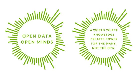
A world where knowledge creates power for the many, not the few. A world where data frees us — to make informed choices about how we live, what we buy and who gets our vote. A world where information and insights are accessible — and apparent — to everyone. This is the world we choose.
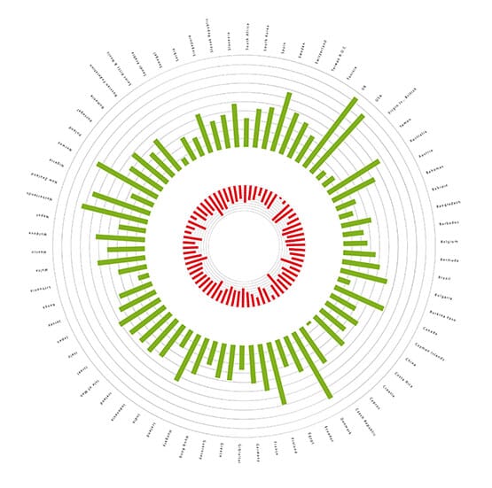
We then started to look at their visual identity: the chosen route was sourced directly from the data collected in one of their landmark projects, the Global Open Data Index. We extrapolated the symbol directly from the datasets of the then 72 countries in the Index, showing how open (green) or closed (red) their data is.
This short animation explains the process in more detail.
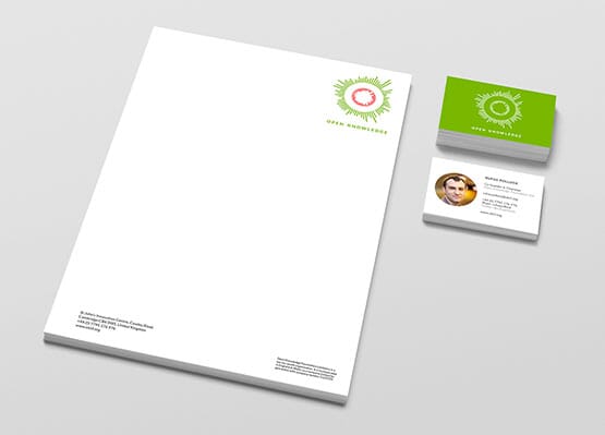
We then built a scheme around what was swiftly nicknamed the 'data earth' and a shortened version of their name, Open Knowledge. The symbol is designed to work on multiple levels, as an 'earth’, as an eye, and as an 'O' for 'Open.
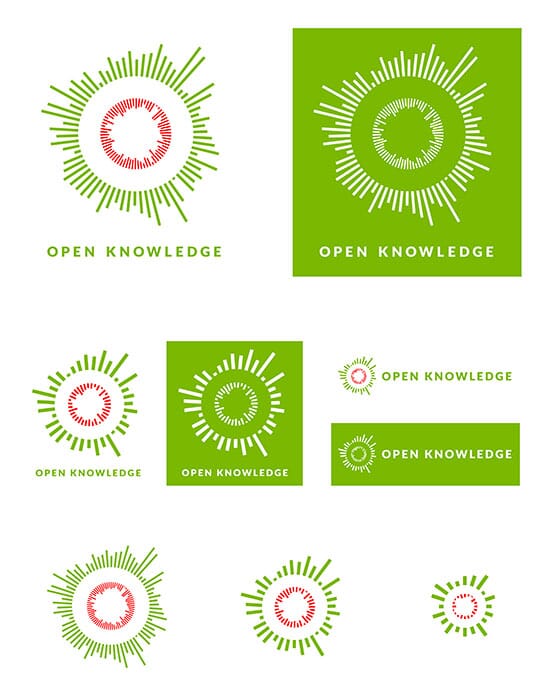
It's important that it can work in multiple sizes and formats…
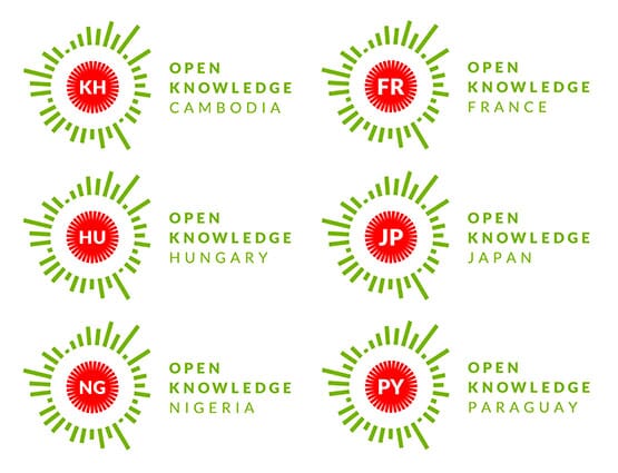
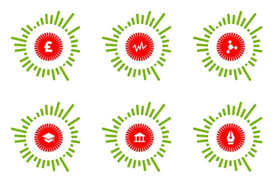
…and can be adopted by their many working groups and global members. The identity is supplied as a working 'kit of parts’ and utilises as many open source elements as possible, including the free font, Lato.

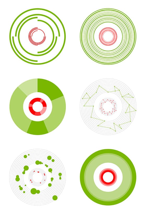
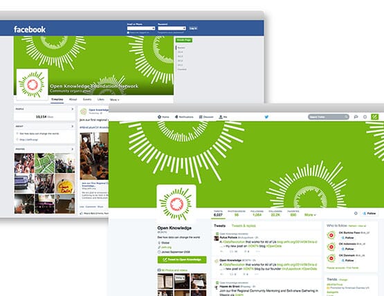
The scheme is designed to be as flexible as possible, across all formats and platforms…
![]()
…and use of the circularity/data principle is already being applied out across many applications.
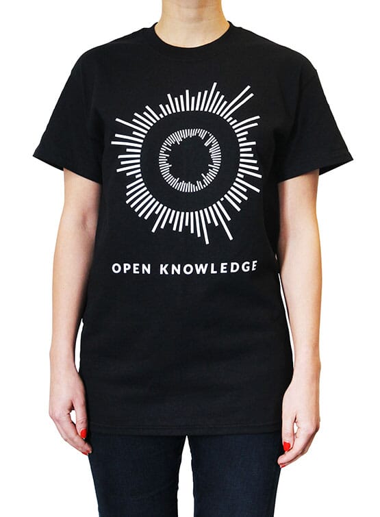
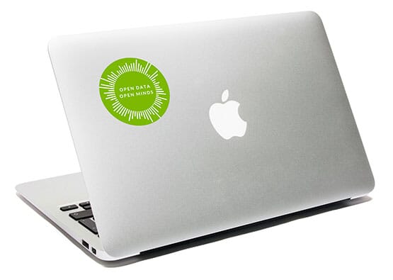
The t-shirts and stickers are also pretty important for their conferences and community.
As the scheme gathers pace across the global network, we'll start to see more examples of the identity in use for their projects, case studies and micro-sites. We'll post more examples of phase two soon.
Follow johnson banks on twitter @johnsonbanks, on Facebook or sign-up for our newsletter here