

Action Against Hunger originated in the late 1970s, set up by a group of French intellectuals appalled by the hunger crisis then gripping underdeveloped nations.
Over nearly forty years and now in nearly 50 countries, it has led the global fight against hunger. Much has changed over the decades, but political and social turmoil, poverty, inequality and natural disasters continue to have devastating consequences for the world’s poor and malnourished.
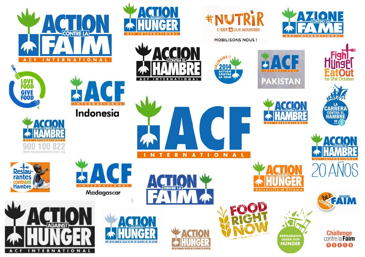
It was immediately clear to us that – whilst the work it was doing is hugely respected – the organisation was very under-branded and often less than the sum of its parts when viewed at a global level. It had developed a complicated mixture of local country names, used its French initialism, ACF (Action Contre la Faim), or a combination of the two.
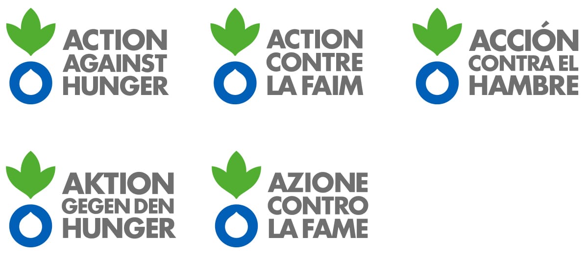
Yet in growing markets, such as Spain (Acción Contra el Hambre) and the USA (Action Against Hunger), the ‘ACF’ letters weren’t understood and confused the situation further. So our first task was to try and find a common ground between all the countries, whilst respecting its federal structure (there is no ‘head office’ as such).
A clear brand architecture, a memorable narrative After many meetings, discussions and workshops across Europe, it became clear that the organisation had to re-present itself as genuinely global. And in identity terms, this meant something had to give - either the whole organisation had to adopt ‘ACF’ as its name, or each country should adopt ‘Action Against Hunger’ in its local language. We felt from the start that the full name was far more emotive, and clearly spelled out what they did. Eventually, after many debates, the organisation agreed.

Allied to this strategic decision was the development of a revised ambition – 'for a world free from hunger' – and a new brand narrative.
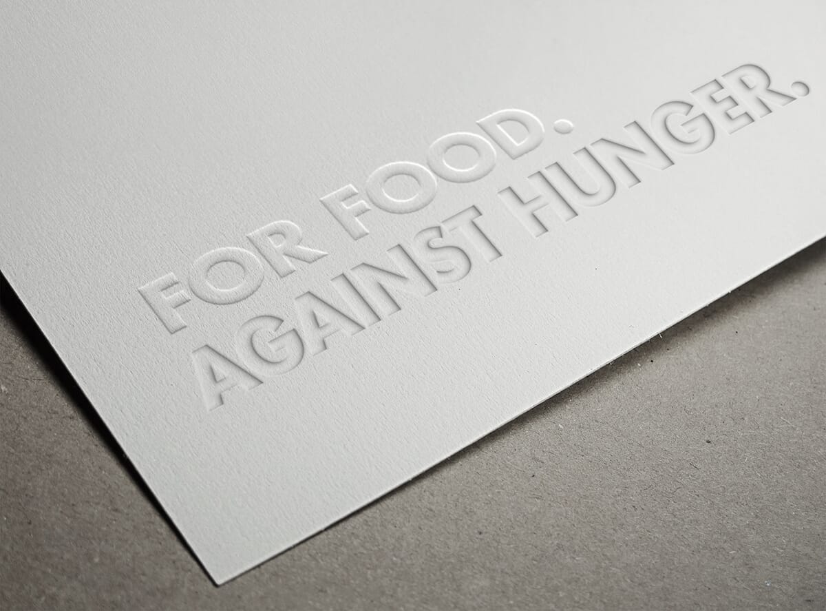
We were looking for a rallying cry that could work in dozens of languages, and realised that there is a ‘for’ and ‘against’ in every language – pour/contre, para/contra, für/gegen, and so on.
Therefore a clear for/against theme emerged which is proving to be very flexible, links well to their name and offers a clear response to the question, ‘why are you here?’ ‘For action, against hunger’.
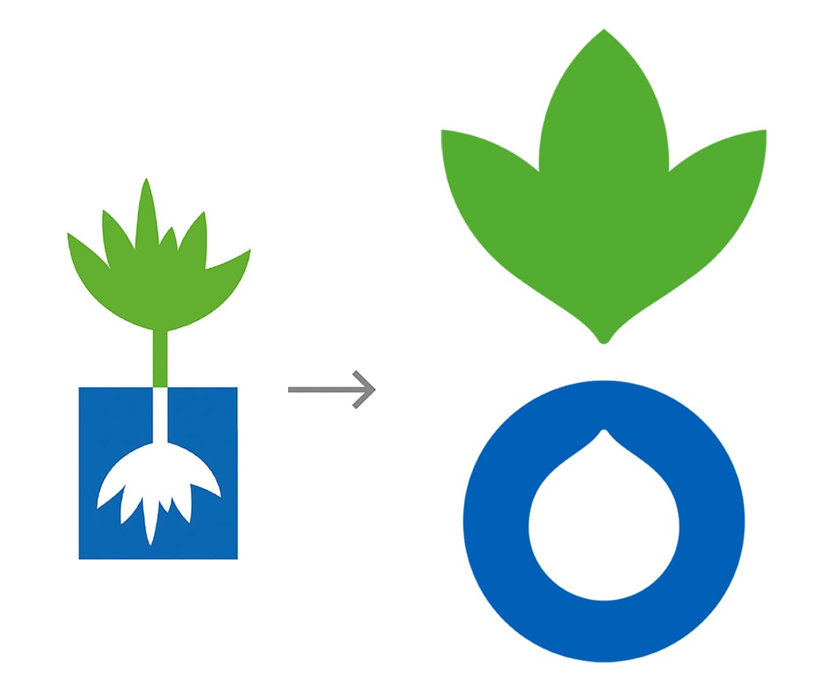
Evolving the organisation’s symbol The other key decision regarded their historical symbol. For decades, an illustrated plant and its root had been in use, and the organisation was in two minds about this. For long-term employees, it had longevity and familiarity on its side. For newcomers and outsiders, it was confusing - was it a symbol for a farming organisation, or (in some people’s eyes) a marijuana leaf?
After lengthy discussions, and one false start, we agreed that a visual mark was imperative to ‘glue’ the organisation together, and it needed to evolve from the old symbol in some way.
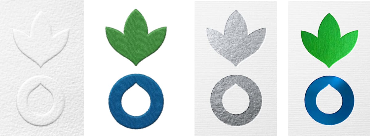


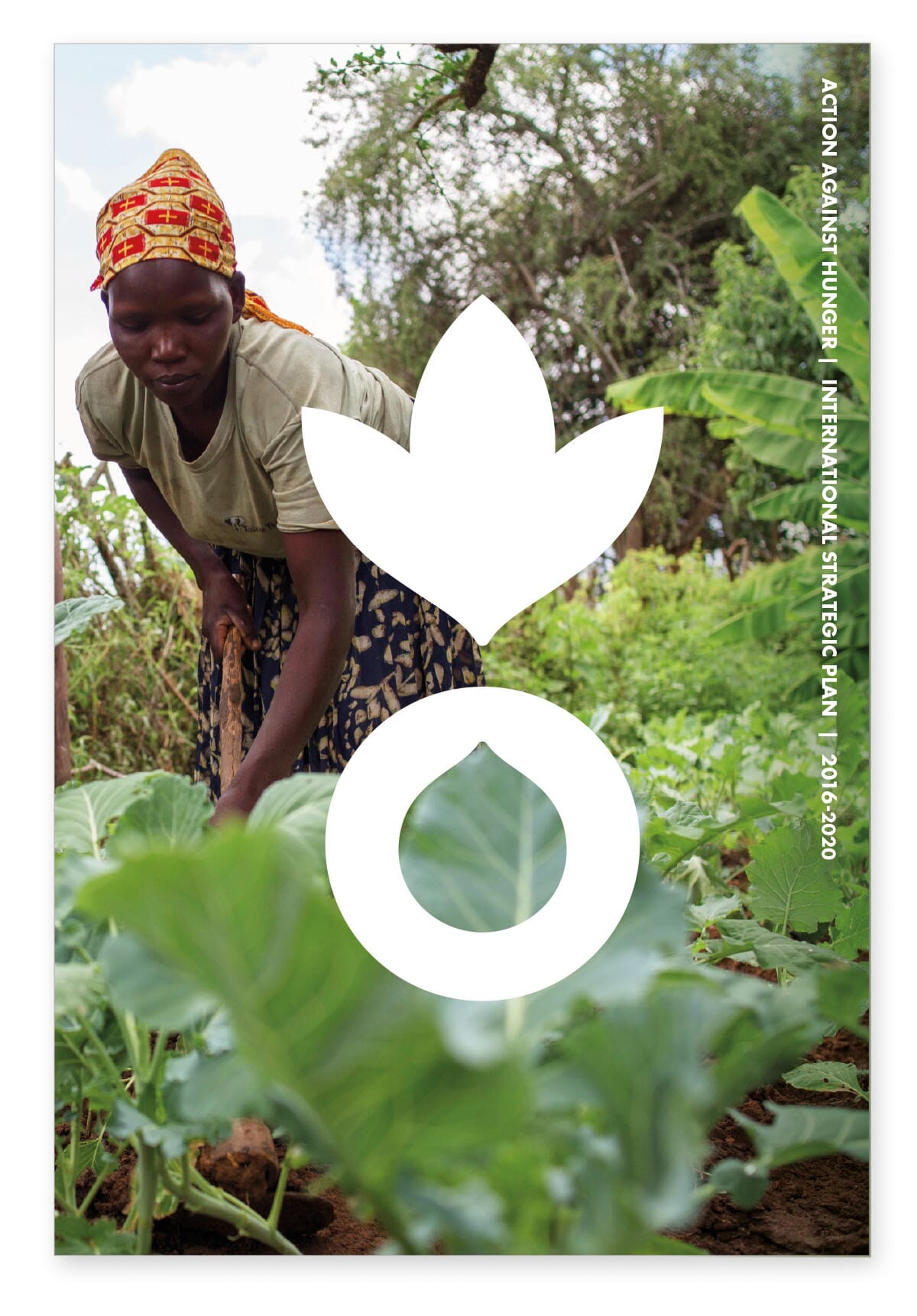
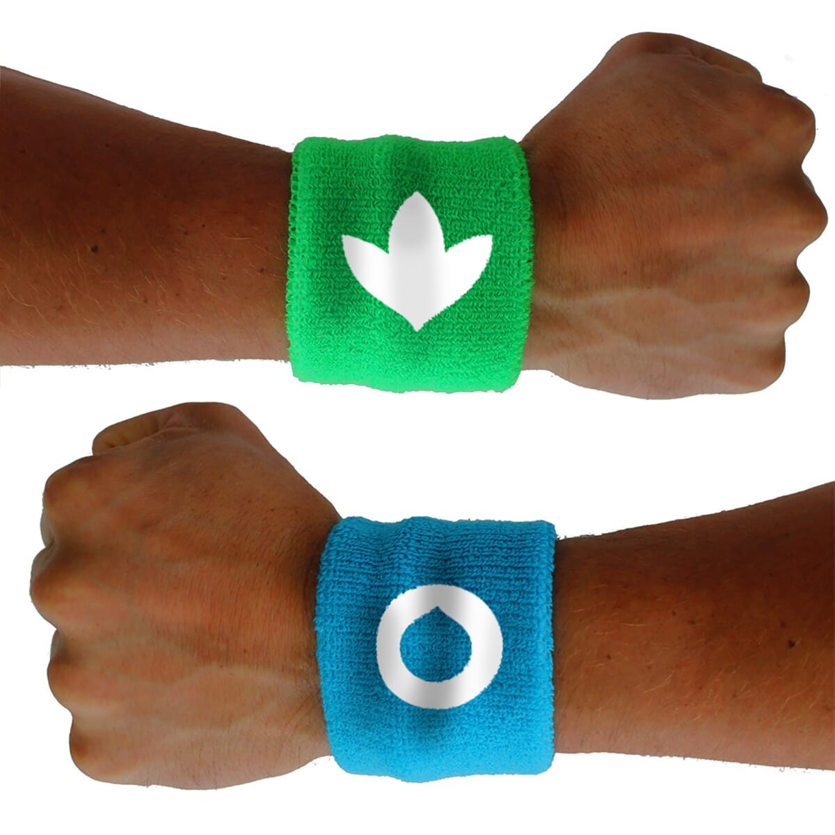
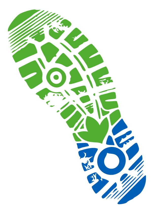
Their new symbol replaces the ambiguity of the old by simply representing two key elements of their work – food and water – whilst tweaking and adapting the core colours. As one employee pointed out ‘if we’re driving into a warzone in Mali and people can’t read our logo, at least they should be able to recognise our symbol’. We can also incorporate the symbol into the typography in certain applications.
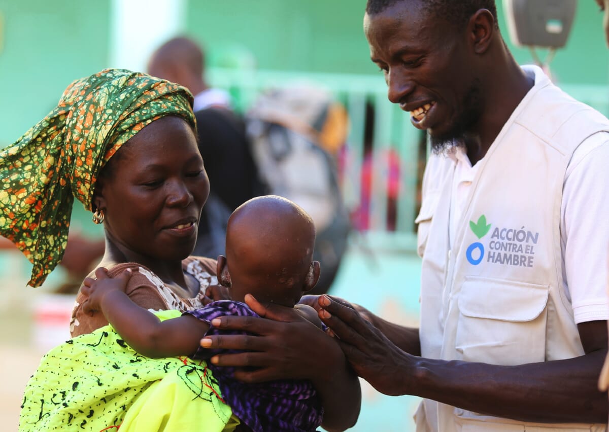


Creating a consistent house style Our next challenge was to create a straightforward design toolkit which could be used across the world, allow for creative freedom yet bring the organisation together. We’ve done this with one weight of our lead typeface, Futura Bold, free typefaces thereafter, straightforward photographic and illustrative guidelines, and a clear two colour livery. The interim work is being supplied via pdfs but will soon become part of a global hub of online design assets.
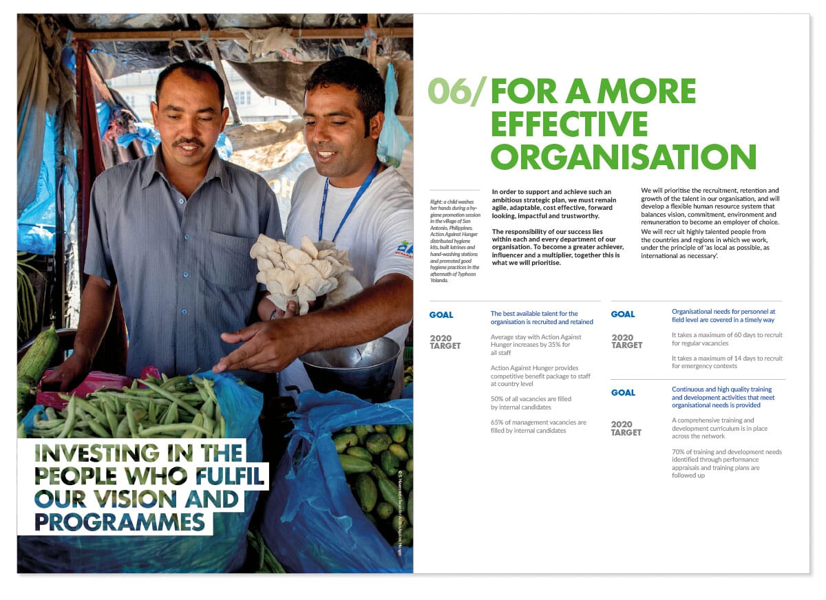
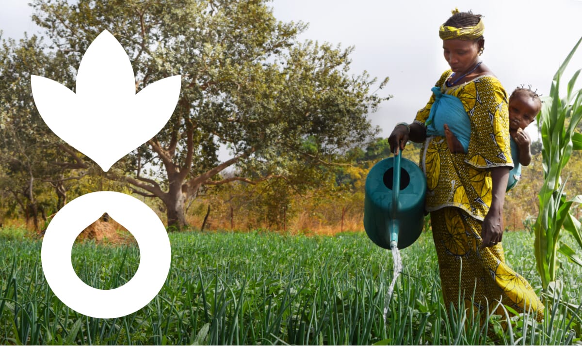
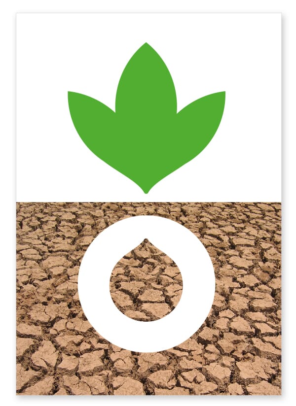
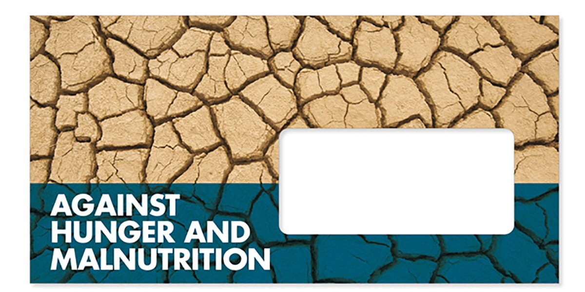

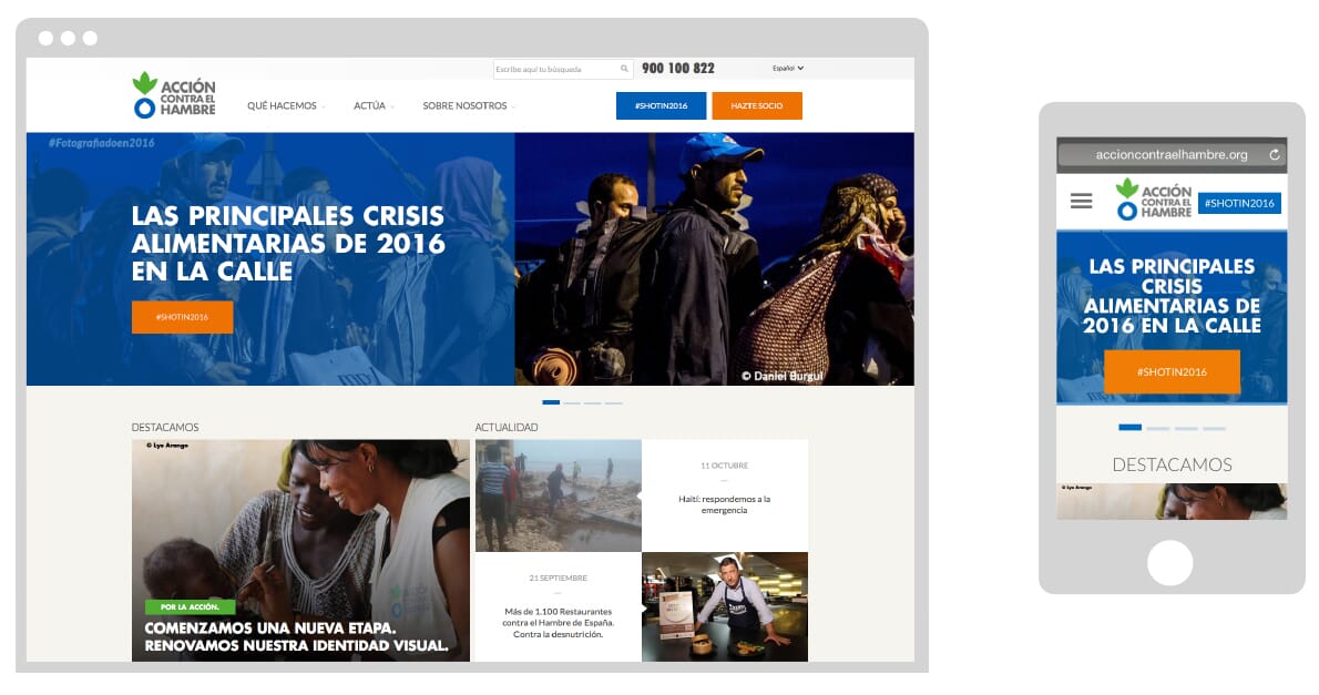
Coping with sub-brand confusion As with many busy and multi-country NGOs, the activities of local communications and fundraising teams are numerous and varied. And all agreed that greater coherence was critical. So we’ve been developing clear rules to allow emergency appeals, activities, initiatives and sub-brands to continue, yet within clearer restraints. Here are some examples, and some further initial applications of the scheme.
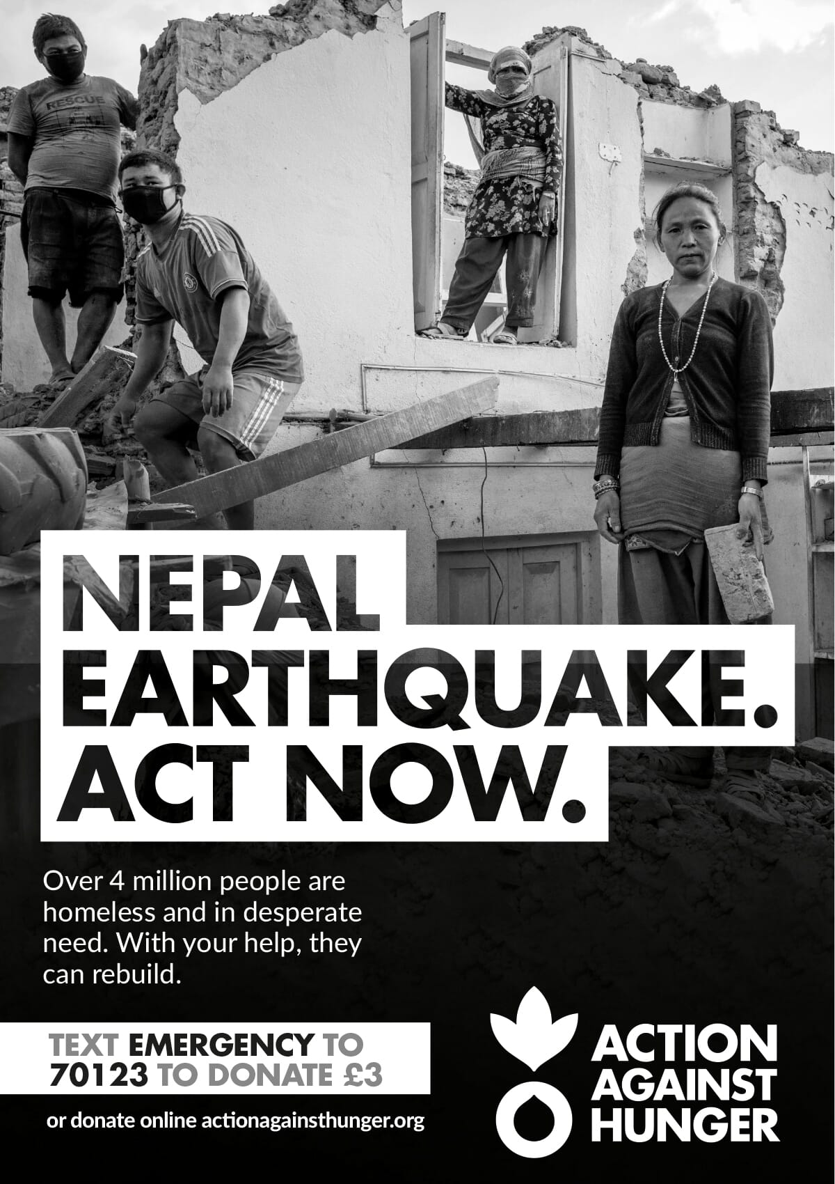


We'll update when more applications come online. After an arduous 30-month timeline, it’s great to see this scheme make it into the public domain.
Follow johnson banks on twitter @johnsonbanks, on Facebook or sign-up for our newsletter here