Recently I was walking through an area of Shanghai dedicated to up-and-coming designers of all descriptions. There was some interesting work on display, but some of it felt, well, familiar. I quizzed my locally based colleague and he replied with a quote I’ve never forgotten: ‘well, over here we see copying as a form of flattery’.
That really stuck with me. Designers have increasingly realised the worth of what they do and the ownership of their ideas, but in an internet age how realistic can we be? We’re more finely tuned to the protection of ideas, but it’s become much, much harder to check.
How do you know an idea is original? Just because you’ve not seen it before, how can you guarantee it hasn’t been done before? How do you stay abreast of all the designs being produced, worldwide, in any one given year and all the years that preceded it? Or conversely, should we relax a bit more and let what will be, be?

Let’s take an example. In the cold light of day, Cancer Research’s new symbol of people from above, that forms a ‘C’, then resolves to a ‘C’ made of dots…
![]()
…does seem perilously close to this St David’s scheme of five years ago...

...where an image of people from above forms a ‘D’, which resolves to a ‘D’ made of dots.


OK, one is a C and the other a D. But, otherwise?
Only the designers at Interbrand know if they’d seen the original. Even then, who would really want to sue a famous research charity over the possible sleight of hand of a supplier? And, the idea of people shot from above forming a letter is hardly new, let’s be honest.
This comes back to that old rule – you can’t copyright an idea, just the way the idea is carried out and a legal ruling (and at least 30k in legal fees) would rest on whether the C and D above were too close.
Another example - the American detective show, Elementary, has some nicely shot opening titles which use objects landing and falling in a cause and effect style. First reaction: memories of that controversy when a Honda ad took arguably too much inspiration from an art film.

Second reaction: that scene in Chitty Chitty Bang Bang where Caractacus Pott makes his boiled egg. Third reaction: remembering the mad machines of Rube Goldberg.

So, that’s a lot of references and influences in the space of a thirty second opener. It turns out that its director Simon Clowes was indeed inspired by Goldberg, but his is nicely shot homage, not a steal.

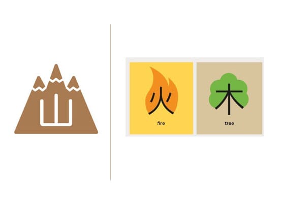
Let’s try another. The ‘idea’ of explaining mandarin characters with images isn’t new – here’s an example from a famous Tuttle text book by Alison and Laurence Matthews illustrating the visual provenance of key characters in an educational way. I picked this book up at a Chinese airport a few years ago and it became the starting point for a research project linking Mandarin back to its visual roots, using pictograms, simple line drawings and bright, flat colours.


We called them Mandagrams, exhibited them, wrote blog posts, made little books and gave them to Chinese clients. We talked about it as a kind of educational resource for tourists who couldn’t understand the language.
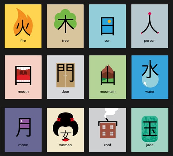
3 years later, ‘Chineasy’ appears all over Kickstarter, and now design competitions. In case you haven’t seen it, Chineasy takes Mandarin back to its visual roots with simple line drawings and bright, flat colours. It’s pitched as a educational tool.
Now, some months after the initial shock has worn off, I’m starting to wonder if the Tuttle authors shouldn’t be ringing their laywers, not us. I actually think Chineasy is very nicely done, but the visual similarity to Mandagrams is, well, uncomfortable, to say the least.

Of course it’s really hard to talk about and ask for views on this topic without sounding like Scrooge, retrained as a copyright lawyer. ‘Some people have no conscience (especially in advertising)’ suggested North’s Sean Perkins. ‘It seems their whole industry is based on 'being inspired' by a recent film, photographer or graphic style. A memorable one for me was this one for the V&A which I was reminded of recently returning from Heathrow seeing Lucozade neon advertising on the Westway.’
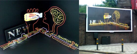
Perkins isn’t trying to claim that he had invented the idea of illustration/art using fluorescent tubes, but was understandably aggrieved by the closeness of this ‘homage’ to his work for the V&A.
If you really want to air a grievance, at least the internet comes to your rescue with various design blogs, you thought we wouldn't notice or logothief.com. If you want to register an idea electronically, you could always have a look at the Creative Barcode.

But a paradox of the design profession is that at college, designers are often pushed to emulate their heroes. Thousands of Swiss-school designers have devoutly developed ideas based on Müller-Brockmann and Armin Hoffmann. Rather than being seen as tedious copying it’s often been an entry card into the business, almost seen as ‘grammar’, to be learnt before proceeding further.
Every day designers take other people’s typefaces and adjust and adapt them, then swiftly claim their adaption as unique. Or pull books of carefully categorised logos off a shelf to get their own ‘inspiration’. Craig Oldham’s view is suitably forthright: ‘I like homage, I like inspiration, I like evolution, curation, narrative, influence, reference, as long as there's rhyme and reason to them, and that people are open and honest about it. But I can't abide direct reproduction, like-for-like. It's fucking pointless.’
Perhaps it’s best to be more realistic. Design commentator Rick Poynor thinks we should just take this on the chin: ‘Graphic design has always been ultra-prone to this - a field in which there were memes before we called them memes. And now, digitally enabled, we are living in the age of the copy’.
And, of course, who’s to know if that design on your computer at this moment is as unique as you think it is? There might be exactly the same idea or parallel execution sitting in the public domain somewhere – you just haven’t seen it yet. It's happened to me before, it will probably happen again.
So, in defence of the Chineasys and the Cancer Researchs of this world, perhaps they really hadn’t seen any of the precedent. Or, to put it another way, perhaps we should just be flattered?
By Michael Johnson
Follow johnson banks on twitter @johnsonbanks, on Facebook or sign-up for our newsletter here