
It's fair to say that logos and symbols, every now and again, look a bit similar to something else. You can do your darndest, check trademark databases, scour Google images, but sometimes, like that old episode of Star Trek with the parallel universe, something's happening that's slightly too similar.
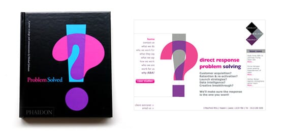
We've done the odd project that looked too close to something else (not on purpose, we hasten to add). Or, every now and again, someone has, er, emulated something of ours. It happens.
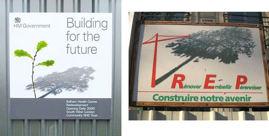
So was this.
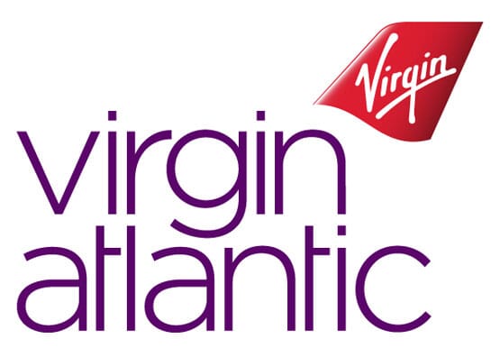
This one? A bit dull, if we're honest because someone in Australia got well paid for picking apart our Virgin Atlantic artwork (sigh).

Anyway, thanks to eagle eyed reader Matthew Laws, what follows is just entertaining.
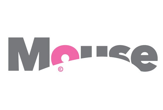
Remember this logo of ours from 2008 for Microsoft Europe? Pretty pleased with this one, nice use of negative space, won awards, yada yada yada.
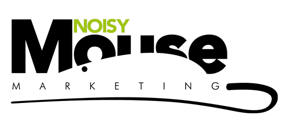
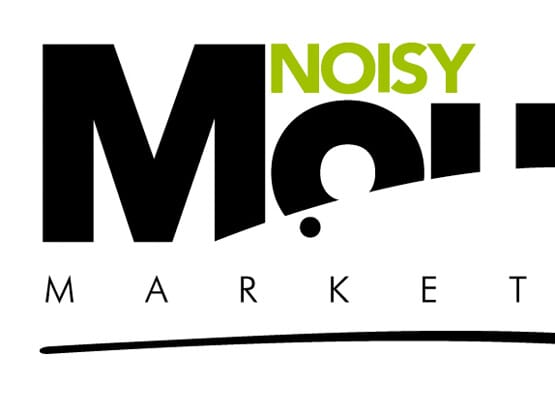
Now enjoy Noisy Mouse Marketing's version. Now that is good - we think it's definitely improved and the addition of the tail is just genius.
Update: Noisy Mouse Marketing's logo was designed by ASBO graphics in Coalville, Leicestershire.
Follow johnson banks on twitter @johnsonbanks, on Facebook or sign-up for our newsletter here