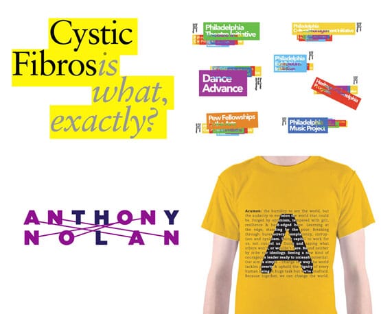

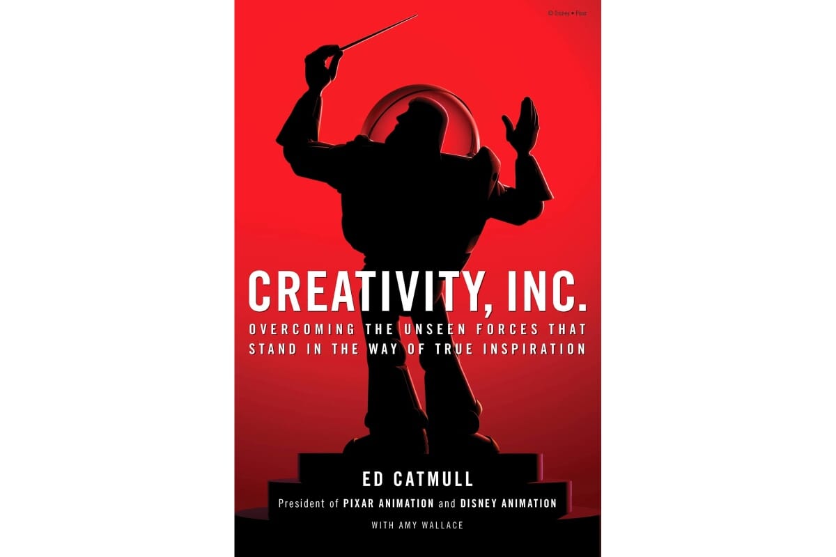
I'm reading Ed Catmull’s book, Creativity, Inc.
Catmull is President of Pixar Animation and Disney Animation, and his book is subtitled 'overcoming the unseen forces that stand in the way of true inspiration’. As a book it does lapse into management platitudes every now and again, but is generally pretty insightful.
I’ve just read an interesting chapter talking about ‘hungry beasts and ugly babies’. 'Hungry beasts’ as a concept crosses over into design pretty easily - we all have big, time-consuming projects that need a lot of attention yet yield fiscal rewards (eventually).
'Ugly babies' is more interesting and got me thinking. Catmull's point is that the early mock-ups of Pixar films are 'not beautiful, miniature versions of the adults they will grow up to be. They are truly ugly: awkward and unformed, vulnerable and incomplete. They need nurturing – in the form of time and patience – in order to grow’.
That prompted a raid of the johnson banks server to look again at a series of different projects, from the start of the design stages to the end to see how our particular brand of nurturing works, for better or for worse.
It's interesting to look at the beginnings of what eventually turned out to be a workable scheme: the stages and inflexions a thought had to go through to reach a satisfactory conclusion, and whether those idea 'seeds' withered, or flourished.
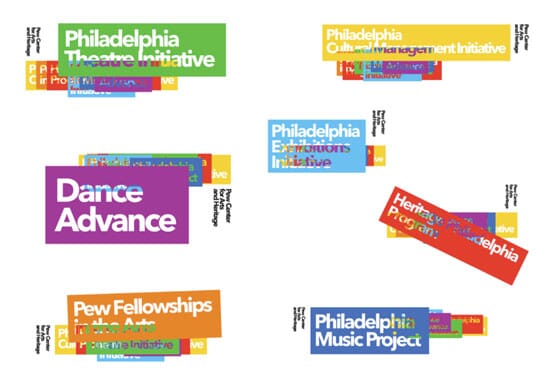
For example, it seemed to take us an inordinate amount of time to go from the early observation above...
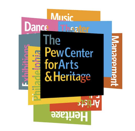
...to anything remotely interesting...

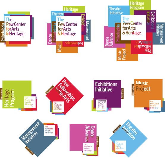
...and then to the final iteration of The Pew Center identity, with it's multiple states (below). Yet, there is a kind of link from where we started to where we ended.
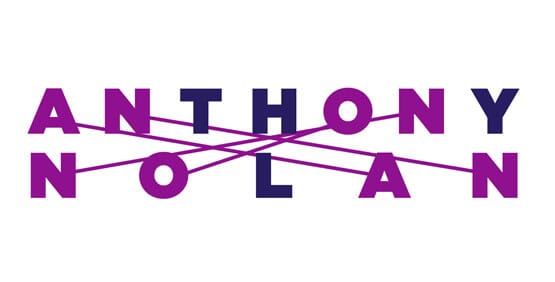
Looking back at the initial typographic sketch of Anthony Nolan’s identity (above), the idea of 'matching’ for a bone-marrow registry is definitely there...
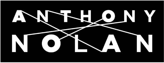
...but it was clearly in need of some careful crafting, and the switch to black and white helped enormously. (And it helped mask the fact that the T, H, Y and L aren't matching anyone, yet).
At the time, the inspiration for the initial attempt at Acumen’s manifesto-based identity came somewhere in the mid-town tunnel driving into NYC only hours before the meeting. At the time, the approach shown below seemed really interesting, and was the favoured route...
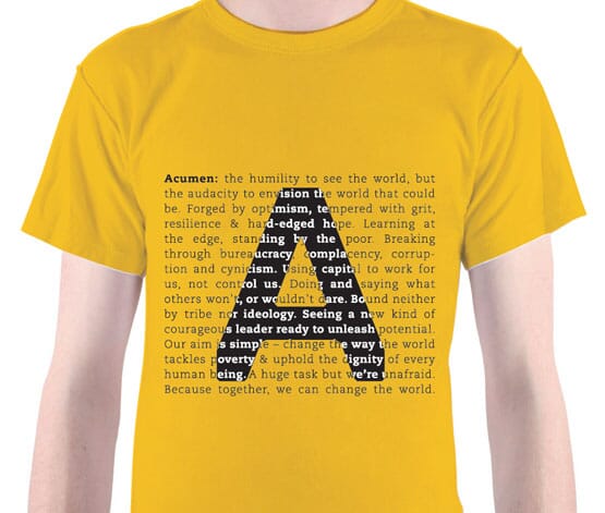
...yet pretty quickly proved impractical (that's a lot of words for a ‘small-use’ logo, for example. And maybe just a bit too hipster).
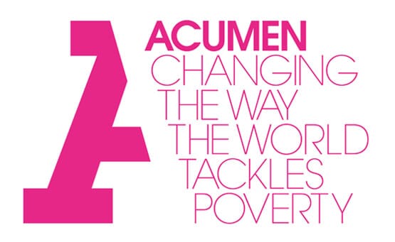
After that it took what seemed like a million more goes to get to the final idea – yet – the idea of combining monogram and narrative stayed in there, albeit in a completely different form.
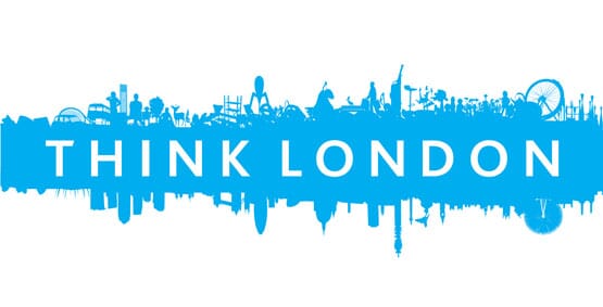
At the time, the initial design presentation of Think London’s logo felt like a major breakthrough, but the client took a while to be persuaded. Perhaps it was because the first version was, frankly, bonkers. In fact we can only find version two, shown above (version one was clearly so bad it's disappeared without trace).
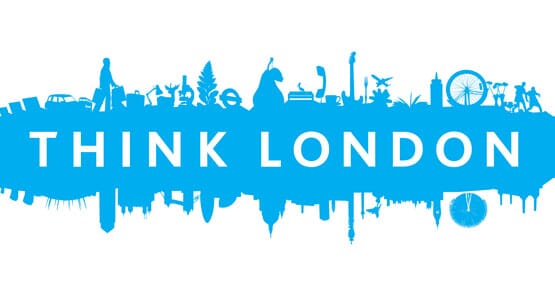
Shown above is version four.

Then there are countless more iterations before we got to the final design and final colour, shown above, which is, er, version eighteen. Definitely a good example of how good honest crafting of an idea took it somewhere much, much better.
A more recent project is equally intriguing. We'd had the ‘is’ idea for the Cystic Fibrosis quite early, in the strategy stages, but we were struggling to find a way to do it justice that didn’t feel a bit over-designed.
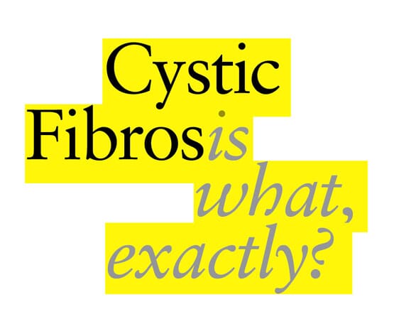
Here’s a really early version.You can see what we're trying to do, but it just looks a bit too knowing, too designery.
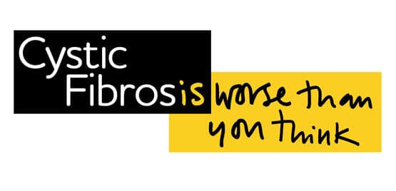
Then a really early, and very clumsy attempt to use handwriting. But the informal quality of the writing seemed to unlock the idea and make it far more approachable. In this case it seemed to need less 'design' rather than more.
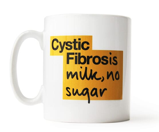
Here's a bit of the final scheme which uses their own special handwriting font, and 42 different logos (so far).
In conclusion?
Well, Catmull's 'ugly babies' theory seems to hold - many of these ideas (and of course many others) went through long development stages, but they all retain links back to where the route started, even if the changes are quite dramatic. They are all better because of the improvement process. The development may have been painful, but they grew up, eventually.
By Michael Johnson.
There's more on Catmull's book here.
Follow johnson banks on twitter @johnsonbanks, on Facebook or sign-up for our newsletter here